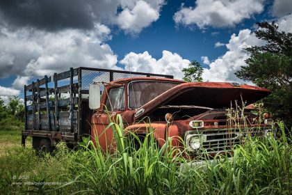
Welcome back everyone, and I hope you had a very Merry Christmas!! It is time once again to go back through all of the images that I have shot during 2023, and decide on which ones might be significant for the year. I know that during this time of year, you are blasted with these lists, like “Instagram’s top 9”, or maybe it is the “10 best of the year,” or possibly something like “my favorite images of the past year.” These lists are always somewhat subjective whether chosen by the photographer or by social media like counts. They can be picked based on total interaction through social media, opinions of family and friends, or just which images the photographer happens to like that particular day. No matter how the list is curated, it always comes down to opinion and there isn’t much there to back it up, even when it comes to likes on social media. There are too many variables to base how good a photo is based on how many likes and comments it might receive. Those numbers are always skewed and have little to no relevance to the quality of a photograph.
That is why I started looking at things differently years ago. I have chosen to take Ansel Adams’ approach as he said that having 12 significant images a year is a pretty good crop. For someone that is so well known in the photography community based on having a huge body of work that is still sought after today, that is a rather profound statement. Essentially, the implication is you will shoot a ton of photos each year (if you are doing it right), but most of them will be average at best. If you can come across just 12 photographs a year that elevate your photography and result in images that will make you stop and look twice, you have had a very good year.
With that in mind, I started looking back over my photographs from each year and trying to decide which of those images had risen to that particular level. It would have nothing to do with whether or not I liked the image more than others, or whether it was well received on social media. No, this list was going to be those images that still cause me to react to them after I have had a chance to live with them for a while. The difficulty with this list became going back through those photos at the end of the year and trying to remember if they were shot during the year, or if they were older. The ones that were routinely in my mind were the photos from Fall and later on, so those started to get more than their share of attention on this list. That was pointed out in the first year that I compiled the significant list by another photographer and he was exactly right. Since that time, I have created a folder on my computer where I will put a collection of images that I think will be in the running for this list shortly after I create them. This list will usually grow to roughly 30 examples by the time I start to put the final list together. From there, I pull the ones that still seem to have that significance into a final folder from which the list is actually comprised.
It is a year long process, and still isn’t an exact science. I would love to say that it is easy picking the significant images as opposed to my favorites from the year, but the truth is, this is getting more and more difficult each year. I think that I am experiencing a deeper understanding of what Ansel was talking about the more that I engage in compiling this list. As the quality of my photos gets better, the ones that take my breath away and represent some big growth as a photographer are getting harder to differentiate. I guess you can say that I am growing by little bits here and there rather than by leaps and bounds. Even five years ago, it was easy to pick out the photos where it all came together, and there was rarely any issue in determining the standout images. These days, the differences all come in the nuances of the photo, and usually just a small aspect that I keyed in on at the time of capture which elevates an image. Picking those out of a crowd of hundreds, if not thousands of photos from the year is getting very difficult. It is a nice review of the year though, and it allows me to track my progress and see where my creative preferences are at currently.
Before we get rolling with the list, I want to share some stats with you. I’ve started doing this each year to kind of keep track of my personal style as a photographer. If you are interested, you can look back over my more recent lists from 2018, 2019, 2020, 2021, and last year for a comparison.
3 Vertical compositions
9 Horizontal compositions
1 Panoramic
4 Black and white images
8 Color images
4 Landscape themes
5 Decay themes
2 Automotive themes
1 Studio theme
2 Were shot with the 16-35mm lens
2 Were shot with the 24-70mm lens
6 Were shot with the 70-200mm lens
1 Was shot with the 14mm lens
1 Was shot with the 100mm macro lens
1 Was shot with the new EOS R5
11 Were shot with the workhorse 5DS R
Some things that I have learned from putting this list together are that it would appear that while I’ve had a resurgence of sorts in the genre of landscape photography, most of my standout photographs are still in the decay and automotive spaces. I am continuing to create meaningful black and white images, but they are not as prevalent as the color images which stands to reason as a comparatively small percentage of my overall photographs are done in black and white. Lines and shapes continue to be a very important part of my work, and in some cases the lines and shapes define the piece. In prior years, I believe that I had a bit stronger of a showing on my vertical compositions, but this year, there were only three of them. I recall back to when I started out in photography, that most everything that I shot was vertical because I found that the easiest way to eliminate the distractions to the side of my main subject. These days, I like the more open quality of the horizontal composition. For me, this is a more relaxed way of showing a scene, but this means that when I want to add some drama and tension to the photo, I’ll work the composition as a vertical. The big surprise here was the number of significant images that came from the 70-200mm lens. I knew that I had been using that lens more this year than ever before but didn’t know that it would result in exactly half of the photos in this list. On a related note, the lack of use of my 24-70mm is equally as surprising. This is the lens that I used to gravitate to with everything that I shot, but with only two images on this list seen through that lens, I can tell that a big shift has happened this year. That realization might be the most significant thing that is represented in this list.
As I go through all of the cumulative stats for the year, I start to get a clear picture of how my personal style is developing. This is something I recommend all photographers do regularly through the years so that they can fully understand how they see the world. For instance, as you look through these photos, you will see that I have been gravitating towards the details of a scene, whether it be the structure of a tree, or a specific point on a vehicle. There are very few grand scenes with a lot of information to look at, and this is something that I’ve known about myself for a very long time. While I am capable of capturing a grand scene, I usually find the details more engaging. Knowing this about myself, I am better able to find the shots that I will like quicker than if I am trying to read the scene as somebody else would.
I’ve done enough talking about the twelve photos that you will be seeing, and it is time to get into it. I hope you haven’t skimmed ahead to see what made the list. I’m going to try and keep this short by posting the date that the photo was shot along with the associated blog entry. This will serve as the general background of the photo while I will just say some quick words about why the photo was selected to be in this list. Just keep in mind that this list is not necessarily representative of the best of my photography for the year, just those that have an articulable significance to my work as a whole.
Number 12

Friday, April 21, at Doughton Park
I had such high hopes for this scene, but the weather never really did cooperate for me the way I was planning for. As I look back on this panorama now, I have forgotten all of the issues behind it, and I can just marvel at the beauty of the scene. I think that aspect of the photo qualifies it for this list in a lot of ways. What truly makes this one significant is how I chose to edit it which has given it that particular impact. For me, the edit needs to be invisible where everything within the photo still looks realistic. I don’t go for the falsely saturated colors, blown out highlights and such. However, if you look through the blog entry, you will see that this scene has nothing to do with the scene that I shot, or the RAW file that the camera created which was the starting point for this photo.
I will freely admit that I took the edit of this photo much further than I normally would have, but I had a vision for this scene when I started, and wanted to see if I could pull what little color was present out of the sky so that I could realize that end result. Lightroom had just been updated to allow the use of the tone curve in local adjustments when I used rather judiciously for this set of stitched images to get the sky to look the way my heart saw it at the time. There was no sky replacement, no image manipulation, just wringing out all the information that had been captured by the camera. In the end, this is what I had, and I couldn’t have been happier with the outcome.
The significance of this photograph comes down to just how far I am willing to push an image while still keeping it true to the scene at hand. I learned a lot about how to pull that color detail out using some new tools. I also learned that even with some very high-powered tools available to me, the ultimate success of the photograph would still come down to how it was captured. I had to pay attention to things like where the sun was hitting on the fence, and how the overall composition was looking. Keep in mind that I was estimating the composition since there were ten individual frames that went together to build this scene that I wouldn’t be able to see together until I got the files home and stitched together. What I learned specifically from this trek was that any photograph that I create starts as raw materials which will then become a representation of what I felt at the time of capture.
Number 11

Wednesday, July 19, at Outlawed Restorations
Yep, it is a photo of an old truck, and one that I have shot many times over the years. What makes this one so significant? Well, it represents a different way of seeing the details on a vehicle. I’ve shot door art many times and have usually done it either squared up on the door or using the door art as a foreground of such with the composition trailing off past the front of the vehicle. The logic there is still valid because I wanted the most important aspect of the shot to be what was right there up front. However, during this mentoring session, I was looking for different ways of seeing so that I could share options with the client.
When it came to photographing the door on Old Stitch, I wanted to pay homage to the hand drawn artwork, but I also wanted to have it come together with a bit more of a complete story. One of the aspects of this rat rod truck that I love is how the different sections used to widen the body had been “stitched” in as seen on the fender. From the driver’s side, the Grimm Reaper is looking towards the fender and bringing the attention to that aspect. I had already shot a composition from the other side where the fender was in the background. Overall, I had liked the composition better for the flow, but when I saw the character pointing to the fender, I saw a better opportunity. I could have gone with the same type of composition as before, but I felt that the overall result would have been a bunch of directing factors taking the viewer’s eyes out of the scene. By switching things up and using the fender as the foreground, I was using the stitching to introduce the door art which then pointed the eyes back into the image. Essentially, I had created a roadmap within the scene that kept the eyes busy without pulling them out of the fame.
This is not a new concept at all, as I routinely look at how the eyes pursue in an image, but for me to take the main point of the composition and put it more or less in the background, was a little different. I also didn’t worry about perspective here as nothing is exactly plum, vertically or horizontally. The subtle diagonals helped to keep things interesting in my opinion. The choice for black and white also put much more of the emphasis on the door art due to the higher contrast which was instrumental in the success of this one. While we lose the effect of the rust without the color, we gain a deeper understanding of the textures that the body provides as well as the evidence of the dent removal on the fender. The end result is a photograph that comes together in every aspect and keeps the attention of the viewer until they choose to move on. This is all I can hope to achieve with my photos, and that is what makes this one significant.
Number 10
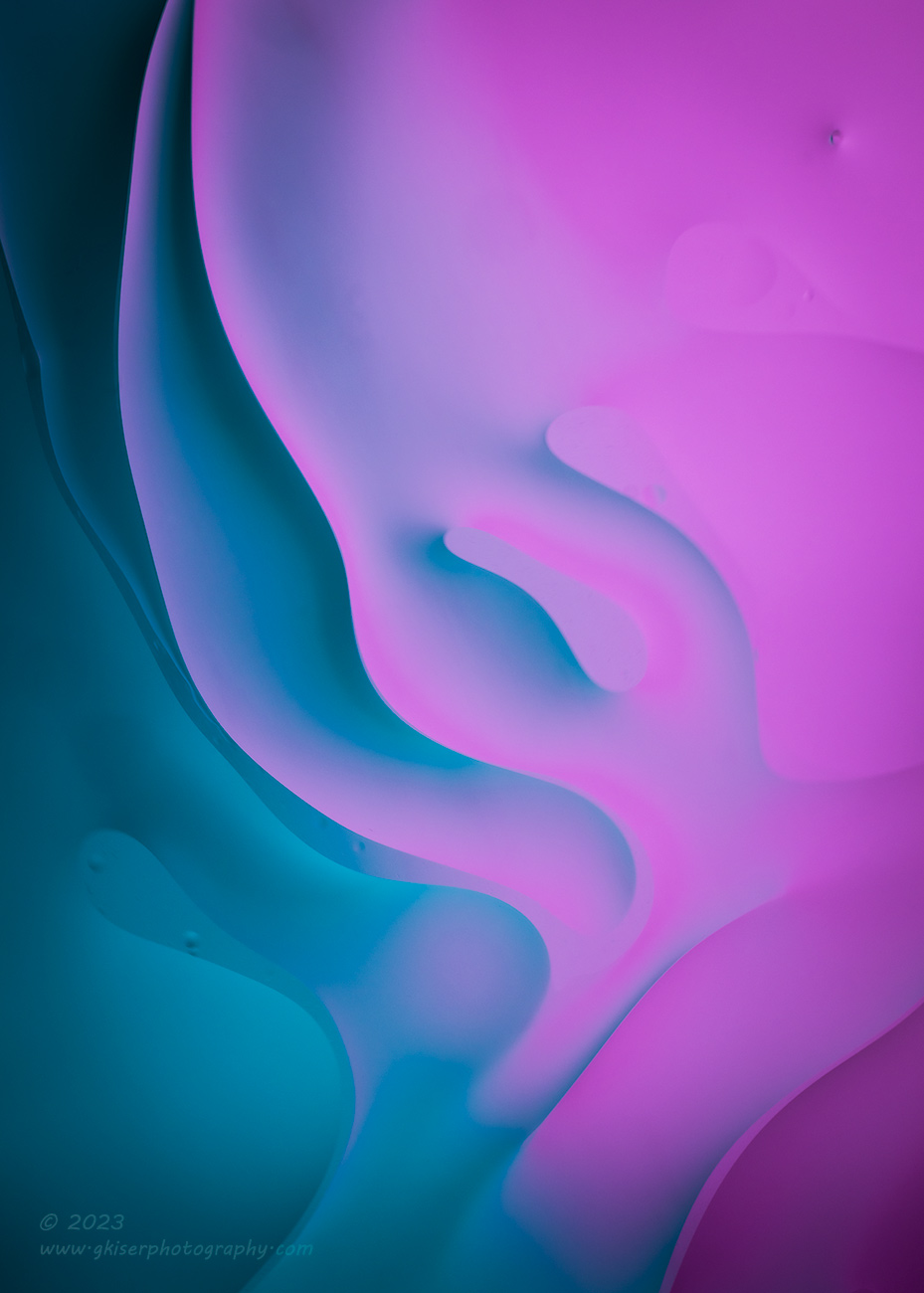
Friday, December 1, in the studio
When you first look at this one, you are probably thinking that it is the factory set background screen from my cell phone. I can see where the confusion might come from, but this one is one of my significant images from 2023. So, why would this photo be on that list? Well, it was only shot a matter of weeks ago, so it still has that new image smell for me, but you have to admit that it looks pretty cool. Aesthetics aside though, the significance of this one comes from the process that was used to create it.
Photographing oil and water isn’t a new concept, and it isn’t even something new for me to photograph. I think that the first time I tried it was in 2008. That was also the last time I did it. I had largely forgotten about this technique over the years as I moved away from doing this type of studio work in favor of going out in the field. It wasn’t until I watched a YouTube video showing another photographer doing this technique that I remembered my attempt. The more I thought about it, the more I wanted to give it a try again. In a couple of days, I was set up and stirring the oily water shooting over 100 frames as the shapes changed.
I put my knowledge of color theory to work as I mixed and matched different colors in the background which resulted in the blending you see in the final photos. The compositions were actually kind of thought out as well since I was stirring in a way that would create the different shapes which I was watching through the camera to know when to actually shoot the frame. This significant image holds the honor of being the only photo on this list where I created everything that you see, and it wasn’t just a matter of me photographing something that was already there.
The true significance of this one is that it is a reminder that no photographer has to be pigeonholed into a certain genre. Photography is a visual language, and it is just how you tell the story that you are wanting to share at the time. When I did this studio session, I wasn’t wanting to speak in the language of landscape and decay, but was more interested in color, texture, and shape. I accomplished that goal with a high degree of success from this roughly hour-long shoot. Because of that, I feel that this photograph has earned a place in this list.
Number 9

Tuesday, Sept 5, in Foscoe, NC
Speaking of textures and colors, our number 9 entry for the list kind of fits that theme, but in a different way than the previous photo did. It is rare that I photograph a car that is in this kind of condition. There was hardly any rust to speak of, and the paint still had a shine to it. The chrome was even in pretty good shape for the age. The parts of the car that drew me in and made me want to photograph it are largely absent in this photo which turned out to be one of my last compositions. I was after the yellow paint under the sunshine which I knew would make it radiant. I went for recognizable detail shots and many compositions that I have used successfully over the years. While I liked the photos that resulted, none of them were going to ever make this list. I was fine with that, because I was just wanting to shoot this car in a way that I would not have done usually with the bright sunlight overhead.
The photo you see here was kind of an afterthought for the day. As I looked around to see if there were any other compositions that I could shoot, I looked at the area of the rear pillar which I have shot many times before with great success…only on non-convertible cars with lots of rust and patina. The composition was still there, but the top added a type of texture that I was not really all that fond of. The colors were also very similar between the top and the quarter. This type of monochromatic look with wildly different textures certainly wouldn’t work as a photograph. The two bits of chrome trim did catch my eyes and set up a nice dividing line between the textures. I decided to give the composition a shot, but I had very little hope in it succeeding.
When I got the photo home and started to look at an edit, I began to see potential here that I had not seen earlier. The chrome was reflecting the blue of the sky which was the perfect color to go along with the yellow of the car. I could easily differentiate the color tones between the canvas and the metal as local adjustments to add a little interest, and the painted surfaces would become negative space pushing the attention to the top where I would pull out all that great texture. It took a little doing in Lightroom to get it the way that I wanted, but the end result was a photograph that truly stood out from the others that day and changed up how I usually found textures on a car. This one photo gave me a completely different way of seeing and working with convertibles. It also pushed my use of analogous colors and how to utilize them to tell the story that I wanted to share.
This may just look like a simple isolation shot of a convertible, but this single photo represents a longshot chance of success at the time of capture, which was turned into a learning experience, and resulted in a different way of seeing and appreciating a subject that I have been photographing for years. Any time that much personal growth can be attributed to a single photo, there is no choice but to call it a significant image.
Number 8
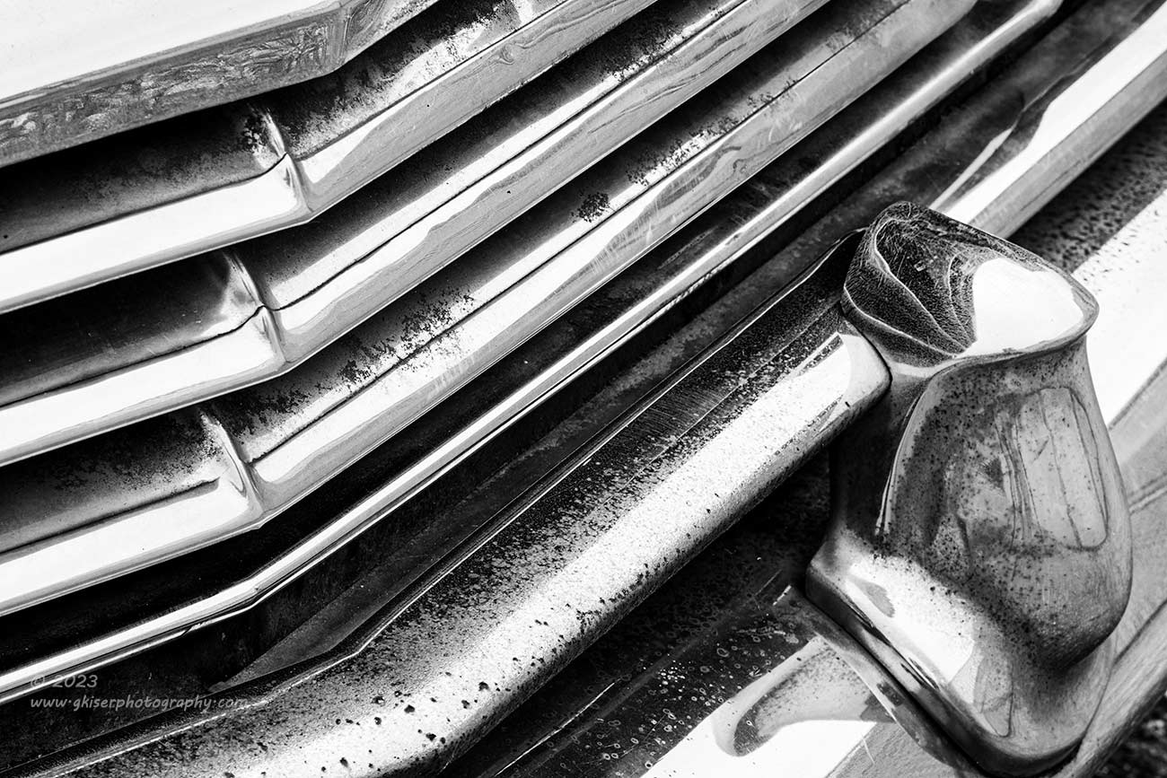
Saturday, November 11, Taylorsville, NC
You may or may not recognize this as a grill when you first look at the photo, and that might be my favorite aspect of the picture. It has just a little bit of abstractness to it, and a little bit of well thought out composition at the same time. This was certainly not an easy photograph to make though. In fact, it took two different attempts to photograph this car, and several different tries to get this photo right. The concept for it stems from a grill shot I made of a Buick back in January 2021. I have a print hanging on the wall of that grill, and it serves to remind me the power of a black and white photo when dealing with chrome and reflections.
On this second time of photographing the old Chrysler, I was drawn to the grill because I recognized some of the same qualities that I loved about the Buick Grill. I tried every angle I could imagine, and then added to that list, and then added some more. I just couldn’t get the lines to work in a composition that I liked. I ended up giving up and moving on to other aspects of the car for a while, but I was determined to really work this car since it seemed to have remained there for several years since my first visit waiting to give me this second chance. When it came to the grill, I was running into a roadblock to my creativity, but I knew I could get past it if I just kept trying.
Eventually, I landed on this composition from an elevated position which was horizontal and took the main lines of the grill as strong diagonals which were framed by the bumperette. On the left side of the frame, I included the direction change of the gill and the ripples that were designed into the chrome to make that transition a bit more stylish. At the angle that I was working, those ripples lined up almost vertically, and happened to be diagonally opposed to the bumperette which added another interesting diagonal to the frame.
The end result was a photo that I feel is superior to the Buick one from several years back which had been on the short list for inclusion in the 12 most significant for the year but had just missed the mark. This photograph checked off all the right boxes and I thought it made a very strong black and white image with the lines, shapes, and thanks to a bit of pitting here and there, some great texture as well. The abstractness of it all added that final bit of the equation and made this a photograph that I was certain would be included in this list.
Number 7

Monday, April 3, at Doughton Park
This is not the first landscape image from Doughton Park to appear in this list, but it is from a different day. For those of you who are familiar with my work from that location, I’m sure you will recognize this tree. I’ve shot it more times than probably any other tree in existence, so why would this photo have a place on a list of significant images? I think that more than anything it belongs on this list because it was shot on a morning that pretty much redefined the direction of my photography for the Spring and into the Summer. I had kind of left landscape photography behind in favor or focusing more on my decay photography but had started to miss the quiet of the landscape.
It was this April morning at Doughton Park that re-energized my love for the landscape once again and I had some of the best luck in capturing great compositions and colors throughout the morning. The colors stuck around much longer than they normally would which allowed me to work a few different locations during the morning hours. Because of where I had parked, I had not been able to get to my favorite tree for sunrise, but shortly after, I made the short hike out to it and found that there was still some color to be had in the sky to the North. I seized that opportunity and set up a shot with a telephoto lens so that I could keep just the lower portions of the sky visible where the colors were. I cropped well into the tree to showcase the unique shape of the trunk and shot the photo. The sun was just at that point where it was providing some very strong side light to the tree, but about to lose the warm qualities. I didn’t have long to work, but I was able to get the shot.
It was the structure defining side light that I loved about this photo and the bare nature of the tree added to that sense of fine detail. The colors present seemed almost electrical, and it was almost like getting a shock to see the photo. That was where the title came from, but the title went further than just that. It was this photo of a very familiar subject that actually energized my love for shooting sunrises again. Seeing this tree in (quite literally) a new light was fascinating to me, and I just couldn’t get over the impact that it held over me. In the eight months that have passed since I have shot this one, I still find myself catching my breath when I see it. I think that is a pretty good reason to have this one included in this list.
Number 6

Saturday, November 11, Taylorsville, NC
If you clicked the link already, you would immediately recognize that this photo is from the same shoot as the one from Number 8 on our list. This particular trek shares the distinction of producing two significant images for the list along with one other trek that we will hear about next. Was this location so fantastic that it was destined to produce two different compositions that turned into significant photographs for the year? Actually no. In this case, it was just a beige Chrysler sitting in a paved parking lot beside a privacy fence and a metal building. In fact, I debated stopping to shoot it again since I had done so years before with only moderate success. It was the mindset that I developed after deciding to stop and work the scene that I credit with the significance of the photos that resulted.
You see, when I decided to give it a try, I decided that I was going to really slow down and work the scene. I knew that it was going to be isolations and detail shots which were going to be the main subject of the session. I didn’t want to rush through it and didn’t want to make the compositions look like all the other ones I had shot. I had great light and had been having a very hard time finding subjects that day, so I had nothing at all to lose by really working through the options presented to me.
For me, there are two things that really make this photo stand out in a significant kind of way. The first, was how I planned this composition around color theory from the beginning and the second was how I chose to include the rust for texture. The composition here was one that I’ve played with before, but I was finding it very hard to find a visual balance with the scene, especially in color. For me, the most interesting part of the car was the large rusty section along the side, but there wasn’t much there to define shapes and establish a strong composition. As I moved up in the scene, there was a lot more structure to work with which would bring in shapes, but the surrounding metal was just oxidized beige paint. To bring in the detail of the rust, I needed to include more of the side of the car rather than just the top which worked better for this type of composition. As I brought the rust in, the visual balance changed, and I didn’t like the composition.
The solution was to just include enough of the rust to balance out structure design of the vehicle around the glass. That essentially broke the frame up into three sections, with the rust and the window frames being two of the sections, the third was just oxidized paint on the hood and cowl. The visual balance was there, but the cohesiveness of the scene wasn’t. I knew that older automotive glass tended to photograph with a cyan tint to it that I usually reduced in post because it was a distraction. In this case, I saw the opportunity to use the cyan color to balance out with the much warmer colors of the car. By working the paint color and the rust color separately, I would be able to give some good separation there and complete a triadic color harmony for the photo. This worked, and the least interesting portion of the frame (upper right) became the defining negative space which established the rust and the structure as the main elements within the frame.
This significance of it all was that I took this concept all the way from thought to final image by using what tools I had at my disposal to make it happen. It was a process that focused on the composition and exposure at the scene, but knowing how I intended to edit it, and then following through with all of those ideas to create this final image. I’m always looking for the definition of “fine art” in my work and I think that when a process like this is used which brings elements beyond what the camera captures, we start to get into that area. The colors are not accurate in this photo, but they are exactly as I envisioned them to make the composition work as a whole. There is an excitement that the composition brings which is beyond what the subject should deserve. In fact, the subject becomes a distant secondary concern in this photo as you can tell it is all about shape, color, and texture. Had I not given myself the mandate of taking my time with this subject I would have undoubtedly missed out on this opportunity which would have been a complete shame. There is no guarantee that the car will be there the next time I am in the area looking for something to shoot. I’m extremely glad that I stopped for this car since it provided two of the images that we have seen on this list already.
Number 5

Saturday, July 23, Driftwood Beach, GA
I’m sure it will come as no surprise to anyone that my trek to Jekyll Island would find its way onto this list. If for no other reason than this has been a bucket list destination for quite some time, I was pretty sure that I would get at least one significant image from the weekend there. Here we are at number five of the top 12 significant images from 2023, and we finally have one from this trip. What we see isn’t the most flashy of the photos that I shot, and it isn’t even one that is in color. Truth be told, this was always going to be more of a test shot as the light was getting started for the morning. You see, the sun wasn’t even remotely up at this point, and it was still well before sunrise, and barely in what would be considered blue hour. I was setting up compositions based on gut and just enough light to pick out the major structures in the scene through the view finder. The live view was worthless because of how dark it was as I couldn’t see anything on the screen. That eliminated my options for using a histogram, and even the light meter was worthless as I wasn’t able to get a baseline exposure. I had to do a 30 second test exposure here to get an idea of how far off I was before I even shot the first test frame. Based on the result of that photo, I was off between 3-4 stops, so I dialed in an exposure of five minutes and gave it a chance.
During that agonizingly long five minutes, the light started to increase in the sky, and I worried about overexposing the photo which forced me to manually stop the exposure at what turned out to be 4:59. The resulting photo was exposed perfectly, and I had all the detail where I needed it to be. The color was not good because it was just too blue for my tastes. However, the composition worked well, and that was what I had really been concerned with because I wanted to be ready when the sun started to add color to the sky. I didn’t give this photo much more thought until I was back home and started culling through the images. While I still didn’t like the color, I loved the composition, and there was something about this one that I really thought was special. I kept it around during the cull and eventually started to edit it. This was when the test shot started to take the form of a significant image.
I started out by making this a black and white image which took that overall blue cast out of the equation and left me with shape and shadow to play with. I found the perfect color profile to showcase those tones, and then went to work adding contrast through dodging and burning. Slowly the photograph took shape, and I could see the potential of it all shining through. It had it all. The composition was that of a high-end landscape photograph, the black and white brought with it an aristocratic style while the forced long exposure due to lack of light, gave the clouds the motion of a fine art piece. The gradient of gray tones had a bit of an Ansel Adams vibe while there was still plenty of contrast to the whole scene. It was a photograph but looked like something hand drawn. I was hooked and it became one of my early favorites from Driftwood Beach.
The thing with a significant image is that you never know what those images will be until you have lived with them for a while. This photo was actually destined to be a throwaway image when I shot it. Yeah, I wanted it to turn out well, but I was mainly using it to check the composition, depth of field, focus, and start to get a handle on the exposure since I was having to estimate it at this stage. When I shot it, it satisfied my needs at that particular point, but I didn’t really put a lot of stock in the photo having a life outside of building up to the “real” photos of the day. I saw a potential for this to be a black and white image and tried an edit just to get a feel for the intricacies of the scene more than looking for a grand photograph. What resulted was one that stopped me dead in my tracks, and even got some high praise from other photographers as to the quality of it. The longer I’ve had this one in my collection, the better it has become. This is the true test of a significant image in my book. There are certain photographs that you just can’t forget and seem to remain in my mind at all times like that song you can’t stop humming. This is definitely one of those photographs for me, and I’m really excited to have it a part of this list!
Number 4
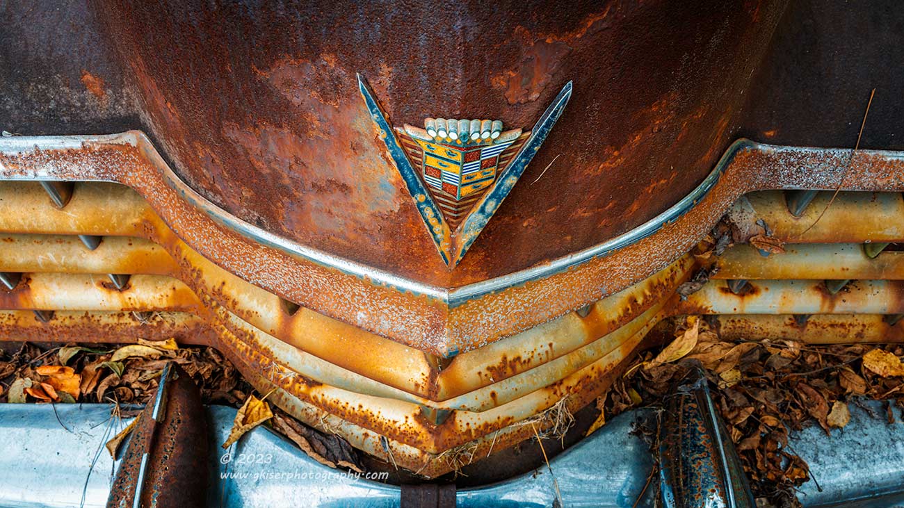
Monday, October 17, Taylorsville, NC
We are moving closer and closer to the top spot of the year. Coming in at number 4, we see what looks like a pretty standard photo from me. There is a hood ornament, grill, and bumper of an impressive rusty car. What makes this one so special? I’ll skip over the part where finding this location was a stroke of luck because that makes all of the photos from this multi-part trek significant in their own right. What I want to concentrate on here is how I composed the photograph to give it balance. It is not a composition that I use often, and I kind of tweaked it for this specific car because of what I needed it to say. It all started with the idea to photograph the crest on the hood. I’ve done that thousands of times and have even combined that crest with the hood ornament at the top for a nice composition. For this, I wanted to make the crest the main subject and at the forefront of the image. I worked different angles but found that nothing really felt exciting. The scope of the composition started to grow, and the grill became included, but that threw things off because the rust colors were getting too prevalent in the scene.
What I was learning was that the bit of blue that the “V” under the crest was reflecting from the sky wasn’t enough to balance out all of the warm tones. By adding the bit of chrome at the top of the grill, I still wasn’t getting enough cool tones to balance the scene. The slats in the grill were also covered in surface rust and just added to the warmth of the overall composition. The only way to bring in more cool tones was to grab the bumper which was still covered in chrome plating. When I expanded to that composition, I liked the color balance of the scene quite a bit, but the proportions were off. By going with a 16:9 aspect ratio, I was able to simplify the scene, and create the image you see above. The bumperettes give two points of visual contact to balance out with the crest to form a triangle that is opposed to the “V” for a bit of visual tension. The shape of the grill works its way through the other shapes in the scene and everything frames the crest within negative space.
The crowning achievement of this one was how I chose to edit it where I pushed the cool and warm tones to the exact points on the color wheel where I needed them to be for a perfect complementary color palette. The way that the color tones worked together here helped to bring your eyes right back to the crest that was the whole reason behind the shot in the first place. This image is significant for just how elegantly the focal point becomes the primary focus with so much other detail going on within the scene. Composition and the use of color created this image for what it is, and like so many on this list, it haunts my mind. I could look at this one for hours and still not get tired of what I was looking at. In fact, I have gazed into this photo for quite a while just selecting this list. I think it was always destined for inclusion, but until I hit submit on the entry, everything is up for debate which makes this a very hard process for sure.
Number 3

Wednesday, October 4, Taylorsville, NC
We keep getting closer and closer to the top of this list, and I think that the photos are getting stronger and stronger as we go. Coming in at number three, we have what is certainly an odd composition from me. There are no headlights, no hood ornaments, no rust, and the car actually looks like it is in pretty good shape, but we don’t even see much of that. Why does an image like this get to be in this list, and how did it make it so high up on that list? Well, simply put, this photograph has taught me a different way of seeing and has opened my eyes to a whole new possibility in composition when photographing cars.
What I mean is this, the end photograph is much greater than the sum of its parts. Even when I was starting to build a composition here, there wasn’t really anything specific about the scene that jumped out at me. I rarely photograph rear wheels on old cars, the wheels themselves were period correct, but not really that interesting photographically. The tires looked to be basically new, and the chrome was highly reflective which always causes problems for me. The body of the car was in decent shape and showed very little visual interest for what I would typically be drawn to. The concrete parking lot where it was parked also had lines painted on it which would more than likely be a distraction. So, why did I stop to shoot this composition?
Well, I was really experimenting with this car more than anything else. I had seen an opportunity to get some unique perspectives on it and I had permission to be there so I was happy to just play around with the camera and see what I could do. When I got around to this rear wheel, I loved the light on the scene and felt that there was something there. As I moved around to look at the angles, I started to see the lines as an interesting addition to the composition rather than a distraction. I wanted to use the lines to help to frame the subject but had to figure out just what the subject was going to be. It turned out to be that non-descript wheel, and the reason for that was that it was positioned in the middle of two lines. I used the curve of the wheel arch in the quarter panel for another framing element to the scene which firmly established the wheel as the focal point. To keep things visually dynamic, I included a third stripe which fell to the left of the frame and that allowed me to get the trailing end of the quarter panel which showed an implied motion within the photo. It also fell nicely into the rule of odds.
That implied motion provided the visual pathway through the scene, and it followed a dramatic path through the wheel. By removing the color here, I was able to accomplish several things. First of all, it cemented that visual path through the image, but it also allowed me to tweak the contrast to a point where that too improved the visual pathway. The stripes on the ground were not nearly as pronounced as they appear here and the blue paint on the car registered much darker than the concrete below. By adjusting the tonalities, I was able to match the concrete to the blue paint while keeping the stripes nice and bright. The point of contrast where the eyes focused became the Rally Wheel which I increased the contrast on quite a bit. The tire had also been covered in a tan film from being curbed a few times. By removing the color, that problem was dealt with as well leaving just a nice black tire with enough shadow detail to see what the lettering said.
I liked this image right after I was finished editing it, but it took a while for it to really and truly grow on me to the point where it is today. These days, I love everything about the photo, and see it as a profound learning experience for how I see a scene. There was not something that would be my typical main point of interest, or main character to the scene. Nope, there was nothing really special about this scene at all, but I must have recognized something about it on an unconscious level. As I worked the scene, I was able to figure it out, and by the time I was done, the entirety of the photo became the point of interest. Every time I come across this photo, I am forced to stop and stare at it. It is one of the true elegant images in my collection, and because of that it had to be included in this list.
Number 2

Coming in at the number two slot is one that I knew from the beginning was going to be on this list, I just didn’t know where exactly it was going to be. In full disclosure, right up until you are reading this, I have been going back and forth with whether or not this was going to be in the top slot or here. Yes, I like this photograph that much, but this isn’t a list for photos that I like more than others. It is a list for significant images only, so what makes this one so significant that it was destined for this list before an entire year’s worth of new photographs had even been created?
Well, I stopped in Elkin for the first time to photograph a train back in the Fall of 2020, which keyed me into some of the potential of this location. I spent a little bit of time riding around looking to see what was around the area. One thing that I found was an old rusty trestle bridge for the rail system. The rust caught my eye, and I liked the idea of photographing it, but couldn’t figure out how I really wanted to capture the photograph. For the next few years, I would drive by and look at it every time I was in the neighborhood trying to figure something out. I thought about doing isolations as well as broader compositions, but nothing really seemed to stick.
Early on in the year, I happened to be driving through Elkin once again and was in a mindset where I felt that I could work through just about anything photographically. I decided that the sky was looking really good overhead and it was as good a time as any to try a photo of this bridge. I worked the scene for a while with my 16-35mm lens but just kept thinking that there was more to fit in the scene than that lens could cover. When I went back to the truck to swap batteries, I came back with the 14mm prime and tried again to create a composition that fully told the story. By including the stop arm in the photo, I had that last bit of the puzzle, but still wasn’t quite sure how the photo was going to turn out. In fact, after working this scene for probably 30 minutes or more, I was feeling defeated by the location.
It wasn’t until I got home and started to look at the photos in Lightroom that my opinion really started to change. There was so much more information captured than I was expecting to see based on the LCD review, and it all just looked perfect. I chose a desaturated color profile that fit the mood set by the sky and worked the edit out over nearly an hour. When I was done, I was amazed at what I was seeing. The entire photo came together to tell a cohesive story and I couldn’t help but look at it endlessly. It had texture, shapes, and just the right blend of warm and cool tones with a pop of red to capture the attention. It was more than I had hoped from this location, and it was more than I expected after the capture. This is another one of those examples of the reality was better than the expectation which doesn’t happen all that often.
Another aspect that makes this photo significant was the time in the year when it happened. You will notice that the photo was shot on January 3rd which was just the second trek that I had made for the year. Now, I have created the system that I have for selecting the significant images based on the fact that I got called out for selecting only recent photos that still had that new image smell to them. This photo has been in a folder since January 3rd where I have been “living with it” to determine if it has staying power. Without a question, this photo has not left my memory even for a second. It haunts my thoughts and I have grown to love it more and more as the months have gone on. It would stand to reason that the photos would improve over the year as I get better as a photographer, but there are just times when you nail that perfect photo in spite of yourself. This was one of those times, and because it turned out so well, it deserves a spot at or near the top of this list. Like I said, it almost made the top spot, so the one that does reside there must be truly special.
Before we get into that most significant image of 2023, I want to talk a little bit about landscape images. As the year was progressing, I really thought that I was going to see more landscape photographs on this list because I really had a resurgence of interest in the landscape starting in the Spring. I was making photographs that I absolutely loved and felt very proud of. In fact, there were quite a few of those landscape photos in my folder where I selected the top images from. Why did we not see more of them on this list? I still really like the photos and am actually feeling like shooting landscapes more than decay currently. I’ve pondered this question a lot while making this list and have come up with a fairly simple answer. When you really think about it, a landscape photograph is just a pretty scene that has been captured. There is very little that can be done with a landscape photograph to really make it stand out as a significant image. They serve the purpose of providing a bit of beauty to focus on for a time during your day, but that is kind of it. The photographs that you see occupying most of the space in this list are photos that tell more of a story and ask more questions of the viewer. They are more involving and have more of a deeper meaning. It goes back to why I decided to focus on decay photography in 2022. Landscape photos are kind of a dime a dozen, and we see tons of them every day. This will always water down the photos that we create in this genre, but that doesn’t affect why it is rewarding to be there in the moment to capture the image. There is no relaxation like the relaxation of shooting a beautiful landscape as the light changes subtly right before your eyes. There is no stress about asking permission to photograph on somebody’s property, and there is very little chance that you will get a gun pulled on you. You just get to be one with nature, and sometimes that is reward enough. It just doesn’t necessarily make for a significant photograph.
That being said, this list of 12 photographs is bookended by landscape photos. Yep, the most significant photo of 2023 is a landscape photograph, and a sunrise at that which is probably the most cliche’ of the landscape photographs. It is one of the most beautiful photos I think I have ever shot, and there is a good amount of significance to it as well which ensured it a top spot on this list. It was something that happened long after the capture, and even long after the edit that sealed its spot as the number one significant photo of 2023.
Without further ado, allow me to introduce the top spot of the year……
Drum roll please……….
Number 1

Saturday, July 23, Driftwood Beach, GA
It is this second photo from Driftwood Beach that is our top image of 2023! The points of significance for this photograph are numerous to be sure. Let’s just start with the fact that this has been a bucket list location for me for more years that I can remember. It was one of those locations that I was actually afraid to go there because I thought that it would be a disappointment in reality. Quite the contrary, this location was as epic as I could have dreamed, and I absolutely loved both of the mornings that I spent there. Just being able to successfully photograph a location like this pretty much ensured that there would be representation on this list from that trek. I’ve talked about this in previous years where I had tried to get certain photographs for a long time and finally was able to make it happen. That buildup before a photograph always elevates the photo in my mind, at least for a while. I’ve been sitting on this photo now for about half of a year, so that part of it has worn away a little bit, but there is still so much happiness tied up in having been there that I will always remember the trek.
Beyond that bucket list element, there has to be some more staying quality for a photo to be a part of this list, and certainly for it to be in this spot. The process alone for the creation was rather significant. I had spent the whole morning watching the sun come up and trying to decide if the sky was going to kick off in a way that I was looking for. This didn’t stop me from getting a large number of really great photos, but I was waiting for the sky to really light up. I had used an app on the phone to show exactly where the sun would be cracking the horizon and had found a perfect tree to place in the fame, but the clouds were looking like they were going to snuff the color out. As the time for sunrise got closer, I was thinking it was going to fall short of my hopes. I almost moved to other locations to take advantage of the sky the way that it was but knew that this was the composition that was needed in case the sky did its thing. I ended up waiting there for about 20 minutes after the sun cracked the horizon before it found the one little hole in the sky. This was what I had been waiting for, and the sky came to life for a very brief period during which I was able to get this particular photograph.
I was pretty sure that I had something special at the time of capture, and I could see the difference in light quality between the image before this one and the ones after which told me that I had nailed the moment which was really fleeting. This had all been done at a personal cost to me in blood and comfort because I was being eaten alive by the different bugs that had found me to be rather tasty. Would the love for this photo carry on through the editing process? You bet it did. In fact, my love for it grew when I started to see the detail that I was able to pull out of the deadfall which had been heavily backlit. What I thought was going to be a silhouette shot had turned into a shadowed foreground with tons of texture. The colors in the sky came to life with a few minor tweaks in Lightroom, and I just sat there in total awe of how the photograph had turned out. I remember thinking at that point that this was going to be a defining landscape photograph for me. It was significant even then, and that significance has grown by leaps and bounds since.
The landscape of Driftwood Beach was unlike anything that I had ever seen before outside of photographs I had seen online. The setting itself was the perfect blend of landscape and decay photography which was the right place for me to be since those are my two primary genres. I had picked what amounted to the perfect morning to visit and had been able to lean on all that I knew about photography to make the most of the situation in order to create this image. It was almost as if I had been training my whole life for this trek, and specifically for this photograph. It was truly one of those photographs that I still look at all these months later and think to myself “I really shot that!!” Those photographs come about far too infrequently, and for good reason. You might feel that way right after the image is captured, but soon enough, you will repeat the level of quality and all of a sudden, that one impressive photo becomes your new baseline. That isn’t the case with this photo, and I even still feel that way about the top image of 2021 which confirms that I chose correctly for that year. I can only hope that I still feel that way about this photograph a couple of years from now and I don’t look at it as my new baseline.
I’ve offered up plenty of evidence to support the top slot for this photograph, but as they say in infomercials….But wait, there’s more!!
About three months after shooting this photograph, it finally was ready to be shared on social media. The day that I shared it, I was contacted by a potential client that asked the simple question if I sold to people overseas. This was something that I had never done because it just adds a lot to the process as well as being a good deal more expensive to ship overseas. However, I said that I wasn’t opposed to it and would get some estimates to ship to Australia. In all honesty, I figured that once I got a price, that would be the end of that, but he seemed to be committed to making this happen after I got a rough estimate. It was higher than he wanted to pay, and we talked about some alternatives. Eventually, I found a price he was comfortable paying and I made his 11×17″ print which turned out so good I almost cried. As if this photo needed another reason to be significant, it has become my first print to travel to another country to get to the client. It was that fact that pushed it into the number one slot, although, as I have written through all of this, I think that it fully deserves to reside here even without this last bit of evidence.
This list was a hard one to put together, and hopefully I have picked some of your favorites from the year. Just remember that this is not a list of my favorites, or even what might be considered the best images from the year. They are, however, all very significant in their own way. Most represent personal growth on my part or figuring out different ways of seeing. Some represent an occasion where the reality was better than the expectation which rarely happens to a photographer. In all of the cases, these photos are ones that I am very proud of and expect to be ones that stand on their own for a long period of time. I hope to still be talking about them for years to come, and I expect to use what I have learned from them on future shoots so that I can continue growing. This humble list of 12 images will serve as the marker in the doorway showing how tall the kids get over the years. It is a great snapshot from the year that can be compared with previous as well as subsequent years to see what I have considered the more meaningful photographs over time.
This list also serves as a great way to help me see the evolution of my style over the years. As I mentioned, the biggest shock came in the lens use. I think that every year I have seen the 24-70mm lens being my go-to glass. I’ve tried over the years to branch out from that lens, but the best images always came when I used that one. This year, there has been a huge change in my lens of choice, or should I say the lens that I don’t use as much. You can see from the breakdown at the beginning that only two of the significant images were shot using my “workhorse lens.” That means that ten of them were shot with either wide angle or telephoto lenses. If you look at the photos in the list, you will see that my wide angle shots are of landscapes, while I’m using the telephoto range for more of the detail shots. My new “workhorse lens” has become the 70-200mm which is kind of shocking. For years, that was my least used lens and early on, it was in the shop during a week away and I barely missed it. These days, I could just about leave it mounted to the camera body and be ready for most anything.
Information like that is valuable for a photographer because it is really handy to know how you see the world when it comes to starting a composition. In fact, I am typing this right on the heels of a quick trek into North Wilkesboro where I had already figured out my favorite lens of 2023. With this knowledge, and some practical understanding of the 70-200mm’s benefits I chose to work with that lens exclusively during the shoot. Maybe even six months ago, I would have defaulted to the standard zoom and I would have had a harder time getting the shots that I did. It pays to be self aware as a photographer and compiling lists like this will go a long way to helping you get there. If you haven’t made your own list, give it a shot and see what you tend to gravitate to in subject, composition, and gear. You might surprise yourself.
Thank you for joining me for this yearly collection of significant images. In a few days, I’ll be starting on a new collection that will end up being the 2024 significant images. I can only hope that they will all be better than this list, but at the same time, I feel that this is a very strong list and it will be hard to beat. Time will tell, and I’m ready to enjoy the journey that leads us to that point. I hope that everyone has a very Happy New Year’s and a prosperous 2024. Join me back here on New Year’s Day for the year-end review.
Until then….