Sunday, August 3, 2025
Long time, no see!
Glad to have you back for the fourth and final installment of this blog series that is documenting what amounted to a full day’s trek on Sunday. If you haven’t had the chance to catch up through the previous blogs, I’ll be happy to wait while to go through each part in order to end up right back here again. For simplicity, here are all the parts, in order for you:
Part 4….You are already here.
Now that we are all caught up, you will know that this part is actually an extra blog post because of three extra photos that I added after that first blog. I usually go through the photos one last time before I even start the blogging process that involves uploading the images to this website. It usually comes across rather seamless when you are reading and makes it look like I know what I’m doing. The fact is, I have a lot of doubts and second thoughts along the way when I am working through the images and that takes some time to work through. I didn’t give myself that time on Sunday and decided to plow through with the first two images of the day. That way I could get the first blog out on the same day as the trek happened. Well, that bit me in the butt because as I was writing it, I was thinking about one of the other compositions that I had shot of the first barn and how it would look good in black and white. That started a second run through the discarded image files to grab that one and process it. Of course, I found two more that I wanted to work with which will appear in this blog. That second run through the images took my keepers from 18 up to 21 and that is why we are here with the fourth installment from this one trek. In full disclosure, I made the “mistake” of showing one of the new additions to Toni last night which you will see here at bottom of the blog entry. It was an odd composition admittedly, but I liked it. She keyed in on the odd part noting the negative space that took up most of the frame. She wasn’t wrong, but for me, that was the point of the photo in a lot of respects. However, it got me thinking about the reflection of the MG that was showing up in the door of the Triumph. It could be used to fill that negative space, and since it wasn’t a new model Cadillac or something similar, it would help to tell the story.
Well, I considered that through the evening and was still thinking about it when I woke up. What does a photographer do when they have an idea of how to process a photo differently than they have already done? They crank up Lightroom and see what they can do. That was what I did after my morning routine was done, and I was starting to write this blog. You will see the results of that processing as we close out this trek, but for now, just know that my keeper number has risen to 22 out of the 101 exposures that I had shot. Also, in full disclosure, I am starting this blog on Tuesday morning, just after publishing part 3 of the series. It has taken me this long to see this trek through.
When we last parted ways, I had just gone to the truck to swap out lenses for my standard zoom. This lens allows me to work in closer to subjects than the telephoto, but I’ve found that for doing isolations I typically like the longer lens better. Because things were so packed in at this location, I didn’t really have the room to work with the long lens and ran into issues with focusing distance minimums more than I really wanted to. I was able to overcome those problems in most situations, but as I found myself working with an Oldsmobile Toronado which was in a bay, there was a bay door frame that was just not going to budge an inch, and that was what I needed. Now that I had the standard zoom attached, I didn’t have to worry about focusing distance and could get in really close. With the long lens, I had been working with the 100+mm end of the zoom range and now that I had the other lens on, my tightest focal length was 70mm, so right at the start, I was including a great deal more of the portion of the quarter panel that I was working with.

I had to get in really close in order to get a framing that was similar to what I had been working with before. That wasn’t a problem thanks to the lens, but now I was close enough that I was becoming a cameo in the chrome bumper. Here I was in the man’s shop taking a photo about a foot away from the back of a car and waving my arms around like I was selling used cars on a street corner. Fortunately, the guys in the white van never showed up to give me a jacket that lets me hug myself. I am sure that he wondered what it was that I was doing. Those that have attended some of my recent decay workshops will recognize the move as the “funky chicken” which I do in times of reflection potential. It is far too easy to miss something still and distorted, but when you add movement, you can spot where you are showing up in the car. This gives you the opportunity to change your shooting position, move your body, or change up the framing to avoid the reflection. If none of the above are possible, then you will know where to look in post to do a little retouching. In this situation, I was able to move my position slightly to get out of the bit of bumper that I was using in the composition. I didn’t need all of it, just enough to frame the marker light.
You might remember that the idea for this shot came from the other side, but I wasn’t all that happy with the condition of the marker light lens. It was kind of hazed over by what looked to be overspray from the primer at some point. The quarter panel also had a blob of grease that had wicked into a large sphere of oily residue in the paint. When I came over to this side to see what my options were, I found the lens to be in much better shape and there was actually a bit of rust showing through the paint. The best part was the way that the paint had been worked the last time, resulting in a gradient of textures and tone that helped to frame the light in the same way that the bumper was doing in the lower right. The composition really built itself on this side and for all the work I was having to do to capture it, I really felt that it was worth it.
The only part that I really had to be careful about was in post with how the colors were treated. There was a lot of red in the frame, and red is one of those colors that has to be handled carefully. It is a color of energy, excitement, and danger. To fill up the whole frame with it can be an overload of the senses without a proper balance or control over the intensity. I tried to balance things out by controlling the saturation, using the reflection in the chrome bits, and the areas of primer that were bleeding through. The gradient offered the best chance for balance as it was already less intense than the actual paint color and by adding a bit of a vignette to the image, that tonality got even more muted. In the end, it was a better photo than I expected, and one that Toni was even interested by. That tells me something because this type of photography isn’t really Toni’s cup of tea.

One of the aspects that I loved about the Toronado was the shape of the body. Oldsmobile really did a fantastic job with the sculpting of this car and the fact that they are not seen anymore, it has become something rather unique to see from this era. The last time I had photographed one of these cars, it was pretty much buried from the doors back and I wasn’t able to see this part at all. Ironically, this time, the car was nosed into a bay with very little room to work as a photographer, so the only parts that I could really access for photos happened to be the rear. That gave me a chance to capture the bulging wheel arch. I would have loved for there to have been a fantastic patina here, but the car was actually in pretty good shape considering.
What I had to work with was a paint job that had been sanded down at some point in the past showing the different layers of color with a bit of rust here and there. It did add interest and was certainly better than a shiny car would have been, so I had a chance of making an interesting photo of the lines of the car in this confined space. Fortunately, I did have a lens that would go wide enough to give me some options. I started to look through the camera to get an idea of how things were looking with a wider angle focal length. The perspective caused the wheel arch to swell which I really liked. I decided to make that my visual anchor and built out a composition from there. I extended the frame past the door handle which I decided would be a framing element. I used the window moldings to add a nice complimentary curve to the frame in the upper right with the windows dark enough to keep the eyes from wanting to exit the frame. The rear window provided a nice dark triangle in the upper left that balanced with the dark ground in the lower right. The flow of the image was from the lower left to the upper right, so it all had a nice diagonal flow.
When it comes to building a composition, so many photographers rely on the rule of thirds. While that is a great learning technique, a composition such as this would never fit in such a static layout. To get it to work in the rule of thirds would actually kill the balance of the scene. This is why I will rarely default to that rule or really think about rules in general with my compositions anymore. I’m much more interested in balance within the frame. This is a great example of just why I prefer that approach to composition. I’ve spent my time working with the rule of thirds and still end up with compositions that fit into that plan. However, in the end, I’ve spent enough time behind the camera to know what feels right about a composition and I’ll overrule the rules without a second thought these days.
That was the last composition that I shot of the Olds. I just didn’t have enough room to work to get anything else, and I wanted to go out and try the roadsters with the wider lens to see if I could get anything else to work out. In the first round of culling, there was only a single frame that I processed in that first round, and it was a close-up of the rusty wheel on the MG. I’ll talk more about that one in a minute, but there were other photographs that happened before that, and I’ll go through the order in which they were shot to keep with tradition here in the blog.
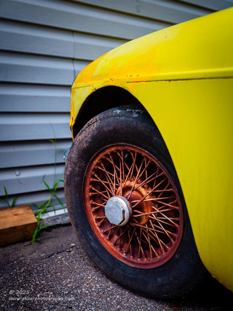
You might recall from the previous blog entry, that I had tried a shot of the wheel on the yellow MG that included the fender arch and the vinyl siding of the building. I tried to describe how close the cars were to the building, but that might not have been clear until now. The photos that I shot with the telephoto lens weren’t really working for me and I ended up culling those images out in the first round. I had tried again with the wider lens which allowed for a bit better composition. Now, I was able to include the block of wood in the left of the frame as well as the entire weed. Previously, to get the car framed like I wanted, I wasn’t able to capture the block of wood or the weed. Why is that important you ask? Well, I wanted something else to share the color of the wheel which the wood did. The weed also was going to be in the frame because it continued well past the tire. Because of that, I wanted to have a base for the weed to grow from, which also meant that the wood needed to be there more than a sliver.
The focal length of the standard zoom allowed me to get the car framed like I wanted it done while giving enough room to the side to include those odd bits which completed the visual flow. I now had a workable composition that I thought that I would like. I fired off a few shots here with some slight variations in depth of field before moving on to my next idea. It was that next idea that won out in the culling process which left the photo above locked in at a three-star rating which for this group of images just wasn’t enough to push through to being processed.
After doing that first blog on Sunday night, I went back through the images and while I still thought that my choice was right to go with the next photo over this one, I still liked how the more encompassing shot had turned out. I decided to go ahead and promote it to a four-star image and pulled it into processing. The main part that had swayed me was the fact that the building had vinyl siding and that just didn’t really fit with the theme of the photo. However, upon reconsidering things, I liked that the building was gray which would add some cool tones to the frame to balance out the yellow and the rust. The strong lines of the siding would also point to the subject, frame the subject, and offer a great way to fill the negative space around the subject. The more I thought about it, the better I liked the idea of the siding.
That enjoyment of the image increased as I processed it because all the things that I had been worried about actually turned out to be huge benefits to the design of the image. I now loved the juxtaposition of the simple straight lines to the main subject’s curves and overlapping lines. The slightly blue tint on the siding provided a great deal of color balance that allowed me to really push the saturation on the yellow and the rust without it being too much in the frame. That weed that I had been so concerned with gave a little hint of nature and an organic element that the scene really needed. While not really a favorite image from the day, it was one that worked so much better than I had given it credit for initially.
The really odd part was that I felt strong enough about this compositional idea on Sunday that I had shot it twice with two different lenses. I had a half dozen frames of this concept, yet when it came time to cull it, I dismissed it. Looking back, I think I was drawn to the scene for the reasons that I have listed about the dichotomy of elements and colors, but on a subconscious level. When I started to look at the photo on the computer, I was trying to examine it too clinically and didn’t allow myself to just react to what I was seeing. After the initial stress and push to get the images processed, I was able once again to soak in the scene and love it for what it was. This should have been a first-round pick for processing, but at least it wasn’t trashed and never to be seen again.

The image that made it through the first round of processing was a much closer shot of the wheel. While I had been working with the larger scope of a composition, I had noticed that these hubs were marked for removal and that was a point of interest for me. I also really loved the rusted wire wheels as I have already mentioned. I remember back to a shot that I had made of Toni’s car during a recent photo shoot and decided that the concept would still work with this wheel. I had the right lens on because I was wanting to get in close to the hub more than anything.
I think that the wheel was a 13″ or 14″ which was much smaller compared to the 19″ on Toni’s car. The hub was also quite a bit larger of an element which created some issues with framing because I kept getting too much tire in the shot. I had to work on positioning more than I thought I should, but eventually I got it right and dialed in the composition before trying a couple of exposures with different depths of field.
This was one of those photos that I knew was going to be a keeper when I was shooting it, and I even knew how I was going to edit it. You can see between this and the previous photo that the colors are quite a bit different. It isn’t that the colors are wrong in either one, but the way that I treated them had to be different because of that visual balance that I keep referring to. In the fuller composition, I had the ability to have more saturation because there were more color elements present and the contrasts worked to my advantage. With the more intimate capture, the same levels of saturation would have been overboard and created an image that felt too busy. I was faced with a similar issue that I had when photographing that marker light on the Olds earlier. What I decided to do here was to pick a color profile that was already very desaturated and then carefully work the color contrasts until I had that visual balance that I was after. The end result that you see here is a photo that I am very happy with and one that turned out better than expected. It was also the original finish point for the photos.
With that, you would have seen all 18 of my keepers, and we would be done.
But wait…..
There’s more….
If you have been counting, I have already added in an additional two images with one being a black and white presentation of a barn that opened up the second part of the blog series. We also saw the photo of the MG wheel against the building which brings the total to now 20 keepers. There was one more that I put through processing early Monday morning before going to bed, and we are about to see how that one turned out.
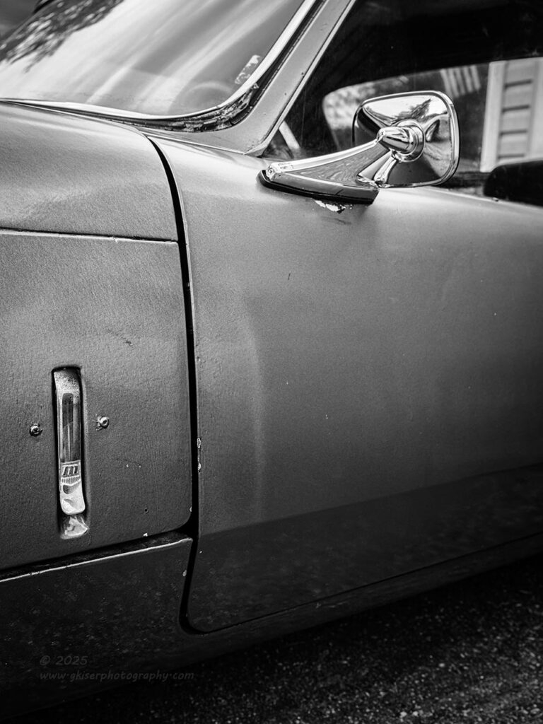
You know I wasn’t able to leave the purple goblin alone after switching the lenses. I had already gotten a bunch of photos of this car that I had deemed too ugly to shoot when I first saw it. This was a car that I was totally wrong about by the way. It turned out that I loved the color and the way that it was captured by the camera. I’m going out on a limb here and saying that it was my favorite subject to work with at this location, and potentially my favorite subject of all the spots that I had worked that day. Maybe it is just the honeymoon phase with the photos because I just don’t have much purple in my collection, but I do love the way that it looks in photos apparently.
I did realize that I had a plethora of color photos of this purple Triumph and had bypassed this composition because the frame was pretty much filled with that purple. The elements that I had chosen to focus on were kind of spread around the frame and it felt a little too empty when I looked at it to begin with. It was a shot that arrived at that three-star level, but in the last round of culling I had pulled it from the list because I had enough of the car to work with. There was also a part of me that figured that this car would not be a popular subject and would likely not have much traction beyond my own enjoyment. Having too many photos of this car would dilute the whole trek for those that didn’t care for the color, or the car, or whatever. This was the easiest one to trash out of those that had made it to this stage of the culling because it was a bit of a reach in terms of compositional choices.
It then occurred to me that when it comes to my personal work, I am not necessarily driven by what others will like because there is no way to determine that, and it just doesn’t make sense to chase that goal because the target always moves. The only way that I want to work in this field is to shoot for myself and for what makes me happy. If can achieve that, then there will be others that enjoy it as well. That smaller group of “fans” will be the ones that really love the work though, and that is the connection that I am after.
With that thought in mind, I pulled the photo into the develop module and started to work out an edit. I didn’t really see this one as a color image and chose to go with black and white so that the color wasn’t the main subject. I wanted to focus the attention on the abstract of the shot and leave the negative space specifically to serve a purpose. In my mind that purpose was to add a bit of tension to the frame and force you to look at the other details which were the main reason behind the photo. Again, this didn’t really fall into any specific compositional rule, but it is close to the golden spiral which I love working with. The primary goal of the composition was still balance and that negative space provided more visual balance that you might realize.
Something that I discovered during the processing was when I was adjusting the color calibration, which still works for a black and white image that started as a color image, I found that the reflection in the door could be manipulated. For this shot, I chose to minimize the reflection as much as I could by adjusting the color channels. If it was going to be negative space, I wanted it to be negative space. As I worked through the image, I found that it was more successful than I had figured it would be. I really liked it as a black and white because the attention was firmly placed on the latch that secured the hood….BLIMY! I meant to say bonnet and the mirror above. These were the elements that I felt were key to the composition.
I felt really good about this one and was happy to have it close out the blog series with now 21 frames from the day. It was the last image uploaded to the skeleton that I put together Monday afternoon in preparation for finishing out the blog this morning. I was almost to the point where I could put this trek to bed and move on to the next project.
But wait…..
There is still more….
This one is Toni’s fault though…not mine.
Last night when Toni got home from work and we were talking a bit, I showed her the new additions to the keeper files and when I got to the one that I just shared with you I was met with a look that I hadn’t expected. While she doesn’t really care for my decay photos that much, she does like a good black and white photo, and usually really loves the off the wall compositions that I come up with from time to time. I expected her to respond positively to this one, but that just didn’t happen. She immediately pointed out that the main area of the photo really had nothing in it. I mean, she wasn’t wrong, but that was kind of the point. I chalked it up to the fact that she was looking at it on my phone and some of the nuances of the photo were lost due to the file size as well as the small viewing screen. We’ve been through this before, there is just so substitute for seeing a photo in print, the way it was envisioned. That is why I love making prints of my photos for clients, so if there are any in my collection that you love, you owe it to yourself to actually purchase one of my prints to hang on your wall. You won’t regret it!
Now, I went to sleep considering what Toni had said and recalling the lengths that I had gone through to minimize the reflection in the door. The thought came to me that I might be able to use that reflection to add a bit of interest into the negative area of the photo. The fact that the reflection was of the yellow MG certainly fit the subject of the photo. It seemed to make sense, and it was something that I was interested in seeing through. I had to decide if I wanted to alter the black and white image to include more of the reflection or if I wanted to tackle the idea in color. That was going to be a choice for the morning because I wasn’t going to stay awake all night once again pondering the photos.

After I got done with my morning routine, I opened Lightroom back up and went to the last photo on the filmstrip. I still liked how it looked and felt pretty confident that I wasn’t going to change it. I did make a virtual copy and worked the calibration for a few minutes to see how much of the reflection I could get back and if it would work better for the photo. I quickly decided that I liked the photo as it was. Since I had the virtual copy available anyway, I went ahead and reset all the sliders and started from the beginning as a color image. I slowly worked through the process and when I got to the calibration, I tweaked those sliders in a way that maintained the purple that I had come to love so much (don’t judge me!) while making the reflection come through just a bit more. I did all the different steps and worked the image through to completion in about 15 minutes. When I was done, I pulled both versions onto the screen to compare them. I could tell that they were the same photo, but they seemed to say two different things, and most of that narrative difference came down to the reflection and the use of color.
I saw no reason why I shouldn’t add this one it to the mix of keepers. I liked it just as much as the black and white, and I think that it addressed Toni’s concern which had also been a little bit of a concern for me as well. I’m sure that was a key reason to why it didn’t get through the first culling process. Now that I was coming to an end and my mind was more open to experimentation with this batch of images, I was kind of happy to throw this one out there to see how it does. One thing that I can say about my odd compositions is that I usually will look back on them years later and really be impressed with what I had done. I’m hoping that is the case with this composition, especially since the single RAW file has accounted for two of the now 22 keepers from the day.
Yes, I am now done because after I had shot that last composition, the owner came out and we chatted for a bit about the change in how auto parts are now sourced and talked about the rain which seemed like was getting closer. It was actually starting to drizzle a little while I was talking with him. When we finished our conversation, he said that he was going to close up the shop and head to the house. I thought that was a good idea because this was supposed to be a quick stop and I had been here for an hour at this point and had shot 44 frames of the 101 for the entire day. I was tired and getting hungry. I was thrilled to find out that Toni was ready for dinner and was willing to let me pick her up and go out to eat. That was the end to a fantastic day out. The rest of the evening was spent working through the photos and doing that first blog…and working through some more photos.
I’m glad that you joined me on this adventure. I’m sorry that it has gone on so long, but there was just so much to talk about from this trek. Hopefully, it was all worth your time and you have enjoyed the photos and the story behind them. If you haven’t already, be sure to subscribe to the blog so that you will get notifications with every new entry so you can be among the first to see the new photos. I know most are happy to wait for me to post on social media, but that has become so backlogged, it will be a while. As of today, I have 262 photos to share and am currently sharing photos that I shot in March of this year. Yep, I’m five months behind at this point and that seems to be about the standard that I am keeping up with. The best way to see the photos as I am shooting them is here in the blog which is usually finished up very shortly after the trek is over.
I also have some openings in my mentorship programs if you are wanting to work on your own photography. I offer a completely customizable and scalable set of options that will certainly fit your needs and learning style. It all starts with a commitment free consultation to make sure that I can help you with what you are wanting to learn and to see if we are compatible. If all goes well, I can put together a plan of action for your needs and help you on your own creative journey. Let me know if I can help you out.
Until next time….