Tuesday, September 5, 2023
Welcome back! I hope that everyone had a great Labor Day weekend. I guess it could be said that I took a little break for the holiday as the last time you heard from me was on the 1st with a new Behind the Camera and a quick trek into Boone. The connection between both of these blog entries has to be shooting in adverse conditions. For me, adverse conditions usually mean bright sun, clear skies, and working in the middle of the day. I spent some time talking about why I think it is a good idea to go out during those times that you are not accustomed to working in because you expand your creative horizons and learn to adapt to different conditions. While I don’t like working in the bright sun, I have done it on enough occasions that I do understand the benefits that these conditions can have on a subject. The last trek of August is a case in point for me because I went out on a day that kind of fit my general photography style. Sure, I didn’t get the fog that I wanted, and the clouds were a little thinner than I would have liked, but generally, the lighting was about right for most of the time.
On the way up to Linville Falls, I had passed an Oldsmobile convertible sitting all along in a gravel parking lot. It wasn’t rusty, or even all that bad looking, but the yellow color caught my eye. I didn’t stop because I had other more pressing ideas to work through that were dependent on the fog which was hanging around the area. While I did get a really good photo of a barn in the fog, I didn’t get those conditions with the waterfalls as I was hoping. At the end of that part of the day, I was headed back home and stopped at a couple of locations as targets of opportunity. One of them was this Oldsmobile sitting alone in the parking lot. The weather at the time was kind of cloudy and moody which I really loved…but not for this car. The car was painted in a bright yellow which was in really good shape, so it didn’t really work for the mood that I usually aim for with my decay photos. An argument could even be made that this car didn’t even fall into the decay category because it was mostly complete and in decent shape. What drew me in was the unique design of the car, at least in this day and age because I don’t get the opportunity to capture many Oldsmobile Cutlasses in my travels.
That being said, I sat there for a while and pondered what I would do with the car. Most of my typical ideas wouldn’t work nearly as well because the patina of the car was almost nonexistent, and I didn’t have the textures to draw on like I would have with a rusted example. The longer I sat there, the more I began to dismiss the car as a photographic opportunity. The setting wasn’t supportive of the look of the car either which left me really wondering what it had to offer in terms of a photograph. Eventually, I put the 4Runner back in drive and continued on my way home.
I kind of forgot about the car until I started writing the blog post and recalling the events of the morning. The memory of the car came back, and I started mulling over the options in my head. It was too pretty a subject to dismiss and I needed to figure out how to make this work. The only thing that really came to mind was to go back on a sunny day which would fit the look of the car better than my typical overcast day. The bright sun would help the yellow to pop, it would help to establish the lines and shapes that the lack of texture was hiding. A sunny day is also just what a convertible needs to look good, and there was no arguing that fact. I decided that I would go back out there to give it another try on the next sunny day that I could go out.
Well, that sunny day happened just a couple of days later and I was headed out there again on the 1st. You can read all of the details from that trek in the link, but essentially, I found myself in the middle of a very busy parking lot as the restaurant was open for business. I was confused initially because I had been here at the same time on Wednesday and there had been nobody there. I wasn’t able to look at their hours of operation because my phone had no internet connection. It was later on that day that I found out that they were closed on Tuesday and Wednesday which explained the empty parking lot. Even though I had arrived during a peak time for customers, I sat there for a few minutes to ponder the photographic potential of the car under a different light. I was right, the sun made all the difference in the world with this car. The yellow was looking brilliant, and I could make out move of the shape of the body with the midday sun shining down on it. A lower sun would actually limit how I could shoot this car as it would either put too much of the details in shadow, or would shine too much light on them. I liked the look of the top down lighting on this car for the sake of contrast.
There was no way I was going to be able to get out and work the car at this time though. I would be in the way, and there would be a high probability I would get run over as I would not be able to pay attention to my surroundings when looking through the camera. I just took it as a loss and pulled back out on the road headed back into Boone. At least I had spotted a Chevy sedan sitting at one of the entrance drives to the Chevrolet dealership which I stopped and photographed. As a side note, I’m really happy that I stopped and shot this car when I had the chance because it is now gone. I’m thinking that it was one of the employee’s cars and they drove it to work on Friday. I don’t recall seeing it the previous Wednesday, so I managed to catch it on the right day at the right time. It is just further proof that if you get the photo, you might as well get it because there is no guarantee that the subject will still be there the next time you come by.
The weekend was spent pondering the options with the Olds as well as watching the weather for a mentorship session that I am trying to get planned in the near future at Price Lake. The weather patterns were looking to change as the week moved on. There were going to be some light clouds early in the week, while rain and storms were back into the forecast by the end of the week and into the weekend. Things were looking favorable for Price Lake over several days while I was going to run out of good light for the Oldsmobile sooner than later. I knew that I was going to need that bright sun to get the photos that I wanted from this car, and that kind of sealed the deal that I would go out on Tuesday and try once again since that was the first day that the restaurant was closed as I couldn’t verify if they were closed for Labor Day or not.
I didn’t have to get up early at all, and when I did get up, there was no rush to get out the door. I just wanted to get up there around noonish which meant that I left about the time that Toni left for work. It was yet another trekking day when I was wearing sunglasses which just doesn’t usually happen. The ride up was spent thinking about the angles that I might want to shoot on the car. The lack of texture was really bumming me out, but it was a good chance to work with a shiny car for a change, and I knew that the color was going to look really good. I just had to come up with compositions that were interesting and would tell the story of the car.
When I arrived, the parking lot was empty except for one other car pulled up to the side of the building which wasn’t going to be in my way at all. I parked the 4Runner over by the dumpsters so that the reflection wouldn’t get into the chrome. If it did, the reflection of my truck would block the dumpsters which I thought was a better option. The one thing that I had decided on during the drive up was that I was going to shoot with the 70-200mm lens because that would allow me to stay further away from the car and reduce my chances of showing up in the chrome. I have learned that this is a very good solution to that problem, and it has served me quite well recently.
Now came the hard part. I had to come up with compositions even though I really had no idea how I was going to shoot the car. I just started off at the front of it where I had a view of the headlights. This is the best way for me to get started with a car because I really do view the headlights as the soul and personality of a car. Looking at the light, I found that the Southern side of the car had the best overall lighting, so I started to work from the driver’s side front quarter.
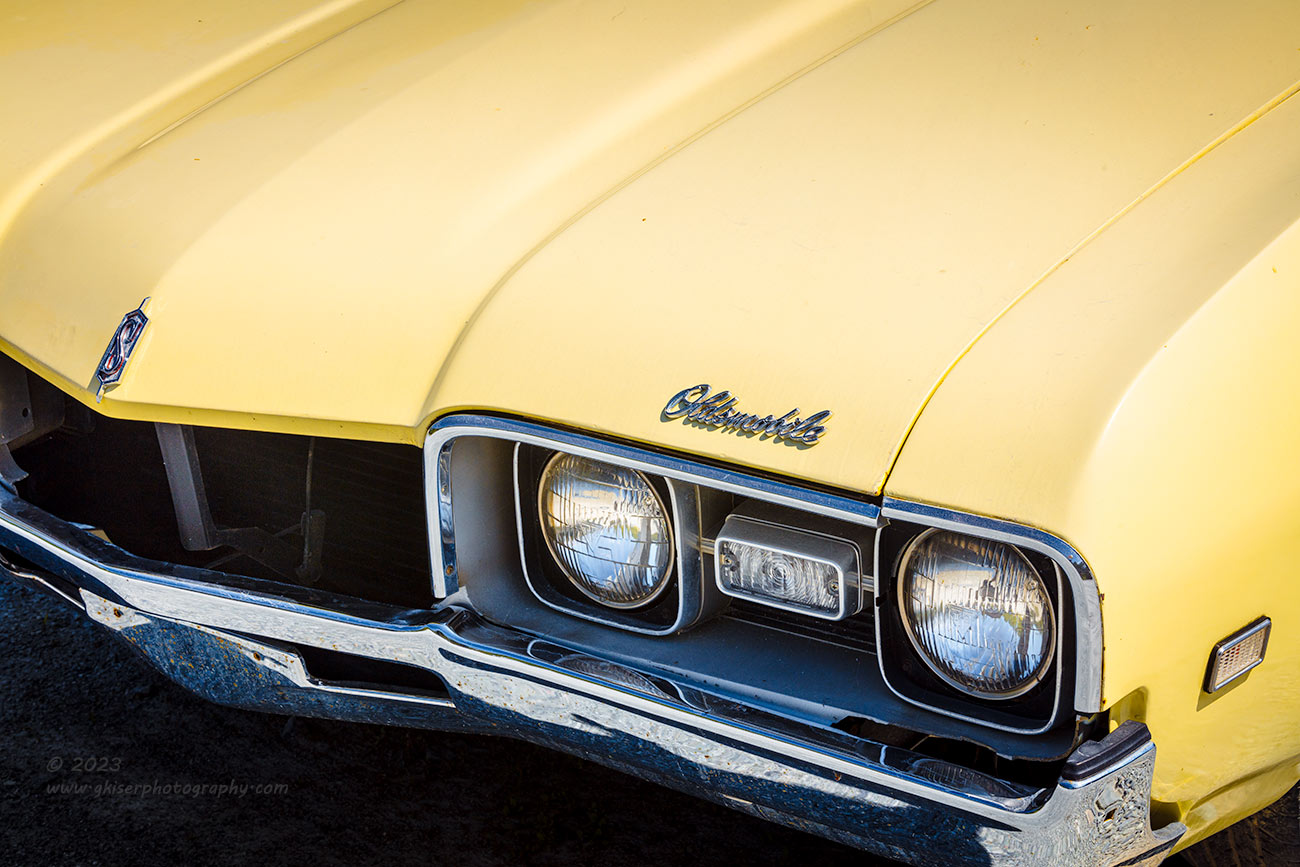
I played the game of what do I like and what don’t I like for a bit until I managed to get a composition that centered around the headlight bucket, the Oldsmobile emblem, the “S” emblem, and the side marker light. I had enough of the chrome to bring in a cooler color temperature to balance out the overall yellow of the scene. I ended up shooting four variations of this before I backed up to get the entire front end for an additional two exposures. While I was on location, I felt that the more inclusive composition was going to be better, but when I got the photos home, I changed my mind and really liked the more personal framing of the tighter composition which is what you see here.
While I was getting that first concept wrapped up, a truck pulled into the parking lot and stopped by the building. I didn’t pay it much mind, but did realize that the driver was getting out and coming towards me. He started off saying that he missed photography, and I could tell immediately that this was going to be a pleasant interaction and not a case of having to explain what I was doing. The gentleman turned out to be the owner of the car, and one of the management members of the restaurant. I learned a good deal about the history of the car and why it meant so much to him. Not much has been done to the car in the last 10 years, and it belonged to his Dad who had passed away around that time. The car itself was as unique as I had imagined being a one-off year model for 1968. My suspicion about the taillights being a difference from the ’67 model were correct as well as parts of the front grill. This bit of the history of the design of the car helped to influence more of my compositional ideas.
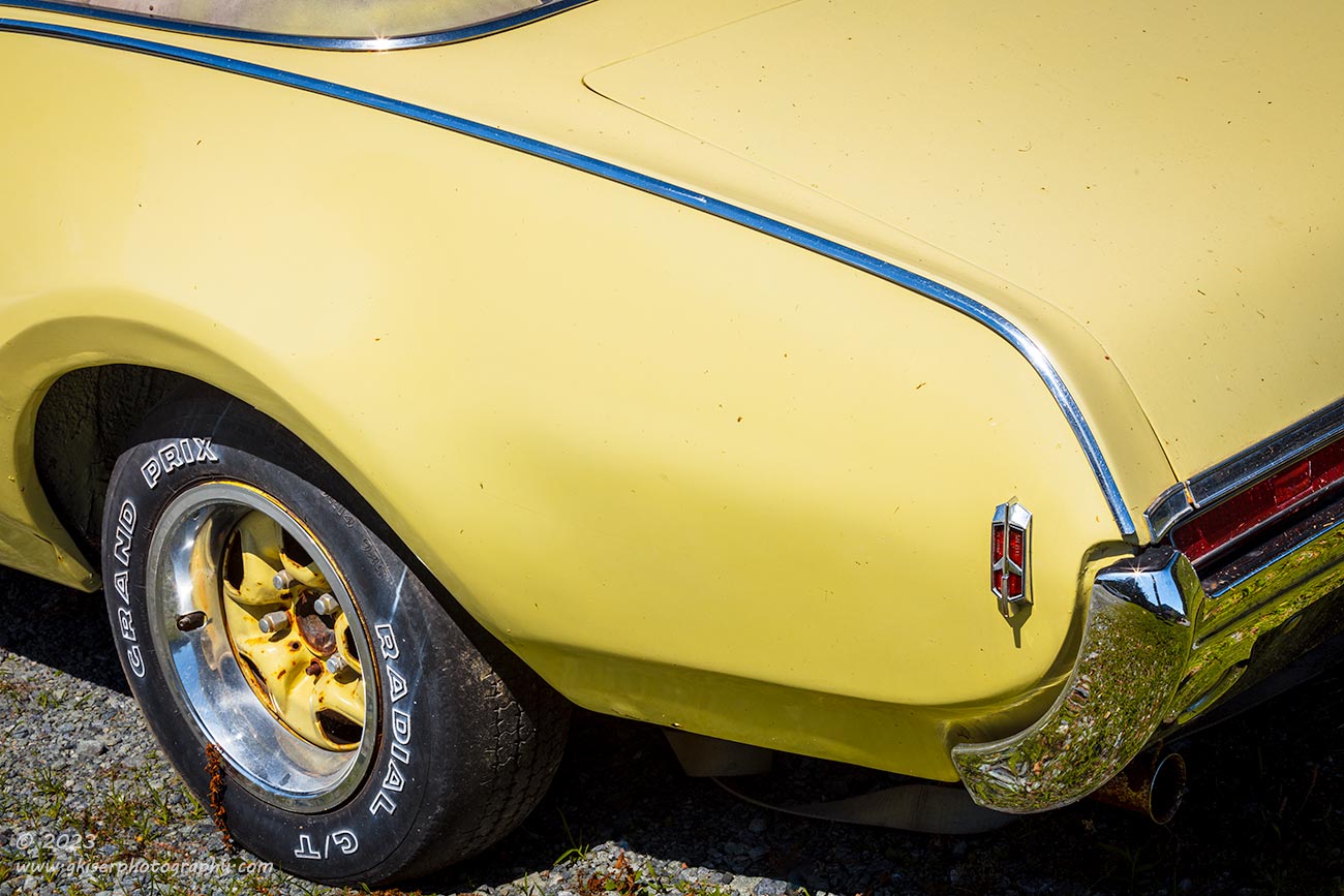
When the conversation was concluded, I was back at it and moved to the rear of the car since I knew that was a specific difference to this model. Fortunately the wheel was the correct Rallysport wheel and not the plastic hubcapped version that was on the front wheel. I framed up a shot that focused on the chrome trim providing a line through the negative space linking the shape of the wheel arch, wheel, bumper, marker light, and just enough of the taillight to tell the story. I allowed just enough of the drip rail around the soft top to enter into the composition to lock the eyes into the frame. It was not a great composition, but it worked for what I wanted to showcase, and allowed me a way to get away with all the negative space that the car was giving me.
It was the negative space that really threw me on this car. No matter what angles I was photographing, I had expanses of yellow paint with very little visual interest to include. This was not a bad thing, but it was a lot different considering that I would normally have flaked paint, rusted metal, and just more textures than I knew what to do with. The smooth surface provided color for the image and was about all it did. I knew that I had two options for how to work with this when it came to photographs. My first option was I could embrace the color and let it set a happy mood that went along with the lighting. This was what I planned on doing for the most part because I had picked a sunny day to set just that mood. My other option was to convert to black and white and focus on the shapes and lighting. I tried that with two of the images during the processing phase and quickly changed my mind. Losing the color made the negative space just empty space. There is a difference between the two.
Negative space is actually a good thing and can be part of the storyteller by establishing physical space or providing visual tension. In the case of this car, it was doing both with the added benefit of bringing in a cheery yellow color to the entire image. Yellow stands for happiness, joy, energy, and optimism which is something that I have learned during my studies of color theory. When the color is removed from these photos, I lose that mood and in many cases the car disappears just showing the elements that I am photographing. That is where empty space comes in. Those areas of the image that have no real detail, start to serve no purpose because the space represented between elements is no longer a cohesive space that joins the elements. It just becomes a visual wasteland which is not beneficial for any part of the photos. I quickly abandoned the idea of going black and white with these and embraced a full color approach with an emphasis on the yellow tones as well as cooler reflections from the blue sky in the chrome.
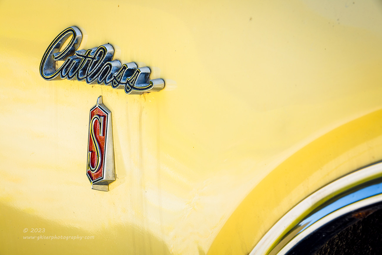
If you have been with me for any length of time over the last decade or so, you will know that I love working photographs of the emblems on these old cars. There really isn’t a quicker way to identify what is being looked at, and I have always felt that the emblems make for great subjects. Of course, usually, I will have the emblem in a state of deterioration against a rusted background. It is a tried and true approach in my photography, but that doesn’t mean that I can’t use the same compositional ideas with a car in much better shape. I had already worked the Oldsmobile emblem on the front of the car, but hadn’t done anything with the fender emblems that featured the model of the car as well as the “S” on the red background. I liked the red along with the yellow because that added touch of excitement really amped up the emotional reaction to seeing the image.
I started on the driver’s side of the car which was getting the sunlight. The shadows dropped down too far and made the emblems look kind of confusing against the yellow. My first two frames were also square to the car which was the way that I have shot these emblems the most often. I used a bit of the wheel arch to help define the space and add shape to the negative space within the frame. It was kind of working, but not nearly as effectively as I had hoped. It was just too static which is a pitfall with this type of composition at times. The biggest issue that I had was the long shadow under the emblem which just didn’t flatter the scene at all. I knew that the other side was in the shade and I wouldn’t have to deal with the shadows at all. I grabbed the camera and started to walk over to the other side.
As I was clearing the front of the car, I noticed how the light was looking on the front right corner. Having the side of the fender in shadow helped define a bit more depth to the image and I thought I would grab a quick shot here as I was transitioning sides. I set up a single frame and made the exposure. It wasn’t as exciting as I had hoped for because it was missing the emblem over the headlights that really helped to tell the story much better than a couple of headlights. It was worth a try, and if I decided I liked the composition later, I had the one frame that I could edit. I ended up not caring for it at all and it fell to the cutting room floor in the first pass of culling.
When I finally did get to the other side of the car and started to look at the fender, I found the lighting much better on this side of the car. I started to frame up a similar composition to what I had shot on the other side, but never got a shot off before changing my mind. This was not the scene for a square on shot. I didn’t need to be worried about leveling the emblem here, and having a little angle to it would add to the excitement. I moved the camera off to the right a bit allowing the emblem to drop towards the center of the frame. As soon as I got the composition framed up, I loved it. I ended up shooting three different variations of this, but it was the first one that I ended up going with and editing.
It was at this point that I was starting to feel like I was finally understanding the car and was able to hear how it wanted to be captured. Yeah, it was talking to me at this point. I know it sounds odd, but this is a very important part of my creative process whether I am shooting landscapes, barns, or old cars. Sometimes everything just clicks and I start off in tune with my subjects, other times, it takes a few minutes. This time, it had taken 24 minutes to happen which still isn’t that long.
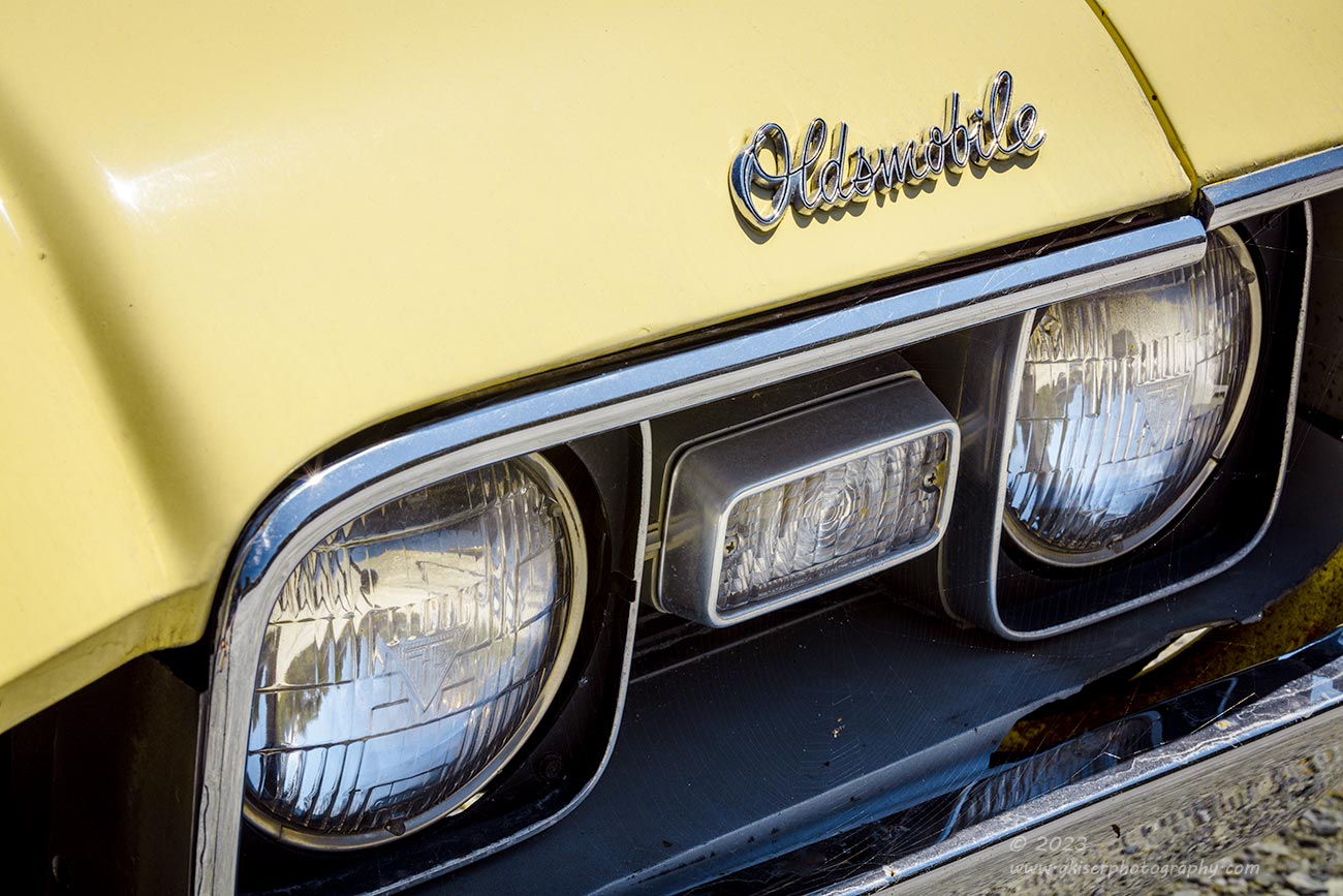
Now that I had a better understanding of the car, I moved back to the front of it and started to look at the headlight assembly on the driver’s side. This was the side with the Oldsmobile emblem that I really felt helped to tell the story of the car. It had been the main subject of the first composition of the day, but here I was looking at it in a different way this time. No longer was I photographing it from the outside of the car, I was standing right in front of the car looking from about the centerline of the hood. From here, I started to pick out my composition, and realized that there was a small detail that I hadn’t noticed before that helped to tell the story of this car.
As I’ve discussed, the condition of it was generally quite good, and from the photos that I had been taking, this could easily be a daily driver. That wasn’t the case, and I wanted to add a few clues to that fact. One of those clues happened to be between the headlights. A spider web had formed here and from the angle that I had shot earlier, it was invisible. With the change in angle, it became more prominent, although still very subtle. By cropping in close to the elements that I was wanting to capture, the web became even more visible, and I knew I had something. From this angle, I was also able to get a kiss of sunlight on the body line of the hood which helped to add purpose to that negative space. In order to capitalize on that bit of sun, I played with the polarizer for a bit as I shot four frames. It was the third one that had the right mix of glare and overall saturation to the paint.
It is worth mentioning here that those of you who enjoy capturing your own images, might be overlooking the utility of a polarizer. This is my most used filter by leaps and bounds because of what it can do, but I don’t always use it at 100%. Since the polarizer removes glare from surfaces, it is a great tool for automotive photography, but it is not an on/off filter as many would suggest. If you look through the viewfinder as you twist the filter, you will see varying degrees of effect to different areas of the image. Those effects will move over the scene and fade in and out as you twist the filter. This is your opportunity to fine tune the effect and decide exactly what you want to happen with the filter effect. This image shows the effect at probably 60-70% of maximum which allowed just a bit of light to shine off the ridge of the metal. I could have removed it entirely with the filter, but that left a flat looking color without much definition. The light was the key to the composition, and it was the polarizer that allowed me to add just enough to make the photo work, but not so much as to distract from the rest of the image.
The other benefit to the Singh-Ray Color Combo Polarizer is that you will see added detail in the shadowed areas while the filter also adds contrast. You can see the benefit of that bit of the recipe here because most of the main subject matter is in the darker areas of the frame around all of the headlights. In fact, that is where the spider web is. By having more detail in the shadows I’m able to bring more depth and dimension to a very important part of the scene while the added contrast gives more pop to the paint and the chrome bits. There was actually very little post processing done to this image and that is because the filter got me most of the way there in the field.

While I felt like I was just hitting my stride with this car, I knew that there was only a limited amount of photographs that I could make with it because of the setting. Honestly, I was already over that number because I was going to be thrilled if I came home with two good photographs from the car. I was feeling pretty good that I already had more than that in the camera which puts me well ahead of the game. I knew that I was winding down with compositions, but that didn’t bother me at all. In fact, I was thrilled with the whole experience because again, I was shooting in conditions that I normally will stay home for because I don’t like working in the bright sunlight. Not only was I out and making images, I was making images that I felt were going to be pretty good and worthy of adding to my collection.
I walked around the car a couple more times to see if there was anything else that I had missed. I had photographed all of the parts that really interested me, and there wasn’t much left at all to consider. The one area that I have had good luck with here lately is the rear pillar because of the different shapes that come together. I’ve done compositions of this area with success, but they have all been with non-convertibles. Looking at the scene in front of me, I had the same type of body lines going over the rear quarter, but instead of a rusty surface, or some flashy chrome above the belt line, I had a kind of raggedy canvas top. I wasn’t really sure how to work this out since I just haven’t done much with convertibles in this condition. Even though I didn’t have a clear understanding of how I wanted to capture this, I felt that I needed to try for a couple of reasons. First of all, the canvas top gave some really good texture to the photo, and the color difference was just enough to give a little bit of color contrast to the scene. The top was also part of the storytelling behind the car just as the spider web had been. This top showed the age and gave a better idea as to the “decay” that was quite hidden from the initial view. This could actually be an image more to my style than the previous ones had been.
For the composition, I wanted to include just a bit of the rear window to give a triangle to start the composition out. Secondly, I wanted just enough of the top to establish what it was and to provide the textures needed. The most important part of the composition was the two chrome rails that went through the scene. The lower one established the body line and broke up the negative space to establish a shape. The upper one was unique to a convertible and followed the lead of the main trim but curved around the top at the rear of the car adding a bit of dimension to the scene that I really liked. That curve framed the top to establish it as its very own compositional element. That allowed me the ability to work a local adjustment on the top to further the contrast from the rest of the car.
It took six frames before I was satisfied that I had what I wanted with this scene. Most of those repeats were changing the depth of field as there were only two tweaks to the framing to change the relative visual weight of the elements. It was the sixth frame that made my last keeper for the day, and a favorite from this car. I really liked how I had spotted this potential but hadn’t really figured out how to capture it until I worked through it. The end result has the textures that I liked, the age is represented, and the overall composition has a bit of an abstract quality to it.
In the end, I had shot a total of 50 frames. No….wait a minute, that isn’t right at all. I had shot only 24 frames during 40 minutes. Of those, I had five keeper frames that were edited. If you are keeping track, that is a 20% hit rate which is fantastic considering the less than forgiving lighting and the fact that the car wasn’t quite what I would normally be shooting. This also marks the second time this month that I have gone out on a very sunny day during the noon hour and come away with winning photographs. I might have to reevaluate my dislike of bright and sunny conditions if this keeps up.
I hope that you have enjoyed this trek and the photos that it produced. As always, if you have a connection with any of these photographs, I would love to talk with you about making a print for your wall. There is just no better way to enjoy a photograph than in a physical form that takes all of the variables out of the equation. In a proper print, you will be able to see the photograph that I intended for you to see. Variations in monitor brightness, or even colors won’t matter, and the resolution of a print is so much better than what you will see on a screen. The device you are using right now will only give you an idea of what you can expect to see in an actual print, so let’s get yours started today.
If you have enjoyed the behind the scenes parts of this entry where I talk about the creative process and my use of filters, consider signing up for a mentorship session or two with me. These are much better than workshops because I get the chance to cover specifically what you are wanting to learn. I will tailor each of my mentorship sessions to your needs based on a conversation we will have prior to beginning. I’ve got many different levels of mentorships available to match your needs and budget, but the best part about them is that they are all totally customizable so you can get exactly what you want out of them.
Hopefully, in the next couple of days I’ll be able to get out to Price Lake for a morning mentorship session with a client. I don’t know if there will be any photos shot by me, but if there are, I’ll be back here soon sharing some landscape images with you. Getting my own photos will be a distant secondary concern during the mentorship, but when I’m done with it, I’m hoping that the conditions will be good for a bit of a trek of my own.
Until next time….

Remember to use the code KISER10 to get 10% off your purchase