Saturday, September 16, 2023
Here I sit on a rainy day, trying to remember things that were happening roughly 24 hours ago under a bright sunny sky when all I want to do is lay back and relax, enjoying the sound of the rain outside. Had it not been for that one thought that I had Friday evening, I would have been in my recliner watching something on TV instead of typing away in the studio. Oh well, that is the life of a creative and I embrace it. So, what was that thought, you ask?
I was thinking about my workshops, or lack thereof this year. I was wondering if it would be worth bringing them back next year, and if so, what would I do workshops on? I’ve never been a fan of being a tour guide. I think it is criminal to take people’s money for the chance to follow me along while I capture my own portfolio images. Granted, I certainly see the benefit of doing that and I could very easily finance my own trip to Iceland off of other people’s money. In the end, I would much rather give a different kind of value for the money invested in a workshop. If you clicked that last link, you will have read how I like to conduct workshops and how they are different than so many others out there. My primary concern is to teach, and have the participants learn how to capture the images that they are after. The locations really fall a distant second because I want you to be able to go back at any time to repeat what we have worked on which is how you get better. Going to a distant location and getting epic scenes photographed only to come home and be disappointed at future outings locally serves no purpose. If you learn techniques and how to capture situations, that knowledge will help you no matter where you are, and if you learn the techniques closer to home, you can go and practice on the same subjects whenever you want to.
Let me get back on point here. After canceling three of my workshops at the beginning of the year due to no interest, I’ve been hesitant to bring them back without some careful thought and consideration. I needed to do something different and needed to add some new qualities to them. What I started to think about was doing a two-part workshop that had a day in the field where we would go around and capture things that caught our eye. Then each participant would evaluate what they captured and on the second day, we would present a handful of the images for group discussion. It would allow everyone to see how scenes were captured by others and could learn from everyone that participated. The idea sounded really interesting, but I wanted it to be centered around a location where everyone would be shooting different things and seeing different points of interest.
As I was thinking about possible locations, I wanted to have something close to home because that was where day two would likely be as I would need space to have about five or six participants present for the discussion end. I could use one of the many landscape locations around, but I typically see most everyone shooting the same type of scene which would turn into a comparison session on the second day. The location that seemed to offer the best possibilities was a simple photo walk, and I’ve learned that downtown North Wilkesboro serves up some very interesting scenes in this context. I’ve been out there several times, with the most recent only a few weeks ago. Each time I go, I will see different things that spark my imagination and while the scenes might not be the epic shots that so many photographers want to capture, the lessons that are able to be learned from a trek like this are very far reaching. The question was whether or not a Saturday morning would be workable for a workshop, and if there was enough there to occupy a handful of participants.
I was keeping track of all the teaching points that I could cover during the two hours that I was walking around to see if it would work out the way that I intended. Other than things getting a little busy during the middle of the day, I found that there was enough subject matter to appeal to a lot of different folks. There were also many opportunities to teach photographic concepts. Depth of field is something that is very important in close quarters, how to read the light makes a huge difference in how an image will look. Even working with high contrast scenes with deep shadows comes into play. Finding a balance in the composition as well as utilizing lines and shapes to tell the story all come together. Each of these concepts can be put to work whether you are photographing a landscape, or if your preferred subject is automotive, or even more abstract in nature. I even had times of needing to adjust the shutter speed to kill movement in the scene, or to give the hint of a bit of movement. All of these lessons would have been covered during the short time that I was in the field and then reviewed during the following day.
The scouting trip was mainly designed to just look at things from a teaching standpoint, but I ended up shooting over 60 frames in a bit over two hours on a sunny day. That was about all the time that I had before my afternoon commitments took over. It wasn’t until the evening that I was able to get the photos processed and I ended up with 13 keepers out of the bunch. There were 14, but I ultimately didn’t like the composition on one and it was removed after the edit. Here we are on the next day and I’m finally able to talk about what I shot, but there wasn’t much excitement during the walk, so I’m not going to bore you with my walking route around town, but rather some quick words about the photos that resulted as that will be mostly the way the workshop would go.
I know that many of you won’t care for the photos because they are all a little abstract in nature, and don’t really share the same kind of story that my photos usually do, but this has always been a fun exercise for me, and I do like shooting more the abstract end of the spectrum from time to time. Treks like this keep my eyes open to odd compositions and allow me to visualize scenes that are not slap bang in your face. Skim through and read about the images that you are interested in if you don’t want to read through it all. There isn’t really a timeline to this one, and I’m not going to talk about gear here as I mostly shot with my telephoto lens with one exception where I went with my standard zoom. For each shot, I was using a polarizer, and the camera was mounted to a tripod each time as you would expect.
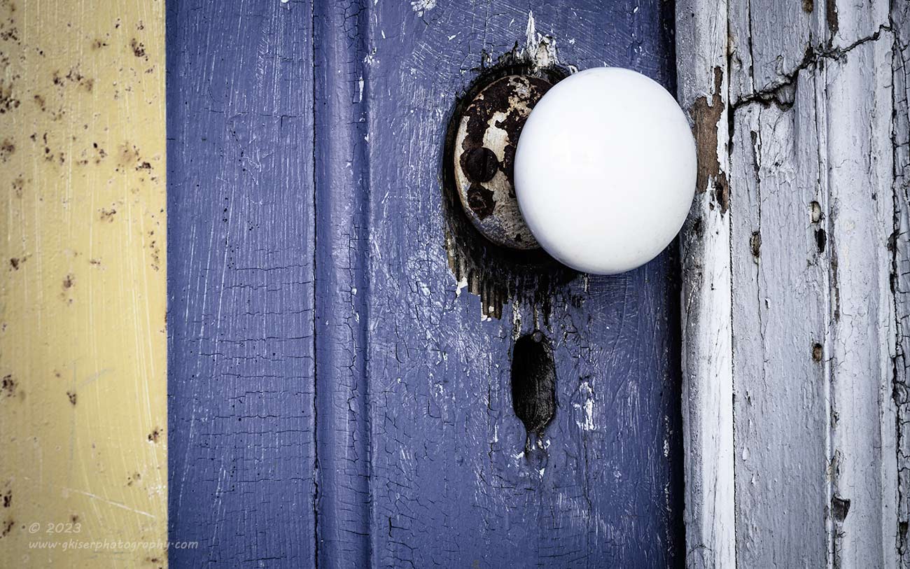
The order of the images that I have included do follow the timeline of the day so you will see the progression as it took place. I happened to start the day off in the same area that I usually do because it was closest to where I was parked. Since an early trip out here for a photo walk, I have enjoyed this old door on the back of one of the stores. It has been painted and security barns have been added which give it another unique quality. Whoever painted it gave color theory a consideration because the two colors that were used work wonderfully in a contrasting space. It worked well for a shot that I made that day, but I’ve always felt that I included too much in the photograph making it more complex than it needed to be. I do still like it, and I like the additional lines that were included, but I wanted to get in closer this time and really focus on the doorknob which is not your typical exterior piece.
It took me a little while to really reduce the composition down to this point, because I kept wanting to bring more into the scene which was causing the overall impact to get diluted. I ended up changing up my normal questions of what I like and don’t like with a single question that replaced both of them. I asked, what I needed in the frame to tell the story. I needed the doorknob because of the reasons that I mentioned. I needed the keyhole because, well, it was just a hole on what was obviously an exterior door. Since I loved the colors that the door had been painted, I needed to include some of that yellow/gold hue to balance out the purple paint. For depth, and a bit of balance for the white knob, I needed the frame. As I looked at this, I realized that the door frame, and the wooden door shared some similar textures as they were both wood, while the knob was smoother like the metal bar which now occupied the left edge of the frame. That was another balance that I liked and didn’t even know I needed.
The dominating lines in the scene were all vertical which would usually dictate a vertical composition. I didn’t like that idea because it was too expected and would include too much of the door. Instead, I opted to go with a horizontal orientation which provided a good bit of visual tension to the scene. In post, I cropped that down even further to a 16:10 aspect ratio which forced more attention on the knob and the keyhole. The resulting composition was much more direct and effective at showing what I wanted to showcase with this photograph. It is similar to what I had shot before, but if you compare it to Dare to Be from that last trek, you will see a whole different appearance. They say completely different things in my opinion and this newer capture says it clearer, I think.
You might also notice that the colors are quite a bit different as well as where the knob is. In that first photograph, I had flipped the image on the horizontal axis because I felt that it read better that way. Based on the visual weight of the image, I still hold to that decision. However, now that the metal bars are not as dominating, that visual weight has changed, and the knob needed to be on that left hand side to pull the eyes through the image as the bars tried to do last time. About the colors, this photo was edited completely different. I didn’t want to focus so much on the colors as I did the knob and the textures. This prompted me to desaturate the image quite a bit from how it appeared. The colors are still an important part of the scene as you can imagine how a black and white rendition of this would look like.
The end result here was an image that hit everything that I wanted to showcase and nothing else. I had the textures, I had the weathered appearance of the surfaces except for the knob which still looked brand new. The colors all worked together, and the way that I included the bar in the frame didn’t pull the attention from the knob as it had in the first attempt. Which do you like better? For the purposes here today, I prefer this one. It is a more mature version of what I had shot before, and that suits my aesthetic style better for the moment.
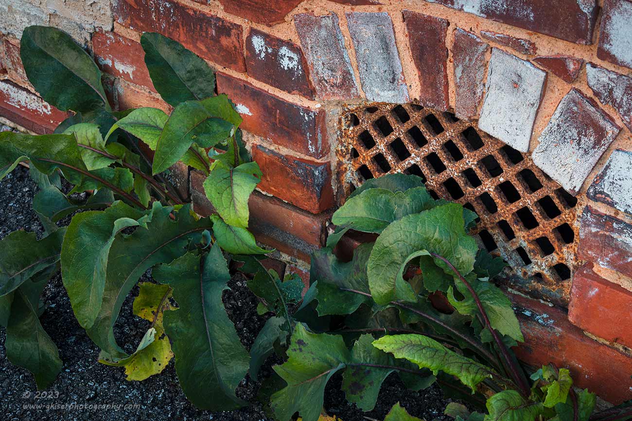
Just a matter of feet from the door was something that I had not seen before, or at least hadn’t really paid attention to. There was a vent at the bottom of the wall which was quite decorative in the masonry. I liked this old-world look, and the fact that the metal was very much rusted and pitted just called out to me. How I had missed this in the past escaped me, but I have a feeling it was because the weeds hadn’t been there. Yep, you heard me right, it was the weeds that sold me on this scene and actually got me more excited about the grate than the door I had started out photographing. After a few minutes, I couldn’t stand it anymore, I had to try and get a shot.
Obviously, the weeds were blocking much of the view of the grate, and shooting this from straight on would be pointless. I wanted to give the scene depth and a bit of excitement which caused me to shoot from about eye level kind of close to the wall. This perspective gave me the entire vent with the brick arch above it which I had to have. The angle allowed me to see a little bit behind the weeds which gave my main subject more weight in the image. I wasn’t done here because I was able to use the other cluster of weeds as a visual balancing for the composition as they were captured further up in the frame. The green colors contrasted with the predominant reds of the scene very well and I had to be able to include enough of both to maintain that pleasing balance. It was the weeds that presented the biggest problem to the composition, and that was in the form of movement. While the wind was calm, there was a slight breeze that was pretty constant along the back of this building. There were two leaves that kept wanting to move and the only way to address that was to increase the ISO which I did to 400. That gave me a shutter speed of 0.8 seconds which was enough to freeze the leaves while keeping the depth of field as deep as possible.
I remember looking at the image review and getting very excited about this one. In fact, I liked this a lot more than I did the door photo that had brought me over to the spot in the first place. This is the beauty of a photo walk in my opinion. You go out with no preconceived ideas of what to capture and just keep an open mind to what presents itself. This old vent caught my eye and I reacted to it which is exactly how I would proceed with a workshop in this location. If you see something, capture something. It is just that easy. Even if you don’t think that the photo will come out good, this is a chance to flex your own creativity and learn ways of capturing things that you might not have considered shooting before.
There was a lot here that I loved, and it is something that I never would have seen or photographed during a landscape trek, or even going out looking for barns or old cars. This was something that I would only see walking around in alleyways with my eyes open for good light, shapes, and colors. No, this isn’t an epic scene from an exotic land, but I am pretty sure that I am the only photographer to capture this particular scene, at least in this condition. That was a huge deposit in the bank of uniqueness in my portfolio. In the day and age when everyone has a camera attached to their phone and photographs everything, the true value of a photographer is to have unique images that don’t blend in with the masses.
What are your thoughts on this photo? Does it speak to you and tell you a story? Can you see this printed out and hanging on a wall, possibly in a historic district? Have I finally lost my mind and have gotten excitement out of photographing weeds? I don’t know, maybe this is totally off the rails for a photographer, but I find it very freeing to go out and just react to scenes that I come to without concern about whether or not the photo will be liked or even understood. As photographers, we should all shoot for ourselves first and foremost. That is where we develop our style, and then others will either appreciate that style or not. Those that do, are the ones that will truly appreciate the photographer.

After shooting that rusted vent, I was feeling pretty good about the day, and I felt that I really had that first image in the bag. I thought that I could give the door another go at this point but didn’t want to focus on the same things that I had done before. For this next composition, I wanted to highlight the textures and lines that I was seeing. This one needed to be even more simple than the doorknob one, but full of little details to keep the viewer interested. As I looked at the scene, I could see that the larger door beside the door that I had just shot had the same blueish color, but a completely different texture and look. I started to examine it closer and found that it fit the bill with what I was trying to capture for this one.
The door itself had diagonal wooden panels which were interesting. The door frame was vertical, of course, while the brick wall next to it was brick with a dominant horizontal aspect to it. In the space of a foot or so, I had three different types of lines and two different colors. If I included a bit more to the side, I would also get a vertical line of runoff down the wall that had left a dark residue and removed some of the paint from the mortar. That would introduce another vertical line to go with the door frame and add a bit of warmth to the scene. There wasn’t much in the way of main subject here, so I tried to figure out a visual anchor to give the eyes a resting point. The best thing that I could come up with was the door hinge which I placed in a good spot within the frame to give a bit of visual tension to the composition.
Whether you believe it or not, that small hinge dictates how this scene is viewed. Take a second and scroll down just enough on the photo until the hinge is out of the frame. What you are left with are just blocks of color and texture. There is no context, no real indication of what you are looking at, and your eyes will just quickly scan it and be done. That hinge gives a point of interest with just enough detail to make you look closer. This establishes scale and gives depth to the image. That was the element that I needed to make this photograph work.
So as not to have the door and frame overly heavy in the scene, I reduced the saturation levels quite a bit here and established three different zones for edits so I could work the bricks differently than the frame, which was treated differently from the door itself. The end result was a pretty in depth edit to establish each element the way that I wanted them seen. The image here is a successful one for how I saw it initially, but what do you think? Is this something that you could see on your wall? Does it cause you to think and ponder what the rest of the scene looks like? Those are my goals with this one.
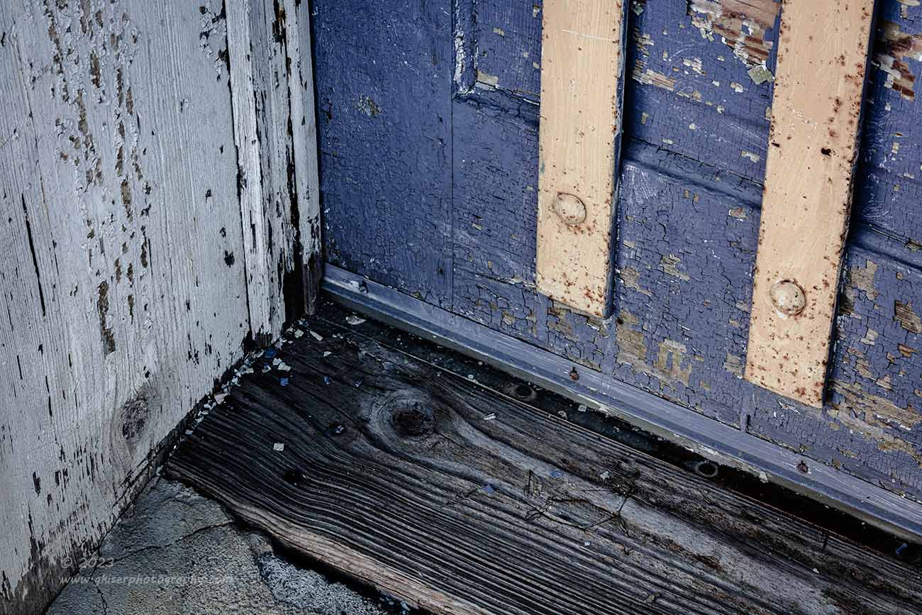
I realized that gaining a sense of depth was quite difficult when I was shooting straight on to the doors, even if I moved off to the side slightly. Before I moved away from this door, I wanted to try something a bit different with it. What I decided to try was a compositional technique that I had explored earlier this year on a mentorship session. It was based on a composition that I had discovered working with an old rusty Bug a while back. The composition was fairly simple and just included shooting down on a recessed corner. This gave three different planes of interest and allowed the primary lines to form shapes that felt logical within the frame. For the door here, I was able to capture all the different textures from the asphalt surface to the worn wooden threshold. The wooden door frame added the flaking paint that matched up to the peeling paint on the door, with the faded and rusty metal bars that were mounted to the door. The carriage bolt heads paired nicely with the knothole in the threshold and fit within the rule of odds giving a visual pathway within the scene to look at.
Framing this composition up wasn’t difficult at all, but picking the right focus point was where I spent the most time. I had the aperture set to one stop less than the narrowest which for this lens turned out to be f/22 as my working aperture. While pressing the depth of field preview button, I moved around to different areas of the scene until I had the focus point right where I needed it for maximum depth of field. I was pretty satisfied with how this one turned out because it was the texture that I wanted to capture more than anything else. Had the depth of field gone soft, I would have lost that.
For the edit, I treated this one in a very similar way to the other door photos. I like the desaturated look as it fit the age of the subject. Previously, I had embraced the colors and really punched them up in post, but that seemed to set the wrong mood for what I was wanting this time. I like the older look of the photos with this color profile attached to them. They are more restful and calming to my eyes. This is one of those things that I think many photographers don’t fully appreciate. I know that for my first 10 years or so as a photographer I didn’t understand the value of color intensity. We’ve looked at many of my garish images from the past and I have no problems making fun of how the colors looked back then.
I see this same issue with a lot of photographers that are getting started out. They want to saturate the image way too much. The worst offenders are those that shoot sunrise and sunset images where it looks like the twist the saturation knob until it breaks off causing colors to appear in the photo that would never be seen in reality. There are times when saturation to the extreme can be a great thing and can help to tell a story. Most of the time it is a precise dance that the photographer must do to support the mood that is intended for the image. The longer I’m at this, the more moderate or selective my saturation levels are becoming. Just looking at the door photos I posted here compared to the original photo from the beginning of 2022, you will see a huge difference in how I am treating colors.
These are always very personal choices for the photographer to make, but something that I would certainly talk about in a workshop based on this concept would be the use of the colors within your photographs. Color says so much to the viewer and causes so many automatic reactions that we can’t just dismiss something as important as saturation by pushing the envelope as far as possible. DO WE REALLY NEED TO MAKE ALL OF OUR SENTENSES IN ALL CAPS??? Excuse me, that sentence was oversaturated, allow me to rephrase….Do we really need to make all of our sentences in all caps? You get the point, I think. Remember that with your own photos, saturation levels are there for emphasis and balance, not for shock value.

There are times when any level of saturation might be too much. The next few photos that I shot needed absolutely no color at all. If you recall, a few months ago I talked about how I made the decision to go with a black and white photograph over a color image. There are times that the colors get in the way of the story, and there are other times that the colors that are present are not pleasing to the eyes. The scene that I came upon at this point in the day was all about shadows on the concrete. Basically, the structure of my photo was from darkness on top of a very light gray tone. The only color here was the blue tones reflected from the sky and the green of the railing. Neither color was important, and the concept that I had here had nothing at all to do with basing the photo in reality. I was struck by the lines against the texture and to tell that story, I just needed a contrast between light and dark.
It was about 10:30 so the sun was still coming in at an angle when I walked by this railing. The shadows produced by it were very long and the angles were perfect. I immediately saw this as a high contrast black and white situation and knew that my main focus was going to be the shadows from the railing since the maybe a foot beyond the railing was as drop and the view of the Farmer’s Market below. The side of the railing that faced the shadow was, of course, in the shadow as well which I wanted to include a bit of for a contrast in lines. The deep shadows provided every bit of structure that I was looking for here and I started to frame up the image with the camera.
I actually shot a good many variations of this scene trying to get the mind to pay attention to the flow of the scene and not what it was actually seeing. I didn’t limit myself to which way was up and down and knew that I would flip the images as needed in post to arrive at the visual flow that I thought was best. What I concentrated on in the field was determining proper visual balance. This was a game of how much of the railing to include compared to how much of the shadow was in the frame. From there, it was a matter of determining the camera angle that created the right angles within the frame.
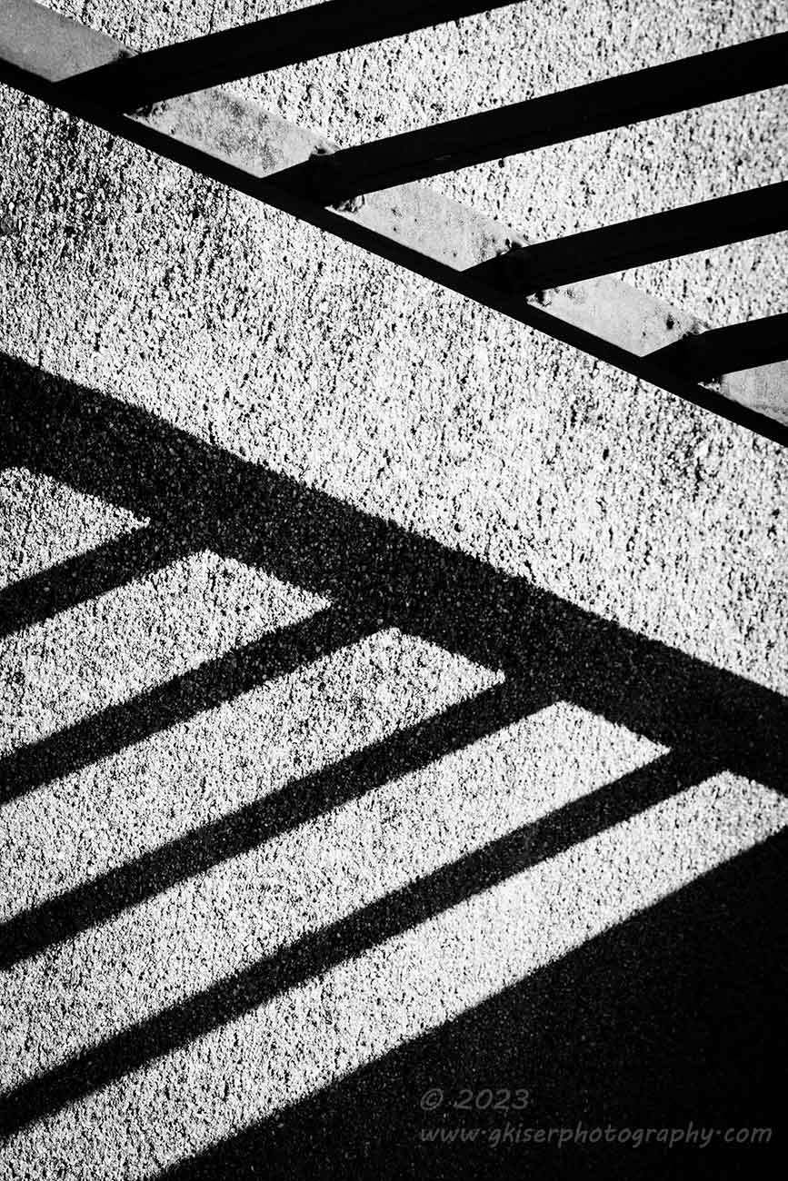
This was another fantastic teaching point for a workshop here. So many times, I see photographers take a very wide shot of a scene and then pick out the compositions when they get home. In some cases, I’ve seen two or three compositions come from a single frame. This might seem like a great idea and a very efficient one because you can shoot the image at the scene and create the photograph later on when you get home. What folks forget is that by doing that, you are throwing pixels away that you have paid for with your camera. In many cases, you are losing 50% or more of your camera’s resolution. You have to think about your camera’s sensor in much the same way as Silly Putty. For those that didn’t have a childhood with this toy, it is a putty that you could play with like Playdough, pull newsprint off of a newspaper like a copier, and bounce it all around the house. It was a ball of putty that you could stretch into different shapes, and it is that characteristic where it is like a sensor. Let’s say you could roll the putty out into a large square that measured 1ft by 1ft. It was thick enough that you could pull it up and place it on the newspaper. After pressing it, you could pull the newsprint up and see a full mirror image of what was on the paper. Now, take that ball of putty and toss a quarter of it over to the side and spread that remaining portion over the same 1ft by 1ft area. It is much thinner and harder to manage at this point. There might be some areas that are so thin that it will no longer pull the print from the newspaper. Try it again with only half of the original ball of putty and you will find that there are holes in that 1ft by 1ft square because you have had to stretch it out so much. The only way to get the same attributes from the putty is to reduce the size of the square that you are working with, so you are only able to make a 6in by 6in square with half of the putty available.
When you crop an image in post, you are losing valuable pixels that determine how large you can stretch your image file in print. If you are shooting with a 100mp camera, that probably won’t be an issue, but if you are shooting with a 24mp camera, losing 12 of those megapixels will cause you to stretch the file too far for having good detail in the photo. If you are shooting with that 100mp camera, you have spent a lot of money for that resolution, so why throw it away for no good reason? Take the time in the field to determine the crop and composition so that you can bring all of those pixels to bare in the final photograph. I’m shooting with a 50mp camera and short of cropping for aspect ratio choices, you won’t see me do significant crops in post. Sure, it takes me longer in the field to get the image right, but when I have a finished photograph, I have a huge image file that can print four feet on the long end without having to break a sweat.
You might be thinking that you will never print that big, so you don’t need to worry about it. I hear you! I happily shot with a 24mp camera for years knowing that the resolution was more than enough for anything that I would throw at it. Then I started having prints sold through Hampton House and they were routinely 30×40″ or larger. All of a sudden, I was struggling to keep up with the sizing demands being requested. What happens when you shoot that perfect image and it becomes something that you can sell, only you cropped it down to an 8mp image where the detail is stretched so thin that it gets lost? You are limited as to how large you can print it, and even at a moderate size the image falls apart. If you had just taken that extra time in the field to frame the image more carefully, you would have all kinds of flexibility with the end use that might pop up.
This is my motivation when I’m in the field and that is what I was spending the time on with these shadows from the railing. The planning worked out and short of cropping to a 5:7 aspect ratio for balance, there was no further cropping involved. I can print these as big as needed with no loss of detail or sharpness. In fact, I had to reduce the quality of the files to post here to keep load times reasonable. I’ve reduced a file that is native at 287MB down to a jpg file of under 200KB. The compression needed to make this happen was extreme, so you can image the detail in print from a full resolution file. That is why I say in order to truly appreciate my photography, you have to see it in the printed form.
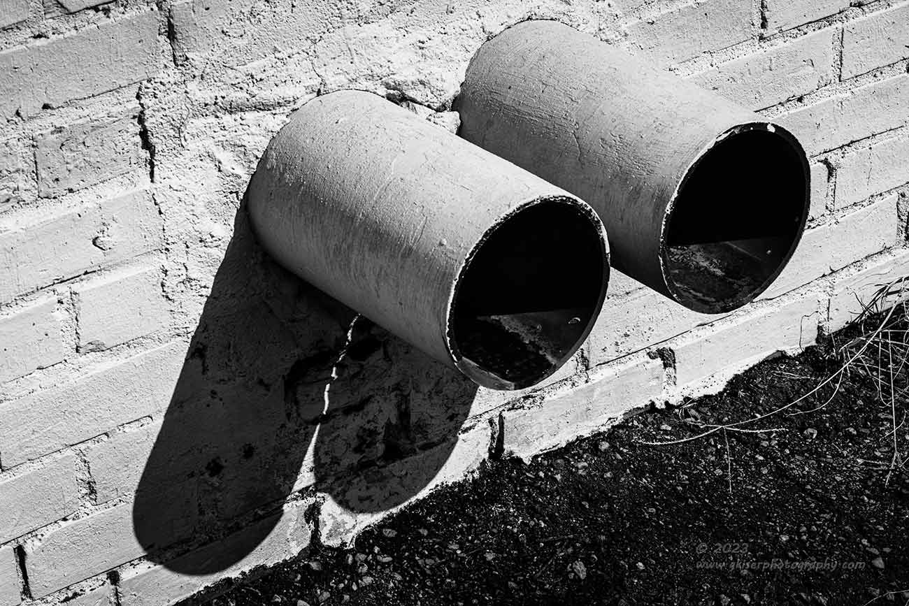
While I was walking around in the bright sunlight, I spent time looking for interesting shadows more than actual subjects. One such scene I came upon was this set of drains coming from the side of the building. The drains weren’t interesting at all, but the way that the shadows appeared on the wall gave a new shape to this object. It was the overall shape that caught my attention and I wanted to photograph it. I hit it at the right time because a few minutes after I started, the sun climbed high enough to cause the shadows to merge into the pavement which ruined the shapes for me.
Setting this photo up was all about angles once again. I needed to bring in diagonals to make the scene interesting because it was just two drains after all. I found that an area over to the left and slightly elevated gave the best angle on the scene. The polarizer that I still had attached allowed me to deepen the tones where the water was draining from the pipes. Seeing that the wall was painted white and the pavement and pipe interiors were black, there was no need for any color here at all. As with the railing shadow photos from before, I switched the camera into black and white so that I could accurately see how the photo was developing.
This was the last of three shots that were made over just a minute or two. Nothing was changed in each of the shots, but I was trying to capture a single drip falling from the closest pipe. It never did register because of how the light was passing through the scene so the repeated photos were not needed. I ended up picking the last frame for the simple reason that it was the first one that I reviewed in my culling process since I go from last to first.
I’m still not convinced about this photograph because of the subject, but there is something about how the photo actually looks that interests me. There is more to this one than meets the eye and I think that it will cause a reaction from the viewer which is my main goal. I mean, I know that nobody goes shopping for a bit of wall art based on a set of twin drains. My goal was to create something that had nothing to do with the subject itself, and that is the beauty of working with shadows. The shadows can become the subject as in the railing photos above, or they can combine with a physical element in the frame to form something else entirely. What do you think about this one? Is it a success, or are you wondering why I chose to capture this in the first place?

By now you are probably thinking that a photo walk is all about capturing small details, but that isn’t really the case. This is a perfect opportunity to find larger scenes as well. I’m always looking for interesting sections of buildings that show a relationship between subjects. While I was walking back behind some of buildings, I found this little location. What caught my eye first was the stairs leading up to the door in the upper level. I loved the rust on the platform and felt that the design of the supports would make for interesting lines. I worked on finding a composition that I liked and shot a few frames. I was pretty happy with how they were looking on the camera, but when I got them home, I didn’t like them at all. This is one of those considerations that we sometimes forget. Looking at an image on a camera when the angles are a bit off due to compositional considerations, you might not recognize it on the back of the camera. In this situation, I had the camera tilted slightly to capture the strong vertical correctly. It all looked great on the back of the camera, but the camera was still at the odd angle, so the photo looked correct. When I got it home and started to look at it the computer monitor wasn’t tilted in the same way, and my sense of horizontal and vertical were more intact. The image just had an odd look to it and the composition didn’t work well when separated from the scene. I did an edit on the photo that I liked, but the composition still was very weak. The lines felt odd, and the impact that I wanted from the photo wasn’t present. After several times of considering it, I shelved the photo and removed it from the keepers.
Fortunately, while I was there, I saw another compositional possibility and decided to take the shot. This was the one time that I fitted the 24-70mm lens because I wasn’t able to back up enough to get the long lens to frame the shot as needed. What I liked about the scene that you see above is the strong diagonals that link the two doors together. I chose to emphasize the diagonal staircase with the slope of the ground which gives a contrasting diagonal line. The two doors occupy opposing corners which are linked by the stairs that happen to touch both of them. As a compositional choice, I kept the railing right at the edge of the lower door so that it would stand out as a visual anchor. There was no way to keep the upper door separated from the railing, so I managed to place it in the most appropriate position by way of elevating the camera until the doorknob was visible above the railing.
I did a few variations on this composition to make sure that I had everything as close to right as I possibly could. When I got home, there were still some perspective problems which were a bit of a distraction to me. These problems would have been handled with a tilt/shift lens, but I don’t own one. What I do have is Lightroom which has several really strong tools for perspective correction. That was what I did, and after establishing two vertical points and a single horizontal point, the perspective was corrected, and the image came together once again.
I liked this image less at the time of capture than the lone upper door, but when I was looking at it on the monitor, my opinion greatly changed. This happens more often than not because how a photo presents on a larger screen is always different than when it is on a 3.2-inch LCD. I’m glad that I took the time to shoot this second composition thinking that it was going to be a second runner to the original concept for this scene. It was this alternate that turned into the keeper which happens from time to time.
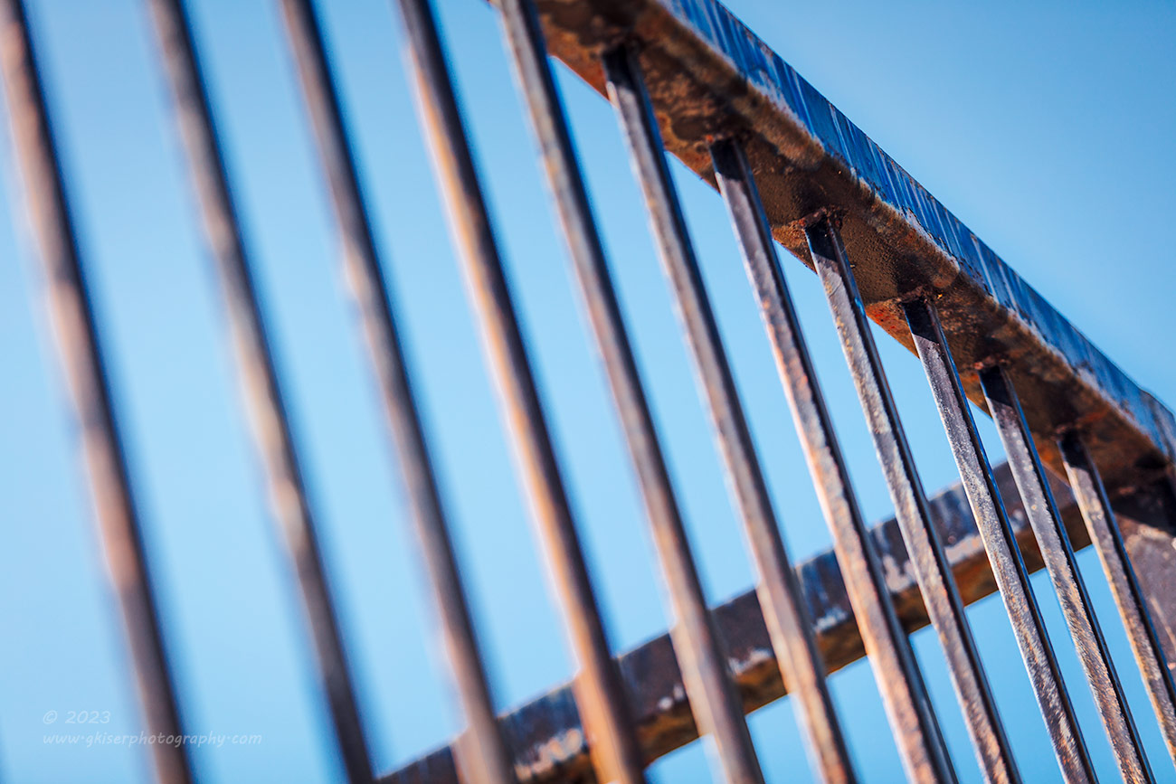
I was about to call it a day because I needed to get home and get ready for a trip to Surry County and then to Winston. When I got back to the truck, I happened to look at the elevated parking lot next to where I was parked. This is another one of those scenes that I had shot previously, but in a different way. You can check out Remove the Mask which is the last photo from this trek over a year ago. What had caught my attention then was the façade coming off of the brick wall. This time, it was the railing at the top of that brick wall against the blue sky. It was probably less about the railings as it was about the lines and shapes that I was seeing. I saw a bunch of diagonals coming together which brought to mind a lot of triangles. I just had to figure out where to stand to get the right combination of elements in the scene.
There was no way that the standard lens was going to work here, so I switched back to the telephoto that had been on the camera most of the day. I moved around while looking through the lens to determine where I needed to drop the tripod legs. This is the benefit of using a light carbon fiber tripod. I was able to handhold the camera with the tripod still attached. Unlike your normal light tripod that is made from flimsy materials, this one is very sturdy and strong allowing for a very stable shooting platform, even after me landing on it during a fall.
When I finally got the composition right, I was looking at the main bars coming together into a sideways “V” with just a bit of stem to ground the main shape. The uprights were canted in the opposite direction by tilting the camera, and I made sure that they overlapped any uprights that were in the background to simplify the lines. All that time putting the composition together through the viewfinder must have had an impact on me because when I was deciding the depth of field, I didn’t like seeing all of it in focus. I started to back off the aperture while looking through the depth of field preview until I was happy with the blur. It turned out to be f/2.8 which is what I had been setting the composition up with. Funny how that worked out.
My initial thought was to do this as a black and white photo with the sky going almost white to force the attention on the shapes. I even did most of the edit that way before realizing that it was too simplistic. I wanted more attention on the age of the railings and for that I was going to need color in the frame. Fortunately, rust pairs great with the blue of the sky. I chose a color profile that fit the balance I was after and did the edit from there fresh. I really liked how the limited depth of field pushed the eyes to the upper right third yet allowed you to see the shapes leading up to that point. It is the pattern that I was after more than anything which was accomplished here.
An odd thing happened with this photo. I had been ready to call it a day, but after shooting the railing, I felt that I still had some things to say with the camera. I wasn’t completely sold on the railing photo and wanted to continue for a bit longer to see if I could push that idea in another direction. I looked around to see what direction to go in next. There was another alleyway on the other side of the street from where I was parked that turned into the direction that I headed.
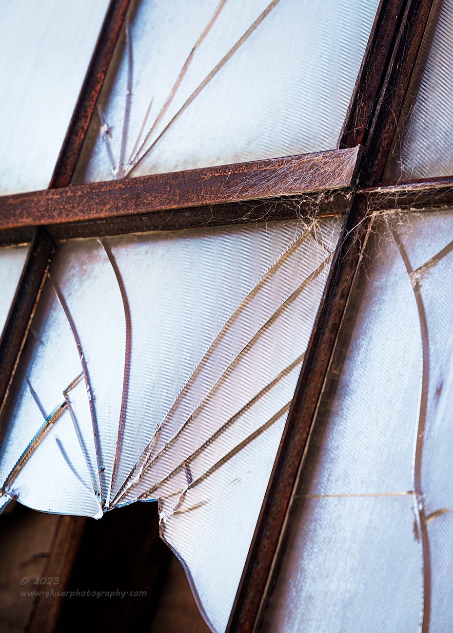
I had been through this alleyway several times and recalled seeing a broken window near the road that always interested me. I stopped and studied it for a while this time to see if there was a composition there. In the past, I had dismissed it because I couldn’t get the camera elevated enough to shoot my standard squared up image with the broken frame as the visual anchor. I hadn’t wanted to introduce the perspective from shooting down low because I thought that would ruin the image. My thoughts were different this time.
I had been shooting several scenes already where I embraced the diagonals and perspective distortion which had turned out pretty nice. I also recalled a recurring theme that I have been going over with one of my mentorship clients recently about when to have verticals and horizontals accurate, and when to embrace the distortion. This was one of the times to embrace the distortion and push the diagonal aspect from shooting low. It was worth the try because the window clearly meant something to me as many times as I had stopped and looked at it.
It took five tries, but I finally did get the right perspective and the right focus point for the image that I had in mind. I also flipped the image horizontally so that it read a little better having the hole in the entry point of the image. What I loved about this composition was the visual anchor took the eyes right to the spiderweb of cracks which takes up the main part of the frame. Those cracks lead to a different kind of web which becomes a secondary focal point to balance out the anchor in the foreground. There is another crack on the right side of the frame that helps to frame the image since the dominant lines are diagonal throughout. For that last bit of visual balance, there is another crack in the top pane of glass which crowns the whole thing.
I chose to photograph this window from this side because of the extreme glare from the sunlight. If I shot it backlit, the glass went dark, and it lost all of its character. By shooting into the light, I had a frosted look to the glass that showed off the cracks to their best ability. I used just a touch of polarizer in order to get the right contrast to the cracks, but the lighting was super simple from this angle. Whether this was going to be a color or black and white image had yet to be determined, and I edited it both ways to make sure I made the right choice. In the end, I needed the color to provide a bit more visual interest on the metal surfaces which established the age and the webs stuck out more in color.
I like the photo, and I’m glad that I finally gave it a try. I also think that most will look at this and pass it by without much of a thought. At least that is what I think will happen. When I showed it to Toni, she really liked it which might mean that my assumptions are wrong about the reactions on this one. Time will tell but let me know what you think about it. I do hope that you like it, but this was an image that I shot for me first and foremost.
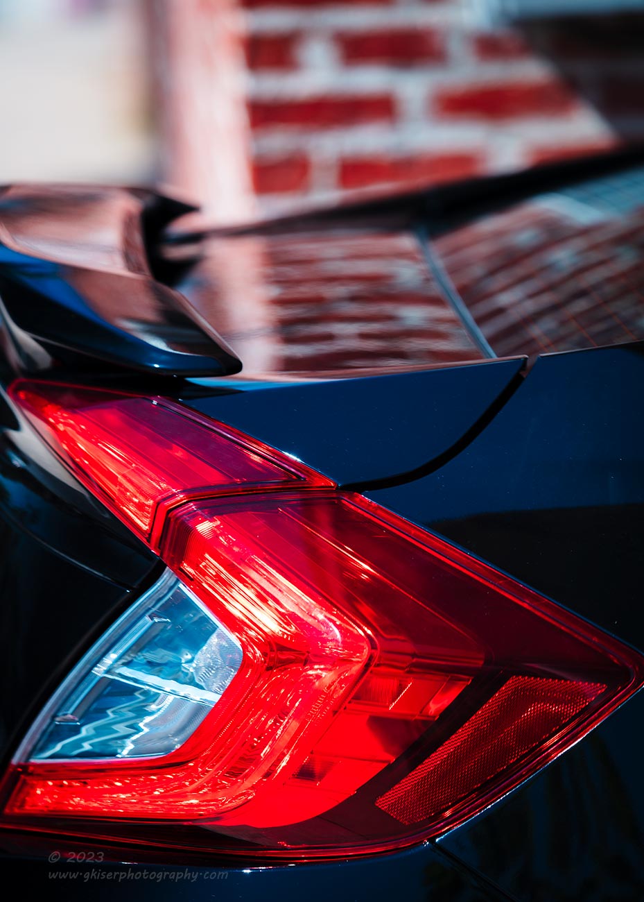
I still felt like I had things to say and wasn’t ready to call it quits just yet. I was having to pay more attention to the time at this point because I needed to be ready to go at 1:30. I still had some time but didn’t want to hold Toni up for the afternoon. I just continued walking around looking for something that grabbed my attention. As I was walking, I saw a Honda Civic pulled into an alleyway showing just the rear of the car. I realize that there is nothing at all special about a late model Honda Civic and it certainly isn’t one of my normal photographic subjects. In this moment, it sparked something in me though. I quickly dismissed that there was no rust on it, and that it was just a few years old. It didn’t bother me that I could only see a little bit of it, or that the view that I had seen was between a building and a tall potted plant. What mattered was the shape of the taillight and the color against the black paint that was reflecting the blue of the sky. The red bricks that reflecting in the truck made for a perfect transition between cool and warm tones and the bricks added a contrast to the smooth textures I was seeing with the light.
What I was seeing wasn’t a photo of a Honda at all, it was a study in shapes, colors, and textures. If you have been paying attention to this entry, you will recognize that those are the elements that I have been searching for in each of my photos. I had stumbled upon this scene by chance and the car would likely never be in the same spot again, so I stopped and worked out a composition. I couldn’t get an uninterrupted view of the car by moving to the left of the plant because I would lose the shapes that I wanted to capture. I had to be exactly on the side of the car, but that was where the plat was. I couldn’t get too close to the car because my reflection would show up too easily which meant that I needed to be back with the plant. However, having the camera on a tripod pushed the camera too far from the side of the building and I ended up including a bit of blurred leaves in the composition. While this is a valid compositional element and one that shows depth very well, I didn’t want the blurred leaves distracting from the shape of the taillight. What I did was straighten out the two legs near the building to allow the camera to get in closer while I extended the remaining leg to keep it as close as possible to the building. This gave me a clear shot between the building and the plant to get the composition worked out.
Not wanting to pull attention away from the light, I went with a limited depth of field that left the brick wall in focus just enough to establish what was being seen to give context to the reflections on the trunk. The light was the only thing that was sharp which was by design. The curves of the trunk lid gap matched up to the curves from the spoiler which gave some more visual interest in the midground of the photo which I liked. The blue in the black paint from the sky was also showing up in the reverse light which helped to cool the scene and give the right amount of visual balance. My favorite part was how the bricks reflected on the top surfaces of the car though. The softness of the texture made you just focus on the colors which was my main goal here.
While this isn’t my favorite image, it is probably the best example of why I am starting to really love photo walks like this. I don’t think that at any other time, I would have been in a frame of mind to have seen this photograph. It would have been something that I would have walked past and not even considered. However, during a photo walk, the idea is to see everything as a potential photograph and capture what excites you with no preconceived notions about what you want to photograph. While this photograph is completely different from my typical automotive captures, I think that it is also just as identifiable as being one of mine as if was of a rusty Chevrolet by a barn. Photographic style isn’t what you shoot, but how you shoot whatever is in front of the camera.

If I’m being honest, I wasn’t sold on how much I was going to like the Civic photo after I shot it. I still felt like I had some more to say with the camera, so I continued on with my walk. The next scene that caught my eye was on one of the main strips. There was a barber shop which I had passed by many times both walking and driving. This time, something caught my eye that I liked. It was the old barber’s pole out front. These are just not seen as often as they once were, and I was finally taking notice of this one. It might have been because there was a matching window decal leading to it. I had no interest in shooting the entire storefront, but this pole on the side was cool enough to carry a photo on its own.
I started to try and figure out how to capture it and I moved around looking at the angles. I eventually found the right side to shoot from and saw a way to pull the pole and the decal together for a bit of harmony in the scene. By doing that, I ended up with a lot of negative space in the window above the decal which I didn’t like. The rest of the frame was looking good with the appropriate amount of diagonals included to balance out the strong verticals which had to be included. The shapes in the composition were spot on, but that negative space was causing too much of the scene to be off balance.
In an attempt to fix that, I tried to show motion in the rotating pole by dragging the shutter. My first attempt yielded a mostly purple pole as the red and blue combined which I didn’t like. I tried it with a shorter shutter speed and got a blur of red and blue which was better, but I had lost the characteristic shapes of the pole in the process. I also found that it compounded the off-balance nature of the photo because there was more activity in the busier part of the frame while the negative space just loomed over it all. I sped the shutter up some mor and got just a bare hint of moment in the pole while still establishing the three colors within it. I liked that, but that negative space was still a big problem for me.
I thought about changing the crop to a square to reduce it, but that would lose the decal that I liked as an element in the frame. As I was about to change up the composition to try something different, I happened to notice a slight reflection in the window of the pole. This was not visible in the camera because I had twisted the polarizer all the way over to deepen the tones in the glass which all but removed the reflection from view. I reduced the polarization and saw the detail of the pole come back out in the reflection. I just had to move over a few inches to get it to be fully visible in the window. That little bit of change reduced the vast amount of negative space into something that I could deal with. A crop to a 5:7 in post brought the composition the rest of the way home. I flipped the image horizontally so that it would read better and did a fairly simple edit on the photo to arrive at this. It was this photo that I think is my favorite from the day because of the way that the colors came out and the overall composition thanks to the reflection that I added back in. I really think that this was the image that I was waiting to find and why I hadn’t been able to call it quits just yet.
Remember, these images all appear in the order that they were captured. You can kind of see the progression of how I captured the scenes throughout the day. They started fairly simple and became mor and more complex as the day went on. That is how I work behind the camera. The more I shoot, the more layers I see and can resolve visually. It is kind of like warming up for exercise. You are slow at the beginning, and you are never quite sure you will be able to last. After that warmup is completed though, you feel like you can go forever, and you can push yourself. That is what I was doing at this point. I was pushing myself to photograph things that I normally wouldn’t, as well as in ways that I normally wouldn’t’ be able to figure out. I was really feeling good about this trek and had no doubt that I had a handful of images that I would be talking about in the blog later on. I just didn’t’ realize that it would be the next day. I honestly thought that I would have four or five images and a quick little blog entry to go along with them. Here Iam some five hours after starting to type and just coming up on the end of the trek.
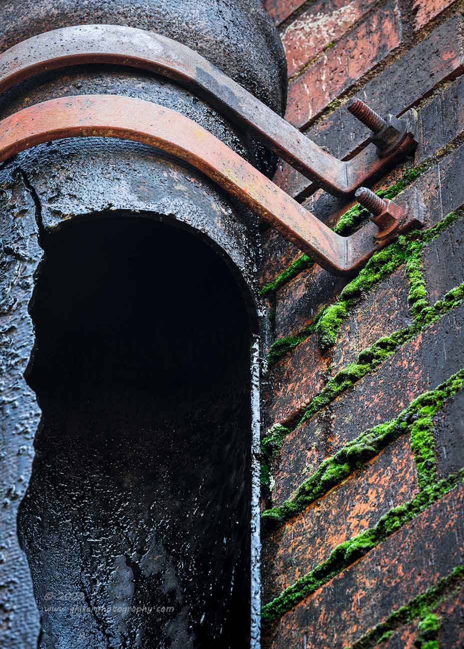
That end of the trek comes from another alleyway that was near to the door that I had started off photographing. As I was walking down it, a gutter downspout jumped out at me. It was a very large pipe that had been broken at some point a long time ago. The resulting hole had allowed all the roofing residue to coat the remaining exterior of the pipe with a tar like substance. The water that had splashed out for some time had caused moss to grow on the brick wall which added a really interesting color against the warmer tones. It was just an interesting scene for me and spoke to my decay tendencies. I wanted to try and get a shot of this but didn’t know if I would be able to figure it out, or if I would have time to pull it all together before having to head home. I had enough time to try and that was what I did.
I looked at the scene and determined what about it I liked the most. The gaping hole had been the first draw to the scene, so I wanted to include that, but I needed something to anchor the scene. That came in the form of the strapping that secured the pipe to the wall. While all that was interesting, it wouldn’t make a good photograph because there wasn’t enough visual interest to keep a viewer’s attention. That was where I looked to the brick wall which added texture and the moss where the mortar would have been seen. Since the primary element was vertical, that was how I positioned the camera.
I started off including the entire pipe which forced the brick wall behind it as well as in front. What I liked about the scene was getting lost in that composition, so I tightened it up and cut the frame through the side of the pipe showing just the edge of the break. I found the right balance with the brick wall and placed the straps at the top with just enough breathing room to keep the element important to the frame. I knew that I would be shortening the length of the frame in post to a 5:7 if not a 4:5. That composition worked out great and after working out the depth of field and focusing point, I was done with the day. My creative voice had been heard and I was satisfied.
I’m not sure how, but I managed to get home with about 45 minutes to spare before Toni got home and we were ready to head out. That gave me time to import the photos and to get about four of them edited before I had to take a break. The remaining ones waited until we got home, and I worked on them until about midnight when I was satisfied with the final edits. It was a long process to get to this point, but I have to keep reminding myself that this trek was all because of a single thought about a workshop offering in the future. It was billed to myself as a scouting trip to see if I could make it work which really didn’t include mor than a couple of photos. Those couple of photos turned into nearly 65 and I ended up with 13 keepers from the bunch. More importantly, I have realized that this could work as a workshop, and I think would provide a lot of value when linked with a second day image review for the participants. You’ve kind of seen my image review here, but the real value comes from seeing how others saw the same areas that you were in. Only in that way can you start to evaluate how effectively you saw the area you were in.
I hope that you have enjoyed this trek and the photos. I know that these are not quite like what you have come to expect from me over the years, but I appreciate those that have read through all or even most of this entry to see what photos I captured. You know the deal, if one of them speaks to you, I would love the opportunity to match you up with a print of your very own. Remember that seeing the photos here is nothing like what a print would be. The resolution is so reduced for web quality that this just gives you an idea of what a final print would look like. It is through those print purchases that I am able to continue with these treks, so you will be helping to ensure future photographs to be added to the portfolio. With my portraiture, I am paid to photograph the subject while in landscape and decay work, I capture the photographs hoping to get paid for them. That is just the nature of the beast and I truly appreciate those that have purchased prints over the years.
Let me know what you think about a workshop that is based in this location which would be a two-day affair. The first day would be about four hours doing just what I did over the course of two. I would be there to help locate the subjects and then to help with the techniques of capturing the scenes. The following day, we would meet in my studio which is just under 10 miles from downtown for an image review and discussion about the day. We would all learn from each other and grow as photographers. I really think it would be a lot of fun, but I would hate to plan such a workshop only to cancel it due to lack of interest. If there is no interest for it, I would rather know now than later. Let’s talk about this and see if we can make it a reality.
Until next time….

Remember to use the code KISER10 to get 10% off your purchase