Welcome back for another installment of my monthly Behind the Camera series. It is here that I will usually talk about things that are on my mind or to answer questions that have been asked during the month. Last month I made a big announcement about a new sideline that I have with my photography in the area of “people pictures.” This month I want to get back to more of what I have been known for in terms of photography. I’ve also been wanting to do this kind of post for a while now, but never really formulated how I wanted it to go. The topic is simple enough, and you can see from the title that it is dealing with composition in photography. I originally got the idea of doing this back in the Spring when I hosted a mini-workshop for the Wilkes Art Gallery at Doughton Park focused on just composition. You would think that composition would be an easy topic to discus because it is rather black and white…at least according to all of the rules that you can read about.
There are countless resources out there when it comes to compositional theory that date back centuries. You have heard of most of them by now I’m sure. They have names like “Rule of Thirds,” “Golden Mean,” “Golden Spiral,” “Rule of Diagonals,” and others. The concepts can be a bit overwhelming when you are just getting started in photography, and you start to adhere to these rules just like they were…well, rules. I could spend the time here going over these rules with examples of how different images of mine fall into the rules and help to create another batch of photographers that rigidly follow these rules and create images that look like everyone else’s. That wouldn’t be doing any of us any favors, and would actually cheapen my view on composition and turn me into a source for the same information that you can find anywhere on the web or in print. Speaking of print, I do have some really good resources at the bottom of my gear page where I list out many of the books that I have used in my own journey in photography. For this entry though, I really want to do something a bit different and possibly make learning composition easier on you.
Centering the Subject

Remember back to when you were a kid and your parents gave you a camera to take your first picture. No need to reveal how old this makes you, it could be a digital camera, a Polaroid, or one of those huge boxes with a handheld stick of dynamite used for a flash. The point is, that first instruction that you got from them was probably just center the subject and press the button. Simple enough, whatever you are shooting goes in the middle of the frame and you have a photograph. That worked well unless you had a rangefinder type camera where the viewfinder was not on axis with the actual lens which introduced the need for a bit of Kentucky Windage when framing up a composition. Bet you didn’t know that! For years, I just thought that Mom was horrible at taking pictures with her Kodak point and shoot because she would notoriously cut the heads off. I found out that was in large part to the fact that the lens was a bit lower than the viewfinder and then depending on the photo size and print ratio that problem was even worse. I digress, but that is still a funny memory for me.
Anyway, back on the trail again. The instructions that I have identified are simple and effective for someone that has never held a camera before. However, they usually don’t yield the best photographs, or any form of print art. The reason is there is no visual tension and the images that are produced lack a dynamic quality or in many cases…interest. They turn into pictures that document something and while that has a place in the world for sure, it would rarely be regarded as an artistic attempt. Having said that, there are times when centering your subject is the right call to make (see above). Creative rules are really more guidelines or loose suggestions in my view. They are there to help you when you are having a hard time figuring out how to place elements in your frame, not to force you into a certain pattern every time.
Looking at the picture of the Buick grill, you will notice that the emblem is smack dead center in the frame. Based on just about every compositional rule, this image shouldn’t work, but it does. We have to ask ourselves why that is before we start looking at building a composition from scratch. In the case of this photograph, the grill has a certain shape to it that is much longer than it is tall. That fits into a letterbox type horizontal composition. The circular portion of the emblem is without direction. The slats of the grill are symmetrical on each side of the subject and by getting in close with a wider angle focal length, you start to see a slight curve to the slats that point inward. You can kind of start seeing that the implied motion is all pointing towards the center with no implied direction either left or right. It is symmetrical with the lines bringing your eyes right to the center. By placing the emblem anywhere else in the frame, that symmetry would be lost and the overall visual effect that I was going for here would have been lost with it. It was the curves leading your eyes into the center of the frame that I loved. The circle was going against those curves which provided visual tension and made that disk stand out. The triple shields gave a diagonal element to the image from lower left to upper right within the circle. The diagonal patterns on each shield were going in the opposite direction which added more visual tension. The balance of colors were also quite symmetrical here with the red opposite of the blue (warm vs cool tones). The white was in the center which gave separation and calmed the union between the colors.
The actual design of the emblem was due to Buick’s designers back in the day, but you can see here why that emblem worked compositionally. It was designed to be mounted front and center on the car so a symmetrical approach was beneficial to the design. When I was photographing it, to have it placed anywhere else but in the middle of the frame made no sense to me. It was one of those times that I made a conscious decision to break one of the hard and fast rules of photography which is simply not to center your subject. The idea behind that rule was to help give your images visual tension which leads to impact and excitement within an image. Most of the time this rule is a good one, but there are just times when that rule is totally wrong for a situation.

Another situation when it is OK to break the rules is when you want to visually calm a scene. For example, this chaotic image from a few years back had a lot of competing lines throughout the scene and it was easy to have the main subject lost in the clutter. I chose to center the main tree trunk because it was my main subject and I wanted that emphasis to be on that rather than the tangle of limbs around it. By introducing symmetry to the scene, I took an overly stressful scene to look at and gave your eyes a chance to settle on one aspect of the design and just venture away from that main subject gradually. The monochromatic look of the scene added to that visual calming effect and it all worked together to allow the viewer to feel the cold and stillness of the image rather than just visually explore it. Again, this image really doesn’t fall into any established “rules” about composition, but it works.
So, why am I starting off a piece about how to compose images with exceptions to the “rules?” Simple, I want you to know that your creative choices should never be bound by these rules and you should always feel free to break them. The only thing that I ask of you, is that when you break the rules you have a reason that you can articulate. If you are framing up an image and you have centered the subject but don’t know why you have…that is just being lazy. Think about your image and what you are saying with it. Then look at the composition and decide if that is the most effective way of telling a story. Think about the rules and see if any of them will help the image. Move around and use different elements in support of that main subject and see if you can get a more dramatic image, or one that conveys your purpose more than the static centering of the image. Yes, it takes a bit more time, but it is that extra time which will make the difference between an image you remember, or one that will soon be forgotten.
What is Composition?
Composition for a photographer is essentially the same as the story development for a writer. Composition is how we tell our visual stories and the two concepts share quite a bit. Think about it, those little notebooks that you had to use in English class were called “Composition Books” and here we are talking about composition in photography. You have heard me mention the term subject already in regards to photography. Yes, the subject is what the photograph is all about much like a story that you are writing. Without a subject, your story has no meaning, and neither does your photography. This is the first step of creating a photographic composition. You have to find your subject. Once you find that subject, it becomes your main character in the frame and you have to then look at the supporting cast to see how they all work together.
It has been said many times that painting (and writing) is an additive art while photography is a subtractive art. What that means is when you are writing your story, you are adding the characters and events that further your story. In photography, you have to remove elements that don’t tell your story, or compete with the story that you are trying to tell. You have to keep that in mind when choosing your supporting cast for a composition. You want to have characters in the frame that help tell the story that you are after while avoiding, or minimizing those characters that you know just don’t make sense (Nobody wants a Jar Jar Binks in their photograph). This is the hardest part to creating an image and the part where we can all use improvements. This is why I chose to delve into this topic this month. I’m also considering doing another mini workshop on the topic next year and wanted to kind of put together a introduction piece to that workshop.
Finding the Subject, or Main Character
When it comes to photography you probably don’t go around and point the camera in random directions before pressing the shutter. You will only pull the camera out because there is something that you have decided to photograph. You have found something that speaks to you. It might be a certain object, or it could just be a particular view of a landscape. In either case, you have decided that there is something of interest in close proximity that you want to record. You can just simply point the camera and press the button and you will have a documentation shot of the scene or object, but that is pretty much like Mom telling you to place the subject in the center and pressing the button…which we have discussed. Don’t treat that scene that grabbed your attention with such abandon. Take a second and think about it before you snap the picture.

You have your subject already which is the fun part. That is now the main character in your story. It is now up to you to determine how you want to represent that character in your image. In the above example, I chose a very simple subject that I found at Carolina Beach a few years back. I saw these groins out in the surf and really loved how they looked. I could have just pointed and shot, but that wasn’t going to do my vision justice. The day was very overcast without any real color at all. That made it very easy to make this image about the main character and that only. Instead of just centering the subject in the frame, I knew that I wanted to provide a bit of visual tension to it so I thought about how I wanted to place the single element in the frame. I had decided that I was going to go for a long exposure to blur the water and have the horizon disappear in the distance under the white clouds. That left me with this string of poles to frame up. To add visual tension I wanted to get them off of the center of the frame. Good practice here is to have more room at the top of the frame than at the bottom of the frame, so that meant that it was the better bet to place the subject along the lower third line of the frame (think rule of thirds here). The ones closest to me were larger and more dominant in the frame, but I could see smaller ones going off into the distance to the left. I could have just centered the bulk of them on the center point of the lower third line, but that would still be boring, and more importantly, would lack balance. By moving the bulk of them over to the right of the frame, I was able to have the fading ones in the distance going off and filling the part of the frame to the left. That gave me balance, and a sense of depth, while the horizontal placement gave that visual tension with negative space above.
I’ve found that balance is the key when placing objects in a scene. Balance is not actual symmetry though. As you can see in the above image, there is a calm sense of balance in all directions. The white negative space is balanced with the dark and textured main subject. The addition of the textures to the wood makes this element more impactful than the smooth white that surrounds it. Because of that added visual interest, the dark areas carry more visual weight which is why I needed to have more smooth bright areas to keep it balanced. In terms of visual weight with the groins, the larger ones are the foreground , but they are balanced with the ones disappearing to the left which seem to go off into infinity adding to their visual weight within the frame. There are two distinct types of visual balance at play here with positive and negative space as well as where the visual weight is placed. These are all considerations when deciding where to place your main subject within the frame. Keep these ideas in mind with your main character and you will be instantly on your way to better photographs.
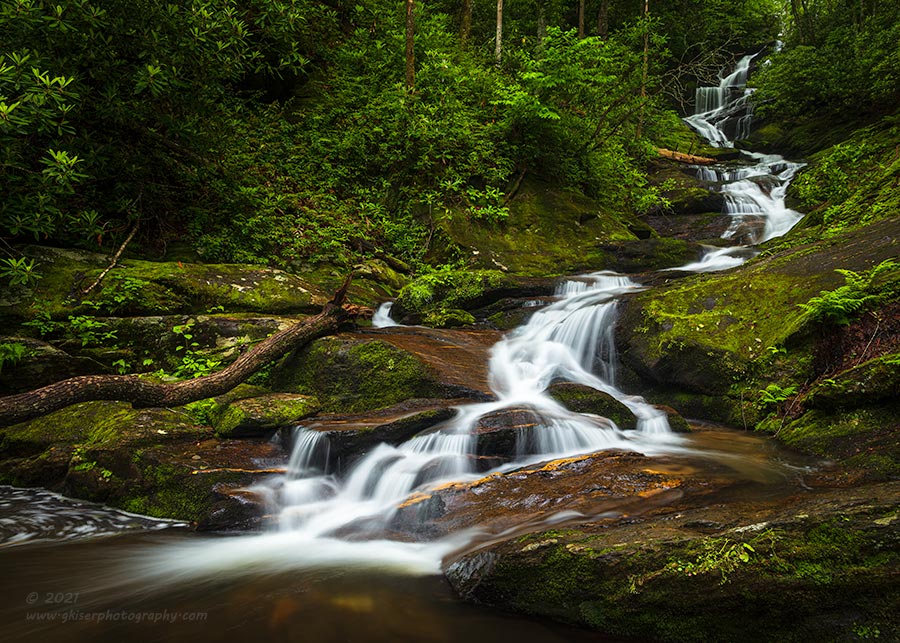
Sure, placing a single element in the frame is simple when everything that surrounds it has been turned into negative space but what about those times when your subject is in a setting with a lot of texture and visual interest? Well, it really isn’t that much different. The concepts of composition still apply here and the idea is add visual tension where you can and create depth through angles and perspective. Take for instance this photograph of Roaring Fork Falls that was captured during the Summer. Essentially, we are looking at the same recipe as the previous groins but with a lot more visual interest surrounding the main subject. This is the type of scene that you will find in the landscape quite often and it pays to know how to deal with it. You have your subject picked out because you found this waterfall to be visually interesting. You look around and determine what elements you want to remove or minimize from the scene. That is pretty much everything but the waterfall, but you can’t really do that. So, we look for a composition that provides balance for everything around the waterfall. Like I said, this is very much like the previous groins.
I knew that I wanted to have a diagonal aspect to this scene as that would help pull your eyes through the frame and allow you to explore the different parts of the image. I wanted the main part of the waterfall in the foreground as an introduction and visual anchor. Looking at the flow of the water, when it landed in the lower pool, there was a direction from right to left that it traveled in. That meant that I was going to need to give the waterfall breathing room to the left which forced the waterfall into the right of the image. That is a great compositional concept and one that will be very helpful in your own compositions. Anything that has motion, either actual (this waterfall) or implied (a parked car facing a direction), will benefit from this one. Don’t crowd your subject in the direction that the motion would be going in. Looking at this image, think about how uncomfortable it would be if the left frame was cut into the surface foam from the last cascade. You would want to see the resolution of that movement and ultimately would let your eyes flow out of the scene in search of it.
That motion dictated the left side of the frame, and to a point, the lower side of the frame because I needed that same breathing room below the falls for balance. it also coincided with the rocky surface to the right which kind of provided its own boundary for the image as it went into shadow. The right side of the frame was dictated by the fern which gave a nice bookend element to the frame and it also allowed for a bit of breathing room for that upper section of the waterfall. That makes three sides of the composition which only left the top. There are two aspects here that I was looking at to determine that upper boundary. The first was a natural darkening of that upper section of the falls due to diminishing size so that your eyes didn’t go out of the frame. The second quality that I liked was there just happened to be some bare tree trunks to the left that balanced out the upper section of the falls quite nicely. The fallen tree at the lower left followed the natural flow of the waterfall and helped to lead your eyes through the frame. There was no way to remove either the fallen tree, or the ones in the upper left, so I made them valuable parts of the composition and situated my camera so that I could put them to the best use in the overall composition.
That is what you have to do with these simple compositions in the landscape. Be aware of things that are present that you are having to include in order to completely capture the main subject. In these cases, make sure that they don’t look accidental. Have them make sense to the flow of the image and use them for balance for other aspects of the composition. That simple step will elevate your photography quite a bit. There are no accidents in a painting (well, none that can’t be corrected with a happy tree or two) because only what the artist wants in the scene makes an appearance. As photographers, we don’t have that luxury. We have to make due with fallen trees at times. The trick is to make it look like you wanted it there all along and leave the viewer thinking that you were lucky that it was there. The brutal truth to this fallen log was that when I arrived, I was quite upset that it was there because it ruined my idea of the composition that I wanted. After working with it for a while, I ended up loving it for what it added to the composition. It was a matter of about 15 minutes or so of moving the camera around. It was very much worth that time I think.
Now That You Have Your Main Subject…
Think about your favorite TV show for a moment. One of mine is Big Bang Theory. Whatever your favorite is, think about that main cast member for a minute. The show revolves around them. In the case of Big Bang Theory, that main character is Jim Parsons, or Sheldon. He is quirky, brilliant, and socially inept. However, without the supporting cast his character would have no context, and therefor he would lack interest. The same thing applies to your photography. We can even take the simple waterfall from above for instance. While it is a photograph of a single subject, the surrounding characters are all of the things around it. Other than that fallen tree which we discussed, the rest of the characters were just there and really couldn’t be removed. Think of them like extras in a scene. They don’t really have anything important to say, but they are there for context. The location of the waterfall is important because waterfalls don’t float in the fog like pier remains at the ocean. Waterfalls need terrain to exist, and it is that terrain and the textures which provide that context for the main character. None of the surrounding elements have speaking roles though which allows the main character to shine through as a solo act.
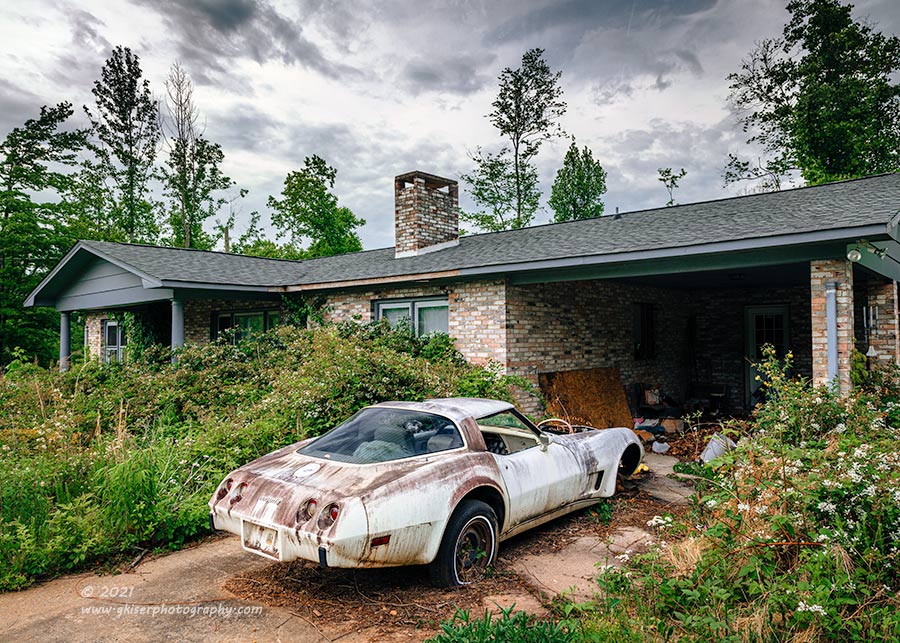
When you want to talk about supporting characters in an image, I think we have to talk about this piece that was shot during the Summer. The Corvette is my Sheldon in this case. This is the main character with all the personality and quirks to attract the attention. However, picture this car sitting in the parking lot at Walmart. Would it be interesting, or would it just be…there? This car needed supporting cast members and that was why it took me so long to photograph it in the first place. The first time I passed it by was in the Winter and there was this car in the driveway of a reasonably nice house. The two didn’t really fit together and there was no context for the car. It wasn’t until later in the Summer that the rest of the cast showed up.
It was the overgrown vegetation that pulled this all together for me and completed the story. The house was nice, but brick tends to age rather slowly and the age was not apparent here. With a few warm months the yard had grown into this delightful mess which gave that final element. The neglect was apparent not just for the car, but for the house and the whole property. I decided to take the picture when I saw all of this coming together in the scene. I had a supporting cast for Sheldon the Corvette. The house was Leonard and while it still looked rather new and in decent shape, it was the play off of the other characters that allowed Leonard to shine here as well. With the yard being Raj, we had something so minor as a yard coming out with this big personality that defined the tone of the entire group. The yard brought attention to the mess that was in the carport which turned into Howard, the slightly creepy friend that they tried to keep hidden (in the early episodes more). The core characters were in place and I wanted them all in the frame to tell the story.
Much like Big Bang Theory, any of these characters alone were not effective, but together the chemistry (or physics I guess) was undeniable. Here we had a cast of characters that told the story of everything being completely normal one day and then there was a major change and everything started to deteriorate all at once. Ironically, that was the story that I chose to capture here, and it turned out that was the actual story of the place. I had the opportunity to speak with a family member of the lady that lived here and she told me how there were a series of tragedies that happened which ultimately resulted in the death of her husband (the owner of the car). She wasn’t able to function from that point on due to the loss and just let everything go, and over time this is the result. It was a very sad story, and I was shocked that I had actually captured the right mood for the actual events of this location.
When it came to building the composition, that was actually harder than it looked because I wanted to get all of the characters in place. I happened to be here on the right day because I had one more important character to the scene. That was the sky which I think is Penny. She started out as a minor roll and eventually grew into a main cast member. The sky was not instrumental to the composition, but it did help set the tone. With the Corvette being my main character, I wanted to place it in the foreground of the scene. Going with that rule of giving an object breathing room in the direction of travel, I wanted to give it room to the front which mandated that I include the car port. The shadows gave a nice contrast to the brighter colors of the car. I was able to set the driveway as a diagonal element from left to right which was great to pull your eyes into the scene, much like the waterfall above. I set the left frame of the image at the edge of the porch so that I could include the entire house. From there, it was just a matter of finding the right balance for the right side of the frame and the top. That was the hardest part because I was going to have to cut the right side of the house off at some point. That point wasn’t going to line up perfectly with the tree no matter what I did so I decided to give the house the primary consideration and let the tree go partially out of the frame on the side and the top. This allowed me to minimize the brightness on the upper right corner so that the eyes weren’t pulled up there after they went into the car port.
It was the inclusion of all of the characters here that told the story and created an image that was greater than the sum of all of the parts. Much like “Big Bang Theory,” it was the result of the chemistry between the cast that made the show a success. You have to remember that when composing your images. You can have a great subject, but if the rest of the composition doesn’t support it, you are actually distracting from it. It really is that simple, everything in your frame will do one of two things for your image. It will add to it, or it will distract from it. It is up to you as the photographer to decide which way an element is going to go and how to deal with it..

There are times when you are forced to include elements that don’t necessarily fit into your concept for the photograph and that is when you need to minimize their visual weight. Let’s take this image for example as it will illustrate this quite well. Normally, by the time I have an image composed, I will have avoided the elements that just don’t really fit, but there are times I just don’t have that luxury. In the case of this scene, I had been sent out there by a client to photograph it specifically because it belonged to her Grandfather. I knew going out there that the rollback truck belonged to the scene and was part of it. The Isuzu in the last bay actually belonged to the neighbors, but they would occasionally have vehicles parked here. Having that perfect combination of seasonal and environmental elements on this morning I chose to go ahead and get the image with the SUV in the frame. That meant that I had some work to do here when it came to the composition.
I started off with asking myself what I liked about the scene. Well, I loved the structure with the business name on the front. That was my main reason for being here, of course. I liked the trees in the background with a bit of early Fall color. I liked the sky above with the touch of high clouds for texture. I liked the fact that the warm sunlight was slowly illuminating the side of the scene giving depth to the photograph. I didn’t really like the rollback, but it was important to the image so I wanted to include it. The red cab helped to pull in the red from the sign which was a nice balancing element for the scene.
What I didn’t like was a bit more complex. I didn’t like the Isuzu in that last bay, and I didn’t like the fact that the neighbor’s house was potentially going to be in the frame. I wasn’t happy that the rollback was nosed in leaving me the least interesting part of the truck as the dominant introduction to the image. These elements were going to be a part of the scene if I captured it in its entirety which was what I was hoping to accomplish. In order to make all of this work together, I was going to have to minimize those aspects that I didn’t like in the scene.
By framing up the scene from the far left side, I knew that I would get the warm sunlight that I felt was going to be very important for this scene. I made the left edge of the image right at the beginning of another building to the left that I didn’t want in the scene because it would throw the balance of the image off. The right side of the frame was a bit more difficult to determine. If I cropped out the house beside the business then I would lose part of the sign which I wanted to keep because it was an instrumental part of the story. I also wanted to keep that side of the building because that was where the office was located and where my client’s Grandfather worked. What I decided to do was to cut the image right at a tree which provided a natural darkening area so the house didn’t pull your eyes out of the frame. That brought in a bit of the leaves of the tree which covered the sign which also helped to give the right side of the building breathing room which was important. With the right and left sides determined, I had to figure out the top and bottom which was easily done because I wanted to place the rollback along the lower third line of the frame (rule of thirds). That gave me a bit of parking lot as a foreground which worked because of the shading that was developing on the pavement for a bit of texture. The upper part of the frame included the entire tree on the left which I loved, and got a good portion of the larger tree to the right. that tree was cut off on the side and the top which worked for the sake of balance in the overall scene. I had my boundaries figured out so now I had to figure out my camera placement.
That was where this composition got interesting. I had to watch for separation and general element placement. I wanted to make sure that the end of the rollback ended at the vertical post so that it wasn’t as apparent in the composition. That helped to minimize the boring part of the truck, while still allowing it to be a focal point. I also wanted to make sure that the door to the office was visible because I always try to leave doors visible and unobstructed in my compositions. Since the sun would be shining into the structure, I knew that the windows on the Isuzu would be reflecting brightly which would pull the eyes to the SUV. In order to minimize that impact I elevated the camera until the rollback blocked the windows of the SUV leaving just the black painted portions for any reflections. The fact that the SUV was black helped because it would kind of get lost in the shadows for the most part and hopefully not be a distraction to the scene. By using a polarizer, I was able to control the reflections on the black paint as well.
With the brightest parts of the scene to the left and what the sun was illuminating through the image, I knew that the neighbor’s house would be in shadows so what I was hoping for with the SUV would apply here as well. Darker elements don’t attract attention as much as the brighter ones. As you can see, the parts of the scene that I didn’t particularly like were all minimized significantly while still flowing with the scene. To be fair, I would typically avoid situations like this so I don’t have a lot of examples where I have minimized specific portions as I much prefer to compose around those elements. That is the best way to completely avoid potential distractions. This just happened to be a case where I was asked to photograph a scene and I had to make it work as it was.
Balance
I’ve talked a lot about the placement of objects in a scene and only touched on following the rules of composition. Normally by this point in a composition theory discussion I would have referred to templates with the different “rules” and used them as overlays on my images. That is all well and good and I’m sure that I can find a bunch of examples in my works that fall into those rules perfectly. However, that is really not how I organize the elements in my scenes most of the time. At best, I will use the rule of thirds overlay on my LCD live view as a rough guide, but that is it. My final determination on composition and how I organize the elements comes down to something so much simpler than a bunch of rules. I use balance in my images primarily and that opens up a lot more creatively when you really think about it.
Composition in photography is not so much where you place something in the frame, it is how you place it in regards to the other elements, or characters in your cast. Something that I have seen in my workshops more than once is the main subject will be placed arbitrarily at the intersection of one of the thirds in that famous rule. I can recognize this technique because I did it for many years when I was starting out in photography. I knew the rule of thirds and I knew that for the best picture possible I needed to place the import things at those intersections. Unfortunately, I really didn’t understand the full application of the concept and I just followed it blindly.

Here we have a photograph from 2006. Shall I say it again….2006. I know it is a lousy composition so you can quit whispering amongst yourselves about it. Yes, I composed this blindly following the rule of thirds. The church was a point of interest, so it was placed at the upper left intersection. The tree and foundation were another point of interest and that was placed on that opposing third right next to the church. Sure, I would have rather had them lower in the frame, but the sky was blank white thanks to the fog and I wanted to have the texture of the grass to add to the image. My idea was sound, but the fact that I just was concerned with following the rules hurt this image greatly. There is no balance to it at all. Every bit of the interest is in the upper half, and the main point of interest has no breathing room either to the left or to the top. In fact, I cut the weather vane off at the top. All of the interest here is smushed up in the upper left corner of the frame. I was fortunate to have included the tree to the right at least because I have shot many an example where that part of the frame is just as empty as the lower half of this one. It is a boring image and one that is uncomfortable to look at because of the balance issues.
To understand balance, you need to understand where the eyes go in a scene. Generally speaking they will go to the brightest part of the image first and foremost. They will search out contrast from there, and then look for saturation. because of the bright sky here the eyes are pulled up from the lower part of the frame to the top which makes the bottom very heavy as dark negative space. There is no contrast to pull the eyes back into that grassy void so it is wasted in the image. The eyes only linger in the top half of the image due to the bright sky and then they are pulled to the roof of the church because that is where the greatest contrast is located. Wonderful, we have directed the eyes to the main subject. Unfortunately though, the eyes are now cramped into that upper left corner where more of that bright sky is located. What does that do? It pulls your eyes right out of the frame so you never get the chance to see the tree in the fog which is actually the strongest part of this particular composition.
Just because I’m picking on this image doesn’t mean that I always thought that this was a bad photograph. Quite the contrary because I had entered it into a photo competition because I just knew it was a winner because of the adherence to the rule of thirds. It did win a 3rd place ribbon and looking back on that I’m really shocked that it won anything. Its best quality is to illustrate the problems with just placing the main character arbitrarily based on a compositional rule. If you are doing this, there are much better ways to compose your images. All you have to do is look at the balance of the scene and make sure that what you have included all helps the story you are trying to tell. The acres of grass that I included here do nothing to help the story, but the inclusion was necessary because I needed to have the church at the intersection of some lines.

Here we are 14 years later with the same subject. This is what some experience will do for your photography. The rule of thirds is only loosely followed here and it is more used as a reminder to keep the church out of the middle of the frame now. Instead of placing the church at each intersection and deciding which worked best, I threw that out of the pool to start with. This time I established my cast of characters. The lead roll was the church and that was what I wanted everything to support. I then picked out my supporting cast by playing the game of what I liked and what I didn’t like. What I liked was the sky (much better than in the previous example), the two large trees, and the road going through the scene. What I didn’t like was the stop sign that was at the intersection behind a third tree. That third tree was neither something that I liked or disliked, but it was a deciding factor to that side of the composition for a couple of reasons.
I had my cast of characters and some elements that I wanted to eliminate or minimize in the composition. I wanted to have the church in the open between the two main trees so that meant that I needed to find the right angle where the branches would follow the shape of the roof as close as possible while not obscuring the steeple. I also wanted to make sure that the road went through the scene diagonally so that your eyes were pulled right where I wanted them to be. Remember the eyes are drawn to the brightest part of the scene which was the church thanks to the lighting. To reinforce that, I used the road to direct the eyes. In case that wasn’t enough, I used the two large trees to frame the church within the frame of the pictures.
I had the idea on how I was going to get the church to be the main character in a multi-element photograph so I just needed to get my edges defined. Unlike in that previous attempt, I didn’t have to worry about breathing room for the church since it was very well into the meat of the image as it was. Since I had established the two large trees as secondary characters I needed to have breathing room for them as well, so that meant that I needed a bit of room below and to the outsides of both of them. The right side was simple as there wasn’t really anything in the way for me so I just planted that tree where I thought it looked good without giving too much room for possible exiting of the image. The left tree was much more difficult because of the intersection with that stop sign to the left. If I cropped the left side close enough to omit the stop sign, I would lose part of the roots of the tree and place it much too close to the edge of the frame. That also introduced another issue with the tree behind it. There was a substantial limb that would just appear out of nowhere creeping in from the side. That was the tree that I was neither hot nor cold about so I opened up the frame to include it as well, but cropped in close to the trunk. Since it wasn’t an important part of the composition it didn’t require the same breathing room that the other tree needed. Think about actor’s dressing rooms. One of these trees had their name on the door and a fresh bowl of M&M’s ready for them. The other one, had to get dressed at home and was listed in the credits as “Tree in front of sign.”
The inclusion of that tree gave me the breathing room that I needed for that main tree, but it introduced a problem with the stop sign. It was now visible, and if I positioned the camera to where the cast extra blocked the sign, I was then putting branches over the steeple and didn’t have enough separation for the church. My answer to this was to partially block the sign which was close in tones to the tree and having it linked to the tree now, it became less obvious back there. In all reality, by establishing the frame within a frame with the two large trees I have told the viewer that elements on either side are not that important and to focus on what is between them. With that figured out, I had to determine just where the top and bottom frame was going to exist. As long as I had sufficient breathing room at the bottom I was happy. I didn’t need a repeat of the previous image where all I could think about was how long it would take to mow the grass. The sky was interesting and the bare limbs of the trees added to that interest as well. This was where I finally reverted back to the rule of thirds. Remember, I have 90% of the composition figured out already and haven’t referred to a rule yet. I needed to reference that rule for the placement of the church. It was off center which was by design after giving that right tree a bit more breathing room. I just needed to determine that top to bottom movement of the camera. I chose to use the bottom third line as the point where the church would live. That followed that rule that said that the distance from your subject to the top of the frame should be roughly twice that of the distance to the bottom of the frame (right at that lower third line).
I had the balance that I wanted here thanks to the placement of everything. All portions of the scene made sense and supported the main subject. I hadn’t just randomly picked an intersection and placed the church there. I had worked out all the cast members so that the entire script would be entertaining. I have bright areas balanced by darker areas, hard textures to balance out the soft one, and even warn colors balanced out with the cooler colors. I didn’t really follow any particular rules with this composition, but I took bits and pieces from many rules to arrive at the placement of the different elements. My main goal was to achieve balance in the composition so that every area of the scene served a purpose and that that purpose supported the story that I was wanting to tell. It sounds like this process could take all day long, but it reality after some practice, you can see the scene, compose it, and shoot it in a matter of a minute or so.

While on the topic of balance, we really need to look at the use of negative space in an image and how the other elements, or characters appear. This image shot at Doughton Park is a great example of how a visually balanced image should appear. This tree is just a small portion of a scene that I have shot many times which includes a whole line of rocks and a total of three trees situated between the rocks. This is a composition that I have just recently discovered in that setting and it was the perfect image to capture on this particular day. The situation was this…the sky was clear with no clouds and the leaves on the lower half of the trees had fallen off. What that meant was that if I were to have captured the entire tree, there would be this great structure on the lower half, while the upper half would still be rather complicated in appearance due to the leaves. Adding to that was the fact that there was no interest in the sky. I was able to eliminate the leaf issue by concentrating on this lower section of the tree, which also allowed me to use a telephoto lens which was hopefully going to allow me to take full advantage of the little bit of color at the horizon as the sun went down over my right shoulder.
How I composed this image was a little tricky, but it still falls into the same questions of what I like and what I don’t like, followed by how to organize those characters in the scene. For this to be a successful image, I was going to need more than just the structure of the tree and the color in the sky. I was going to have to provide a pleasing visual balance to the scene so that everything came together in the viewer’s eyes. That first started with the subject placement. Looking at the tree, it has an implied direction of movement…no, not up as it grows. The implied movement is going to the left because that is the direction that the branches which happen to be closest to horizontal take. That is an important aspect here because it provides a visible difference in the two sides of the tree. As we have discussed, you want to allow for breathing room in the direction of the movement, or implied movement. That meant that I was going to need to place the tree further to the right of the frame. Conveniently, there is a rule of thirds which gave me the best starting point for that placement. Now, I had to frame the image so that I had the visual balance and flow that went with the tree. The next characters that I liked were the rocks that were on either side. Now, these were very long rocks and I could have captured the entire tree’s height in order to capture the entirety of the rocks on either side. However, that would lose the visual impact I was after. I just wanted to concentrate on the structure of the tree, so that meant that the rocks really shouldn’t take up more visual space than the tree. I knew that I was just going to include a portion of them in this image.
The question I was faced with was how much to include. The tree helped me decide that with the way that the branches were formed. Looking at the lower branches near the base of the trunk, they seem to follow the shape and relative height of the two rocks. I could work with that aspect quite easily. I would adjust the focal length until the framing felt right with the two rocks. I wanted to give them comparable space, but wanted to keep it small enough so that they didn’t detract from the tree. This is a matter of personal taste for sure, but you will find yourself going between two points. The first point is where you are including too much of the rocks and they feel visually heavy in the scene pulling your eyes down. The other end of that scale is they look like an accidental inclusion into the composition, more like they are there because they were in the way of the main subject. Right in the middle of those two poles is the point where they have harmony with the scene. It is very easy to determine when your background is basically negative space as in the case of this photograph.
There is a similar process that has to be gone through from the top to bottom in the scene as well. We have a thick trunk that branches into three thick branches right between two fairly hefty rocks. This gives the lower section of the image a lot of visual weight both by content as well as relative brightness. As we look up at the tree, the branches get smaller, but there are a lot more of them. That is something that we will use to our advantage because the further up the image goes, the more dense the branches get. Again, you are going to have to balance between two poles when it comes to that visual balance. On one side, you will not include enough, and your eyes will continue to fall to the base and stay there. On the other, you include too much, and possibly start to introduce the leaves above, but you will also add lots of textures and darker tones that will start to overpower the base of the image and will pull your eyes up and away from those lovely shapes below.
Another part of the equation that has to be considered at this point is the light in the sky. As I mentioned, there is no texture to the sky since it was without clouds, but I knew that the setting sun would give a gradient of color in the sky behind the tree. That gradient of color would also add to the visual weight depending on where the lighter parts of the sky were as opposed to the darker parts. In this situation here, the darker parts were at the top which helped to add more weight to the smaller branches, forcing the amount that I included to be a bit less than I had originally planned. In fact, to counter the added darkness at the top of the frame, I shifted the composition down just a bit and used a smaller rock that was just barely coming through the grass as a lower frame for the image. An important part of this character was that it was reflecting the same warm light on the surface to the right, while the remaining length of the rock to the left was in shadow. That reflected portion drew the attention down because it was a brighter spot in the area of darker tones. This small reflection of light linked that rock with the reflection of light that appeared on the right hand rock which matched the colors in the sky. This linking of colors helped to move the eyes through the image. The brightest portion of the scene just happened to be in the center which was where I wanted the eyes to fall. Remember, your eyes will go for the brightest part first, areas of contrast second, and finally areas of saturation. With that theory in place, your eyes will go throughout the image several different ways.
The last bit of visual balance to this image was in the form of color theory. This is another aspect that is worth talking about in composition. The colors you choose to work with have a great deal to do with how the eyes will move through an image and how harmonious that image will appear. There are times when a color is used that will just not work with the other colors in the scene. Then that is the one aspect that will stick out creating an imbalance in the image, or possibly a dominant focal point. What you strive to create is an image where the colors all work together and create harmony and balance within an image. In this particular scene, the colors in the sky and the reflections of light on the rocks were all analogous colors which work in harmony together. That gives a nice overall balance to the majority of the image. There is a contrasting color present with the color of the grass and moss, but this particular tone of green just happens to fall right into a triadic color harmony which means that it is a complimenting color more than just contrasting. It is just another subtle way to introduce balance into an image and since it requires paying attention to what you include in a scene, it fits in a discussion about composition.
The most simple way to look at balance in an image is to take the shot, and then look at it. Imagine it hanging on a wall for all to see. If somebody came up to look at it, not knowing why you took the photograph, would they be able to figure it by looking at the photo? Would their eyes go where you want them to go, or is there a part of the frame that completely dominates the rest of the scene? Is the image too dark in one area, or is it too light in another? Do the colors work? You want a pleasing balance to your image, and part of knowing when you have achieved that is to understand that you are reducing a three dimensional scene down to a two dimensional representation. You are also taking out all of your other senses, leaving only sight to tell the story. That visual balance surrounding a strong subject will be what makes your image better than a snapshot.
What if Your Main Character is Just the Landscape?
Up until now, I have been using examples where the main subject is clearly defined and easily picked out. These are simple examples and I wouldn’t be doing my job if I didn’t explain the process in the case of a landscape where there might not be a clearly defined main character. What do I look for in these situations, and how can I tell what elements support that reason for taking the image? You might be surprised at the simplicity of it all from here. Actually, if you fully understand the basics that we have gone over already, this will be a piece of cake.
I was asked once on a workshop I was hosting how I chose my landscape scenes. That was an interesting question because the quick answer was I see a scene that looks pretty and I compose a photo to show why I like it. That was not how I answered the question though because that sounded a bit uppity. I gave it a bit of thought and came up with a better way of describing my process. First of all, I look for something that stands out in the landscape. It could be a tree, a mountain, a cluster of rocks, even the curve of a road, or a patch of light on something significant. It could be anything, but it has to be something that stands out from everything else. That becomes my main character and I start to work out a composition around that element, or aspect. It is the unique quality of that particular scene that I am after, and that is where the composition starts.

Lets take a look at this image to kind of dissect what goes through my head as a photographer in the landscape. As I was driving along within Doughton Park, on the Blue Ridge Parkway, I was passing the well known Ice Wall and after the recent rains there was water coming off of the top of the cliff down to the road. It is something that doesn’t happen all the time, so that made this location stand out a bit, but it wasn’t enough to make an image all on its own. That was just the element that caught my eyes because it was slightly different from the norm. Looking at the scene critically, I was looking for a full cast of characters that would make this a workable image. I wanted to have depth and dimension here and that wasn’t going to be possible taking the basic and expected straight on shot of the waterfall coming down the side of the wall.
My first step was to ask the questions what do I like here, and what do I not like? I liked the textures of the rock wall, the bit of water coming off the side, the Fall colors, the sweeping curve, and the dramatic sky above. I didn’t like that the light was rather flat on the scene, and I didn’t like how limited my shooting position was going to be based on the road which I didn’t want to stand in. I didn’t like that the waterfall wasn’t larger which forced it into a bit of a secondary element to the scene. With all of that in mind, I had to come up with a composition that worked. I chose to stand on the side of the road with the falls so that I could use the roadway to pull the viewer’s eyes through the image. Since I really didn’t have a compelling foreground, I chose to make the waterfall my foreground and use it to introduce the image as a whole. Wait a minute, the aspect that drew me to the scene was now just a supporting player? Yep, that happens a lot in landscape photography. These images are more about the entire scene rather than just a dominant subject as we have been discussing. The lighter tones of the falling water would pull your eyes to the darker rocks and then let them fall across the road which was like a bullet train swooping through the image. I needed to answer the question of what was the road taking your eyes to and the simple answer was that the road was leading your eyes out of the frame because the rocky wall was separating the foliage from the road. I needed to get the eyes up on that hill so that the foliage would be a main element to this image. To do that, I chose to frame the image so that the road was minimized in the distance, and I had a tree that was growing in the lower section pop up and block the exit to the frame. By making the road just a sliver, the rock wall took over as the leading line and the tree still worked to push the eyes up before they left the frame. That got the eyes onto the foliage which was my goal. I then had to determine just how much of the sky to include in the frame.
The sky was going to be a delicate part because it was going to be the brightest part of the image and I didn’t want it to overpower the whole scene. This was where balance came into play. I wanted to include enough sky so that it balanced with the road and the rocks in the lower right portion of the frame. This would give similar grayness to the lower right and the opposing left side which would then frame the color within the frame. The white of the waterfall would help to link the brighter nature of the sky with the darker areas of the image for more balance. With the addition of two different grad filters, I was able to bring the exposure of the sky down to a level where the rocks and the clouds were on speaking terms and not in opposition with each other.
I had the elements in place in the frame and then decided that this was either going to be a 16:9 or 16:10 ratio because I needed more reach on the sides than I did top to bottom. That tree poking up in the distance was key, and I didn’t want anything beyond that, but I needed to keep that nearly panoramic look to the scene. I just needed enough breathing room for the waterfall on the other side so I decided to put it close to the third line, but not exactly on it because that would make it too much of a focal point and would force me to add too much of the rock wall in front of it. The same breathing room applied to the water stretching across the road which formed an “L” of sorts in the frame which then became a frame within a frame. Having the road pass through the water stains on the road added depth because it was almost like the 3D effect of a line going into a picture frame pointing out the image inside of it. Just as I had designed the image to have a juxtaposition of the sky and the rocky wall, the same thing happened with the Fall Foliage on top of the cliff which matched up perfectly to the foliage below the road. Again, I was looking at diagonal opposition of elements to provide the balance within the frame.
Since I didn’t really like the light that was hitting the foliage, I waited until the sun poked out enough to just kiss the colors which gave me a starting point to bring up that detail in post. This image took a while to set up, and then there was a lot of waiting for the sky and the sun to cooperate for the entire story to be told, but you can see how this image was brought together from an initial element that drew my attention. In the end, that waterfall was just an element in the scene, and if I’m being honest, it is the Fall colors that turned into the primary subject here which is just fine by me. I just wanted to be able to capture this scene in a very balanced way which captured the mood and atmosphere of the season.

Here is another example of a composition that was built around a landscape that has no one specific element to it. This shot from Doughton Park is one that I found while conducting a 1-on-1 session with a client. It is an area that I have photographed many times, and I’ve used this grouping of rocks as a leading line most of those times. In this case though, I was interested in the mountains in the distance with how the morning haze looked on them. Obviously, this was not quite the material for an image built around just those mountains. I needed some more depth to the scene and I wanted drama to factor in. Having the foreground rocks gave me both of those things which accentuated the soft shapes of the hazy mountains in the distance. Building this composition was a little tricky though because you have to be very careful when shooting against a barrier like these rocks because they will easily block the view of the object in the distance, or will keep your eyes from actually moving through the image. It really is a barrier, and your eyes will have an equally hard time traversing those barriers as your feet would in person.
It was that last part of the equation that prompted this to become a panorama. I needed to stretch the sides out far enough so that I had a path to follow through the image to get on the other side of the rocks. I needed those rocks to have a sense of place and importance in the image as well which meant that I was going to have to give them a large portion of real estate. Something to keep in mind with compositions is illustrated here. What you deem to be important needs to take up more space in the image than objects that are not important. That is worth repeating. What takes up the most room in an image is generally the most important element. I needed to include the overall shape of this field of rocks to give that part of the story enough to resonate with the viewer. In order to give the foreground balance and to provide that much needed visual path into the scene, I wanted the rocks to take up roughly 2/3 of the width of the scene (looking at the golden mean). Since they were the foreground, I wanted them to be lower in the scene, so placed them along the lower third line of the composition. I then elevated the camera so that the distant horizon wasn’t interrupted, but that the distant mountains below were only slightly impacted by the rocks in the foreground. I was establishing a relationship between those similar elements to help bring your eyes to them. I planned out what section of mountains would be seen between the rocks in the foreground to make sure that they provided enough interest to pull the eyes over the hump in the foreground. This was the easiest place to walk over, so it was the point that made the most sense to jump over with the eyes as well.
The sky dictated the rest of the composition as the sun was rising to the left causing the grass to highlight and the sky to be brighter on that side of the frame. I took the image as far to the left as I could and filled the top 2/3 of the frame with the sky. I just waited until the clouds came into a position that best worked with the scene. As you can see, there is an upside down triangle of blue that is coming in from the top of the image that points to that junction of the near rock and the distant mountains. That indicates that is an important place to look at. It also forms another triangle between that large rock, the blue sky, and the rocks to the right of the frame. The clouds further provide leading lines to the center of the image from both the right (several diagonal lines in the clouds) and from the left (hard line with the dark clouds, and lighter diagonals above that). Looking at the brightest side of the frame, that is where the eyes will enter originally so it was important to have that dark line of clouds pointing into the image so that you knew where to go. If you enter normally, you will hit the foreground rock, see that bright cloud and go up and over that rock. The blue sky will point you back down to see the distant mountains and then you will see the similarities with the foreground causing you to look at the entire image at this point. The darker sky to the right and the implied lines pointing back in keep the viewer’s eyes in the frame. If by chance, the viewer stays below the foreground rock, there is a path that the eyes can follow through the rocks that lead to the distant mountains, but the bright blue in the sky will pull the eyes up into the clouds, to be pointed back down again and back on track. Those two paths were instrumental for the success of this image and that element happened because of the sky.
When it comes to a main subject here, it is not the mountains that I wanted to capture, and it isn’t even the rocks in the foreground that formed the basis of the entire shot. The focus became that wonderful sky. That was the story that this image was all about and everything that I did to set up the shot turned out to be a supporting cast for the surprise main character. There is nothing at all wrong with establishing a much different hierarchy of cast members than you had planned on originally. When it comes to the landscape, it will always be more about the light and the sky than your actual subject matter. Think about your favorite scenes that you like to photograph. They don’t always look good, but sometimes they look fantastic. That is the power of the sky and what it is causing the light to do. Many times, it is the sky that will take precedence in the image.
Before we leave this one, I just wanted to point out that I framed up the intended composition based on both the Golden Mean and the rule of thirds. When I did the final crop on the stitched pano, I found that not only did it fit those “rules”, but it also fit the Golden Spiral as well in almost perfect fashion. The only reason I mention that is to let you know that every one of the compositional rules is very closely related and if you can get somewhere close to one of them, you will find that others will possibly apply even better. This is why you can get away with just having that rule of thirds grid on your LCD when you are setting up the shot. It will get you in the ballpark of other rules, but don’t stress too much about those rules overall. It is much more about balance and giving the eyes a path to travel through the image. If you can arrive at that, then you will have a pleasing image regardless of whether or not any rules were followed.
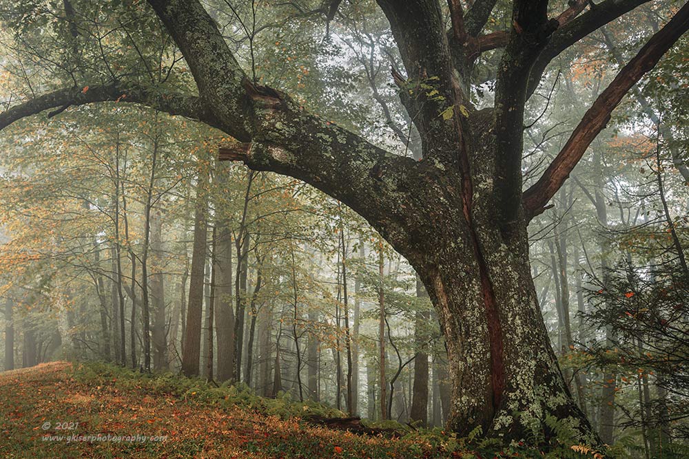
Landscapes don’t have to always include scenes without specifically designed subjects. Quite often, you will find subjects that just stick out from the surrounding elements such as was the case with this tree off of the Blue Ridge Parkway. The process was quite similar in building this composition because I knew that my main focal point and visual anchor was going to be this strong tree. The question was going to be how I was going to situate in a photograph. The first thing that I did was to walk around the tree and find where the branches became most harmonious because the last thing that I wanted was a confusing gaggle of branches at the top of the frame. Once I found the angle on the tree, I started to look around the tree to see what was there to work with. To the right was a forest that wasn’t really all that special and didn’t go with the flow of the tree. In short, I didn’t like what was to the right of the main subject which I did like. To the left, was a repeating patter of much smaller trees as they went into the background, softened by the fog. I liked that element, but just beyond the frame, to the left, was the actual Parkway. The road didn’t fit my vision this time even though I had successfully captured a similar composition before which included the roadway. For this instance, I decided that I didn’t like the road. I did like the soft colors of the foliage in the forest behind the tree, and the sky wasn’t too obtrusive thanks to the remaining foliage in the trees. I had a list of what I liked and didn’t like so I started to form my composition.
Since this photograph was about the large tree, I chose to place it off center along the right third line of the rule of thirds. The most interesting part of the tree, where the intersection of the limbs happened, was placed close to the upper right third. I then used the predominant branch that stretched out to the left as an upper frame within a frame to draw attention to the smaller trees that were in the background. This limb also established the perceived motion of the subject and further dictated me placing the tree further to the right of the frame. By using a wide angle lens, I was able to amplify the size of the foreground tree while reducing the scale of the background, forcing them to become more about the repeating patterns than individual trees. It is the perspective here that makes the image work so well because had I stepped back and used a longer focal length, there would have been no visual tension in the image and no drama. By using the established rule of thirds for placement along with my preference for available backgrounds, I was able to create an image with an overall unity which is what composition is all about.
I think that the rules were pushed so much because they are the safest way to produce a successful image based on history. Like I mentioned, these similarities in images have been around for centuries and have proven to be a good way of organizing your elements. You just have to keep in mind that when these rules were first being used, they weren’t rules at all. I doubt that painters in the Renaissance would look at their canvas and place a tic tac toe board over it and start to paint their main elements right at the intersections. That would essentially kill the creativity that they had. No, I’m sure that they just started placing the elements as they saw fit in regards to balance within the frame. The similarities between different works started to be noticed and the rules applied based on those similarities for those learning later on. The compositional rules are a great place to start learning, but once you learn the guiding principals of balance, visual tension, and depth, the rules all of a sudden are less important to the success of your images. You will find yourself following the rules out of instinct rather than on purpose. That frees you up to be a much more creative photographer…or painter…or whatever you are into. Rules stifle your own creative nature and if you choose to adhere to those rules and pull out your checklist with every shot, you will find that your images will always look forced, much like that foggy church picture that followed the rules explicitly.
Create a Dynamic Composition with Balance, and Visual Tension

When you put it all together, you should be able to create images that really pop and tell your story. Lets look at this rural scene from Ashe County that was captured last Fall. What I saw here was the barn and that was my reason for stopping. Of course, the barn would just be a simple postcard shot if I filled the frame with it and called it a day. Sure, the barn looks great as all red barns do, but it is boring without a story and context. I needed to add drama to the scene and the way to do that was with visual tension, but I needed to keep balance for that to work successfully. The last thing that I wanted to do was to arbitrarily place the barn at that intersection of thirds and take the picture without any regard for the surroundings.
I started off with those two main questions…what I liked and what I didn’t like. That was actually pretty easy since I liked the yellow trees in the background, I liked the diagonal slope of the hill, I liked the cows, and I liked the implement just in front of the barn…which I liked as well. In short, I just liked the entire scene which meant that I just needed to organize it to make it interesting. The yellow trees were all around, but I couldn’t include them all because the barn would become an afterthought in the image. I had to scale it down. That worked because the one thing that I didn’t like about the scene was the sky, which was completely overcast with no detail. By scaling the image down and including just those elements that I liked, I would be able to crop the sky out completely. I knew that without the sky in the frame, the roof and the lower section of the barn would be the brightest elements in the scene so the eyes would go there first. That was perfect, because that would give the barn the visual weight that I needed it to have. The red would also be the most saturated color which would have that same effect. With the bright roof and dark windows, I had the contrast that I needed to keep the attention here as well. That allowed me to make the barn smaller in comparison to the other elements in the scene because it had all of those things pulling your eyes. That meant I needed to place the other elements in primarily one direction from the barn and place it close to a corner since it was an anchor for the scene and I wanted everything to radiate from it.
I looked for triangles here and found that by including two large clusters of trees I was able to get one triangle established. I moved from left to right so that I could get the barn into position to where the red diagonal boards on the siding pointed to both clusters of trees. They were opposing diagonals which would have been distracting had they not pointed to anything since this was a visual anchor to the image. I got in that position where I felt that the diagonal planks were doing that job quite well. I framed the image at the top so I could just crop out the sky while leaving both clusters of trees intact in the frame. I gave the barn just enough breathing room on the right side to include just a hint of gold on a neighboring tree that faded out into shadow to establish the end of the frame.
The lower section was a bit more difficult to deal with. With the way I was framing the entire image, the small farming implement that I had liked was not all that visible now so I could have cloned it out, or even cropped in close to eliminate it. That would have put the barn too close to the bottom. With the line of yellow in the field, I needed to go a bit lower to give that bright area a bit of room underneath so it didn’t pull the eyes out of the frame. I chose to include the red equipment as it helped to balance out the large amount of red with the barn. I also found that there was another triangle that was formed with this added between the cows and the barn, or just with the cows which were small as well. Having two distinct cow shapes, I needed to have a third element to really make them make sense. This piece of equipment pulled the cows in because they shared a sense of scale. Those three elements all provided balance to themselves. and in turn provided a bit of balance for the comparatively larger barn. I had balance on a small scale and a large scale several times over.
The fact that the barn was placed so close to the corner gave the visual tension as the eyes kept moving around the scene while always returning to the barn. There was no leading line to direct your eyes where to go here, but by taking into consideration the brightness, contrast, and saturation of the barn, I knew that the eyes would settle there. By adding elements that formed triangles with the barn, I was able to pull the eyes away in different directions while not having anything close enough to the edge of the frame to allow for a visual escape. This composition loosely follows a few of the “rules”, but none of them are exactly followed. What I did more, was to take different visual fundamentals that I have learned and put them to work in order to direct the eyes where to go and where not to go. Doing this was much more helpful in this image than following rules of placement. It allowed me to create a dramatic image with lots of visual tension which told a story, complete with time and location. Compare how this image played out to the black and white church scene from above. If you think about it, the main subject is placed similarly, but the inclusion of all of the other aspects makes this a much more dynamic image and is more comfortable to look at.
Conclusions
When we are learning photography, it is so easy to get caught up in the rules because they are presented to us in a way that makes us think that we have to use them or our images will not be good at all. Even when you hear photographers say that the rules are more guides they do so in a way that makes you think that they are somehow special and are just so good at what they do they don’t need to adhere to the rules to get epic images. They always miss telling you the part where they are looking for balance within an image and applying bits and pieces of all the different rules whether they know it or not. The images that I have shared here today weren’t really created adhering to any specific rule. Instead, I used a combination of facts about how we see, and how the established masters have created images in the past to come together to create the images here. They might not fit the rules exactly, but they represent a combination of all the things that I have learned. You can do the same thing as you get out and find out what works in your own style. We each see things differently, but the main thing to remember is all compositions start with two simple questions. What do you like? and what don’t you like? once you answer those questions start organizing the elements that you want in the frame keeping in mind that you have to tell the viewer where to look in your scene. What is important to you should be important to them, but you have to tell them what is important by how you frame the image.
In the beginning, this is more like a check list and I’ve kind of illustrated how that check list works when I am creating a composition. It sounds cumbersome, but honestly once you get used to going through the process, it becomes very quick most of the time. The more you do it, the more proficient you will become in the process. Just remember that you can have the best light and the best subject, but if you miss the composition, the picture will be boring, or even confusing for the viewer. It is worth spending time on the composition, but far too many worry about the technical aspects of settings more than the content of their photograph. Settings don’t make a photograph any more than a camera makes a photograph. It is your creative vision that is responsible for the image, and the most important part of that equation is the composition. This is why you start with the composition before you even bring the camera out. Once you have the composition, you work through the technical stuff which is all subjective for what you are intending on capturing.
I do hope that you have found this beneficial and interesting. If you aren’t a photographer and have made it this far, congratulations! You are now qualified to look at an image and understand why you like it so much. You will start to evaluate where your eyes are going and why they are doing that. It will greatly help your appreciation for the art. For those of you who find yourselves behind the camera, consider some of these tips when you are putting together your image. Be thoughtful in your compositions and you will find that your images will improve greatly. Let me know if you feel a workshop dealing with compositions would be something that you would be interested in. I would love to put together a workshop for this topic again.

Remember to use the code KISER10 to get 10% off your purchase