Wednesday, August 6, 2025
I’m thinking that you all have caught onto the fact that this is yet again, another multi-part blog. I tried to keep it hidden from you, but you are just all too smart for me. I’ve obviously grossly misjudged the amount of work that I started for myself when I went out the door on Wednesday morning. I’m not complaining, because a successful day with the camera will always be a very good thing in my mind. I was just really ready for a bit of a break. Yet, here we are starting in with NOT part 3 of this blog series. How much longer can it go? Stick around and we will find out the answer to that question in due time.
When we left off with what wasn’t part 2 of this blog, I had come to the realization that I was spending much too much time with each individual subject. While I could do this if I had gotten an earlier start with the day, the fact that I was getting started after 2pm made time an issue and there was so much that I wanted to capture. During the tour that I had been given on the property, I had seen a Rambler American between two of the buildings. Now, this is not a flashy car in any way, but it is one of those cars that I will always try and photograph because those were some of my Grandfather’s first cars when he got out of the Army. I grew up hearing stories about them, and how Mom learned to drive in one (although the story included a sidebar about how she drove over a sapling tree in a yard). I made a mental note to myself that I was going to come back to that car and get some photos before the day was out. There was a long list of cars that I wanted to spend some time with that was being developed as we walked around.
After having finished up working with the Polara drag car, I was ready to move onto the next subject. I recalled seeing a very interesting Chrysler Imperial on the other side of the yard and went over to check it out. It was a big beautiful boat of a car, but it was in really good shape which made it difficult to find isolations on it. It was parked in a way that there was no way to get an establishing shot of the car between two others. While I might have been able to work something out eventually, I just didn’t have the time to fool with what I was thinking was a lost cause. There were other subjects to be worked which were in better situations. One of these was a Chrysler sedan that was parked under a shelter beside a barn. That car had patina for days and just a wonderful look to it.
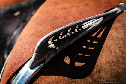
I walked over there and started to look at the scene critically. There was really no way to get an overall shot of the scene because of too many distractions around the car. However, I was able to pick out some isolations that interested me. The first thing that I wanted to work was the hood ornament and emblem. These appeared to be pretty easy to photograph, and I moved to the front of the car to start working out a composition.
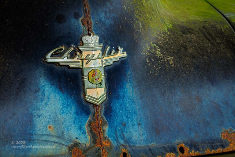
I had to work around a few lawn mowers and a large tank which were at the front of the car but started to get something dialed in that I was kind of liking that included the emblem and the ornamental trim at the top of the hood. I just couldn’t get the exact angle that I needed because of how the mowers were sitting in the front of the car. I know you are thinking that it should be easy enough to move things out of the way, but that is not how I operate, especially when I am just meeting the owner. I don’t like to move anything or disrupt anything around the cars. My goal is to leave without leaving any trace that I was ever there. I feel that this gives better photos in the long run and certainly goes a long way with the owners.
There comes a time when a decision has to be made when the angle can’t get achieved. I was still using my standard zoom lens, which was the better lens for this subject, but I needed to be able to set the camera up further away to get the angle that I wanted. That was going to necessitate the telephoto lens which I just decided to bite the bullet and switch out for. Now I was able to get the camera beyond the mowers for a better angle. Now the scene looked a bit flat to me due to the lack of perspective distortion that I had with the wider lens. It was the best compromise though and I worked out a composition that fit the perspective I was seeing. This meant that I had to give up on the hood ornament in favor of the emblem which was in a sea of blue with a bit of green moss in the upper right corner for balance.
This worked out quite well and I was feeling good about this car once again. I was over the front end though because it was such a problem to get a good shot from, but I still had a lot of car to look over and work. As I went to the back, the size of the taillights struck me as odd. For as large as this car was, the entire taillight housing was about the size of a marker light on today’s cars. It looked out of place on the rather large quarter panel, but oddly well designed into the car. That became the next focus of mine for a composition.
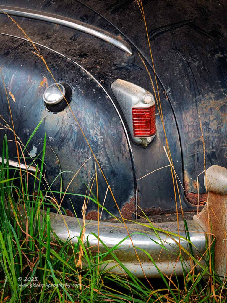
Now, I didn’t want to just get a photo of the taillight because that would have no scale at all, and the quality of the subject that interested me would have been lost. Instead, I decided to use the power of “And” and start adding elements to the scene for context and scale. The gas cap was a natural fit, as was the chrome trim along with the body seams above. Those added a bit of visual flow to the image and the curves brought about a repetitive pattern of sorts. Those leading lines took the viewer through the areas that I wanted to show off, but they needed to go somewhere to keep the eyes from just exiting the frame. This meant including the bumper at the bottom of the frame. Because of the choice for where the left edge was, I had a bit more trim that entered into the frame from the left which needed a balancing element to the right. That came in the form of the bumperette to the right. I debated with myself for a bit on how much of the bumperette to include. I don’t like cropping into elements like this to where anything looks accidental, but to include it all would pull the eyes down to the bottom right corner and lock them in. To omit the bumperette would also force the eyes out of the frame to the right. I finally chose to make that crop through the piece and use it like a framing element which turned out to be the absolute right choice.
After all the working around to figure out the composition, I had something that provided a road map to everything that I felt was important in the scene. All the lines and elements played a part, and even the tall grasses at the base of the car helped to tell the story of what we were looking at. The colors all worked together with the blues, oranges, and greens, with that dominant pop of red from the taillight. I had truly simplified the scene from what I was seeing through the opening in the posts for the shelter of the barn and the different items that were around the car. This could very well be out in a field away from any distractions, but it wasn’t. I was really happy with how this one turned out.
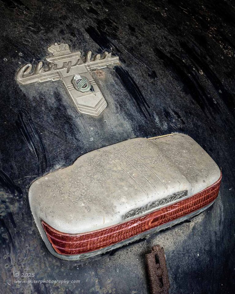
It was while I was working on that back corner that I had spotted the emblem on the trunk that matched the one on the hood. It was positioned above another light housing, that I imagine was the brake light. There was some script in the housing that indicated the luxury transmission that the car had. It is hard to see in this low-resolution web sized image, but in the full resolution file, you can clearly see “Fluid Drive” stamped in the housing. It is the little touches like this which I love to capture with the photos. The question was how to get that shot.
As with the hood, I had a very hard time getting into position behind the car to get the shot which forced me over to the side. This was both a blessing and a curse. I didn’t like my composition being dictated by the fact that I could only stand in one place. However, it did force me to do something different than the straight on symmetrical shot that I would have started off with had I been able. Now that I was off to the side, I was looking at things at an angle which worked quite well for the scene. I would have liked to have gotten a bit lower, but that wasn’t possible. I just kept making the adjustments that I felt would make the image stronger. Eventually, I landed on this composition and really liked it.
The processing of this image was a bit different than the others with the car. I went with a color profile that desaturates the scene and seems to really emphasize the blues. It is one of my favorite color profiles when I am needing a bit less punch to the colors and have found that it is very helpful when blue is a main color. I needed the colors toned down and wanted to really concentrate on the blues and the reds as the main colors. This profile did just that, and I was able to build the colors back up to where I needed them in a more convincing way. The end result has a duotone look in many ways but fits how I saw this scene. The mass of blue colors doesn’t dominate the frame which it was threatening to do with a more “normal” color profile.
I spent some more time around the Chrysler, but I didn’t want to spend all my time here on just a few cars. I was hoping that I could come back another time and dig deeper into some of the subjects. For now, I had to keep moving so that I could cover all that I was inspired by while I was here. I started to look around and remembered that there was a Dodge Coronet sitting in the weeds between the two buildings. This was a scene that was very specific to this time of year, and I had to get it while I was here. In the colder months, the vegetation would die down and make the background more visible. While I liked the Mustang that was behind it, there was no benefit to having it in the shot. This was the right time to photograph the car, and I wanted to go over and work on it for a bit.
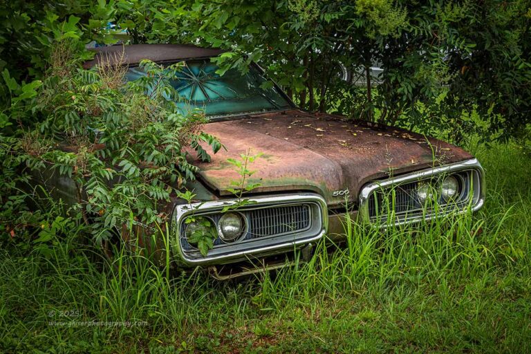
For the first time during my time here, I was able to get an overall establishing shot of a car. It almost felt too easy, and you might point out that I still wasn’t getting the whole car. Yeah, that is true, but I was getting all of the car that was visible while including the surroundings. That counts as an establishing shot without question. I was still using the long lens which was the right choice here because I didn’t want to stray too much from where you see the edges of the frame because I would start to include other elements that I didn’t want. The telephoto lens allowed me to keep things very much to the point.
What I loved about this scene was that the grass was grown up around the front of the car and the vegetation was very much covering the sides. There was only a bit of the windshield that was visible and that had a beautiful radiating crack which was perfectly framed by the vegetation. The deep greens of Summer which I usually don’t care for somehow fit the scene and balanced the reddish tones of the rust. It was a photograph that was already crafted and just needed to be captured. It was almost too easy, especially compared to the struggles that I had been having with the other subjects.
of course, the point could be argued that I was finally starting to get into my groove with this location. It always takes a little while to really listen to the landscape and figure out how it wants to be photographed. I know it sounds crazy, but the longer I am at a location, the more I understand it. With that understanding comes the discovery of the nuances and how the story should unfold in photographs. My mind was settling down by this point and I wasn’t quite as overloaded as I had been.
Of course, you will recall that when I first spotted this location, I was interested in just a single vehicle that was seen by the road. When I came in to try and get permission, I found a few more subjects that I wanted to photograph. This is that “plus 1” rule that I learned as a police officer that applies even more to this kind of photography. If I see one subject, there are usually more to be had in the area, or on that property. By the time my tour of the location was over, and I had permission to shoot, I had discovered a dozen or more subjects that interested me. My brain was in overload, and I was thinking that I only had a few hours to work the area before I was going to have to head home. I would compare this location very similarly with the spot that I conduct my decay workshops where I have found it easy to spend an entire day out there and still not get everything photographed that is worthy. I was just out here chipping away at the visible part of the iceberg and really starting to understand the area that I was in.

Part of that understanding was seeing how some of these vehicles had been here for some time and wanting to capture that aspect of time passing. With this Coronet, I had a great opportunity to show off that aspect because of how low to the ground it was with the tall grass growing up through the grills. It wasn’t so tall as to obscure the interesting parts which made this a great subject to work with. I got in closer to the front of the car and went over to the side for a bit of a diagonal aspect to the scene. The main focus was on the passenger side grill and headlights, but I wanted to include the 500 badge between the snouts as a framing element. It made sense because for those that look closely, you can see the 500 badge on the fender to the left. it is subtle, but there.
Since the main subject here was the chrome bits that really had no color, I didn’t feel like I wanted color to be a part of the story. Black and white is much more effective at showing off design language like this and I wanted the impact to be on that chrome surround and the lights. The rest of the scene was all there to support that and tell the story of location and time. I didn’t need color to accomplish that. The end result of the photo was just what I wanted out of it. I loved the fact that you could see the details that were missed in the overall shot like the weeds growing out of the headlights. Even Toni noticed that right off when I was showing her the photos for the first time. It is the recognition of details like that which are easier without seeing the color. The color would have complicated the scene, while making it more familiar and causing you to miss little details like that. Because black and white is not a familiar way to see, we are forced to look deeper in the image for more clues. That leads us to those little details that I wanted to showcase.

That isn’t to say that I would dismiss color in an isolation of this car. Far from it, the rich greens, thanks to all the rain that we keep getting this year go really well with the rusty tones that the car had. There were other aspects of this car that I wanted to capture like the 500 badge on the front of the car. Normally, this would be a place for a crest, or a brand logo, but Dodge decided to put this badge here instead. I really liked how it was bookended by the inner portions of the grill and quite literally underscored by the opening from the popped hood. This seemed like a great opportunity to use that straight on approach that I have been trying to get away from recently. There was an inherent symmetry with the scene, but the tall grass added a little visual tension that made the otherwise calming composition a bit more active.
I worked out how I wanted to frame this for a bit. It actually took longer to get this composition dialed in than the other two that I had shot of this car. It was not all that easy to make a scene that was not truly symmetrical due to a leaning hood, and grill pieces that might not be exactly true to one another appear symmetrical. That is part of the beauty of imperfection which is a cornerstone of wabi-sabi. I chose to embrace that here and not worry about exact symmetry, just the indication of it as a compositional element. The badge was the main focus, and the grass gave the color balance to the scene. Everything else was just there for framing and for directing the eyes into the frame.
It is a fun little photo which you look at and have to think about to figure out what you are looking at. For those that aren’t familiar with Chrysler design language from the era might not even know that you are looking at the front of the car. It is questions like those that I have always enjoyed asking of the viewer of the image. Something like the spider web that is in the space under the hood forces the question of how long has the car been left here untouched. The height of the grass makes you wonder if the car has wheels, if it is buried, or what is going on below the frame. These questions all keep the viewer engaged with the photo, and in the age of scrolling and swiping, if I can keep you engaged with a photograph for more than 0.0004 seconds, I am winning.
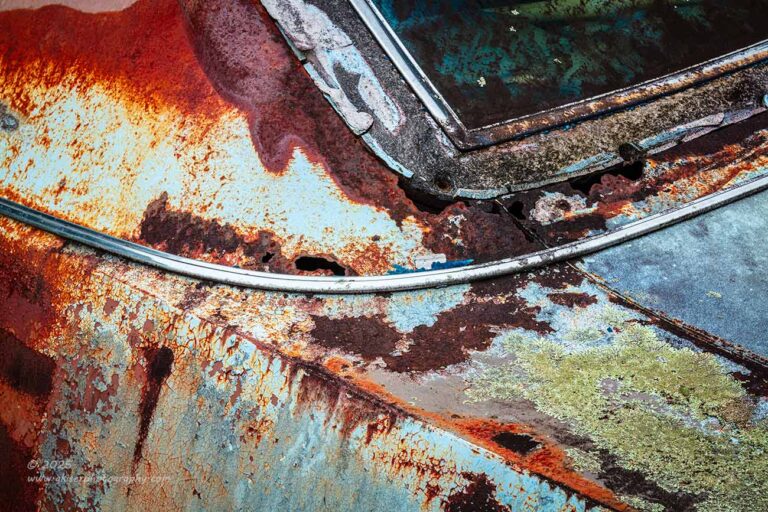
Through the weeds around the previous scene, I could see the large Chrysler Imperial which was behind the next building. Since I had been looking that way, that was the next shiny squirrel that I started to chase. Sadly, I completely forgot about the Rambler that was parked off to the right of where I had been working. The Chrysler was parked in line between a later model Mustang and a box truck with several boats on the side of the car. Nothing about the scene indicated that I was going to be able to get an overall composition shot of the car. I mean, the car was at least a football field in length and was maybe a foot away from all the other vehicles around it. Knowing that I wasn’t going to be able to get that full composition, I started to look for some isolations. Not being overly familiar with the car, I struggled trying to find those isolations because I just didn’t understand the design language of it.
Eventually, I reverted back to something that I understood and could photograph quickly. That was an abstract showing off the wonderful patina of the car. I always find good lines at the base of the C pillar or A pillar. In the case of this car, the best combination of lines, shapes, and colors came from the rear section of the car near the base of the pillar. I’ve shot similar compositions for a while now and I was able to get one figured out pretty quickly. I really did like the combination of colors and textures with the shapes creating the composition for the abstract approach. It was simple and effective and allowed me to get a shot of this big car.
I then moved to the front of the car and started to work the front quarter like I enjoy doing. The problem was that there was not enough room to get a good view of the corner of the car, and I wasn’t liking how the rest of the scene was developing as a result. I went to the driver’s side and found there to be more room to work thanks to the box truck being shifted slightly over. I also had the grill emblem that indicated the model of the car which was a big plus. The issue here was that the weeds were covering the corner of the bumper which housed a light and a great point of interest. It was a thin light, and I decided to focus my attention on the badge instead which was framed with the weeds. This composition felt awkward because of the scaling, and I decided to abandon it after two frames. I had more subjects to work which I was confident would be easier to deal with.
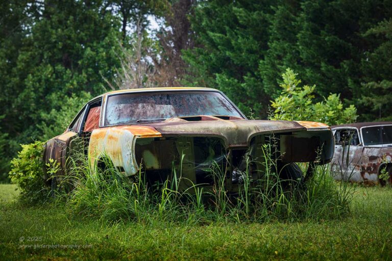
Just to the side of the Imperial and a bit closer to the building was a Dodge Super Bee that was missing a lot of parts, but still looked awesome because of the patina that it had and the fact that the grass was grown up around it. I had spotted this car during the tour and had really wanted to photograph it. The problem that I was facing was the background. In all directions, there were either cars, boats, box trucks, buildings, or some other distraction that would have to be dealt with. I knew that this was going to be a hard one to photograph, but I also knew that I would be able to find a way because at least it was sitting alone for the most part.
I was still using the long lens and decided to use that to my advantage for the compression of the scene that it offered. I got a good distance away from the front of the car which put me under the trees. This was actually great timing because it was starting to rain once again and by being under the trees, I was able to keep the filter dry on the end of my lens. This also gave me the excuse to slow down a bit and really work this out because I was able to keep the camera dry as long as I was sitting here.
The reality hit that there was no way to avoid getting something in the background. From the driver’s side of the car, I was getting the building and another vehicle behind the Dodge. I really didn’t like the composition at all. From the passenger side, I was going to get either the Imperial or the box truck in the background. Obviously, the truck was a hard no from me, but the Imperial was from the same era which would work. It was such a big car that I didn’t want it to garner too much attention due to visual weight. This meant that I was going to have to crop it down and only include a bit of it.
I worked my position around a little bit and found where I could get the right amount of separation between the Super Bee and the Imperial and then found where I liked the crop through the Chrysler. The composition was really starting to come together at this point. I just had to figure out the rest of the edges in the frame.
This is something that I have spoken about several times both in the blogs here, and with my clients on workshops and mentorships. Finding the subject for a composition is the easy part. The hard part, and where I spend most of my time composing is dealing with the background and the framing of the image. Honestly, with this photo, I lost all track of the main subject because that was a given for the photo. Sure, I could make a snapshot of it and not care about what else is in the frame, or where the frame actually begins and ends, but that is usually the difference between that snapshot and an artistic photograph. I’m out here to create art, not a snapshot, so I spend that extra time worrying about the background. That was 75% of the heavy lifting for this photo, and what makes it work as well as it does.

The Imperial is in the shot, but it is not intrusive at all. Despite it being some seven times larger than the Dodge in reality, it was looking rather small in the background. The small snippet of the car gives just enough clues that you can tell the era that it is from and the state of neglect, both of which support the main subject. Because it is so much brighter than the Dodge, I had to be very careful with tones and scaling because I knew that it would pull the attention away from the Dodge. However, by picking an area of the car that had some darkness to it, I minimized that problem and then burned it a little in post to further darken it to where it was no longer a distraction. It would still pull the eyes a little bit but having it right next to an area of high contrast and visual interest due to the shapes of the front of the Dodge, it would pull that attention right back to the main subject. If all else failed, there was the reddish color visible through the passenger door opening that would certainly pull you attention back to that side of the frame.
You see, it is very important to understand how a typical viewer will read a scene. This allows you to craft the composition to force the viewer to see things in the way that you want them to. It takes a little practice, but eventually, you can see these opportunities in the field and then enhance them in post to make the photo “work” the way you had envisioned it. These are the things that make the most impact in a composition and are more important that following “rules” of placement.
My next photograph is another example of using the way that people see to create a composition that really has no bearing on the compositional rules. I was still working with the same Dodge but had really become fond of the hood with the holes from the scoops that had bene removed. There was something about this that fascinated me and now that the rain was calming down, I wanted to spend some time trying to figure out why it fascinated me so much.
The hood had a green tint to it and the rust was this beautiful red/orange tone. The patina of the hood gave some really nice dark areas, but all of this was very faint to the eyes because of the sun bleaching on the hood. The shapes of the openings were very interesting to me, but even more so was the hood framework that was visible through the holes. The more I looked, the more I became involved with the scene, not for what it was, but for what I was trying to make it be beyond just a hood. It was an abstract ready to be photographed, and that was what I wanted to do with it.
I was still using the long lens which worked well for the scene, but it did require me elevating the camera rather high to get the right perspective. Once I did, I was able to frame the image with a couple of key aspects determining the framing. Again, I knew that the subject was going to be the holes in the hood, so I no longer needed to worry about that. What I needed to be concerned with was where the edges happened to fall. The frame itself is a valid part of the composition and introduces the shape that is the base of the composition. For a bit of interest, I went off to the corner of the car so that the main shapes would form diagonals rather than just a static vertical shape. I used the orange fender on the other side of the car as a framing element that formed a triangle in the corner with a color that matched the inner parts of the hood framework. I used the cowl vent as another frame element that had a subtle pointing quality into the middle of the frame. The lower left corner was dominated by the dark patina of the hood for a natural vignette while the bottom right corner had just a hint of orange that matched the fender and the color of the main subject. One last detail had to be worked out because the composition looked kind of static with the main subject in the middle. By shifting it to the point of contacting the left side of the frame, it gave a point of entry to the viewer from the left side which is how we read a photo. Now, the viewer will enter the photo and proceed into the void of the hole which has detail at all. Searching for something to lead them out of the hole, they will find the lighter shades of orange and now it is game on with browsing the full photo. The more you look, the more you see, and the more you see, the more you speculate about what you are viewing.
The processing was the last step in this photo, and it was actually pretty easy to do with minimal local adjustments being made. I just make sure that the blacks were completely black and then added contrast to the midtones to make the colors really pop. A bit of extra saturation finished it all up and the image exceeded my wildest expectations. I’m a fan of abstracts created from these subjects, and this one really came through for me. There was a lot of thought put into this rather simple composition, but the idea isn’t to wow you with how much effort the photo was to create. I want you to see it for the simplicity that was created which invites a lot of visual exploration.
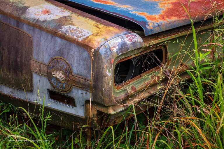
I’ll admit it, I was feeling pretty good after the hood shot and was ready to do more with the patina on this Dodge. I was quickly finding this to be my favorite subject that I had shot out here. That is saying something considering how much of a personal connection I had with the Z that started it all earlier in the day. The Dodge had some interesting things going on like a door that had been removed and then set back against the opening that it created. I wanted to do something with that but wasn’t sure exactly what that composition would look like. As I approached the back of the car, I could see the iconic decal that adorned the quarter panel but had obviously seen better days. I knew I wanted to capture this, and I had an idea how I was going to do it.
Looking back at how I have photographed the rears of cars previously, I felt pretty good that doing the taillight composition with a slight adjustment would work very well here. Normally, I would be focusing on the taillight and using an emblem or marker light to balance out the composition while having lots of great diagonals to keep the excitement in the image. Now, I was looking at no lights, only holes where they had been. The main focus of the composition was going to be the remains of the decal. Fortunately, it was surrounded in a lighter color than the rest of the car. This was going to help pull the attention to this area. There were more vivid colors on the trunk lid, but that was going to be a framing element, and I could balance that with the grass below the car which was getting a bit of light from the cloudy sky above.
I started to put the composition together, again looking at the edges of the frame more than the subject. I needed the framing to be just right for this one because I was trying to get the main focus to be something that was barely there in the first place. My positioning made it to where two tall bits of grass framed the decal in addition to it being in a lighter shade which would draw more attention to it. The taller grass to the right served as a framing element to make your eyes bounce back into the frame to the left to see through the clearing. The contrast of the empty taillight would be the next visual stop, but not wanting to spend time in darkness, you will go to the lighter areas. If you go up, the lines of the trunk will curve you back down to the decal, but the white-ish surrounds of the decal will ultimately bring you to that point to see the bit of extra micro contrasts that I brought into the image. Again, it is the little details like this which you will more than likely not realize you are seeing but will direct your eyes to show you what I wanted you to see (insert evil laugh here as I say, “My evil plan is working”).
If you have been keeping track, I am now 20 photographs into this stop that I really didn’t think was going to work out. Am I done yet? Well, I promised that this wasn’t going to be a multi-part blog entry, so this has to be it. Well, we are three parts into that lie that I told, and I’ll be back with what surely won’t be part 4 tomorrow. The question is, will that be the end of the trek? Meet me back here again tomorrow and we will hopefully find out if there will be more chapters after tomorrow or not.
In the meantime, don’t forget that I do sell prints of my work and have been doing quite a few prints here lately for clients. You owe it to yourself to see what the fuss is all about when I say that there is no better way of enjoying a photograph than in its intended form. When you remove the variables that are introduced by your viewing method like screen brightness, contrast, and even color rendition, you are seeing exactly what I, the photographer, wanted you to see and in the way that I intended. When I make a print, the colors and overall look of the photo are exactly what I have created based on a fully calibrated system from capture to print. There are no more variables, and you are left holding my vision and my execution of that idea. I would love to match you up with a print of your favorite image today!
I’ll be back soon…