Welcome back for another installment of my monthly Behind the Camera Feature. If you are back after reading my last entry, I applaud you. I’ll admit that the topic was a little heavy and I might have come off sounding a bit melodramatic, but that is exactly why I waited until I was in the right place mentally and emotionally to tackle it. This month, I want to delve into something a little more fun and informative which is mostly what this feature has been about. I’ve realized over the last couple of years that I am handling my black and white images differently than I have in the past. Looking back over the last 20 years of doing photography, there have been times I’ve been in that camp where I would just post a color and a black and white version of the same image. I might have even said the dreaded, “I can’t decide, which do you like better?” I’m not saying that an image can’t be successful as both, but I’ve learned over the years that for the most part, the presentation of the image has a lot to do with what the photograph conveys to the audience. There is a certain art to this decision, and I can assure you that it is not as simple as black and white.
With color photography starting as early as 1861, you would think that the precursor presentation of black and white photography would have faded away into oblivion, in favor of the new medium. I mean, we don’t see in black and white, and photography is supposed to be able to capture what the human eye sees better than any other medium. Certainly, by the time digital came into play, we would have forgotten all about rudimentary black and white photography. Yet, there are several digital cameras that only shoot black and white. Leica is one that comes to mind on that front. Not only that, but just about every image editor out there includes a way to convert a color image to black and white. Surprisingly, there are plug-in programs which are specifically geared to converting images to black and white and that is their whole reason for being. After more than a century and a half of being able to create increasingly high-quality color photography, why would so much effort still be placed on the simple black and white image?
That is what we are going to discuss here today. More accurately, why do I choose some images to be black and white while most of my photography is in color? It is a creative choice that I make at one of three points in the process of creating a photograph. If I am really on my game, I make the choice in the field at the time of capture. This is probably the best stage to make the choice because I will typically look at a scene differently if I am anticipating it to be shot as a black and white. I might make the choice during the culling process when I am considering how to fully edit the photo, or in a few cases after doing a full color edit where I’m still not convinced that color is the way to go. At each of these points, the decision is made based on several different criteria which goes a little further than saying “black and white gives the photo a classy and timeless feel.” This is the reason that I see given for so many black and white photos online and I think it is a copout. The decision really should come from a very different place, and the photographer should understand why a particular photo looks better as either color or black and white.

In the formative years of photography, even well after the color photograph was invented, black and white was the norm for most photographers. Why would you want to shoot a dated format when the technology was there to shoot in color? Back then, even well into Nineteen 60’s, the choice was made for the simple reason of cost. Yep, color photography was cost prohibitive to create. The film was more expensive, and the processing was more elaborate and expensive than black and white. Photographers stuck with black and white out of a financial decision mostly. They learned the way a scene would be best captured without color because in order for a photograph to have meaning, there had to be visual clues as to what you were looking at. Most everything in the world we see is based on color information. That is our default. Shapes and luminance values are a secondary concern in most cases. Think about it, you walk outside and start to look at things. You think to yourself that you are seeing green trees, a blue sky, that cute little red convertible driving by, a brown dog, and so on. You don’t register the fact that you are also seeing different contrasts thanks to how the light is catching certain objects. You don’t see the structure of a scene, or at least, not at first.
The challenge of photographers has always been to represent a three-dimensional world in a two-dimensional medium. When you take color out of the equation, you can easily lose the context of what you are seeing and just view it as a simple photograph. Those early photographers, even in the latter half of the twentieth century, had to understand this and formulate a way of seeing a scene that would transform the colorful world that we live in. Those concepts have carried forth in photography and have defined how images should be created whether in color or black and white. It is this way of seeing in black and white though, which has kept the presentation alive and well to this day. When done right, a black and white photograph can be so much more impactful than a color one.
With that in mind, shouldn’t all photographers strive to create only black and white images? Wouldn’t those be the most impactful ones of all? There are some that believe that and will only shoot in black and white. I’m not here to disagree with them, because when that is all that you shoot, you become an expert at seeing the world sans color. I’m of the opinion, however, that there is so much beauty in the world that to dismiss either color or black and white is doing my craft a disservice and limiting my options in how to create. I mean, it literally costs the same to create a color image and a black and white image these days when we are talking about digital photography. Film is another story, because you can still process black and white digital film at home for much cheaper than the color option. That isn’t the focus for today though. I want to really discuss why I choose the way that I do with my photography, when the decision is but a few button presses either way.
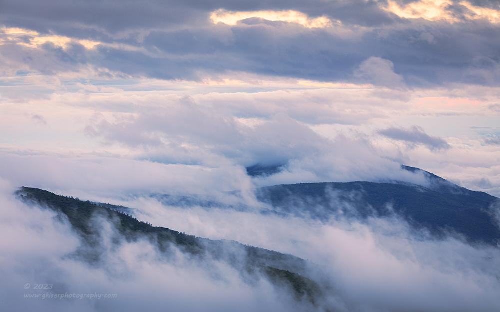
For me, I try to simplify my photos as much as possible from the creation to presentation. This means that I consider my compositions, read the light, and minimize or remove distractions. There are times when color is a distraction to an image. I try to keep color theory in mind for this decision. Colors have a meaning to us which is largely a common thing for the different cultures. In addition to colors creating an emotional reaction, there are certain color harmonies that should be entertained. If you have a great scene, but the colors clash, the colors will immediately become a distraction and a source of negativity. Other times, the harmonies all work together, and you are left with a scene that evokes the right emotional reaction. If you look at the image above, there are just a few colors present, but they all work together to evoke a calm, yet striking scene which leaves you feeling happy. Why did I not make this a black and white image? I felt that the colors directed the emotions better and helped to tell the story of the scene. Without the blues, orangey yellows, and magenta tones, the image would start to lose that connection which I wanted to be a part of the photo. Now, if this had been in the Fall with the hills all kinds of different colors, there would have been a division in emotion with the cooler tones showing a calming effect while the warmer Autumn tones would have been more exciting in the image. The contrast of emotions did not fit the scene and would have distracted from the story. I would have done a black and white conversion in that case to simplify the scene.
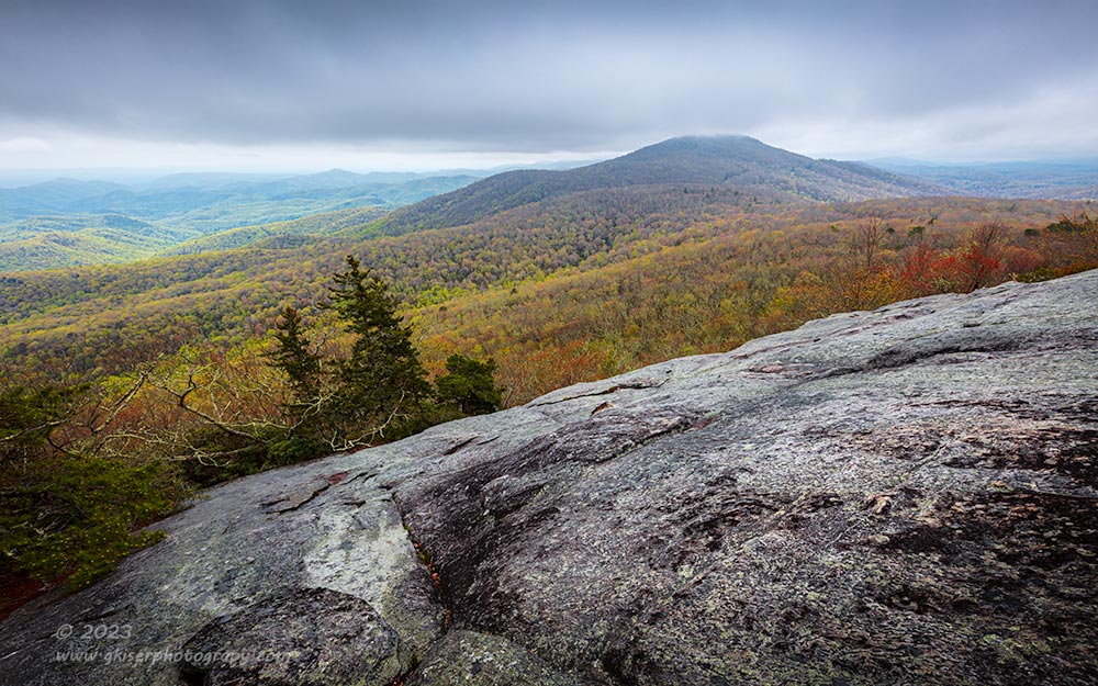
Speaking of contrasts, that is another consideration when it comes to whether or not an image will be done in color or black and white. There are a lot of different contrasts that I could be talking about, and these contrasts in a photo are key to its visual success. As I mentioned, there can be color contrasts, which as long as they fall within the color harmonies, they are good. If they clash, that is a bad contrast. More than likely, the contrasts that are most important to an image come from lighting and from object brightness. In this example, the lighting was very flat across the scene and when I looked at it from a luminance point of view (brightness), there was very little contrast there. Had I made this one a black and white image, there was just not enough contrast in the scene to really make it work. I needed the color contrasts between warm and cool tones to really make the needed impact. In fact, if you look at it in layers from top to bottom, I have essentially a swath of color in the middle of the image while the top and bottom are generally the same monochromatic tones. The composition framed the color which was the early Spring colors in the trees. This was the story that I wanted to tell, and the colors pulled the eyes into the part of the scene where I needed them to go. I would have lost that very important visual direction had I shot this in black and white.
As I did in the previous image, color can be used to direct the eyes to an important element within the scene. This can be a pop of color that really stands out, or a grouping of vibrant colors which pull the attention to an object within the scene. This is especially helpful in a complex scene where they eyes might struggle to find the important part of the frame. I run into this a lot in my decay photography. Part of the challenge in that kind of photography is to shoot it in a way that minimizes distractions. In many cases, those distractions are a part of the scene and if I’m lucky, the colors of the scene will help the main object stand out from the background.

In this example, I actually considered doing this composition as a black and white presentation. However, when I was editing the image, I decided to go with the color version because of one simple fact. In black and white, the truck blended in too much with the two structures. Had the light been different on the scene, I could have made this a black and white easy enough, but I needed that color contrast with the truck against the faded wood to really bring the attention to the subject. During the processing of the image, I toned the truck and the sky to be very similar hues which helped to unify the image. This is commonly referred to as color grading. The end result had a mostly cool color tone, with a touch of warmth thanks to the wood and rust. It was just enough to give the image the excitement that I needed it to have because of the flat lighting on the scene. Color was very instrumental for this image’s success. It helped to tell the story as well as giving the eyes more to look at while still making sure that the truck stood out as the main subject.
In cases like this, it is important to know that most people are used to seeing in color and in order to create that connection to logic and experience, color is an important aspect of photography. Let’s face it, as photographers we do want our images to be representative of reality at times because leaving reality behind is a sure way of making a photo visually confusing. The last thing that we want to do is create something that causes a disconnect between the photographer and the viewer. There is an exception to that which I will get into later on, but for the most part, we want the viewer to be comfortable with what we are showing them, and color is the ingredient of familiarity.

Take this image, which was one of my top 12 images last year. It is an abstract composition and a minimalist one at that. Imagine this without the color. We would just be looking at some dark gray sprigs against a nearly white background. We would lose a valuable clue about what we are looking at, and it would become boring. By introducing color here, I have created the emotions of calmness, stability, tranquility, happiness, and freshness. The colors also provide a contrast to keep the image interesting to look at, while not allowing the contrast to go over the top with light and dark. The colors here keep the image balanced and pleasing to look at for an extended period of time, and thanks to the colors, we know that we are looking at grasses poking out of the water. We aren’t spending too much time to gather an important piece of the puzzle which I didn’t want to keep secret. The scale of the scene was something that I didn’t think was needed, nor was the location of the image. Even the time of year isn’t important in this one. It is all about structure and composition, but the emotional connection was very much needed and provided through the use of color.
OK, I’ve spent a lot of time looking at why I have chosen color in my images, but this piece is supposed to be about black and white photography. Well, I wanted to explain why most of what I do is in color. I see in color, and that is part of my visual language. I’ve alluded to why I might want to choose black and white, but there is so much else at stake than saying if the colors get in the way to eliminate them. There are quite a few other reasons to go with black and white in your own photography. I’ve got a little something different planned to demonstrate how I look at a scene to determine if it will be in black and white as opposed to color. It might be a bit of an eye opener for you.

Before we get into that, I would like to share with you a couple of the times that I have recommended shooting in black and white during workshops and mentorships. The most obvious is a way to deal with strong light during a cloudless day. This is one of those times when I typically don’t like to do photography because I am not a fan of harsh light for landscape and decay work. For portraiture though, I have learned that harsh light can be exciting and beautiful light. When we are out in the field shooting either landscapes or decay subjects under a harsh noon sun, the compositions quickly become all about the contrast between light and dark. This is where black and white photography shines since its main component is the difference between highlight and shadow. You can take that negative and make it work to your advantage by embracing the shadows. Make the shadows the subject of your composition for a change of pace. This is something that I had to learn after my first workshop on the Blue Ridge Parkway when all we had was bright and direct sun through most of the day. I was at a loss of what to shoot during those hours but have since learned that black and white is a great alternative in those conditions.
The other situation where I will regularly suggest black and white photography is if the photographer is color blind. I’ve talked with at least four photographers that I can think of who have been red/green color blind. While this is not a complete lack of color information, it is a point of frustration in many cases, especially when it comes to post processing. In one case, the photographer loved blue tones because that was a color that he could see very well. That makes since when you think about the color space we work in as photographers. You might have heard about it before, it is RGB, which stands for Red, Green, and Blue. For those that are red/green color blind, that leaves only the blue channel where they can see proper color. Since every pixel is made up of a ratio of these three colors, those that are red/green color blind are missing out on a lot of that color information throughout the photo, or scene. When I started to look at the color images from this particular photographer, I felt compelled to get with him in a one-to-one situation and discuss the way that his photos looked. He had not been aware that the images had looked like a cyanotype monochrome image but admitted that he did push the blue tones. We talked about it for a while, and I explained some of the benefits of a color balanced image which he understood. I also offered a solution of shooting in black and white because then all he would be looking at was the luminance values of the scene. The beauty there, is color just doesn’t play a part and it translates a little better from how he actually saw the scene. Long story short, he has been creating more and more black and white images over the last three years or so, and they are amazing and beautiful. He has a way of seeing luminance that I think most do not possess. Black and white was a natural fit for him and he has made it his own.
Outside of those reasons, the choice for black and white photography can become a little more convoluted. I would love to say that any image will work as either a color or black and white presentation, and it is just a personal preference, but that just isn’t the case at all. There are a number of different things that have to be taken into consideration when creating a black and white image whether it is from the capture stage, or the decision during post processing. A good black and white image can’t be made from any color scene because black and white does have limitations like we have been talking about up until now. That doesn’t mean that black and white isn’t as good as color, because in many respects, it is a much stronger way of presenting a photograph. You just have to learn how to see in black and white and find the scenes where those limitations turn into strengths which will enable the black and white photo to surpass the color scene it was captured of.
In the case of the photo above, I chose black and white for a couple of different reasons. First of all, there was basically only a concrete color to the scene which I thought added nothing to the composition. Even in color, the photo was about shape, texture, and light. By leaving the color, we would immediately recognize the material that we were looking at, and more quickly recognize that we were looking at an exterior wall. I didn’t want to give that information away quite so quickly, so I pulled the color out. This left a composition that was more abstract and asked more questions of the viewer. I felt that the photo would be more engaging as an abstract. I wanted the focus to be the structure which was defined by the shadows as well as the lines. This is one of those examples where I shot it with the intention of being done as black and white, and exposed it in a way to capitalize on the contrasts that I wanted to focus on.
For the real introduction of why I choose black and white over color, I’ve decided to do something a little different. Instead of lots of text and uploading color versions of images that I have done in black and white, I’ve decided to do a video that takes you through the comparison in Lightroom. This will help keep new files from being added to the website server which is becoming a little overburdened with image files. It will also give me a chance to explain in a bit more detail visually. Let me know if you like the video format and I might do more like this in the future.
I hope that you made it through the entire video. I tried to remember to include everything that I wanted to say there. I know I talked a lot about contrast and how the eyes are directed based on the lack of color. This is usually the strongest reason for me to go black and white. It simplifies the scene and allows me much more creative control over the existing contrasts. Contrast is what makes a photo visually interesting and gives it depth. Even in the days when I was building models, it was contrast that helped to make the scale believable. In that case, it was a wash of dark tones over panel lines that made them look deeper than they were, and therefore made the model look more life sized, rather than a 1:48 scale representation. Those same contrasts can work with a two-dimensional photograph to make it appear more like a three-dimensional scene. If you know anything at all about colors, when you add contrast, you are making certain tones heavier and as you add intensity to those tones, you are actually increasing the saturation, and in some cases changing the hues. This means, by adding a great deal of contrast, you are actually changing the colors within the scene which will then have to be edited separately from the contrast. This can be done easily to a point, but if you are adding a lot of contrast, it becomes very difficult. By removing the color, all you have to worry about is the luminosity of the tones which is easy to work with in the realm of contrasts. When I want to add a lot of contrast to a scene, black and white is usually the way that I go, or if I want to capitalize on the existing contrasts where color might not really play a part.

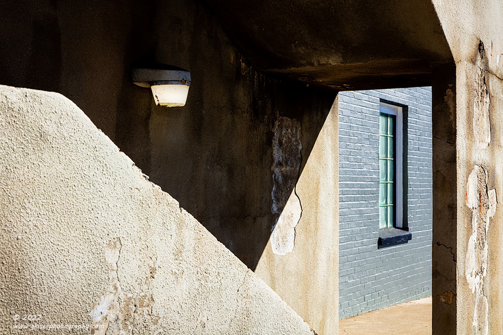
Take these two photos which are two similar compositions shot on the same day here in North Wilkesboro. Both images are studies of contrasts that are already there with the strong light. I ended up doing these two images differently in one major respect. The first one is the simpler composition, and it was shot with black and white in mind. Remember how I said at the beginning that our eyes use color to define much of the world? You can easily see that the surfaces being photographed in the second image are largely concrete because we are used to seeing that color. By removing the color, our only clue that is left is the texture, but the deep shadows will throw us as to the shapes of what we are looking at. In a way, by removing the color, I am leaving the viewer with an abstract representation of light on textures, much like the previous photo of the wall with window slits. Our depth perception is skewed which adds to the abstractness of the image and what we end up focusing on are the shapes. These shapes actually don’t exist outside of the contrasts created by the sun and the shadows. Essentially, I have photographed something that was never physically there to begin with.
As you look at the second image, you are probably saying to yourself that it is essentially the same, so why did I treat it as a color image, and you might be asking why I even retained both images? The color version has a different story. The shadows add to the visual interest by creating more shapes within the frame as they had done in the first example. What sets this one apart though is the inclusion of the brick wall with much cooler tones since it was painted gray. It is the cooler tones that provide another form of contrast to the overly warm scene. Another form of contrasts come into play with the change from concrete to brick. I felt that the additional contrasts were beneficial to the composition because of the added interest that they provided. Both photos are built around contrasts, but a decision was made about color versus black and white in each of them based on the elements within the scene. Color only benefitted one of the compositions, and therefore was only allowed to remain in that composition.
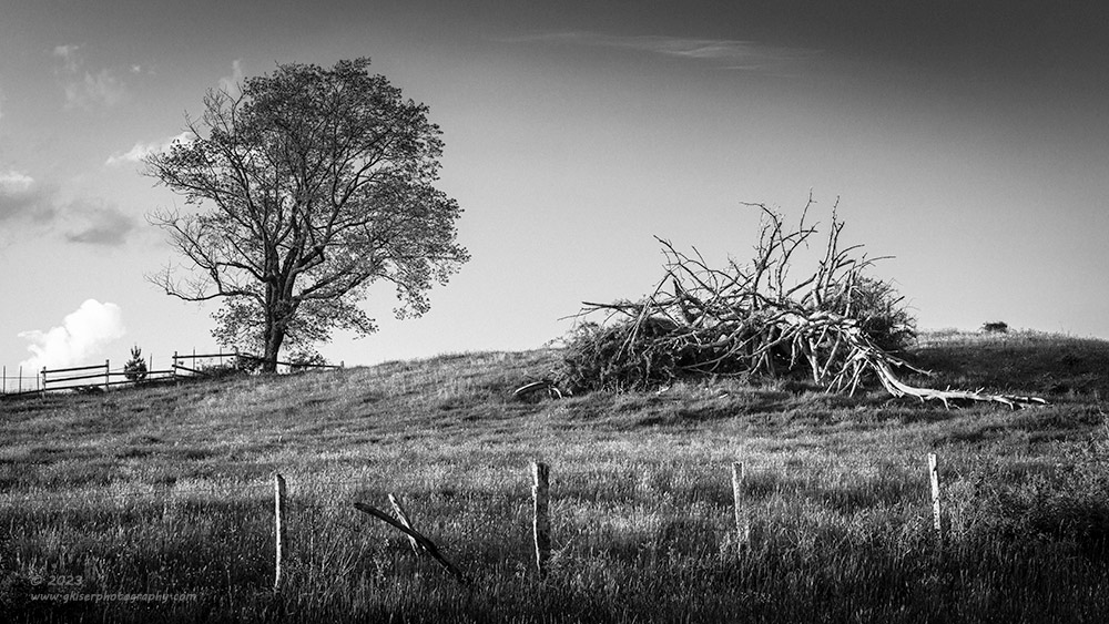
In this example, I was faced with one of my least favorite conditions for landscape photography. The sky had very little in the way of clouds in the direction that I was wanting to work in. I liked this composition with the two trees in very different forms (another form of contrast). In the color image, the sky was overbearing in the amount of blue that was visible. The grass was mostly green at this point with some faint yellows mixed in. There was just not enough warmth to make the scene work when I was looking at that large expanse of blue sky. Plus, I just don’t like blank skies. The decision to shoot this as a black and white image was due to those issues. I knew that I could add some gradients to the sky in black and white that wouldn’t make sense in color. This would help to close the image in. I could also add in some grain to give the sky texture, which I don’t think looks right in color. Most importantly though, I didn’t have to worry about the overly cool tone to the image thanks to the blues and greens. Black and white gave this image a balance that the color had taken away from it. The resulting image allowed the viewer to really concentrate on the two trees and the contrasting textures of them. The two fences give the depth that it needed, and the sky becomes just part of the backdrop without pulling attention away from the main elements.
There is a certain abstract quality to this image as well if you think about it. We are so conditioned to see the world with colors that we have to look into this image deeper to really understand what we are looking at. We have to pay attention to the shapes we are seeing and match them up with similar shapes that we understand. While this process only takes a fraction of a second for our minds to process, that sets the stage for really looking into the photo for more clues as to what is all there. Had this been in color, we would have seen the green grass and the blue sky and known that it was a landscape photo with a tree. Satisfied that we understood the photo, we would have moved on. By eliminating color, this photo becomes more interesting and therefore demands more attention.
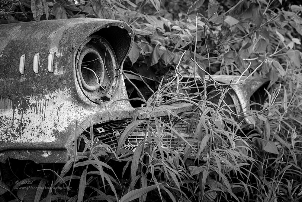
When it comes to abstract photos, black and white is a very powerful way of going about it. I shot this image of a ’57 Chevy a while back and I had a hard time figuring out how to capture it. I wasn’t able to get any more of the body included in the frame because of other distractions that were sitting on top of the fender, just out of view to the left. I loved the shape of the fender which is one of the more iconic classic car designs. Everything that I framed up was boring and just didn’t tell a story. I found out that the reason behind this was that with the color included, all we saw was the fender which was the recognizable feature in the photo. The eyes never went to the weeds, or to the other side of the nose of car. In short, I was dismissing about 2/3 of the frame because the green pushed my eyes away, and towards the main subject which was a mixture of much warmer tones. I didn’t like that happening and wanted more of the scene to be explored. I was able to frame it up in a way that captured the entire front of the car, and that was what I wanted to be seen, but the color conflicted with that plan.
By stripping the photo of color, I was able to create an abstract representation of the scene where it was just a matter of looking through the shapes and textures to define the objects. Once the color was pulled out, my eyes were free to examine the textures of the weeds and therefore found the grill and opposite fender. Those items had been hidden from view because the color was the distraction. Turning this into more of an abstract, the viewer is forced to look deeper into the image for visual clues. The reward for that is you get to see much more of the car than you would have otherwise. The bonus is that the viewer will now start to fill in the rest of the photo and will begin to ask questions about the location which I have purposely not answered. The implication is that the car is completely covered in vegetation which isn’t the really the case, but it does make for a more interesting back story. In reality, this car was parked between two other vehicles with trash laying on top of it. It was truly a junkyard scene, but the composition doesn’t tell that story, and the lack of color keeps the interest on all that I’ve captured to complete the composition.
As you can see, there is so much more that goes into choosing between color and black and white than just going for a “timeless” photograph. I believe that when you look at a black and white photograph, you are looking at the essence of a scene and a much deeper representation of what was seen than when you look at a color photo. I wish that I could be a black and white photographer and always shoot in that medium. My eyes are not yet trained in that manner of seeing though, and I rely on other types of clues in my scenes. I do like the different emotions that can be brought into play with color, and I find that color theory is a fascinating aspect of photography and humanity. It is just when I can nail a black and white scene, I really feel that I have captured the scene for what it truly had been. This works for both landscapes and for portraiture. With color photography, you are photographing the person or the scene, but with black and white, you are photographing the soul or the essence.
Thank you for joining me again this month for Behind the Camera. If you haven’t already done so, be sure and subscribe to the blog just to your right in the sidebar, or on the home page at the bottom. By subscribing, you will never miss a blog entry and you will always be among the first to see the new images as I shoot them. Look for me to return next month with another topic which I haven’t fully decided on just yet. If there is anything in particular that you would like to see me discuss, please feel free to make a suggestion. I love answering questions that my readers have posed.
Until next time…

Remember to use the code KISER10 to get 10% off your purchase