Welcome back! Here we are on the first day of August wondering where 2022 has gotten to. We are all getting tired of the heat, but before you know it, the cold will be settling back in which creates its own set of hardships. Regardless of what season it is, there are always opportunities to engage in a bit of landscape photography. That brings me to the topic of this month’s Behind the Camera. After nearly 20 years of learning landscape photography, and about four years of teaching it, I’ve had the opportunity to see some mistakes that pop up across the board with photographers. Most of these I’m guilty of, and if I’m being honest, still make to this day from time to time. There is no perfect photo out there, but there are some things that you can consider as a photographer that will improve your images and set you apart from the crowd.
Let’s jump right into things. I’m going to lay out what I feel are the top 10 most common mistakes in landscape photography. When I say landscape photography, I’m talking about the broad definition which pretty much includes any photograph made outside, with objects that don’t move (meaning people or animals). Whether your thing is photographing trees, barns, old cars, or the ocean, this list will generally apply to you.
Number 10: Arriving on location too late, or leaving too early
This may seem like an odd one to consider, but the timing of when you are making the photograph has a lot to do with the way the image looks. Since photography is nothing but light being recorded, the single most important element that we have to have, is in fact, light. It is the quality and direction of light that defines the shape of what we are capturing which establishes the visual impact. The last thing we want to do is to select a lighting situation that doesn’t flatter our subject. All light is good, but each type of light applies better to different subjects and compositions. You can read more about that idea in a previous Behind the Camera. In landscape photography, it is generally understood that the best light is right around sunrise and then again right around sunset. I agree with this to a point, but I truly feel that there is good light throughout the day if you know how to harness it.

The mistake that I see many photographers make is not taking into account the window of light that they will have, nor the appropriate time to get set up for a shot. For instance, if sunrise is supposed to be at 6:10 am, a photographer might arrive at 6:00 thinking they will be able to capture the sunrise. This is too late on several different fronts. First of all, the sunrise light is best about 15-30 minutes before sunrise. This is called the first blush and only lasts a few minutes usually. The color will then leave the sky right around the official sunrise. That is when most photographers will show up. It is the second blush that happens about 10 minutes or so after the sunrise that they are capturing. The colors in the sky are not as dramatic, and usually they are getting the sun in the frame which is just a blown-out ball of light near the horizon. This is the best time to shoot in a direction other than towards the sun because the light is softer, and the colors will be more vibrant.
The same situation happens at sunset, but in the opposite order. I can’t count the number of times I’ve seen photographers leave once the sun is out of the frame. Within about 10 minutes or so, the sky lights back up again with much better colors than what they had seen. This is the time that you can also get detail in the ground below the sky because the light is being reflected off of the clouds and with the sun lacking from view, the contrast is much less pronounced. Most of my favorite sunrise and sunset photos have taken place with the sun well below the horizon at the far ends of the day. This is why I will try to get to a location roughly an hour before I plan to be shooting, and I will stay until well after the light is gone just to make sure.
The other benefit in getting to a location much earlier than you expect to need to be is you will have time to find your composition. Once the light starts changing, you won’t have long to get that perfect photo and if you are struggling to find a composition you will lose the light. By leaving things set up until well after the light has passed allows you to be able to react quicker to that second blush in the evening as well. Of course, using a tripod is so beneficial here as you can maintain compositions through the changing light.
Number 9: Feeling like you need fast glass
This is a trap that many new landscape photographers fall into. They read all the photography magazines (do they still do that? Maybe it is watching YouTube videos now?) that say you have to have fast glass which equates to quality. I remember reading those same things and thinking that I needed an f/1 lens to be taken seriously as a photographer. This is one of the biggest fallacies in landscape photography and it causes more back injuries than it makes for good images. Why is that you ask? Well, simply put, fast glass is heavy glass, not to mention expensive. If you choose to fill your bag with fast glass, you are adding weight for no real reason. But wait, fast glass is great glass, isn’t it? Not so much for landscape work where depth of field is king. The vast majority of my landscape images are shot at f/11-f/16. As you go and check out my gear list for landscapes, you will undoubtedly see that I am using a full kit of f/2.8 glass. That was a decision that I made knowing that I wanted to have a reasonably capable lens selection for portraiture work which deals much more with faster glass. It was a compromise that I made which has created a very heavy bag for me to carry. In landscape work, I rarely go wider than f/4 and if I wanted to have a truly dedicated kit for landscape, I would have opted for the f/4 variations of each of the lenses. Another consideration on this front is the focal range of zooms. You are more than likely better off with zooms in this genre because framing is important, but stick with short zoom ranges to maintain the quality of your glass. A 28-200mm lens is a great all in one zoom, but it will be soft with lots of optical compromises. Keeping a 16-35mm, 24-70mm, and 70-200mm lens will keep your quality high, and each of these lenses is available in an f/4 in most mounts.
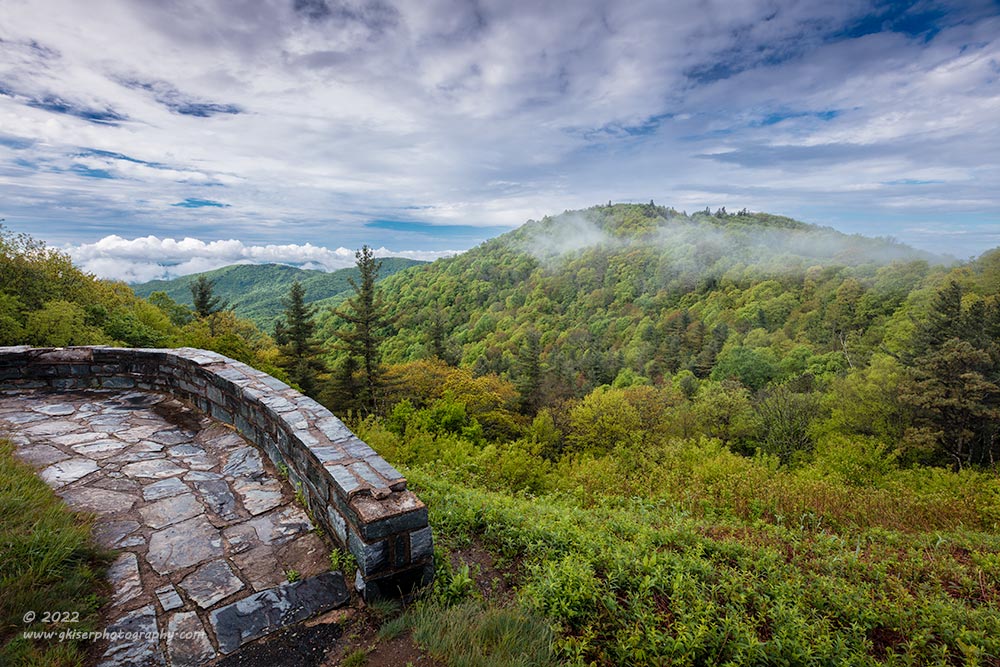
There are several examples of lenses where the faster version is slightly softer overall than the slower version of the lens. For instance, the Canon EF 70-200mm f/4L was a sharper and lighter lens than the EF 70-200mm f/2.8L lens which makes it better suited for landscape work in general. I used an f/4L version for years and can attest that it is a truly capable lens but falls short when photographing portraits outside which was why when the time came to buy a 70-200mm to replace the one that I sold after giving up photography, I selected the f/2.8 version which is almost as good for landscape work, but adds a whole new dimension to portraiture for me. Generally speaking though, if you value weight and value for your dollar, go with the lighter and cheaper slow versions of the lenses for your landscape work. It will make you much happier overall and your images will be as good, or better optically compared to the more expensive glass.
Number 8: Uncertainty on where to focus
Here is one that comes up in my workshops just about every time. So many photographers have their camera in auto focus (my eyes are bad, and I use AF these days) and just let the camera pick the focal point for them. This is fine for a quick snapshot, but if you are doing landscape photography sharpness and overall focus is very important to the image. If you leave the decision on where to focus up the camera, it will choose what is closest to the lens, with the most contrast. It will lock onto that subject, and you will have a focus point. The problem with that is your camera is not taking into account the depth of field that you need, or even what part of the scene is important to be in focus. You will usually be focusing in on something close which means that the background of the scene will go soft while you are missing out on a lot of sharpness that isn’t even being captured by the camera in the foreground.
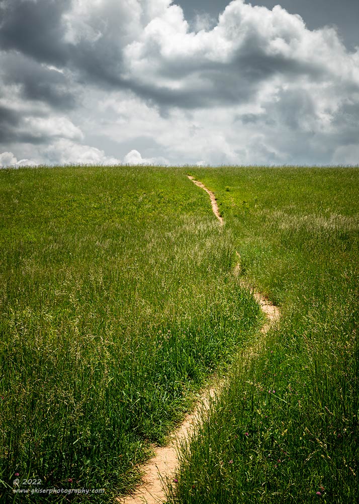
Here is a perfect example of a focus problem for auto focus. There really isn’t a main element that the camera would choose to lock onto. It would just randomly pick a portion of the path and lock focus there. Now, I mentioned that I use auto focus these days, but I use it with a focus selector box which I have activated in my menu system. This allows me to select a point of focus by moving the box in live view over the area that I want in focus, or I can select a box in the viewfinder to lock focus on. It makes my auto focus act like manual focus which operates in the same way. you pick an area that you want in focus, and you twist the ring until that area is in focus. In this situation, I used what is referred to as hyperfocal distancing and focused roughly a third of the way into the frame. This allowed my area of apparent focus to extend roughly a third in front of that point and 2/3 beyond it which is my depth of field. I adjusted the aperture to give me the depth of field that I needed from that set focus point. Everything from the front of the image to the background is sharp which was the plan. The nearest point was about 20 feet in front of the camera and the furthest point was about 200 feet or so.

There are also times when the elements in the photograph are so far away that you can just focus on the furthest point that you want in focus and everything in the frame will be sharp. Take for instance this photograph captured from Rough Ridge. The mountains included in this frame are several miles away from me. There is no need for hyperfocal distancing because there is nothing in the frame that is considerably close to the camera. I just focused on the antenna and used a sharp aperture with very little concern for depth of field. At this distance, I could have shot it at f/2.8 and it looked the same in terms of sharpness.
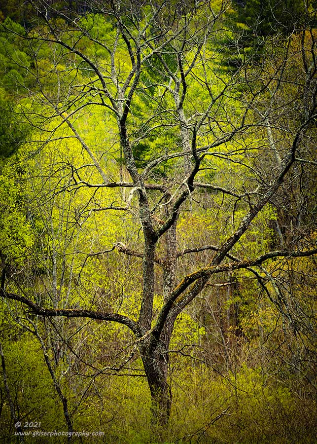
Not all landscape photography deals with extreme depth of field though. There are times when you want just the main subject to be in focus and want to blur the background slightly. That was the case here, and I used subject focusing and a wider aperture (f/5.6 was sufficient for the softness I was after). I just focused on the tree which was a couple of hundred feet away from me. You can see that even at a wide aperture, the background is still relatively sharp due to the distance, but it was softened just a little bit to bring more attention to the tree.
The point is, you want to tell the camera exactly where to focus so that it will represent your creative choices in an image rather than an arbitrary point of focus. Whether you hear me talk about this in a workshop, an introductory photography class, or even during a mentorship session, I will always recommend making all of the decisions for an image yourself and not leaving it up to the camera. Cameras, while capable, are dumb and have no idea how to capture your vision unless you tell them how to do it.
Number 7: Getting carried away with long exposures
ND filters are all the rage it seems. There are 5-stop, 10-stop, 15-stop filters and even darker. As we have discussed, I used to think that longer was better when it came to waterfall photography, but I gradually saw the error of my ways. I fell into the trap of thinking that long exposures were the right thing to do in many different situations. I’ve even had clients on workshops that come in thinking that they could put an ND filter on and immediately improve their photograph even though nothing was moving in the scene. The problem with long exposures is that they can be addictive, and you will see all sorts of really cool effects when you do them. It is the type of technique that pushes you to go further and further, but what the marketing folks don’t tell you is that with all long exposures, you will reach a point of diminishing returns. What I mean is that up to a point, you are going to improve an image, but beyond that, you will lose detail and texture and you will create an image that has a very odd look.

Here is a long exposure that I shot a while back at Cape Hatteras. I went through a lot of different shutter speeds to arrive at this particular look. I started with a base exposure of a fraction of a second that showed all the detail in the water, but that took away from the structure. I added the 5-stop filter and started to play with the exposure times. I had images where you couldn’t see the structure at all, and the water blurred into a pretty uniform look. I also had ones where the structure was clear, but the water pouring off of it wasn’t visible. It was an exposure time of 4 seconds that nailed the look I was after. I just wanted to get a little separation from the main subject and the background which the long exposure did. I had the ability to use a 15-stop filter which would have given me an exposure of well over an hour but the whole meaning of the photo would have been lost and there would have been no visual interest at all to see.
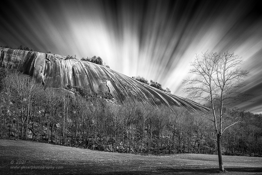
Here is another example of using a long exposure to good effect without going overboard. Streaking clouds look great, but if you go too long, you will have a sky that is just pure white. For this image, I carefully calculated the speed of the clouds and how much exposure time I was going to have to have in order to record the motion that was wanted. I needed something around three minutes which turned out to be achievable with a 10-stop filter. Had I gone longer with a 15-stop, I would have had an exposure of almost two hours and would have lost the sky completely.
This brings me to the other end of the lesson here. You do have to have something in motion to make a long exposure work. It could be water, clouds, or an object, but there needs to be something in motion which is anchored by something that is perfectly still. I had mentioned a client of mine on a workshop that thought they could improve the scene by adding an ND filter and doing a long exposure with a grand landscape scene. I asked specifically what part of the image would be improved. The few clouds that were in the sky were not moving at all, and there was nothing else in the scene that was in motion. The response was the ND filter would darken the sky and make it have more drama. That is actually a product of an ND Grad, but this client was under the impression that an ND filter would change individual elements of a scene. An ND filter (a good one anyway) won’t change anything but the amount of light entering the lens and therefore the shutter speed that can be used. When I asked what benefit the slower shutter speed would have on the image there was no answer which could be provided. If nothing is in motion, there is no difference in a shutter speed of 1/8000 of a second, or 8 minutes. In fact, in landscape photography, the longer the shutter remains open, the more chance you will get unintended motion in leaves or limbs which are usually not appreciated in the final image.
Number 6: Incorrect use of filters
This is another problem that I have seen with different photographers during workshops and have even fallen victim to it myself. Filters in photography are like any other tool you might use and they require a bit of knowledge and understanding to use effectively. I’ve already mentioned the use of the ND filter and how one can get in trouble with that filter. For this tip, I’m going to talk about polarizers and ND Grad filters which are the most used filters in landscape photography. Both of them have their uses, and they both can quickly ruin a photograph. One of the photographers that I follow on YouTube is Nick Page. He said once that using an ND Grad is a destructive process in capturing an image because when you use the filter, you are making permanent changes to an image. I agree with his statement, but I think that he is missing the bigger picture in the use of Grads. That is what I’ll get into first.

The problem that you typically see with Grad filters is that the division line between the dark and clear part of the filter is clearly visible in the frame. When I first started using these filters, I was using a screw on filter that had the division line right in the middle and I was only able to rotate it around. That meant that I was very limited in how I could place the horizon in the composition. More often than not, I ended up over-darkening a section of the horizon because of the filter placement. I’ve seen the same problem when teaching clients to use an ND Grad because they will place it too low, or use the wrong division gradation (hard vs soft) which will cause an overall darkening of areas that you don’t want darkened. It may seem like an inevitable problem you will have to deal with and Nick’s comment might start to make sense. However, there are times such as in this photograph, where the dynamic range of the scene is just too wide to capture with a single exposure and there are elements in motion that will lead to problems with blending images. These are the times when using ND Grads really pays off.
Looking at the way the horizon is shaped in this image, you can see that the sky only takes up a corner, but that is an important corner for the mood of the image. Because of the breeze that day, I didn’t feel comfortable shooting this as a multi-frame HDR image to be blended later on in post. I wanted to get an image that was as close to finished as I could make it right out of the camera. If you look at the description of the photo you will see that there was a total of three filters that were used. The polarizer removed the glare from the rocks and added contrast to the water pouring off of the wall as well as adding a bit of color contrast and warmth to the leaves. The other two filters used were ND Grads and I chose this image for that very purpose. In just that corner of the sky, I have used the grad filters to pull down the exposure just at the sky, but how did I do that? I first started with a hard edge ND Grad which was placed right at the top of the main line of trees. It overlapped a bit on the trees in the foreground, but they were brighter than the background trees so I would be able to pull a bit more exposure out of them in post to counter the effects. I only used a 2-stop here because I didn’t want to darken the trees too much which would create a visible division line with that hard edge. I did need to get the density of the filter effecting the image pretty quickly though, so I needed that hard transition. That still didn’t bring the sky down as much as I needed, so I added a 3-stop filter which was darker, but in the soft edge variety so the transition would be much less noticeable. I staggered these filters so that the transition effect of the soft filter fell on the trees and then increased closer to full intensity by the corner of the image. The use of both of these filters darkened the trees down quite a bit, but I knew that I would be able to counter that by dodging them back in during post. The important part was that the sky was full of the detail that I needed because of nearly 5-stops of light reduction preventing the brightest part of the scene from blowing out.
The proper way of using an ND Grad is to have the effect be invisible. If you can look back on your photographs and see the filter used, you are doing it wrong. Of course, the same thing can be said of post processing techniques. No matter what you are taking a photograph of, you are forcing a mechanical/electrical device to see what our biological eyes and brain are seeing. Filters are there to aid you in that goal, but not to the point where it looks like you used a lot of tricks to create something.

Polarizers are probably the most misunderstood of all of the filters and are easily the ones that most often used wrong if they are used at all. You might recognize this photo from a recent Behind the Camera where I looked at my evolution as a photographer. I’ll go on record once again to say that this is not a good photo. There is very little about it that I like, but I remember thinking that it was pretty good when I shot it. Why I’m bringing this back up now is because of one of the problems that is present here. From early on, I loved to use a polarizer because I wanted that deeply saturated blue sky. It is no surprise then that I used a polarizer for this photograph. Sure, it removed the glare from the water to allow the color of the sky to shine through, and it saturated the sky as well. Just don’t look at the sky too much because it is almost neon on color and I’m sure will cause permanent vision damage if you look too long. Theoretically, this was the correct time to use the filter, but I missed one valuable part of the puzzle (other than the horrendous editing). I was shooting on my Sony F828 which had a fixed lens with a focal range of 28-200mm. If memory serves, I was shooting this around 28mm to get that wide angle look. Bad editing aside, you can see the problem in the sky.
A polarizer works directionally and has the most effect at a 90-degree angle to the sun. If you think about it, if you are shooting a wide-angle lens, you are covering so much of the sky that you will start to see the different intensities of polarization as you can see here. The sky is a much deeper shade of blue to the left, while it fades out to a very light shade of….ew, that isn’t even a natural color. That is a product of the polarizer doing what it is supposed to do. Had there been clouds in the sky to break up the blue tones, you wouldn’t have seen that gradient that is not naturally occurring. I didn’t know that, and I didn’t know that you really shouldn’t use a polarizer for the sky when shooting wider than about 35mm, and even then, you have to proceed with caution. I was aimed roughly Southwest which put both the polar opposite of the sun as well as almost 90 degrees from it in the frame. You can see the effect of the polarizing filter clearly here and remember that the main rule is to use filters in a way that you can’t tell that they were used.
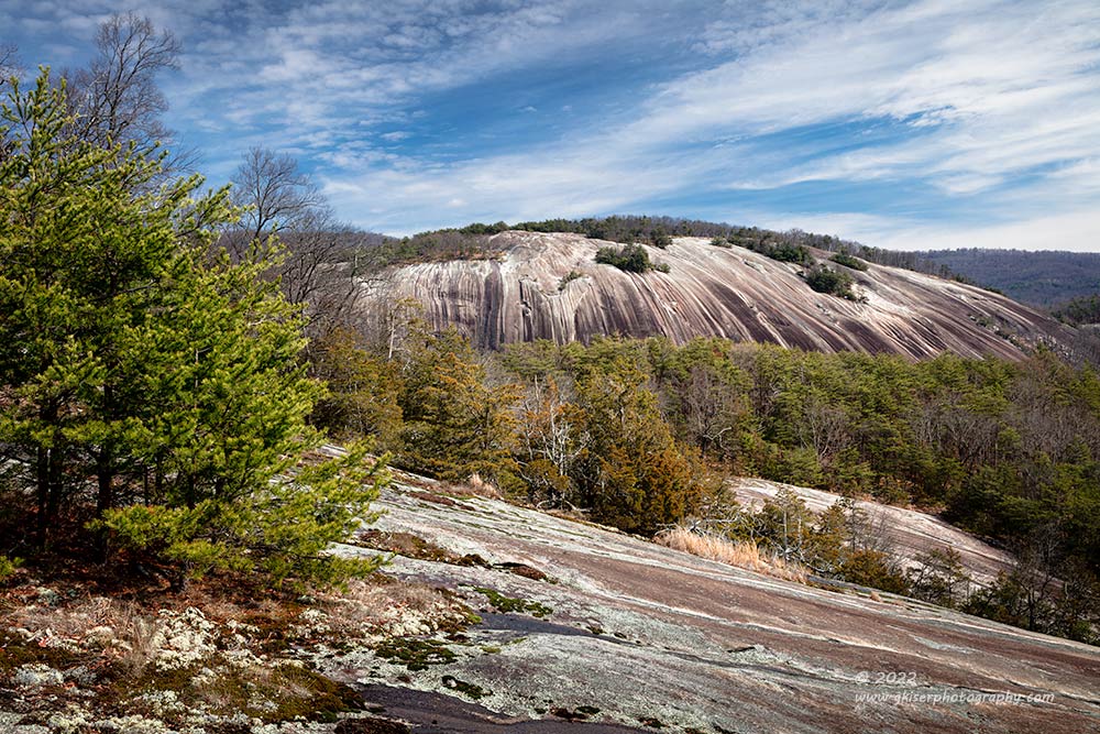
In this example, you can see a much more evenly toned sky, not to mention a color that would naturally appear in nature. I was using a tighter focal length as well as included clouds to break up the gradient in the sky. There is also another lesson to be talked about here and it goes into the actual use of the filter. So many new photographers will get a polarizer because they have heard that they are valuable in outside photography. I can’t argue with that logic because it is correct in my opinion. However, once they get the polarizer, they will just screw it onto their lens and leave it there as protection. A polarizer should never just be left on a lens for protection because a good polarizer will cost several hundred dollars easily, not to mention that not all scenarios are good for a polarizer. Those that do leave it on end up not actually dialing in the effect. As you will see in this product review of my Color Combo Polarizer, the filter is actually a two-piece design. This allows you to position the filter relative to the direction of the sun to achieve the effect that you are wanting. If you never rotate the filter, you will get very inconsistent results with your photographs. They are designed to be positioned for each photograph that you shoot, or at the very least when you change shooting direction or go between vertical and horizontal orientations. If there isn’t a need for the filter, take it off because it will take about a stop and a half of light out of the lens and force a slower shutter speed for no reason.
Number 5: Uncertainty on how to use foreground interest
Generally speaking, in landscape photography, you want to establish depth to your image. One of the easiest ways to do that is to use something in the foreground of you photo. What I have seen more times than I can count is a photographer will just include whatever they can as a bit of foreground because they think they need something there. A proper foreground interest is more than just an object though. There has to be a link between the foreground and the rest of the photo so that they are telling parts of the same story. The scale has to work, and you have to include enough of it so that the viewer knows its context. For instance, I judged a photo competition a while back and saw multiple examples of this among the images. The foreground element had nothing to do with the subject (a random wall, maybe a portion of a tree, a large plant, etc..). They would all look like the foreground was included to check a box because the photo needed a foreground. There was generally too much distance between the foreground and the subject which made the subject much smaller in the frame reducing its visual importance. In some cases, the foreground plant became the subject of the story because it took up more than half of the frame and the structure behind it became a supporting element.

If you choose to use a foreground element such as this fence post and bare rocky surface, you have to keep in mind the relationship to the rest of the image. Here, I selected a focal length and distance from the foreground to establish scale with the rest of the scene. I didn’t want these elements to dominate the composition, but rather to direct the eyes to the distant view. I made sure that the fence didn’t crack the horizon which would have put it higher than the tallest mountain point indicating that it was a more important element. I used the line of fence posts as a leading line from the angled post that directed the eyes where to go. The foreground works with the background and the midground connects them both very well to tell a cohesive story of an image.
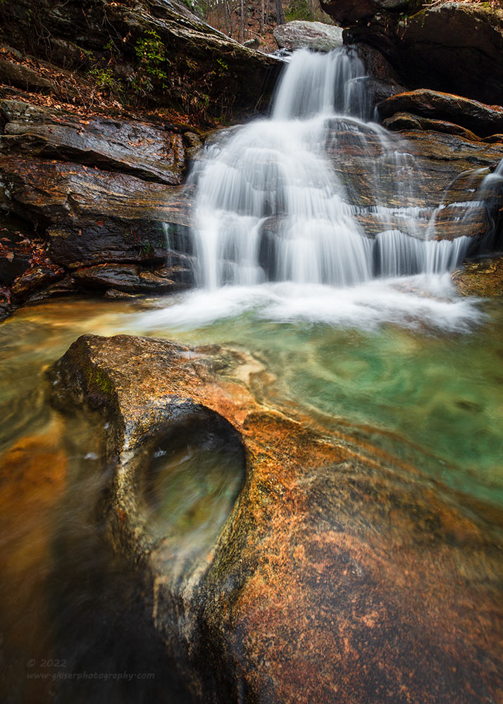
When you decide to use a foreground interest in your photo, that decision should really come with the choice to use a wide-angle lens. The reason for that is, by getting in close to your foreground interest, you can create a lot of drama to your scene. In this particular image, I was working on a composition of the waterfall obviously. I started off with including just the waterfall, but it really appeared to be rather boring as an image. There was not much depth to it, nor exciting visual interest. As I was looking for other elements that I thought would add to the overall composition, I found this small section of the rocky surface poking out from the water. It was interesting because it had been carved out by the water over many years. The colors went very well with the green at the bottom of the pool and it was visually interesting. The problem was this particular element was about two feet long and the scooped area was maybe 6 inches wide. It was in no way going to be noticeable in the frame when compared to the waterfall.
This is where the beauty of a wide-angle lens comes into play. By getting down very low to the ground, I was able to increase the size of the rock in relation to the waterfall. I also got the two elements to be closer together since reducing the height reduces the apparent distance between foreground and background. The resulting scale changed in relation to the falls and the rock, while also bringing the rock into its own spotlight, but still not to the point that it distracted from the waterfall. The resulting image has a lot more visual drama because of the addition of the foreground interest. That foreground adds to the overall story and fits the entire composition perfectly which is important for a foreground.

Foregrounds don’t really have to be all dramatic and located in support of your main subject. You can always compose your image in such a way that the foreground is just kind of part of the main subject as I did here. The main subject is the trees, but the rocks around them are really connected to them. What I did here was, again using a wide-angle lens to get in close and low I changed the relative scale of everything. By making that leading rock much larger, I didn’t need a dedicated foreground element because the rock became just that. It also turned into a leading line that along with the fence, drew the eyes to the trees. You could even make an argument that the rocks and trees are actually a foreground element with the fence being a midground, while the background is the top of the meadow and the sky. I prefer the simpler way of looking at this where the trees are the subject and everything, including the sky points to them. The use of foreground is just a leading line to aid the image as a whole.
When you are composing your images, keep the use of foreground in your mind. You don’t have to use them but try to make sure that there is some form of depth to the scene in their absence. If you feel that you need a strong foreground, be selective about what you include. Don’t just arbitrarily pick an element and put it in your frame. Make sure that all elements and objects in your fame support the photo as a whole and tell the same story. Foregrounds can be a huge distraction and ruin an otherwise strong photo, so even if you pick the right foreground, make sure that it is placed and scaled correctly so as to work with the compositional concept.
Number 4: Always shooting at eye level
This is one of the biggest mistakes that I see photographers making, and it comes down to laziness more than anything. To this day, I still have to remind myself to try different camera heights because when I see a scene that appeals to me, it is usually from eye level. As I see most photographers do, they will pull out their tripods and extend the legs all the way to get the ballhead to about head level. Then they add the camera which is conveniently at eye level and they take the shot. Alternatively, the photographer doesn’t use a tripod….GASP! and approaches the scene as they pull the camera up to eye level and they grab the photo. The composition might be very good, but usually this will produce a boring image because we are all used to seeing things at eye level. Photography gives us the chance to look at things from completely different points of view whether it be from an ant’s view, or from a bird’s view. In order to force myself to take this into account, I will usually start my compositions with the camera close to the ground and work my way up to see what things look like. The various elevations also change the size of the midground so if you need to alter how much space things are taking up, camera height is the way to go.
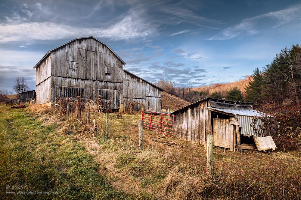
In this example, I was shooting from a position downhill from my main subject. If I had chosen a shooting position from eye level, the two barns would have occupied the same plane and created too much confusion of elements. If I shot from down low, the fence would block a lot of the textures and shapes that I was after, not to mention making the overlap of the barns even worse. To get this composition, I elevated the camera to the top of what the tripod would support which was roughly seven feet above the ground. I would have benefited from going even higher, but I was at the limit of my tripod travel. The end result of getting the camera well above eye level was a much better organization of the scene, and a composition that really showed off the slope of the land which added to the story. This was not a relationship that I had seen walking up to it, but it was the view that caught my eye while driving in the truck. That is the power of camera height. I had seen something that was visually exciting to me, but when I was out walking around it, there was no excitement, and the scene was rather mundane. Getting the camera back up to approximately where my eyes had been driving through, I was able to get much closer to the composition that had attracted me in the first place.

In this example, I had the camera pretty low to the ground, probably around two feet up. I liked the tree walking by, but it was not an interesting composition because the tree blended into the background too much. It also didn’t have the presence that I would want from it in a photograph. By getting the camera down lower while moving in closer, I was able to make the tree much larger in relation to the background which gave it an immediate visual punch in the scene. The location of the camera provided all of the key components to the composition and the success of the image as a whole. Nobody walking around Stone Mountain would see this tree in this way which makes the composition much more effective.

In this recent example from a couple of weeks ago, I used camera height for another reason. There was a road (actually a paved two-lane asphalt road) passing through right at the fence line in front of the barn. I deemed this road a distraction in my early compositional attempts and decided that I needed to do something with it. Sure, I could have cloned it out, but the grass on one side of the road was markedly different from the weeds on the opposite side of the road and I felt that the colors of the weeds were useful in the story because of the barn colors. Thankfully the weeds were about calf-high, and I realized that I could use them to mask the road by getting lower to the ground. I had to find a dip in the field in order to get the camera and tripod at the right height to just mask the road with the weeds. The new perspective also put more emphasis on the colors of the weeds which worked very well for the image.
If you are looking at the description, you might notice that this was shot with a telephoto lens which is the opposite of what I would usually shoot with a camera position that was low. The reason was I didn’t want to make the weeds larger because it was just the texture and color that I was after. The field of weeds counts as a foreground, but I didn’t need to make it a prominant element to tell the story that I was after. I also wanted to keep the longer focal length because of the way that the barn naturally got smaller on the far side. Had I gone with a wider focal length, the disparity in size from the near side to the far side would have been exaggerated and made the barn look really funny. This way, it is closer to how it actually appeared which suited the photo much better.
Number 3: Failing to turn around and look
This is a big one when it comes to landscape photography, and pretty much any type of photography. We all tend to get locked into a single idea when we get to a scene. One of my favorite examples of this is the Thunder Hill Overlook on the Blue Ridge Parkway. It is a typical grand landscape overlook with a parking lot and everything so you can sit in your car and gaze out over the landscape. Sure, it is a wide-reaching view, and you can see a lot of the Blue Ridge Mountains from your car, but you are missing the best views by doing this. I fell victim to this as a new photographer when I arrived here and shot several photos of a sunrise from this vantage point. I’ve seen countless photographers do this very thing over the years that I have visited this overlook. It is just the expected thing because that is the view that we have come to expect.
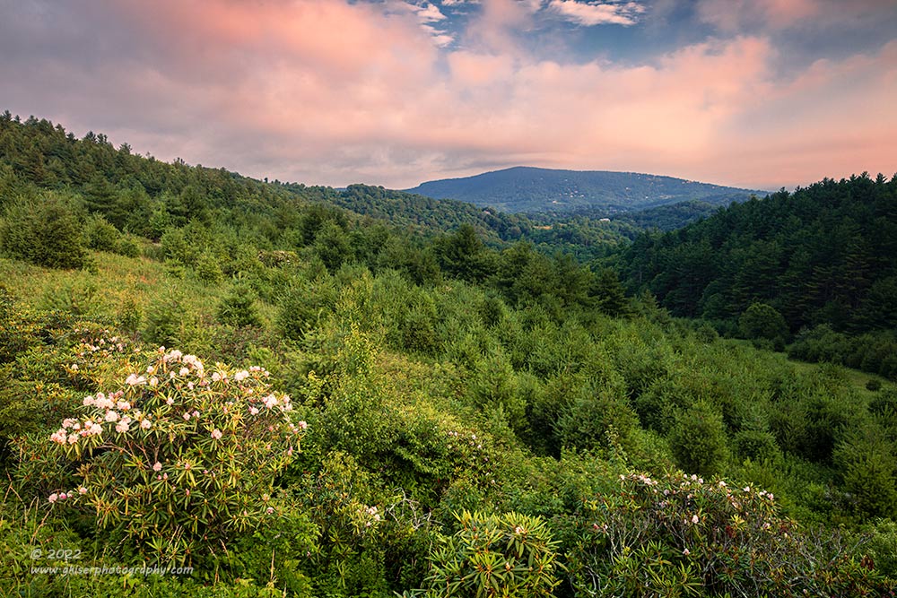
On one of my early repeat visits to this location, I remembered reading that a great tip in landscape photography is to turn around. Just that simple tip caused me to do just that and look. What I saw was an embankment on the other side of the road. I climbed up and found it to be a field with wildflowers and a beautiful view off into the distance. I spent a very long time that day photographing the scene that was not the overlook. Not long after that, I started to explore more of the area that wasn’t the overlook and found one of my favorite views from this section of the Parkway. I’ve gotten to the point now that I rarely pay any attention to the actual overlook and spend most of my time on the other side of the road to get photographs.
I found these great vantage points because I just simply turned around and looked. The same thing applies to pretty much any other location. As you are working a certain direction take time to look around to see what the light is doing elsewhere. You might find that there is a better composition to be had because the light has changed while you are focusing on a lackluster composition. This has provided me with some of my favorite photos over the years and they would have been missed had I not just simply turned around and tried to see what had changed around me.

Here is a great example of an instance where that happened to me. I had been photographing a sunrise at Price Lake and the light had faded in that direction. I had turned my attention to the other side of the lake that was now getting the warm sunlight. I was about to land on a workable composition and was taking some frames as the light changed. In-between those exposures, I would do a quick 360 to check out what was changing around me that might make for a good photo. On one of those swivels, I saw that the clouds were picking up the third blush after the sun had hidden behind the clouds. I saw an opportunity to get a great image but knew I didn’t have much time. I got the camera repositioned and worked the filters that were already on the lens to make the most of the scene. The whole process took just a minute or two and the color had faded out of the clouds. This was an opportunity that I would have missed completely had I not just simply turned around to see what was changing around me.
This might be the most important advice that I can give a landscape photographer because we will miss a 100% of the images that we don’t attempt, and if we don’t see what is going on behind us, we will never get those photographs. It only takes a moment, but the photos that will result will last a lifetime.
Number 2: Cluttered Compositions with no visual path
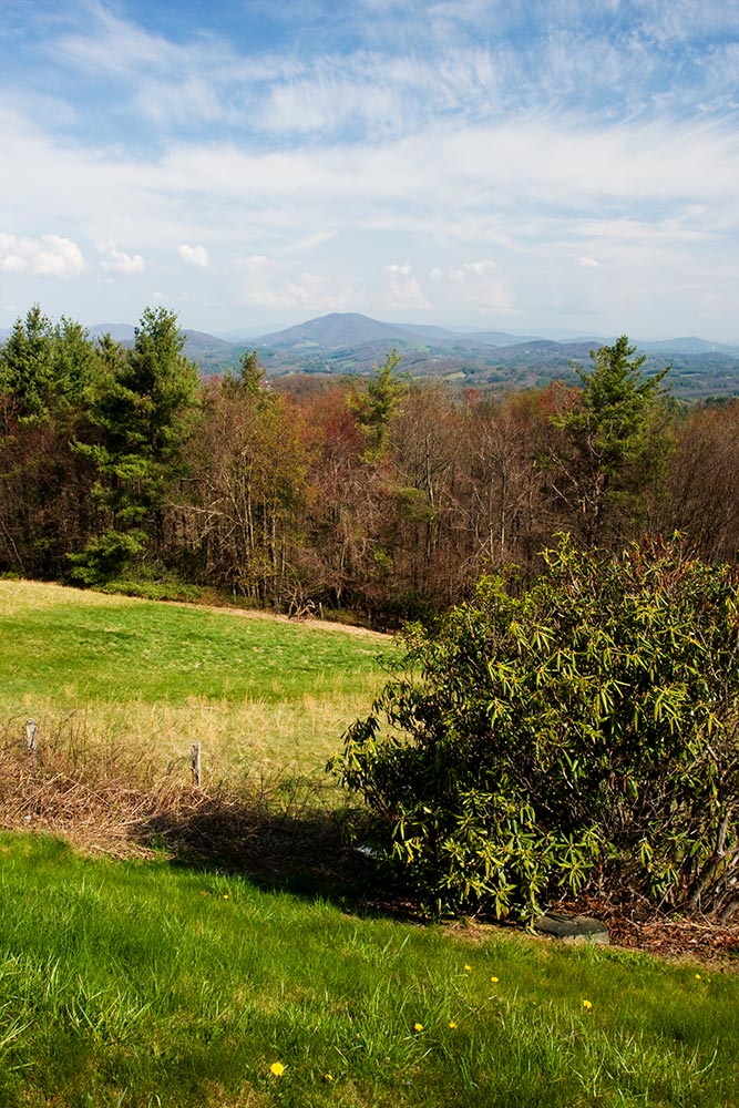
One of the reoccurring issues that I find with new photographers is their ability to organize a composition. I’ve talked about composition a lot here in the blog, and specifically in the Behind the Camera entries. Now, I don’t view myself as a Master of Composition by any stretch, but I have learned a lot of things along the way in my photography education. It is very easy to look at compositional rules and place an object at the intersection of one of the thirds and call it a day. I was very guilty of doing just that as indicated in this example from 2008. I figured as long as I had an object at an intersection on that tic-tac-toe board overlay, I would have a successful composition. What I was missing was the organization of the entire composition and having a visual anchor that added to the story and helped to direct the eyes. I just have an arbitrarily placed bush in front of a line of trees with mountains in the background. It is uninteresting photograph and that is 100% due to the compositional choices that I made here.
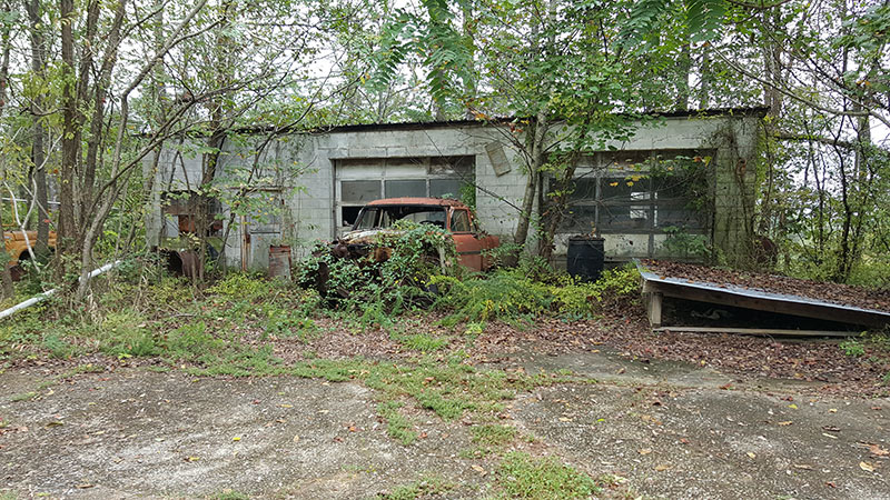
Here is a cell phone grab to show how detrimental a cluttered image can be. Composition is all about answering two questions; what you like in a scene and what you don’t like in a scene? The goal is to focus on what you like, while minimizing, or eliminating what you don’t like. The main element in this photograph is the car which is all but lost because there is no organization to the image. My eyes go all around the scene and never really land on anything for any length of time. There is no way that I would be able to expect the viewer to know what I was intending to highlight in this photo. Even knowing what I am looking at, my eyes go to the section of roof at the lower right because of the contrast and hard lines. That becomes the main focus of the photo but isn’t even remotely important to the scene. There are no indications about a route that the eyes should follow through the image, and it is just too complicated to really enjoy looking at. Yet, this is the kind of image that I see photographers making all the time. Going back to the judging that I did, I saw a lot of examples of this very thing, and I’ve seen it in my workshops as well. It is not an isolated problem; it is one that we must all teach ourselves to recognize in our own photography and then ask the questions that make the composition better.
While this is a quick cell shot to show the environment I was shooting in, I have seen considered compositions looking very much like this from many different photographers. I’ve asked why they chose to compose the image like this because I never want to dismiss their creative choices, but the answers always come back the same. “I like the car and the building.” They had included all of what they liked and had given very little thought to the excess of visual information that was included along with those things that they liked. I’ve mentioned this many times before, that photography is a subtractive art, while painting and drawing are an additive art. What I mean is this, what makes a good photograph is what you remove from the scene much more than what you include in it.

Here you can see the results of a considered composition of the same scene. I have included both the car and the building but have done it in a way that makes the car the primary focus. By getting in closer, I have also managed to include the nearly fallen sign for inspections which adds so much to the story here. There is an organization to the elements now and they all work together to provide all the information that the viewer needs to understand what they are seeing and to get the story being conveyed. Compare the two photos and you will see how organizing a composition can go a very long way in making a photo much stronger.
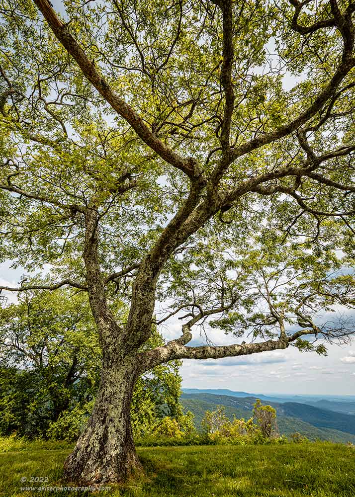
Here is a more landscape centered example where I liked the tree but had a hard time figuring out how to create a composition that was orderly and organized to showcase the tree. It was right on the side of an overlook parking area with the Blue Ridge Parkway filling a second side. There was a sidewalk and a trash can that were just out of the frame to the right as well. No amount of moving the camera up or down would remove the vegetation in the background and going with a clear view to the distant mountains would have involved including a parking lot, trash can, and sidewalk. As the photographer, I had to make some choices in what I was going to include and exclude. The tree and vegetation in the background added more to the story than a parking lot did, so I had no choice but to go with this angle. I decided to use the tree in the background as a contrast reducer for the tree trunk of the main tree and positioned it to where the main trunk came through the greenery while leaving the shadowed trunk of the background tree as a complementing shape. By placing the camera low, I was able to get the top of the main tree well above the others to show the importance of that element. I went with my widest angle lens to emphasize the structure of the tree as I looked up at it which added visual weight and importance to the main tree. That structure was then used to my advantage because the one horizontal tree limb was placed in the open framing the mountains in the distance. The end result of all of the compositional planning is an image that represents the beauty and dominance of this tree with the background of the mountains to show location. The clutter that surrounded this tree was eliminated from the view so as not to confuse the viewer. This is how composition makes or breaks an image. It does take time on the part of the photographer, but the results are much more gratifying that the quick approach to a photograph.
Number 1: Lack of Edge Patrol
By far, the number one mistake I see in photographers is a phrase that I have become associated with by a number of my clients. This phrase is “Edge Patrol”, and it refers to reviewing your compositions and images to find out what is creeping into or out of your scene that might become a distraction. In my opinion, it is one of the aspects of photography that sets the professionals apart from the amateurs. The good news is that this is the easiest technique to master and even a hobbyist photographer can have the same polished look as the professional in this respect. It all comes down to slowing your process enough to catch the small details in your photographs.

OK, for this one I get to pick on myself a bit more with this stunner of a photograph. I’ve talked about this one before, but it is a great example of what I am talking about with edge patrol. As I’ve mentioned before, I arbitrarily placed the church at the upper left intersection for the rule of thirds because that was just what I was supposed to do. I won’t go back into all that is wrong with the basic composition, but one thing that I didn’t get into much detail on was the edge patrol concept. I did mention that the weathervane at the top of the church goes perfectly out of frame at a very obvious point. You might not have even noticed it until I mentioned, but now you can’t unsee it. Had I been thinking correctly (or more accurately, known better), I would have seen that either before or after the photo was captured and recomposed to include the entire element. This is one of those little details that will automatically trash an image these days. That is an example of watching for things going out of the frame, but what about coming into the frame? I messed that one up too. If you see the fence covering the side of the church, the crop is much too close to the church which puts a lot of pressure on that fence as it really feels crowded right there. Because the fence is having to enter the frame, I needed to give it room to become an actual element of the photograph, but I missed that opportunity because I wasn’t paying attention to my edges. What I was doing here was looking at two elements, the church and the tree to the right. I placed them at the opposite intersecting points and didn’t give much thought to anything else.

You can see the edge patrol in full effect with this much more recent photograph, and as a side note, enjoy the chill of this one as we are still fully in the summer months. There are a lot of little details represented in this photograph. First of all, it is set up very similar to the photo of the church as the two main players are the structure and the tree. They are both placed at roughly the third intersecting lines, only this time they are much lower in the frame. I paid attention not to cut the top of the tree off and even made sure that it had plenty of breathing room beyond the tallest branches. I placed the frame on the left side at a point that used the far tree as a framing element to keep the eyes from escaping the photo. On the right side, I balanced the frame precisely so that I cropped out the road and the distant power pole, while giving enough room for the tree line to form a bit of a leading line showing depth while creating a natural curve to highlight the tree. I made sure that nothing entered the frame at the bottom that would have been a distraction while leaving plenty of texture to show the season and indicate the depth of the snow.
Edge patrol is all about addressing distractions and making sure that there is proper breathing room for the elements in your photos. This is the hardest part of the composition because the human eye will focus on what is important in an image and that is all you see. When you are framing up the shot, you are only seeing what your mind will let you see. You have to force your eyes to look through the rest of the image and find things that a non-prepared mind will see. Remember, you have the ability to rely on all of your senses when you are seeing a scene. It is your responsibility to convey that same feeling and reaction while only engaging a single sense…the eyes. By removing all of the distractions and focusing on what is important in the scene, while making sure it is represented completely, you are helping the viewer be able to make sense out of the photograph while only using a single sense and not knowing the context of the location.

Edge patrol doesn’t mean that you have to include a subject in its entirety, because that is not always possible, or practical. There are just times that you will need to frame an image in a way that cuts an element. My advice here is to make sure that you do it with consideration and make it look like it was done on purpose. In this example, I think we can all agree that the tractor is the main subject. It is well placed within the frame, but I had to decide where to place the edges of that frame. There is a barn to the left of the tractor, and a large tree to the right. I did a few compositions that included both of these elements in pretty much their entirety, but as you can imagine, the tractor was lost in the photo, and it became a jumbled mess (see tip #2 above). In order to address this, I had to change the visual weight of the composition and that meant making the supporting players smaller. I started with the tree to the right and found a framing option that included the whole trunk with enough room on the side to make it a full element and not just a framing piece. I paid particular attention to the top branches because there were only a few points that I could crop and still make it look like it was done on purpose. My next consideration was the barn. Just out of the frame to the left was the front of the truck that you can barely see parked in the shadows. Well, the front half wasn’t in the shadows and the chrome was causing highlights within the barn. Those bits were deemed to be a distraction in my edge patrol routine, and I decided to crop out the offending portions of the truck knowing that the part in the shadow wouldn’t be a problem. Now I had a new issue with my edge patrol because the small tree between the barn and the tractor was getting close to the edge. I didn’t want it to breach the edge because that would pull the eyes out of the frame, but if I gave it too much room to breathe, I would be seeing a very tall door mirror shining brightly at the edge causing an even worse problem.
I ended up splitting the difference and working out the camera’s position down to the millimeter to get the framing right on the left-hand side. That left me with the task of figuring out where I was going to have to cut the top of the tree. If I went higher, there was a large horizontal branch that was stretching across the frame that would have to be included in its entirety because partially cropping it at the top of the frame would have looked very accidental. By doing that, I was putting the bottom of the frame into the closest wheel of the tractor which wouldn’t work at all because that would look accidental. That meant that I was going to have to avoid that horizontal branch which meant bringing the frame down, but that included another smaller branch that was overlapping in the tree behind the barn. To avoid that would mean cropping very close to the top of the barn and turning the tree behind it into a distraction. Again, I split the difference and included a bit of the hanging branch, but only as much as worked with the branches of the tree behind the barn. That gave me my overall framing and composition for this image.
As you can see, I spent more time with edge patrol on this one than I did with finding the subject or composition. I say again, edge patrol is the difference between a fair photographer and a great photographer in most cases. My clients get tired of hearing me say edge patrol during workshops, but it is just that important and invariably I’ll get to see some of the final images which have turned out great except for the fact that the bumper goes slightly out of frame, or the tire is cut off by the lower edge. It jumps out to me because I have trained my eyes to look for that, and when I mention it to the client, they had no idea that was even an issue because they were still looking at the image with their brain, and not their eyes. Keep in mind the client had been through all of the images and edited the ones that they were showing which meant that they had been looking at these images for some time. That is how powerful the brain is when looking at a photo that you are connected to. Had they been able to disconnect from the memory of the scene and look at the photo for what it was, they would have seen those small issues and hopefully been able to correct them in the field.

Terrible editing aside, here is a final example of mine in regard to edge patrol. Take a minute a look at this, but not too long as the neon orange grass will likely cause cornea damage. What kind of edge patrol issues do you see here? The tree is in good shape as I think all of the branches are in the frame. It is kind of hard to tell from the artifacts near the horizon though. The peak of the barn is good with lots of room to enjoy that Carolina Cyan sky. The bottom is good with a nice roadway for the hazmat team to drive up to the barn and decontaminate it from the nuclear fallout. The image falls apart on that lefthand side though. I tried to get the whole barn in the frame here while dealing with a house that was behind it. You can see that I put the edge right on the edge of the frame and since it wasn’t a straight piece of structure, you can actually see the house behind the barn peeking through. With the decayed parts of the barn visible adding lots of new lines and shadows, that edge pulls my attention and amplifies the distraction. This would have been a good use of a well thought out crop into the barn at a different angle making use of the bell as a framing element as well as foreground to take your mind off the back corner of the barn and keep the attention on the front of the barn where it belongs. Doing edge patrol on the adjustment sliders is a whole different ballgame, but certainly was overlooked here as well. I think I moved every slider available to an extreme edge of adjustment to arrive at this Ted Turn Colorized Classic. Much more subtle movements on the sliders would have been the better choice here, but I guess I wanted to flex the pixels a bit.
So, there you have it, the 10 most common mistakes that I see landscape photographers making. Look through your collection of images and see if any of these apply to you. None of these issues are hard to correct in the field, but the first step is recognizing that you are doing them. It took me a very long time to figure these things out, but that is because I was learning the hard way by teaching myself. It was a lot of comparisons that I made to established photographers that allowed me to see the errors of my way when I finally did see them. However, it would have been a much quicker process had I reached out to a mentor or attended workshops. This is why I enjoy providing those avenues for other photographers these days. I know how difficult it can be to learn photography through trial and error. If I can help you over the learning humps along the way, then I am doing a service to the art world in general.
Thank you for joining me for another installment of Behind the Camera. Be sure to come back next month as we look into something that is just starting to really be a thing in photography. I’m going share some of my thoughts on how we edit photographs these days whether in our own way, or through the use of artificial intelligence (AI based editing). Can a computer program edit better than the photographer? I plan on taking a look at that, but without having any AI edits to show you. I’ll see you back here in September!

Remember to use the code KISER10 to get 10% off your purchase