Welcome back to my monthly Behind the Camera feature! It almost feels strange typing this out since I have opted to do the last two of these as videos. It is a little simpler to put together and takes a lot less time, but there is just something to this typing away and going back to change things here and there. I guess I’m just old school like that and enjoy the physical process of putting words to paper, or to the monitor as it were. Let me know which format you are enjoying more, and I will try to move things in that direction as time goes on. You might also see another difference here with the thumbnail that I have chosen at the top which replaces the photo of me at Linville Falls from a number of years ago. There was no real reason other than I thought it was time for a change, and I decided to go with a photo that I shot a while back which is now my business card graphic. The goal is to start using this slightly Photoshopped graphic in more places for a more unified feel throughout my business.
Anyway, that is not what I wanted to talk about this month, just feels like I needed to catch up with you for a bit to get started. This month, I wanted to talk about ambiguity in imagery and how you can use it to your advantage. You can also go too far with it, and it can become a detriment as with most things in life. I also realize the irony of this statement because it is a little bit ambiguous all by itself. What am I talking about, you might be asking. Maybe you are starting to skim down the lines of text to find a clue, or maybe you are looking at the photos that have been attached. It could also be, that you are patient and are just reading along with interest to see what I am going to be talking about.
Just like that, I’ve got you hooked. You can’t just walk away because you want to know how ambiguity might help photography, and how if it is good, it might also hurt it. In essence, that is what I’m going to be presenting to you today. What I just did in print, you can do in photography and keep the audience’s attention much better than if you lay it all out for them to see. Simply put, I try to create photos that ask questions or seek some further involvement from the audience. I will rarely just shoot a straight on photo of a pretty scene where all the questions are answered. As a photographer, I am responsible for everything that is included in the photo, and everything that is not included. What appears in the frame is the only information that I provide the audience, so if I include too much, the image gets boring. If I don’t include enough, there is nothing there to engage with. If I manage to get the ratios correct, then I have sucked the audience in as they hunt for clues and fill in the details with their own experiences. For me, this is the real key to successful photography.

Let’s take this photo for example. It was done during a mentoring session last Fall. As we were walking through the property, I spotted this scene and with me already in the Fall mindset and looking for Fall colors, it stood out to me. There wasn’t really much going on here except for color with the one tree. I composed the shot to show the dichotomy between the small tree and the tall tree which was mostly bare. This was to provide some visual interest in the frame. I think that it was successful in that regard, but the photo falls short of what I would have liked to have captured. It is a pretty much all inclusive photo. We see two trees, sky, and the background woods. What is out of the frame is inconsequential. There are no shadows within the frame which would lead to mystery. It is all there to be taken in which isn’t a bad thing at all. The risk behind this photo is that the viewer will look at it briefly and absorb what they are seeing to a point. However, there is nothing there to really draw the viewer in and keep them in the frame looking around. Within a few seconds, you will understand what is going on here, and your attention will move on to something else. In this age of social media, that means a swipe and possibly a “like”, but that is it and the photo is quickly forgotten.
There is also the issue of hanging wall art which is the main motivator in my photography. I’ve found that photos like this are usually good for a commercial setting where they are trying to match colors and find peaceful scenes that just go with the decor. When it comes to my clients finding photos for their own homes, they typically want something that speaks to them, that they want to make an effort to look at every day. I’m not saying that this photo can’t exist in that role, but the chances of somebody seeing it and being haunted by it are kind of slim. It is a pretty photo, and that is pretty much the role that I intended for it.
What is the answer here? Well, I still want to create photos that are pretty, or aesthetically pleasing, but there is another realm to the equation. If I can create an image that asks questions from the viewer, or makes them look further into the frame for clues about what they are seeing, that is when a connection is made. It is this kind of connection that will prompt looking at an image over and over. It will invade the thoughts of the viewer and cause them to create different stories around what they have seen. They will want to come back to look at the photo again and again as they come up with different possibilities. In a way, a photograph can be very much like a choose your own ending book. You can experience it differently each time you view it, so it is always fresh.

Here we see a different type of photo. The main subject is not completely present, nor is the context of the photo. When you look at this photo, you first see the shapes, textures, and colors. These are all composed in a way that is visually appealing because in order to want to look at something for a long time, you need to be invited in. That is the easy part. The part that sets this image apart from the trees above is the fact that we have to look deep into the photo for more answers. Unless you are just very familiar with the automotive designs of the era, you might be at a loss to which car you are looking at. One of the clues provided as a conscious choice is the “Chevelle” badge on the trunk. This was a very popular model in the Chevrolet lineup, and most will be familiar with it. This will help fill in what the rest of the car might look like. The next clue to be seen is the fact that the ground is right at the bumper level indicating that there are no wheels on this car, or at least not on this corner. We also see the condition of the car based on the patina and accumulated dirt on the body. Thes are all clues as to how old the subject is, how long it has been sitting here, and what it might look like if we could see the entire thing.
Now that the viewer is invested in the photo thanks to the clues, there are certain questions that start to come up. Where is this car? How did it get there? Just how long has it been sitting? Some of these questions might be answered in the blog entry that was associated with the shoot, but that won’t always accompany the photo. As the viewer, you become interested. These questions will get answered in your mind, but you will always wonder if your answers are accurate. This leads to other possibilities which you will eventually come up with. Each time you look at this photo, your current mindset will affect the answers that you provide. What you thought was an obvious answer might be replaced by a more romantic version during a subsequent viewing, only to be changed back at a later one.
At some point along the way, you will start to wonder what the car looked like when it was brand new. You will start to picture it all shiny and new with a fresh coat of Turtle Wax applied before a family vacation road trip. These thoughts will lead to wondering at what point did the owner stop caring about the car and it began to fall into disrepair, eventually ending up like this. Those questions will again keep you involved with the photo as you ponder the options, or even better, relate this small portion of a decaying car to a specific memory in your own past.
That is the icing on the cake for me as a photographer. I love when a photo that I create somewhere along the back roads of NC will remind somebody in another state, or even another country of something that they might have forgotten about from their childhood, or photos that they saw from their parents’ lives well before their time. These are the connections that just don’t happen with simple photos that lay it all out as with the trees which opened this entry.

Ambiguity doesn’t have to exclude landscape images. In fact, you can create that same sense of connection with a landscape by not including all of the answers. here we have another Fall photo showing off the colors of the season, but this time I have created a composition that asks the viewer to become involved and not just look at the pretty subject. The road is a clue to the photo which suggests the type of location. The trees suggest the season, and the clouds suggest the weather. The leading line of the road pulls the viewer in but doesn’t show where it goes. That part is up to the viewer and their imagination. The tree to the right is heavily cropped so we only have an idea of how big it really is. That is up to the viewer to complete the structure in their mind which then will start to fill in more of the scene. Again, I am asking the viewer to complete the image in their mind. They are pulling from their own memories for this which puts them on that road driving along. I’ve provided plenty of questions and clues to direct how to view this image, but I’ve left much of it to chance, with that chance being the viewer.
Compare this photo and the one of the other Fall trees at the beginning. They are both of the same subject, but one provides all the answers in quick fashion while one makes you look into the frame and eventually causes you to become one with the scene. I would argue that the photo that is designed to engage with the viewer is going to be the stronger image and will create a reaction beyond a like and a swipe. This becomes a photo that you can look at for longer than a few seconds, and you will want to come back to it so that you can tell yourself a different story each time. This is the kind of photo that I would want on my wall over the other presentation. This is the one I could enjoy many different ways over the course of a very long time. It would also be a fantastic discussion starter as the colors are eye catching and it would draw attention from visitors. The ambiguity all stems from the fact that we don’t know where the road goes, and how big that tree actually is. Neither detail is important to the photo, but it forces the viewer to ask those questions.

How far can we take this visual ambiguity? It can go as far as you dare but know that there is going to be a point where you will cross a line, and the photo will be confusing. Is this example past that line? I don’t think so, but it is going well beyond the examples that I have shared thus far. Let’s take a look at this one. The subject is basically a shape with complementing colors. The first question is what are we looking at? The clue is in the shape, but because I have rotated the frame 90 degrees to the right, it might not be completely apparent that this is smoke being photographed. Looking at the clues within the swish, you might be able to figure that part out. The next question is where did the color come from? How was this created? What extends beyond the frame? Another very effective question that is asked is what lies in the black negative space of the frame? Is there something there which we just can’t see, or does this shape happen in a total void? Beyond the technical questions, we start to ask ourselves what we are seeing with the shape. Much like clouds, these smoke photographs can take on numerous different forms depending on who is viewing.
You can see that with something so simple as a shape on a black background, the viewer can become engaged and start to create a whole world around this colorful shape. That is the key to doing photography beyond the pretty. Sure, we want to create pretty photos, but those are a dime a dozen and can be seen popping up on social media by the second. What I am suggesting is that we make pretty photos a secondary concern and start focusing on viewer engagement. It has been said that one of the most difficult jobs of a photographer is to represent a three-dimensional world in a two-dimensional medium. That certainly is a tough job, but I think that creating an image that forces the viewer to become involved is a much harder task, and one that will ultimately be responsible for how the photo is received.
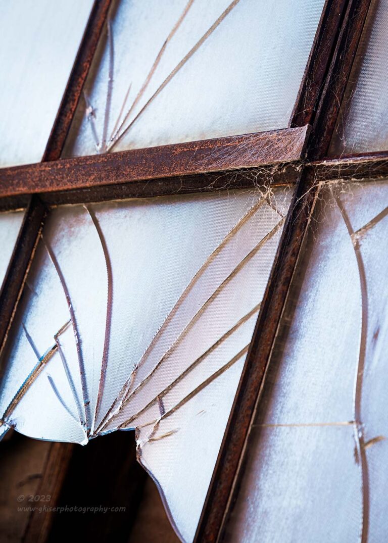
Another misconception in photography is that what we photograph should be “pretty.” One of the most freeing moments in my time as a photographer was when I realized that I didn’t have to photograph only pretty things and that I could celebrate decay and broken things as well. The concept of wabi-sabi has really opened up my options as a photographer and allowed me to create images like this. It really is another example of ambiguity in a photograph which leads to asking questions. What I have provided here is a broken window with enough framework to suggest the size of the entire window. I have given clues as to what is behind the glass, but mostly that is in shadow. What I am asking from the viewer is a string of questions about what lies behind the glass, what broke it, does anyone actually care that it is broken? The spider webs which you will eventually see will be a clue to the answer to some of those questions. I didn’t include a location, or weather conditions, so nothing surrounding this photo has been established for the viewer. Those details are completely up in the air and for the viewer to decide. The composition was designed to keep the visual interest with the diagonals and triangles suggesting more to the photo outside of the frame but keeping the eyes in the frame at the same time.
The reality of this photo was that it was shot in a very narrow alley in North Wilkesboro. It was very sunny, but I was in the shade. There was very little to the story, I just liked the broken window. If I have done my job correctly as a photographer, the viewer will look at this and possibly thought that there were some kids playing baseball in an old parking lot of a warehouse. The one at bat got a good piece of the ball, but it went wide and broke through the window. The game was called short, and they all ran hope hoping that nobody saw anything. Based on the questions that the viewer is forced to ask here, that is a likely story that will develop. From that story, maybe be a memory of a time when the viewer broke a window as a child would pop up. If nothing else, the viewer would be able to recall hearing glass break and that would spark that particular memory. It is all about engagement through photography.
If we compare this photo to the opening one, it is obvious that one is pretty, and one is not. In contemporary thought, it is the pretty photo that would be the strongest of the two. I’m here to argue that the more ambiguous and least pretty photo is the one that will better engage a viewer. It is the one that will invite more time looking at the photo and contemplating it. The pretty photo will be forgotten soon after seeing it.

I just mentioned “looking at the photo” and I chose those words carefully because I wanted to talk about how I prefer to think about it. As a photographer, I don’t want the viewer to look at my photos which is what most would want. If I was just creating pretty pictures, then I would be satisfied with someone looking at my photos. The truth is, that statement is the bare minimum that I want from a viewer, while what I really want to see, is them looking into the photo. There is a big difference in those statements, and it comes down to what we have been talking about here today. If there is ambiguity in a photo, you are forcing the viewer to invest time and energy into enjoying the piece. Some won’t bother taking the time, but for those that do, they will be rewarded with a photo that is on a different level than just a pretty picture.
Take for example this waterfall photo. It is one of those that Toni makes fun of me for because I can take a small waterfall and make it look huge. When she finally sees it in person she is disappointed because it doesn’t look as impressive as what I had captured. The trick to creating images like that is to be careful about what things you include for scale. In this photo, scale is established by finding leaves which means that you have looked into the photo. I made it kind of easy by including a yellow leaf in the lower right corner (it was there before I arrived, and I did not move it). This leaf provides a good representation of the scale, but maybe it was on a ledge that was in the foreground which would make the waterfall much larger than it appears. You have to look for other leaves throughout the scene to answer that question. The questions of what appears upstream and below also come into play. The shape of the falls will captivate the eyes and keeps them rolling around the frame as you hunt for clues and ask questions about the surroundings.
Arguably, this is a relatively simple landscape image, much like the opening photo, but there is obviously more connected to the scene beyond the edges of the frame. Landscapes like this are generally more effective than ones where the contents beyond the frame are irrelevant to the photo. This little slice of the landscape is obviously part of a larger and more complex scene which the viewer will start to recreate in their head. This becomes a very unique image to each person that views it.
Ambiguity is something that I think has a profound place in the art world. It is not something that is good in verbal or written communication where being concise is much more effective. With art, we want that lingering and we want the engagement beyond what we provide. Think of it this way, through our art, we are able to engage in a conversation with our viewer without even being there. In the case of the opening photo, it is like saying “Hi, how are you?” which the response would be “Fine, hope you are.” That would be the end of it. When we introduce ambiguity into our photos, that conversation comes with open ended questions that prompt a back and fort. The ambiguous photo will ask “Hey, what are you planning on doing today since we have such great weather? I’m going to be going out on a canoe to a remote island, would you like to join me?” The conversation will take off from there, unless you don’t know the person, and then there might be some questions from the local law enforcement officer which will follow.
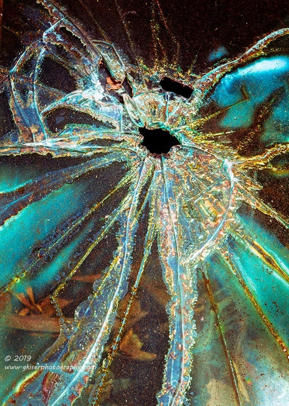
When talking about ambiguity, I mentioned that there might be a time when you take it too far. Several years ago, I was photographing an old Plymouth Fury that had a broken windshield. I loved the patterns developed by it as well as the colors that were present with the leaves behind the glass. I shot a couple of photos of it and shared them. I think that they make for a nice abstract piece, but I think that photographically, they might be a little too ambiguous. They don’t seem to ask the right questions, although there are questions begging to be asked. Because I know more about the photo, I tend to engage with it more than I think the audience has. In many ways, I think that the questions that come up don’t have meaningful answers which means that the audience doesn’t really care what the answers might be. There are no memories that might be brought to mind, and therefore no real connection. This photo falls at the other end of the spectrum and is about as effective as the opening photo of the two trees. As far as being an abstract image, it is successful, but all you really need to know about it is right there. The parts that I wanted to leave as questions are just as unimportant as what lies beyond the trees in that first photo.
Looking back on when I shot this image, I think that I needed to include some more clues in the frame which might have brought it out of the abstract end of photography but would have created more of a connection with the viewer. Even adding in part of the frame of the windshield would have helped here as it would have established that we were looking at a car. As it stands, we can see leaves and debris behind the glass, but that could just as easily be the ground beneath a single pane of glass. There is a connection to an outside world that is missing in this photo, and it just becomes a photograph existing within the frame that I have given it.

This photo on the other hand shows interesting patterns in the glass just as the previous one had. The difference is that we can tell that this glass is part of an old car thanks to the rusty frame that is partially shown. We can also see through the glass into the interior of the vehicle and out the other side. We have a sense of the setting that the vehicle is in which forces more questions as we look to fill in the parts of the scene that we can’t see. The patterns on the glass start to beg the question of what happened to make it look that way. The rust is only part of the story as it shows age, but not the amount of delamination. The viewer has no choice but to become invested in this photograph and decide if they like it or not. For me, I think that this is a much more successful example of photographing patterns in glass than the other example.

We are getting a little less ambiguous with this example, but the theme of broken glass is still very much at the forefront of the photo. As we look through the frame, we can tell that there are two different pieces of glass that are included and broken. The focus point is the dash, and the cracks frame that to tell us that the dash is important. We know more about the vehicle, but less about the area that it is in compared to the last example. The questions that we have are all about the car and what condition it is in. This is where the engagement happens but keeps us looking for clues that help us to fill in the parts that we can’t see.
The last three photos are just a progression of ambiguity from what might be a little too much, to where more and more clues are present about what is being looked at. Which one is most successful for you as far as making you look further into the scene? Why are you looking into it more than the others? Does it have something to do with what clues have been included by the photographer?
Photography has always been a subtractive artform while most others are additive. This simply means that most art starts from a blank canvas of some sort, while photographs start from a real scene and the photographer determines what doesn’t need to be in the frame rather than just what to include. By removing elements from the frame, you are removing certain context and forcing the viewer to understand the photo from a very simplified view without distraction. If you just remove the distractions, you will be left with a pretty picture, but if you remove some of the context, you will create an engaging photo that forces the viewer to look deeper inside for clues about the scene. If you remove too many elements, you will lose the context of the scene completely and cause the viewer to only react to what is in the frame once again.
For me, it is playing in that gray area where I have the most fun. I want you always see something different in my photos and be taken to different places in your mind each time. I really think that the only way to do that is to force you to ask questions based on the clues that I provide within the frame. If I bring out the right questions, not only will you become engaged in the photo, the photo will become a key to unlocking memories that will send you down a path that makes you happy that you saw the photo in the first place. That is how I gauge the success of my images, not whether or not they will win a competition. My only want in photography is to create photos that people want to look at because of how they make them feel and what comes to mind.
I really hope that you have enjoyed this month’s Behind the Camera, it has been a lot of fun sitting here at the keyboard once again working this out. The video is much easier, at least the way I do it without editing or scripting, but I like the idea of sitting down with this and reading through it at your own pace and studying the photos along the way. You just can’t do that with a video. We will be back here next month with the last issue of Behind the Camera for 2024. I’m not quite sure what I will be talking about for that one, but I have some ideas that I might use. I know that on the first day of 2025, I will be going through my yearly review to see how 2024 has gone. I suspect that it will be a short one because it really seems that not much at all has been going on this year photographically. I say that now, and after reading 13,000 words, you might beg to differ. We shall see.
Until next time….