Thursday, July 30, 2026
Regardless of how it might seem, I was actually wanting to have this trek all wrapped up with the last blog entry that you read yesterday. It was the addition of a few more images after the initial processing that made the last entry just too long, so I had to break it up into two different parts bringing this epic adventure to a four-part blog. That is significant because of the conditions and fundamental lack of planning that all came together for this one. You see, the weather wasn’t really ideal for photography, but I was wanting to get out and do some photos anyway. It was a gamble to go out to Outlawed Restorations under a bright sun, but I figured that I had a better chance of making things work at a place I was very familiar with rather than hunting something that just looked good in the existing light. You can read all about how this began by visiting the first chapter. There was no planning as far as compositions or types of photos that I was aiming for. The only thing that I had in mind was to capture one of the rat rods in the barn with the sunlight on the very front of it. I managed to get that photo right off the bat, but after that, I had no real idea of anything that I wanted to capture. The plan, such that it was, was to walk around and respond to what I was seeing, but in a way that I didn’t expect to be surprised by anything since I had been out here more times that I could count.
By this point in the blog, you know how successful this trek has been, and we still aren’t done yet. That was actually the biggest surprise for me with this one. None of the subjects surprised me, but the fact that I could go out on a very sunny day, in the Summer, right around the middle of the day with this kind of success was amazing. Conventional wisdom would suggest that the light was too harsh, or the shadows were too deep to get good photos. The light around midday is just not flattering. While this can be true in the world of portraiture, I’ve found that this kind of light actually lends itself to rusty subjects quite well. There are still concessions that have to be made as far as reading the light to determine the best direction to photograph in. During a cloudy day, any direction is usually open because of the widely diffused lighting that is falling across the scene. With the sun out and uncovered, there is a very specific direction to the light, and the compositions have to fall in line with that direction. Oddly enough, with the sun high up in the sky, the direction starts to take on less specific direction. Shadows are aimed down, and the light is once again relatively flat just as if it were cloudy. Another benefit to the bright sunlight is the saturation that the colors begin to take on. This is something that doesn’t happen on cloudy days and the colors are usually more muted. With the sun, they pop, and the hard light of the sun accentuates the textures of the rust.
Make no mistake though, this light is still more difficult to work with and requires a bit more care and consideration when compared to a cloudy day. I’ll always prefer the light on a cloudy day, especially with the added interest to the sky, but I’m getting better and better with working under a brighter sun. You can see the proof in this blog series because for the most part, there was no shade involved in the photos. The light was either flat on the scene, or the highlight and shadows were utilized creatively. In short, my compositions fit with the existing light which again illustrates how important composition actually is in photography.
Before we get started with this last part of the series, I would like to share a word from our sponsor. Our sponsor today is….me. I would just like to remind everyone that as of a few years ago, I have started to incorporate portraiture into my photographic offerings. This has turned into several different offshoots of people photography from your basic portraits to professional headshots and family portraits. I can also do photography around big events in your life like engagement photos and maternity photos. For those that want to bring a little more creativity to the session, I do offer boudoir and other creative sessions where I tailor the entire shoot to a particular vision or theme. None of these sessions are designed to treat you like a number or just a customer. I will work closely with you to help you decide on wardrobe and style options. My services will continue as we discuss how the photos will be used and displayed. I’ll use my experience with fine art photography to help determine sizes and media for your photos as well as how to place the prints for the most impact in a room. I’m much more than just the one who presses the button. I want to understand why you are wanting the session which makes me able to bring your own expectations to reality rather than just taking some photos of you. If this sounds like what you are after, let’s chat. All of my portrait sessions come with a free consultation so we can explore your expectations and I can make sure that I’m able to achieve what you are after.
Thank you to…me…for sponsoring today’s blog entry. Now, let’s jump right back into where we left off. You might remember that the last time we spoke, I had finished up with some detail shots of the little firetruck which had turned out pretty good. That had been an accidental distraction that I had pursued while working with the Oldsmobile Delta 88. I had only gotten a few photos of that car before getting baited out to the firetruck. Now that I was pretty happy with that subject, my attention turned back to the Olds because I knew that it had more to offer me in terms of compositions.
Unlike the vast majority of subjects that I had shot during the day, this car was largely in the shade since it was under trees and between two barns. There was some light coming through, but nothing substantial. This made it both easier and harder to work with. It was easier because I was used to working in shadows and with more diffused light. However, the background beyond the car had some really bright hotspots from where the sun wasn’t blocked by the surroundings. This was just something that I had to keep in mind when it came to how I composed the photos and what areas of the car I chose to work with.
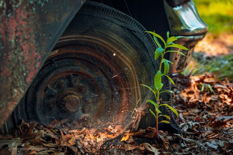
As I was looking around the car, I noticed the front right wheel. I don’t think that it had ever really caught my attention before, but this time, I was very interested in the thick spider web that was covering most of the wheel and there was a lone weed that was growing just to the front of the wheel. The best part about this scene as I was looking was that there was a shaft of light that was coming through the trees and illuminating both the weed and the web. It was almost as if I had staged this scene.
As with the other wheel photo that I shared yesterday, I wasn’t so much interested in the wheel along. It was the wheel in the setting that drew me in. This setting told so much of the story about how long the car had been here. You had the fallen leaves that were burying the wheel up to the lug nuts. There were the weed and the web, which gave an indication of time passed. The rust on the wheel as well as the fender showed the age of the car. Even if you couldn’t guess what car you were looking at from the bumper style, you knew plenty enough about what you were looking at to become really involved in the story. All of this from a simple photo of a wheel.
These are the kinds of photos that I really enjoy making. I imagine that most folks will never put that much effort into looking into a photo like this to really appreciate it, but for me, this is what photography is all about. I’ve talked about the term synecdoche which I learned when reading about Haiku poetry. Essentially, it is letting a small detail speak for the entire subject. A photo like this is but five short and rhythmic lines that make you feel something while speaking for a much broader scene. I really feel that this gives a photo much more depth than putting everything in the frame and spoon feeding the audience. The most important part of a photo is what the viewer brings to it. Those memories that are sparked, the emotional pull, just the wondering of what could be seen just out of the frame. Those are the elements that create a connection with a photograph that goes much further than “gee, that is a pretty picture.” Unfortunately, those kinds of photos are not rewarded these days, and are usually overshadowed by the flashier photos that follow the current trends.
What are your opinions on a simple photo like this of a rusty wheel encased in a spider web? Am I just out of my mind, or does it cause you to think about more than just the few elements that you see within the frame? This is the kind of photo that I am drawn to more and more these days. They are quiet and expressive at the same time. They speak volumes without saying much at all.
It is the little views on this car which have always captured my attention. There are so many interesting shapes and textures that the Olds offers up. I hate that the hood has been bent as I mentioned in the last blog because the character of the car has now changed. It has lost the snarl that I have loved for years, but there are plenty of other areas on this car that I think speak for the whole quite effectively.
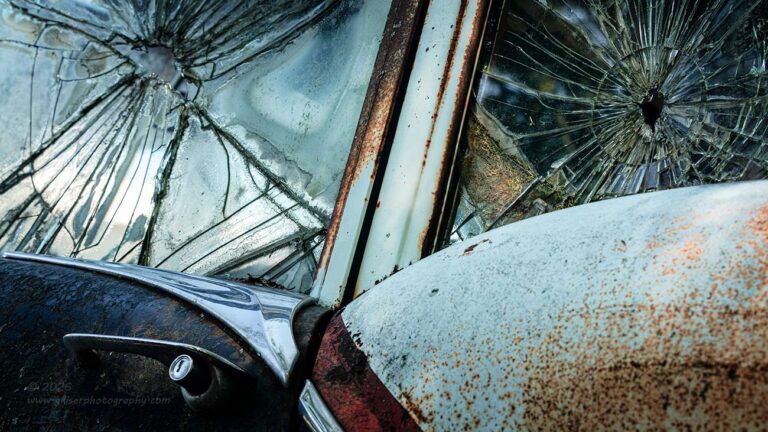
One of these areas and an area that I have come back to many times over is the windows on the passenger side. These windows have been broken for years but still hold together in the framework. Knowing all of the storms that have rolled through, I am kind of impressed by that, but more importantly, I have found that the cracked glass offers up some amazing textures. This might be the car that started my love for cracked glass, at least glass before the tempered glass became commonplace. The way that the old glass cracks is very much like a fingerprint. Each example is unique and presents totally different from the last. Even looking at this car with two neighboring panes of broken glass, they are both very different in appearance.
With this car, it is not just the broken glass that appeals to me, but the shape of the door and quarter panel. There is a sense of style that was added here that gives clues to the rest of the car. That was what motivated this particular photo, and I had to really work with it to meet my expectations of what it should look like. In fact, this is one of those added photos that I did the following morning. It had made the cut during the culling phase, but I wasn’t able to get it processed in a way that I was satisfied with until I had time to really think about it.
What you are seeing here is a changed aspect ratio from the standard 3:2 to a 16:9 which changed the visual weight of the elements. The crop pushed the attention higher in the photo where the glass was and left the beltline as a smaller element rather than including more negative space below the door handle. This alone didn’t fix the issues that I was dealing with as the photo still read awkwardly even with shifting some of the luminance values through dodging and burning. The final tweak that I did which made it work so well, was flipping it horizontally. There were no readily identifiable markings that would betray that flip and make it look odd. The colors and shapes all worked better left to right with the photo flipped and with that second tweak to the original photo, I had a successful one to add into the keepers.
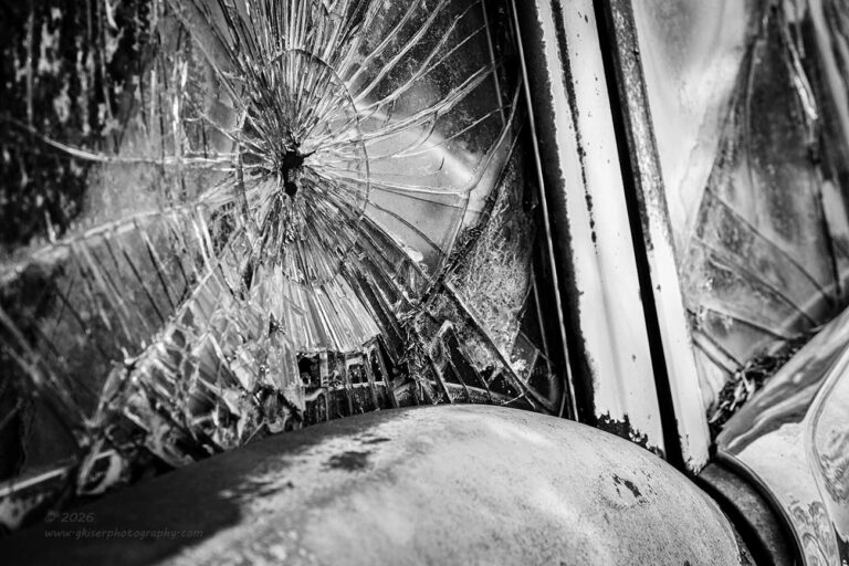
There had been another photo that I had shot of the cracked glass which had made it through the culling and initial processing phase. This was done a bit differently and from a position further back on the car. Normally, when I have photographed this part of the car, I have been squarer to the side of the car for a flatter image that I thought made the cracks more graphic. I suppose that is true, but I felt that I wanted an angle to add some drama to the shape of the quarter panel underneath of the broken glass. This started to cause issues with where to frame the image to the right. I needed that pillar, but at the same time, I was having to add a bit of chrome that was very bright and pulled the eyes out of the frame to the lower right.
In order to combat that, I chose to make the image black and white. This allowed the chrome to blend in with the white paint, so it was not so much of a distraction. Now, it was no longer the brightest element in the photo. This meant that the attention went where the contrast was highest. That was the broken glass and just where I wanted the attention. There was no question that this image worked well and that was why it was chosen over the previous during the first run of processing. Only after I had time to think about the images that I had bypassed did I start to figure out why I wasn’t happy with them and come up with solutions.
It is a funny thing about photography. When I am in the field, every time I press the button I think I have a winning image, or at least a solid keeper. Yes, every time I press that button. I also know that the reality of things will dictate that most of what I shoot will be trashed. How can both of these statements be true? Well, I take a lot of care working through my compositions before I press the button. I only do that when I think that I have the best possible image. Of course, I’ll look at that image on the replay and see if there are any improvements that can be made to exposure or framing. This is where I start getting into several different frames of the same composition. There are also times when I look at a composition and decide that changing things up will make it look better. It doesn’t mean that the previous compositions don’t work, it just means that I might be able to improve on them.
There are only so many things that I can do in the field as far as polishing a composition though. Don’t get me wrong, I do spend lots of time getting things as close to right as I can in the field, but there are things like aspect ratio which I know I can play with in the final version during post. The other end is working how an image is read. In the English culture, we read a photo the same as we read a book; from left to right and top to bottom. Of course, I will always make the argument that with landscape images that is left to right and bottom to top, but that is just my thought on the subject. I do try to keep that in mind when I am out in the field, but there are times and conditions where I have to photograph in a certain way. With this Olds for instance, the interesting windows are on the passenger side of the car. In the second composition above, that worked out so that I could create a photo that read successfully across the image. The first one, didn’t work that well, and that is likely why I changed up the composition in the field. It wasn’t until I got the images into post that I was able to compare and see how well they read side by side. I could also make that simple adjustment by flipping the image which allowed a strong composition to read more fluidly. Had I been able to get the same subject matter from the other side of the car, I could have done that in the field, but since I had a strong composition to work with, I could polish it with a quick alteration and make it work as if I had been on that driver’s side.
After taking another few rounds around the Olds and the other cars on this corner of the property I decided that it was time to start working my way back to the truck. I was getting tired, and I had way more photos captured than I had intended. It was going to be a long night of processing and blogging at this rate. I had no idea that I was still going to be typing blogs on Saturday afternoon…which I am.
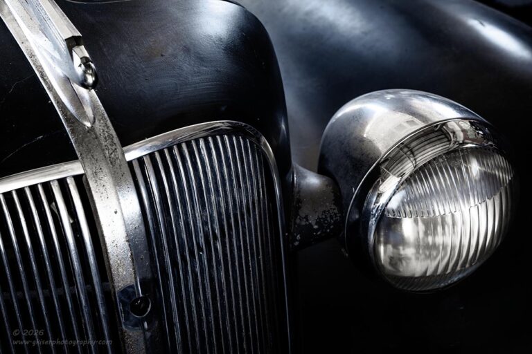
There was still one more car that I had wanted to work with that was in the shop. This was the Chevy that I had been looking at while Dean and I were talking when I first arrived. The car wasn’t in my preferred state of rust and patina, but the paint was aged nicely for a barn find car. There was a satin finish to it and some scratches and swirls to add some interest. It wasn’t a fresh paint job and that was all that really mattered. What had drawn my attention was the shapes that were formed between the grill and the fender with the headlight and chrome trim providing some visual interest to the curves. I could see the composition in my head while I was talking with Dean and knew just what I wanted to do with the car.
Since I was trying to get started while the sun was right on Stitch in the barn, I didn’t worry about the Chevy in the shop. The light wasn’t going to change dramatically on it throughout the day which meant that I could get the same photo now that I had seen a couple of hours before. Since things were kind of tight in the shop, I left my bag outside and brought the camera in which still had the long lens attached. I probably could have done this shot with the standard zoom, but I wanted to err on the side of caution by spreading that fender out as much as possible beyond the light so that I didn’t get any of the background in the shot. The extra distance from the car would also help reduce the possibility of me ending up as a cameo in the chrome.
It took a little doing to get the composition worked out since the camera was positioned well above eye level to get the angle that was needed. I had to use the LCD to get the shot composed and the focus set. Fortunately, it wasn’t bright in the shop so I could actually see the LCD with very little glare present. What I could see of the shapes told me that I was onto something really good here and I kept working with it and improving the composition with each of the four frames that I shot. It was looking like a black and white image since the color of the car was a cooler shade of deep green. The chrome was bright and looking almost white.
Oddly enough though, I wasn’t really wanting this to be a black and white image. I liked the idea of the calming nature of the cooler tones and felt that leaving the color in the frame would set a better mood for the image. It wasn’t until I got the photos home and could really see how it looked did I start to make the hard decisions. I could tell right off that the shade of green wasn’t all that pleasing in the photo with the correct luminance values assigned to the image. It was greener than I had pictured it and I was missing the cooler blue tones in the paint. Switching it over to black and white had the exact effect that I was worried about. It just lost something in the translation and seemed wrong. Had this been a show car, there was no doubt that black and white would have worked well as the chrome would have really stood out in a highly polished state. As the car was though, the chrome was a disappointment without that warm tone of tarnish on it.
This photo had been the one that I was most excited about coming home and the one that I was looking the most forward to processing. Even with that, I waited until I was about ten images in before I pulled it up on the screen to start. I wanted to be in my flow state for edits before tackling this one so that I could do it justice. It was like a speed bump when I opened it up. I didn’t like the color, and I didn’t like the black and white. The composition was spot on, but aesthetically it was a huge miss from what I was expecting. This experience was precisely the reason why I wanted to get into my groove before starting the processing. If I had looked at this seriously to begin with there is a really good chance that I would have tossed it in favor of something that worked better.
I had a lot of time visualizing this photo and how I wanted it to look which began during the conversation with Dean. I had known what the composition was looking like on the way home after seeing it in the LCD and I knew that I had a winner in terms of composition. I just had to work out the presentation of the image. I pulled my chair away from the desk and stared at the photo for a bit. The green paint was a sticking point for me, mainly because I had seen more of the blue tones with my eyes. This was more than likely a process of the white balance that was used on the camera. Since it was a sunny day outside and most of the light in the shop was coming in from outside, I had left the white balance on “sunny”. However, there were also lights on in the shop which could very easily be affecting the color captured. This was where I started and began playing with the white balance. It got better but still wasn’t where I wanted it to be.
The next step was pulling out one of my favorite color profiles which leaned into the blue tones quite heavily as well as desaturating the scene while adding some contrast. When I applied this profile, the color looked almost spot on to what I had remembered, and the brightwork was still showing the warmer tones of the tarnish. It wasn’t perfect, but it was close and I knew that by using this as my starting point, I could bring the colors up to where I wanted them to be while working out the overall contrast to where I wanted it.
Bit by bit, this image started to come together in terms of color and in contrast. By the time I was done with the edit, I was looking at exactly the photo that I had imagined while standing there talking with Dean. The subtle lighting on it gave just enough shape to the fender and grill shell for the dimension that the image needed while the brightwork gave some really nice contrasts to keep the eyes exploring the image. It was an image worth the excitement that I had experienced before, during, and after the capture. To think that I almost lost the momentum on it because of the colors that were captured. Sometimes the processing goes like this and it just not as straightforward as I would have thought. I’m very thankful that I stuck with this one though, and it might be my favorite from the day.
I was feeling pretty accomplished for the day and saw that I had over 70 frames captured which amazed me considering the conditions. I mean, as a photographer, I should have been sitting inside and waiting for several more hours so that golden hour could start and I could race to make photos for maybe 30 minutes. I had broken the rules, and I was going to pay the price for hours going through the photos and getting them processed. There was just one more scene that I spotted which I wasn’t able to pass up. It was just going to be one more photo, that’s all.
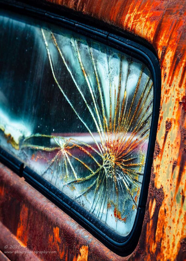
It was the rear window of a Chevy truck that was cracked which caught my attention. This wasn’t the first time that I had seen this truck or the window. In fact, I had photographed this truck many times and had even captured the broken window a while back. The way that the sun was hitting the back of the cab was just beautiful though. It helped bring out so much color in the rust around the window and added some sparkles to the glass as well. After spending so much time with the broken glass on the Olds, I was really motivated to give this one a try before I left.
The camera was still all put together, and it was just a matter of finding the right angle. I started off with the camera just slightly above the window and I framed the shot horizontally. I liked the idea of the shot, but the window just seemed too static in the frame with it having just a shallow droop to the right. I needed more droop and more diagonal to make this more interesting. I elevated the camera by about another foot or so and reframed the image with the window coming in at a steep angle to the lower right. This immediately felt better to look at, and I shot a couple of variations of this to make sure that I had the best composition available when it came time to process the image.
One of the things about glass is that there are two different reflective surfaces to deal with having both sides of the glass reflecting light. You don’t notice this when looking through an intact window, and it isn’t even all that visible when looking at a crack. However, when the angle gets really dramatic, those reflections start to be seen, and the actual crack tends to visually soften. I was at that kind of angle to the glass and when I started to look at things, I saw that the cracks were not as sharp as I had hoped. This wasn’t a focus or camera shake thing; this was the optical reality of the situation. The cracks were sharper in the first image because the angle wasn’t as severe, but they were softer across the board in the latter images.
I had to make a choice about how to proceed with this concept. On one hand the main subject, the cracks, looked better in the less dramatic composition. However, the overall photo was just not interesting. The photo that held more visual interest looked softer overall because of the optical qualities of the broken glass. My gut told me that this was the composition that I needed to entertain more than the sharper one. As I thought through the scenario at hand, I knew that this was supposed to be an abstract style photo. I had purposely reduced the depth of field to keep the area beyond the crack from being in focus, and I was fine with some of the rust losing texture due to softness. My creative goal was to capture the colors of the rust and patina and showcasing the shape of the cracks, not necessarily the textures.
In fact, looking at this image on a larger screen allowed me to see another aspect of the photo that I really liked. It seemed that the striping of the rust along the top and even sides of the glass took on a similar pattern to the broken glass. This was a concept that didn’t need utter sharpness to enjoy or recognize. In fact, having things a little softer made this easier to spot. The more I looked at this, the better I felt about the optical issues that I was facing with the subject. The photo worked well and I was really happy that I had spent the few minutes it took to capture it.
That was the end of my day though. I had been out there for a couple of hours by that point and had shot a total of 79 frames. During the scope of this blog entry, I had fired off an additional 19 frames which resulted in these five keepers. The final tally of images that I have added to my collection now sits at 26 when the original cut was 23. I’ve been at the beach for nearly a week and haven’t come back with this many keepers. This goes to show you that with the right subject, even the worst possible light that we are told about can be very good light. There is no reason at all to be scared of strong, midday, summer sun. It is just a matter of understanding that light and choosing to work with it rather than against it.
Thank you all for joining me for this trek and for making to the end of the blog series. Looking back on the month of July, I think that this might be one of the most successful Julys that I have had in terms of volume of strong photographs. I’ve done a little bit of everything during the month, and I’ve tried to take advantage of some less-than-ideal conditions along the way. There is no telling what August holds for me, but as of this morning, I have a lead on an old truck that might just work out well. Stick around to see if I can make something out of that subject.
Until next time…
 www.singh-ray.com
Remember to use the code KISER10 to get 10% off your purchase