Thursday, July 30, 2026
Welcome back to the blog. Looks like this is becoming a daily stop for you, and I do appreciate you dropping by. For those of you who haven’t been getting the notifications for new entries, you have missed the start of this trek, as well as the second chapter of it. There was also my newest Behind the Camera which was published yesterday where I talked about the state of photography as I see it. I had originally planned that I might just publish this chapter right after that Behind the Camera but thought against it eventually. I don’t like doing multiple entries in a single day as that tends to overwhelm folks. There was also another fold to the puzzle which I didn’t realize before. You see, as I tend to do with treks like this, I went back through and looked at some of the photos that didn’t make the cut initially and ended up doing some more processing. By the time it was all said and done, I had added three more images to the mix. Two of those were going to appear in today’s blog, but that made it rather long. Instead, I decided to break this conclusion up into two parts to make it a bit more digestible.
That brings us to this point on the second of August, still talking about a trek that happened on the 30th of July. As I’ve mentioned a time or two, the conditions were less than ideal for this trek with cloudless skies overhead making way for a blistering sun. To make matters worse, I was at the location right around noon. In fact, the first photo in this blog was shot at 12:28pm right at the height of the “bad” light that photographers are always talking about. While I’m very vocal about preferring cloudy days, I have found that sunny days during the middle of the day can provide some interesting light especially for subjects like these. I find it funny that so many photographers are just scared to go out on sunny days like this as if the light is unusable. All it takes is working the compositions around the existing light and understanding how to read that light. I guess that is what I’m trying to get across here with the title of this blog series and the fact that I have enough photos to fill four different entries. Take that conventional wisdom!!
When we last left off, I had been working around the middle of the property with a Chevy pickup and a sedan that were side by side before ultimately making my way up to a Winchester taxicab where I spent a good bit of time working with that. It had taken almost two years for the decay on that car to rise to the level that I found it truly interesting to photograph. I’m still really quite happy with how those photos turned out, but it was time to move on to see what else I could put in front of the camera.
The far corner of the property has always been a source of some of my favorite photos from here. Early on, there was a Ford Starliner that was quite a lot of fun to photograph, but sadly I didn’t really know what I was doing at that point, so the photos were not all that fantastic. That car was sold and hauled away by the next time I was out here, but there was that Oldsmobile Delta 88 which I had worked with many times over the years. It has some damage to the front that has always made the car look like it was snarling. Most every time I am out here, I spend some time with this car and have never been disappointed by it. There is also a little ratrod fire truck which is one of Dean’s earlier builds which sits by the old house. This car has found itself in front of my camera on multiple occasions and has formed the basis for many starts to workshops out here. There is also the shell of a hotrod that moves around from time to time that has been the subject of more photos than I care to admit. This corner has always held some very interesting photos, and the light is usually pretty good here during the afternoon.
When I got back there, the first thing that I noticed was that the Olds was looking very different. The hood was more opened than I was used to seeing it and there was a larger bend to it now. I could usually just see into the engine bay, but now it was out there for all to see, and the characteristic snarl was no longer a part of this car. I did end up asking Dean about that and he said that someone came to look at the car and opened the hood. When they closed it, the hinges bound up and the hood bent so that it couldn’t close any more. This was a real shame, although Dean said that he has a plan to fix it so that the hood will latch again. We shall see what it looks like the next time I’m out here.
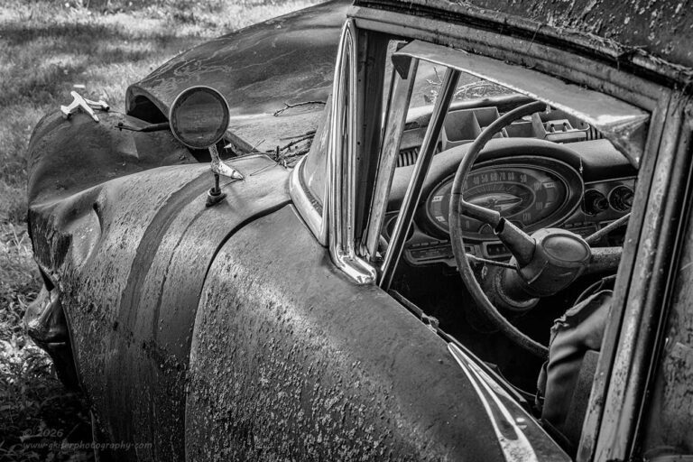
Even though the look of the car had changed drastically since the last time I had photographed it, there was still so much goodness to see and work with here. I took a bit of time to look around and see what struck me as photogenic this time. I just let everything seep into my brain and I processed it slowly. The end result was to go back to the dash and take a look at that interior once again. This is probably one of the first cars that I ever shot an interior shot of because the window is open and the dash is in really good shape. All of that still held true for me, but this time I was looking at the way that the light was bouncing around inside of the cabin. The car itself was in the shade, but the light all around was so bright that it was bouncing in from all over creating some nice light on the interior of the car.
I brought the camera up to my eye and started to see how things were looking with the interior. It all seemed very much like other shots that I had done in the past, so I started to figure out different ways of capturing the dash. What came to mind was something similar that I had done with the large Chevy truck with the door art that I talked about in Chapter 1. I liked the idea of having the interior as a part of the larger photo that included fenders and surroundings. It seemed to make for a more interesting composition with a bit more opportunity to think about the overall composition.
Now, with the truck, I had been using the wide-angle lens which worked very well for that truck. I wasn’t thinking that the wide-angle would be the best choice here because of the distractions that were around the car. The trick here was going to be reducing the background and filling the frame with the car more than anything else. Since I had the telephoto lens attached, I decided to see if that would work for the composition that I had in mind. There wasn’t a lot of room to work with, but somehow, I managed to get back far enough that the lens could work.
One of the things that I liked about this focal length, and composition was the fact that the hood blocked the view in front of the car. With the framing that I chose, the hood just carried around to the roof as a continual shape. This really simplified the overall composition and allowed me to keep the grass to a minimum around the car. Looking at the histogram, I had plenty of exposure latitude to be able to capture all the details that I wanted in a single frame. It was actually looking like a better lighting situation than I had seen with the large Chevy before.
I did decide to make this a black and white photo because of all the colors that were present in the scene. I felt that by leaving the photo in color, I was overly complicating the photo. This was the complete opposite of my reasoning for leaving the Chevy interior shot in color. In that situation because of the background, the color helped to define the individual elements within the frame. The colors actually simplified the composition and made it more effective. They would have done the opposite with the Olds, so always keep in mind that there are no hard and fast rules in photography when it comes to things like this.
Speaking of rule in photography, if you are trying to learn the craft and finding that you are getting more and more confused the more you try to learn, this might be part of the reason. It seems that every time you turn around, there is someone on YouTube telling you that “only amateurs make this mistake,” or “only pros know this technique.” They make it seem like there are certain rules that will make your photos either great or horrible and only those who know how to apply those rules can make it in photography. I’m here to tell you that all the rules in photography are just guides for when you aren’t sure what to do. It all comes down to creative vision and how you feel it should be presented. This is how I handle my mentorships. I take into account the person behind the camera and how they see the world. I consider their intended use of an image and what makes them unique among their peers. This holistic approach to mentoring photographers allows me to teach the person, not just tell them how I would do it. I look at each and every situation and person as a unique set of variables and I try my best to teach to those variables.
It is very much like these two interior shots. They were set up the same, but two very different situations with different lighting and surroundings. In once situation color was the right choice to simplify the image while the other benefited from being presented as a black and white. I looked at both RAW files and determined what would work best and didn’t really think anything about what others would say, or any rules governing the use of color or black and white.
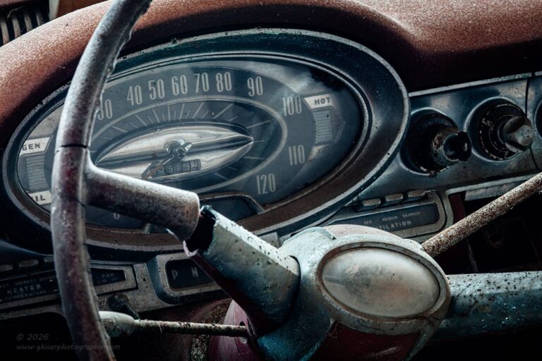
To throw another wrench in the works, the next composition that I worked on was a tighter shot of the dash itself rather than a more inclusive interior view. While the overall scene had worked well in black and white, I really liked the limited palette of colors that were on the dash. There was a nice blend of warm and cool tones which just seemed to go well together. The details on the dash, especially on the speedometer really drew me in and I liked how the colors helped to define the shapes.
After getting my tripod set up at an angle so that the camera could be as close to the side of the car as possible, I was able to get the framing that I was wanting. It was tight, but the long lens was the right choice to allow me to get the frame just under the window visor while avoiding the frame at the front and rear of the door as well. I just wanted to make sure that I had the speedometer and the horn button which had the same shape. The rest of the photo kind of filled itself in and with a bit of adjusting, I was quite happy with what I was seeing.
I had just fired off six frames for two different compositions dealing with the interior. The first one included the surroundings and worked out nicely, and the second had dialed that composition in to only show the details on the dash. On both occasions, it was the third and final exposure of each version that turned into the keepers. I was actually kind of surprised that both of the compositions worked out so well because I had shot the closer crop as an alternate in case the wider version didn’t quite pan out.
I normally spend more time with the Olds, but working on the dash like I was, caused me to pay more attention to the little ratrod firetruck sitting off in front of the Olds. This thing is just too cool with all the little custom touches. It was a blending of Mitsubishi and Isuzu trucks to arrive at this final version. Since I had done plenty of overall shots of this rig, I saw no reason to battle with the awkward light and bland sky for another overall. Instead, I wanted to pick out some details to work with.
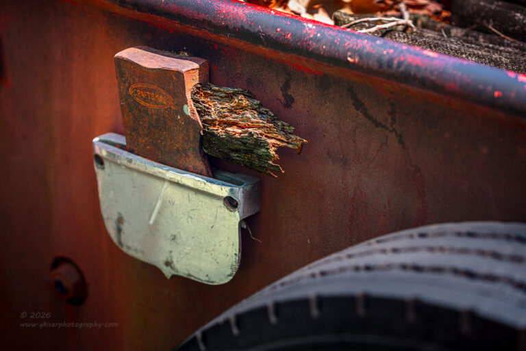
The first detail that I decided to try was the broken axe on the side of the bed. This is something that I had shot once before but had kind of messed it up a little bit. The photo still worked, but I was never quite satisfied with it. This was the area that I gravitated to once again. The light on it was pretty good with the shadowed side of the bed protecting the axe from any strong sunlight. Most of the issue that I had with the previous attempt was due to the exposure and highlights. The other part was due to the framing and the crop that I decided on. This time, I wanted to deal with both issues in an attempt to make a stronger photo.
The first step was partially dealt with as the sun wasn’t overly bright on this side of the truck. I intentionally underexposed from where I would have normally been to protect the highlights of the broken wood handle. Those areas had clipped and looked bad under scrutiny before. I also adjusted the composition to include more shapes around the axe for a bit of framing. This included more of the rear wheels which introduced a nice curve in the lower right. There was a bolt that was included to the lower left which framed on that side. The top was framed by including the bedside railing at an angle for a bit of visual drama. It all came together rather nicely and now that I’m looking back and comparing the two images, this one is worlds better than what I had shot before.
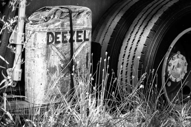
Another area of this rig that I find very interesting is the jerrycan on the rear which Dean added. Since spelling has never been one of my strong suites, the fact that Dean chose to spell Diesel as “Deezel” just makes me chuckle. If by chance, that is the proper spelling, disregard my statement and I like it for the seriousness of marking the container. I’m pretty sure that this was meant as a funny, and that is how I’m going to treat it.
I’ve shot this a few times with limited success. It was always missing something and there was always something with the composition that I didn’t care for. I was feeling good about what I had been doing so far on this trek, so I thought that I would give it another try. One thing that I noticed was different from normal was that the grass around the area was a good bit taller than usual. I’m not pointing fingers Dean, I know you were out mowing again by the time I was wrapping up. I also know that usually this is kept really tidy except when I have a workshop coming through. Those are the times that he doesn’t mow around the vehicles because he knows that I love finding them like this. Maybe Dean just knew that I was going to be coming around today even though I didn’t give him any warning before I did. At any rate, I loved the tall grass and found that it added just that right element to the scene.
As far as framing went, I had to be careful to the left because the can was so close to the back corner of the bed that it was going to force me to include a lot more of the scene than I really wanted if I included much at all beyond that corner. By keeping the crop close, I needed to keep the right edge of the frame pretty closely cropped as well. The wheel was a logical point to crop the image, but the question became at what point do I want to cut the wheel. I tried it with the entire wheel in the frame, but that started to change the visual weight of the image, and the fuel can got lost. By cropping in too close the tire ended up not serving the purpose and getting lost. The fuel can also ended up smack dab in the middle of the frame. After some fiddling with the elements, I found that cropping just past the center hub did the job that I was looking for. The tones of the hub were similar to that of the can which linked the two elements. The darkness of the wheel blended it into the tire which made the crop feel more considered.
The last part of the puzzle was the presentation of the entire scene. I went with black and white because the main subject in the frame, while lighter than the other tones, was devoid of color. The can drew the first looks from the viewer, but then the colors surrounding it started to steal the attention. The reds and greens were too punchy for the attention to stay on the Deezel container for more than a couple of seconds. I felt that this confused the viewer as to what was important, so in order to simplify things, I removed the color and let the contrasts work to keep the eyes where I wanted them.
The end result of the image turned out better than expected. It is easily my favorite photograph of this part of the vehicle. I like how it all comes together and the visual balance is just about perfect. Part of that balance comes from the sunlight that provided a couple of hotspots on the tread which helped to link the hub with the rest of the scene. The illuminated grass was also a nice touch because it didn’t visually block the main subject as much as the green over silver had done in the color version. Everything just worked with this, and I was happy that I gave it another try.
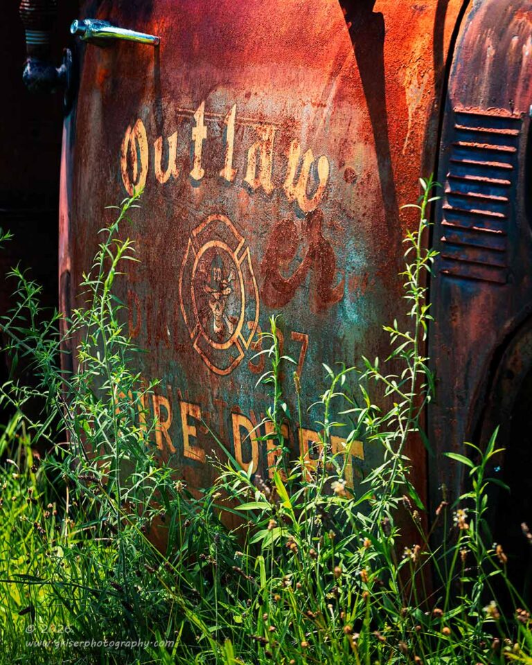
Just a few feet forward on the vehicle was another area that I had often photographed. This was the door art that really helped establish part of the personality of this rig. I’ve shot it several times, but never with the grass quite this high. Again, not trying to shame Dean, I am actually very happy that the grass was pretty tall here. It gave more of a sense of depth here as well as adding a bit of mystery about the door art. Of course, the viewer can easily complete the text, but it is another layer of interest. The highlights and shadows are another part of the equation that I found particularly interesting thanks to that strong sunlight coming from directly above.
It took me a while to figure out where to place the camera to get the composition that I was after, but once I did, I was really happy with how things looked. The only thing that was left to figure out was the framing. More specifically, I needed to know just how far up to go on the door. There was a large mirror that was mounted to the door that created a compositional problem for me. If I started to include it, I became forced to include even more of the upper door which then forced me to consider the window which brought in more of the mirror. By the time I was done figuring it out, I had the entire cab in the frame and that was just too much.
I wanted the attention to be on the door art first and foremost and that meant that I needed to simplify the image to keep the attention where I wanted it. The decision was made to cut the image right below the mirror mounting arm which gave me the chance to use the exhaust stack in the shadow to frame the left side with a natural vignette. To the right of the door, I had a slightly darker portion of the cab with the vent which also served as a natural vignette, especially when paired with the wheel well arch below the vent. The lower part of the frame I decided to allow to fall where it needed to as I wanted to include the grass anyway.
Now, there was a lot going on here just like with the Deezel photo. In that one, I had gone to black and white to simplify the scene and that had worked as I hoped. In this situation, converting the image to black and white actually caused more confusion to the image. The colors helped to define the elements and provide a better visual balance for the whole composition. This is just another example of similar situations requiring different techniques based on what is within the frame and what is trying to be shared with the viewer.
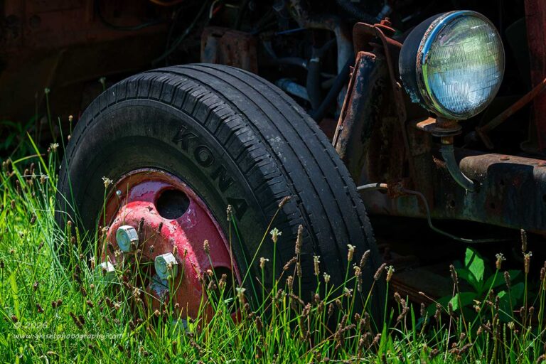
Before I called it quits on this truck, I took one more look around it to see if there was anything else that jumped out at me. Once again, it was the tall grass that made something pretty mundane rather interesting. That was the front right wheel. There really isn’t that much special with a wheel, but with it being painted red and being surrounded by the vibrant green grass, it took on a different level of interest for me. The question was, just how did I want to photograph this scene?
I didn’t want to make it just a photo of a wheel. There needed to be some context to it all. Looking around the wheel, I was mostly seeing mechanical items in the shadows which I didn’t see as particularly useful in a composition. The only thing that really stood out as being another element was the headlight housing that was mounted in front of the wheel. That made sense because it was bright and would balance out the red wheel. Having those two punchy elements would make the mechanical bits disappear into the shadows and not cause any distractions to the photograph.
The hard part was figuring out just how to frame this because to give the headlight room to breathe, I ended up including the grill which had decals on it which would require more of the grill to be included until it looked like the headlight was the subject and the wheel was an afterthought. I needed the wheel to be the anchor for the image and the headlight to be a framing element. That meant that I was going to crop in close to the headlight while giving the wheel a bit more breathing room in comparison. This took a little doing, and you would be surprised at how far back I was positioning the camera to get this particular framing with the long lens. The focal length just felt right for the scene though.
This was one of the images that didn’t make it to the processing stage during the first evening that I was going through the images. I didn’t like the crop as much as I thought that I would and I tried to make it a square to fix that problem. I didn’t like it as a square crop at all because it became just a photo of a wheel as I suspected. It wasn’t until the next morning that I pulled in three additional images to look at that I gave this one another try.
It wasn’t so much the composition that I didn’t like as it was the balance due to lighting. I started to do some processing to it and then created a few local masks to dodge and burn some areas for better balance. After a few minutes, I was able to see the composition for what I had intended when I set it up. It is still not a favorite photo of mine, but I do think that it is successful and has merit enough to become a keeper from the day.
With that, I am going to take another break before I start on the final chapter of this trek that should have failed miserably. At this point, I have added another six keepers to the mix with another 18 frames shot. This brings the total number of keepers to an astounding 21 out of 60 frames captured. How many more can I possibly have to share with you? That is a valid question because I have been going here for years photographing the same subjects time and time again. I really should be finding myself at a point where I can’t find anything else to photograph. That is obviously not the case, and I’m sure that the lighting is playing a large part in my success because I have plenty of cloudy day photos with flat light in my collection. Join me back here again tomorrow for the real conclusion to this trek.
Until tomorrow…
 www.singh-ray.com
Remember to use the code KISER10 to get 10% off your purchase