Wednesday, December 17, 2025
Welcome back to the next installment of this multi-part blog series. I’ve been a little absent from these pages over the last few months, and it would appear that I am about to make up for that void created in your appetite for decay photos. When we last talked, I had just finished conquering a Chrysler Imperial that had eluded me over the Summer because I just wasn’t able to figure out a composition that would work with the car. If you missed that entry, go back and give it a quick read because it really sets up what happened for the rest of my time on this property.
On my first visit here, back in the summer, Things were a little rough to get started, and by the time I arrived back and started with the photography, I found it very hard to really dial myself in as I was overloaded with great potential. Even though I was mainly hitting the low hanging fruit in terms of compositions, I still managed to come back home with a ton of new photos which ended up being shared in a multi-part blog series. After several of those, and even promising that I was going to be dialing back the length of the blogs, I jokingly titled those blogs “Not” with the subsequent parts after that. Ironically, it was on Wednesday that I was finally to the point on social media where I was starting to post the photos from this property. I had already been contemplating returning for a bit of a more relaxed experience with less vegetation to get in the way. It just so happened that I ended up back out here the day I posted the first photo from this property.
That has given me a very unique way of looking at this trek. Not only am I going through the previous one photo by photo as I do my daily posts on Facebook, but I am also looking at the new photos as well as reliving the trek in minute detail over the course of the next few days. There is no way to avoid comparisons between the experiences and the photos that I have captured. It goes without saying that the Chrysler Imperial that I had shared in the last entry was a huge achievement over what I was able to produce on my first visit because I was able to get nothing then. As I started to prepare for this entry and figure out how many photos I was going to include here, I was able to see another car that I hadn’t done anything with at all that turned into a fun little abstract study. There was the car that started it all, a 240Z which I was never really all that happy with how the photos turned out, but now I have a couple of shots that I didn’t think were even possible during the Summer. I also spent time with another car that I thought I had gotten all the good photos out of but turned out to have a couple of simple images that I feel are even better than what I had shot before.
There is just no way you will ever convince me that a photographer can produce the best possible images on a first visit to a place. I had really liked what I had created months ago, but after going back and knowing what to expect from the property, I have proven once again that returning to a location results in a much better chance of capturing the essence of the place or subjects. It all goes back to listening to the landscape, or the subjects as it were. The first time out, I had a lot of different voices coming to me from all the new subjects all trying to get my attention. It was too much to sort out effectively, or at least as effective as I would have hoped. Now that I was familiar with the location and understood the vibe that it put off, I was able to really “see” everything in a much more organized light. Finding that common wavelength with the subjects made all the difference in the world. I also had the benefit of having gone through the list for the 12 most significant images of 2025 which will be published in a little over a week. During the making of that list, I came to realize just how impactful my isolation compositions and abstract work had been. I’m starting to see where this kind of photograph really showcases the vision of the photographer while grand scenes and the photos that just depict a “pretty” or “interesting” scene are more to show off the technical side of photography. There is nothing special about capturing a scene like that, but when you start to pick out the details and really boil a scene down to just what interests you, that is when the artistic side of photography comes into play. This is also the time that you see what makes a photographer unique.
These two concepts came together for this trek, and I was able to see the minutia within the larger scene much better than before, and I had a very strong urge to capture the essence rather than to document what I saw. With the exception of one of the photos that you will see in this blog entry, every one of them is based on picking out a detail or element within the overall vehicle that would then become the photograph. Just so we are clear about this, the crops and framing that you are seeing here were all picked out in the field and framed in the camera. I know that many photographers will shoot an entire scene and then crop into areas to make individual photos later in post. I’ll never do that because once you capture that overall scene, your angles are locked in. For me to make the images that you see here, I choose the angle of the camera for that one shot specifically. By doing this, I can bring the full resolution of the sensor into play with the final image so these little details can be reproduced at a very high quality on a huge print which is how I like to see my photos.
Speaking of prints, don’t forget that all of the photos that I have here in the blogs as well as in the galleries are available for sale. You can order smaller, stock sizes through the online store, but to really match your decor and to see the prints larger than 13×19″, I do offer special order sizes and media that include countless options. I just need to have a quick discussion with you about what fits your style and space to make the perfect print for your walls. By purchasing a print from me, you will have a unique piece of wall art, and you will be supporting my art as well as my business. Those print sales go a long way towards funding these treks and the resulting photos. I look forward to hearing from you and know that your new print will exceed your expectations.

Now that we are through that “this post is sponsored by…me” intermission, I’ll get back into the blog entry at hand. After working the details on the Imperial, I turned my attention to the shell of a Plymouth sedan of some sort, a few cars to the left of the Imperial. It was one that I had seen and dismissed during the first visit because the entire rear of the car was missing as was the front with the exception of the hood. All that was left was the roof, quarter panes, and four doors. This car was certainly not low hanging fruit in the sense that it was a gimme composition. The only thing that it had going for it was the rust and decay that was showing up on what was left of the body panels. I keyed in on the passenger side which had the most intense decay. I wasn’t going to do anything with the entire car, but I was seeing a potential for some isolations which is what I started to work on.
Photos like this are hard to visualize in a crowded scene with lots of photographic potential to work with. That was why I hadn’t paid any attention to it during the Summer. Now that I knew what was here and had ideas about how I wanted to photograph things, I was able to slow down and pay attention to the little things. For the next bit of time I was concentrating on the passenger side of this car and was trying to get some working compositions put together. It took a minute to understand the car, but once I did, I was able to see lots of really compelling compositions which I started to put together.
The first one was kind of the obvious one based on the door handle. You’ve all seen me do compositions like this on other cars, and there isn’t anything overly unique about the concept, but the part of the scene that I used to balance with the door handle was a large area of rust that had caused the skim coat to peel and flake off. To me, it looked like a heart and had structure to the shape. The area around it was filled with textures and dimension which made for a very interesting photo. The molding gave a nice diagonal when the camera was elevated with the door post breaking up the negative space caused by the windows. Since most of the visual information was low and to the left, the comparatively empty upper right created visual tension to the image. The fact that the door wasn’t latched and was sagging a bit gave that last bit of visual interest while linking the lower body seam with the door post above.
Here you thought that this photo was a random capture of some rust on a door. There is a lot of thought that goes into these compositions once I figure out what I want to photograph. It is always a mix of compositional suggestions and going with my gut that leads to these photos. It is all part of my visual language and that is something that I have been working on for over two decades now. Most of it is subconscious in the field, though there are some things that I will adjust after considering options in my mind. It usually isn’t until I get the images back home that I start to really look at them critically to figure out why a photo works, or why it might have missed the mark. This is when I can really see what was going on in my head at the time. By doing this, I get faster at making the decisions in the field and it looks more like it is just a natural process to anyone looking at me. With practice, anyone can do what I do…in their own way.
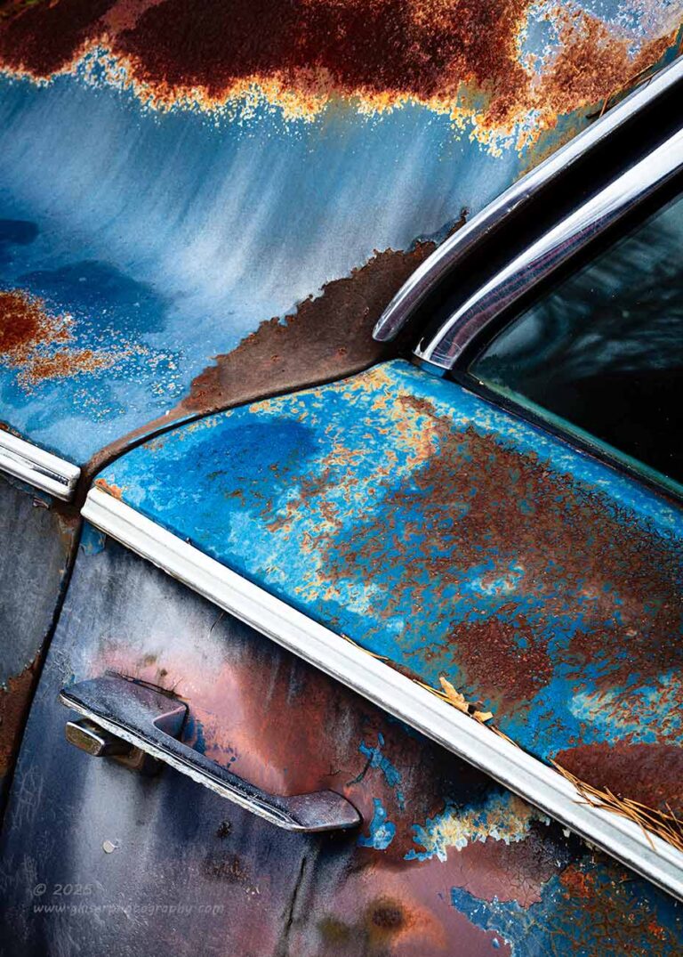
Having two doors on one side of the car isn’t my preferred situation. I’m always going to be a two-door kind of guy, but having the extra doors gave me the opportunity to find another composition with kind of the same formula as I had used on the front door. I’ve found that door handles work very well with a background of patina and rust, so I moved back to the rear door handle and started to look at things around that handle. Just as with the other door, the paint, patina, and rust were remarkable on this door, and I found that the pillar also had a great section of rust that had some staining underneath of it that looked like someone had brushed the paint. Everything from the textures to the colors, to the staining worked to create a very interesting visual compilation of elements.
With this in mind, I started to formulate a composition that included these aspects. I began with a horizontal frame that seemed to fit everything in that I wanted, but there was something about it that seemed off. The scaling was fine, and it read well from left to right, but it didn’t feel good. I studied the image on the image review for a moment and pictured it hanging on a wall. The photo didn’t fit in the frame well and felt awkward. There was too much side to side and I found that the majority of the visual interest was in a section that was largely vertical. That was the key, and with a quick flip of the camera as well as a slight repositioning, I was able to get a vertical shot of the same concept.
This worked miles better than the horizontal version and captured just what I had been interested in. I had the same diagonal flow with the molding for that bit of visual interest, but the seam of the door took the eyes in another direction that added to the excitement of the image. Everything was better with it in vertical and when I stepped back and looked at the camera imaging the photo framed and hanging on a wall, it felt right. When I looked through the images during the culling, I liked both variations enough to push them through to the second round of culling. It was then that I had to make a decision about which was the right one to process. Looking at both on the screen, I found that they were both effective and the horizontal one was better than I had given it credit for being. However, after really looking at the two, the parts that I liked the best, while visible in both versions, were more pronounced in the vertical composition. That was the one that I ended up going with, and I think that I made the right choice here.
This is one of those times when I just about could have cropped the horizontal image in a way that would have created this very composition. It would have looked just as good here on the website, or on any online platform. You wouldn’t have known that I had cropped over half of the pixels to arrive at the photo. If you then ordered a print that was say 20×30″ in size, I would have to really stretch the resolution of the image and some of the sharpness in the details would be missing in that print. This is why I shoot for the end composition in the field. What you see here is all of the pixels that should be here after changing the aspect ratio to fit a vertical format better. I can print this larger than that with plenty of details, and who doesn’t want a photo of a rusty subject where you can’t “feel” the rust just to look at the photo?
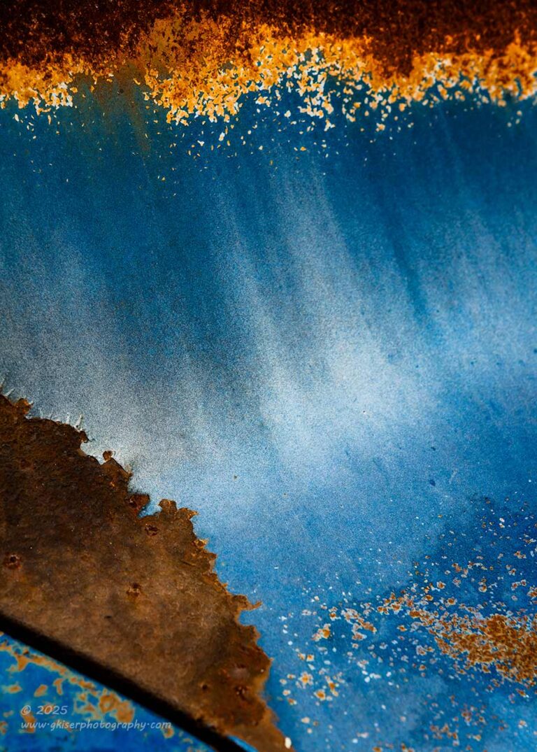
Speaking of really looking into the details on the car, I was particularly drawn to the area on the rear pillar where the color had started to fade and there was a good amount of staining below the rust. It kind of reminded me of a large wave breaking at the coast. This was one of the details that I was particularly drawn to. I wanted to get in and explore that little detail without having to include the visual anchor of the door handle as I had done in the last two compositions that you have seen. I still felt that there needed to be some kind of structure to this photo, so I included the dark rust above to frame the top part of the image, and I brought in some complimenting rust at the bottom left corner as well. It still lacked structure, and I wanted there to be a diagonal element to the scene, so I included just a sliver of the seam from the door to the quarter panel. This gave a nice little triangle on the side which complimented the lighter rust on the other lower corner. That was enough to adequately frame the color variation in the middle.
The issue with this was it read awkwardly when I had it up on the big screen. There was something that I just didn’t like about the line at the lower right corner where the door seam was. It took on too much importance to the scene and threw the composition off a bit. Now, nobody would have noticed or thought about it, but on a subconscious level, it would jar the brain. Before I dismissed this one into the discard pile, I flipped the image horizontally which moved that section of the door to the lower left as you see above. This immediately felt better and was less jarring to my brain. That little sliver no longer held that much visual importance in the scene. It was now an element that directed the eyes further into the scene which is what I wanted to happen.
This wasn’t a problem that I spotted in the field when shooting this photo because I was just reacting to an area that I liked on the car. I had composed based on my gut as to what was going to look nice and balanced, but I didn’t put much technical thought into it. That was a luxury that was reserved for when I got home and could really pick the photo apart and determine if it worked or not as a photograph. It also gave me the chance to see if flipping it would work better. This is a technique that works on just about anything that doesn’t have writing or something that would indicate if it was being viewed as a mirror image or not. That is the wonderful thing about abstract images. They rarely have any visual clues about what is left or right, or many times what is up or down. This gives so much creative control over how a photo is viewed by the audience. Something so simple as flipping an image can truly affect how the brain receives the photo even if the viewer doesn’t know that they are supposed to look at things in certain ways.
I walked around the Plymouth one more time and decided that I had gotten what I could off of the car. I was quite happy with the variety that I had captured from essentially a six-foot section of the side of the car. It was much more rewarding than if I were to have captured a single overall composition of the car. There is a time and place for that kind of shot, but this car just wasn’t a good subject for that largely because of all the missing parts, but also because of the location. The car that I moved to next was a little bit of a different story though. You might remember this one from my first visit as I did start off photographing it, and it was the car that drew me to the property in the first place. You guess it, the 240 Z that was parked near the top of the driveway.
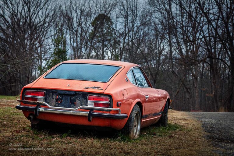
The last time I shot this car, I dealt with it in terms of isolations because of the distractions around the car. Most of those distractions were still there and they prevented me from getting anything at all from the front of the car. Again, I started to look at this car in terms of details, but with the paint in good enough shape that there wasn’t much if any rust on it, I had to look at photographing this car as I would any other shiny car out there. The problem with that was that the car wasn’t in that good a shape. It was more in the decay realm, but not so much for the details if that makes sense. It is the impact of the car overall that more effectively communicates that decay aspect and that was where the photos fell short on my last visit.
Now, I know that most of you would be fine if I just bypassed this car and moved on to more of that Mopar goodness that is scattered about on this property. This is just a little Japanese tin can of a car after all. True, but these cars will always have a soft spot in my heart as they have always been a favorite of mine since seeing a ’77 280 Z when I went to high school. It was silver, lowered, and had a booming system in the trunk. Oh, and there were spoilers front and rear with louvers on the rear window. It was a beautiful car and the only car on campus that made me feel a little less impressed with my CRX. I had the opportunity to buy a ’72 Z after totaling out my CRX in college and I jumped on that chance. That was the Spring break that I learned what rust removal was all about and learned how to apply copious amounts of Bondo, right before learning that this is not the way to deal with rusted panels. That’s a story for another venue but just know that the year that I had that Z was a great year for me in terms of automotive experiences. It is the one vehicle that I’ve ever owned that I regret getting rid of nearly every day. The running joke is that my then fiancé had strongly suggested that I get something without all the issues. I traded the car on a truck, but in hindsight, I should have gotten rid of her and kept the car. These days I have neither, and I only miss one of them.
Because of this history with a Z, I will always take the opportunity to photograph one, and here I was looking at this one yet again. The biggest decay feature on the car was the ugly wheels (same ones that mine had by the way), which just weren’t all that photogenic. There were cars all around this Z so there was just no real way to get a clean shot of it. Or was there? As I was looking at the car from the rear, I was able to get a clear view from the rear passenger side. These cars look good from any angle to me, so I started to work out a composition. There were some things along the road that I had to block out with the positioning of the car, and I do believe that there was another car parked in front of the Z that had to be addressed. I wasn’t able to use a wide angle lens because most of the distractions were close to the sides of the car. This mandated a normal to telephoto approach to the car. There were also support lines from a power pole that had to be dealt with. I opted for the telephoto lens because it would give me a bit shallower depth of field at a tighter focal length which would help to simplify the scene. I was going to need to get low to the ground to cover the distractions in the distance, but that also gave a very flattering view of the car which was a great thing.
It didn’t really take that much positioning before I was happy with how the composition was looking. It was just a matter of making sure that the shutter was released when there were no cars in the frame and none being reflected in the side of the car. If I’m being honest here, I wasn’t all that convinced that this was going to be a good photograph. It seemed a bit like I was just taking a picture of a car that I saw and seemed to lack a story. I know that not all photos have to have a story that goes along with them, but I do like to engage my viewer with some kind of inner dialog or questions that pop up. I had the photo, and that gave me the opportunity to evaluate it later on when I got home.
When I did pull the photo up in Lightroom, I liked it, but mainly because of the subject. I mean, I know I am greatly biased when it comes to a Z in a photo. I’ve not met one that I didn’t like, which makes it hard to really look at photos like this critically. I get that and fully accept that I am impaired when it comes to these cars. I started to examine the scene critically though. I had framed it keeping in mind a number of compositional considerations and had used the driveway for a bit of nose room for the car as well as a framing element. Looking at the photo, the driveway was now calling out to me because the car was facing that driveway as if it were getting ready to merge onto it. Just like that, I had convinced myself of the story behind this photo. It isn’t anything wild, but it fits the look of the car as this could very well be a driver car with some age on it. I can hear the inline six rumbling through the exhaust and can smell that exhaust as it comes through the trunk seals into the passenger compartment. It really is a good thing that the seals on this car don’t seal very well, because all of the seals in the front portion of the cabin allows you to live with some fresh air entering to counter the exhaust that is always being sucked into the rear of the compartment. Yes, I have a rather in-depth relationship with these cars.

I ended up really liking the overall photo of the Z and it was the first time I had been able to capture this entire car which made it an achievement not unlike what I had done with the Imperial minutes before. While I was in the field, however, I wasn’t sure if I was going to like the photo or not, so I started to look for another way to capture the car. I went around all the sides and corners and looked. It did strike me as funny that the car that I think has the most beautiful design language is the one that I struggle to photograph the most. I mean, I just shot a partially disassembled sedan and had no problem putting together abstract compositions of it. I had shot a proverbial land yacht and had found all kinds of details to shoot and even used a telephoto lens to find the back seat for an interesting shot. Neither of these cars struck me as particularly beautiful, but I was able to photograph them without any undue problem. Here I was looking at a car that has probably done more to inspire my love for cars, than any other vehicle out there and was stumped as to how to photograph it. It was as if any photograph or composition that I could come up with wouldn’t do it justice and I was scared to try.
As I am typing this, I’m seeing a correlation to another problem that I have with photography. That is photographing Toni, and I think that many of the same hurdles apply and I just don’t think that I can truly capture what I am seeing and feeling when I look at her. I’ve tried, and the photos are really good, but they miss the mark ever so slightly, and that is what normally happens when I photograph a Z. I find them both beautiful, but the camera just never does them justice. I’m not as invested with other subjects (people or cars), and it is easier to create images without that investment. Anything that I feel for the subject is short lived and based on the situation when I’m photographing it. I can move on after that and improve for the next one. There are just certain subjects that I just feel I can’t let down. A Z is one of those subjects and I feel like I’ll always chase that perfect photo that defines how it makes me feel.
With none of the detail shots really working for me, I took a step back from the car and asked myself what about the car did I most like, and what would reflect the essence of the car. I loved the lines that showed off the long hood, the rearward seating position and those iconic pillars after the quarter windows. These are bits of the design language that have shaped many new versions of the Z over the years and with good reason. The sculpting of the body, especially over the rear wheel is just something magical to me. With this in mind, I started to look at the car from the same angle that I had shot it from minutes before. The lines were there, and they had been visible in the overall shot that I had done of the car, yet they just kind of blended in as a part of the car. For me, as the photographer, I needed to figure out a way to communicate exactly what appealed to me about the lines on this car. I wanted a photo that I could always look at and remember just why I love this design. The answer wasn’t a photo of the entire car; it was a photo that accentuated the long and lean look of the car. I needed to do a very odd crop for my photography. In fact, the idea that I had was somthing that I am pretty sure that I’ve never done before.
I started to frame up the whole car, not unlike I had done previously, but I zoomed in closer and closer until the length of the car filled the frame. I cropped through the rear of the car only leaving a bit of the rear finisher visible to accentuate the line. I kept the roof line intact as that was important to the design language. The odd bit of this was I cropped out the lower half of the car just at the wheel arches. This took some finessing as I figured out just how much of the wheel arch to retain in the composition in order to support the overall balance and to make sure that everything that was visible in the frame looked intentional, and nothing was visibly missing. When I finally landed on the right composition it still looked rather odd to me, so I played with the exposure settings. Using a very shallow depth of field allowed me to focus right on the Z badge allowing the rest of the car to go kind of soft leaving just the presence of shape to be seen. The background was nearly obliterated in blur, or bokeh leaving the focus just on the shape of the car, rather than the car itself. While messing with the aperture I noticed that when the frame was underexposed the orange popped off the frame quite dramatically and the windows took on a cool blue look. The underexposed look was what I was after and how I ended up shooting the photo.
When I got this one home and pulled it into Lightroom to start processing it, I still wasn’t convinced as to whether or not this was going to work out. However, after a minute or two of dialing in the colors and contrast I absolutely loved how it turned out. This oddball composition captured what I love about the Z and it gets my heart racing to see it. Everything in the frame is balanced and it works on a technical level as a photograph, but more importantly, it creates an emotional reaction from the photographer that wasn’t even present when I was shooting the scene. This is one of those examples where I used the subject to photograph an emotion that wasn’t even there. That just doesn’t happen often at all but is always a goal of mine when creating a photograph. What do you think, did I nail it?

I had spent some time with the Z and had come away with two different shots from essentially the same spot. There was nothing else that I felt like photographing with the Z and I knew that there were many other subjects that I wanted to spend time with on the property. I had run into this problem the last time I was out here as I ended up spending most of the time with just a couple of cars and had actually forgotten to shoot one that I wanted to capture. One of the cars that I had spent just a little bit of time with was a Chrysler that was parked in a shelter which was surrounded by different bits of property and spare parts. It was difficult to get to but was a really excellent example of an old car. There was enough rust and patina to make it interesting, but there was also plenty of paint to show that the car isn’t that far from looking good. I had spent a good bit of time with it the last time and had focused on the hood ornament and the rear details around the trunk. These were the areas that I could get to and appeared to be the low hanging fruit on this car. Neither area excited me this time because I had captured all I really could with those elements. The lighting wasn’t all that different so there was just no need in revisiting those compositions.
Looking around the car revealed a few more bits of interest for me though. Most notably was the emblem on the side of the hood. It was naturally framed beneath the molding and above the seam of the hood. I’m not sure why I didn’t shoot this the last time, but I figured it was probably because of something in the way. This time, I had reasonable access to the area and started to work on figuring out a composition. The first one that I tried was probably the most expected as I have shot hood emblems like this for many years now. It is just a straight on composition using all the framing elements to make the emblem the star of the show. It was simple to put together and to expose which meant that I was able to move on after a minute or so. I didn’t like leaving this as just the simple and expected composition though. I needed to add a bit of visual excitement to it through the use of some other elements and possibly some angles.
I expanded my scope around the emblem to see what I had to work with. The molding was missing on the cowl which had worked out well for the last composition for a bit of visual tension, but that molding picked back up on the door. The missing molding accentuated the body seams on either side of the cowl which I liked. The fender below as not in bad shape at all and had very little rust. There was some patina to the oxidized paint and some cat paw prints made for more visual interest. It was essentially negative space though. However, the more I looked, the more I started to see that there was a glare on the fender that came together at the back end. That brought in a nice curve at the bottom which brought your eyes right to the emblem before finding that molding to finish the visual tour around the scene.

With all of that in mind, I was able to form up a composition that worked just as I had suspected. The polarizer was very handy in determining just how much of the glare would be visible in the frame. It was probably used at about 50% which was just enough to give the contrast that I needed overall, while still keeping the glare to be used as a visual roadmap for the image. The only change that I had to do when I got the image into Lightroom was to crop it down to a 16:9 aspect ratio to firm up the attention on the emblem which was kind of getting lost in the middle of the frame to the left. By removing the top bit of the photo, the emblem was now in a very nice diagonal relationship to the interest provided by the glare on the fender below. This is where the visual balance of the image came from and is one of those great examples of when changing the aspect ratio for the photo is a good choice, and a good use of cropping because it serves a purpose.
I did a little walk around this car once more before realizing that I was pretty much done with it as well. It was just way too hard to get clear views of, and there was no way to get an overall photo of it with the stuff that was surrounding the car. I would love to get a picture of it sitting in the shelter because I think that it has a lot of potential, but there is just no way to make that happen currently. There are still plenty of other subjects to work with on the property, so I bid the Chrysler a farewell and moved over behind the building to where the owner’s Grandfather’s Polar drag car was sitting.
Now, I had photographed this Polara a good bit the last time that I was out here, but it was another example of a great car being in a lousy location for photos. First of all, it was under a metal shelter for protection when I totally understand. Second, there were all kinds of mowers and UTV’s parked around it probably for protection as well. It was very hard to get a clear view of anything on the car, and I was pretty sure that I had taken advantage of all that I could manage with this car the last time I was out here. It didn’t take long before I decided to move on in hopes of finding something else to capture.
We are seven more photos into this trek which brings the total number of keepers to 12 up to this point. I’m still not done and will return with another installment to this series tomorrow. There are still so many great photos to go through and I’m just getting started with these first two blogs. Keep an eye out Saturday morning for the next part as we go through what is proving to be a very good location for photography.
Until tomorrow….