Tuesday, August 19, 2025
I admit it, we are back here again with another part 2 of a multi-part blog series. I know that I am trying to get away from those here lately, but the more I try, the more I seem to get myself into the situations where I kind of have to shorten the blogs to a more digestible size. This is for my benefit as much as it is for yours. These blogs take while to get finished, and I just really start to get tired of typing after a certain point. It is much easier for me to be able to take a break and let my thoughts catch up for a bit. I also assume that it is better for you, as the reader to be able to go through these entries in a single sitting. Of course, I’m assuming that a fair amount of you are actually reading through the accounts of my treks. I know there are some (like Toni) that might skim the narrative and just look for the photos, but what fun is there in that?
So, in case you missed the last part of this blog that was published late last night, you can catch up with it here. Essentially, I started out on a day full or ironies. The main and only real location that I wanted to shoot was a ’57 Chevy wagon in front of a shed that I spotted in Walkertown the day before going to the eye doctor. This is a location where I have lived for over 20 years and thought that I had worked pretty much every aspect of it out. However, time changes things and photography subjects come and go. It was kind of surprising to find a scene that was this good not even five miles from where we used to live. When the weather looked right the next day, which rarely happens, I decided to make the hour and a quarter trip out to this location rather than try to shoot another old car that was much closer to home. It was an investment in time to go out there on the chance that I could find the owner and get permission to photograph the car. That didn’t pan out as I could never locate anyone to ask for permission.
That brought me to my plan B for the day which ended up being another car that I had spotted off of the main route into Forsyth County. The blue Chrysler had grabbed my attention because of the distinctive shape from the ’60’s, but when I started to look closer at it, I really didn’t think that there was going to be much there to work with. It was surrounded by other cars that had nothing to do with the story that I was wanting to tell, and there wasn’t that much rust on it which made the blue kind of boring to look at. I ended up stopping there just to kill some time and that resulted in eight keeper images out of 25 frames captured. I guess you could say that I missed that call when I thought there wasn’t much potential there.
There was no doubt that I had gotten more photos out of that “boring” subject than I was going to get with the more exciting scene that I had come all this way to capture. I should have been satisfied for the day considering my goal was to have a quick editing session and be done with the blogging by the time Toni got home. However, I was still wanting to get that tri-five Chevy because it had been burned into my mind snice the day before. I tried to go back out there, but there was still nobody to talk to and get permission. After leaving my card in the door with a note, I took the scenic route home in case I were to get a call. I also knew that there would be two areas of potential that I would be passing through on the way home should I see something else that sparked my creativity. It wasn’t so much that I wanted more photos, I just wanted some different colors than just the blues that I had photographed already.
I like a bit more variety in my photographs when it comes to blog entries and I just didn’t want to have a full entry based on a single color. Yet, as we are just getting started with this second part, you have only seen that blue car in the first entry. Ironic, huh? At least some of them were black and white for a bit of variety, but largely the colors were pretty much stable through the whole shoot.
Now that I was on my way home and back on the main route, I found myself in Yadkin County and was coming up to an area that had several shops on either side of the road that often had some interesting subjects. The first one that I came to had a tan car in the parking lot that I had noticed the day before. It looked like a Mercury of sorts and had a unique look to the front end. It was a four-door car, but was a design that I could see some potential in. I pulled in to get a closer look. It turned into a Ford Thunderbird and was one of the few four-door versions with the suicide rear doors. The car was in generally good shape except for the vinyl top which was torn to shreds. I didn’t really find anything that I wanted to photograph on the car, and it wasn’t in a location where I could have gotten the full car in a photograph. That would have been worth stopping for, but not the isolations that this car presented to me. Everything that interested me on the car, I had shot on another similar Thunderbird a while back, and this one wasn’t as good an example for a decay photographer.
I pulled out in the road again and looked at the next shop on the left. I had been to this one several times in the past and had photographed many of the cars that were still in the lot. While there were interesting subjects to be had, there was nothing new that grabbed my attention. The next location was on the other side of the road and occasionally there were some good subjects there, but this time there was nothing in the lot that interested me. I wasn’t really feeling bad at all because I knew that I had a good many photos already in the bag from the Chrysler earlier. There was still one more spot to check while I was here and it was coming up next on the right.
I could see many of the cars that I had shot before, and a couple of new ones which were in a bit too good a shape for me to really take notice of. However, things were spaced out well here and I had some more opportunities to work around the cars. I also knew that there were some other potential candidates located behind the shop. It was worth a stop considering I was here and there were several good subjects that I could potentially work with. The one that really caught my eye was a wonderfully patinaed ’40’s Chevy that was tucked in with several other cars at the corner of the lot. The business didn’t look open, but I remembered that being the case the last time I came through and photographed it. I went to the front door and found it to be locked, so I pulled out my phone and called the number on the business cards out front.
The owner answered the phone just as he had the last time and I introduced myself again and mentioned that we had spoken a couple of years prior. I again asked for permission to photograph the cars on the property, and he granted that permission. I specifically asked about behind the business as well since I had spotted what looked to be a Chevy with some fins back there which caught my eye. He said those were just parts cars, which was actually just fine by me. With permission, I went back to the truck and grabbed the camera bag and tripod so I could get started with the session.
The first car that I went to was the Chevy that I had seen from the road. The patina was great on it, and it had beautiful teal wheels that somehow just fit with the look of the whole car. I spent a lot of time trying to work out a composition that I liked, but I was just having no luck. The lens that was getting me the closest to a workable composition happened to be the standard zoom which was what I was using at this point along with the polarizer.
I had probably tried a half dozen different compositions but had not pressed the shutter once to this point. I was still in the mindset of getting everything worked out before pressing the button and I was enjoying doing it this way if for no other reason than it would cut down on the time spend culling when I got home. I was needing to get something to work out though, or I was going to need to move on to something else until I could figure out a way to capture this car.
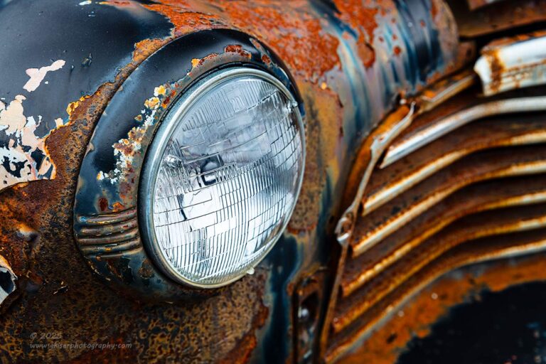
The answer to the composition conundrum was to do something that I have done for a long while now and I know it to work. I focused on the headlight and let the grill go off in the distance for a bit of structure and the pattern of repeating lines. I angled the shot in a way to where the grill was displayed nicely diagonal without the composition looking like it had that unnatural Dutch Tilt that I just don’t care for. The patina and decay on the fender came through really nicely and juxtaposed well with the relatively clean headlight lens. It wasn’t a showstopper of an image, but it was something to get me started with this location. That first shot was the only one that I made of this composition because I worked out all the details before pressing the button. It paid off and turned into the first keeper from here.
My next attempt didn’t prove as fruitful as I went to the rear of the fender to get a photo of more of the age of the car with the curves of the fender. It was all framing the teal wheel which I really liked matched with the condition of the car. I ended up shooting two variations on this composition and felt that I had something that would work. It is a composition that I have used before, but I was limited as to where I could stand to get the shot which caused some differences in what I usually do here. While the photo looked pretty good on the back of the camera, when I got it into Lightroom, the proportions and scaling were just off. The wheel was too small and positioned too far to the edge of the frame. It would have been much better had I been able to get the front of the car included, but that would have forced the inclusion of another car that had nothing to do with the story.
As a side note, after talking about that composition, I went back into Lightroom and looked at a few different aspect ratios for the photo. I really needed to change the scaling of the elements and by removing some of the body, I would be able to do just that. I tried a square crop which helped, but the photo lost a lot of the visual appeal. I tried a 4:5 crop and that felt better overall, but the wheel was still too close to the edge of the frame. The balance was just off. It was a shooting position problem and nothing that could be “fixed” by changing the framing. It was just a lost opportunity, but remembering how the location was, I don’t think that I could have done any better knowing how this one resulted.
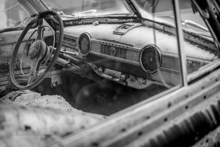
I spent only two exposures with this composition as I tried to get it to work but eventually gave it up for something that I found that I liked better. There was nearly a clear view to the interior of the car which was very well lit, and I felt that this was a much better photo to work on. I changed up my position and found the right place to have the camera before dropping the legs on the tripod. I chose to focus my attention on the dash where you could see the Chevrolet nameplate. I used the steering wheel as a framing element as well as an element that would lead you into the photo. Everything was looking really good with how things were lining up in the interior of the car. As you know, this is one of my weak points when it comes to this kind of photography. Interiors are difficult for me to organize with all the different shapes and lines. This one was really coming together though.
There was still a problem that I was going to have to deal with. Just on the other side of the car was a later model SUV or minivan. I can’t really remember, but the large taillight was right in the windshield of the Chevy. Not only was this the wrong era for the scene that I was capturing, the red really pulled my attention from the entire inside of the car. I could make the light go away by raising the camera, but that would cut off the top of the steering wheel and make that a distraction. To keep the steering wheel from being a distraction, I was going to have to include a big red blob next to the bright chrome wiper arm…which was a worse distraction.
I battled with this for a few minutes as I went between the two different compositions. In the end, I decided that I had to have the steering wheel left intact for it to work overall. That meant I had to keep the lower section of the windows which also helped the composition but forced the inclusion of the taillight. I figured that I could desaturate the background a bit in post and maybe darken or lighten it to reduce the impact of the red. I mean, I went through all kinds of mental gymnastics as to what I could do to handle this red distraction.
It is a little embarrassing to share the solution with you, and even more embarrassing because it took me until I got home to find the solution. You are probably sitting there reading this blog (congratulations if you have made it this far, by the way) and thinking to yourself “just make it black and white ya big dummy!” Yeah, that would be exactly what I ended up doing with this one. It addressed that problem of the red taillight as well as really enhancing the overall impact of the image. I should have shot this thinking it would have been a black and white image from the beginning. I am very fortunate that I liked the composition enough to get the single frame that I did without giving up entirely before I even made an exposure.
The black and white conversion on this photo worked out so well and the way that the colors were treated in the conversion made the dash stand out so much better. In fact, all the little details came out of the shadows and turned into a proper focal point to the photo. That red taillight that had been so problematic…well it was gone from memory and had nothing at all to do with the photo. When I had set the shot up, I had limited the depth of field trying to minimize the impact of the later model vehicle and with the blurred aspect and the lack of color, you can’t even really tell that there is a vehicle beyond the windshield. I mean, this turned into a very strong photo and one that tells the exact story that I was after. It is ironic that I almost passed it up over something simple like the use of color in a photo. I know better than that!
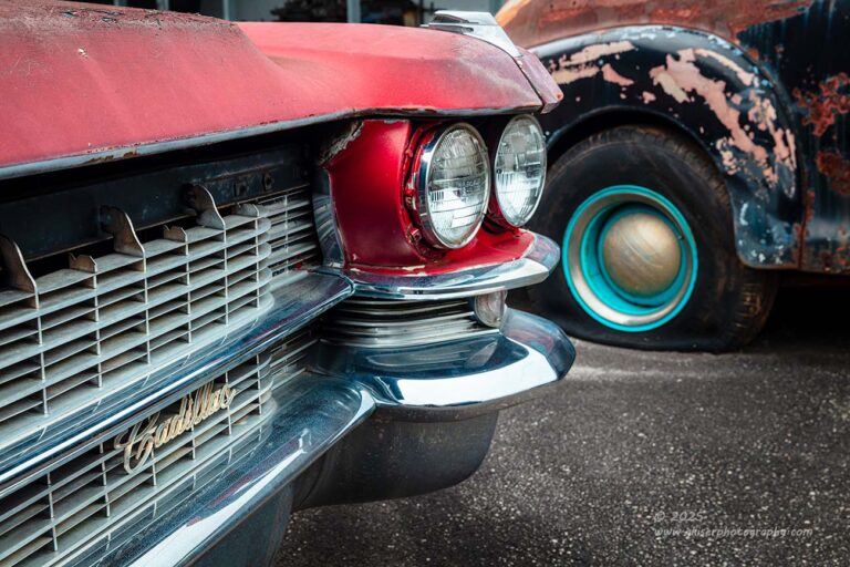
I was reaching the point where I knew that I needed to move my attention from this Chevy and try some of the other vehicles on the lot. There was a nice ’60’s Cadillac parked close by that I wanted to try a few things with. I’ve always had really good luck photographing the headlights on this body style and while I didn’t have much room to work, I wanted to give them a bit of attention. The car was in pretty decent shape with a fairly intact but faded red paint job. There wasn’t much decay going on here, and as I’ve mentioned in previous blog entries, I try to limit the use of red in my photos because it is such a powerful color to use. This meant that I was going to have to concentrate on the chrome more than the body of the car, and I was going to have to find a way to balance out the colors that I was using.
With all that in mind, I started to focus my attention on the Cadillac emblem on the grill since it was slightly golden in hue. It worked well as a focal point with a color temperature between the hot red and the cooler blue tones of the chrome. I tried several different approaches to the composition but wasn’t able to find one that I really liked. Everything felt a bit boring with the entire composition because everything with the car was in too good a condition. As I worked through the angles, I started to see that the Chevy that I had been working with was lined up nicely beyond the headlight showing off the teal wheel that was similar to the one that I had been trying to photograph on the front of the car. This inspired me, and I started to set up a shot to capture both of the cars.
I took a page out of something that I learned a few years back when photographing tightly packed cars that I could use interesting details of one car to lead to the interesting details of another one. This seemed like just the occasion to use that technique. I worked out the composition so that the visual anchor was the Cadillac emblem with all the leading lines of the grill taking your eyes to the pair of headlights that I found so interesting. Those headlights shared a common shape and size to the hubcap on the Chevy which was then framed with a trim ring that highlighted the teal. All of a sudden, you were looking at the patina of the Chevy which was more visually exciting than the Cadillac was. The teal balanced out the red, and there was a nice balance to the whole image. Even the juxtaposition of the hard lines of the Cadillac compared to the softer curves of the Chevy made for an interesting dialog between the subjects.
That was the only photo I shot of the Cadillac that made it as a keeper, and it was one of the more unique compositions that I have done with one of these cars.
Wait a minute, I want to interrupt this blog for a bit of breaking news. After that last sentence was completed, I went back to the photos in Lightroom to see how many frames I shot of the Cadillac. I had made six total exposures with the fourth one being the one that we have seen earlier in this blog. The first one was an uninspired composition from the driver’s side that just didn’t read well. The next three were working out the connection between the Chevy and the Cadillac. The following two frames were a fresh attempt at the first concept, but from the passenger’s side. This had been dismissed during the initial culling in favor of the more interesting composition that included the Chevy. After looking back at these, I still didn’t like the photo because there was too much red in it, but there was no denying that the composition was solid and deserving of a little more attention. Allow me to introduce a late addition to the party….

“Always Look Ahead“, Canon 5DS R, 24-70mm f/2.8L Mk2, Singh-Ray Color Combo Polarizer
When I started to look at the composition, I could see why I dismissed it so readily in the first place. However, there was something about it that just begged for a second look. Could it be so simple as making it a black and white image which was the painfully obvious solution to the interior shot from earlier? No, the black and white was boring and lacked something. Looking at the color image, the balance was way off and there was just too much red, and it was all too high in the photo. This made the composition feel very heavy at the top with less color at the bottom to give it a firm foundation. I needed to change the way that the colors were treated in the photograph. This didn’t mean that I was going to go into Photoshop and change the color of the car to something more appropriate. I wasn’t even going to manipulate things on that level. The answer was quite simple and something that I do rather frequently with certain photographs. There is a color profile that I just love in Lightroom which desaturates the colors and seems to work very well with color palettes that have reds and blues in them. It deemphasizes the reds and will usually make the blues a bit more intense even if having a reduced saturation level. I thought that this profile would work very well for this image of the Cadillac, so I applied it, and I immediately saw a workable image from a color standpoint.
I now had a solid composition, good color balance, and a nice overall feel to the lighting for this subject. Over the course of the next five minutes or so, I worked out the full edit and did the local masks to make it a finished photograph. The end result is one that I really enjoy and am fully happy with. I’m starting to see a routine over the last few treks that I have taken where I get home and find that several of the images that I had dismissed early on become some of my favorites after a second round of editing happens. I think that once I get the reality of the situation out of my head, I can start to see the creative possibilities that the photos provide in their RAW form. This is not so much a photo based in reality as it is an interpretation of the scene based on how I wanted it to look.
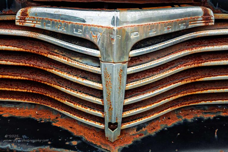
OK, thank you for joining me on this little sidebar from the blog. Now that I have that out of my system, I can get back to where we were. After having worked with the grill so much on the Cadillac, I wanted to return to the Chevy once again to look at that grill. I had used it as an element to support the headlight, but there was a very predominant “T” shape in the center of the grill that I really wanted to capture. The horizontal component of the “T” contained the Chevrolet stamping that identified what was being seen. There was a good deal of rust within the slats of the grill as well which added to the interest.
For this, I didn’t need to do anything special as the symmetrical approach was the better option. I did elevate the camera to give more impact to the top of the grill and let the diagonals of the slats provide the visual interest in the repeating patterns. There wasn’t much reason to do more than a single exposure of this gill because the light was stable, and nothing was moving. The single exposure was all that it took for me to get a keeper out of this one. With that, I really did figure that I was done with this section of the property. I had worked the two interesting cars plenty enough and still needed to get to the rear of the property where I had seen the Chevy with the fins.
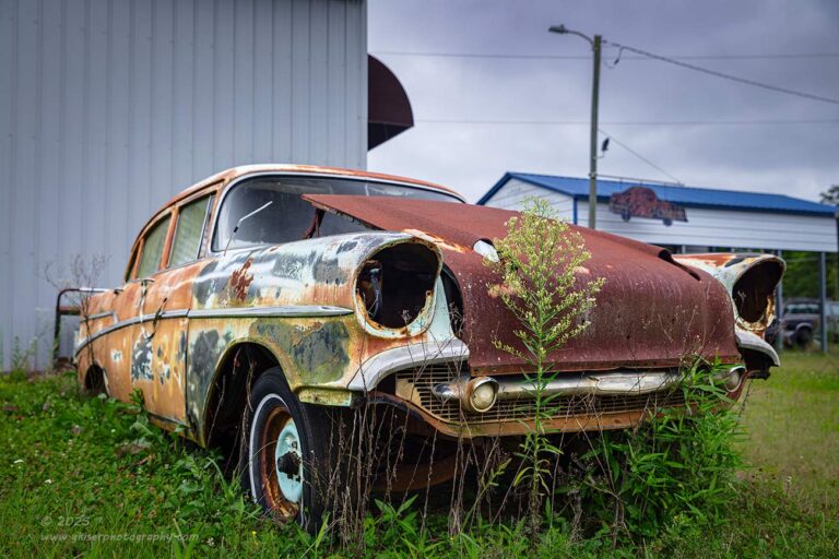
I grabbed my gear and worked my way around to the rear of the building and could finally see what I had seen only glimpses of before. It was a ’57 Chevy which is ironic because I had come out this way for the express purpose of shooting a ’57 Chevy wagon. While that didn’t work out, I was looking at a sedan here that had many of the same styling cues but didn’t have the wagon body. I know that I can never go wrong photographing one of these tri-five Chevy’s, so I started to work with this one.
There were issues with location that I had to address. It was parked at the corner of a metal building beside the bay door. On the other side of the bay door was a stack of doors from a later model vehicle and then a line of unrelated cars beside the building. Right behind the Chevy was a rack that had a bucket on the lower shelf which stretched just about the entire width of the car. As I looked beyond the building, there was the shelter that I had been working around to start this session off. There was also a light pole erected right in the line of sight from the Chevy. If I went behind the car and looked forward, there was a collection of later model parts cars that I didn’t care for, and the shelf got in the way of any composition I could work out anyway.
My options with this car were clear. I could either shoot isolations of it, which would be difficult because many of the areas that work well for isolations were missing the chrome which would be needed for structure. I could shoot an overall of the car, but I would have to include areas of the location that I didn’t really find all that attractive which meant that I was going to have to really work out the composition to make it all make sense. This was the route that I chose to go with.
I was still using my standard zoom lens which would allow me to really distort the size of the car and hopefully block some of the background. I wasn’t able to distort it as much as I have with other vehicles in the past because many of the defining parts had been removed from the front leaving the rest of the car equally important to the composition. By getting the camera set moderately wide, I was able to make the car larger in the scene, but not large enough to really block everything. I had minimized the shelter in the distance to pretty much just the roof which added some cool tones to the image. I could make out a truck parked under it, but by limiting the depth of field, I was able to blur that to where it didn’t pull too much attention. I chose to keep the light pole in the frame as well as the power lines to give a bit of interest to the sky and keep it from being empty space when compared to the other areas of the photo. The arch of the light framed the top of the image well and went with the curve of the awning on the building.
The part that I really liked about this composition was the tall weed that was growing in front of the car. Normally, this would have been a distraction and would have kept the viewer from seeing important details of the car, but there were so many missing parts and the area where this weed was happened to be kind of uninteresting anyway. It succeeded in telling more of the story and adding more interest up close to keep eyes from wandering too far back in the photo where I didn’t want time to be spent.
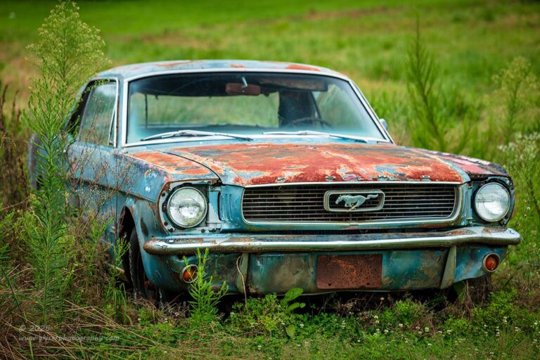
I ended up shooting a total of three frames of the car in that basic composition. I tried both vertical and horizontal compositions, but it was the horizontal one that seemed to feel the best. I looked around the car one last time to see if there were any isolations that I might want to shoot and then decided to move on to something else. As I mentioned, there was a line of cars along the back side of the property which included a Mustang. It was a blue/teal color with some nice rust and patina going on. There wasn’t much there that I wanted to capture in terms of isolations, but I did like the car as it sat in the tall grass. Of course, it wasn’t to be that kind of an easy photograph to make. It was positioned between a Dodge K car and a Honda Accord with a house and red truck in the background on a slight hill. In short, I was going to be hard pressed to find a composition that worked with this car if I was going to get a photo.
Fortunately, the most interesting part of the car was the front of it, and there were tall weeds growing on either side that cemented that fact. I tried to work out a composition but kept running into problems with the rear bumpers of the neighboring cars coming into the frame, or the houses behind it all showing up at the top. I realized quickly that I was having a focal length problem and needed to get a much tighter focal length to cut out the distractions. That meant a quick lens change to my telephoto which I’ve found to be excellent at detail work, but when it comes to simplifying the background, that is what the lens was made for.
After swapping out the lenses, I started to recompose and had to find the right place for the right perspective. At 125mm I was happy with the scene and could find no intruding elements along any of the edges of the frame. I dialed in the exposure settings and fired off a shot figuring that I was going to be happy with it. It was close, but there was a bit of clipping on the roof, so I needed to drop the shutter speed by a click which resulted in a photo with no blown-out highlights and plenty of shadow detail to work with. That was all I needed of the Mustang. Since there were no isolations that I wanted to try, this was as good as I was going to get with an overall composition. I do feel like the colors all work very well here and I’m quite happy with how it turned out.
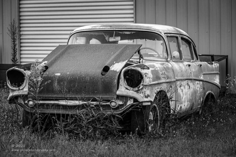
Now that I was dealing with my long lens, I decided to go back to the ’57 to see if there was something else that I could try with the change in perspective. In an attempt to simplify the background, I decided to approach this composition from the opposite side of the car. From here, I didn’t have to worry about the sky, shelter, other cars, or even the light pole. All I had to worry about from this side was the shelf behind the car and the bay door with the stack of doors leaning up on the building just on the other side. I decided that the bay door was important to give a little interest to the background since it had horizontal lines and the metal siding was all vertical. To keep it from looking out of place, I had to include a sliver of the building to the left of the door, but not so much as to include the doors leaning up on the building. There was this great weed that stood quite tall directly beside the bay door that added a bit of visual interest there to keep it all relevant to the photo.
What I had come up with was a pretty simple postcard style shot of the car. It was effective, but nothing overly special. I ended up shooting four frames as I was trying to deal with some exposure clipping on the roof. It just took me more adjustment than I had anticipated to clear the clipping out which was why there were four separate exposures made. The end result had no clipping and plenty of shadow detail to work with. That last image made it through the first two rounds of culling but ended up being shelved in favor of the wider angle shot that was a bit more dramatic. As I was coming to a close in the processing phase of the afternoon, I decided to take a look at this one again.
I wasn’t really happy with it as a color image because it was too simple of a composition for the all the colors that the patina on the car introduced. I needed to simplify the car even further, and the best way to do that was to convert the image to black and white. When I did that, the photo became less about the patina of the car and more about the shapes that the car had. This became even more impactful when I started to look at the background that was all vertical and horizonal lines. The shapes of the car became much more organic, and full of life. The added contrast of the black and white added to the dramatic effect as well. What had started off as a simple postcard shot had been transformed into something with a good bit of drama and visual excitement. It was a photo that worked quite well, and I was happy to add it into the mix as a keeper.
Before moving on from this Chevy, I tried one more attempt from the passenger’s side to see how the long lens would treat the background. It wasn’t too bad, and I actually shot three variations of the composition that focused more on the sign above the car than the background itself. I liked these in the camera and felt that they might be more effective than the wider shot that I had done earlier, but when I looked at them on the computer, I realized that I was just getting more of the distractions in the frame. This minimized the impact of the car and the reason for the photo was kind of lost after that.
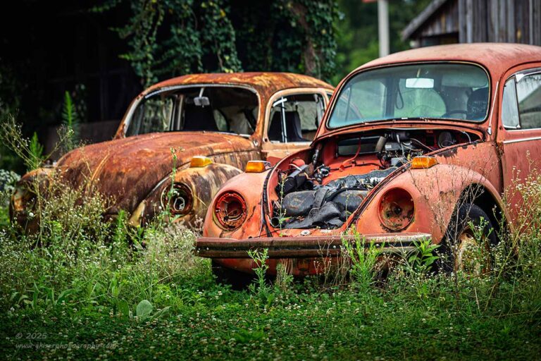
There was no escaping the fact that there were three Beetles parked on the other side of the property. I had worked with one of these on a previous visit here but wanted to get a different view of them this time. I liked how they were all lined up in a row and felt that I could do something with all three of them. That was rather difficult because of other vehicles in the way. There was also a background to contend with that included a building, a covered bridge full of wood piles and the road could be seen between it all. I worked around the area looking for angles and trying to get a feeling for what would work the best. Once again, it seemed that the long lens was the answer to my question. I was needing to have to the compression of the background to make this work as I wanted the focus to be squarely on the Volkswagens. I had to give up on including all three of them because of how the BMW was parked to the right. This meant that the Bug with the missing hood was going to be my visual anchor which worked well due to the contrast with the items now visible within the storage compartment.
Over the next few minutes, I played the game of inches to get the best position for the camera to get the shot that I was after. Because all of the cars were parked close together, I wasn’t able to get the entire car in the frame without including the other Bug, so I did a close crop through the driver’s door which concentrated the attention on the curve of the front fender which I liked. The repeating shapes and receding distance completed the composition and a bit of work with background blurring, enhanced the feel of depth to the scene.
I ended up shooting a couple of frames of this with different apertures. I ended up liking the f/4 variant because there was enough blur to show the depth, but enough sharpness to see the detail of the background Bug. Going with f/2.8 wasn’t ever an option because I wanted to have the lead Bug in full focus, so I was looking at either f/4 or f/5.6. The latter was too wide of a depth of field at the distance that I was shooting which was why I didn’t choose that one. The surprise aspect in this photo that I ended up really liking was the soft texture of the grass with the rich greens that complimented the rusty tones so well. Having the majority of the background in shadow completed the overall effect of depth and turned into a very successful photo of one of the more loved and iconic German cars out there.
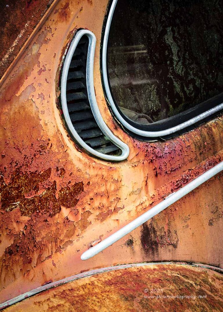
Of course, one of these Bugs had the vents behind the rear window which I had photographed the first time I had been out here. That was when I was just getting comfortable with capturing detail shots like abstract compositions focusing on shapes. It had turned out really nice and had been a composition that I had kept in my mind since. I wanted to try the same concept again to see if I would treat it any different now that I have a lot more experience with these types of compositions.
I worked out the angle and then chose where the edges would be of the composition. I wanted to include the vent obviously, and to have that shape makes sense, I wanted to have enough of the window to establish that curve in the upper portion of the composition. To match that curve, I included the top of the rear fender which had a great texture to it and connected with a body line that was enhanced with a bit of molding. This provided an entry to the image because even though I was shooting from the driver’s side, I knew that I was going to flip the image in post. There was no denying that the passenger side gave a more pleasing readability. However, I was liking the look of the driver’s side in terms of patina and age. This way, I could have the best of both worlds. In the upper left corner, I had included the window in the original composition years ago but felt that all I needed was the darkness of the rust to close in the image with a natural vignette. There was no reason to include another shape here as the main focus was that vent.
When I was happy with that, I decided to try this composition as a horizontal approach. I flipped the camera and started to work on adding in elements to the sides. This was working pretty well through the viewfinder, but when I got home, neither of the versions worked out the way I had wanted them to. The winner was still the vertical one. Compared to the earlier version, I liked the more intimate capture that I had just done, but there was a quality to the more expanded capture that focused more on the body lines rather than the vent. I remember that the first time I had photographed this car, it was the body lines that had interested me which made sense in how I captured it. This time, it was the shape of the vent, and I had captured it in a different way to show that aspect off. Slight changes for a completely different story.
I’ll be honest here. I was starting to get tired at this point. Originally, I had been looking at an hour of good light once I got started at 9am. It was now after 12:30 and the light was still good. Having only mentally prepared for a photograph or two, I was well into overdrawing the creative bank now that I’ve been shooting for hours and have been dealing with many different subjects. When I am prepared for this, I have no problems doing it at all. When I’m not prepared, I start looking at all the time on the back end that I will have to be dealing with. I’ve been paying attention to how I was shooting and knew that my hit rate was going to be well up there. Looking at the image review, I had a total of 54 frames captured in the camera. I knew that was not going to translate into my normal 10% ratio of keepers. I was looking at probably twice that which was meaning a lot of processing ahead of me and a long blog to be written. I still had an hour’s drive ahead of me to get home. I was really needing to think about calling it a day.
I did want to make one more pass around the property though before I threw in the towel. There is just no guarantee that any of these vehicles will be here the next time I’m out this way. There was a Ford Fairlane that was off on the side under a shelter that had caught my eye. It was parked next to a white Trans Am that didn’t really interest me that much, but the Ford looked interesting. It was red, which kind of made it difficult to work with because I was probably going to have to treat this car as an isolation subject. This meant that red would be a large portion of the photo and as I’ve mentioned, this can be a negative for color balance.
The first order of business was to walk over and give the car a closer look to see what I might want to photograph. Most of the trim was missing on the car, and there wasn’t much rust on it. In short, the closer I got, the less interesting the car became. I tried to figure out a wat to get a photo of it, but there was just not an isolated area of the car that I could find that really interested me. What had gotten my attention was the entire car rather than the details. There was just no way to photograph the entire car because of the fact that it was parked under a shelter…Or was that the exact way that it needed to be captured.
I stopped to think about this for a moment and started to see the lines created from the stacks of pallets to the left of the car which created a nice pattern for a background. Then there were the support posts that established a strong vertical component. The roof of the shelter gave a really nice diagonal shape to the scene with more horizontal lines from the material used in the roof. There was another building that was in the background that would help to simplify that part of the image and there were enough trees to block out the sky and to add some texture to the background. It wasn’t ideal, but I could see it working fairly well.
I worked out the right position to place the camera for the right framing of the scene. To include enough of the shelter to have it make sense meant that the car filled only a portion of the scene, but that seemed to work well for this car. The lack of details helped here because there was no reason to have the car looming large in the frame. I just wanted the shape of it to establish what we were looking at and you could easily see the condition of it from the distance. It all worked well.
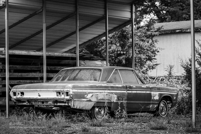
That was until I got it home and started to look at it on the computer. Once again, the reds were too dominant in the scene, even though the car only took up about a third of the frame. The red indicated excitement, but the composition was anything but exciting. To get the image to make sense, I needed to address the overall tone of the scene. I thought about using that desaturated color profile to handle the red, but that pushed too much blue into the scene. I finally decided to look at this as a black and white presentation. That was what worked the best. I was able to find a profile that visually brightened the car in relation to the background. This made the car stand out more effectively than the red color while keeping the tone of the photo a bit calmer. It actually worked out much better than I had anticipated when I started to photograph it. The frame that was chosen was the fourth and last one that I shot of the concept.

By this point, I was very tired and ready to head home. Coincidentally, I’m feeling that same kind of tired now typing this blog out. I’ve been hammering away at the keys since I believe around 10am and it is now 3:00 sharp. When I say that these blogs are a labor of love, I really mean it. They take a lot of time to put together and type out. It might not seem like much, but it is not uncommon to spend four or more hours per blog entry. I’m also thinking about having to start the next Behind the Camera at some point and those usually take about three different days to finish up. I don’t think that I will be starting that like I had thought this morning. That was when I was thinking that I would be done with this blog before 2pm.
Well, I am nearing the end of this adventure, so hang on for a bit longer. I was actually walking back to the truck at this point but having learned my lesson with the Rambler from a couple of weeks ago, I still had the camera out and ready. There were a few Corvettes over by the side of the building and one of them was this beautiful orange Stingray that I really enjoyed looking at. Sadly, it wasn’t quite something that I wanted to photograph in the position that it was in. There was another Corvette that had a certain quality to it that got my attention as a photographer. It wasn’t a flashy color like the orange one, but since it was white, there was a lot of opportunity for contrast. That contrast was made possible because it had the fixed light conversion kit done to it along with NACA ducts in the hood and vents on top of the fenders. There was a lot of interest added into that white body, and I figured that I could do something to capture it.
I still had the long lens attached and saw no reason to change that out. I just walked around the car and looked to see how the lines went and where the visual interest happened to be. It seemed that most of what excited me was centered around the front of the car with the light pockets having been added in. They were painted black and gave a great contrast to the white paint. My first thought was to make this a black and white presentation, but the Corvette emblem on the front of the car had this rich red color that really needed to be included in the composition. That hint of red was enough to make the whole image a color image, but there was not much color to be had which made the red stand out even more.
What I needed to figure out was a composition that captured the elements that I liked while still keeping a nice balance to the entire scene. The rule of odds came into play here as I wanted to keep the main elements restricted to an odd number. I needed both headlights to frame the emblem, but I needed something to balance out the headlights which fell on the passenger side NACA duct. Those three elements created a visual triangle to the frame. The vent on the fender was much less visible but still played a part which when added to the emblem kept the number of elements at five, still an odd number. I included the ground to the side to establish the shape of the fender and further identify the car. This was at the corner of the frame which resulted in yet another triangle to be seen in the photo.
The problem that I was facing at this point was the fact that the driver’s side headlight was just too dominant in the frame. I had to find a better balance for it. By cropping in a bit tighter on that housing, I reduced the visual weight of the light and made just one of the headlights visible which matched the other side for a bit of symmetry. The shapes fell into place quite a bit better this way and I liked how the image was coming together. I shot two different exposures with slightly different depth of field to try and handle the ground because I didn’t want there to be too much texture in that section since the majority of the car had little to no texture. Again, I was looking for balance in the image.
The last image that I shot was a detail shot of the vent over the fender and the duct. I liked the abstract nature of this, but when I looked at that final image of the day on the computer, I could see that there wasn’t enough contrast or visual interest to really carry the photo. There needed to be something else to really make it work. It was fine that the last photo was a miss. I had plenty of others to choose from. I was ready to go home at this point. I had been at this location working for just under an hour and had shot 35 additional frames. This brought my grand total to 60 frames for the day in less than two hours of shooting.
Now here is the amazing part. I had shot 60 frames which under normal circumstances would have resulted in six to ten keepers. If I was having a really good day, I might stretch that to an even dozen. Yet here I was looking at 18 keepers from my first run through the RAW files. By the time I was all finished with the blog, that number had risen to twenty keepers. That is a solid 33% hit rate which is amazing. There really is a benefit to slowing down and thinking through the process and not shooting a picture with every change that you make. I was also able to recognize when compositions weren’t working out and never even pressed the button on those. What was left was 60 frames that for the most part were all workable images. I just chose the ones that were a smidge better to represent the full day. I’m really proud of how this all turned out and even though I didn’t get the chance to shoot the car I went out there to capture, I did manage to get a different ’57 Chevy along with a bunch of other cars that might actually have been more interesting.
After going through the importance of previsualizing from my last trek into Hickory, it is an interesting contrast how not really having all that time to think about things can also turn out well. I’m still previsualizing the photos and that is part of the process of finding the right composition as I’ve talked so much but it is more of a reactive thing based on the current conditions and lighting. I had left the house with something completely different in my head and when that didn’t pan out, I had to improvise with scenes that were not quite as ready-made into photographs as what I had been prepared for. Is one way better than the other? I don’t think so, but I think that there is a time and place for each approach. A good photographer can shift seamlessly between the different processes of creativity and capitalize on whichever one makes the most sense at the time.
Thank you all for joining me on this trek that should have been a whole lot shorter than it actually was. Hopefully you are still with me and have enjoyed all of the photos as much as I did while making them. Don’t forget that if you would like a piece of my art on your wall, I would love to match you up with a print of your favorite photograph. There really is no better way to enjoy my photography, or the photography of any other. That physical print is the most truthful a photo can be because there are no variables in how it is being viewed. It is as the photographer intended down to the colors and depth of the shadows.
I’m probably going to be kind of quiet for the last part of this month. I’ve still got a headshot session going on this weekend that I need to get prepared for. There is still that Behind the Camera that I need to get started on, and I realize that I need to leave something out there to shoot in the coming months. I feel like I’ve been just non-stop since the Fall last year. I need to take a break, but I keep getting inspired to get new photos which is a great way to be. I keep thinking about how much I was struggling through the Summer last year and how I wondered if I would ever recover from that creative slump. I guess you could say that I bounced back quite nicely. I’m interested to see how long this streak lasts.
Until next time….