Wednesday, August 6, 2025
I stand by my pledge not to have so many photos from the day that I need a multi-part blog, so this is NOT part 2. There was certainly not a part 1 to this blog because that would mean that I failed miserably at restraining myself on a dreary and rainy day. Since this is not a part 2 entry, there is no reason to catch you up. If there was a reason, I would say something like I had finished photographing two locations local to me and had returned to a spot that I had tried to get permission for between those two places. There was nobody at the shop when I stopped but managed to find the owner across the street. He said when he would be back at the shop and to come back then. There was a conspicuous omission of any permission being given, so I knew that it was going to be an uphill battle to gain permission. I almost decided against returning because I did have enough photos to make for a quick blog as you didn’t see posted yesterday.
Now that you aren’t caught up on the events that happened before this blog, I was in the middle of some questions now that the owner was back in the shop. I remember there was a moment when things shifted in the body language and tempo of the talking and that was when he asked what I did with the photos once I shot them. I explained what I did, and since I mentioned I was putting them online, I added to the answer that I don’t disclose my locations. It was at that moment that the air lifted a little bit and I saw a chance. So, with that in mind, I’m going to be particularly careful of disclosing this location, so understand that no clues will be provided and I am going to be very tight lipped about what I saw during the tour that he gave me before I was released out on the property.
I will say that he turned into a genuinely nice man with a very interesting story of how he got to this point. He had history with the Datsun racing teams from the ’70’s and had actually been trying to purchase the Z that I had spotted originally from the street. It was a customer of his who was wanting to get it running, driving, and stopping. While the car looked great from the outside, I know what secrets these cars hide and figured that was going to be an undertaking to make the car safe on the road. You see, they rust from the inside out, so by the time you see any rust, half the car is compromised.
It was still a primary reason for me stopping here in the first place which meant that even though I saw so many potential subjects I decided to start with what had inspired me in the first place. I had a spring in my step as I went back to the truck to get my gear, and I settled into working with the Z. As much as I love these cars, I don’t have much experience photographing them and when it comes to compositions, I don’t have any that are just locked and loaded. I have yet to get a good overall photo of one of these cars and that is still on my bucket list of images. There was just no way to get that kind of shot with this car because there was just too much going on around it which was unrelated to the car. I decided to just slow down and think about what I loved about this car. The first thing that came to mind was the part that I universally hated because my Z suffered from the same aesthetic choice of wheels. These were dished chrome wheels that were designed to take wire wheel covers to complete the look. I have only seen them with the covers on a time or two, and most of the examples have looked just like this. I hated them then, and I hate them now…but they did bring back memories for me and I decided that I was going to make my first composition based on the wheels.

Sadly, the part that I really didn’t like about the wheels were that they were so lacking in visual interest. These had a good deal of rust showing through which helped, but in the end, it was still just a chrome disk with a hub in the middle. I needed to add something to the composition, and that came in the form of the decal that ran along the bottom of the body. It framed the Datsun emblem on the fender which told a great deal of the story of the car. To keep that element visually important, I needed to reduce the size of the wheel. I could have done that by shooting from the right of the scene, but that would have changed the flow of the image. Instead, I decided to crop the wheel down on the left and bottom, while keeping a close crop on the top of the tire for balance. This made the hub of the wheel more of the focal point rather than the full disk of the wheel. My position allowed for the stripe and emblem to trail up with a slight diagonal line for a bit of drama in the image.
It made for an interesting composition, but I felt that the color really didn’t do much for the image since the amount of orange seemed to be a little less than what I would want. Because of that, I decided to do this one in black and white which I really think works very well for the entire image. It changes the focus to the lines, shapes and textures which I think were quite a bit more interesting than the color here. That wasn’t to say that I didn’t think that the color was important with this car. I loved the orange, and part of that love was because my Z had originally been an orange car before the previous owner had it repainted black.
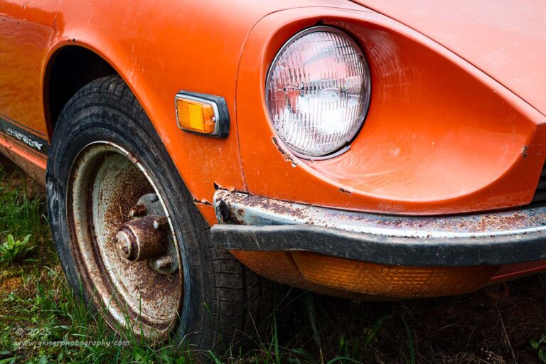
I did go to the other side to try something else that included that horrible wheel that made me feel all warm and fuzzy inside. This time, I wanted to include the iconic headlight scoop which was one of those design aspects that lasted with the Z until the advent of the 300ZX in 1984. This was one of those compositions that I wasn’t all that wild about during the initial culling, which was extensive considering I had promised myself a quick trek with just a few photos. It actually didn’t make the final cut, and I didn’t think about it again until I was typing this blog two days after the trek took place. Now that I was thinking through things, I wanted to go back and give this photo another look. It still isn’t a fantastic photo, but because of my connection to the car, I wanted to have something with the headlight bucket in the collection.
I went through a couple of different edits on the photo before I found the version that I liked the most. I looked at things in black and white as well as color, but the color seemed to be important for setting the mood of the photo. Unlike that opening image, I wasn’t concentrating as much on the shapes, but rather the essence of this particular car. The color was a valid part of that story, and with much more of the frame being filled by orange there seemed to be a more pleasing color balance with this composition. I’m glad I went through with this one because the alternative was that it was going to get trashed which I would have regretted later. I’m not sure yet if this will be a portfolio image or not, but it is a subject that is near and dear to my heart.
It was around this time that the owner came back by to take me on the extended tour to the house next door. There were a couple of vehicles under cover that he wanted to show me. He was very willing to pull the covers off of them if I wanted to get some photos, but knowing how many subjects I already had to work with and the limited time that I had to do it, I opted to have him leave them covered up. I had to fall back on my love for finding these vehicles out in the wild with whatever dirt and debris that might have fallen on them over the years. I think that makes for a better photograph with more visual interest. However, I wouldn’t mind coming back and giving some of the other examples a try at another time.
Something that I hadn’t considered from the weather forecast was that it was starting to drizzle a little bit. It was nothing too hard, but it was enough that I was going to have to be careful about the rain drops on my filter. There is no disappointment like coming home with what you think is a killer photograph, only to find that there are a dozen spots where the blurry water drop has distorted the sharpness of an area of the image. I’ve had that happen a couple of times, and it is something that I just don’t care to repeat if at all possible. Therefore, I was having to take some precautions with how exposed that filter was to the rain, and keep it covered as much as I could.
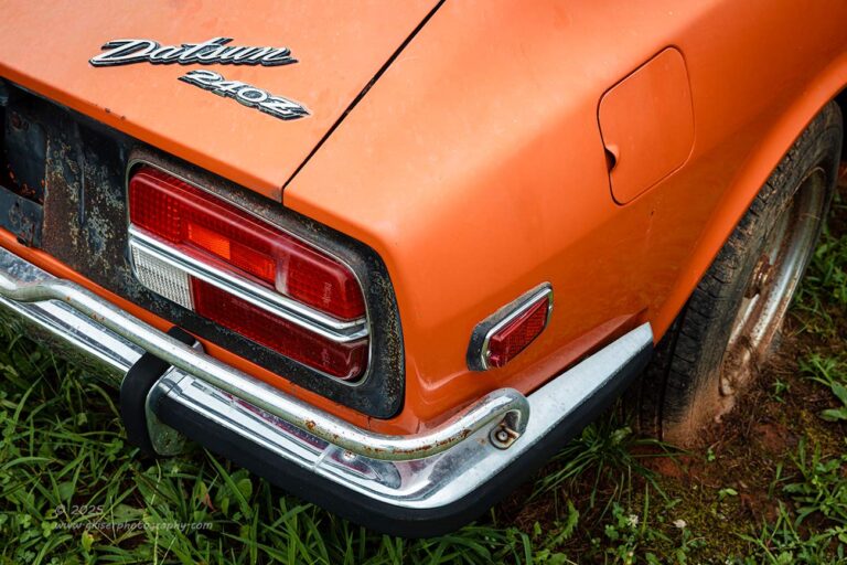
One way that I can keep the rain off of the filter is to point the camera down, which was kind of the motivation for the next frame that I shot. This was the back corner of the car where the emblems were still in place on the hatch. It was also a chance to capture the dealer installed overrider bar that was added to the bumper more for style than protection. I’m not a fan of the bumpers on these cars at all and had removed both of them from my car. However, the thin bumpers like this one were the preferred on the cars, even with the later models getting progressively larger bumpers for crash protection. The bumper here was all part of the story of the car and I wanted to capture it along with the emblem.
The composition was pretty straightforward and still included the wheel, but this time, it was only a sliver and that provided a bit of framing to go along with the chrome on the bumper and emblems. Again, this composition was all about balance. The gas lid was even important here because of the blocky details of the taillight on the left side of the frame. With all that was going on through that left side, there needed to be some detail on the right side to keep things even. That came from the marker light, the gas door and the three luminance values of the body of the car. Now that you understand what I was looking for, you are starting to see how those elements helped this composition be as strong as it is.
I can’t believe that I’m saying this, but this Z suffered from one big issue from a photographic standpoint. There wasn’t enough rust leaving the panels kind of boring in the grand scheme of things. There was rust on the car, and really bad rust at that, but I wasn’t photographing frame rails which had holes eaten through them. It did make it kind of difficult to get the isolations that I wanted on this car, but I was starting to slow down a bit now that I was settling into the right headspace to create. This allowed me to look for shapes more than subject. One of those shapes that I found to work with was the area behind the quarter window.
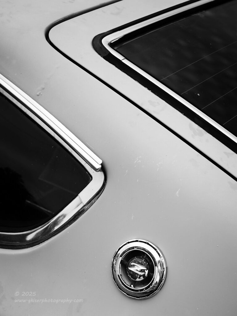
This is another one of those areas that has iconic styling cues for the car. It also has the “Z” emblem affixed to the body in just a perfect place. This emblem placement is still in use with the current Nissan Z platform that is being sold today. I worked out a composition that I liked with the design which included the hatch window and the quarter window to establish the shape. The emblem became the focal point of the image. The paint was pretty smooth here with just some dirt, but no rust for texture. You can see where the roof panel is joined to the quarter which was finished in lead from the factory. There is rust beneath that leading which is causing that bubbling. Like I said, by the time you see the rust, the car is in very bad shape on the inside.
It was the lack of any texture that kind of prompted me to go with a black and white presentation for this. Usually, I would go with a color image here, but I liked the minimal aspect of a simple black and white for this. It was even done as a higher contrast high key image to really dial in the shape that I was after. Oddly enough, I noticed something when I was shooting this that I had never really paid attention to in the past. Looking at the shape that I was concentrating on, I started to see a reverse “Z”. This was just too cool, and my first instinct was to flip the image horizontally when I started to process it, but that would reverse the actual Z emblem. Fortunately, I was still here with the camera and there was a much better solution to the problem that I had just found.
Now, in my defense, I was still spinning thinking about all the cars that I wanted to capture here and simple details like this were just not computing like they should. However, I did realize the creative aspect of the repeated shape of the Z and how that would make this a stronger photo, so I grabbed the camera and went to the other side of the car. Just like that, I had flipped the image horizontally but had kept the letting in the emblem in the correct orientation. Yes, I know…logic 101, but I was thinking a mile a minute with all that I wanted to photograph.
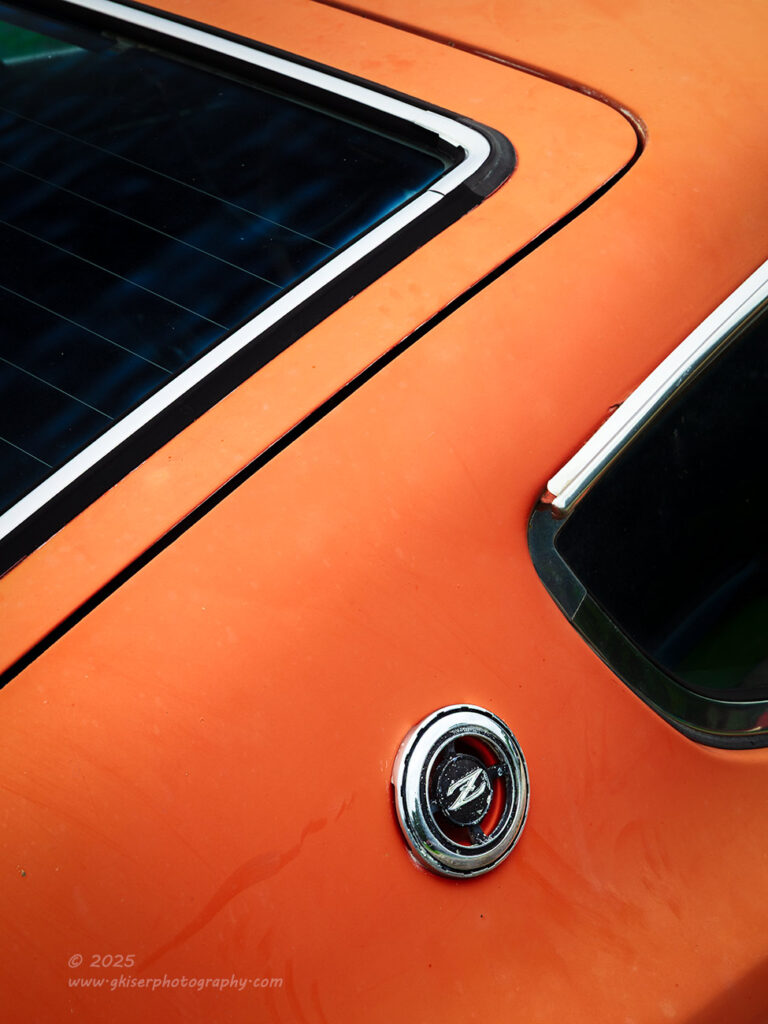
As you can see, there is a fantastic repetition of the shape of the letter from this side of the car. I treated it mostly the same way as I had the other side, but I felt that this one deserved color to add to the excitement. Maybe it was just the excitement that I had for finding the patterns here, but I felt that it was a more exciting image compared to the other side. When it comes to doing isolations like this, I really enjoy finding patterns and repetition in the different shapes. That is what drives the compositions because otherwise, I would just be documenting an aspect of the car. When it comes to creating art, I want more than a photo of what I saw, I want a photo of how I saw it, and one that makes you see things in a different way.
I realized at this point that I had been working on the Z for quite a while. There was also that quick interlude where I went next door to check out the two vehicles under the covers. The reality hit that I was going to run out of time if I kept working at this rate. I needed to step things up and look at it like a triage situation. I wasn’t going to be able to photograph everything, so I decided to work with the subjects that I thought had the most potential and skip those that would probably not create portfolio worth photographs.
Sadly, the Malibu that I had spotted during the first drive down the driveway was one that I decided to skip for now. I was mainly interested in the taillights and the shapes, but I had spotted a better option for that during the tour that I was taken on. The car that I was more interested in was a bit further into the property and in a metal shelter. It was a ’66 Dodge Polara which was actually a full drag car with a chute and wheelie bars which could be attached to it. While that was impressive, it was the patina and the shapes that really caught my attention. This car was huge, and it was something that I just don’t see often at all. I loved the way the taillights were shaped, and the big DODGE emblem between the finish panels on the trunk. That was way more interesting than the Malibu for me.
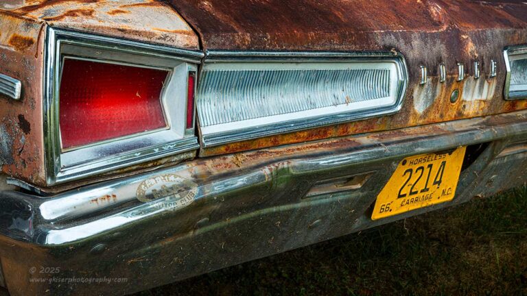
Since it was the taillights that had really pulled my attention, I started off with those. While visually very interesting, they were not all that easy to photograph. I had to really think through the framing of the photo and the aspect ratio to arrive at a working composition. The last thing that I wanted to do was to cheat the viewer out of seeing the entire design of the light. There was something elegant to it all, and the way that it stretched across the trunk showed the size of the car. The specialty plate that he had affixed to the bumper was also interesting and something that provided a nice balancing element for the red lens of the light. There was a bit of care used in figuring out the framing elements that were used on either side of the image, and I chose to work with a 16:9 aspect ratio to really accentuate the width of the car. It all came together really nice, and I found that the residue from the AAA decal helped to fill that area of the chrome bumper with some visual interest.
There was no doubt about it, this was much better than the Malibu for a creative photograph. I did try some other ways of capturing the design of the taillights, but nothing really told the story the way that I wanted it to. I needed that long stretch of trim inboard of the light to really establish the uniqueness of the design. Even just seeing this bit of the car tells you just how mean it really is. I would have loved to have gotten an overall establishing shot of the entire car, but there was just no way with the location it was in.
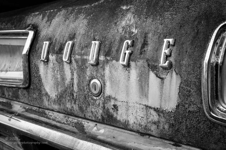
Before leaving the rear of the car, I decided to focus my attention on an element that had just been a supporting player for my taillight compositions. This was the lettering between the finisher panels which I found to be very impactful visually. I got in close and started to work out a composition that featured those letters. Of course, I started with the standard straight on shot but found that to be just too static to look at. Here recently, I have been changing up the angles that I shoot emblems from, and I’ve found that it makes for better compositions. There is also the added benefit of not having to spend so much time getting everything squared up exactly right so that it is all symmetrical and placed exactly in the frame where I want it. By going off to the side, symmetry is no longer a concern on that level, and I get to replace having everything square with using angles which are much easier to work with. In essence, I get a more impactful photo with less work in the field. That is not a bad way of doing business.
For this one, I once again used the finishers to bookend the letters but had to choose just how much to include for that visual balance taking into account the difference in size with the perspective distortion of getting in close. I ended up using very little of the finisher on the right, but a bit longer of the left strip. That left side also included a portion of the bumper which added a diagonal to the frame and underlined the lettering. It was another way of framing the subject which was also framed by a natural vignette on the top of the trunk.
The final piece of the puzzle was whether or not to do this in color. Normally, I would have been all over color because the patina was wonderful here. However, the colors seemed to overpower the letters which I didn’t like. Now, the letters were dominant, even in color, but the visual weight shifted with the colors so that the letters and patina shared approximately the same visual weight in the image. By stripping the color, the letters were the brightest part of the image and what the eyes with to. Without color, it was only contrast that was secondary. The letters had the contrast as well since they were on a darker surface. The patina was still evident here, but not a major player in the story. That main focus was the emblem and the composition which were the two things that I wanted the viewer to focus on more than anything else.
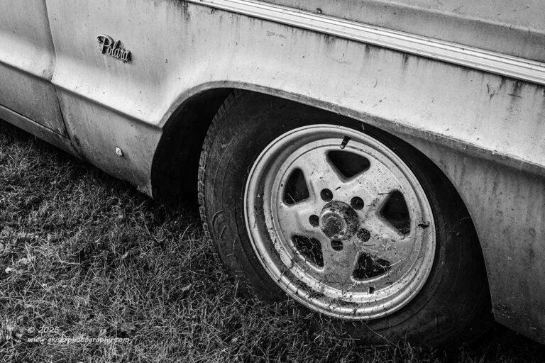
Now that I was happy that I had what I wanted from the rear of the car, I moved around to see what else the car offered. There was a lot of surface area on the car to work with because it was a big vehicle. The best patina was on the trunk, so the other parts of the car were not quite as intriguing to me as I browsed the options. I did stop at the front quarter where the front wheels told a bit of the drag car story. I started to look around and found the fender emblem and the Dodge logo which was placed on the left lower fender. These things interested me, and there were some good lines that were nearby that I could use in a composition. I started to work the camera around to see how it looked from different angles. When I settled on one that looked good, I started to play with what to include in the frame. I ended up bringing in a number of the body lines which from the angle I was shooting from happened to provide a nice set of diagonals through the entire frame for a bit of drama. I used the Polara emblem to introduce the composition and finalize at the wheel which was tucked ever so nicely into the fender.
The composition worked well, but it still seemed to be a little boring. I realized that the blue color of the car was too calming for the scene, and without a lot of rust on the panel, there wasn’t much in the way of color balance. The solution was pretty simple. I just had to remove the color from the image and find a black and white color profile that brought out the contrasts in the existing colors. Once I did that, the image came to life, and I knew I was on the right track. When it comes to choosing black and white over color, the reasons are not always the same, but there is always a reason behind it. I can say that I don’t use it as a “rescue” for a failed image though. If the image doesn’t work, then it just doesn’t work. Black and white is just another creative choice to express a scene in a photograph.

Something that really interested me with this car was the front end. I would have loved to have gotten a full front end shot of this car, but with it being in a metal shelter, I had supports to deal with along the sides, and there was a riding lawn mower parked right up against the front on the passenger half of the car. There was clear sightline to the front of the car, but I was able to get the hood ornament easy enough. I started to work with that element and kept feeling that the composition needed more. Every time I tried to include more, I would bring in elements that were distractions. I played with this for a while but didn’t mind too terribly since the rain was falling at a decent rate at this point. I was under the shelter, so the camera was staying dry and so was I.
The more I worked the scene the more frustrated I became. I really wanted to brin in the Dodge letters on the leading edge of the hood, but that was usually dictating adding the grill which would add the lights, and ultimately the upturned chute of the mower. As I worked around things, I finally landed on a composition that seemed to work. I had the leading edge of the hood which supported the hood ornament story, and the curved trim of the hood with the grill kind of going dark below. I found a way of including just the top bit of trim near the headlights as kind of a framing element. The shape of my subject was looking good with this composition, but I had two uprights for the shelter that were in the background. I considered these as framing elements for a few seconds but decided that they didn’t work in that capacity at all. I decided that I would remove them in post. Yes, I get the irony that I’m removing posts in post.
This brings up an interesting point about removing distractions during the post processing of an image. This is something that has been highly contested over the years but is becoming more and more commonplace with the different software platforms offering automatic distraction removal. I’m not a fan of that, and I try not to remove anything in post unless I have no choice. It always leaves behind evidence that can be seen if you know what you are looking for. The AI generated fills have odd artifacts in certain conditions, and it generally causes more issues than it is worth. Now, in this case, I had two posts that really detracted from the scene. Their omission would not negatively affect the scene because they were not really associated with what I was shooting. Because I was shooting with a limited depth of field, effectively blurring the background, I didn’t have to worry about blur being added to the areas that were removed. There was no important detail that I would be affecting. That made this a perfect case for distraction removal.
You might remember the opening image in the blog that certainly wasn’t a part one of a series of entries. In that one, I had about five power lines that were stretched across the sky and the house. Even Toni made mention of the fact that they were there. Ideally, they would have not been visible in the photo, and I was tempted to remove them. I obviously didn’t, and you might be asking yourself why that was. Especially after I am making a point to describe removing two thick posts in the photo above. As mentioned, the posts here were a part of a blurred background which wasn’t instrumental to the image. I was basically replacing them with texture to match the soft focus trees. It was simple and left very little evidence to be seen. Go ahead and look for where the posts had been, I dare you! In the case of the old house with the van, the power lines crisscrossed through the sky which would develop a pattern of new pixels in an area with only a little texture. That would leave anomalies that I would have to massage out to make it convincing. I could do that, but it would take a while. More importantly though, the lines went across the house which was a main subject and was photographed with sharp focus. This would mean that I would have to recreate fine detail in the house, and the trees for that matter. Again, evidence would be left and easy to find. Instead of removing them, I did establish a composition to where they worked. Unlike the random silver posts for the shelter the car was parked under, the power lines were associated with the scene. This was a modern house, at least in terms of having electricity which would require power. The power lines make sense to the story, and with the way that the scene was composed, they add to the visual flow of the scene. These are the kind of things that I take into consideration when it comes to removing distractions in a photo.
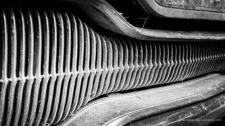
Sorry for that bit of a diversion along the journey. I’ll get back on topic now. While I was still working the front of the car, I really liked the grille. It was a series of repeating patterns with a unifying bulge that linked them all. I really wanted to photograph this, but I wasn’t quite sure how to go about it. I tried the normal straight on approach but found that was very boring. I tried a top-down approach, but things got lost. When I went from the driver’s side, I liked the way the pattern looked, but I was including too much at the top and bottom. The flow of the photo was also backwards. I would have rather shot this from the passenger side, but there was a mower in the way which prevented that option. I could easily flip it in post since there was nothing in writing to identify which was left and which was right. As far as too much information on the top and bottom, I was able to fix that in camera as well by shooting in a 16:9 aspect ratio. Now that I had all that figured out, I was able to include a bit more length to the scene which really helped the overall composition.
When I got it home and started to look at it on the computer, I realized that color wasn’t really important to this at all, and I had to do it as a high contrast black and white presentation. I did a lot of dodging and burning throughout the image to really focus the attention on the shapes rather than the content. I really like this for the abstract qualities that it has, and the hints of decay really add so much interest to the scene. There is just something hypnotizing about photos like this of the right kind of grill. I’ve got a few that I ft in this category and I love them all. The chrome makes for a natural high contrast look and when reduced to black and white, it just all makes so much sense in the end.
It was around this point that I realized that I had been shooting for about a half hour now and had only worked two different subjects. Granted, I had a lot of really strong images from these two, but I knew that there was a lot more to come. Feeling pretty confident that I could come back, I wanted to get a good overall coverage of the property to really get a solid feel for it. I could get creative another time. This was time to meet everything and start to feel the rhythm of the location.
If I were doing a multi-part blog, I would be telling you how I’ll pick this up tomorrow with another installment with some more subjects. However, this is certainly not a blog with chapters as I promised myself that I wasn’t going to get into that much photography on this trek. I mean I still had a lot of other work that needed to be done for clients and spending days on several blogs was going to kind of get in my way. That is why this isn’t part two, and there certainly shouldn’t be a part three following up tomorrow. However, I think you might have figured out that I kind of stepped in it a little bit and have a bunch of photos to share with you. I’ll give you a hint that I shot a total of 118 frames for the day between three locations. What you have seen up to this point represents the first 45 frames of the day. I was just getting warmed up.
Join me tomorrow as we continue this adventure. I mean, there are no other parts to this simple trek, I’m all done here. Wink…wink
See ya soon….