Saturday, February 28, 2026
In case you missed it, I started this trek early in the morning hoping for some fog to make a barn look a bit more interesting. I didn’t get the fog that I was after, but I think that the argument could be made that I got something much better with a colorful sunrise and a bonus subject that I shot on the way home. Be sure and look through that blog if you haven’t already because there are some very good photos shared in there. I debated adding these last few to that blog but decided against it primarily because the subject matter is so different from the first two subjects that I captured during the day. I figured that these two blogs would possibly appeal to two different groups and I wanted them to be easily accessible in the search function.
As I mentioned, I was really happy with what I had captured up to this point and was headed home. I wasn’t really looking for anything else to photograph but I’m always watching things as I drive by. Close to home, there is a spot that I have shot a number of times in the past which I always look at to see what is different. About a month ago, or maybe longer now, the Oldsmobile Toronado that had been inside the shop had been moved outside. I had photographed this car the last time that I was out there, but it was inside the shop and hard to get good angles on. Now that it was outside, I could get angles on the front of the car, but it was nosed up to the building and parked next to another vehicle on the driver’s side. This would make it hard to work with yet again but would at least offer some different views of it. I hadn’t really been motivated to stop and capture this car any of the times that I had driven by it though. It just didn’t really jump out at me. However, this time would prove different. I’m not sure if it was the fact that I was feeling really good after the last two subjects that I had shot, or if my want to work with more abstract compositions was the driving force. At any rate, I did decide to pull off and give this car a bit more attention than I had the last time.
It was the first time I had looked at the car critically since it had been moved out of the shop. In terms of appearance, the car had not changed any since the last time I had shot it. That was a good thing because I really liked how it looked with the paint having been sanded off showing the primer in many spots. It was a unique patina, and the two colors went together quite well. The part of the car that I was most interested in was the front of it. To this point, I had photographed two different Oldsmobile Toronados and both of them had been victims of an obscured front end. The other was one that I had found behind a business a couple of years back and the front of the car was pretty well buried in the brush. This one was a more interesting body style, so I really wanted to spend some time with the front of the car. I only had the passenger side because the driver’s side was nosed up to the corner of the building. It was enough to give me something to work with and I had nothing at all parked on the passenger side of the car to get in the way.

This was certainly not the time for the wide-angle lens because there was just too much clutter around the car. The name of the game was going to be isolating the details that I was wanting to capture and the best way to do that in a tight space is with the telephoto lens. Sure, this seems to be counterintuitive because you need a lot more room to work with the long lens, but given that space, you are rewarded with much less of the scene being included in the photo as well as limited perspective distortions. For me, the biggest advantage of this lens is being able to back away from the chrome so that my reflection isn’t nearly as much of an issue. The chrome on this car was still in good enough shape that I had to worry about reflections, and I needed that extra distance.
After building the camera with the telephoto lens, I went over to the car and just started to take it all in. The front of this car was wildly modern for its time, and even in 2026, it looks like something from the early 90’s which is a testimony to how these cars were designed. I used the technique of looking through the camera to see how things all came together in the frame because I wasn’t wanting to capture a large portion of the car, and ideally, I was just looking for shapes within it. Abstraction was the flavor of the day with this car, and I was motivated to capture at least a couple of images before leaving.
It was the front corner view that really caught my eye to start with. This might have been because it was the most accessible thanks to being right at the corner of the building. I moved the view of the camera around until I found an angle that I really liked around that front corner. There was no headlight to focus on, and I wasn’t interested in the parking light so much as I was the shape of the fender corner and how the bumper wrapped around it. I also liked the grill with the honeycomb shape. The peeling chrome off of the bumper added just that extra bit of interest, but to keep the true shape of the car a mystery, I elevated the camera and did some crops that I wouldn’t have normally done. This took emphasis off of the actual elements and put that attention onto the shapes that existed. For me, this was an important way of looking at the scene because I didn’t care about the car specifically, and I didn’t want the viewer to get tangled up into the car itself. The photo was all about a visual journey into something way beyond the car itself.
As I mentioned, the colors here worked very well as the red paint was rather vibrant and the primer beneath it was a gray primer with a distinct blue hue to it that balanced out with the red very well. Even the chrome had some warmth to it with the rust. I leaned into this color palette when I was processing the image and chose a color profile that really worked with the colors and the one, I ended up with surprised me. It is one that I usually use at the end of Summer to start bringing in the Fall colors when there is just a hint of warmth in the leaves. It worked well as a starting point for these colors, and I ended up finessing those relationships within that color profile. The end result is something that I am very happy with and actually used on another photo that I shot a bit later.
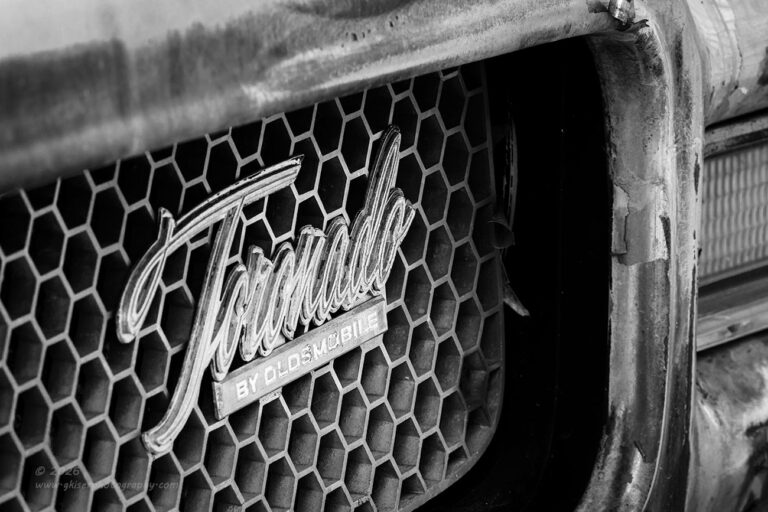
While working with the corner of the car, I really found that I liked the grill details and wanted to do something with that grill. As I was looking around, I saw that the Toronado badge was on the driver’s side which was quite unfortunately on the driver’s side. This was the corner of the car that was blocked by the building, and I wasn’t able to get into my normal position to shoot this detail. Of course, as we have learned, my goal for the year is to learn to see things differently, and that is what I decided to do with this detail.
I knew that images that involved text did have more impact when the left side of the text was closer to the camera so that first letter had more impact. It also worked very well to have the text on the left side of the frame. Using that logic, I was able to put together a composition that used the grill shell and bumper as a frame of sorts for the badge. To keep it from looking too static, I let the parking light on the opposite side creep into the frame just enough so that it didn’t look accidental, but not so much as to distract from the main subject. It took a bit of work and several different variations in composition to arrive at this framing which worked as intended.
The honeycomb grill took center stage as the background that surrounded the script, but the way that the light fell on the different surfaces made this quite exciting to look at. With the black grill surround and brighter chrome, there was a real focus on the contrasts within the scene. Keeping that in mind and realizing that the slight bit of red in the upper right corner was a bit of a distraction, I knew that this was going to be a black and white image without a doubt. Once I made that conversion I was sold and then went to work on finessing the contrasts and tonalities within the frame.
Considering the difficulties in getting this image framed because the building itself was just out of frame to the right, I am really quite happy with how it turned out. One of the tricks of shooting images in tight spots with limited flexibility in angles is to make the image look like it was always the best choice in composition. Even looking back at this one, I am having a hard time remembering the struggles and what was just out of frame. It looks like a natural composition and the best option that there could have been. I’m sure that given more flexibility with the scene I could have come up with something better, but to have a composition that was formed through many compromises look this polished is the difference between an artistic photograph and a simple snapshot.
Speaking of photographic art, I have to slip this in just for a second because as I was typing this, Toni came down to say hi after she was done with her morning workout. While she was down here, I showed her a client print that I had just done which is destined for Midland Texas. It was not a large print at only 11×17″, but it was a print, nonetheless. The subject was one of my decay photos that was shot recently when I last worked with an old Pontiac. She usually doesn’t get excited with my decay photos of old cars because it just isn’t her thing, so when she says that she likes one I typically take note. The photo Unlock the Power is one that she has seen digitally a couple of times since I created it because I will always show her the final images after I’m done editing and then she will see them again when she is reading the blog entry. I know she is reading these blog entries word for word, even though she never mentions when I talk about her in them.
Toni, if you are reading this, throw something at me. At least the next time she throws something at me I can say it was because she read this.
Anyway, she was looking at the print that she had never really gotten excited about and kind of stood back for a second and said, “I get it now!” She went on to explain that she doesn’t really care for these when she sees them but seeing it in print was a whole different story. The photo took on a different life and became more interesting and impressive even at a relatively small 11×17″ size. She never really understood why I love these old car images as much as I do because they didn’t seem all that special when she would look at them on her phone or even the computer screen. I totally understand that disconnect because I know that seeing an image digitally is only a part of the process and a step towards the completion of the photo. Everything that I shoot is intended to become a print and I shoot it with that in mind. I’m not here to create digital “content” though that is what I do most of the time it seems. My ultimate goal is for my images to end up as a print on a wall. As Toni so eloquently stated, the print is worlds better than any digital version that can exist. I couldn’t agree more and that is why I get so excited to make these prints for clients. It really is a special experience to be able to share my ultimate vision with folks. I appreciate those who enjoy seeing my photos online whether here on my website, or on social media, but I want you to know that you are seeing a photo with about 40% of the impact that it actually has as a print. I’m making that percentage up, but it is probably about accurate. What you are seeing digitally is a file that is dependent on your monitor for color and contrast while the original image file is reduced from 280-300mb down to 200kb which is a small jpeg in 8-bit color reduced to around 19-25% quality for ease of uploading. There is just no way that these low-resolution digital images can hold a candle to an actual print. I stake my reputation on that statement every time I make a client print, and I have never had a complaint.

Sorry about that little detour while working images of the Toronado, but I really thought that it was a worthwhile sidebar to take at the moment. I had been working with the grill emblem and for that had been a bit lower to the ground that I had to start with. From this angle, I started to see more interest in the front corner of the car. I knew that I had already done an abstract shot of that corner, but I was liking it from this angle for different reasons. I moved the camera further to the left and started to put together another composition which included the same section as before, but a larger scope was now involved. I chose to bring in the wheel cover at the bottom left, the full turn signal, as well as a bit more of the top of the fender and hood. The grill was still there just as a framing element to go along with the wheel cover.
As with before, the colors all worked together quite well, and I kept this one in color because of that important balance. I thought that it wouldn’t be as good as the abstract view of the same area, but after living with this one for a little while, I am liking it better. Because of the design of the car, it is not the expected view of an old car because there is no headlight. The design causes you to stop and think about it which almost puts this in an abstract realm as well. It is the opposite end of the abstract that I am wanting to concentrate on this year, but I think that this one turned out beautifully because of the design work of the Oldsmobile team.
This really is the benefit to knowing how to work the details of a car and to create abstractions from it. There was no way that I was going to be able to photograph the entire car where it sat without it looking like a random snapshot. A decade ago, I would have been left with nothing from this car because there were no good options for a photo of the car itself. I’ve come a long way since then and have found the power of details within the whole. As you can see, from a car that there was just no chance at capturing the entirety of it, I have come up with a total of four keeper images from a short time with it. If you add the other set from the previous experience with it, we are looking at seven different images of the car. There is power in the small details when it comes to photos, and as Toni just discovered, they make fantastic prints.
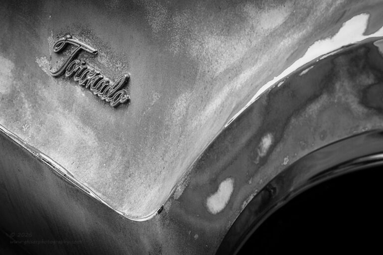
The lack of rust on this car was a bit of a stumbling block for me because I tend to rely on the rust for the textures that I am after. In the case of this car, it was the color variation between the red paint and the gray primer that offered the visual interest in what would be the negative space in the frames. The area on the front fender by the Toronado badge didn’t have much of the primer visible, and there was no rust. It was all just variations of sanded red paint which seemed to be a bit monotonous to look at. However, the way that the paint was feathered due to the sanding provided a different kind of visual contrast that I liked. The red was too much in the frame, but by removing the color, I was left with tonality shifts which became way more interesting to look at.
As I had done with the grill emblem, I went through my options for color profiles which include more than a dozen black and white profiles. I looked for one that brought more variation to the different shades of red and found one that worked quite well. From that point, I went in and carefully massaged the tonal relationships until I came up with this image. There is a smoothness to it and a gentleness in the curves that I think really represents the car well. The script of the badge is the area that pulls all of the interest because of the high frequency textures that are introduced as contrasts in the scene. It draws just the right attention, and I think completes this image filling the negative space in the upper left portion.
When I was all finished with the fender emblem, I took a few minutes to look around at the rest of the car to see if there was anything else that I might want to capture. It didn’t really take too long before I realized that I was pretty much creatively done with the car for the day. I had shot more than I had expected and considering I had gone out that morning to shoot a single image, I was pretty well drained creatively. I had a total of 89 frames captured on the camera and was hoping for five or six keepers. It was a very pleasant surprise to see eight images come together in the end. It had been a very different day than I had started out with. There were a total of three different locations that I ended up shooting, two of them were new and the third was a familiar subject in a different setting. It had been a very successful day!
I do hope that you have enjoyed this trek as much as I have. I’m sorry that it has been drug out over the course of several days. I just didn’t have it in me to do a blog around eight different photos all in a single day. With the publishing of my latest Behind the Camera happening yesterday, I didn’t want to bombard those that subscribe with two different entries in the same day. The simplest thing to do was to just hold off on this part for the day after that. Thank you for joining me, and I hope to see you back here soon with another trek.
Until then…