Sunday, August 3, 2025
I admit it, I’m a glutton for punishment. I’m actually starting this blog a little after lunch on Monday after getting next to no sleep the night before. I finished up the previous installment of this multi-part blog just a few hours ago. I decided to take a little break from the computer and go out for a quick ride in the Miata. I did take my camera with me just in case I found a good spot to get a quick set of photos of the car since it was all clean. The increasing cloud cover kind of killed that idea though because it was looking like rain. I was not going to go through that again, so I just headed back home instead. There was a nice little surprise on my ride though, I got a call from a client about a commissioned piece that they are wanting created. Now I’m starting to plan that photograph out and hopefully it will end up being talked about here in the blog. For the time being, I am trying to get caught up from yesterday’s trek.
I went out on Sunday with full intentions of going to several places and figured that I would end up with maybe a half dozen photos if all worked out as planned. As seems to happen quite often, I stepped into a creative space and started to make more and more photos. The ending count for the day was 101 frames shot which in the grand scheme of things really isn’t all that many for a full day out with the camera. If you take my typical 10% hit rate, I would be looking at around ten photographs to share. Here recently though, it seems that my hit rate has been around 20-25% and this trek holds true to that routine. Had I just gotten ten keepers, I would have knocked this blog out in a single entry and called it a day. As I mentioned in the first part of this series, I was looking at 18 keepers from the day. However, shortly after writing that blog entry, I went back into Lightroom and worked through three other photos that had been culled out earlier. That brought me to a total of 21 keepers for the day. When I had 18, I was planning on doing this as a three-part blog which became a norm for me back in March when three treks in a row yielded a trilogy of three-part blogs. It was just an easier way to share the images while keeping the blog entries manageable.
As it turns out, here we are again, and with the additional photographs that have been added, I’m going to make this a four-part blog and break this section up into two different ones. There was actually a really good break in the action while I was working the scene. It was when I swapped lenses from my telephoto to my standard zoom. That is where I will break this blog up, and you will see that it makes sense when we get there.
So, how did I get to this place to begin with? I was coming down off of the mountain and was planning to head to Walmart to get some shopping done while I was out. When I finally had cell coverage again, I found out that Toni had taken care of it and I no longer needed to go. With a bit of extra time on my hands, I decided that I might as well stop by the repair shop that I had been looking at for the past couple of months ever since he got a yellow MG to work on. It was not in bad shape, and there was actually very little rust visible on it with the exception of the wire spoke wheels. While it wasn’t a true decay subject, I felt connected with it since I have been enjoying driving my Miata around for five years now. There is just something about a small roadster that captures your spirit when you aren’t looking. It was that connectino that I wanted to try and capture with the MG, but could never really figure out how I would want to shoot it.
Maybe a month ago, he got a white Fiat added to the collection. This car was in about the same shape and didn’t really fit into the decay theme, but I found it interesting just the same. I was still having a hard time figuring out how to photograph either of these cars and they kept changing positions around the shop going from bad to worse photographically speaking. I still kept looking and thinking about how to approach them. There was also the matter of whether or not I would have any issues working so close to the business when I wasn’t ever sure when they were open.
Maybe a couple of weeks ago, there was a new addition that grabbed my attention, but not for the same reasons as the other two cars had. This one was a Triumph, and it was painted purple with black accents. I’m pretty sure that wasn’t a factory option color and it kind of struck me as not quite right. Out of the three roadsters, this was the one that I felt had no place in front of the camera. There was no rust that was really visible, and the paint was just that over-the-top purple that didn’t excite me at all. It did succeed in keeping my eyes on the place every time Toni and I would drive by.
As I was driving down the mountain with that bit of spare time, I figured I might as well drive by the shop and give the cars another look before telling myself that they weren’t worth stopping for. That was what I suspected was going to happen and that was fine. I had been pretty successful with the photos up to this point and had plenty to work on for the rest of the day and possibly into the next day.
When I arrived, I slowed to look at the cars critically which again proved that they were in terrible locations. The Fiat was nosed into the building (quite literally touching) with cars all around it. The yellow MG was also similarly nosed against the building with the Purple Triumph backed into the building directly on the side of the MG. There were cars on either side of the pair, and the only one that I could get the front end on was the Triumph which was the worst color of the three.
The good news was the bay doors were open, and I could see the owner of the shop inside. As I was convincing myself that none of these cars were worth photographing, I found myself pulling into the parking area out of the way. How did that happen, I had fully intended on continuing to drive and think about all the reasons that this location wasn’t going to work. Well, I was here now, might as well get out and see if he would mind if I looked around and maybe shot a frame or two if I got really lucky.
He was quite nice and had no problems with me photographing the cars with a simple condition that was easy enough to follow. While talking with him, I spotted an Olds Toronado which was pulled into one of the bays. These are very unique cars, and I do enjoy photographing them when I get the opportunity. As is the usual with these cars, it was in a position that made it very hard to photograph, and pretty much impossible to capture an overall composition of. I did ask if he would mind if I grabbed a few shots of it in the bay as long as I stayed out of his way. He had no problem with me doing that and even offered to move some of his tools and gloves off of the trunk for me. I assured him that I prefer to shoot it as I find it and that anything that was on the cars would be fine by me.
With his blessing, I went to the truck and grabbed my long lens. I know that this seems counterproductive considering how closely packed the cars were as this lens requires a bit of room to work. It is very good at doing isolations though, and that was what I was anticipating doing the most of. I didn’t see any way of capturing an entire car and I needed that narrow focal length to really isolate my subject. Of course, I added a polarizer to take care of the glare, and it was also going to help me reduce reflections of neighboring cars and potentially myself in the glass.
At this point, I started to look around for that first composition. The first car I came to was the purple Triumph. It reminded me very much of my Transformers toys when I was a kid. I also had flashbacks to Joker in Batman. The color just seemed comical and juvenile. There was also an abundance of pinstripes and graphics on the car that added to that feeling. Yet, here I was with the camera in my hand looking at the lines of the car. I really think that the Triumph has the best design out of the three, at least from a photographic perspective. Maybe I could deal with the horrid color by converting the image to black and white. That worked out well when I shot a pink over tan Studebaker a while back. Without the color, I would be able to concentrate on the shape of the car more than anything. That should allow me to get an image or two from this location to get me started.
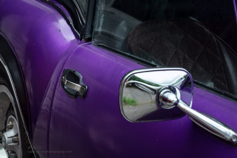
I picked out the curve of the rear quarter panel where it meets the door and started to work out a composition. I liked that curve, and the door handle added a bit of interest and contrast. By bringing the frame out a bit more, I was able to get the chrome mirror which added a really nice anchor to the image. I carefully decided how much of the wheel to include to balance out the mirror without necessitating including too much of the car. I found that right balance on where to crop the frame on the right side and got the angle just right to include the close crops just how I wanted them. I twisted the polarizer to adjust the glare and add to the saturation.
That was when the magic happened. All of a sudden, I found myself actually liking the color. The rich purple hues jumped off the screen of the camera against the deep blacks. The two colors were amazing together and I had a feeling would photograph very well together. Could I have been wrong in my assessment of this car since seeing it for the first time? It was not the ugly, red-headed stepchild that I had made it out to be. It was absolutely beautiful, and this first composition just sang in the image review.
I was firmly on my way with this car and was actually excited by it now that I had seen how the camera saw the colors. When I was satisfied with that first shot, I moved around to find something else that I wanted to capture. The scooped headlights are a feature that I love with these cars. I’m sure it has to do with my love of Datsun Z’s, but I wanted to capture something with the headlights here. Since the purple car was the only one that was facing away from the building, I had no choice but to work this car for that front end shot. I was no longer complaining though as I was genuinely happy to photograph the purple car now.
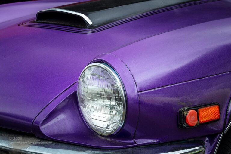
I decided to work with the car from the driver’s side front corner because the light was better there. I looked around with the camera to see what different framing options there were. I knew that I wanted to get the hood scoop in the photo as well as the scooped headlight bucket. This forced the inclusion of the side marker light which wasn’t a bad thing at all. Now that I was happy to shoot these in color, the orange was a nice contrasting color for the image. It was all coming together so nicely except for the front bumper which was very bright and very dominant at the bottom of the frame. To include it all would throw off the balance of the image because of how bright it was in comparison. However, to exclude it would mean cropping through the headlight scoop which wasn’t an option since it was a main reason for the photo. I decided to crop through the bumper which I had done in other compositions with success. The trick was to get just enough of the bumper in to make it look like it was purposeful and was there to serve a purpose. That left me with a sliver of chrome at the bottom of the frame that complimented the chrome trim strip on the hood scoop.
The composition worked out and I started to make exposures altering the position of the polarizer to give some highlights to certain areas of the fender and hood. I wanted to create depth to the scene, and this was the best way to do that. It is just another reason why I love using a polarizer so much when it comes to automotive photography. It was the last of three frames that made the cut with the light in the right places along with the right framing and depth of field. I was really starting to enjoy this car at this point. I know that was the case because the tacky pinstripes that I had seen around the hood scoop became an important element in my next composition.
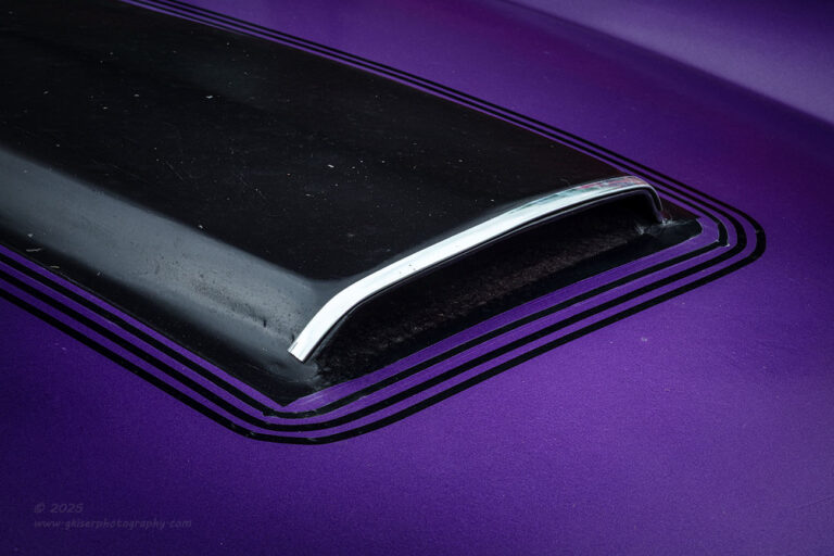
I moved my attention to that scoop and went for an abstract style shot of it where it was all just shape and color. The stipes helped to frame the visual anchor, and I used the polarizer to get the right modeling on the hood and fender to show the shape of it. It was a simple shot, but it was the little details that I really didn’t care for that made the shot. The back pinstripes framed the scoop while the chrome trim defined the shape of the black scoop. The contrast between purple, black, and chrome was perfect for what I was after. The final thing that I did was to take the image and flip it horizontally to read a little bit better while still taking advantage of the better direction of light.
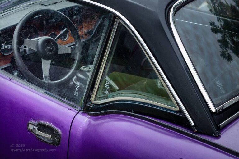
Now that I was working this side of the car, really wanted to get a good interior shot through the hardtop. This was driven mainly because I was still enjoying the shape of the quarter panel where it met the door. For this shot I wedged myself between the MG and the Triumph to set the tripod up. There was just barely enough room to get the working distance that I needed in order to get the focus locked. Once I got that distance settled, I fine-tuned the composition so that there were plenty of diagonals. I framed the steering wheel with the door window and made sure that I exposed the shot in a way that the darker interior had enough brightness to show off the wood trim on the dash. I was actually pretty happy that the car was mostly a dark color and that it was cloudy because that allowed me to get the exposure pretty well balanced. I sacrificed the brightwork trim as it was going to overexpose, but our eyes are used to seeing chrome trim reflecting very brightly so the loss of detail in the highlights caused me no problems at all.
I only had to shoot two frames to get the exposure pushed as far as I needed it to be. It was that second frame where the chrome was pretty much all clipping that worked the best for me. It was a joy to process because I had shot it with the understanding of how I intended to edit it. One of my favorite aspects of this one was the fact that the wood grained dash had the same visual effect as the marker light had in the earlier shot of the front end. The colors complemented each other quite well and made for a pretty good color harmony. Thanks to the polarizer, I was able to eliminate the vast majority of reflections from the glass to allow us to see inside of the car. Without the polarizer, there would have been too much glare and the reflection of the building and myself which was visible in the mirror reflecting on the glass showing me behind the camera.
I was quite happy with how this one turned out, but it was time to turn my attention to the “photogenic” cars which I had stopped for in the first place. This purple one was horrible…only I had proven myself wrong as could be after only a few minutes of shooting. The yellow MG was parked right beside the Triumph, and it was time for me to look for some photos of it. Honestly, after working with that amazing purple color, the yellow seemed kind of bland to me. It was a period correct color and was likely the original color to the car, but it just seemed all too plain at this point. I looked for details and isolations, but nothing was really sticking out to me. The one detail that I really liked was the wire spoke wheels that were super rusty. The driver’s side front wheel was turned in a great position for a shot and I decided that I would frame something up with the wheel.
I shot a composition that included the fender arch going around the wheel and a bit of the wall which was done in vinyl siding and added another linear element to contrast with the circles. The composition kind of worked but seemed forced to me. It was much stronger in a vertical format, but it still wasn’t quite working out. I was pretty sure that the problem was I was having to get too far back to use the long lens and that I would probably have better luck with the standard zoom if I mounted it later on.
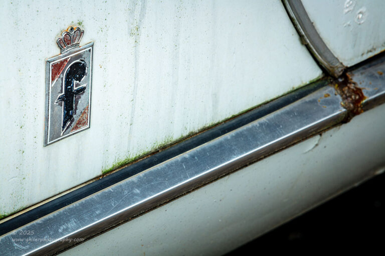
Not feeling the MG at all, I moved over to the Fiat and looked for something to shoot on it. Since it was a white car with very little rust, I was having a hard time finding interesting areas to shoot that would have enough contrast to make a photograph work. The only things that got my attention were the luggage rack on the trunk that I wanted to use in relation to the Fiat badge, the 124 emblem on the rear finisher, and the Fiat emblem right behind the doors. The first two proved to be exceedingly difficult to compose and I eventually made my way to the simple little bade on the quarter panel. It had a few things going for it that the other scenes didn’t have.
First of all, the image was surrounded by dirty runoff from years of rainfall. This added some interest and patina to the paint that the trunk just didn’t have. At the base of the door was a bit of green moss developing from the moisture. There was a chrome strip right beneath the door that added a strong line to the composition as well as a contrasting tone and color. The seam from the door was slightly curved which added yet another point of interest for some compositional options. The badge itself also had some contrasting color present and showed a good bit of age which the other emblems didn’t show. I had the elements that I wanted to work with, and it was time to organize them all into a composition that worked.
I decided to go with a strong diagonal element to the composition by shooting slightly elevated and to the rear. I would index the image based on the emblem so that it would appear to be square with the frame. This would allow the chrome strip to progress from the lower left to the middle right side. The curve of the door would create another shape in the upper right corner to keep the eyes in the frame. I worked all of this out before I started making exposures because how the eyes would read this photo would determine if it was a success or not.
When I was happy that I had everything organized just right, I made the first of three exposures. Looking at the image review, there was too much negative space around the core image, so I zoomed in slightly to close it in. That was the second frame, but I realized that the emblem was not quite as vertical as I wanted it to be. After making that slight adjustment, I fired off that last frame which I felt was the right one of the bunch. It was the one that made it through the culling process and was ultimately processed. I chose to keep this one in color when an easy choice would have been to make it black and white because of the splash of red and green with the blue hued trim. The colors helped to define the area and the shapes, so I deemed them important to the image.
By this point, I was by the open bay door where the Toronado was being worked on. From this angle, I was really impressed with the way the body flared out over the wheels. It really looked muscular, and I became very interested in photographing it. I was really wishing that the car wasn’t in the shop and there was a way that I could get the entire car in a photo, but that wasn’t going to happen. In fact, with the lighting, I was pretty much relegated to working details on the rear of the car more than anything else. The first thing that I saw that I wanted to photograph was the emblem under the trunk lid. I don’t have a photo of one of those in my collection and I felt that it was an important photo to get.

I started to work through the elements that I wanted in the photograph because I wasn’t going to settle with just a straight image of the emblem. I needed it to have some character and a bit of a story to go along with the name. I immediately started to look at the marker light on the quarter panel which was disguised as an emblem with the Oldsmobile logo. It was situated in a sculpted bend in the bumper which added to the interest for me. The taillights were kind of buried in the bumper and they were so dirty that they really didn’t show that well. The car was red and had been sanded at some point years ago showing feathering between the layers of paint and primer. It wasn’t rust, and wasn’t really patina, but it was interesting in its own right. Knowing what I wanted in the shot, I started to organize the elements in the frame to make the composition.
There were a lot of little decisions that I made as I moved the camera around. Since I wanted the main focus to be on the Toronado emblem, I made sure that I was showing more of the rear of the car than the side. That put the side into a supporting role for the composition to add depth to the scene. It helped that the light was darker on the side due to it being in a bay, but the chrome around the marker light was still catching the light making that a viable element for the composition. I had just the corner of the trunk lid in the frame to give another shape to the image, but that left me with what to do with the taillight and the bumper. Since the light was basically two strips in a large chrome bumper, I decided to creatively crop through both of them to minimize their impact visually. I considered the taillight to be the more important aspect of the bumper and sacrificed a good bit of the chrome while keeping a large portion of the twin lensed light.
The result was a lower framing element that had minimal brightness and where the larger chunk of chrome appeared on the side of the car, it went dark due to reflecting the darkness of the shop bay. That dark chrome reflection contrasted very nicely with the chrome around the marker light which was angled just right to catch the light from outside. There was a natural vignette leading through the quarter panel which helped to keep the attention on the rear of the trunk where I wanted it. After a few minutes of working the camera around to arrive at all of these choices, I was finally happy with the composition, and I tripped the shutter. That was all it took, and I was satisfied that I had the right image of the rear nameplate.
I found myself being quite interested in the side marker light with how it was designed into an emblem. That became my next idea for a composition. Since I had more room to work with on the passenger side, I started working the angles over there, but quickly decided that that the lens had some overspray on it that was dulling the red. The area around the light was also not as interesting as I would have wanted with the exception of a drop of grease on the surface which had developed a very visible wet spot on the panel.
I looked at the other side and found that the around surrounding the marker to be much more interesting with an almost halo-like gradient to the surrounding area. The lens inside of the emblem was also clear and had a richer color to it. This was the side that I needed to work with, but I was having a hard time getting the camera far enough away to get the shot. After a few minutes of working around the frame of the bay door, I realized that it just wasn’t going to work. I was going to need to get closer, and for that, I was going to need my standard zoom lens.
I went back to the truck and swapped out the lenses and kept the polarizer attached. I made my way back to the Olds and started to frame up the composition once again. The difference in focal lengths took me by surprise at first because I hadn’t realized that I was working at the longer end of the lens to get the framing that I was wanting. I was about 30mm away from where I had left off when it came to focal lengths. I was able to work closer, but I was seeing a field of view that was quite a bit wider which changed up the composition.
You will have to join me again tomorrow to find out if this idea worked or not. Let me know if you think that I was able to get the shot or not. You are also going to get a chance to see the final images of the day. I’ll go ahead and let you know that two of the images that you will see tomorrow are ones that I had discarded during the initial culling process only to revisit them before going to bed Sunday night. I’m happy with how they turned out and I’m glad that I went back to them before calling it a night. I hope that you will have the same opinion.
Keep your eyes out Wednesday morning for the next and final installment from this trek. All of your questions will be answered by that point.
See you soon!