Sunday, September 6, 2026
And just like that I’m back, once again. My original plan for the day was to start near sunset and photograph the old Jonesville Motor Company building under the dimming light while the storms were going through the area. As it turned out, I had a chance for good light during the morning storms, so I went out to take advantage of that light while I knew what I had rather than waiting for something that could very easily change. Of course, that put me in a situation where I still had good light after I finished with my planned location and that left me with choices of where to go next.
As it turns out, about the time I was really deciding that I wanted to photograph that old building, I had also spotted a unique old Ford truck sitting behind of the office building where I had just finished shooting a Ford Galaxie. It was a body style that I was not familiar with, and it resembled a COE truck. After a little research, I found that this is an N600 which was a medium duty truck that Ford made during the ’60’s. When I first saw it, it just reminded me of the truck in the movie Jeepers Creepers which is one of Toni’s favorite movies. Just looking at the truck set an expectation for the mood that I would want out of the photos, and the sunny day that I saw it on didn’t fit the bill. In fact, the bright sunlight and harsh light on the truck kind of turned me off of it to where I didn’t even linger to check it out when I first saw it leaving the location where the Galaxie had been. I did file the truck away in my memory for another time when I was looking for something worth shooting and the weather was better.
Well, here I was wrapping up a moody session with the old building in Jonesville, and I was really digging the light. In fact, it was a nice change of pace for me to be able to get out in the clouds once again to get some photos. It seems that for the past month or more, I have been stuck with going out on sunny days. While I have had some tremendous luck with those conditions, there is just no doubt that I much prefer cloudy days for the decay photography. It just seems to fit the overall feeling that the various states of decay give me. This is not to say that I can’t work on sunny days because I actually do find the saturation of the colors better in the sun. I just don’t want anything too bright and cheery for these photos, generally speaking.
With the dreary conditions over the area, I had a feeling that the Jeepers Creepers truck would be looking much better than it had a couple of days before. I wasn’t but maybe 20 minutes away from it, so I decided to head off in that direction to see if I could beat the rain. According to the weather the rain was going to hold off in East Bend for a bit longer and I would more than likely have time to get aquainted with the truck and get a few photos.
When I arrived, I noticed something right away. First of all, I proved to myself that light as a lot to do with my perception of a subject and how I am drawn to it. Just a couple of days before, I was out at this same spot under sunny and clear skies. The truck didn’t look good at all, but the Galaxie which had minimal decay looked wonderful. It was bright and energetic which prompted me to shoot the entire series of photos in color even though the car was red. I’m usually trying to tone down the reds in my images, but the color worked for the lighting at hand. This part of the day had happened after working a black Chrysler Imperial under similar conditions. Most of those images were done in black and white because the black paint on the car just created too much of a cool color cast over the image. Two very different colors treated in very opposite ways under the existing light. Something that these cars did share was that neither was all that consumed in rust or patina. You could actually say that both cars were in pretty good shape overall. That was why they both looked good under the existing sunlight.
The Ford truck that I was now looking at was covered in patina, rust, and a heavy buildup of dirt from being out in the elements for a very long time. That was the fundamental difference and because of that difference, it didn’t look good at all on a bright and cheerful day. This vehicle demanded something more reserved and slightly less energetic. Now that I was looking at it under cloudy skies with some drizzle falling, the truck was absolutely beautiful and well worth my time to photograph it. The Galaxie, on the other hand, didn’t really show anything special and almost seemed out of place sitting there. While I still believe that composition trumps all in terms of photography, there is no denying that light plays a huge part in what looks good at the time.
I now had the right light for this Ford truck, and it was now up to finding the compositions that worked best for it. I had no doubt that I would be able to make that happen, but before I started to really work the scene, I needed to take a walk around the truck to see what I had to work with. The obvious part of the equation was that it was a flatbed truck which kind of lessens the appeal for a subject for me. Think about it, you have this great cab to work with and then nothing at all behind it but a long shelf sitting on the rear wheels. Because of the height that the truck sits above the ground, I was going to have to include those rear wheels to keep the truck from looking like it was balancing on just the front wheels. If I had cropped off the bed of the truck, it would have been very similar to cropping a portrait of a person right at the ankles. They would appear off balance and awkward looking. I wanted to avoid that with this truck, but that meant that for any type of all-encompassing composition, I was going to have to include the flatbed.
This problem was compounded by the fact that the nose of the truck looked like a Pekinese dog. There weren’t a lot of angles or depth to capture with this truck, so angles were going to be very important as well as where I guided the eyes of the viewer. I needed to minimize the rear of the truck as much as possible, while keeping enough of it to give the truck depth. This concern bled into the next concern which was the fact that there was an old Greensboro Police cruiser sitting off behind the truck. I knew this car from when I was out here years ago photographing a Corvair. Seeing what I thought were the remnants of GPD’s decal package, I had looked at the car closer and actually remembered the equipment number which was still visible on the rear window at the time. Funny that this car crossed my path two counties over long after its career was finished. Anyway, I had to make sure that I composed the image in a way that blocked that car from view.
Speaking of blocking elements from view, right off the passenger side of the truck was the office building which had a staircase that ran off the back corner close to the truck. If I wasn’t careful the concrete stems were going to sneak into my frame and create a distraction. In no way did the building fit with the truck, so I wasn’t going to be able to include any of that structure in the photos which would have made an overall photo much easier to compose. On the other side of the truck was a power pole randomly sticking out of the ground as well as a carwash building. None of these elements did I want in the frame. In fact, I wanted nothing at all that surrounded the truck to appear in the composition other than the trees in the background.
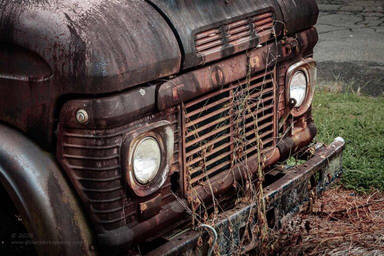
I had my work cut out for me with this truck. The safe bet would have been to work on the isolations and abstracts which I was already seeing a good many potential areas to work with. Because this was the first of this style of truck that I have run into, I really wanted to get an overall composition done of it. That became the first priority and after looking at everything around the truck, I realized that the lens of choice was going to be my telephoto lens for the ability to compress the scene. This served several different purposes. First and foremost, it would keep the front of the truck from looking oddly big which would happen with a wide-angle lens. Since the flatbed was already small in comparison, I didn’t want to shrink it visually any more than it already was. I also didn’t need to enhance the size of the grill of the truck over its current impressive size. Second, the angle of view would keep a lot of the background out of the photo and allow me to shoot past the steps of the office building as well as miss the opening in the trees that showed a picnic table by the stadium at the neighboring school. Thirdly, the long lens would also allow me to get in close and pick off any details that I saw which interested me. This lens really is a favorite of mine to work with and has been now for something like four years.
I framed up the shot that I had in mind for the entire truck and started to make exposures. I found that I didn’t really like a full polarized effect on the truck because the glare on the surface actually helped to separate the truck from the trees if I positioned the filter just right. I went through two different compositions of the entire truck before deciding that I wasn’t really liking them as much as I had hoped. I had the shots, but I wanted to get to know the truck better before I really tried to get the overall composition knocked out. I knew that the front of the truck was the most unique aspect and that was where I went next. this wasn’t going to be my standard quarter view of the headlight and grill, but it was going to be based on that concept.
I wanted to get the spaced out FORD lettering across the grill as well as the way that the grill looked and the decorative panels on the outsides of the headlights. I didn’t want this to be a static photo shot from straight on, so I moved to the passenger side where the light seemed better to compose the shot. I started at eye level, but that was still too straight in the frame. I needed some more drama which would come through the use of diagonals. By elevating the camera to well above eye level, I was starting to see the composition that I was wanting. It was kind of hard to really see the details during the composition as I was standing on my toes looking at the live view. Keep in mind that this is an old camera and it doesn’t have a flippy screen on the back so, having the camera pointed down at the subject, kept the screen pointed up and away from my eyes. It is a minor hassle and not something that bothers me too much, so I don’t mind dealing with the lack of the flippy screen as that is just one more thing that can break over time.
There were another two frames shot of the front end of the truck from slightly different positions. It was the first one of the pair that made it through the culling process and was sent over to processing. I finally had a good one in the bag from this truck. I felt like I was on the right track at this point and decided to embrace the isolations and let the parts speak for the whole in the spirt of synecdoche. It wasn’t so much that I was taking the easy way out, but rather taking my time to learn the subject and figure out how it wanted to be photographed.

The next subject was almost too easy to spot. I have a think for emblems on these old rusty vehicles, and I spotted the Ford crest just behind the hood on the driver’s side. What I really liked about this was the fact that the hood had taken on a much different color than the fender panel which was still blue. The orange and blue harmonized quite well and the shapes between them seemed to really flow with the emblem. As I was looking things over, I found another little surprise within the crest. I could just make out the 600 designation in almost a ghostly fashion. I knew that I would be able to capture that with the camera and that sealed the deal for me here. I started to work out the composition in a way that would read correctly from the left to the right. I wanted to keep the Ford emblem close to the viewer since it was going to be on the right side, so I chose a shallow depth of field to push the eyes right to that badge even though the cooler color of the fender panel naturally receded away from the viewer.
It really pays to understand how the eyes and brain work when it comes to visual stimuli. Had I shot this composition straight on, the blue would have pulled the badge away from the viewer while the orange panel came forward. With all of the image on the same plane, that would have created a situation where the visual anchor fell into the background. By shifting my point of view to the right and having the emblem closer, I offset the natural recession due to the color. By adding the shallow depth of field, I ensured that the eyes would want to focus on the sharp portions of the frame which was right where the emblem was. It appeared closer because it actually was closer. I just used some photographic techniques to create a third dimension on a two-dimensional image.
Things were starting to roll nicely at this point, and I was starting to feel confident enough in my photos that I didn’t take a lot of alternate images. Now, I was shooting more compositions than you are seeing here, but there were a few that just didn’t work out and never made it through the culling process. It wasn’t that they were bad images, they were just boring. I was working quickly and trying to get to know this subject at the same time so I knew that I would be getting quite a few duds in terms of compositions as I figured out what worked with this specific vehicle.
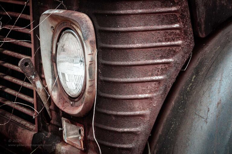
Something that I knew that I liked about it was the COE design with the front grill rolling right into the fender. There was a panel between the headlight and the fender which was stamped to resemble the grill which I thought was a very nice touch for a commercial grade truck. It offered a collection of shapes that I felt were really nice and worked together very well. My gut told me that this was needing to be a vertical image which I set up and shot. Looking at things, it felt awkward with how the headlight was positioned. It needed more breathing room on the sides of the image as that was where the interest was rather than above and below the headlight. I rotated the camera into a horizontal orientation and tried the composition again. This time, it worked and I really liked the idea. It was a new type of composition for me, and it relied on the visual tension of the headlight looking left, while being on the left side of the frame.
I thought about doing this same shot from the other side on the chance that it would read better from left to right. I didn’t do that because the colors were not as good on the passenger side and I didn’t think that it would hold as much interest as what I had just shot. This wasn’t one of those images that I could simply flip in post like I admit to often. In this case, the text on the headlight would give away the flip. You can’t see it in the web resolution, but you can make out the General Electric stamp and part of the model number in the full resolution image. Since I create these photos with the intention of making them into prints, I wasn’t going to sacrifice that telling detail even it if made the image easier to read.
Looking at the image now after going through all of that thought process on how it reads, I do think that it reads well this way. The visual tension adds an element that would totally be missing if it was flipped or if I had photographed it from the other side. Both would work, but I think that this composition is slightly more effective because of the direction. Do you think that it works? Let me know.
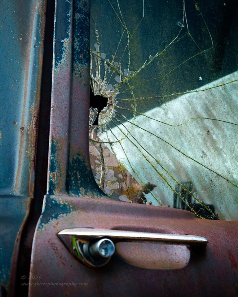
While working on the driver’s side, I was still looking the entire truck over for more areas of interest. One of those happened to be a crack that I saw in the side window on the other side of the truck. If you have been with me for any length of time, you will know that I love photographing this old glass when it is cracked. There is so much character with the laminated glass which you just don’t find with the tempered glass of today’s vehicles. I needed to get a closer look at the window to really see if there was a composition there or not.
When I got to the other side of the truck, I found the cracks even better than I had expected. They radiated from a central hole right at the edge of the glass and there was a circular crack around the hole that seemed to frame it. The main cracks were radiating from the hole almost in a rhythmic fashion. I started working on a composition right away and found that the button on the door handle was roughly the same size as the hole in the glass which made the handle a natural element to place in the frame. Because of the long horizontal element of the handle itself, I chose to bring in the panel gap from the open door which was a strong vertical. The fact that the shadow of the door jamb contrasted with the highlight of the door handle was a nice bonus to the equation.
To bring more attention to the hole in the glass, I chose to position the camera in a way that placed the hole in line with the roof panel so that the contrast would be greater with the broken glass. I paid attention to the placement of the line between the roof and the windshield as that established yet another shape to the composition and became important to the overall photo. Once again, I used the polarizer to control the glare and place it where I wanted it. All too often photographers tend to think of a polarizer as an on/off switch and only use it fully engaged. The power of this filter comes from the ability to fine tune the effect for the creative goals envisioned. That was what I did here and added a few highlights here and there to help add structure to the image.
For a difficult composition to come up with, I think that it turned out very nice. I had originally considered that it would probably be done as a black and white image, but I never really did play that thought out in post. I chose to keep it in color because the muted blues, greens, and magenta/reds seemed to go well together and they added another layer of interest to this photo. The greens also helped the cracks to stand out better than they would have without color. I wasn’t done with this door handle yet though.

For the last couple of years, I’ve had a thing with door handles. I can’t really explain it other than I think that the chrome works well as a visual anchor on almost any surface. The shape of the handles also seems to bring in a nice sculpted aspect to a composition. Whatever the reason, I’m really drawn to them and the shadows that they create. Of course, there are no shadows on cloudy days like this which means that I am looking at the handles being just handles on the door. The lack of shadows didn’t deter me from working a composition with a one of the door handles though.
I chose to go with a minimal composition while I was looking at the passenger side door. There were no shadows, or anything else to add other than the scoop for the fingers in the door. Even the patina was pretty bland around the handle. To spice things up slightly, I chose to include the deep shadow from the door being slightly opened. It was a small element at the lower left of the frame, but it gave the image some nice depth. To add to that depth, I composed the scene at an extreme angle which amplified the gap behind the door as well as showing off the scoop in the door skin. I used the polarizer to adjust the tonalities in the scene to show off the shapes more while reducing the depth of field to achieve the depth I wanted in the image.
The end result was a very minimalistic image, but I chose to retain the colors because they were all muted anyway. I liked the cool color cast over the image as it calmed things down quite a bit over the typical rusty colors that I capture most of the time. I do like these simple images for the graphical impact that they can make. Considering that the door handle is one of the main touchpoints on a car, I think we overlook them when appreciating the overall design of a vehicle. This is the case no matter if the vehicle is new or old, the only notice that we ever really give a door handle is to grab it to get inside. That is what makes this minimal image as effective as it is since it forces us to look at and study this simple device that we take for granted.
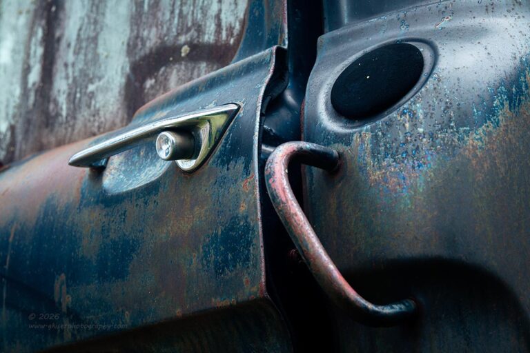
Of course, a door handle can also tell a story when surrounded by other elements as well. That was where I ended up after the minimalist composition. I went to the other side of the truck to see if I could do anything with that door handle since I had done two different compositions with the passenger side one. The first thing that I noticed on this side was that the patina was a bit better, but there was no cracked window. There was also the dummy plug where the fuel filler would have been had the truck not been equipped with saddle tanks. There was also a grab handle which was the same on the other side, but for some reason it seemed to fit the shapes better on the driver’s side. I was seeing something, but I wasn’t quite sure how I was going to put all of the elements together.
The things that I liked included the door handle, the grab handle, the dummy plug, the deep sculpting of the body line below all of that, and the residue on the glass. By getting low, I was able to form a visual triangle of sorts with the main body line going up to the right and then dropping suddenly with the grab handle and the body line. I found that from this angle, the steering wheel also fit in the frame nicely right above the door with the film on the glass effectively diffusing the shape. The patina on this side added to the visual interest and went along with the more complex composition. If you compare this one, and the other two compositions based on door handles, you will see a range in compositional complexity. They all work and they each work because of what elements were included in the frame, or what elements were omitted from that frame. The key is always to have separation of your elements and keep a visual flow working through the frame.
For me, composition is no longer about the rule of thirds. I’m not concerned with arbitrary placement of the elements within a frame based on a formula or an overlay. I am always looking for balance within the frame and that balance comes from the elements included, the placement of them, the light and dark areas, and even the colors. Each of these examples show a (in my opinion) perfect balance in all aspects within the frame. They are all based around one aspect, but there are other elements at play in each image which make them all very different. If you are having problems with composition, I’m happy to work with you and help you figure out some strategies through my mentorship program. You can get all the information to get you started by visiting this page. Then, if it is something that you think you might want to try, let’s chat about it and figure out if I’m a good match for you. I like to take a holistic approach and tailor the experience to the client rather than sticking the client into a predisposed curriculum that I formulate to fit most needs.
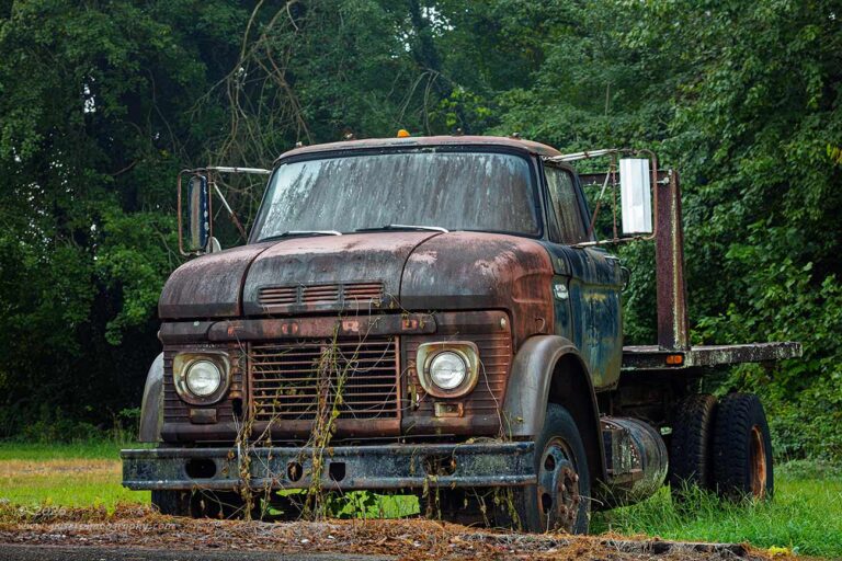
By this point in the experience, I was starting to feel pretty good about this flat nosed truck. I had been working it for roughly 30 minutes now and had a pretty good understanding of the personality of it. For an ugly duckling of a truck, I was really digging the design elements of the cab. The colors were working well for me, and the lighting was still very fitting for the truck. The only problem was that I was starting to feel some drizzle falling on me. I didn’t mind for my sake, but I didn’t want to have to worry about spots showing upon the filter face. Yes, I had my wet weather kit with me that included a lens hood for the lens, but that lens hood was a 77mm hood, and my polarizer was an 82mm filter which required a step-up ring to fit. Because of that disparity in diameters, I was unable to use the filter with the hood which sometimes isn’t a problem. This truck had to have a polarizer to get the photos that I was after because I needed to be able to control the areas where the glare showed up to help separate it from the surroundings.
I was feeling that it was time to go back and try the overall compositions of the truck before the rain got too heavy and I had to give this location up. I knew that I had a couple of frames of the entire truck from when I got started, but I wasn’t all that thrilled with them and I think that was because I didn’t really know the truck as well as I had wanted to. Now I had connected with it as a photographic subject and understood the design language a good bit better. I knew that the first thing that I had to do was to get down lower to the ground than I had been before. I needed the truck to look like it was looming over me, and I had missed that call earlier. The second thing that I needed to do was to get further away from the truck. This was a minor thing, but it was going to help the scaling between the cab and the flatbed portions of the truck. I needed them to be a little more equal in size than they had been. Originally, I was working around 100mm, but now I was between 115-130mm which seemed slightly better. With the lower altitude of the camera, the whole image changed significantly though.
I ended up shooting seven frames of the truck with slightly different camera placements to try and get the separation that I needed between all of the elements on the truck. Even a simple shot like this requires some thought and consideration. It might be the postcard shot of the day, but had I simply pointed the camera in the direction and made the photo, it would have looked like a snapshot. By working the composition over several different frames, I was able to explore what elements overlapped and how the whole image felt. This is where photography really becomes an artform and requires the same care and consideration as a painting.
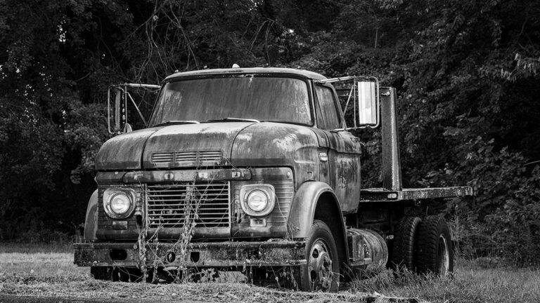
The next stage of the process is deciding on the way that the final image will look. As I said, I ended up shooting seven individual frames of the truck. Two of those ended up passing through two rounds of culling. The fourth and the seventh in the series were good enough to look at further and I had to make some decisions about them. They were arguably the exact same composition, but the camera placement had been slightly different with each exposure. The fourth in the series was a bit closer cropped to the truck and more head-on as I tried to minimize the effect of the flatbed in the back. This had the result of making the nose of the truck a bit more dominant in the frame. For that reason, I chose to finish the image off in full color because of the reddish hues of the nose.
The last of the series of images was a bit wider of a capture and slightly further to the right showing more of the length of the truck. The composition lent itself better to a 16:9 aspect ratio which accentuated the length of the truck and made the flatbed make more sense. The next step was deciding that this one needed to be done in black and white. That determination was made simply because the side of the truck was more prevalent in the frame and with the blue tones, the truck didn’t stick out as much from the trees in the background. By stripping the colors, I was able to work with the tonal contrasts a bit more effectively allowing for that all important separation from the background.
The result of these decisions created two very different images from essentially the same composition. They each say different things and capture different aspects of the truck’s personality. This series of photos turned out much different than the initial pair of images that I started the session off with. The only difference was that I had taken time to get to know the truck a little better. The slight changes in approach to the image made all the difference and I’m glad that I decided to come back to this concept after taking some time to get to know the truck.
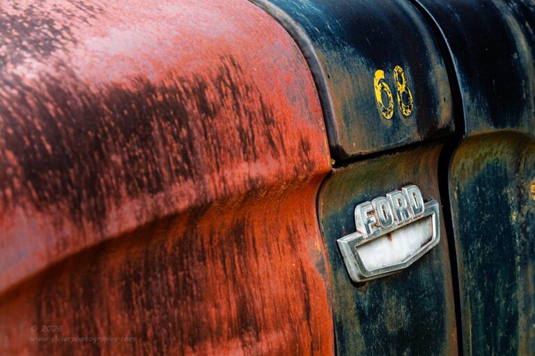
I was feeling like I was coming to the end of the compositions that I wanted to capture with this truck, but before I called it a day, I wanted to walk around it one more time. The first place that I stopped to look was the front left corner of the truck which I had already spent some time with. I was once again drawn to the Ford badge on the side of the fender that had the faded 600 badge within the crest. Now, I have recently gone through all the explanations of why I shot this part of the truck the way that I did from slightly behind the badge. Now, I was looking at it from in front of the badge which seems to go in direct opposition to the logic that I applied to the previous composition.
In case you missed the memo, I don’t really follow the rules in photography and tend to bend the rule to fit the scene that I am photographing. My concept was a little different this time, possibly due to being more familiar with the truck overall. I still wanted to have a composition that anchored on the Ford badge, but I also wanted to include the number 68 which appeared above that badge. All the same concerns were still in place about how warmer tones seemed to jump out towards the viewer while the cooler tones receded into the frame. I would have to deal with that head on because I needed the viewer’s eyes to go to the badge more than anything else.
I used several tricks to overrule the warm tones towards the front and actually leaned into that effect a good deal. I went with an extreme angle looking towards the rear of the truck. I filled the majority of the frame with the warm tones but made sure that I included some of the darker areas closest to me. The reason for this was that I knew that the human eyes would go to the brighter parts of the scene first. The badge was already the brightest part, but I needed a progression in the warm tones to force the eyes deeper into the image gradually so as not to jar the viewer. Then I used the body line on the side of the hood to direct the eyes specifically where to go. The blue colors receded into the background, but the yellow of the number 68 grabbed the attention and brought that area closer to the viewer which happened to be on the same plane as the Ford badge. I darkened the blues a little bit to add to the contrast which is the second thing that the eyes look for in an image after brightness. The contrast is very effective at pulling the attention of the viewer and the dark blue and chrome worked great. The third thing that draws the eyes is saturation. Once again, the yellow of the 68 came to the rescue. When linked with the orange of the hood, I had a saturated framework around the brightest part of the image. This gave the eyes reason to explore through the entire frame of this composition while being basically set up the exact opposite of the more minimalistic composition. There is a big argument here for knowing how to bend the rule to apply to the situation at hand.
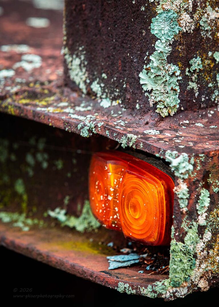
While working with that last composition, I spotted an area of the bed of the truck that I hadn’t really taken note of previously. Now, keep in mind that this is a pretty bland flatbed that offers no real styling and is an element that I had been working at minimizing from the beginning. However, I was now looking at the little marker light at the front corner surrounded by rust and lichen. It all just felt like a really neat abstract isolation from this truck and I felt that I owed it to myself to try and get an image of it.
This is not something that I have really worked with in the past, so I had to kind of work out the concept for the composition in my head before setting it up in the camera. Of course, the visual anchor was going to be the light which was a brilliant orange. The bed framed that light and the stantion was right above it adding to the vertical detail of the scene. That meant that I needed to do this as a vertical orientation, but I didn’t want the scene to be filled with horizontal and vertical lines. I needed some diagonals in the frame as well. By elevating the camera, I was able to get the bed floor to become a diagonal at the bottom of the frame with the intersection of the vertical element being right at the light. I had the added benefit of having everything below the bed in shadow, so it became negative space that defined the shape of the composition. I figured out that by increasing the width of the frame beyond the stantion that I was able to get a good bit of depth into the scene as long as I used a shallow depth of field.
Once I had the concept all figured out, I made a series of five exposures with two different camera heights as well as several different aperture settings and focal points. It was the third image of the series that made it through both rounds of culling and became the keeper. I’ll admit that for a last-minute concept based around a silly little detail, I am quite happy with how this one turned out. The green and orange colors are in perfect harmony together and the composition gives it a lot of visual interest and depth. It might be one of my favorites from this subject and to look at the photo, you would never know that it came from such a cool truck.
That brought me to the end of this session with 29 frames captured over 40 minutes. Of those, I ended up with ten keepers which is pretty darn good for a subject that I had all but dismissed two days ago in the bright sunlight. It all came down to the lighting as to when this truck needed to be photographed. Had it not been for the building in Jonesville that had gotten me back out in this area, I doubt that I would have come all this way for just this truck. I would have missed out for sure because the conditions were absolutely perfect for this subject. In fact, considering that I could find another cloudy day, I really liked the green trees behind the truck. They helped to obscure the school that was behind this location and the green worked well with the colors of the truck. During the Autumn, I think that the trees might have overpowered the colors of the truck. There is always the chance that by the time the conditions would have worked for this truck again, it might have been gone.
All too often, these decay subjects just disappear. I never take any of them for granted and if I find something that is worth photographing, I will get the shot as soon as possible just in case it gets gone before I can come back another time. I don’t know how long this has been here, or how long it will remain, but I’m glad that I managed to get it captured when I did. Even if I can never come back to get it again, I am very happy with what I have captured of it. I might actually like this set of photos better than the ones from Jonesville which was the whole reason to come out on a stormy day like today.
Thank you for joining me on this trek and I do hope that you have enjoyed the photos from both this location and the previous one. I’m kind of considering visiting a waterfall tomorrow after all of the rain that we have had and the fact that there should be clouds still hanging around during the early afternoon. I’m not quite sure as of yet, but that is a distinct possibility as it has been a while since I’ve shot moving water and the falls that I have in mind happen to be a location that I have had problems with previously as far as composition and exposure goes. I think I owe it to myself to give it another try.
I might be back here sooner rather than later, so keep an eye out. If you want to make sure that you never miss a blog entry, be sure and subscribe to this blog by clicking this link. All you need to do is enter your email address and then confirm your subscription through the email that is sent to you. After that, you will get notified with each new blog and you will be among the first to see all the new photos.
Until next time…

Remember to use the code KISER10 to get 10% off your purchase