Friday, September 4, 2026
Today was a sunny day and a hot day, but as Ice Cube once said….It was a good day. I saw a high temperature of 101° and even though there were storms forecasted from 2-5pm, the only clouds that I really saw came a few miles from home around 4pm which had torrential rains falling from them. By now you are used to me going through a bunch of planning before I go on a trek. I’ve usually scouted the areas and knew where I wanted to be and what I wanted to shoot. I normally spend a good deal of time looking at the weather and figuring out the best time to go out for what I am intending to capture. Most importantly though, I have some kind of direction in mind before I commit to heading out with the camera.
Well, none of that applied today, and when you look at how this went down, I pretty much tossed my own rules in the bin and just went with it. This happens occasionally, but even when I am throwing caution to the wind and putting my faith in luck, I still have an idea of how the day might go. This was not one of those days. This was one of those days that I just wanted to get out with the camera and wasn’t really too concerned with a plan. I felt confident that I could make a few photos regardless of the weather as I have been proving that to myself time and time again here recently.
I don’t know if I was wanting to prove to myself that I could make strong images in any condition, or if I wanted to make a specific point of it to those that choose to follow my progression as a photographer. Either way, when I started the truck up around 11am, I was really hoping that I was going to be able to make good on the promise that I had made to myself that I could salvage a sunny day if the clouds didn’t actually come into the picture (pun intended). Not only was this going to be a sunny day, but it was going to be getting started at that middle part of the day when normal photographers will usually take a break or just stay in the house. It is generally considered unflattering light, but I’ve found that for the photography that I do, midday light can actually be quite good.

The plan for the day started to form as I was turning out of the driveway because I chose to go left. Since I was headed in that direction, I decided to go up one of the main routes to check on a Dodge truck that I have been trying to photograph for a while now. It was just about five miles from the house, so it didn’t take me long to get there. I found the gate closed once again which I kind of expected. The grass was grown up around the truck to the point that I was pretty sure it would block the fence out of the view for the overall photo that I had in mind. The light on the truck wasn’t all that great which confirmed that I was going to need the earlier morning light for this particular scene. It was all a moot point as I wasn’t going to be able to get into the property anyway. I knew kind of where the owners lived, but I was going to have to choose from three houses on a private driveway to make contact. Based on the signage around the houses, they didn’t want company, so I was really hoping to catch somebody at the shop.
At any rate, that was not a location that was going to work which meant that I had to make another choice. I recalled that the last time that I had tried to photograph this truck and failed, that I had gone out to Yadkin County to check out a car that I had seen from the highway. I figured that I might be able to make something work with that, so I ventured out in that direction. There was a little backtracking involved, but I was eventually going in the right direction. When I came to the town of Ronda, I decided to head South to pick up Old 421 and come in through the back roads of Yadkin County.
When I was going through Yadkin County, I spotted a location that I had seen before, but never really studied. It was a large shelter built over a car lot of sorts. There were a couple of older cars sitting under that shelter which kind of interested me. The shade from the shelter was really the draw to the location as neither of the cars were really all that interesting photographically. I just knew that the light on them was good. I got turned around and looked at things critically for a bit. I had good light, but the subjects were not all that great, and I wasn’t really seeing anything in the way of compelling compositions.
Going on my thought of needing two of the three aspects of a photo for a decent photograph and needing all three for a great one, I decided that just having good light wasn’t enough to convince me to stop here. The fact that some eight hours later, I can’t even remember what cars they were tells me that I made the right choice by skipping them. I was back on the hunt, going down the main stretch through Yadkinville when I spotted the swoopy lines of a ’60’s model car of some sort. I couldn’t really tell much about it when I was passing other than it was big and it was black. I didn’t really see much rust or patina on it, but the chrome was really bright in the sunlight.
Under normal conditions, I don’t care for photographing back cars, but I’ve found that on a sunny day, they do work. I’m also not a fan of photographing cars that don’t have some sort of rust or patina on them because I really do like the textures that those aspects of age add to the photo. Historically, this would not have been a car that would have interested me, but for some reason I was drawn to it. After getting turned around, I found the parking lot that it was parked in and pulled in for a closer look. There was a lot of room to work with around the car which I liked. The paint was faded and dull, but otherwise in pretty good shape. The chrome was also in fair shape but had some wear evidence on it. Again, this was not a car that I would have typically stopped for, but there were two things going in its favor. First of all, this appeared to be something like a 1959 Chrysler Imperial which is not a car that I get a chance to work with all that often. The other aspect was that with the existing lighting, I was seeing this black car with the bright chrome to be a natural for some black and white images.
There was enough here to convince me to stop and see if the shop owner minded if I spent some time photographing the car. I got myself parked well out of the way because I didn’t want my truck showing up in the reflections of the chrome bits. Before I made contact with the owner, I did a quick walk-around to just make sure that I had something worth working with. I knew it was hot, and I could feel the heat radiating up from the pavement and even when I got close to the car, the heat was bouncing back from that black paint as well. This was not going to be a comfortable shoot by any stretch, but I was really digging the styling of this car. The front and the rear were both really unique and I was seeing lots of potential with the different elements in terms of composition.
I was feeling motivated with this subject and knew that I was going to get a few good photos from it. There was just the step of getting permission since the business was open and I didn’t want to be in the way. That permission was simpler to get than I could have imagined, and I even got some information on the car. It was a driver and in for some mechanical work. The only thing left to do with it was some brake work and it would be ready to go. It looks like I timed this stop pretty well.
When I got back to my truck, I grabbed the camera and decided to use my telephoto lens because I was going to be working the details rather than the overall scene. I needed the compression that the lens offered for the compositions to simplify the background. Of course, I also added a polarizer to the mix to help me fine tune the tonal relationships between light and dark areas. With that, I was on my way and ready to get started.
To get rolling, I picked what I felt was the low hanging fruit of the car with the front end. Yes, I went right for the headlights from a corner view which is one of my go-to compositions for automobiles. I had no problem going with this time-honored composition because the styling on this car was unique and that would make the image stand out in my collection. I didn’t include too many elements though and tried to keep it as simple as I could. The color profile in the camera was set to black and white because I really thought that was all that I was going to be shooting while I was here.
I do have mixed feelings about black and white in my photography though. On the one hand, and the hand that I care most about, black and white photos are the best way at capturing the essence of a scene. All of the recognizable features of a scene are removed in terms of colors. This is how most of us see on a day-to-day basis, so we are used to seeing the world like that. By removing the colors from a scene, we are left with only shape, tone, and structure to establish what we are looking at. I truly believe that is the first step in forming a relationship with a scene and becoming involved with it. On the other hand, in this age of scrolling through thousands of photos in a day, a black and white photo will not demand the same attention as a highly saturated image with dramatic perspectives or revealing outfits. I didn’t have a bikini model handy to place next to the car so that I could get engagement with the photos, which meant that I was pretty much guaranteed very little reaction to the images that I was going to take.
My gut told me that black and white was the right choice because color really didn’t play a part in any of the images that I was looking at in my head as I was getting started. I’ll always go what I think that the photo requires first and foremost. If it leads to a popular image online, then that is great. I’m not really looking for likes and comments anyway. I’m looking for print sales and real connections with my clients that enjoy looking deeper into the images than just a quick face value assessment. If that is you, then you are in the right place, and would love to match you up with a print of your favorite images from this blog or any of my others.

I had the basic idea set up for that first image, and it was really the image that I had stopped to capture in the first place. With the black paint and the chrome elements, the black and white was a natural choice. It was just a matter of forming the composition which I did around the shapes more than anything. I just loved how the fender and grill worked around the headlights and how the bumper was so dominant on the front of the car. It was all about framing and what elevation to put the camera. There was a lot that I processed that brought me to the composition, but I will say that I went through all of that pretty quickly. In fact, I only needed two exposures to get that first keeper in the bag. The only reason that I shot two images was that I found that I could squeeze an extra 1/3 of a stop of exposure out of the scene after that first exposure was done. There was no sense in changing anything else about the photo as I was looking at something that I felt was print ready right in the camera.
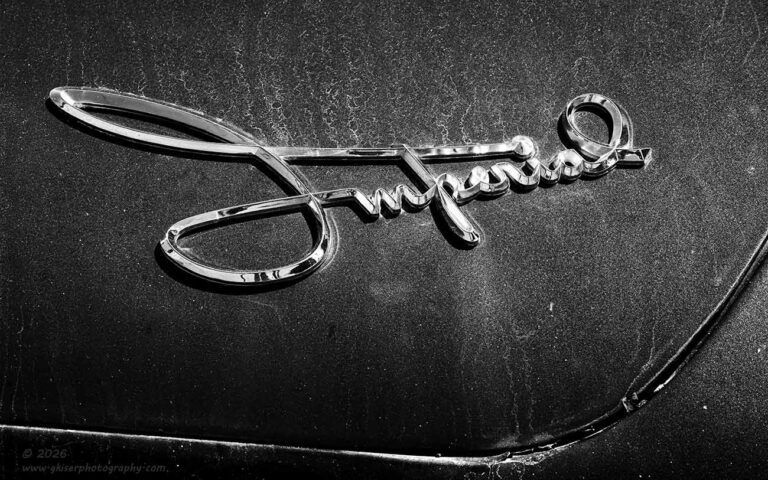
The other aspect of the car that I was really interested in was the trunk. It reminded me of a Buick LeSabre with the angle of the trunk lid and the fins on either side. As with most of the cars from this era, the model name was usually found on the rear of the car and that identifier was something that I wanted to capture. For this Imperial, it was a beautifully done script that identified the car. While I would have loved for there to be rust or some other sense of decay around the script, I found that the layer of dirt on the car kind of served the same purpose. The dirt became more prominent with the camera set to black and white because the dirt just became texture on the black paint. That was enough to add just the right element to the negative space.
The next thing that I had to work through was the composition. I could have just filled the frame with the script, but that seemed kind of boring to me. I tried to bring in the taillight and fin which was a good idea. The only problem was that I wasn’t able to get the camera high enough to get the angle that I wanted. With a ladder, I might have been able to do it, but I was going to need that long lens for the framing that I was after between the two elements as anything wider would have shrunk the script in the frame making it a secondary element rather than the main subject.
With that idea a total failure, I changed things up and decided to work the script alone. Well, not so much alone since it was positioned right at the edge of the trunk. I decided to use the panel line to frame the script while giving a dramatic upswing to a line in the frame which had a similar flow to the cursive writing. The composition was very simple, but I thought that it was quite effective as well. I did like it in black and white since in color everything was just a different shade of blue which I really didn’t care for with this composition. The lack of color would allow me to concentrate on the contrasts more than anything else which I much preferred.
Since I had started working with the taillights, I had really learned to appreciate the styling that was introduced with them. This was certainly the design language from the era of space travel. It looked a little bit Buck Rodgers and a little Flash Gordon to me. I could really see this part of the car being color or black and white because of the bright taillight which shown red. Red is one of those important colors in a frame and can really elevate a composition if used correctly. I decided to keep my mind open while I looked for a composition around the taillights. This was more difficult than I had expected. There was a small button light under the taillight which kind of forced a decision on framing really early on. either I would include that smaller light, or I would crop it out. I much preferred the scene without the small light included, so my bottom frame was pretty much decided before anything else. Second of all, I found that the light was better from the passenger side because there was a bit of shadow on that side that added to the sculpting of the shapes. This meant that I needed to look at both from the passenger side to get a good composition.
The driver’s side light was the one that I chose to work with first. I liked this as a color image because I was also capturing the grass to the side of the car as a background. The green grass paired nicely with the red taillight lens and the overall blue hue of the black paint (reflected from the sky) rounded out the color harmony. I just worked on finding a framing that worked and figured out the proper placement of the camera to get the elements organized within the frame where I needed them. It only took me three frames to get it all figured out and most of that was getting the depth of field worked out. I knew that I wanted the grass to be blurred in the background while the entire taillight and trim would be in relative sharp focus. It was all down to just where I focused in the scene and the aperture that I chose to work with.
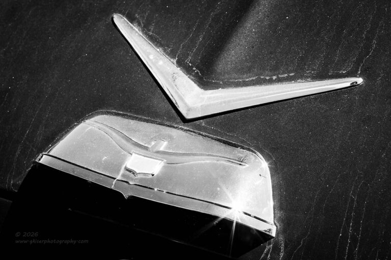
While I was back here, I decided to take a look at the trim and emblems in the center of the trunk. I really liked the detail work that was done with the bird and crest molded into the piece of trim. Keeping that diagonal element that I look for, I moved off to the right side and aimed the camera down to get the right kind of angle on the scene. There was no doubt that this was going to be done in black and white. I also knew that the sun was making a rather large specular highlight on the right side of the chrome. This was a better option than having the entirety of the chrome blown out as viewed from the driver’s side where the sun was really brightly reflected. Now that I had the sun worked down to just a point on the chrome, I saw the opportunity to introduce a sun star into the composition for a bit of visual excitement. This was just a matter of stopping the lens down to f/22 which was still a very sharp aperture for the telephoto lens. That would make any highlights display with a star around them which was just what I wanted.

I only needed to fire off a single frame to get the image that I wanted. I saw no reason to make any changes, so I moved onto the next subject. Since I had been working ideas for both taillights, I decided to move to the passenger side one next. The general composition was going to be pretty much the same as the one that I had shot on the other side. The biggest difference is where the grass had been included as a background, there would be a trunk as a background for this side. Remember, I was having to keep to the same side of the fins for the lighting that was there. I was also limited based on the smaller light below the taillight which dictated the lower edge of the frame.
I liked this view as a black and white presentation because there wasn’t the green to balance out the red, and I didn’t want to pump up the saturation in the blues enough to compliment that red. Black and white just made more sense here because it was the shapes of the trim that I was most interested in, and I knew that through the color channels, I would be able to make the red taillight glow easy enough during the black and white conversion.
The actual composition went very smoothly since I had pretty much already figured it out with the other side. I mean the trim and housings were the same on the outside of the car as well as the inside, so there was really no need in reinventing the wheel in terms of compositions here. There were only two frames shot here because I had figured out most of the pitfalls with the previous composition. Of course, I didn’t need to worry as much with the depth of field as I didn’t need to blur out the grass as I had before. However, I still wanted the attention on the main elements of the taillight, so I did limit the depth of field a bit. An aperture of f/11 gave me enough for a small sun star where the chrome had a bit of a specular highlight. I don’t get to work with shiny chrome all that often, so when I do, I do like to give it a bit of a sparkle when I can.
Speaking of the bright chrome on this car, I was really worried about showing up as a cameo in my photos. This happens more than you could imagine and I’ve gotten pretty good at composing in a way where I don’t show up in any reflections. I’ll admit that this car was difficult to get that figured out because of all the different angles on the chrome and so many places that I could appear. The telephoto lens did help this as it allowed me to work from a further distance away. However, I felt really awkward standing there on the side of the main road through Yadkinville waving my hands up in the air and bouncing around. Yes, I did that before just about every shot that I made and even have a term for it. I call it the funky chicken, and it helps me to identify where my reflection is compared to the reflections of the different objects around me. If I see any movement in the chrome, I know it’s me and that I need to move. Of course, to those passing by on the street, they are just seeing a grown man flopping around like a brim out of water in the middle of a parking lot. I kept waiting for guys in white coats to show up to let me try on my new jacket with the very long arms. They never showed up, and nobody offered to go get my meds. I guess there is more acceptance for my mental health issues than I would have suspected.
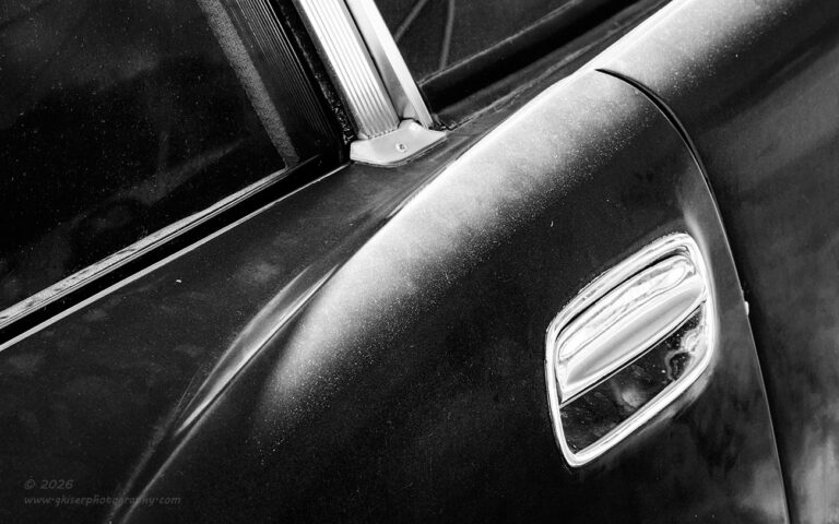
Anyway, I had now photographed pretty much everything along the rear of the car that I had wanted to capture. In fact, most of what I had set out to work with had been done by this point and I had only fired off a total of nine frames in about thirteen minutes. It was time to get creative at this point. I wanted to photograph the lighting on the car as I had started working with that aspect on the tail fins. I was seeing similar sculpting light on the sides of the car where the fins came into the doors. I switched off from side to side to see which side made the most sense in terms of lighting, patina, and how the image would read. I found that the best side was the passenger side which was really no big surprise after finding that the sunlight was better on the fins from the passenger side as well. I looked at the composition from the front as well as the rear to determine the best course of action for setting up the composition.
I decided that my best bet was going to be photographing from the front of the car looking back. For a visual anchor, I chose to work with the door handle which was actually quite unique being a recessed handle rather than the typical hoop handle that I normally end up photographing. I wanted there to be a diagonal aspect to the image, so I shot from an elevated position which had the diagonal going up for a bit of visual excitement. The windows provided the framework for the top of the image by introducing some interesting shapes as well. I used the polarizer to adjust how the glare appeared knowing that was going to be the shaper for the start of the fin here at the door handle.
It is the styling elements like this which have always excited me about the cars from this era. Considering the designers were working with clay and wood rather than CAD and computers, it is really amazing the shapes that they created and the beauty which resulted. These cars were not just transportation; they were works of art with no concern for the coefficient of drag or fuel mileage. The whole idea was to impress and some 65-70 years later they are still accomplishing that task.
It really does sadden me that images like this will likely be ignored in the daily consumption of images online. While it highlights a design element that has long since been forgotten, it isn’t an image that yells at the top of its lungs for attention. It is a quite image that only rewards those who spend enough time to really look at the image and seek to understand it. Everything that appears in the frame and how the contrast is laid out was the product of a lot of time and energy on my part to tell the story that I wanted to tell. It isn’t an action/adventure story, and it isn’t even a thriller. It is just an account from a time gone by that is meant to stir memories, both actual and borrowed. It is a photo with meaning rather than something that has been bedazzled.
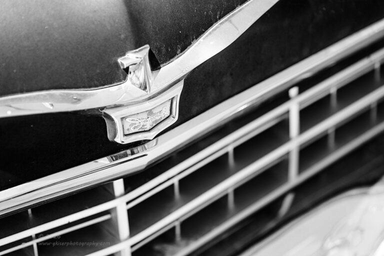
Going along with the quiet images of this Chrysler, I decided to move back up to the front of the car once again since all I had really worked with was the front corner with the headlights. As I looked the car over, I found that I really liked the hood ornament and the badge on the front of the hood. The grill wasn’t too bad, though it didn’t have the presence that I would have really liked to see. The repeating patters were nice though and I felt that I could do something with those elements.
Once again, this felt like a black and white scene because it was all about the highlights and the shadows rather than how the colors worked together. With that in mind, I started to work out a composition. I decided to keep things simple and omit the hood ornament because that would force me to include too much in the frame. Instead, I decided to concentrate on the badge with the large bird spreading its wings. The compositions that I was coming up with didn’t really seem to work though. There was just too much in the frame and I didn’t really like the visual flow.
I kept reducing the scope of the frame until I had started to crop into the wings of the bird. First on the left side, and then on the right. This started to feel much better overall, and I liked how it was looking in black and white. The grill took on an importance that I had not expected it to which impressed me. There was just enough detail in the Imperial badge that I was able to pull that script out with a bit of work in contrast which made this close crop of an image quite effective. It was also the shallow depth of field that helped add the depth to the image which was started with the angle that I chose to work with. All in all, I liked the image but wanted to have an option in case I decided that I liked the full wingspan of the bird.

To address the extra width, I decided to change the aspect ratio to 16:9 in an attempt to remove some of the extra bits at the top and bottom of the frame. Essentially, I was keeping the basic framing of the closer crop but extending the sides to better include the wings. I changed the height of the camera as well slightly to allow the right wing to fit in better. This seemed to work out well and I was liking it as much as the closer crop. I felt that the emphasis was different with both of the images though. The tighter crop showcased the Imperial emblem and the head of the bird while the wider one, focused more of the attention on the wings and the grill of the car. I actually liked them both for the different things that they said and decided to keep them both.
The dilemma that I was faced with was having two very similar photos in my collection. While I’ve done that before plenty of times, I didn’t want there to be two black and white images that were so similar, so I decided to bring one of them to life in color. The decision was actually quite simple since only one of them had enough real estate to bring in a contrast of colors. The wider view seemed to capture more warm and cool tones which I felt created a nicer color harmony overall. However, when I looked at the photo in the standard Adobe color profile, I found that the colors were just too much. I was still liking the idea of the black and white treatment for these images of the front of the car. While I thought that the colors worked for this one, I needed to be very careful with them so that it didn’t look overdone for the sake of color.
There was a profile that I have used quite a bit over the years that works wonders when I am torn between black and white or color. It also tends to lean into the blue tones which I liked for this image. I applied that profile and it seemed like a good starting point for the image and I began working the processing out from that point. The end result was an image that had reduced saturation all around while the tones were all shifted to the cooler side of things which helped the chrome pop a bit more against the black paint. This treatment was very effective with this image and resulted in a photograph that I liked a lot more than I thought that I would. I even tried to do the same processing to the closer crop to see if it had the same effect. It did not, and fell short of being a successful color image which solidified my decision to make one color and one black and white.
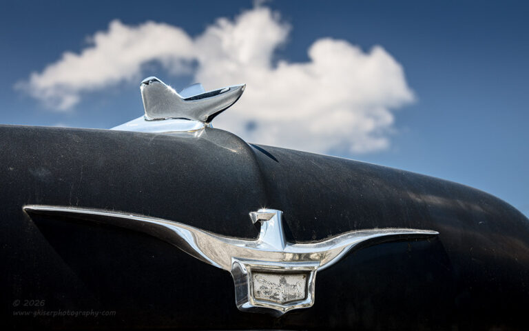
There was still the matter of the hood ornament which I had not captured yet. It was in really great condition with good quality chrome on it. I thought about capturing it as I normally would, but with the paint in fair condition and the chrome looking good, the composition just felt boring to me. It lacked texture and that put it into the realm of a photograph of a shiny car which this one was not. There had to be some other way to capture this element with the condition of the car.
That was when I looked up and saw that the one cloud that was in the sky was passing in the background. I started to consider shooting the hood ornament from down very low for a different perspective. That actually made a lot of sense because there were power lines just to the side of the car which bothered me. I got the camera down low to the ground and started finding that close focus distance so that I could focus on the bird up front. I found the right distance and then worked on getting the right angle so that I could capture both the badge at the front and the ornament above. The cloud was moving into the scene and slowly overtaking the hood ornament. I waited it out and started to make exposures as it was passing over the hood ornament. From one minute to the next, I wasn’t sure if the cloud was going to stay formed up or evaporate, so I made several exposures during the process.
There were eight exposures of this composition as the cloud moved over the front of the car. It was the seventh in that series that turned into the keeper, so you can see how valuable it is to keep pressing the button at time. I had spent the most time on this composition of any that I had shot of this car. It was the only one where there was movement involved and I had the opportunity to improve on the composition by just merely waiting for the cloud to move into a different position.
That brought my total frame count to 23 exposures in roughly 30 minutes time. I had moved quickly and had captured a bunch of compositions which I had remembered most of them. Thinking back over the frames that I had shot, I was pretty sure that I actually had six or seven photos that would be keepers, just from memory. This was actually more photos than I had planned to get from such a simple subject considering I wasn’t able to get anything including the entire car in the frame. This goes to show the power of working the details of a scene. There can be an endless supply of compositions available when you start to work the details and looking for abstracts.
I was happy with what I had accomplished with this Chrysler and was actually happy to head back to the house at this point. The sun was still out, and the temperature was getting hotter and hotter by the minute. While it made sense to go back home, I decided to continue out to check on that Chevy which was on the other side of US 421. I was close to it, and it had been the reason that I had gotten this far out in the first place. I might as well go and check on it to see if it was worth photographing.
If you are interested in whether or not that worked stick around. I’ll have another blog entry done up soon enough with the answer to that question. It just might not be the answer that you are expecting.
Until then…

Remember to use the code KISER10 to get 10% off your purchase