Sunday, July 30, 2023
Long time no see! If you have been following along, you have hopefully read part one of this trek which was published yesterday afternoon, as well as my latest installment of the monthly Behind the Camera. Yeah, I have been a little busy here lately with the blog and have probably put down enough words to make a short novel if you take into account the four-part series from the recent trek to Jekyll Island a week ago. Normally during this time of the year, I will see a slow down in time out with the camera and the blog entries that result from the treks. This year has certainly been different. I’ve been ramping up the photos through the Spring and Summer which has been a nice change of pace for me. It will be interesting to see how the Fall goes. I’m almost betting that the month of August will be kind of quiet though because I have two pretty large-scale portrait shoots that are happening during the month that will take a good bit of my time and energy. For that reason alone, I am happy that I have gotten plenty of new photos added to the collection over the past weeks.
When we last talked in regard to this trek, I had pretty much found my rhythm with the cars on the property in Booneville and while the sun was coming out, I was still able to find meaningful compositions that even took the sun into account in the way of dappled light through the trees. I had worked both sides of the property by this point and was currently engaged in creating compositions on the side I had first seen with the Studebaker and the two Ford trucks. It was the Studebaker that had really captured my attention to begin with because I just don’t get the opportunity to shoot them all that often. The Silver Hawk that I was currently working was not my favorite color because black just doesn’t photograph all that well when it has surface rust. The lack of a contrasting color becomes problematic most of the time, but I was determined to make this one work the best that I could.
Shooting overall views of the car was very hard and I had landed on the best possible composition taking into account the neighboring trucks that kept wanting to get into the scene. It was the isolations where I was having the most fun with this old car, and that was what I wanted to shoot next. You might remember me taking about my difficulty with shots of the interiors of the cars, especially through closed doors. With the driver’s side being in the shade, and the window being pretty clean, I saw an opportunity to try for one of those shots. When I thought about the interesting lines that the windows and body contours created, the concept starting to really excite me.
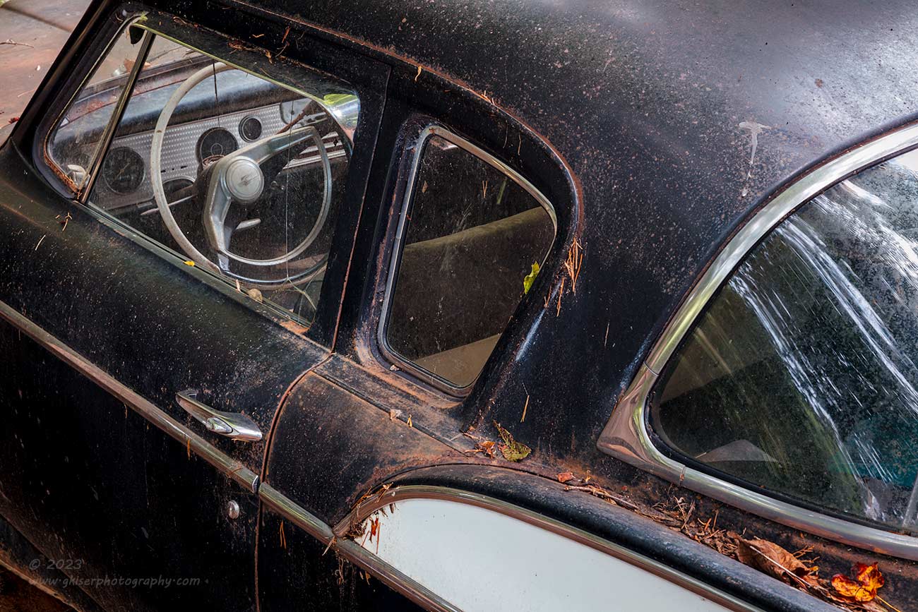
I started to figure out the composition which is basically formed from asking the questions of what I like and what do I dislike in the scene. What I liked was the white panel on the hip, the chrome trim, the surface rust, the shapes of the windows, and the steering wheel. The round gauges were another aspect that I liked because it mirrored the steering wheel and provided a bit of visual contrast to the hard lines of the body. What I didn’t care for as much was the black paint that just seemed to suck in the light. The basic composition was formed from this little conversation with myself. The result, you can see above. What I decided to do was frame the interesting parts very tightly to avoid introducing anything but the car in the frame. The anchor and focal point was the steering wheel with the white panel coming in at a diagonal pointing to that element. That also gave me a diagonally opposed pair of elements to add to the visual tension in the image. The rear window was cropped as a loose triangle, with the body line of the car proceeding in the same diagonal direction as the white panel started. The black paint was treated as negative space, or the ground in a figure-ground relationship. This is one of those concepts that I have learned to work with from doing my portraiture over the last couple of years and it has paid dividends with my primary focus like this decay subject.
By making the paint negative space, it just carried the shapes that I was actually photographing. The rust became more of a standout because it existed in that negative space. The final additive feature that I included with the black paint was a slight tint of magenta and blue so that it worked with the other color tones a bit better. I wanted there to be no harsh transitions in hue, and I wanted all the colors to work together in the scene which is a nod to what I have learned through my studies of color theory. All of these things working together made an image that worked well and was pleasing to my eye. It satisfied all of the wants that I had for the photo even though it was originally based on just the interior. It was the exterior elements that told the story of the interior and gave the right context for the viewer. The angles made it interesting, and the color palette supported the overall look of the scene.
While I am still not fluid with interior shots, I am getting better at them and learning to include more of the exterior to frame what I am seeing and allow the story to be told of what is being viewed. This is one of my favorite interior shots that I have done to date, and I think that the main reason behind that is the inclusion of that white panel that compliments the focal point so well. The splashes of saturated warm tones balance the cool shades of the black paint, and everything is just harmonious with it. With this image shot, I was feeling like I had exhausted this section because the sun was starting to be problematic, and the dappled light was giving me a fit in most directions that I was shooting in.
I made the decision to go back to the other side, but honestly, I didn’t know why I thought that was going to be any different. The sun was coming from that side and the likelihood of having the same issues was very high. If nothing else though, I was going to have different light there than I had experienced before which could present new image possibilities. I guess that was what I was going for, and for the record that does sound better than I thought there would be more shade on the sunny side of the property.
When I arrived at the other side, the sun was just as bad, only it appeared stronger through larger openings in the trees. Check that….the sun had a much different quality about it this time, which allowed me to entertain compositions that would not have been thought of earlier. Yeah, that sounds so much better. I do wonder when I am reading about how photos have been created, or listening to accounts on YouTube, how many times the dialog has been shaped by the photo, rather than the reasonings that are being talked about shaping the photo in the first place. I have a feeling that many of the things that we see happening in photographs happened by chance or were not intended at all. Only after the photographer sees the end results do they like them, and then want to make you think that it was all a conscious decision on their part. I can see that happening for sure. We are even going to get into an example of that kind of situation in a minute, but I wanted to talk about the one and only photo that I shot of the Mercury Montego first.
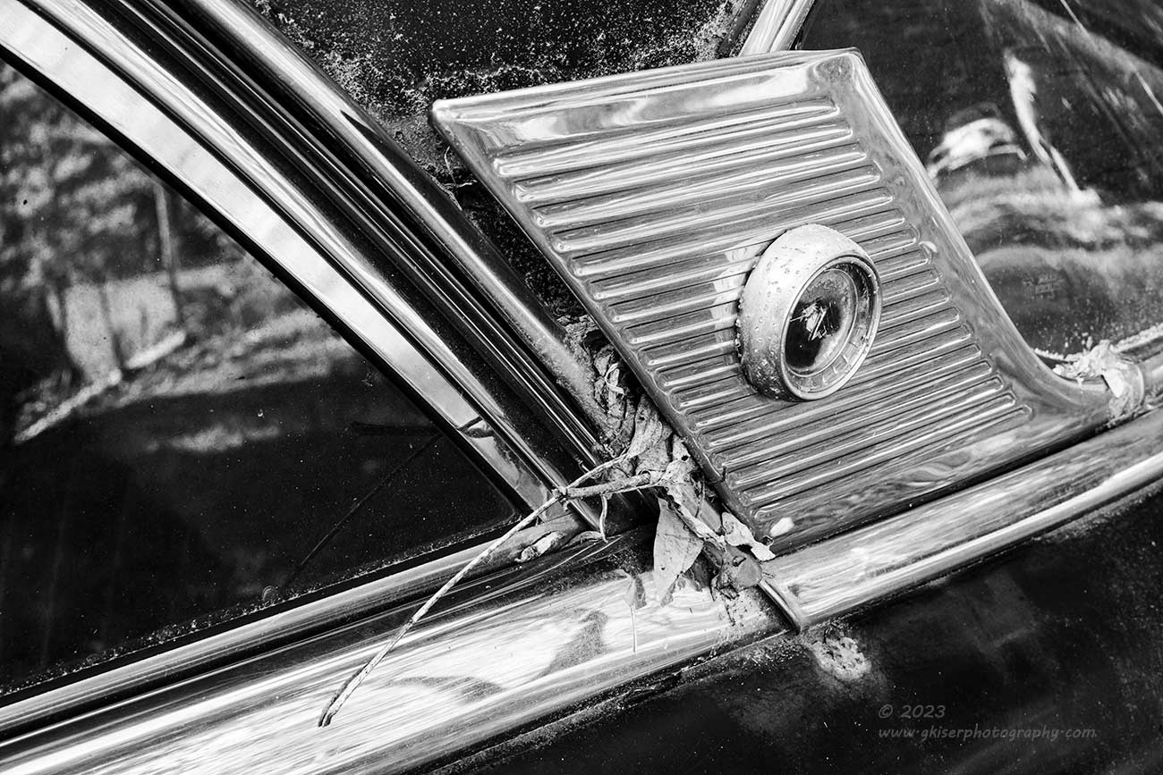
If you will recall, this was the car that was parked right up on the side of the garage in front of a flatbed trailer. It was another black car and in better shape that the Silver Hawk in terms of patina. I wasn’t really a fan of the body style of the car, but at the same time didn’t want to pass up the chance to photograph this piece of history in some way. I looked around it for several minutes to see if I could come up with something interesting about it. The chrome bits drew my attention because they were all in very good shape, and chrome always looks nice against black for that extreme contrast. It came down to the shapes that were available. Everything that I saw appeared very static and not dynamic enough to build a composition around. The emblems were not all that wonderful to shoot either, which left me looking for shapes more than anything else.
I’ve had a lot of luck photographing the sail panel, or C pillars on Fords of this era because of the strong angles that they possessed. As it turned out, this Mercury had a nice, ribbed chrome panel on that pillar. Inside the panel was a badge that added a bit to the scene. The strong angles were there, but there had been a lot of debris which had found its way between the chrome and the car. The panel was pushed out from the car which kind of bugged me at first, but after I considered it a while, it became a full chapter of the story of this car.
What started off as a negative, turned into the whole reason for this next composition that only took two frames to capture. The idea was simple, this was going to be a black and white image because there was really no color in the scene except for the heavy reflection of green from the trees and grass surrounding the car. I wanted to focus on the shapes, and I wanted the debris to be part of the scene because looking at the condition of the chrome and even the paint, the decay element was reduced quite a bit. It was the debris seen that indicated how long this car has been out of service and sitting under trees. It was the debris that dated the vehicle and indicated its status as an inoperable example which was what I wanted to capture.
To frame this one up, I concentrated on triangles where I could and made sure that I rendered all the lines as diagonals rather than horizontal and vertical. This is something that I have really started to pay attention to in the last six months to a year. I’ve had to get over my need for making sure that there is a level horizon line in my photos which is all important in landscape photography. For a lot of decay photography this is important as well, but when it comes to shooting isolations, level can be boring and I’ve found that to add a little spice to my photos I will tilt the camera a bit or shoot at an extreme angle to introduce a diagonal where it was designed as a horizontal, like the belt line of this Mercury. As long as it is done on purpose, and it not very subtle, or overdone, the effect is pleasing and doesn’t affect the perspective of the shot at all.
I wished I could have done more with this car, but the best option for visual interest was on the front of the car which was less than a foot from the trailer. There was no way to photograph the front end with that obstacle in place, and even standing on the trailer (which I didn’t do) would not have yielded a clear enough view of what I wanted to shoot. No matter how much I looked, I just didn’t have the access to the interesting parts of the car except for that one area that I had already shot with a moderate amount of success.
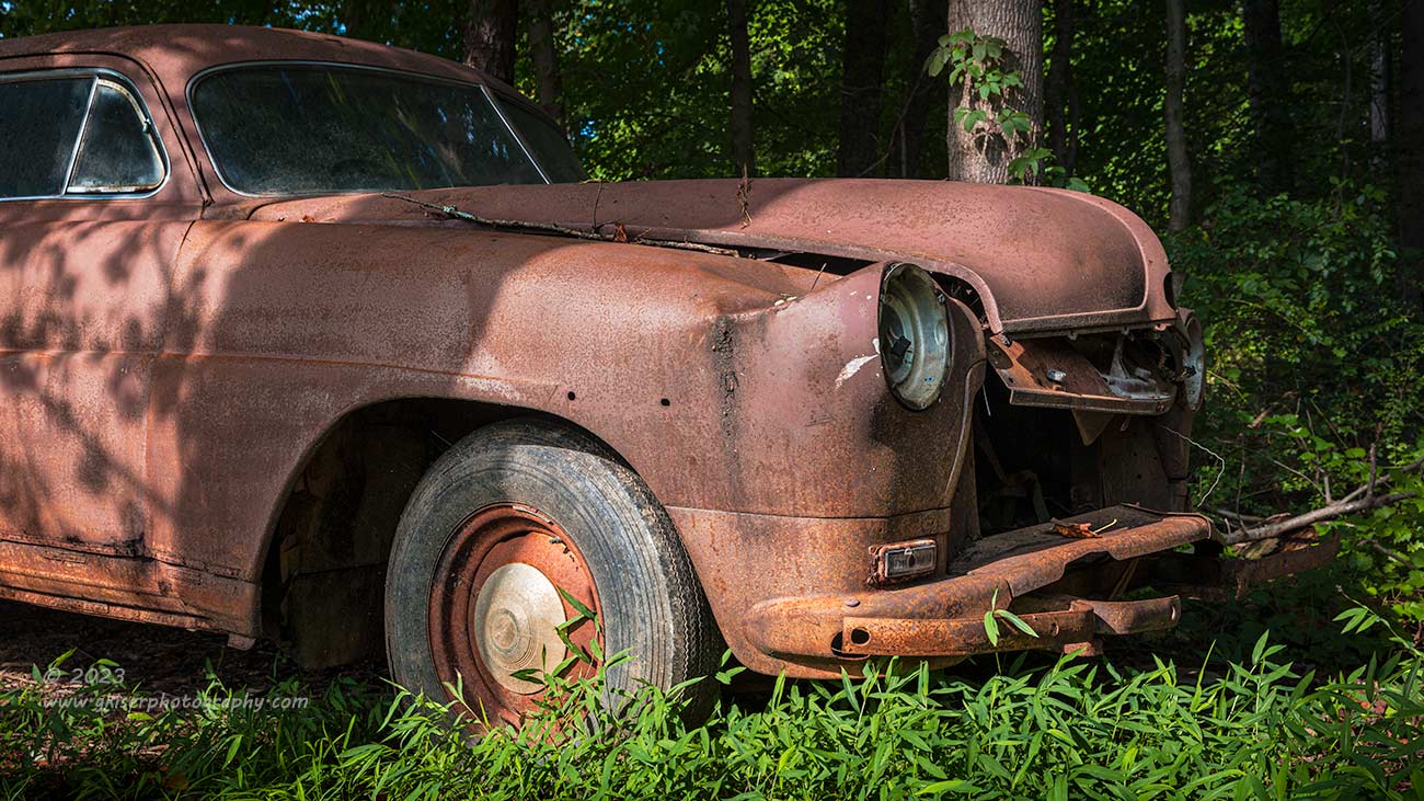
It was time to move on to the next subject, and I wanted to try and shoot the Hudson. This was going to be just as difficult as the Mercury, but for different reasons. It was relatively isolated from the other elements around it, but there was a tree limb that was covering the back end of the car which ruined the lines for an overall shot. What was left of the rear was a very large and uninteresting slab of side for this two-door car. The paint was all gone leaving just a uniform rusty finish on the car, which was better than an all black car, but with a vehicle that was this big, it was bringing in too many red tones. Red is one of those colors that you have to be careful with because it is a very exciting color and should be used sparingly. There wasn’t a whole lot on the car to break up the color, so I was hesitant to shoot an overall, and there weren’t a lot of details available on the body to find workable isolations.
I had to play the “what I like and don’t like” game with this car because nothing I was seeing was going to work as a composition. The things that I liked was the front end with the missing grill and stainless headlight buckets. The wheel and tire gave an interesting shape, and I really loved the dent on the fender that caused the passenger headlight to look up a little bit. To give scale to the front end, I liked the windshield, and the door provided a nice line to break up the body line while establishing the fender. What I didn’t like was the side of the car because it was so massive with no visual interest to be seen. I didn’t like that the tree was covering up the silhouette of the body to the rear which would have allowed the side to make sense. I didn’t like that the color was so uniform through the car. The lack of anything around the car as a foreground, or background kind of bothered me too, but the greens around it did look nice and worked with the color palette of the car.
With all that in mind I dropped the camera low to the ground to give the car a commanding presence and started to frame up a composition focusing just on the front clip. I liked how the vent window frame showed up in the sun, so I made that a framing element to the left. I opened up the framing so that the wheel and headlight bucket appeared as diagonally opposed elements in the scene for a bit of visual tension and angled the camera so that I could get the front of the car captured. I liked the composition, but the sun was giving me some problems. I didn’t like how the tree shadow was running through the fender, nor did I like how deeply the grill area was in the shadows. I waited and shot three different frames as the intensity of the sun changed. I reviewed them all in the LCD and determined that I didn’t like any of them and the car just wasn’t looking good the way that I had composed it. However, looking back at the yellow Commander to the right, I could see the benefits of the sunlight on that car. Feeling like the Hudson was a lost cause, I turned my attention back to the Studebaker and started to form up a composition with that car.
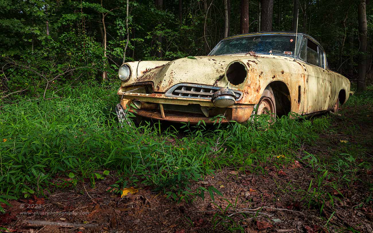
When I had started photographing this car maybe an hour before, I had shot from an elevated point of view to capture the trail running along the driver’s side of the car. It was effective to show the location, but the perspective was a bit boring. It is usually not a good idea to shoot from eye level, and that was what I had done. Since I had images from that perspective, I wanted to get lower to take advantage of the dappled light that was shining over the car while giving a bit more of a commanding presence to the Commander. I was maybe a foot and a half above the ground which was where I had been for the Hudson and that seemed to work very well. I lost the trail, but I was now able to put the car higher in the frame as if it was looking down on the viewer. This changed the attitude of the car quite a bit and I immediately liked the composition better than what I had previously shot.
From here, I was able to really focus on the missing headlight and the grill piece that had fallen out. The sunlight was causing more dramatic shadows on the front thanks to this low position, and I was missing most of the highlights on the hood surface from the direct light. I was feeling pretty good about this one and shot a total of 11 frames until the sunlight faded into shadow behind a cloud. This was so much better than the Hudson, and the light had actually worked for this car. I was glad that I had come back over here and tried the cars with the different light.
Since the light was now more diffused behind the cloud, I again turned my attention to the Hudson. I framed up the same composition that I had done before, but this time there was no deep shadow going across the scene, and I could make out all the little details in the grill area. It only took a single exposure to get the image that I had been missing before with the sun. That was what I had been after, and through patience, I had been able to capture just the image I had in mind.
At least these were the things that I told myself while shooting these two cars. Remember that question that I posed a minute ago about whether the photographer thinks through all of the little elements to get a successful image, or do the unintended aspects end up forming the photograph and the photographer just takes credit for the planning of those aspects? Well, this is the example that I was talking about. If you have been paying attention, the photo that you see here of the Hornet has a very defined shadow raking across the fender, and the Studebaker is lacking most of the shadows except for some very subtle dappled light in certain areas of the scene. both of the photos here are not what I have described capturing.
Well, what you have witnessed here is one of those times when my intended shots didn’t turn out as good as the ones that I deemed as failures at the scene. I could have talked about how I worked so hard to create the images with these particular lighting patterns and told you how I waited for just the right light for a set of reasons. You would think that I was an amazing photographer, and you would be left wondering how you could do similar planning in your own work. Yes, I could have taken all the credit here, but that would not have been quite accurate. What you have read up to this point is exactly what I was thinking while I was shooting the scenes. It wasn’t until I got home that I started to look at the images and decided that they just didn’t work as I had intended.
Let’s talk about the Hudson first. The photo you are seeing is the third, and final image of the first attempt, not the only image of the second which I was sure would work better. When looking at it on the large computer screen, the even lighting of that “successful” image was boring and the problem of the large expanse of rusty reds on that car were amplified. What I found was the image that I ultimately did edit, had a nice shadow on the fender that broke up the uniform tones on the side for a bit more interest. It helped secure the focus on the front of the car which was what I really liked anyway. The dappled light on the door faded into almost a vignette to the left of the frame, but the sun caught the chrome vent window frame which was another aspect that I liked. The shadow had minimized the uninteresting part of the side of the car, while drawing attention to the areas that I liked. The shadow was also diagonal which added a bit of drama to the scene which was largely horizontal. The sunlight on the grass gave it a very pleasing color, while being a completely different luminosity from the greens in the trees above. What the sun and shadows added to this image wan nothing but visual interest that strengthened the photo. At the time I shot it, I viewed it as a failure because the contrast was too much.
Fortunately, I make a practice of capturing images as I am fine tuning the composition and waiting for lighting because this was a fully unintended photograph that turned into the only workable frame of the Hudson that I shot for the day. The one that I felt was “the one” turned out to be beyond boring and wasn’t worth a second look at all. To make matters even more interesting, the photo that you see here didn’t even make the cut originally. It wasn’t until after I had worked 12 of the images that I realized that the Hudson hadn’t been represented at all. I went back and pulled this image and started to do an edit on it; only then did I recognize the potential of it, and only then did I start to identify what was working about the photo rather than dismissing it because of the deep shadow. This photograph refused to go away and I’m glad I listened to it because I think that it works very well as it is here, even though that is in complete opposition to what I thought at the scene.
Now, let’s have a look at the Studebaker which I was convinced looked better with the shadows going across the body. Of the eleven frames that I shot of that car; it was the last one captured that I ended up keeping. That was the one that caused me to stop shooting because the light was fading on the car, and I thought it was becoming more uninteresting. Well, when I got the photos home and looked at them on the computer, I quickly determined that the dappled light on the front of the car overcomplicated things. There was already a lot of interest with the shape of the car and contrast was built in with the fender well, headlight bucket, and grills. The sunlight just added more shadow and interrupted the flow of the car. I tagged three of the images with a single star and they were all showing very faint shadows across the car. That last one had the least amount of shadows and those were just a bit of dappled lighting on the rear of the car. This just felt better to me, and I could see the shape of the car easier in the more subtle lighting. This one just worked, but it was the one that caused me to shut down the composition because the light was gone.
Here we have two examples of my reaction to the light in the field versus what I determined looking at them after the fact. I was wrong with my assessment in the field, but that happens occasionally. Those of you who are photographers out there, never feel like you have to stick by an initial assessment of your photos from when you captured them. There are always aspects that don’t show themselves until you get home and many times, you will see that the accidents make for better photos. It is up to you whether you accept the unintended photos as just that, or if you create a backstory that tells how you crafted the photo with those aspects in mind. For me, I’ll stick with the story as it happened because in the end, that defines my art much more accurately. It is also what will always set me apart from images created with Artificial Intelligence.
Anyway, sorry for the slight diversion, but that was a thought that came into my head while I was editing the Hudson photograph as well as another one that we will see shortly. I was still focused on the Commander because it was a Studebaker, and I just don’t get to see many of them these days. I was pretty satisfied with the overall shots that I had gotten from the car, and even the more intimate shot of the front of the car. I just felt that there was another isolation somewhere on the car that I hadn’t taken notice of yet. I spent some time walking around the car which was starting to get more sun again. I had to be very careful with what sections I framed up because a photo filled with the yellow color of the car would appear dingy, or abnormally warm in tone. A black and white might work in these situations, but there would have to be some visual interest in terms of lighting and texture for that to work. For a while, I wasn’t finding anything at all that I liked for a photo.
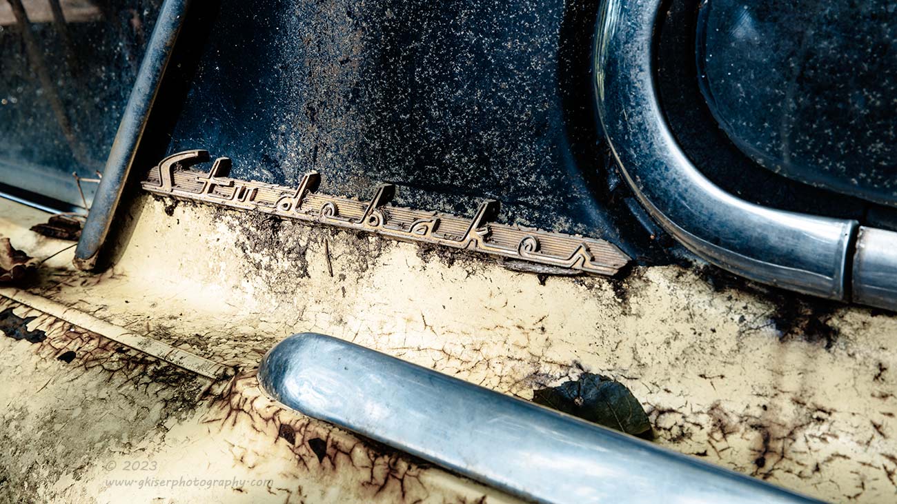
When all else fails, focus on emblems when it comes to these old cars, and that was just what I wanted to do. The best emblem that I could find was the Studebaker script on the C pillar which happened to be at the division line between the roof color and the body color. Coincidentally, it was also in the middle of a lot of the chrome trim which added even more visual interest. The paint was cracked and there was rust shining through in this area as well which checked all the boxes for what I was looking for. I started to play with the camera to get the angles right and found this composition which avoided vertical and horizontal lines in favor of the more dramatic diagonals. It was the use of color that I had to really think about. On the one hand, I had just a warm hue of the yellow against a black panel with some chrome. This would make for a decent black and white shot, but there was something drawing me to the colors I was seeing. I was going to make the final decision when I got the images home because I just couldn’t decide what was going to be best while in the field.
I shot three different images with slightly different framing and focus point. With those captured, I was pretty sure that I had what I wanted. When I got the images home, it was the third image that won out for the way that I framed it. I was now faced with whether to edit this as a color or black and white image. I tried the different profiles to see what spoke to me the strongest, and I found that black and white didn’t quite affect me like I had wanted it to. The color one had more of an emotional impact on me and that was important. I started to look at how I could change the relationships of the colors and found that by introducing a bit blue to the blacks through color grading, and then saturating the reflected blues in the chrome, I was able to get a well-balanced image in terms of color. Of course, I desaturated the yellows a bit to keep it from looking overly warm. From there, it was just a matter of working the textures which I love doing with these old cars.
The end result was a photo that I feel is well balanced both in terms of shape and color. Everything works together to draw the attention to the emblem which lets you know what you are looking at even though the shape of the car is not evident at all. I love images like this because they make you think and try to fill in the rest of the design. Had this been a 55 Chevy, chances are you could picture the entire car with ease. Since this is a Studebaker, most folks can’t readily recall how the car looks which makes an image like this even more interesting because your imagination really can go wild with it.
I spent a few more minutes looking for other areas of interest on this car but realized that I had gotten all of the goodie out of it that I was going to get on this day. I’m sure there were other compositions to be had, but my creative energy was starting to fade by this point and I recognized that fact. There was no sense in forcing another composition on this car as it had been the one that I had probably shot the most of at this point since it was the easiest to work with. I looked at the Hornet and the Mercury one last time and decided that I was done on this side of the garage. I wanted to go back to the trucks on last time because I really hadn’t spent much time with them at all. I knew that there was a workable composition to be had, but I was still waiting for the sunlight to play nicely with them.
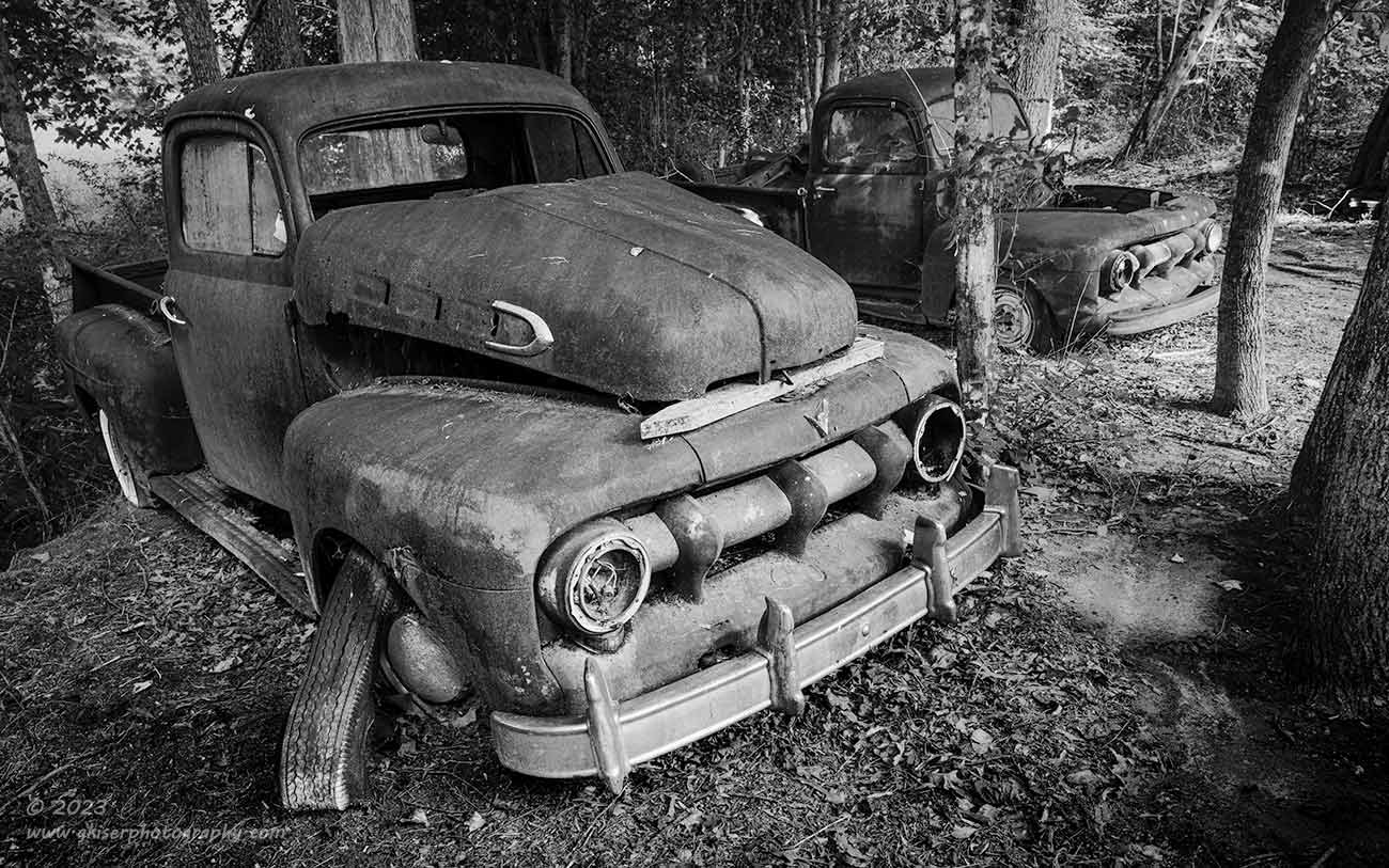
When I got back over to the trucks, things were looking a little less contrasty and I thought that I could make something work this time. I got the camera back into the position that I had been working with earlier and framed up the composition as I remembered it. I realized very quickly that I had the chance to get rid of the brightest spot in the background by elevating the camera a bit more than before which I did. I found the focus point and started firing off some frames as the light intensity changed. I made seven exposures before I saw the background starting to blow out from overexposure.
I had the thought of using a grad filter, but with it just being a corner with lots of tree detail and the cab of the lead truck, I decided that a filter would not be a good idea. I thought about doing an HDR blend, but the breeze was a bit too much for that and I was sure that I would have all sorts of ghosting and artifacts where the leaves were. I went back through the images that I had just captured and saw that there were several possibilities there with a decent histogram to work with. If nothing else, it was better than the original series that I had shot of these trucks earlier which turned out to be three images with far too much dynamic range to work with successfully.
When I got the images home, I looked through all ten of them and as I thought, the first three were all junk. The second one of the last group of seven had some potential to it, but it was going to require some work in post to get it to present the way that I saw it. This turned into the most involved edit that I did for the day. This is not to say that I made major changes, I just had a lot of small adjustments that I felt needed to be made to bring out all of the aspects that I felt were important for this one. In the end, I think that it turned out much better than expected, and I am glad that I stuck with the idea because even though I have photographed many of these Fords over the years, each one is unique in the way that it is aged and staged. For instance, with this one, it is my auditory senses that come into play when I see this. No, I’m not crazy (my Mother had my tested), but because of the hood that is ajar, and sitting on top of a piece of wood, I can hear the rusty hinges creaking as the hood was shut. In fact, I can hear how that sound echoes though the cavernous body and sounds like only 70+ year old vehicle can sound. I’ve heard it many times as I’ve been taken on tours of old cars by various owners and each time I hear it, I think that the vehicle is begging to be left alone to rest. It is a scream of sorts, and that is why this one is titled as it is.

Feeling like I was finally happy with the Fords, I started to look around to see if there was anything else that I hadn’t gotten that I might want to capture before calling it a day. Of course, I moved my attention back to the Silver Hawk because….Studebaker. I had been mulling over the composition that I had shot of the front of the car and wondered if it would read better coming from the other side. Of course, by doing that, I would be missing the emblem on the grill, but it was worth a try in the more interesting light. I ended up shooting two frames of that corner which were quickly dismissed during the culling process because I determined that the crest on the grill was a very important part of the scene.
Wrapping up the day was another go at the body lines of the passenger side of the car, specifically there at the rear quarter window and the white accent panel. I had already shot this view earlier as a horizontal composition but had the thought that I needed to try it as a vertical one as well. I went back to the passenger side which was in the sunlight, and I thought that would make it a bit punchier and more interesting. After two frames I realized that the white was blowing out and I was losing detail in the black parts. Essentially, this was much too contrasty for my tastes and the flow of the image wasn’t all that great either. I moved to the other side in the shade and framed up the same composition. The lighting was much easier to work with on this side, and the visual flow was better as well. I thought I had this one figured out and shot an additional two frames, so I had a safety image just in case.
During the day, I had shot 79 frames and after the initial culling and editing, I had 12 keepers from the day. I was beyond elated considering I had been here for only an hour and a half photographing a total of six vehicles. I finished editing them late Sunday night and decided to wait for a final look the following day before starting the blog entry. While I was getting ready for bed, I realized that I hadn’t edited anything from the Hudson, and you have read about that late addition earlier in this blog. It was added because, well….Hudson. I just don’t get many of those either. There is one other addition I haven’t really talked about which is the last image that you see above.
This is the second of the last four of the day where I was working on the isolation on both sides of the Silver Hawk. During my initial culling, I decided that the horizontal composition was more pleasing because of things like the lighting on the subject and the visual flow. The vertical ones were a bit better composed I thought, but the lighting was too harsh on the passenger side, and while the flow was better on the driver’s side, the lighting was too flat and boring.
As an experiment of sorts, I decided to edit the second of the series which was of the passenger side. In order to address the lighting end of things, I did some pretty heavy lifting with the contrast adjustments and finessed the highlights and shadows a great deal before tweaking the tone curve to put it all back together again. I actually surprised myself with the way that the tones all fell into line. After a bit of local dodging and burning to even out some areas, I was very happy with the lighting of the scene, but the flow still wasn’t there. The driver’s side still had a better flow in my opinion, but there was nothing here that prevented me from making a subtle change to fix that flow. Well, almost nothing.
I flipped the image horizontally, and purposely left one clue to that effect. If you look closely, you might see the window etching which is reversed, but it is not as visible as say an emblem or a crest would be. I could have removed the etching in post easy enough, and for a print, I might still do that. For right now, I am kind of liking that little detail and it is not a distraction at all because the letters look like numbers, and there would be some sort of etching in that window which flows when you look at it. Just a little clue left in the image to show part of what I did to create the form that you see here.
With this final image and the added Hudson, my total for the day stands at 14 new photos. There is no wonder that my creativity has reached a point of being quite worn out. If you think about it, in just a bit over a week, I have created 43 new images for my collection from essentially three different locations. I’ve culled through more than 350 image files and have now written a total of six blogs about these images. That is a tempo that I just can’t keep up for long at a time without really draining myself. I have two other locations that I am planning on working in the near future but have to put those on the back burner for a while as I have two major projects coming up in the next few weeks dealing with portraiture.
These upcoming projects won’t have blog entries and may not even potentially result in photos that I share, but they are pretty big deals for me right now. One of them is a commercial client that I have landed for doing headshots for the whole company. This will be a full day’s work on location as I photograph each employee, followed by another day at the computer editing the files and getting them ready for delivery. The other project is one that I have been planning for over the last month or so and it is working with a non-profit organization out of Nevada. I’ll be photographing more than 150 individuals in a way where I’ll be telling their stories photographically as part of a campaign that has been going on for years. I’ll talk more about this in my year-end Behind the Camera on January 1st more than likely and I might have a sample photo to share there. Both of these jobs come at a great time for me financially and I’m looking forward to doing more with my portraiture on a large scale. It will prevent me from spending nearly as much time out in the field with my landscape and decay work though since I’m going to have to get my mind around photographing people again. If you have read my latest Behind the Camera, you will know why moving between the genres takes a bit of consideration for me.
At any rate, I hope that you have enjoyed this trek and the photos that resulted. If any of them speak to you, please consider purchasing a print as print sales go a long way to keeping me motivated and financially able to go on these treks. You will also get a physical version of a piece of art that you can look at and enjoy for years to come. The problem with digital images is that they look different on every screen that you look at them on. When you have a print, you are looking at the exact version that the artist intended for you to see, and that is just what I provide when you select your favorite print of mine.
Until next time….

Remember to use the code KISER10 to get 10% off your purchase