Monday, October 16, 2023
Welcome back to the blog! When we last parted ways, I was fully in the rabbit hole and feeling like Alice in Wonderland. That was just the beginning because I did end up spending the better part of the day out here getting photographs. The resulting photos that I have were just too many to fill into a single blog post which is why I have broken it up into three parts. Hopefully that will make it easier to read through as well. For much of this section of the day, I was battling the sun which wasn’t supposed to be a problem because of a mostly cloudy forecast. However, there were times, when there wasn’t a cloud to be seen overhead through the trees. Those were the times when I would find the subjects and figure out compositions. Then, when the clouds returned, I would grab those compositions quickly before the sun came out again.
If you just happened to find this chapter and haven’t read through the other parts, I invite you to start from the beginning and go through the entire day with me. I’m not going to do a whole lot of setup here and just want to get right back into it with discussing the photos that I shot rather than the progression through the day like I normally would share. If you would….just follow me down into the rabbit hole.
Chapter 2 — You are here

There are times when a composition presents itself and the subject isn’t necessarily one that I would consider photographing. That was the case with this Mercury Montclair. I have never heard of this particular model before, and the rear of the car wasn’t all that interesting. However, I did like how the “Mercury” and “Montclair” emblems lined up here in the corner of the car. I know that there are some devout Mercury fans out there, and this car was situated in a way that I could get a very simple shot that told a lot of the story without trying to capture the entire car. There was no way to capture the entire car which made compositions like this so valuable for me. There were trees growing up around it, and there were other cars lined up beside it and in front of it.
As I focused on this composition, I wanted to bring a lot of dynamism to the frame so I made sure that I had plenty of diagonals in the design. This was just a matter of elevating the camera a bit and aiming down. I used the taillight as the visual anchor while the stainless trim underlined the Montclair emblem while I chose to have the three pieces of trim underscore the Mercury badge. There is a think called the rule of odds in photography and it says that when including groups of things, it is better to do so in odd numbers, so to keep things a bit more balanced, I went with the three bits of trim, and just imagine it with only two. Something would feel wrong there. The bumper mimicked the line of the molding on the quarter panel and helped to really define the diagonal lines of the car.
The composition was really quite simple, and while I was working on that I realized another part of the car that really interested me. The rear window was one that was perpendicular to the trunk surface with a shroud around the inset glass. I’ve seen this design in a few other cars but had never seen it on something like this. I tried to figure out a composition here, but it was rather difficult. In time, I figured out a way to link that design element with a curved tree that was growing right beside the car. Unfortunately, when I found that composition, the sun had come back out again and ruined the exposure for me. I stuck it out for about 10 minutes waiting for the sun to dip in behind the clouds that were close by. They kept missing the sun, and the lighting never changed. Eventually I gave up on the composition and moved on to something else that had better light.
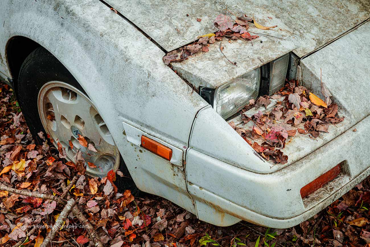
That something else took a while to find because the sun stayed out and pretty bright for way too long. I actually had time to work through most of the area and start back towards the beginning. There was a Nissan 300Z parked nearby which had interested me from the beginning. This is not the type of car that I normally try to shoot when it comes to my decay subjects, but it is some 30 years old now, and a car that I remember lusting after while in high school. Cars from this era age differently than my normal decay subjects, but the lines are still interesting, and as long as there is a story to tell, I am happy to point the camera in its direction.
The Z was white and not really in bad shape at all. A bath would have done it wonders, but it was the dirt and the leaves that had fallen on the car which interested me. As I was looking around for a composition, it was the very characteristic front end that caught my attention the most. I could just see the posters hanging in the dealerships with this angle represented when the car was a new release. I could picture the car sitting in the showroom all shined up and ready for delivery. Of course, I wondered if anyone thought about the car ending up like this 30 years later? The composition came to mind that I wanted to shoot. I wanted to get the angle that had been on so many posters and magazine articles over the years when these cars were brand new. It was going to be like a before and after comparison with the after being a stage that most people never consider or pay much attention to.
I got the camera lined up and figured out the exact framing that I wanted. While this looks very simply, it was a game of small movements with the camera location as I picked exactly how much of what panel to include as well as how the frame interacted with the subject. When I was finally satisfied with it, I only shot two photos with one being a safety. I knew that I had the composition right, so there was no need in tweaking it anymore. I had done all the tweaking before I even turned the camera on which was the way I liked doing it as it saved a lot of time and energy in the culling process. Fortunately, this car was in a nice shade, so there wasn’t any worry with the sun at all.

The next subject I came to was dictated by the sunlight more than anything. There were areas that were in nice shade which drew my attention more than the subject matter at this point. The areas that were getting the dappled light were far too harsh to work with. What I found to work with at this point was a car that I don’t recall what it was, and I can’t tell from the photo here, but there was a nice blue color to it, and an interesting design to the headlight area. With the front of the car in the shade, I went to work figuring out a composition that made sense. I loved the way the bumper came out so far from the headlight bucket, and the rather meaty area of blue between the bucket and grill opening. There was no hood, so there was a point of interest behind the grill that allowed me to bring in a subtle triangle shape at the top to give a bit more dimension.
I set this photo up to have the headlight bucket as the visual anchor while I used the extended bumper and the hood opening as framework for the top and bottom edges. The tip of the side molding was used as a frame for the right side, while the natural darkening of the fender after the curved section with glare made for a nice vignette. The grill opening was another vignette for the photo while introducing yet another shape to the image. The bit of gasket that was falling down had the added benefit of making yet another triangle. I’ll admit that this is not quite a normal composition for me, and even Toni scratched her head at what she was looking at. For me, the colors work out well, especially in this color profile, and the different shapes all work together. The photo is less about the subject and more about the artistic qualities that are present within the frame. The dents just add more shape to the photo and therefore more character.
I can’t explain it completely, but this is one of my favorites from the day. I’ll admit that it looks really random, and I’ll be the first to confess that it was a fairly simple photo to set up as a composition. I didn’t fuss with it even half as much as the Nissan I just talked about. It was a quick grab because of the light, but the more I look at it, the more interesting it becomes. This is one of the qualities that I think determines if a photo is truly good or not. When you crave to see it because you want more answers, or you want to see more of the details, a relationship is formed that transcends the photo. That has happened with this one, at least for me.

During this time, I was really getting more grab shots than anything. When I came upon a scene that was in the shadows, I would look for a composition. This Chevelle jumped out at me because it was in that nice, shaded light. The car wasn’t all that fascinating, and it was largely hidden by the brush. Only the rear third of the car was really visible, and I keyed in on this corner that had the nameplate on the trunk lid. The fact that the car was resting on the ground placed it in a new perspective for me. The light mint green color seemed to go with the surroundings, yet the taillight jumped out as a contrasting color that I really liked. The bumper was just barely visible above the leaves on the ground which made for a really nice separation point.
I framed up this composition in a minute or two and shot two frames with the second being a safety image. There was a decent breeze blowing, so I had to time the shot when it was kind of calm because I noticed that the leaves on the trunk were moving slightly. One of the two images got the leaves sharp, while the other one had a bit of motion blur to them. I had anticipated wanting the sharper of the two images, but as I was editing the photo, I decided that having the leaves still and sharp brought the eyes away from what I really wanted them to be focusing on. By using the slightly blurred leaves instead, the eyes are pushed into the frame where they land on the sharp emblem and the shapes of the car. That was my intention and having that blurred aspect to the scene helped with that result.
I had come up with the idea of the composition because of how the colors all looked, but when I was going through the culling process and thinking about how I wanted to edit the images, I really wanted to do this one as a black and white. The greens were just too punchy, and the red seemed a bit too dim. It really looked like the color was going to get in the way of the composition if I kept it. I went through all of my black and white profiles and found nothing that inspired me. The color ones weren’t really hitting the mark either, with the exception of one. I have a wonderfully desaturated profile that I like to use at times when the right choice is somewhere between full color and black and white. This one showed promise but needed more color to make it work. Over the next 15 minutes I seasoned the colors in the frame like a chef to arrive at this final outcome which I absolutely love for its simplicity. The parts of the scene that excited me originally based on the colors finally showed up the way I thought they should in this edit. Nothing is too punchy, yet it is the color that drives the whole image. This simple composition had a lot of choices when it came to how to present it and I think that every choice that I made works quite well to make this an impactful photograph and another one of my favorites from the day.

By this point, the clouds were coming back, and I started to revisit some of the compositions that I had considered earlier but was unable to work with because of the light. The first stop I went to happened to be an orange Nova that I had seen during my scouting walk through here the other night. The car was kind of off by itself which made for a great chance to get an overall composition of it. The front was overrun with vegetation, which was a shame, but the iconic rear was exposed (typical Instagram pose). The light was directional and coming from the back of the car which made this a very easy composition to shoot. Since I had the room to use, I stepped back and let the composition breathe a bit by allowing the sky to come into the shot. I liked the opposing points of interest, but the sky was causing some exposure issues for me.
The easiest solution was to add an ND Grad filter over the sky, but since there wasn’t much of it there, I wasn’t going to have the ability to really get a soft grad to work here, at least not to bring the exposure down as much as I needed it to. Instead, I went with a 2-stop hard edge to bring the effect in much faster, but with it only being a couple of stops, I would be able to recover the lost exposure in the trees easy enough in post. I slid the filter in and had it covering just what I needed it to in order to protect the highlights. I shot a couple of frames here because the wind was causing some issues and I wanted to get things calm in the scene to fit the story that I was after. I mean the car looked like it was resting, so I wanted things to reflect that mood as best as possible.

Before leaving this Nova, I went to the front of the car to see if I could make a composition work here. I much prefer photos of cars from the front quarters when possible and I felt that this was one of the better choices for that approach because it was largely alone in the field. Even though the car was very much covered on the front by vegetation, I was able to get a composition that I thought would work out. Fortunately, the fender was more red that orange which made it stand out behind the green. This gave shape to the front of the car even though it was largely covered. There was one car that was still visible across the field from me, but it was dark in color, and I doubted that it would be much of a distraction when compared to the in-your-face orange of the Nova.
The issue that I ran into was I was shooting into the sun for this composition and while the sun was behind the clouds and diffused, it was still very bright in that direction. The leaves and grasses were all backlit which I thought was going to be a good thing, and the shadowing on the car was great at showing the contours of the body. The sky was greatly overexposed though, even worse than in the other direction. With there being more sky involved, and the way that the trees were so dominant, I had to lose the 2-stop hard edge and replace it with a 3-stop soft edge grad so that the trees would be a little easier to blend in. Even that wasn’t getting the exposure dialed in correctly, so I had to add another 2-stop soft grad for a total of 5-stops of correction to the sky. The filters were staggered so that the division point was so gradual that it really wouldn’t be noticed, plus I would go in and do some dodging of the trees to bring them back up in exposure.
I started to make exposures at this point and worked on getting things pushed as far as I could to the right without blowing out details. I needed to keep the shadow information intact the best that I could. I think that this composition was arguably the most difficult in terms of exposure that I did. It was on the edge of being too much to capture but I really wanted the photo to work. I probably shot a dozen of this frame with varying lighting conditions from totally shaded, to arguably way too bright. I was going to have to see what worked best when I got back home.
After doing my culling, I had landed on a frame that I thought would work. The foliage had some great back light and seemed to glow in the frame while the car had some good light on it that showed off the lines. I started editing it and found that I was having a very hard time getting things to work when it came to both color and luminosity. When I would get the overall luminance to work the way I wanted, the colors would shift oddly. When I would correct the colors, they wouldn’t look right with the luminance. It was a vicious back and forth, and I was using every tool at my disposal to get it to work. The more I studied the image the less I liked the brighter light on it didn’t think that it worked as well as I had hoped it would.
I was about to discard the image as a loss but figured that I would explore some of the other options to see if maybe I misinterpreted the lighting that was going to look the best. I copied a good deal of the basic edit and applied it to three of the other images with different lighting conditions. One of them seemed to work kind of decently. It was one that was still similarly lit, but not as intense. The shaded ones were too flat and lifeless for me. I worked out the rest of the edit on that one and got to about the point where I had wanted the first attempt to be. Looking at them side by side, they were very close in appearance, but the colors were much more accurate in the slightly darker image. I went ahead and committed to that fresh edit and discarded the original pick.
There is a lot that I like about this photo, but there are still things that I don’t like about it. Time will tell if it is just a matter of being traumatized from the difficulties that I had with the edit, or if the photo really isn’t as good as I was hoping. I think that it has enough merit to remain in the batch of keepers, but probably will never see my portfolio. I’m glad that I tried it because this was the image that forced me to learn about the new point color feature in Lightroom. I had to get very specific with the color treatments on this one, and that was a tool which was newly available. I love that it can be used in a mask, and that is the biggest benefit that I can see with that feature right now.

After I finally called it quits on capturing the Nova, the sun was pretty well hidden once again. I knew where I needed to go because I had some unfinished business with the Mercury Montclair. You might recall that after shooting the rear corner of the car, I had noticed the interesting design of the rear window. I had found a composition that I liked here and waited on the sun to cooperate and quit giving me dappled light that overcomplicated the scene. Now I had the light that I needed and went right back to the car.
I don’t know why I was so determined to get this shot because it is not a really strong composition, but I did like how the tree helped to frame the design element that I was after. I couldn’t remember the exact way that the camera had been positioned but knew roughly how things went. Looking back on the frames that I had shot at both times, I like the second version of the composition better. It was done closer in and a little higher up than my first try. The lighting was certainly better which made it possible to get this in just a few frames. The only thing that I had to wait for was the wind to die down so that the leaves would be still.
This was one of the last images that I edited because I really didn’t have a strong feeling about it one way or the other. When I was done editing it, I felt better about how it looked and thought that the eyes were directed a bit more efficiently through the frame after the edit. I’m not sure how the photo will be received by viewers because the car is not really that beautiful to begin with and the lines that I have captured are largely hard edges and angles which on their own aren’t all that pleasing. However, with the soft contour of the tree to the side, there is a dichotomy that I really like here. That was where the title of the piece came from as a matter of fact.
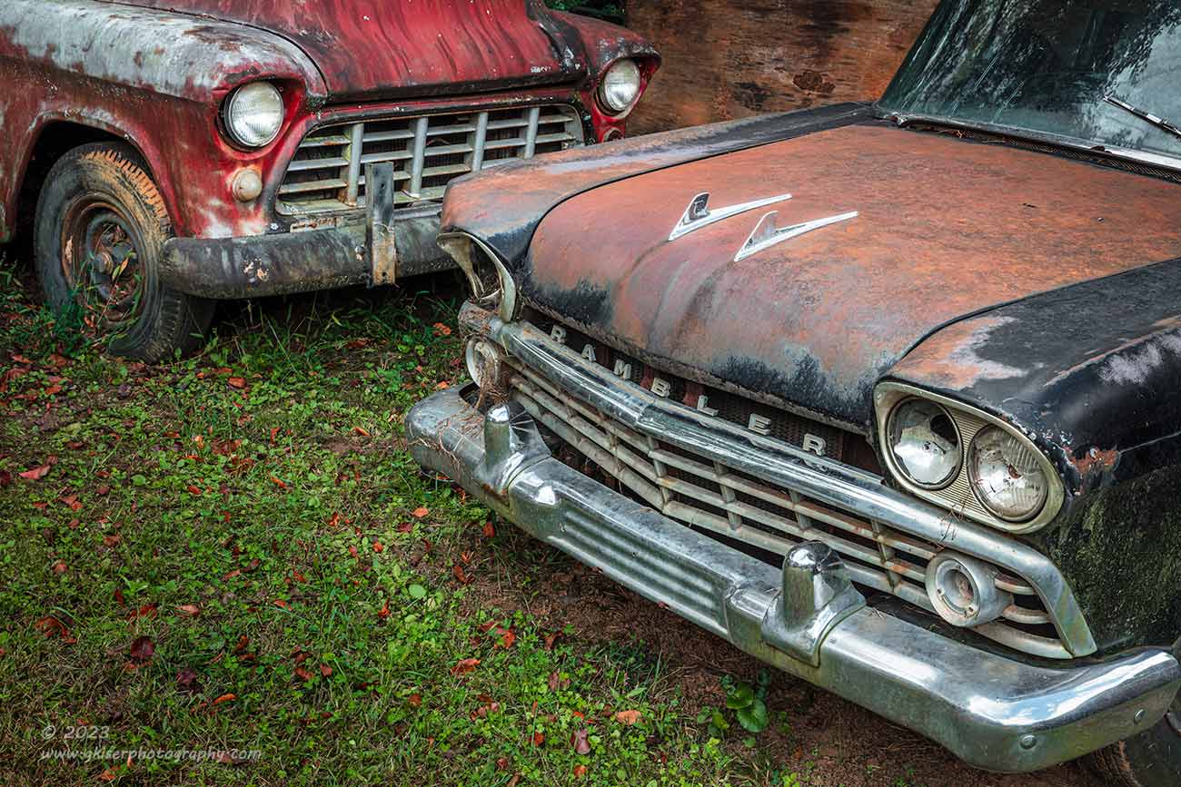
As I went back around to revisit compositions that I had considered while the sun was out, I came back to the gathering of cars that I had shot earlier near where the Fairlane was. You will recognize the red Chevy from another photo, and here is one of the Ramblers which I found most interesting out of the bunch in that line. I had failed to get the group portrait earlier because it looked like just a simple snapshot. After reconsidering, I thought that a more intimate capture would be a better option here and went to work figuring that out. It was these two vehicles that grabbed my attention the most and that was where I started to focus my thoughts on.
There was no way to get both of the vehicles in entirety without introducing other vehicles, and by the time I made it to where they all made sense, I was back at that initial snapshot once again. I had to dial in tighter to get the shot that I was wanting. When it all was boiled down, it was the front ends of the cars that really interested me. This allowed me to isolate them both and minimize the fact that there was a minivan with a plywood panel propped up against it in the background. You could see it in the frame, but mainly just the wood which was a simplifying backdrop for the scene. There have been many times that I would have wanted one of those to put in front of a distraction, but that would be changing the scene which I don’t want to do. Having it there legitimately worked great though, and I was happy about it, especially for this composition.
I was able to get both front ends in the shot with just enough overlap to establish a connection between the two while not blocking the headlight from the truck. This composition was all about separation of elements since there was a necessary overlap of subjects. I played with this composition for a while and adjusted the camera position several times to see what I liked the best. In the final cull, it was the last version of the framing that I liked the best. It had the most room to breathe and didn’t feel as crowded as some of the earlier attempts had. What I really liked about it was the more unique front end of the Rambler took center stage with the dual hood ornaments while the more brazen color of the truck pulled your eyes into the background to explore. It was then the contrast of the black and chrome that fought for your attention once again and pulled you back to the Rambler. The eyes never stop moving in this photo, and that makes it a very interesting one in this collection.

One of the scenes that I had tried and failed to photograph effectively at the earlier part of the day was this old Mack road tractor which was in a barn. While the sun wasn’t bright at the time, I was trying to capture it, there was a huge dynamic range in the scene thanks to the deep shadow of the shed that it was parked in. I tried for about 15 minutes to get the composition captured with varying intensities of light on the truck. None of them really worked out, so I eventually gave up with the intention of coming back if the lighting got better. That eventuality had taken place at this point.
Now I had light that I could work with, so I framed up the same composition with only a few small tweaks. You might be thinking that this is an odd composition because I rarely shoot from this angle without including the bumper and wheels. I would have loved to have gotten them all, but I had a gate to contend with and a push mower that was pushed under the front bumper with the handle sticking out. There was just too many distractions just out of frame to the bottom to include anything else. Instead, I used the headlight as a framing element to establish the right and bottom boundaries of the frame. For the sake of color balance, I wanted to get the green vine on the wall included as well, so that became the left boundary of the frame with the wooden panels forming leading lines into the scene which were situated in opposition to the largely vertical nature of the grill and brush guard. The top of the frame included the dual horns on the roof with enough breathing room to introduce some more leading lines from the top of the structure. The horns created a triangle with the hood ornament and the headlight which were both elements that I wanted to showcase in the frame. The “M” in the brush guard was framed by the other line elements around it which made it stand out while the opposite headlight was largely covered by the brush guard to help simplify the overall composition.
When it came time to edit this one, I spent a lot of time getting the colors right. I needed the orange, green, and blue to get the right hues and intensity for this to work as a cohesive image. It was another occasion where I used the new point color feature in local masks to get things just right. It is going to take a little practice with that tool, but I think it will become a very valuable one for me since color relationships are so important to my photography.

As I was walking around and exploring more under the cover of clouds, I came upon this old Ford peeking around a corner. I had seen it the other night and walked by it several times already today. Every time, it caught my eye, and I liked the shape of the front. With the way it was partially covered by the foliage, it looked almost shy, which was surprising as dominating as the front end appeared. The lighting was nice and even on it, and I figured that I might as well photograph it since it kept giving me reason to pause in my walking.
I embraced the aspects of the story that I had created in my mind based on the vegetation to the side and created a composition that included that aspect. I wasn’t interested in the entire truck, just the front of it and how it was looking in the environment. It was not easy to visualize how this was going to turn out because of all the visual clutter in the left of the frame, but by letting some of it go blurry I was able to push the eyes to the truck which was the goal. I initially thought that I was going to be doing this in full color, but those ideas change from time to time.
When I started the edit, I liked how the rust contrasted to the greens, but the image was pretty well split between those colors, and it felt boring. The green also seemed to overpower the truck because there were tonal variations there that the truck didn’t possess. I moved over to some of the black and white color profiles and found that the image felt better without color. It was the contrast of the truck that drew the attention now, and that was exactly what I was wanting to happen.
When I showed it to Toni, her first thought was one of her favorite movies, Jeepers Creepers, because it looked like the truck that was featured in it. She made some suggestions about titles based on that connection, and then dismissed them based on some interpretation issues that she thought might come up. I did stick with the theme she started and just went along with the song and thought about what came next.
Speaking of what comes next, there is still one more entry left to be done for this trek. Remember, there are thirty new images that have been added from this day long adventure in wonderland. I’ll let you be the judge as to whether or not the best is still to come, but I will say that there are some really great images still to share from this day. I’ll see you back here soon with that final chapter.
Until then….

Remember to use the code KISER10 to get 10% off your purchase