Wednesday, February 18, 2026
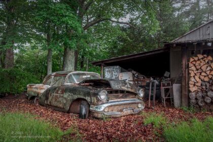
For you, it has been a day or so since we last spoke. For me, it has been a total of thirty minutes and I’m back here typing away. If you missed part one, I’ll give you minute to catch up. Essentially though, I went out today to do a little experimentation with detail shots as well as using the wide-angle lens. I started out wanting to photograph some barns but decided kind of at the last minute to spend some time with a Pontiac that I have loved for around ten years now. It is slowly getting covered with vines and I won’t be able to do much with it in the future. With that in mind, whenever I have a desire to go and capture it, I’m going to do just that because there will come a day when it just won’t be possible.
When I last left you, I was talking about the seven keepers that I had gotten from this single car thus far in the trek. I didn’t say how many more photos I had because I never want to ruin the surprise, and I wasn’t exactly sure how many more I had left to share. Well, I knew how many more I had processed, but there was one that I wanted to give another look at. There was a single frame that I had shot which was a total experiment in concept as well as composition. It had not made it through the first round of culling because it was just too out there for me to work with. However, as I was going through that first installment of the blog, I kept thinking about that one photo and how it really fit with the whole purpose of the trek. I was out here to try different things, and to live on the edge for a bit. This was not about finding my comfort in composition or subject. I needed to stretch how I was seeing things, and the photo that I had in mind did just that. Whether or not it is a good image, or a successful one is anyone’s guess right now, but I wanted to see it through.
When I was done with the last entry, I went back into Lightroom and pulled that single frame back up and opened up the develop module to get to work on it. It was largely monochromatic which was a turnoff for me, so I decided to strip the colors and make it a black and white image. Most of those color profiles failed to give it any depth, but there was one, and it is one of my all-time favorite black and white profiles that I saw potential in. I started from there and started to work the contrasts throughout the scene and ultimately ended up with this image here.
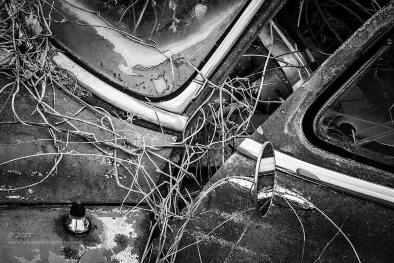
Now, this one doesn’t feel like one of my images at all. It is not nearly as organized as I would like to see. There is no clear subject, but there was clarity of thought going on with the composition. This was designed as an abstract view of the car from the very beginning. When it comes to abstracts, I enjoy focusing on shapes, lines, and textures to define the composition. Many of my abstracts don’t have a clear subject, but the lack of subject becomes the subject in a way. With this composition, I had a bunch of shapes all linked together with the gaggle of vines that I had been playing with. There were several visual anchors within the scene that I liked and positioned in specific ways. These are the antenna mount, the rearview mirror, and the steering wheel. The three elements were placed in such a way as to imply a triangle. I’ll wait while you trace that out in your mind. There are two other triangles introduced with the vent window and the corner of the windshield. Those triangles point to the middle of the frame which is the core of the implied triangle. I also really like the structural break between the door and the body of the car which is just not something we are used to seeing, especially with the addition of the vines. It is an odd scene but not quite jarring to the viewer. It forces the viewer to look into the image and try to determine why the photo was created.
I would love to be able to tell you exactly why I shot this, but I can’t really put it into words. I just liked how it all appeared and I liked the confusion of it all. The mix of nature and manmade body panels connected, yet separate. It just felt like a good story, and I wanted to share it. Like I said, I am not 100% convinced that this is a good photo, but I did want to show it here and wanted to keep it to refer back to. This is part of the learning process. If I only keep the images that I know work, I am missing out on a chance to live with those that stretch my own abilities. Who knows what I’ll think of this photo after a few weeks, or months. It is in the realm of possibility that it might end up in the list of most significant images of 2026, though I think that is doubtful. Honestly, I would be very happy if I decided that I liked this image after I’ve had some time to live with it. It is certainly not a “safe” image which is something that I am trying to get away from this year. I want to create things that are really based on my own unique way of seeing rather than what I think will be marketable images.
If you have an opinion on this one, I would love to hear from you. Let me know what you think about it and if you think I made the right choice to put it through the processing stage and share it here. I’m liking it better than I did the first time I looked at it on the computer. I dare say I like it more now than when I shot it since I only did one frame of it before moving on to something else. Maybe it is just that new photo scent that I’m enjoying, or maybe I’m onto something with this oddball composition.
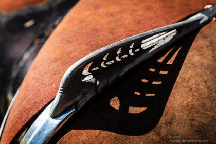
For those that are wondering and are fans of keeping track with the actual progression of the photos during my treks, this one is out of order from how it was shot. This composition took place right after the shot of the taillight putting it in the slot for the sixth photo of the day. As was mentioned, it was just a single frame out of all that I captured because I really wasn’t sold on the fact that it would work. I moved on from this view back to the hood ornament once again and continued on from there. Essentially, that gets us caught up with things and as I last spoke with you, I had just shared a photo of the driver’s side fender ensnared in the vines. I had also mentioned that both fenders showed to be visible behind the vines and I was wanting to work compositions on both sides.

The passenger side of the car felt a lot different from the driver’s side mainly because of how the headlight was still intact. The same basic composition worked on both sides of the car and I kind of repeated the process that I had done to begin with. Because of how the vines were all positioned, the focus on the car changed a little between the two sides. With this side, the main focus was near the headlight while it was the wheel on the other side. This tracked because the human eye will be drawn to the brighter parts of a scene before other areas. As with the other side, it is the color contrast that defines the fender because of the cooler colors that are present. With the vines all being the warm tones the separation is easy to spot.
It is that separation that defines the shape. While we can’t clearly see the fender shape in either photo, we see enough of it to where our minds can complete the structure. This is one of the Gestalt principles called Closure. Our mind can see bits and pieces of a shape and will fill in the missing parts which completes that shape and form. Another aspect that helps this scene along is how warm and cool colors are received in the brain.
Oh wow, I just realized that we are going to school for a quick moment to learn about artistic theory. I kind of slipped that in with the concept of closure, and I’m going to take it up a notch with some color theory. The difference between the warm colors of the vines and the cooler colors of the car is very important to allowing the viewer to visually separate the two layers, but it is not quite what you think. Sure, there is a contrast that allows you to differentiate between the two elements, but it is the warm versus cool that makes it work as well. You see, warm colors are perceived as coming towards the viewer and are more inviting. The vines are being pulled towards the viewer here. The cooler colors are receding colors to the eyes and visually move away. This makes it appear as though the car is moving away from the viewer while the vines are coming closer. This adds to a three-dimensional feeling for this image which is pretty much all on a similar plane. How is that for a cool visual trick?
There is a lot of artistic background that goes into creating a photograph. It is so beyond knowing settings and pressing a button. There are concepts that have been established through centuries of artistic expression that can be pulled on when needed. Of course, as the viewer, you are not really thinking about this stuff, you just have a reaction to the picture that you are seeing. It is up to the person creating the photo to include the ingredients that make the image visually interesting.
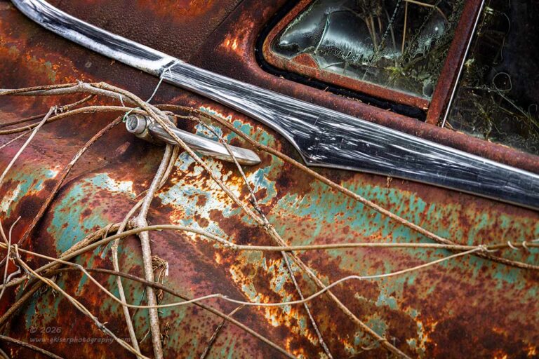
I had been out with this car for roughly a half hour at this point and had picked all of the low hanging fruit. Ok, I did get a little creative with the photo that was a late addition to the part that started this entry out. Other than that, I had been going for variations on things that I had done before and was really wanting to find other ways of photographing this car. That was why I was here after all. I looked around to find some other views of the car that I would be able to work with. As you have seen, the vines were causing me problems and created a good bit of difficulty in what I was able to photograph. Then it hit me. I had been using the vines to my advantage for the fender shots which is an area that I am used to photographing. I could find compositions that featured the vines which would add another layer of interest to the car. There were no shortages of vines throughout the car, so I started to look for areas that had visual appeal as a background. The area that I found was most interesting happened to be the passenger side rear door. The brightwork was still affixed to the door and the door handle was there as well. The vines were wrapped around the door handle and also appeared behind the glass in the interior of the car. This was interesting and told a very different story than the one that I would normally tell with this part of a car. Come to think of it, I had never been motivated to capture this particular section of this car before. That was kind of odd because I have been doing these kinds of compositions for a while now. I’m pretty sure that the reason for that omission was that I have set up a relationship with this car that is primarily based on the overall compositions of it. That is what I have done the most of while visiting this car over the years. Now that I am looking for ways of seeing differently, I am forcing myself to look deeper into this subject than I have in the past.
I just can’t say it enough. We all get into ruts with how we view things and react to our surroundings. It is something that we don’t think of, and we don’t question when it happens. The only time that we actually take note of it is when we are actively trying to change how we perceive the things around us. That was what was happening here, and I was spotting details on the car that I had never really taken note of before. I was incorporating a natural element that was unique to this car to create images that told the story of the car to better effect. I love throwing the word synecdoche around, mainly because it is fun to say, and I’m still impressed that I can spell it without relying on the spellcheck feature. Synecdoche is a concept that I learned as linked to Haiku poetry where a small detail will represent the larger picture and create a mood to go along with it. I’m oversimplifying it, but the main thing is when applied to photography, it is referring to allowing a small detail to represent the entire subject. This makes things much more engaging and interesting as you have to be actively looking into the photo to complete the process.
What I loved about this particular detail of the car was how the organic shapes seemed to mimic the manufactured shapes. Look at the way the molding has a portion that curves and drops away from the straight line. The door handle has another pleasing curve, as does the actual body as the rear fender is starting to be formed through the door. These shapes can all be found in the vines that are currently growing in and around the car. The vines are wrapping around the handle to where it is getting harder and harder to separate the natural from the manmade. Unlike the fender shots where I wanted there to be a color separation so that we could make out the shape of the fender, with this area of the car, I was very happy to have it be a bit more monochromatic to show that both elements were now related and joining.

When I talk about telling stories through my photos, this is what I am referring to. They don’t start with “Once upon a time…” and nobody lives happily ever after. My stories are all about how the elements relate to each other. They are also about how the photo relates to the viewer and what thoughts are sparked in the viewer. In this vertical composition, the visual flow is a little different and the vines take on a more important roll. It is the same spot on the car, but the focus is different here. There is more emphasis on the vines growing around the handle, and the glass forms a triangle frame in the upper right that features more of the vines obviously inside of the car.
The story is a bit different here as I am not so much concerned with the similar shapes between the car and the vines as much as I am wanting to highlight the vines overtaking the car. The patina is more impactful here as well because we are closer to it. As the viewer looks at this one, I can’t help but imagine that they are trying to visualize the rest of the car as it is overtaken by the vines. This is the power of synecdoche in a photograph, and then the story shifts unexpectedly as you start to try and figure out what the rest of the car looks like. We go to our memories from actually seeing cars of this era, or to seeing pictures of them, or seeing them in movies. For the most part, we are seeing running and driving examples in our minds which we are then trying to fit into this state of decay. We just can’t help but wonder what this car looked like when it was brand new and still had a fresh coat of Turtle Wax being applied by the first owner. Now that is a story, and one with a wabi sabi twist.
When it comes to my decay photography, I tend to always think about what brought the subject to that stage in life. As you well know, I am quite dedicated to detailing vehicles and take a lot of time doing that with my own vehicles. I don’t like for them to be dirty, much less looking like the vehicles I love to photograph. I am not naive and I know for sure that every vehicle that I have ever owned will eventually end up looking like the ones that I photograph so often. I always wonder what that tipping point was for each of the subjects that I find in front of my lens. There was never a dramatic change and decay is always gradual. At what point did the owner just give up on a car and let nature take its course? Those are the questions that I always have when looking at these subjects. For the most part I will never know what that reason was, but it motivates me to capture the clues of what the vehicle is currently so as to remember what it was like originally.
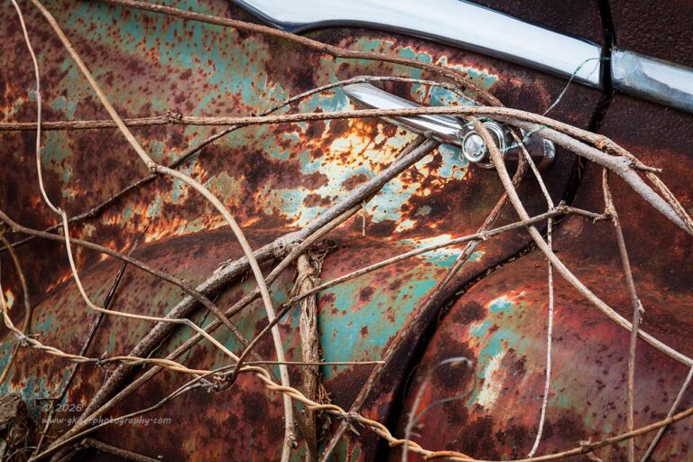
For this final version of the concept that I shot, I chose to frame it horizontally again but concentrate much more on the vines covering the car. I didn’t have the window, and the molding was no longer a dominant piece of the puzzle. It was actually more of a framing element in this photo that helped to accentuate the visual anchor of the door handle. The car is really just the backdrop for the vines here that dance across the patina of the body panels.
Many of the same motivations were present for this composition, but I liked the layout of the elements in this one quite a lot. Of course, as shot it did not read correctly from left to right because there was no clear visual opener on the left side other than the molding that kept the eyes too high in the frame and caused you to miss the main reason for the photo. When I was composing this image, I had a feeling that I was going to want to flip it to make it read better.
At the risk of boring you with more artistic theory, I’m going to mention once again that as humans, in the Western World, we read from left to right and top to bottom. We look at a photo pretty much the same way, though I would argue that in many cases we will read a landscape photo left to right and bottom to top because that is where the nearer foreground elements are found. Why is this knowledge important? Well, we have to look at the elements in a frame as a roadmap for the viewer. As the photographer, we are directing the path of the eyes of our viewers by how we organize the frame. In the case of the photo above, with it flipped as shot, the eyes would enter at the upper left and be greeted by the chrome molding. Our eyes are drawn to the brighter areas first, followed by the areas of the highest contrast. That means that the eyes would follow that molding which would take the eyes right out of the frame around the top center, thus robbing the viewer of the chance to see the rest of the photo.
Now, by flipping this image horizontally, I was able to change that quite easily. Now the eyes enter at the right side, either top or bottom as it doesn’t matter. The eyes are locked onto vines that pull them into the center of the frame, and the bright handle is spotted which gives the eyes a target to go to. This becomes the visual anchor and is where the eyes will fixate on as they explore. That molding at the top right is no longer an escape hatch from the photo, but rather a visual boundary that the eyes don’t want to cross. This is made more effective because of the darker rust just on top of the molding and the fact that there is not much space present above the molding. From the door handle, the vines carry the eyes all around the image completing the visual pathway.
It really seems like a lot to consider when composing an image, and I suppose that it is. It is a muscle memory of sorts though, and you get to where you process all of this visual information on the fly as you are putting an image together. I mean, let’s go back to the masters who worked in oils and different paints. They weren’t referring to Artwork for Dummies as they were applying pigments to canvas. There were no check lists that they went through as they created. It had become instinct based on years of experimentation and failures….and successes. After all this time behind the camera, I don’t actively think about these things until well after the fact and I’m looking at a photo to decide if it really works as intended or not. That is when I start applying the concepts, guidelines…rules if you will. I can pick out the elements of a photograph that work and can articulate why they work even though I didn’t give it a second thought when putting the composition together. Reviewing your own images like this and making yourself articulate what works and what doesn’t make you a much more efficient photographer in the field. You recognize things that work on an instinctual level that actually speeds up the process and yields much stronger photos.
You didn’t know that you were going to be in for a photography lesson with this entry, did you? I apologize for that, but I do like to share some of the concepts that I actively use in my photography to give you a little better understanding of what I am doing, and why. Photographers always get a bad rap in the art world because all we are doing is pressing a button and capturing a scene that is already there. What talent does that take? Heck, with AI, you don’t even need to press the button anymore as the camera will frame the image for you and snap the image automatically. I think that some phones are able to do that now. That is just not the photography that I fell in love with 20 years ago. The photography that I love is a creative discipline that is based on all those artistic principles that have been formed through the years. It is an expression of yourself and how you think. The important stuff is everything leading up to the press of the button.
As I am trying to expand my abilities in this art form, I am really looking at changing the way that I see things, not because how I have seen them in the past is wrong, but I am wanting to increase the scope of my talents and skills behind the camera. I want to learn different ways of putting scenes together, and I want to expand my portfolio. That was why I was out at this location for the umpteenth time. I really have lost count of the number of times that I have been out here, but it all started with that first visit in 2013. I needed something familiar that I was getting bored of photographing to really push me to see it in different ways. It was the last shot of the session that really nailed that concept.
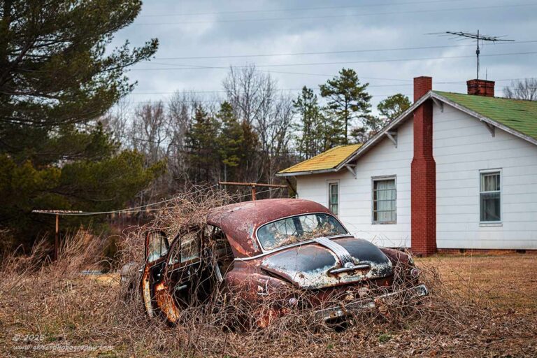
Out of all the times that I have been to this location, I have never been able to photograph the car from this angle. It has always been too cluttered for me with the house in the background, the clothesline stretching through the scene and the power lines in the sky above. In fact, I am waiting for Toni to make a comment to me about the power lines as I will usually do everything that I can to avoid them and if I can’t, will remove them in post. That is what normally happens, but there are times when I keep the lines because they work for the scene or will cause too much destruction to the image file to remove them completely. All of these extra elements to the scene have turned me off of the scene as a photograph for many years now. However, now that I was here to force myself to see things differently, I decided to take a shot at making it work.
I had my work cut out for me with this one though. I knew that I wanted the car captured from the rear left quarter to show the opened doors. I did like the clothesline because that was certainly period correct. The house was showing signs of age as well which I liked more than when I first started to visit. Back then I thought that there was a chance that someone actually lived in the house. These days, I know that isn’t the case. The question was how to put it all together in a single frame. Certainly, you are looking at the image above and yelling at me that is the obvious answer, and you just don’t understand the struggle that I was going through.
Well, there was a struggle that lasted about ten minutes which is an eternity for figuring out a working composition. I started the process off with the telephoto lens which I had been using through most of the session as I was shooting details. This might seem like a strange lens for capturing the entire scene as that would normally be the realm of a standard or wide lens. Because I spent a year working on learning this telephoto lens, I knew that it would work out because it would minimize the amount of background and keep things a little more compressed with the car taking up the same space in the frame. I worked on finding a spot to set the camera and that was mainly to get the house organized around the car. Things like the chimney and windows all came into play as elements on their own distinct from the house itself. I liked it, but the car wasn’t as dominant in the scene as I was hoping for. This gave me another idea.
I went back to the camera bag and swapped out my lens for the wide-angle once again. This would allow me to get in closer to the car and make it loom much larger in the composition which is what I thought I wanted. I went back to that same corner, though much closer this time and started to put the composition together. I liked the car much better, but now I was faced with including too much of the background. I was now getting the entire house with the clutter on the back porch as well as beyond the trees which included my truck. That was too much in the scene and the pitfall of using a wide-angle lens. As I zoomed into 35mm I was not seeing anything more promising at all. I could have gone with the standard zoom, but knew that I was going to be tighter than 50mm with that lens to get the background to where I wanted it. There wasn’t that much difference between 50mm and 70mm which was the wide end of the telephoto. For that, I knew I liked the telephoto shot and decided to go with that lens once again and just spend more time on organizing the elements.
Once I had the lenses swapped out once again, and my camera bag moved out of the shot, I went back to roughly where I had been before. This was where I started to move the camera around inch by inch while adjusting the elevation to just that precise level. This was where the hard work came into place. I used the car to block a window AC unit in the window to the left while keeping the chimney separate from the fender of the car since they were similar colors. I didn’t want one subject bleeding into the other. I made sure that both ends of the clothesline were in the frame and the lines were visible. This meant keeping enough depth of field so that we could easily see the lines, but that the background would go slightly soft to keep the Pontiac as the center of attention. Because I had the trees to the left, I needed something as tall as possible on the right to keep it all balanced out which is where the TV antenna came into play. This might be seen as a distraction, but it was a needed element for the height. It also introduced fine lines that would complement the clothesline. Now that the frame was pretty much established, I was left looking at a bunch of power lines going along the top portion of the frame. This was where my gears started to grind. I was happy with the rest of the composition, but I didn’t like the power lines in it
I still shot the frame and changed up the depth of field to make sure that I had what I needed when I started to process the image. In all, I shot a total of four frames here, but one of them had a car speeding by in the distance that I neglected to plan for, and I had to reshoot that frame. When I got home and looked at the photos, it was the third in the series, shot at f/4 that worked the best. I really liked the photo and started the processing phase. When I was sure I was wanting to keep it, I had to look critically at the power lines. They weren’t really a distraction, but I still would rather them be gone. I tried several different techniques to remove them, but the fact that they were going through several areas of find detail, I wasn’t able to get them removed without leaving artifacts behind. Since I like to print large, and I’m hoping that at some point I will get to do that with this piece, I didn’t want to mess with the integrity of the pixels on that level. My best option was to retain the power lines, so I started to look for ways to articulate the fact that they stayed.
The power lines provided another set of fine lines that complimented the clothesline and the fact that they ran through the antenna atop the far chimney, they kind of helped to frame the photo in a way. They did provide some more visual interest in the sky which had some very light textures from the clouds. Looking at this critically, the sky would have become negative space which wasn’t all that bad, but with the complexity of the textures within the frame, it would almost become empty space which is not good. The power lines filled that space with another texture that really wasn’t a distraction. The more I looked into the photo; I started to see another benefit to having them. The siding on the house was also kind of a negative space that housed other elements, but in that negative space was the lines from the individual boards of siding. Those lines were very similar to the power lines above which linked the two areas of the photo quite well. In the end, I had not only articulated why I could leave the power lines in the photo, I had determined that they were actually needed in the photo. Talk about learning to see differently! I was embracing the power lines and actually choosing to have them in the composition.
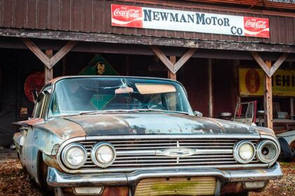
By this point, I had been out here for roughly an hour and had shot 37 frames of this Pontiac. I was happy with what I had captured and figured that I might have five keepers or so from my time with it. There was also the matter of the barns around Traphill that I had wanted to try capturing. The clouds were still providing good light, but they were not quite as interesting as I had hoped they would be. It wasn’t going to cost me much time to drive by and check them out to see if anything would work with them. After I got things loaded back in the truck, I was on my way out to check out the red barn that Toni and I had been discussing for a while, and I had scouted twice in the Miata.

I think it was about a 25-minute ride out to the area where the barn was. During the ride, I was paying particular attention to the sky which was more or less just a blank overcast. I knew the composition that I would be shooting and with the trees behind the barn in a straight line, I was needing something interesting in the sky to keep it from looking like empty space at the top of the frame. I wasn’t sure that I was going to be able to get the photo of the barn on this attempt. Ideally, I would be working with a low sun to the West and some dramatic clouds overhead to give that magic light on the barn to really make it sing. This was the wrong time of day for that lighting to happen, but I was hoping for something good to happen with the light.
When I arrived at the barn, I found it just as I had imagined I would. Fortunately, the cows were all away from the barn in another area of the pasture. The light was flat and the sky was boring which was very unfortunate. I could spot my composition and knew that was decent enough. I was missing good light, and honestly, I was missing an interesting subject because it was a pretty basic red barn. A good composition wasn’t enough to pull this scene into the realm of being a strong photograph, so I decided to scout around for something else to shoot.
Not too far up the road was a side road that I wanted to take but hadn’t done so during my previous scouting trips. Not even a block into the road I found a junk yard of sorts with some ’60’s and 70’s vehicles scattered about. I wasn’t looking to do more car photos today, but this was kind of hard to pass up. I passed by the house that was close by and found a shop just below which had better access to the property. There was no sign of life at the shop though, so I continued on to see if there was something a bit easier to get to further on down the road. After a couple of miles, I was convinced that I needed to photograph that property and I turned around to go and check at the house.
I pulled into the driveway not too certain that this house was related to the property behind it, but when I saw the two dealer tags on the cars, I was pretty certain that I was in the right place. I went to the door and knocked. The door opened a few seconds after that, and I confirmed that the property was all his. I asked for permission to go out and work with the cars and while I didn’t get that permission, I wasn’t denied either. He was on the way out for lunch and asked me to come back on another day. I left my card and counted that as a win because now I have a location that I can easily spend a few hours working with on a later date. That didn’t help me with this day though, and I still wanted to find something else to shoot.
Once again, I drove by the red barn to see if anything had changed with the lighting and I saw nothing positive about it at all. In fact, this was now the fourth time I’ve been by and looked closely at the barn and have yet to see it in an appealing light. It might not ever look the way I want it to, and I might not ever shoot it. It is worth checking on from time to time though. I took that as my clue to move on and find another location to shoot. There was still the other barn that I was interested in looking at again in Lomax, but I was having a hard time remembering how to get out to it. I had found the area by accident the last time I was out with the Miata and had stumbled on it by accident the first time I had shot it. Since I didn’t know where it was on the map, I figured I would just drive around and see what I could see. Eventually, I would stumble across it once again, or I would find something else that I would rather shoot.
Well, I drove around for a while without finding anything else promising to shoot. There was a lot of potential out in the area, but the sky wasn’t really working with me for any of the scenes. I was considering heading home and working the handful of images that I had from the Pontiac, but that seemed like the easy way out. I needed to find one more scene to photograph and try to make use of the lighting that I had. The deeper I got into the community of Lomax; I started to see roads that were familiar and I began to work out where this one barn would be. Eventually, I found the road that I believed it to be on and worked my way in that direction. Sure enough, I found the barn and turned on the side road that it faced. The barn didn’t look all that different from when I was out working it the last time. It was a touch more overgrown, but the structure was still in great shape.
The main difference between this barn and the red one was the state of decay. The red barn, while not new was obviously maintained and cared for. This barn was showing the many years of use as well as the current state of neglect and time. This barn had character and that made it a much stronger subject than the red barn. While the lighting wasn’t all that great, I could see two different compositions that would work very well with the subject. That meant that I had two of the three core elements of a great photograph. You might recall me talking about those things before, but in case you don’t, here is a quick synopsis.
There are three things that make a good photo. You have a subject, light, and composition. If you manage to arrive at any two of those things, you will have a good photo. If you can get all three, you will have a great one. This is a formula that I have used for quite some time, and it is pretty accurate. With the red barn, I had a moderate subject, no light, and a good composition. That was going to be a lackluster image because the subject wasn’t a strong one. With this barn, the subject is very strong, and I had a solid composition, so even without great light, I was going to have a strong image. It was worth stopping for and giving it a shot.
Of course, I selected the wide-angle lens this time because that is where my mind is. I had used the standard zoom the last time, but more than likely had used it at the wider end of that focal length range which is very similar to the narrow end of the range for the wide-angle. Since I remembered speaking with the owner the last time I was here, I was a bit more comfortable in working this barn. I also remembered a lot of the history of it which helped inspire me to create photos around it.
I started out on the same side of the road as the barn was on while I remembered working from across the street the last time. This would give me a chance to get in close and put the wide-angle lens to better use. The sky was such that I could work this barn from both sides and I did just that. However, I figured out quickly that the barn had a naturally stronger side with the smaller portion of the barn in the foreground leading up to the larger part. It just felt better when photographed from the right side. The trees even followed that same pitch of the roofline which made it all very cohesive.
Probably the strongest composition that I shot from this side of the road was from the right side, but when I was processing it, it just felt odd to me. The colors weren’t working with it, and it seemed to read awkwardly from left to right. After working one of the other compositions, I went back and found that this earlier photo wasn’t quite as good in final form, so I pulled it from the keeper stack. Before I was totally finished with the group of photos, I went back to it once more because I remembered that doing these in black and white was a thought that I had considered during the time in the field.
What was failing in the photo was the fact that there wasn’t a lot of light on the barn and that was causing some color issues that I wasn’t really happy with. The framing of the shot changed the focus of the whole frame to the dormant brush leading up to the barn, but the barn was getting lost in translation. I studied the photo for a bit and figured out my chances to address the issues. The first change was to make this a black and white image which would eliminate the awkward lighting and color casts. It would also allow me to create different contrasts to put more emphasis on the barn. The next stage was to flip the image horizontally after making sure that none of the text on the signs behind the brush would have been visible as a clue that the image was flipped. What that did, was create an entry point for the eyes on the left side of the frame that introduced the barn. This took advantage of the brighter tones of the brush and the dramatic rise of the barn through the frame from the left to the right. It seemed to go much better with the perspective distortion caused by the wide-angle focal length. With these two changes and a bit of tonal tweaks to the sky, I had an image that worked much better than the original color version. I would save that color version for the one that was shot later during my time here.
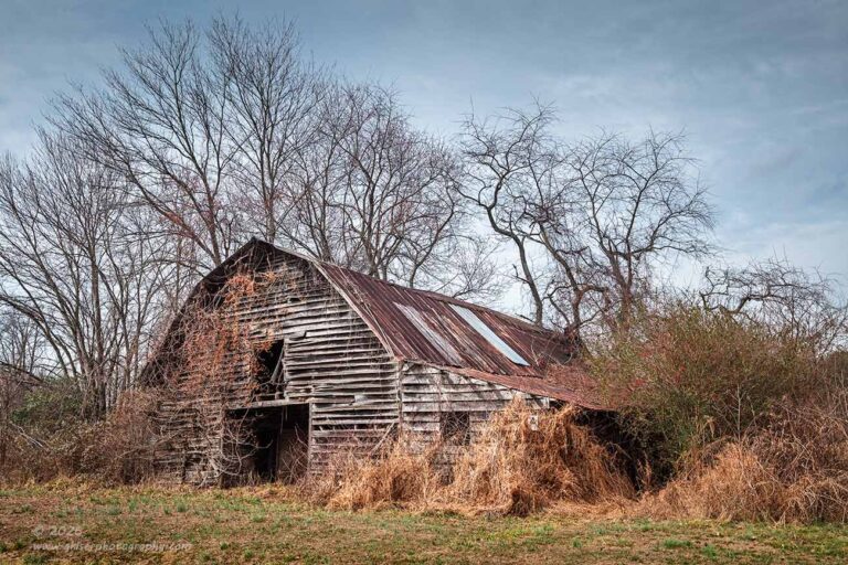
That color version happened right at the end of my time with the barn. I had just finished talking with a Wildlife Officer that had driven by and wanted to chat. It was a great little conversation, and I learned that he had taken photography courses in school and was married to a newborn photographer who worked out of a studio. He had been in this position for 20 years and was looking forward to being able to retire. Man, do I remember those days like they were yesterday. By the time that the conversation was over, the lighting had changed quite a bit. The clouds were thinning and there was now sunlight on the scene which really made things much more appealing. Could it be that I was now looking at the third element of that three-aspect theory I subscribe to?
I wanted the sunlight to take a larger part of the composition, so I moved back across the street and zoomed the lens in to pull out some of the perspective distortion while keeping all of the trees in the frame. The sun was bathing the barn and the dried vegetation in this warm glow, kind of like what I had been hoping for with the red barn from earlier. The sky still would not have worked for that barn because of the horizon line I was forced to use. However, for this composition with the trees reaching into the sky the way that they did, the smoother sky was a much more pleasing element and helped to balance the overall image since there was a lot of fine detail throughout the frame. Having a smooth textured sky was just what this one needed.
With the sunlight on the barn and the ground, the colors were much more natural looking and the whole image was more pleasing to my eyes. This was not as dramatic of a composition, but it worked very well as a whole with the light providing the visual dynamic that was needed. I had my interesting subject, great lighting, and a really strong composition. That makes this a pretty great photograph if I do say so myself.
That was the last of 17 frames that I shot at the barn which brought my total for the day to a paltry 54 frames. Of those, I ended up with a total of 15 keepers which is pretty darned good considering I was experimenting for most of the day. I had a lot of chances at doing detail shots and abstracts early on with the day and also worked on getting more familiar with the 16-35mm lens. I think it is safe to say that I have already used this lens more this year than I have in entire years looking back. If feels good to use this lens more, and to use it for more than just landscape work.
Thank you for joining me on this trek and I hope that you have enjoyed the photos and the stories that have gone along with them. I also hope you didn’t mind the lessons that I have slipped in as they apply to the photos that you are seeing. I love teaching photography and figure I might as well do it whenever the opportunity pops up. If you would like more information along those lines, I am available for mentorships and love to help new photographers learn their craft. I can custom build a mentorship to suit you and your needs, so let’s start talking about how that might look.
Until next time…