Welcome back, and a very happy fall season to you all! I’m glad to see you back for another installment of my monthly Behind the Camera series where I tackle a topic that I might not have time to get into during my regular blog entries after each of my treks. Of course, if you are a regular and read thought these entries, you will likely already know my position on most of these topics from context. What I would like to talk about today is something dealing with composition and how to make yours stronger. Keep reading because it is not what you think.
We live in a society that is dominated by “more.” We always want more, more money, more toys, more time, and more trinkets. I’ve seen this concept at play many times over in photography, especially when it comes to portrait work. The photographer is always looking for one more thing to put into the photo to make it more interesting. This could be another tree in a scene, or maybe the lake in the distance. it could be another prop, or several included in a portrait to fill every bit of space in the scene. For that matter, I’ve even talked about the power of “And” in a photograph when it comes to carefully selecting other elements to include which can make for a more visually balanced photograph, or one that tells a better story. Yes, there are times when adding to a photo can be beneficial and even necessary, but those are the times when your main subject is just too static in the frame. As with most things in photography, and in life, compromise is the rule to be followed. Today, I’m going to talk about the other end of the spectrum, and the one where I see most beginning photographers missing opportunities with their photos.
While it is true that adding to a composition can help, what we usually run into is including too much visual information within a frame. Since the primary job of a photographer is to convey exactly what about a scene excites them. This has to be done visually without any accompanied dialog or instruction. A properly created photograph will leave no question as to why the photographer wanted to capture that particular scene. The problem that is constantly run into is the concept of clarity of thought. This is where the photographer sees what they love, and they create a photo of that subject or concept. Little thought is given to the rest of the frame though. Many times, the main subject is arbitrarily placed at the intersection of the rule of thirds, and the rest of the frame is left up to chance as to what is included. There could be portions of buildings, some trash, maybe a car driving by in the distance, or it could just be a lot of space that doesn’t add anything to the story of what is being photographed. The end result is usually a dilution of the main subject in the frame.
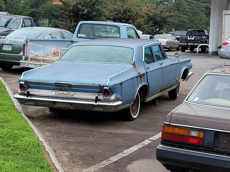
I’ll use this recent cell phone shot to illustrate the point I am making. So many times, I see new photographers capture a photo just like this and are under the impression that it is a good composition and a solid photo, especially after they apply a preset to the edit (another rant for another day). Admittedly, this does roughly follow the rule of thirds with the car occupying the upper left intersection of lines (think a tic tac toe board). There is nose room at the front of the car. The car is interesting from a decay standpoint which was why I wanted to photograph it. In broad terms, I have succeeded in photographing the car which is what drew me to the scene. Job done!
The problem is, this is just not a strong photograph. Yeah, you can see that the only car that is viewed in its entirety is the Chrysler. This makes it easy to understand that this is the most important part of the frame and likely why I shot the photo. However, as you look at the photo, either you stay fixated on the Chrysler which means that you are only looking at about 20% of the frame, or you are spending time looking all around the car trying to find a visual pathway or reason for why all these other elements were included. Add to that the confusion with the haphazard crops through the cars at the edge with the worst offender being the rear of the silver car to the right with the red taillight. Having these bits of visual information at the edges is visually confusing to the viewer. In fact, all of these other cars in the frame distract from the main subject. It is also not clear what I found visually interesting about the car. Your assumption is that the car was interesting to me, but in truth, I didn’t really care for the car as a whole. I can understand the confusion because as a photographer there was no clarity of thought behind this photograph. It did show the surrounding area that I was working with, which was the reason that I even pulled out the phone to get the photo, but I digress.
Clarity of thought in photography is an essential part of the language that photographers have to develop. Imagine reading a book that you selected because it talked about a famous person you were interested in. The first five chapters talked about unrelated people that mentioned the famous person in passing but didn’t really get into what you wanted to learn about that person. Would you stick with that book after five chapters of unrelated information? I doubt it, I know I wouldn’t. Now imagine the same book that started off with a first-person account of running into the famous person and sitting down to chat with them. This developed into a narrative about their rise to fame, some anecdotes about their personal life, and then a look into what makes them tick. The book is now centered around that one subject, and everything flows to support the story. The same concept can be found in photography, and that same clarity of thought comes from elimination of distractions and extra bits of information.
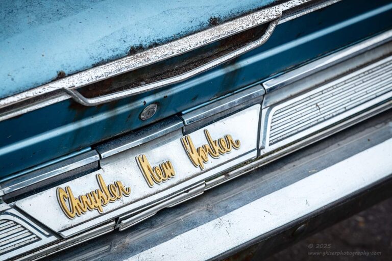
Here, we are looking at what I considered the most interesting aspect of this car from this angle. This very portion of the car was included in the cell shot above, but it was surrounded by so much other visual information that it was likely lost in the larger photo. This is what I am talking about with clarity of thought. I needed to remove elements that did not showcase what I found interesting with this car. That started with removing all of the cars surrounding the Chrysler that had nothing at all to do with it. That wasn’t enough and wouldn’t actually be possible while still including the entire Chrysler. As I mentioned, the car itself wasn’t what intrigued me. It was the styling elements that were used and when I got up close to it, the gold emblems really grabbed my attention as they contrasted with the blue paint so well. I started to work my isolations around this car to home in on what I loved about it. This was one of the compositions that I came up with. As you can see, I have removed a lot from the scene and really reduced what we are seeing down to just the essentials that I was trying to convey.
In short, a composition becomes stronger when you can’t remove anything else from it. It has been said many times by people much smarter than I that photography is a subtractive art while painting is an additive art. Essentially, a painter starts with a blank canvas and adds what they want in the positions that they want to form their work of art. A photographer on the other hand is faced with a scene that exists already and is usually full of chaos. They then have to remove things from the frame in order to show exactly what they are wanting to photograph. This is the clarity of thought in action. The photographer knows what they want to capture and what they do to achieve it is to remove everything from the frame that serves no purpose to that end. This is much easier said than done.
Ansel Adams said that there is nothing worse than a sharp photo of a fuzzy concept. I had always thought that this referred to planning out a photo taking into account the time of day, what equipment you were going to use, and what angle to capture it at. These are all important parts to consider, but the further into photography I get, the more I think that he was talking about this same clarity of thought. The opening cell phone shot was a sharp photo (technically speaking), but the concept behind the composition was fuzzy because I put very little thought into it. The second photo was also a sharp photo, but the concept was no longer fuzzy. I had dialed in the elements that I wanted to include and had subtracted everything that didn’t need to be there. This was the clarity of thought in action, and this avoided the fuzzy concept pitfall because the photo was crystal clear and showed exactly what I liked about the scene.

There are times when removing elements from a scene might feel counterproductive and that is what makes this such a hard skill to master. I’m still learning a lot about it as I go through my own development as a photographer. In this photo of a barn that I did recently, I was faced with a scene where there was a house just to the right of the barn that would encroach into the photo when I shot the barn from the angle that I wanted it. I ended up changing the angle to avoid the house which removed that distraction but took the focus away from what I was most interested in with the barn. It wasn’t the side of the barn which is what I was now essentially photographing, as much as it was the face of the barn with the vines that had grown over the corner. That detail was getting lost when I photographed the entire barn from the side as dictated by the neighboring house.
What I decided to do was to narrow down that clarity of thought by removing more elements from the composition. I had already removed everything around the barn, but now I started to remove portions of the barn itself to really dial in what I liked most about the barn. I removed about half of the barn visually and left just enough of the shaded shelter on the right to balance out with the shelter on the left. I included just enough of the fence to become a leading line into the front of the barn with one post pointing to the vines covering the far corner. I kept the background minimal but made sure that the barn had enough breathing room at the entrance so as not to feel cramped. Since the sky wasn’t all that interesting, I kept that inclusion to a minimum as well. The end result is a photo that has a lot of clarity of thought to it, and you can tell by looking at the photo what drew me into it to start with. This was a sharp concept that resulted in a sharp photograph.
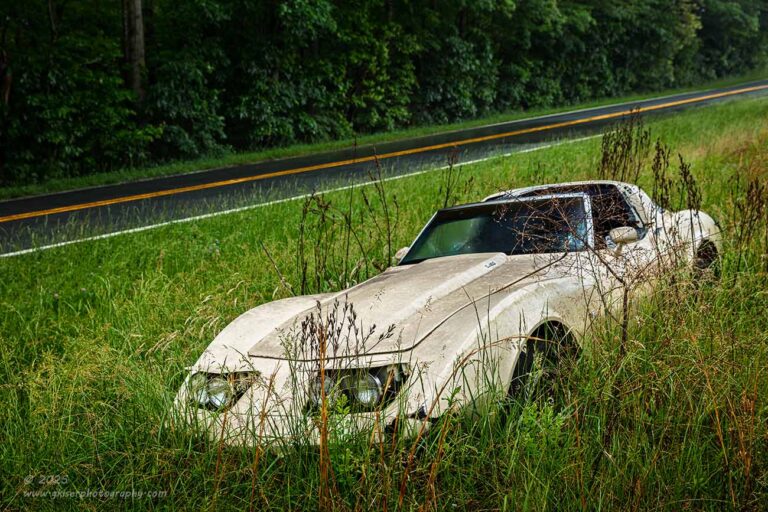
Remember that the core concept behind clarity of thought is to remove elements until you can’t remove any more. This doesn’t mean that you just fill the frame with what you like with no consideration to the overall flow of the photograph. This is a good photo to illustrate that concept. What you don’t see in this frame is the half dozen other cars that are parked out of the frame to the right, or the dumpsters that are behind me. You don’t see my truck parked off to the left along with a small building just beyond the truck. You don’t see the intersection out of frame to the right, and there are no passing cars which would have nothing to do with the age of this Corvette. I removed a lot of stuff from this frame to show you what interested me about the scene. I could have dropped down and eliminated the road in the background and left it as just the car in the tall grass with trees behind it. That would have been one more element that I could have removed which would have supported the clarity of thought because I wouldn’t want you to get confused and think that the road was the reason that I shot the photo in the first place.
No, I’m not insulting your intelligence here with thinking that the road is supposed to be important and a focal point of the image. However, if the road wasn’t in the frame, we would be left with a bright car in a sea of green with no real context. There would be no true composition, only a car in a frame. I realistically couldn’t remove the road because that would create a negative effect to the composition. In short, I would be taking this concept of subtractive art too far. On the other hand, by elevating the camera above eye level, I was able to include the road with enough separation to compliment the car and not distract from it. This gave me a strong diagonal which then supported the car being captured in that same diagonal fashion. There was even a tree trunk on the other side of the road in the upper left corner that helped to balance the visual weight in both sections. Keeping the road in the frame created the composition, so there wasn’t a realistic way of excluding it. That is essentially the power of “And” with compositions. I added that element because it allowed me to create a much more balanced composition but did so without introducing distractions. The road is a tip of the hat to what this car was created for by Chevrolet. It tells the story of what the past looked like for this car. That makes the current state much more impactful. That is the result of clarity of thought behind a composition and a sharp execution of a sharp concept.
Now we are starting to see the value in what elements we decide to include in our photography, as well as what we are not including. If it doesn’t further the goals of the photo, it needs to be removed. If it is instrumental in telling the story we are trying to tell through our photos, then it needs to be included. This can be a very gray area at times, and how these elements are positioned within the frame can dictate whether they are valuable elements or merely distractions that we didn’t recognize at the time of capture. The skill is not easy to learn, but with practice, you can get pretty good at controlling the elements in your scene so that the viewer knows exactly what you are wanting to convey with your photos.

One would think that clarity of thought could easily be achieved by doing isolations which I have spoken a lot about here recently. I mean, if we look at the Corvette, I could have just gotten in close and shot a photo of a portion of the car and not worried about including the road or not. I could have avoided the other distractions that were concerning me as well. Yes, isolations are a great way of really directing the viewer to see what you are seeing in the way that you are seeing it. However, it is far too easy to capture snapshot images of details, just like it is with the broader scene. This isolation shot of a Studebaker around the beginning of the year is a great example of this concept in terms of capturing a smaller scale.
The car was jumbled in with many other vehicles of different years and there was just no way to get an overall shot of the car. I started to remove distractions as I started to really gain focus on what I wanted to convey with the car. I like emblems and I eventually decided that one of the compositions that I wanted to capture would be an isolation of the emblem on the rear pillar. This seems simple enough and I removed the majority of the car from the field of view. I started to look at the emblem which was a very angular bird which looked rather elegant on that panel. I could have just filled the frame with the emblem and called it a day, but that would have been boring, yet I had removed everything from the scene that wasn’t the emblem which is what I’m supposed to be doing in photography, right?. The problem was I had removed things that I wasn’t able to remove compositionally, and the photo suffered because there were visual clues that were simply missing. I needed to backtrack with the power of “And” and create a composition around the emblem. I needed balance and visual tension to make the photo worth seeing, while maintaining that the emblem was the most important aspect of the frame.
Logically, I would have to include some of the stainless trim around the emblem because it was close by. There was really nothing else around it that would create a stronger story. In order to include that trim, I was looking at an angle that forced me to include the interior of the car. Now, in this situation, the interior was done in red which was another warm color that complemented the emblem as well as the paint on the car. It was a distraction in the photo without having reason, so I positioned the camera to show the ash tray in the seatback which gave a diagonally opposed element to the emblem that went in a perpendicular direction to the more established diagonal from thin trim strip. The ash tray was something that was standard equipment on cars from this era, and that helps to define what we are looking at. To make sure that the focus stayed on the emblem, I reduced the depth of field and let everything around the emblem frame it. Everything in the photo matters and serves a purpose whether it be color, shape, or luminosity. Everything that could be removed from this image has been, what is left is the product of the power of “And.” The composition is succinct and effective at relaying what I loved about this portion of the car. It was infinitely more difficult to figure out than the Corvette though, and you will see that clarity of thought with isolations can bring with it some harder choices to make.

Clarity of thought is something that happens on the fly more often than not. What we remove from the frame might be something we do through how we frame the scene. It might also be done through our settings on the camera. In the case of this sunrise, I found myself in a situation where I was at the edge of a parking lot over the water which was protected by a rocky barrier with no access to the beach below. I wanted to have the pier as a main subject to provide structure for the sunrise that was coming. I didn’t want to show that I was in a parking lot, and I didn’t want to include the structure at the back end of the pier. I didn’t want to include the streetlight that was standing off to my left, and I didn’t want a ton of negative space in the frame. I reduced the environmental distractions by carefully framing this with the rocks as a foreground, but not in a way that would indicate that they were at the edge of a parking lot. I kept a close crop around the pier because there wasn’t much in the way of clouds in the sky which meant that the color was going to be contained to pretty much just the horizon. It was the lack of clouds that forced my hand on another omission of an element.
The ocean is in constant motion and with that comes textures in the water. These waves and textures would overpower the sky which was the reason behind the photo. It was the color of sunrise that I wanted to capture with the pier being the visual anchor for the scene. The textures of the waves would create too much visual information in the lower portion of the frame and distract from the sky. The balance would be off and that wasn’t something that I wanted to see happen. The way to remove the texture from the water was to slow the shutter speed which I did through the use of an ND filter to get an exposure of one minute. This smoothed the water out sufficiently to match the smooth sky above. That one technique restored the visual balance to the composition and allowed me to create an image that effectively conveyed what I wanted to showcase with the scene.

On the other hand, I was presented with conditions for an even better sunrise later in our stay and I went down to another pier to capture that one. There were clouds in the sky, and I was thinking that there would be a lot of color. I picked out my composition to exclude the actual beach and the structure at the entrance to the pier. I just wanted the pier as a visual anchor as I had done previously, and I wanted to be close enough to the water so that I could get reflections of the sky when the color kicked off. I had removed everything that I didn’t want or need in the scene. The difference here was that I didn’t need to remove the textures of the waves in the water. In fact, with the clouds above, I wanted to keep the texture to balance out with the look of the clouds. I needed to break up the reflection and establish more of the environment which a faster shutter speed allowed. Compare the two sunrise images and you will see why the textures of the ocean were important considerations for the photos. They set two completely different moods in terms of excitement and tension within the frame.
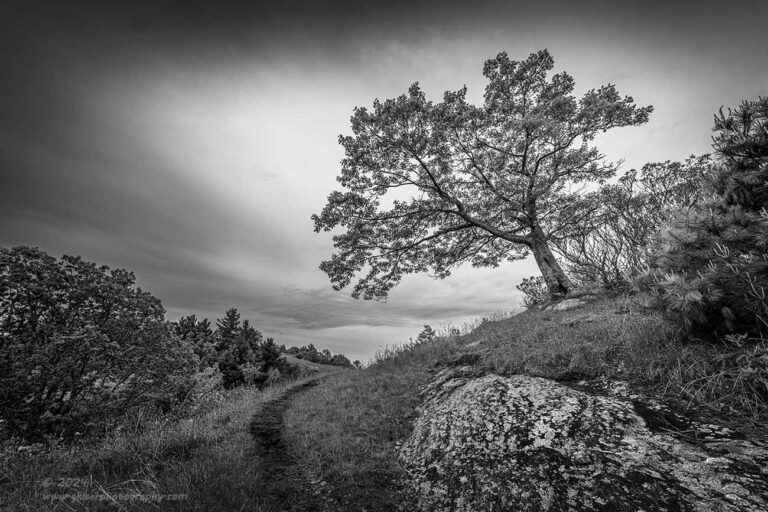
There is probably no harder of a task than having clarity of thought when you are working with a wide-angle lens. Anything wider than 40mm on a full frame camera is considered wide-angle and has a field of view wider than we typically see as humans. The photo above was shot with a 14mm lens which includes a tremendous amount of visual space. As you can imagine, there are a lot of elements that are about to be placed into your field of view. The concept of making a composition stronger by removing everything that you can, still applies when shooting a wide-angle lens though. Your framing choices just become more complicated. In this scene from Doughton Park, I worked the camera around a half inch at a time to get things positioned in the frame just right and to avoid extraneous elements behind the vegetation on either side of the frame. Every piece of this puzzle serves to tell the story that I wanted to illustrate here.
As the viewer, you aren’t aware that you are looking at an image shot with a 14mm lens. You are struck by the tree which is the most dominant element in the scene. By following the branches, you are led to the path which you are now examining and considering what is on the other side of the ridge. I didn’t include what was beyond that ridge because I wanted that to be a question that you asked yourself and pondered the answer. This is an image to get lost in, and that was the concept behind the capture. Had I removed anything else from the scene, that sense of adventure would have been lost. It would no longer function as I intended for it to. If I had included any more elements to the scene, it would have become messy and overly complicated to look at. Clarity of thought works in all scopes when it comes to photography. I can shoot a macro scene, or a big grand landscape and still have to go through those different stages of removing elements that don’t add to the story while making sure that I keep the ones that do further the story.
Clarity of thought is a complex concept that works as a slide rule of sorts. You have a range in terms of included elements within a scene. On one end of the spectrum, you have your subject. That is the one aspect that you are interested in within a scene. On the other end of the spectrum is everything that is able to be included in a photo of that subject. Think about the Chrysler photo at the opening of this blog and consider me having included the road, traffic lights, traffic, and even the parking lot to the left and right. Obviously, neither of these extremes are going to be pleasing in a photography under most circumstances. The right answer will be placing that slider somewhere between the two extremes.
What I like to do is to identify exactly what it is that I like about a scene and fill my frame with just that element. I’m at the far left of the scale in this situation. Most of the time, this is not an interesting photo, so I will look at element placement within the frame while adding negative space which is not really introducing anything distracting. That works in some cases, but many times I find I need a balancing element, or possibly two to get an effective composition. If I can get an element to balance diagonally from the main subject then I am usually happy with that, but more often, I am looking for two additional elements to add that will form a visual triangle when linked with the main subject. Proportion has a lot to play in this because I don’t want the main subject to get overpowered by the addition of balancing elements within the frame. The idea is to form a visual pathway and to tell a story visually.
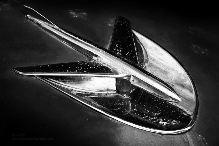
This is an example of really dialing in the composition to showcase just one element. I filled the frame with the hood trim on this car and angled it so that it went diagonally through the frame. I then added contrast to really accentuate the brighter areas of the image which defined the chrome as well as the cat paw prints that were around it. There wasn’t much negative space included except what had to be there in order to get the full subject in the frame. It is a simple composition, and one that is very effective at showing what drew me to the scene.

Here we have another minimalist photo that is essentially of a single subject. It was the neatly coiled rope that drew me into the scene and that was what I wanted to photograph. However, it would have appeared very boring had I just included the coiled rope. You can see for yourself if you scroll down a bit and make the image a square crop that omits the cleat. You can see that you are essentially looking at a bunch of overlayed circles within a square. That was what I was seeing as a problem, so I needed to include something to help tell the story and provide some visual tension. Negative space wasn’t the answer here, but if I were to include the cleat above, I would have something that was physically linked the main subject that provided the right visual balance and tension within the scene. You see how adding an element back into the scene after you have eliminated everything, but the man subject can work? I thought you might be getting the picture.

Sometimes, that extra element can be just negative space which is used to move your main subject to a more pleasing section of the frame. With this candle shot that I made a while back, it was just to static with the subject filling the frame. By moving the subject to the same side where the shadows fell on it, created a bit of drama and mystery which added to the overall mood of the scene. It made it visually interesting. This is the definition of negative space in my mind. It is a significant area of an image where there is nothing really going on, but it is there for a reason. Without the reason of balancing the main subject, this would have been simply empty space which serves no purpose and is generally considered a poor choice to include in a photograph.

With this example, I was drawn to the antiqued streetlights in Charleston, SC, because of the greenish hue that they had. I loved how it looked against the blue sky. I thought that an image with just one of the lights would be boring, so I decided to include two of them. You can see here that I did that with them diagonally opposed for a bit more dynamism within the frame. Had they been on a similar plane, the image would have been boring, even more so than with just a single light. I made the choice to blur the clouds so that the textures of the lights would show up even more within the frame. It was all clarity of thought and how I could best tell the visual story that I was wanting to. It is a simple photograph, but one that illustrates the use of two elements quite well.

In this example, I was drawn to the bit of rusty streaking that was happening below the headlight. The textures were great, but there wasn’t much of a composition with just the rust. If I added the headlight, the rust fell into a supporting role within the frame. I needed a way to visually frame the rust which meant it was best to add the turn signal below the headlight as well as the grill to the left. The grill pointed towards the rust and the two lights provided context for the rust. I essentially added three elements to the scene in order to frame my main reason for capturing the photo. It might seem counterproductive that I have reduced the portion of the frame that the main subject takes up by including larger elements, but there were some other considerations that I put into play here. As I mentioned, the extra elements visually framed the rust which helps the eyes to center on that aspect. Each additional element furthers the story of what we are looking at as it gives more context to the surrounding. The final bit that I added in was the way that I processed the photo. I wanted to really focus on the rust, so I picked a color profile that accentuated the warm tones and then cooled the color of the car for a bit more visual balance in terms of the color palette. All of these choices went into making this photo and fall within the concept of clarity of thought. I had removed everything that didn’t further the image, and included only what made the photo make more sense and be more balanced.
That is really what I am getting at with this Behind the Camera. It is all about finding that place on the scale between a minimal representation of your subject, and a point where you have just too much in the scene going on which dilutes your purpose. This position will be different for each and every photo that you shoot, but the key is to make a conscious decision about where that slider needs to fall before you take the shot. When we are working with this goal in mind, the camera placement and focal length matter more than anything and those are two things that can’t be adjusted in post simply by cropping. To effectively harness the ideas of clarity of thought, you will need to work through all of that in the field.
Photography as a whole is a visual language and one that needs practice to be proficient in. It is no different than speaking or writing. If you don’t do either regularly, your skills and vocabulary will suffer. Language is an art, which is why the course of studies in schools is called “language arts” I suppose. Those that are very good in this field end up doing public speaking or writing as a profession. Most of us can speak and write well enough to get through our day to day lives without giving it a second thought. In the scope of my discussion here, these are the folks that own a camera, or use their camera phones to get snapshots of their lives and existence. By definition one who holds a camera and captures an image is a photographer. There is a huge difference between Mom, who took lots of pictures of me as a baby and through my childhood, and Ansel Adams. Both were photographers, but their purposes and talents were wildly different. One attempted to document the development of fussy little hellion (that would be me), while the other one sought to create photographic art through careful composition, attention to light, and a darkroom process that changed black and white photography as we had known it. What is the difference between these two photographers? Clarity of thought is the biggest difference because the intention was different for each of them. This removes the skill and talent end of the equation because those things can be developed over time.
Clarity of thought is the ability to use your visual language in a way that will direct the eyes of the viewer into a photo in a clear and concise manner to showcase what is important to the photographer. The image as a whole becomes pleasing with attention to details rather than just centering the subject and pressing the button without a care in the world as to what is going on behind the subject. This clarity of thought is the root beginning of where the art is found in photography. It is this clarity of thought that allows certain photographers to excel at their craft. They aren’t mimicking what they have seen others doing, they are creating something from their heart and through their eyes. The image is honest to who the photographer is as a creative and as a person. The longer I am engaged in this craft, the more valuable that this skill has become. It has trumped the compositional rules, exposure rules, and even mainstream processing options and techniques. Having clarity of thought in your photos allows you to create something that is uniquely your own because from concept to execution, you have the creative ideas to drive that entire process.

I doubt that many would drive by this scene and see the potential for a photograph here. Because my visual language has somehow centered on decay, I did see some potential here and came back to it on another day after I had enough time to consider this scene and what I liked about it. Even after spending that time thinking about how I wanted to convey it, I still had to work through the process of building a composition to showcase what drew me in. This is the clarity of thought. I could have just stopped and pulled out the camera to shoot the scene. I could have processed the image with all the care in the world, but it would have lacked something meaningful. By spending time with the scene and trying different angles and including different elements while eliminating the distractions that were all around the scene, I managed to fine tune my idea into a working composition.
In order to do that, I had to remove everything that didn’t further the story and then remove even more until I got down to the bare minimum to show what I liked. That was the car in front of the bay door. In order to make the bay door make sense, I needed to include the roof of the building and the sky behind which added more blue to compliment the blue section on the door. Now I needed something to close in the image which turned into the tree to the left, but that meant that I needed another framing element to compliment that on the right which was the other tree behind the building. This gave me a bit of negative space to the lower right which needed something to balance with similar tones to the car. The sign on the door fit that bill and became another framing element for the scene. I just waited for the light to work for the mood I was after, and I was ready to capture the photo. Later, when I pulled this image into Lightroom, there was too much information at the top and bottom of the frame which diluted what I wanted to say. I addressed this by changing the aspect ratio to a 16:9 if memory serves. This gave much more visual weight to the building and the car which told the viewer what the most important portion of the frame was. Everything else was there to provide a setting and to give that feeling of abandonment that I was after. From the first sighting, through composition building, to lighting, to processing, this photo is a great example of clarity of thought. Every portion of this composition was thought through in order to make a photograph. It was not a snapshot, it was not an afterthought, it was a considered piece and an exercise in my visual language.
Thank you for joining me for this installment of Behind the Camera. I hope you have found it interesting and educational. With any luck, you will have more appreciation of the works of the different visual artists out there, myself included. There is a lot more to this than meets the eye. Sorry, I had to use that phrase, it would have been a crime not to. Join me back here next month as we tackle another topic that hopefully brings more clarity to what makes me tick as a photographer.
Until next time….