Wednesday, September 7, 2022
It seems like it has been forever since I’ve done a blog entry. I’ve been a little busy here of late with mentorships and portrait shoots, so I haven’t had much time to get out and go on any treks. Recently, I added a lens to my portrait lineup which will enable me to get some really good detail shots of things like engagement rings and abstracts with bodyscapes. This 100mm macro lens is something very different from what I normally carry with me as I haven’t had a macro lens in about a decade. There have been just too many missed opportunities because I didn’t have the capability, so I decided to pick one up while they were in stock and with a rebate. The main reason that I got the lens was for people photography, and since I need somebody in front of the lens to try it out, that was going to be a little difficult to work out since I was needing a few very specific criteria. Since I couldn’t line up a shoot to use the lens for, I decided to create my own session to try it out. One of the missed opportunities that I’ve had over the years has been with my smoke photography. I’ve been using my 24-70mm lens which has a mild macro capability to it, but it is not a dedicated macro lens which is ideal for this kind of photography. Since I was wanting to test out the new lens, this seemed like a great time to make that happen.
Of course, for this kind of photography, I had been using my workhorse 5DS R camera which is what I use for all of my landscape and decay work. The new lens was an RF mount which was needed because my main reason for getting it was for people photography and there are no adaptors for RF to EF mounts. This meant that I was going to need to use my R5 for this session. I’m sure eventually, I’ll phase out my DSLR, but I like working with it too much to do it just yet. For this studio session, however, the R5 was the way to go. I had to do a few little changes to it as I had to mount a quick release plate to the battery grip so that I could mount it to the Acratech ballhead. Normally, I leave that off so that it is easier to hold in both orientations, but this was a time when I needed the stability of the tripod.
The rest of the setup was pretty much like what I’ve done in the past with the posing table holding the incense cone in front of the camera. I had a black backdrop set up on a stand behind the table. To the left, I had a Canon 430 EX III-RT speedlite set up on another light stand with a reflector and barndoors attached to control the light spill. I didn’t use my studio lights because I found that the cooling fan made it nearly impossible to control the smoke and I didn’t want to deal with that issue this time. The speedlite has no fan and moves no air at all which makes it perfect for this type of work. It is also quite a bit smaller, and still has plenty of power to light the scene. The light was controlled by the ST-E3-RT controller which works flawlessly with the R5. The last bit of the puzzle was to hook up my remote shutter release to the R5. I didn’t get a new one for the camera because my tried and true remote from my 5D Mk3 works just fine. That got things all set up and ready to go. I think that setup time was just about 20 minutes.

Once I turned the lights out in the studio and started the smoke, I realized something that I hadn’t really considered before. When I had been using the 24-70mm lens I had breathing room and I knew that I was going to have to crop into the scene to get the smoke the way that I wanted it to look. With the macro lens placed about eight inches back from the smoke, the frame was pretty much filled. Knowing that I only had about 20-30 minutes of smoke from the cone, I didn’t have time to reposition the camera, so I just loosened the panning knob and started to follow the smoke where it ended up going. There was only about a 10-degree spread that I was having to cover which really wasn’t much of a problem at all since the LCD was showing great detail in very low light. The first few shots were out of focus, so I had to take a minute to adjust the focus point which involved using a ruler on the same plane as the smoke to dial in the right focus point. The narrow f/11 aperture gave me decent depth of field, but it was nothing like what f/11 gave me at 70mm further away.
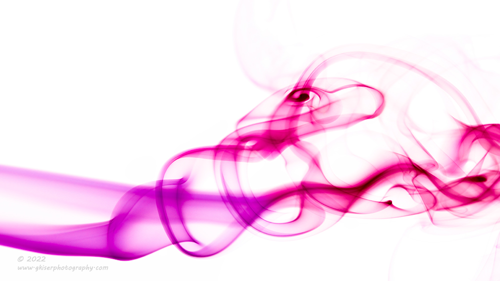
I’ll admit that it took me a little while to get into the groove of getting the smoke to react the way that I was wanting it to. I have tried a lot of things over the years from a card, to my hands, to blowing on the smoke. Each causes different results and I found that the more dramatic motions would make the smoke leave the frame entirely. It was just the slight waving of the hand that would yield the results that I was after. I started to click away and found my routine with the smoke. I didn’t both looking at the image review because I knew that I had the exposure set correctly and the rest was pure chance. I was looking to capture a bunch of options that I would be able to go through later and pick and choose the ones that spoke to me most. That is the thing with this kind of photography, you just never know what you are going to get, and I knew that most of what I captured would be trash.
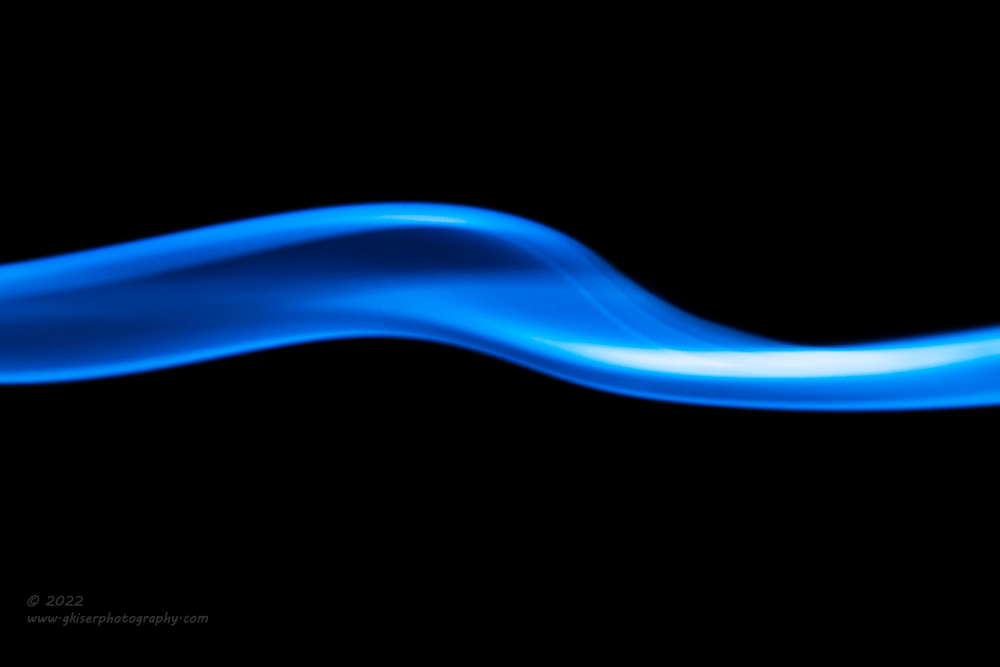
There were times when I would miss the movement either before or after and that would be an automatic delete as has been the case for each time I’ve done smoke photography. For some unexplained reason, while culling the images, I found a very simple line of smoke that nearly bisected the frame. There was a gentle curve to it and the structure appeared less like smoke and more like a sculpted piece of metal. It caught my eye, and it was the first image that I started to edit. I did my usual, playing with the colors and found that I really liked a deep blue hue to the smoke. The way that the smoke bisected the frame it reminded me of the thin blue line stickers that you see everywhere. That gave me the idea for this one. I flipped it on its side to make it horizontal and toned the blue to a stylized variation of that blue line and worked the shadows and highlights within the blue to give it shape and dimension. When it was all said and done, I saw it as perfect for what I was after. It kind of made me miss being a police officer…but only for a brief minute. It spoke to me, and I’m really glad that the direction of the editing went this way.
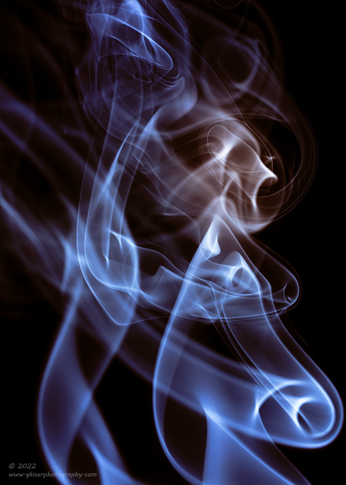
Further down the line of interesting shapes that I was pulling out of the mix was one that was generally quite busy. There wasn’t the structure there that I was after, but I liked some of the designs and I saw what looked like a skull within the shapes. This one was another interesting editing journey as I started off wanting it to be very cool in color tone to set a particular mood which worked with the skull. I guess I was kind of getting into the Halloween spirit with this one. It started out life as a very desaturated cool image with just a bit of highlighting done to the skull. The more I played with it though, the more I decided that it needed some color contrast. I didn’t want to do anything over the top here, but I wanted to counter the cool tones just a little. I isolated the skull and warmed the tones a bit and gave it more of a bone color. That forced me to boost the saturation in the blues to really make it work. When it was all said and done, this was one of my favorites of the day. It was also another example of just letting the edit go where it ended up without too much of a plan in mind when I got started.
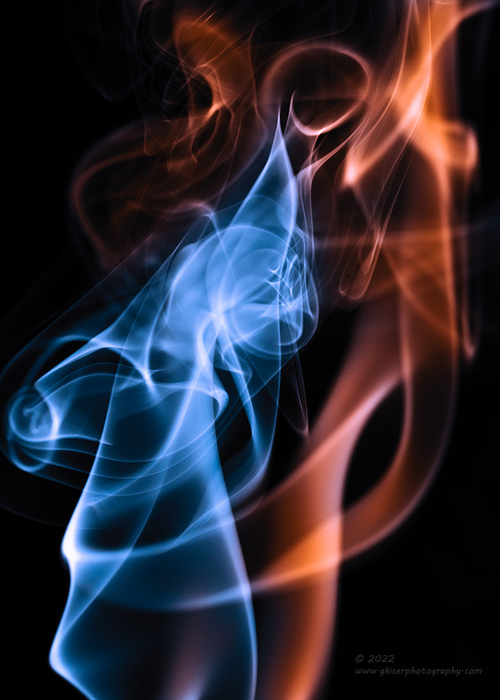
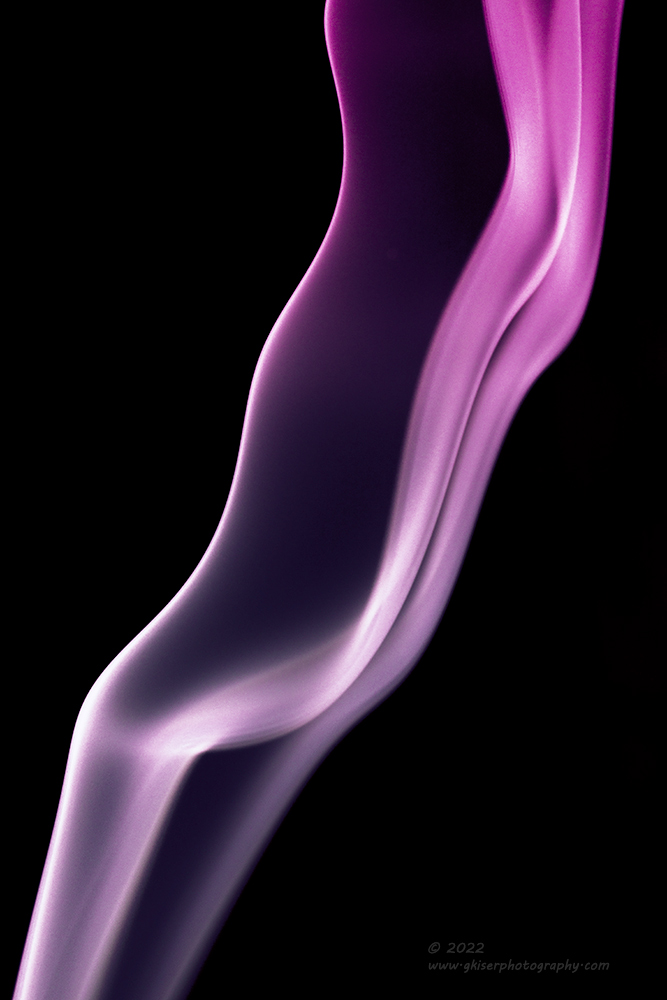
Another example of the editing going in a direction all its own was this next photo. I had picked it out because I could see the shape of a person with feminine curves in the background. I didn’t know if this would work or not, but it was interesting enough to start playing with. I found the crop that I liked which wasn’t much at all beyond changing the aspect ratio. I started to tweak the tonality of the image and then started to work on the colors. It was hard to pick out the human form, so I decided to brush in selective colors with warm and cool shades. I picked a more or less skin toned shade for the figure and had an icy blue for the abstract shape in front. Where the right leg would be I did a very light toning blending the two colors in a translucent style. Of course, I fully expect everyone to see this differently, but I have differentiated the shapes into two distinct forms through color which is pretty cool considering that this all started out with gray smoke in a totally random pattern.

By this time, I was getting a little hungry for a snack which might explain what was going on with this one. The structure was well defined and one that caught my eye during the culling stage. I wasn’t quite sure what it was going to be when it grew up though. I just started to work the tones which turned into working with colors. For some reason, I love to mix warm and cool tones with this kind of photography, and I started with the cool tones because they are easier to work with. When I landed on a blue that I liked, I was then pressed to figure out where the warm tones would go. As I looked, I could see an ice cream cone with soft serve ice cream. That kind of made the cone the part that should be warm. I started to work the colors and landed on a tone that was close to a waffle cone which worked well with the blues. Not wanting to overpower the cone with the blue hues, I added another adjustment to the top where I pulled most of the color out of the blue to have it go more of a white near the top. That balanced the colors quite well I thought and that was pretty much that.

Not wanting every photograph to be a mix of warm and cool tones, I decided that I would work some with an analogous color palette for a change. I love the cooler tones, but some of the more complicated patterns dictate the use of a more exciting color in the warmer ranges. That was what I did with this one. It was handled in much the same way as the others as I worked on the overall contrast and tones to start with and then colored it. I wanted a transition between purple to red so that I had a bit of coolness to the frame, but it was closely touching the warmer hues while staying close to the other tones. As I worked through this one, I started to see the story which had eluded me up to this point. I could see a figure with its head tilted back in exasperation with metaphorical flames coming from that head showing the anger. The colors, and indeed the transition fit that theme in my mind and I could see what this one was saying to me.
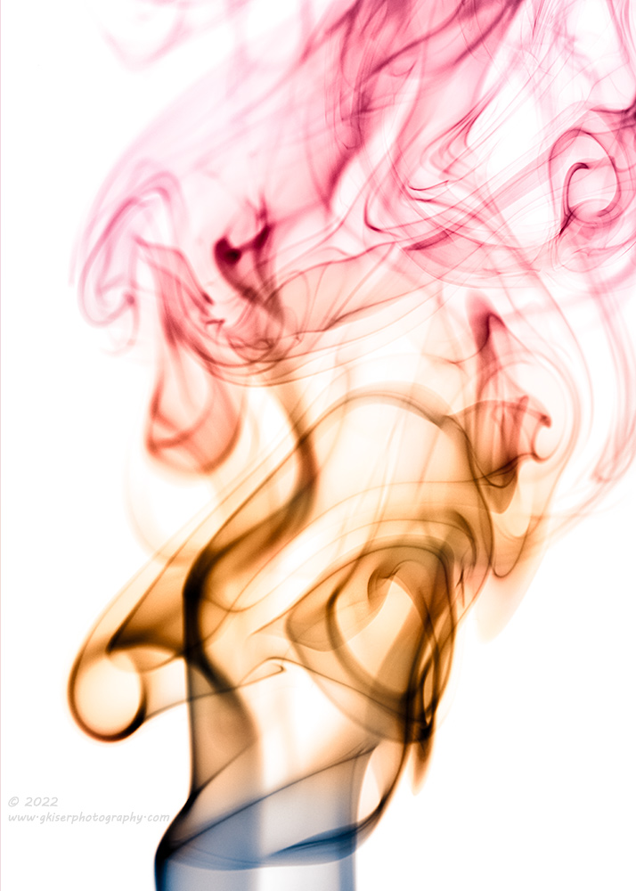
As I had done with a few others, I chose to edit this one in Photoshop next after the initial Lightroom edit was finished. Once I was in Photoshop, it was much easier to invert the colors and put the smoke on a white background. This allowed me to color the smoke differently and have it present completely different. I like the effect, but I do prefer these in low key on a black background for some reason. I think that the details survive better that way. I could still see the same story here, so I did the colors accordingly, but with more color contrast involved. This one was a bit more involved than the others that I had done this way because of how I wanted the colors to appear. I found it impossible with the hue adjustments to get the right colors, so I ended up doing layers of colors that I wanted and then blending the layers by color only and transitioning through a feathered brush. To be fair, this was the first time that I’ve colored an image in this way and it was easier than I thought. I’ve mentioned this before, but I am experimenting more and more with Photoshop for things that can’t be done in Lightroom and for a bit more creative variety. I still have a long way to go before I’m proficient with Photoshop, but I’m slowing adding to my toolbox for things that I can do.
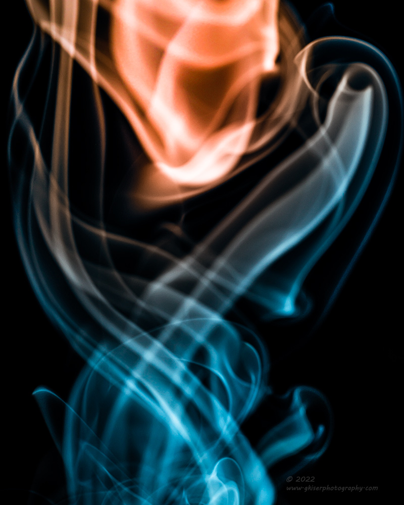
I mentioned earlier in this entry that I had about 20-30 minutes’ worth of time to work with the incense cone. I think it was just at 25 minutes before the smoke started to fade. It will go a while longer after that, but I can usually tell that the intensity of the smoke is changing rapidly after a point. This last photo was one of the last images that I shot. I could barely see the smoke in the image review and the histogram was mostly all dark at this point. The room was also filling with smoke to the point that everything was getting a little soft when it came to contrast and lines. The smoke itself was also not nearly as defined as it once had been. To make matters worse, my flash was running out of battery power, and I was missing about every 4th shot now due to recycle times. To be fair, I think that the last time I replaced those batteries was about three sessions ago, so they were due to die. I just kept popping in case something worthy came up.
I don’t know how worthy this last image is, but it was one that caught my eye for the accidental symmetry that it had considering that it was just a single stream of smoke. There was a cross of lines at the bottom that then went to frame what appeared as some sort of orb at the top. The exposure was very dark because the smoke was failing at this point. I boosted the highlights and even the shadows a bit, while dropping the blacks of the background. This gave me a reasonable contrast to work with and I started to play with the colors. I was going for a teal and orange effect with this one and I knew that the orb was going to need to be the orange. In order to get the colors the way that I wanted in terms of location, I had to create some multi-layered masks over portions of the image to get the color applied exactly where I wanted it to go. The result was one that I really liked but wish that it was shaper and had a better structure. The softness was due to the fact that the smoke was just about to fade out to nothing. I will say that I don’t think that I would have been able to get this image with the DSLR because it is not nearly as forgiving on exposure as the mirrorless camera is. I guess it was a good thing that I decided to do this session with the R5 as opposed to the 5DS R. Outside of the studio I still prefer my DSLR and will continue to use it as much as I can outside of portrait work.
I do hope that you have enjoyed this studio trek and test of some new equipment. Should any of these smoke abstracts speak to you, I would love to match you up with a print of your very own. There is just no better way to enjoy art than in a tangible form. If this type of photography interests you, but I’m not choosing the colors that work in your space, let me know. I am happy to do a commissioned shoot to create just what you are after. If this is something that you would like to learn how to do, I can cover it in my mentorship program pretty easily. I am currently booked on Advanced Mentorships, but I can still do by the hour sessions should you want to learn something specific. I expect that it will be after the New Year when I have another opening with my Advanced Mentorship which is a long-term arrangement that includes all kinds of perks.
Until next time…