Wednesday, October 28, 2026
Welcome back, it seems like just yesterday I was ending chapter 2 of this series. To be fair, I actually was finishing it up less than 12 hours ago. When I set out Wednesday morning, I had no intention of starting what would become a multi-part blog entry with anything like this amount of photos. Since I knew where I was going to be going, I had a pretty good idea that I would be looking at five or so keepers from the car based on that quick look that I was able to give it a month or so ago. Of course, I stopped at a couple of places on the way to my destination because the light was working well for those subjects and I figured it would be a good idea to get those obvious photos instead of hoping that the actual destination would work out. That is where the title of this blog series came from. I’ve missed out on good photos because I was focused only on getting to the end destination which turned out to be not so good.
My luck was a little different this time and not only did I end up with three keepers from those two stops out to the area of Winston-Salem, but I was also able to get the permission needed to work photos with the Impala that was parked in the driveway. After taking a few moments to critically look at the scene I was convinced that there was a good bit there to work with even though the light wasn’t really on my side. It wasn’t terrible, but it wasn’t what I had really planned on having which would have been thicker clouds and a bit moodier lighting. What I had was decently diffused light and the light on the car itself was clean and not dappled which was a good thing.
As you have seen from the last blog entry for this trek, things were working out quite well in practice. I had started out with my telephoto lens because of the close quarters that I was working in. This is a great lens for working isolations on cars, but the more I worked with it, the more I saw that I was needing something wider than 70mm which prompted me to swap out to my standard zoom. This change of glass brought new life to the session, and I started reworking other compositions that I had shot and found new ones that worked well with the wider-angle of view and ability to focus a bit closer.
During the time typing that blog, I took a break and went back through the photos for a moment to look at an overall shot that I had done of the car. While working with that, I spotted another one that I had dismissed after the first round of culling which was a simple composition of a front wheel. I ultimately ended up processing both of those photos as black and white images and added the wheel image to the last blog in the middle of writing it. The one that had prompted me to go back into Lightroom was reserved for this blog entry so that I didn’t end with two similar photos of the car. I also wanted to wait to see if I heard back from the owner about the issue with the tag being visible. I had sent that email right after I finished with the edits and while I was starting to work on the first blog. Here I am on the morning of the day after beginning this chapter and I still haven’t heard back from him, so I’m going to go forward with the photos as I have finalized them.
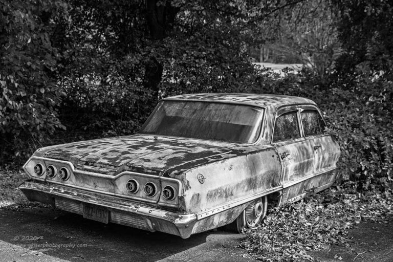
The issue that the owner had with me showing the tag was he didn’t want to have the actual tag visible with the car. While I have no issue with visible tags in photos, I respect his wishes, but the execution that he was suggesting was not something that would work for my photography. He implied to do the blurring, or the blocking with a brush stroke over the tag which you see all the time on social media. I’ve never understood the reason behind that, and this is coming from somebody that has had access to DMV records for two decades as a police officer. Now that I’m retired, I don’t have access to those files and even when I did, there were a lot of oversights and controls over what information was requested through DCI. That is a discussion for another day. What matters here was that the owner requested that his tag not be visible, and I did try to honor that wish.
I had tried several different techniques in post to make the tag less legible and had even waited for the light to cast a deeper shadow on the lower part of the bumper where the tag was. The tag was old and dirty which helped in that regard greatly as it was barely visible to my eyes looking at it. The camera captured a lot of detail though and with the exception of the first character, the tag was still visible. Nothing that I was doing looked natural and most of what I did turned into a distraction on the rear of the car. AI was going to be of no help because it would have gotten the bumper details wrong if I had removed the tag completely. Since my photography is all about capturing the subjects as they are, I felt that I needed to do this car justice and keep the tag like it was and as visible as it was in reality, so it matched the car. The compromise that I came up with was to swap a couple of characters around so that the tag was actually completely wrong for the car as far as what vehicle it was issued to. There is now no link to the actual car from the tag shown. I really think that satisfies the requirement of the owner and the creative direction that I needed this element to go in to suit the car.
This image which was shot with the wider lens and from a more elevated position shows a hole in the vegetation that I think adds to the depth of the scene. It shows that there is a world beyond the wall of greenery that the car is nosed into. It is just another layer of dimension over what had been captured with the telephoto lens earlier in the session. I could have done this as a color image and it would have worked out just fine, but I really felt that black and white added a certain quality to the scene. The car pops out more from the surroundings and it seems to have more character in this presentation. The color version was largely analogous in color palette and it worked, but at the same time seemed kind of mundane to me. Black and white gives the impact that I really wanted the image to have.
It was after that overall shot of the car that I decided on the creative crop that eliminated the driver’s side taillight and the tag from the composition. It worked out very well and I might like that crop better than the one that included all the information, but they both have their merits and I wanted to save them both as keepers. The order was a little off in how I’m sharing them because I didn’t want to have two photos in the same blog entry that might have to be changed or deleted once I heard from the owner. I’m still holding onto the last chapter for a bit longer before I publish it to give the owner time to contact me with any objections to the photo. In the meantime, I am getting this one started and will publish it tomorrow morning.
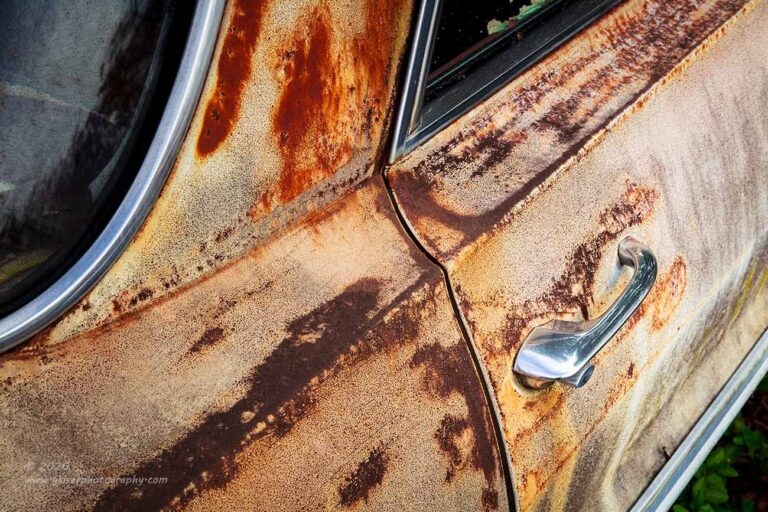
This gets us back on track with the photos in the order that they were shot. The next composition that I moved to was the passenger side rear door. As you have noticed in the past few years, I have started to be drawn to door handles on these cars. The chrome always works as a contrasting point of interest and that contrast is amplified when it is against the textures of rust. I like the shapes of the handles because as they say…they don’t make them like that anymore. I couldn’t just do a photo of a door handle though. I needed other elements to add to the composition which I found with the seams, moldings, and windows. All of these elements together make for a great study in shape and design. The rust and patina fill the negative space with tons of visual interest so there is something to look at through the entirety of the frame.
Photos like this are always a toss-up as to whether or not I do them in color or black and white. I liked the subtleties in the colors here and chose to go full color to really show off the patina to the best effect. I think it was the addition of the green vegetation just below the lower molding and the similar green in the side window from the peeling upholstery that balanced the colors out so well. The three dark areas that framed the photo seemed better suited to color for some reason as well. It is a simple composition but one that has always been very effective in my eyes.
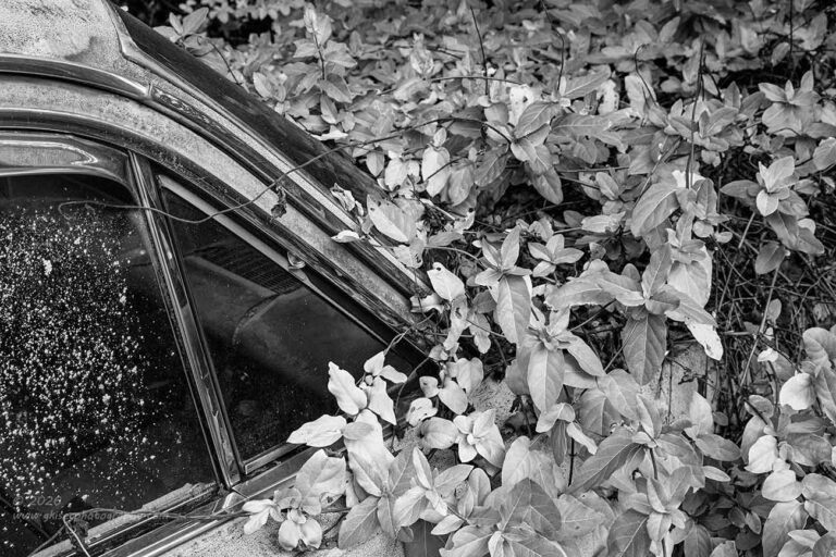
Speaking of the window glass, that was about all that could be seen around the front of the car on the passenger side. You will remember that part of what I really loved about this car I had first seen during that critical look that I gave it upon arriving. I had already photographed a section of the front of the car on the driver’s side which had much more of the car visible. Now, my attention was focusing on the more difficult portion on the passenger side. It was more difficult because the car was mostly lost beneath the vines and leaves. I didn’t have the patina or the panel lines to create a composition that defined the car. What was left was an A pillar and glass which brought you right to the vegetation. It was a composition that I haven’t had nearly as much experience with but decided to give it a try.
I focused on the pillar and the vent window primarily when it came to the aspects of the car. There was just a hint of the roof at the top, but the car was mostly identified by the glass and framework around it. The majority of the frame was filled with the leaves. Those leaves greatly overpowered the scene due to the vibrant green color when compared to the more muted reflected colors in the glass and chrome. Color actually got in the way of this composition and created a strong imbalance to the whole thing. By converting to black and white, I changed the visual weight of the elements and created a situation where the dark windows actually carried a good bit more visual weight than the color counterpart. There was a balance to the scene at this point, and I really liked the image which now focused on the contrasting textures.

I was getting into that groove of looking at things creatively and I started to get very comfortable with the car. I was finally really hearing how it wanted to be captured. I recalled a couple of years ago when I was photographing an Impala rat rod how I had framed up a vertical image around the rear wheel that had come out very strong. With a tree in the background of the car that was showing some fall color, I decided that I would give that a try here as well. There were some obstacles that I had to work through first though. Just above the car on the passenger side was a basketball goal that I didn’t want in the frame. Also, I was forced to shoot from the driver’s side because that side had the gas lid for extra visual interest, and the colorful tree was opposite of that. There was also the problem of the car being in shade on this side which was going to cause some pretty severe exposure issues with the background if I was to get enough detail in the car to make this work.
A quick look at the histogram after I got the composition set up confirmed that there was too much disparity between the light and dark sections of the image. I decided to add a 2-stop grad filter diagonally to control the exposure in the sky. This seemed to work, but when I shot the first test frame, there was still too much difference between the car and background. I didn’t want to lose the color or have the detail of the tree compromised due to an overexposed sky. I changed out the filter to a 3-stop which had a more profound effect on the scene and allowed me to just barely get all the information that I was needing for the image that I had in mind. I don’t use the grad filters that often, but they are invaluable during situations like this where things will move in the frame causing strong ghosting when blending an HDR image or blending multiple exposures in Photoshop. I much prefer to have the image look right without the anomalies caused by that kind of digital manipulation.
When I got the images home, it was the last of the four frames that I had shot that seemed to work the best. There was a little more light that was showing on the car due to how the clouds had moved which helped and the background was exposed well enough. I worked with the image for a little while and it all started to come together. There is no doubt that this composition works better with a two-door, but it was seeming to be effective here because of the direction of the tree branches in the background radiating from the rear glass.

I’m not sure why, but I was seeming to be drawn to the wheels on this car. There were only three of them that were visible, and all of them had the original (I assume) hubcaps attached which I thought was cool. I had now photographed the two wheels on the driver’s side and decided that it was time to work something out with the rear one on the passenger side which was the only one in good light. When I started to look around the wheel, I found some vines that added some texture and color to the scene which had nothing really do to with the car. I liked the counter point to the main subject and decided to make the wheel arch of the car more of a framing element than a main focus of the composition. The molding was used to create a triangle at the top right which stayed in line with the line of vines at the bottom. Everything framed the wheel cover which still showed the bowtie in the center. The colors here looked strong and I liked how they balanced with each other, so the image was kept as a color presentation.
This photograph would not have worked at all had it not been for the greenery at the bottom of the frame. It provided all the necessary qualities for this to work out. Had it not been for that bit of vegetation, I would have struggled trying to get a photo of this wheel even though it was in the better light. Light is just not everything in photography like so many claim. It is the compositional choices that are made along with the light that actually mean more to the end result.
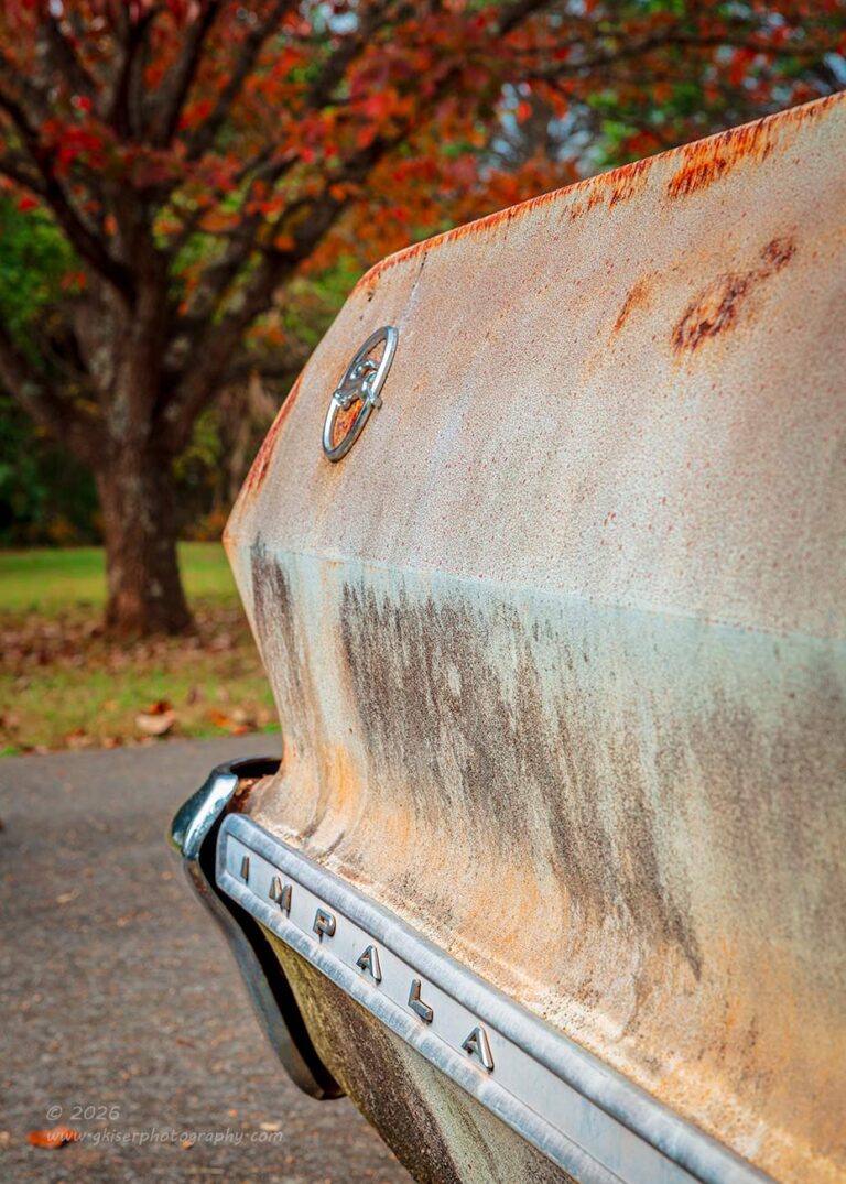
Something that I noticed while I was working with the rear wheel was how the tree in the yard seemed to follow the shape of the quarter panel. I loved the color with the red and orange hues that it gave off. That complimented the beige colors of the Impala quite nicely. It was also another chance to capture the lettering on the trim as well as the emblem that I have always found so interesting. The trick was going to be getting the composition right. I had to make sure that the tree and the car were close enough that the shapes lined up together. This put the angle kind of harsh to the side of the car which made the emblems a bit harder to make out. There was also the fact that just beyond the car on the other side of the street was a large sign for a neighborhood as well as a street sign. I wanted to have neither in the frame. This meant coming in a bit closer to the car which worked for the tree, but was detrimental to the emblems.
I worked the camera around millimeter by millimeter to get the best angle possible to satisfy all of those requirements. I finally landed on this view and shot three different frames with different depths of field and focus points. I wanted to have the car in sharp focus to help draw the attention to the emblems and texture of the patina. The tree needed to go soft so that the textures of the background didn’t overpower the smoother textures of the car. I just needed the tree for color, and as long as I could recognize the shape as a tree with leaves, I was happy to let it fall into blur.
For those that think that a blurred background is the domain of wide apertures like f/2.8 that is only a part of the story. This image was actually shot at f/11 at 70mm. The background has that very creamy bokeh that everyone loves so much, but thinks that it can only be had with a fast lens shot wide open. I could have done this at f/2.8, but that would have obliterated the background and left no real idea of what was back there. In addition, the subject would have been blurred too much in the foreground. By stopping down to f/11 and getting in very close to the side of the car, my focus distance was such that only the area right around that focus point would be in apparent focus.
If this sounds like something that you would like to learn more about, it is a topic that I routinely teach in workshops and mentorships. Since I’m not doing workshops at the moment, taking advantage of my mentorship program is the best way to learn from me in person and hands on. All it takes is a free, no obligation consultation to get started. During that conversation I like to make sure that we are compatible and that I possess the knowledge and skill to help you with whatever you are looking to learn. I don’t know it all and if I can’t reasonably help you achieve your goal, I will be more than happy to tell you that and point you in the right direction. If I can help you, I will work with you to put together a plan of action to learn the techniques or skills and then help you through it. It is all very centered around the client and is not based on a standard curriculum that was developed for the masses such that I had to do in my workshops.
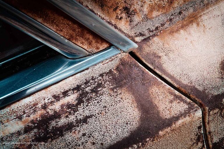
That was just a quick word from our sponsor for today’s blog…me. Now, we can get back to the photos from this trek. The next two frames that I shot were of the passenger side rear door and pillar. Of course, the photo would suggest that this was shot from the driver’s side. Well, I flipped the image in post since there were no identifying markings that would reveal that change. I did it because when I was framing up the shot, I was looking for an abstract study in shapes and lines. I knew that it would read better flipped in the other direction. So why didn’t I just capture the image from the other side and be done with it? Good question and there were actually two reasons that didn’t happen. The first reason was that the rust and patina looked more like what I was wanting on this side of the car. Secondly, and far more importantly, the light was better on the passenger side and that was very important.
I’ve done this kind of composition many times before, so there wasn’t really much need in lingering too long here. The only difference was a slight change in the framing between the two and it was the second one that was slightly better than the other one. The processing was the next portion of the puzzle and possibly the most important set of decisions that could be made for this one. I took complete control of the colors through one of my favorite color profiles and then built the saturation levels back up manually. The contrast is one of the features that I like about this profile for certain photographs as well. It really helped to establish the overall feel of the image and it became one that I really liked with a minimal amount of work done to it.

By this point, I was really starting to wind down when it came to creating compositions. I was starting to look back at areas that I had already worked such as the taillights. Of course, in my defense, these taillights were the reason that I started wanting to photograph this car in the first place. It was the third time that I had looked at them during this session, and I was wanting to create something else with them. I was looking for a strong black and white view of this portion of the car focusing on the shapes more than anything.
I looked at the views from both inside and outside of the lights and determined that what I liked the most was a view from the outside of the driver’s side housing looking in. Because of the way that I wanted the lines to go, I was going to be including the lettering of the Chevrolet nameplate much like the first shot that I had done of the taillights. The difference was that that first shot had been captured from the opposite direction and with a longer lens. I was now going to be introducing some perspective distortion to the scene, but I was still going to have to deal with those letters in very much the same way. My solution was the same as it had been before with the cropping point right after the V, which left the CHEV visible and that was enough to tell the story. I made one more change to those letters for this composition with a slightly narrower depth of field. This blurred the letters slightly, though keeping them sharp enough to read.
That depth of field choice also helped with another issue that I was facing with this composition. I didn’t want to deal with the tag again, and it was going to be included in the frame because of the angle that I was shooting at. The nice thing was that it was in deep shadows to start with. That left the tag very dark and it fit with the way that the light was falling on the car. Because of the composition, I didn’t need much shadow detail as I had in the other shots that included the tag. This time, I was all about high contrast and when paired with the shallower depth of field, the tag was completely illegible…much like my own handwriting. During the six frames that I shot, I elevated the camera slightly as well which increased the pitch of the diagonal aspect of the composition and that blocked the top third of the letters on the tag for an added layer of protection for the owner.
The final result of this image was something very different from the other views that I shot of the taillights. This had a grungy look that I really quite liked which was helped by the black and white with the tweaks that I made to the tones. There was a very nice presence to the photo, though I’m sure it will not be as well received as the color versions of the subject. It seems that folks don’t appreciate black and white like they once did, especially on social media. It seems that the current, preferred approach is highly saturated colors that punch you in the face. The black and white images as well as the more subtle ones seem to fall on deaf ears most of the time.
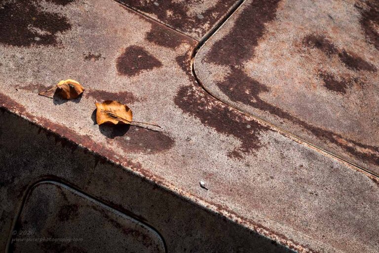
Speaking of subtle colors, the next and last composition that I shot of this Impala falls well within that category. The car itself was pretty much a reddish beige with more of the red tones on the upper surfaces. While looking for another abstract study in lines and shapes, I happened upon this area by the rear window at the trunk which included the gas lid. I liked the design and the textures, but the part that really spoke to me was the two leaves that had fallen on the car. Now, the leaves were roughly the same color as the car which was going to make for a bit of a difficult time to make them stand out. I could have replaced them with some brighter colored leaves, but that would have been cheating, and I don’t like to change the scene when I am photographing it.
What I chose to do was work with the contrasts that were there and treat the colors and saturation levels independently between the leaves and the actual car. I changed nothing about the scene and photographed it as flat as it appeared in real life. By adding the side of the car with the gas lid I was able to get some dimension which established the shadows under the leaves. There was also the added shape of the lid which brought about another layer of shape to the scene.
I shot three variations of the scene, and this is the second one that was captured. I looked at it as a black and white image, but there wasn’t enough difference in color tones to create the separation between the leaves and the car. With color selected, it was far too monochromatic for my tastes. I ended up using that color profile that desaturates the colors and changes up the contrasts. That gave me a starting point and from there, I masked the leaves and added saturation to them as well as just a touch of exposure with the black point dropped to compensate. This gave me just a hint of separation to the leaves and it became something that fit the vision that I had for the scene when I started photographing it.
After I was done with that composition, I noticed that my creative mind had pretty much shut down. I was finished here and didn’t even bother looking around the car for any more photographs. This is something that I am very used to in my creative process, and I don’t see it as a failure at all. I just recognize that my mind has satisfied its curiosity for the particular subject. After looking at my watch, it was a good thing that I was finished because I knew that the owner was needing to leave about this time. Since I was blocking his driveway, I needed to get gone and I still needed to break things down and store them back in the bed.
Once all of that was done, I was back on my way home. I had now shot 79 frames and had a total of 19 keepers from the day. It had been a much more successful day than I had expected when I had left the house some hours earlier. What I didn’t know was that I still wasn’t done with the day quite yet. I’ll get into that with the next installment, but I’ll let you enjoy the last of the Impala photos for now while I am starting to write the next blog entry which hopefully you will see tomorrow.
Until then…
Hold up, wait a minute, let me put some more Impala in it.

You know how this goes. When I end up with a successful trek like this, I will always end up adding some more photos by the end of the blog series. These are one that got eliminated during the initial culling process and then I will come back to them again before I delete all of the unused files to clear space on the hard drives. I’ve already added two new images to the collection in the form of the black and white photos that have appeared in this part as well as the previous chapter. Well, now that I am finalizing the Impala photos from the day, I happened to see one more that caught my eye a little differently this time. It was another side shot that I did with the car going into the brush which as I’ve mentioned really appealed to me. This composition omitted the taillights completely for the sake of capturing the lettering on the quarter panel and the Impala emblem. Both of these features were equally as interesting to me.
Now to give this image context in the timeline of photos, it happened just before the last photo that I had shared in this blog. It was towards the end of the day, and I was just experimenting with different concepts. As I was culling the photos, this looked like an experiment and I wasn’t really seeing what I had captured it to show. Now that I was looking back through the images I saw something more to this one which had gone unnoticed the first time around. Now that I was looking at it, I saw the emblems as being very important, but they would have to be massaged to get the visibility right. In addition, I really liked the bright orange tree that was showing through the hole in the vegetation above. I wasn’t all that thrilled at first by the roof showing of the neighbor’s house, but now that I was looking at it, it gave another layer to the setting that the car was found in. I liked it from a story standpoint.
Once I started to work through the processing, I started to really like the photo for what it was. It wasn’t a grand look at the car, nor was it an intimate look at the details, but it did showcase the trim and the current condition of the car as well as the location. There was a lot of story here and the perspective really showed the size of the car. That was amplified by the limited depth of field that was used to concentrate the attention on the emblems. It had that side effect of showing the depth of the image and giving a 3D view of the length of the car. It all just worked, and I felt that it deserved to be added into this collection along with all of the others.
What do you think, was it worth the addition and the five minutes it took to run through the editing of it?
Of course, that now brings my tally up to an even 20 keepers for the day up to this point with 17 of them being from this single car which I could only see a portion of. This is a great example of the power of really working a subject. I can get a ton of photos out of a single subject when I just let myself be free to do so. After all of this, what on Earth could I possibly have found next to work with?
Drop back by tomorrow to see how it all ended up. Those of you that enjoy my barn photos might be interested in this next chapter.
Until tomorrow….

Remember to use the code KISER10 to get 10% off your purchase