Tuesday, March 4, 2025
Welcome back! Here I sit on day two of what should have been a pretty simple outing, but after the weather turned out not as favorable and my intended location fell through, I was actually expecting only a few photos if I was lucky. I never would have thought that I would have had so much fortune at a place that I wasn’t even convinced I would be able to get enough to justify asking permission. Had it not been for the property owner already being outside, I probably would have passed this location by. In fact, I had passed it by on the first trip down the road. But you already knew all that didn’t you. I mean, you have read part one of this series to know how it all came to be….right? If you haven’t, take a moment and catch up. It is a short entry because it was late when I was typing it and I had to get up early this morning. I’ll wait while you skim how it all got started and will probably take a quick nap since I was up at 4:45 this morning (four hours ago at this point).
OK, now that you have caught up, you know that I went from walking aimlessly around looking for that low hanging fruit to deciding that isolations was going to be the flavor of the day. Once I figured that out, the compositions started to flow. I was looking for color, shape, shadows, and interesting features of the cars which were all kind of packed in tightly together. It took a little while, but soon enough, I was on a roll and was starting to see compositions where I had previously seen only complications to photographs. Essentially, I had been here long enough that I was able to listen to the landscape, and I was understanding what it was telling me. There were certain cars that really drew my attention. This was largely due to the colors that were present. It might be a nice green car with some reddish rust, or it could be a grabber orange Plymouth that just jumped out at. There were also a few blue cars which also paired favorably with the rusted tones made visible by age.

One of those blue cars was another Plymouth Road Runner which was parked in the middle of two other rows of cars. I can’t stress how difficult it was to get into position out here, but I was making it happen one car after another. As I looked over the Plymouth, I found that I was drawn to the colors mainly, so I found a spot where I could get an interesting composition to feature that color combination. It turned out that the best spot to work was the cowl area at the driver’s door. I liked not only the colors here, but the fact that the Road Runner emblem was still on the door and there was an inspection sticker in the windshield that had a simple “1” on it. By wedging between two other cars, I was able to get the angle that I needed to capture this composition and had it all framed up nice and neat.
It was at that time that the sun came out from behind the clouds and started to highlight this area of the car. That put a lot of the scene into shadow which wasn’t too terrible, but the direct sun on the top of the door was hitting the most faded paint and creating a long highlight along the door. In order to expose that properly, I was losing the rest of the scene. I liked the composition and the colors enough that I committed to this and decided to wait for the next bank of clouds to roll over the sun.
I must have looked up at the sun a half dozen times or more trying to determine how much longer I was going to have to wait. It felt like an eternity but was actually only about seven minutes or so. When the clouds started to cover the sun, the lighting intensity changed up quickly and started to pulsate which allowed me a lot of different options as to what quality of light I wanted for the actual photo. It turned out to be the last of nine frames that worked out the best with just enough sun to saturate the colors and give a little shadow under the side emblem for depth. It looked fantastic on the back of the camera, and I knew that I had a winner. In fact, when it came time to start the processing on the photo, there wasn’t much that I wanted to change about how it looked. The edit was done in just a couple of minutes which was a testimony to how good the light was for that moment.
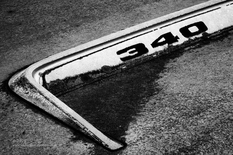
When I was finished with the blue Road Runner, I decided to pick up my bag and move to the other side of the lot to see what was waiting for me over there. Keep in mind that the first time that I had walked through this section, I had seen nothing that I wanted to photograph. Now that I had changed my ideas of what would make for a good photograph, I was looking at these cars with a fresh eye. The first one that caught my eye was another Road Runner, but this one was a later body style, possibly a ’72. It was painted green like the first Road Runner that I had started working a little while earlier. What drew me into this one was the chrome bumper around the grill and headlights, but I wasn’t quite sure how to photograph that just yet. The second element that caught my eye were the scallops on the hood which were very characteristic of the car and still had the motor designation decals on them. I played around with the angles and came up with one that I thought was dynamic enough to work well for the car.
Since most of the hood was green around this area, and there wasn’t much contrast with the colors, I decided that this was going to be done in black and white. This would allow me to amplify the slight variation in tones for a more dramatic presentation. By tweaking the contrast levels, I was able to make the scallop jump away from the hood and further highlight the 340 ci decal. Just including a single bend in the scallop gave the image just the right look for what I was after.
As an added bonus, there was an area where the water had pooled over the years that was darker than the rest which gave a nice triangle to the composition. These are the little things that I like to look for in my photography. If I do it right, nobody actually notices, but the composition becomes more pleasing to look at on a subconscious level. I just needed to figure out how to do the same thing with the front of the car.
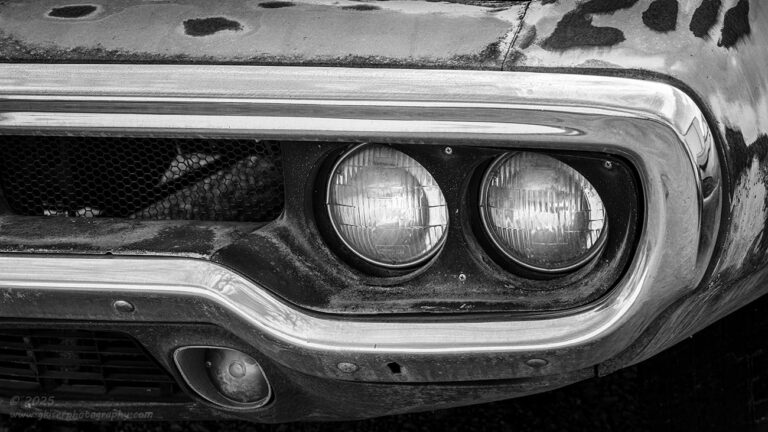
It was the front that really captured my attention. I loved the shape of the chrome bumper as it framed everything up front. The turn signals and lower grill were placed just under a character line that had been added which I’ve always thought was a very stylish choice. Looking at the front of the car, the paint was pretty much pea soup green which was not all that pleasing to look at and with the blue reflecting off of the bumper, the color combination didn’t really work for me. There was also no way to get the whole car in the shot because of the neighboring vehicles, and if memory serves, there was a boat nearby as well. If I did the expected top-down quarter shot, the photo would be more hood than anything with the design and recessed headlights. It just wasn’t a flattering angle for this car. It was meant to be viewed from head on, and down low. That was how I needed to shoot it.
After some playing around with ideas, I decided that I would go with a 16:9 aspect ratio to emphasize the shape of the chrome which was my primary subject. I would let the fender and trim between the bumper and hood act as a framework while I let the turn signal and lower grill frame the bottom of the composition. In order to make this work, I had to step offline to the right slightly so that the fender would bulge out enough to allow me to omit the parking light. It was then all about dropping the camera to give me the overall look that I wanted. I kept it just high enough to give me that breathing room between the bumper and the hood, so I didn’t introduce another panel line into the composition which would have complicated it more than I wanted. Like I said, it is the little details that pay big dividends.
The final part of the puzzle was to do this as a black and white. I had already decided that the colors didn’t really go well together and since my main focus was the shape of the chrome, it was much easier to make that jump out in black and white. It all worked out quite well when I started with the processing. I just had to pay particular attention to the different contrasts and to make sure that all the tones existed well in the same space.
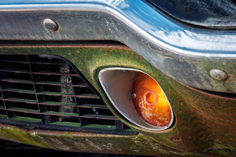
Since I had spent some time getting to know the front end of this car, I found that one aspect that I really liked was the character line that the lower part of the bumper formed as it was making room for the turn signal and lower grill. I wanted to capture this aspect as well, so I started to figure out a composition around these elements. By reducing the number of elements in the scene, I was able to form a very simplistic composition that focused on just the important elements.
One thing that I really liked about this section of the car was that it had not been nearly as bleached over the years and the green was a bit more vibrant. It was also full of chips and specks of rust which helped to balance out the green. The turn signal was a brilliant orange when the exposure allowed for it to be, and that color worked with the green and with the blue that was reflected in the chrome. With all of this in mind, I decided to make this composition about the colors and really emphasize them in the frame.
It was not a composition that I would have normally done, but for this car in these conditions, I really like how it turned out. The lens for the turn signal seemed to have a glowing element inside of it since I was able to greatly increase the exposure time with this all being in the shadows. That increased time really brought out the colors of the lens and make it look like it was lit from within. I did add a bit of intensity to it in post, but the beginnings of the look were already there in the RAW image.
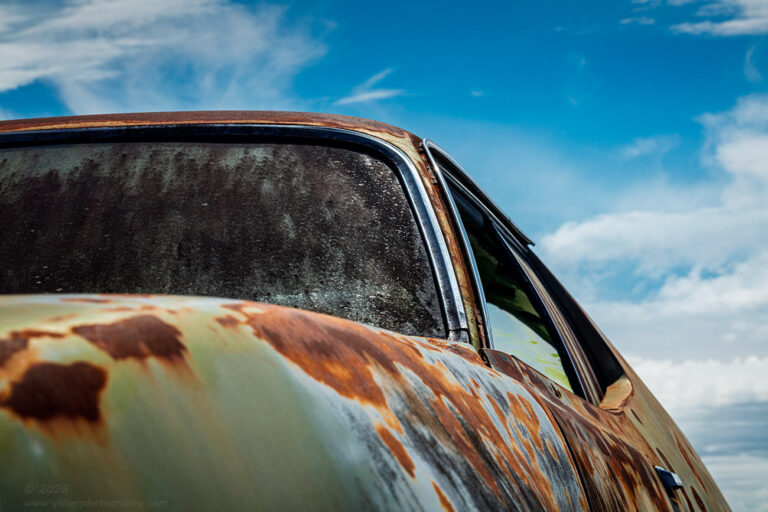
Now something that I started to take note of while I was kneeling right on the ground was how the sky looked around the large body of the car. There was something sleek about the shapes and I really liked the way that the sky looked. Something that I miss when shooting isolations is the way the sky looks. I’m always looking for cloudy days when shooting old cars, but unless I am shooting the entire car, the sky is rarely in the photo. Here I was looking at something that excited me and told more of a story than I would have thought. I needed to capture this real quick.
I moved the camera slightly so that I was able to get a good line on the side of the car while shooting up and beyond it. The exposure latitude was rather wide, but I felt like I was going to be able to capture it all just fine. Once I had the base composition figured out, I twisted the polarizer to add as much contrast to the sky as possible as that would help even out the exposure overall, as well as giving some nice and rich blue hues to go with the rusty patches and the faded green.
With the different ratios of colors in the scene, the colors were working out much better than they had when I was trying to figure out the presentation on the front of car. The larger area of blue provided a much more balanced color palette with the green representing a smaller area and with more rust being visible. It just made sense here and I saw no reason to change from a color photograph for this composition.
There were three exposures made of this composition with slightly different shutter speeds for each of them. I was trying to get that right balance in highlight and shadow by pushing the exposure as far to the right as I could before losing detail in the clouds. I went until I was a 1/3 of a stop overexposed based on the highlight warnings, knowing that I could recover those since the histogram was showing no clipping in the image playback. It helps to really know your gear when faced with challenging exposures like this.
It all paid off, and the last of the three frames was the keeper for this composition. It made it through the first round of culling because I was surprised that it worked out. By the second round of culling, I was starting to really appreciate what had been done here from an artistic standpoint. When it came time to see how it looked after processing, I was quite fond of the photo because it captured something that I thought was very characteristic of the car, but in a very unique way. The way that the colors looked almost reminded me of color photos that I have seen of B-17s during WWII and there was a certain quality of flight that was added to this car. I think that was probably the aspect that I loved most about this composition. I had taken a car that was completely unable to operate anymore, and I gave it a whole new life, and one that it would have never had experienced. It was airborne for the briefest of seconds…1/10 of a second to be precise.
Once I came back down to earth, I had to check out the Olds 88 that was parked next to it. By the looks of the rear tires, this had been a drag car at some point but was largely stock looking from the outside. It still wore a pretty decent paint job for the time that had passed, but the light blue didn’t really pull my attention because the chrome on it tended to blend in because of the blue sky. The part that I really did like was the front grill with “Oldsmobile” stretched across between the headlights. While I had been working on the Road Runner, I started formulating a plan to get a composition with the grill.
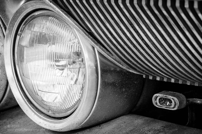
My first thought would be a cheater pano between the inner lights with the text down at the bottom of the frame while the swooping grill filled most of the frame. The scaling was off for that though, and the top and bottom edges were way off from where they needed to be. It wasn’t even possible by eliminating all or a portion of the inner lights. Because of where the car was parked, there was no way to get a full frontal shot of it either. I played around with ideas and eventually decided that I would be able to grab one of the lights and pick out the letters O, L, D, and possibly S to make a statement within the frame.
This worked out compositionally and I formed a workable composition that spelled out “Olds” which would key the viewer into what kind of car they were looking at. While the composition was workable, it was not all that strong. I fact, it felt kind of flat, so I decided to reevaluate my choices. In order to get the grill at all, I was going to have to include the letters as they established the depth. The headlights gave a sense of scale that I thought was needed. I just had to figure out how I was going to include fewer letters in the composition and still have it make sense. I’ve realized this about myself over the years; I don’t like including partial badges in photos unless that partial grouping of letters makes sense to the composition. The OLDS composition made sense, and I could have even cropped it down to just simply OLD if needed. OL, or OLDSM wouldn’t make any sense. However, the single letter “O” could work.
Now here me out, the headlight was round and comparatively larger than the emblem. By including the light, I would have a repeating shape within the composition with the little O. By working from an angle to the driver’s side, I could get much more of the grill in which was now a diagonal which showed the depth thanks to the headlight housing. All of this framed the little O, and I couldn’t help but find the humor in the term “little O” and felt that this composition made sense as well as being more in line with proper scaling of the elements.
Of course, with there being no color except for reflected colors around, I had no want to make this anything but a black and white image. It was the contrasts that shaped the scene and established each element. The little O was framed by darkness, which in turn was framed by different types of brighter elements. It all just worked together, so much better than my original attempt at the concept of the composition.
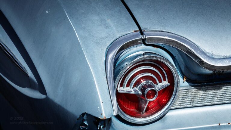
The front of the car wasn’t the only aspect that I liked about the design. The rear of the car was also quite futuristic and something that I had enjoyed photographing before. The last time, however, there was a lot of rust and a trunk emblem to work with. This time, all I had was a taillight, and some chrome on a light blue car. I liked the shapes around the taillights though and I stuck with the idea for a while. Without a bumper to complete the shape, I was really having to focus on the curved chrome above the light. On the passenger side, there was a piece of chrome missing which eliminated that side as being workable. The driver’s side was still there, and as I was looking, I noticed another aspect that I liked. There was a good bit of shading on the sculpted quarter panel that added some depth and interest.
Once I noticed that aspect, I started to frame up a composition that included that bit of sculpting that pointed to the taillight which then brought the attention to the swooping chrome. The composition worked great with the shading. However, when I looked through the camera in black and white something was missing. My eyes didn’t do what I wanted them to do. I needed that red lens to really pull the eyes where I wanted them to go. The problem was that the chrome and the blue paint were very similar in coloration which I didn’t think I would like. However, I needed the red, so I was going to have to deal with the blue tones which did balance the color palette quite well.
What I ended up doing in post was to desaturate the chrome a bit to give it a little bit of contrast to establish it as a framing element for the photo. I think that the image worked out quite well thanks to the shading on the quarter panel as that gave depth and dimension to the composition that was otherwise lost. The red lens pulled my eyes right to where I wanted them to go, and I understood the image. I would have loved for the bumper to be a part of the scene, but that wasn’t in the cards. Without the bumper, there was a lot of distraction beneath the light so, that had to be omitted through composition and aspect ratio. The portion of the car that remained established the design features that I wanted to highlight.
Working with a pale blue car on a sunny day wasn’t all that exciting for me, and had it not been for the design features of the car, I would have bypassed it totally. It was the rust and the textures that made me enjoy this type of photography, so my next subject was one of the more crusty examples out there. It was a rare Ford Starliner, which is something that I don’t get too many opportunities to photograph. Sadly, this car was afflicted by the same problems that the other cars had. It was jammed in with way too many other cars that didn’t add to its story. Once again, I was left focusing on isolations which wasn’t too terrible on a car that was one of the higher end trims for the time. There were lots of little details on the car that made it special.
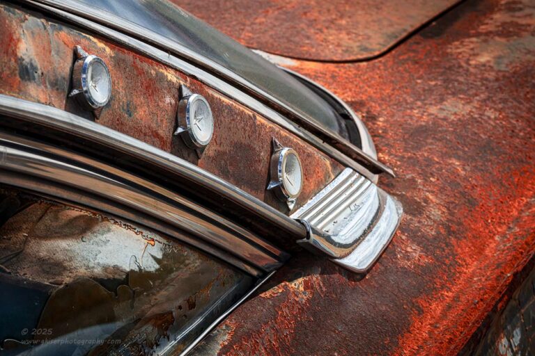
The first thing that I started looking at was the emblem on the driver’s side front fender. Unfortunately, it was broken and read “Starli” if I’m not mistaken. The last part of the word had been broken off and as I mentioned before, I don’t like including partial nameplates unless the inclusion serves a purpose for the story of the photo. In this situation, it did no such thing. As I continued to look around the car, I noticed the trio of badges attached to the rear pillar of the car right above another bit of chrome trim. When I took into account all of the rust that surrounded this area, the composition just begged to be shot.
I looked at it from both ends and decided that shooting from in front of it worked the best and harnessed the lighting the best. It was a pretty straightforward composition and a variation on one that I have shot many times in the past. This one was a bit special because of the extra trim that is usually not present on these pillars. I felt really good about this one when I was done shooting it and that feeling was confirmed when this frame passed through all of the culling stages and ended up being processed.
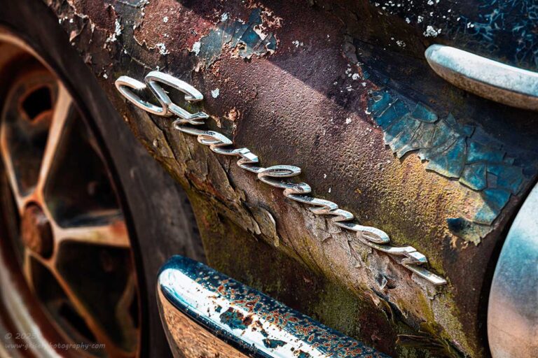
Before I gave up on the Ford and went to something different, I took a look at the other fender to see if there was an emblem there. As a matter of fact, there was, and it was complete. The lighting was also quite a bit better on this side which surprised me. I was really thinking that this side would be in total shadow, but there was sunlight raking across the surface from directly above. This gave some fantastic modeling light which highlighted the different curves. This was going to be my corner, so I started to frame up my standard composition that included the headlights and the full front wheel. It all worked together but seemed like something that I had done too many times before. That was probably because I have done this composition many times over with similar cars. What made this one unique was getting lost in the scope of the composition. The solution was to really dive in and focus on what I liked about the scene.
In an odd turn, I eliminated the headlights and just used the bucket trim to help frame the photo. There was a bit of chrome above the headlight and the bumper below that provided a perfect framework for the complete emblem. I happened to notice that the wheel was of a star shape which I thought helped tell the story that I was after, so that wheel became the framing element for the left side of the photo. I let the emblem remain very diagonal due to my shooting position and found that it was in a great position in the frame based on how I had established the framework. It fell right into the line of the golden mean which I thought worked nicely for a composition like this.
With that composition done, I had now shot a total of 73 frames for the day. It was a lot more than I had anticipated from this property when I had started walking around looking for subjects to shoot. For the first time, I was starting to wonder if I was going to be able to get through of all these and do a blog before it was time to get to sleep. Well, since you read the first part yesterday, you know what the answer turned out to be. What you don’t know is if I am finished with this trek or not. I had been out here about an hour and a half at this point, but if you will remember, I walked through a collection of cars on the way out to these that were in the gravel lot. I still hadn’t shot any of the cars from that first portion.
The day was still very much continuing for me. However, I feel that we all deserve a break before I bring it home with the next entry. To this point, I have 15 keepers from the day which really is incredible considering my first and second opinions of the cars here. Even my trained eye had not seen all the possibilities that could be found driving by and even walking through. It was the much-needed adjustment to my creative thinking that unlocked the real potential of this place. I’m glad that I noticed the property owner out and about because that was the deciding factor in me stopping here at all. As I was talking to him, I wasn’t sure if there would be anything at all worth photographing, but it was an easy ask and even then, I thought it was worth it. Looking back on the day, I honestly couldn’t have asked for more, even in the bright light, I was having a great time and finding some remarkable images. I still think that the best are yet to come. Stick around and you can be the judge of that statement.
Until next time….