Thursday, July 30, 2026
Welcome back! It seems like just yesterday I was telling you about how a sunny day around noon is a terrible time to be a photographer and nobody with a camera should be out in those conditions. Well, here we are in chapter two of this saga from Outlawed Restorations which pretty much illustrates that good photos can be had in that most terrible set of conditions. While these are not my favorite conditions to work in, I am able to harness the sunlight and have found it to be beneficial in some situations when photographing rusted cars. It does seem to add some depth to the patina as well as super saturating the colors which can make for some very nice photos in the end. The tradeoff is that I’m much more restricted on directions that I can shoot in and even what subjects I can work with.
For instance, there is a Ford sedan that I love working with at this property, but it sits under a tree. During sunny days, especially when the sun is high up in the sky, the car is in full shade while everything around it is bathed in bright light. This always causes problems with the overall exposure because for the car to be exposed correctly, the background is blown out, but to keep the background right, the car looses detail. I can’t really do this as an HDR image because the shade would no longer translate to the viewer and the image would look wrong. Therefore, I just don’t photograph that scene when the sun is harsh like I was dealing with on this particular trek.
There are other situations where the bright sunlight brings out compositions that I wouldn’t normally get to work with on cloudy days. Shadows that define shapes and add dimension are a powerful thing in photography and something that I do look for when I am out on a sunny day. There is a little more creativity that goes into seeing these compositions, but the reward is that those compositions aren’t visible without the bright sunlight.
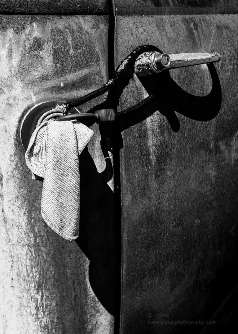
That is where we pick up on this trek. I had finished working the back side of the property where I had started off photographing Stitch parked in the garage as well as a few other vehicles parked along the tree line behind that barn. Now, I was starting to spread my wings and move through the more open parts of the property. Right in the middle was a Chevy truck that had recently been moved beside a Chevy sedan under another tree. This truck was mostly in the sunlight and that gave me some really nice colors to work with. I spent a few moments to look around to see what I might want to photograph with this subject. The first thing that caught my eye was the fact that the fuel filler neck was plugged with a rag. This is pretty standard and I’ve seen it before many times. However, there was also a bungee cord that was looped around that neck and holding the door handle. I’m assuming this was the high-end security system that had been employed on the truck to keep the door from opening up. The whole thing was interesting and I started to look deeper into the scene.
What I found while looking was the shadow that the sunlight was casting under the door handle. The rag was also showing a shadow which added to the visual interest. No longer was I looking at a fuel filler and a handle. The bungee cord and the associated shadows started to create a shape that blended the individual elements quite well. As I began to think about the framing of the scene, I realized that the wide-angle lens that I had on was just not the right choice for this shot. I went back to the bag and swapped out that lens for the standard zoom which would give me the proper framing that I needed here.
With that lens in place, I started to look at things as a horizontal composition, but that felt too restrictive with the rag and its shadow dangling vertically. The seam of the door was also a strong vertical component which just would look better with a vertical framing of the photo. After flipping the camera on its side, I was able to get the shot. There was only one frame captured of this scene and without any ideas on how to improve it, I moved on to find another composition on this truck.
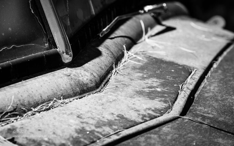
Thinking about abstracts, I was drawn to the area below the windshield of this truck for the next photograph. The angles of the body panels have always interested me and provided some great patterns to work with. This all centered around the vent that was positioned at the base of the windshield. There were pine needles that added to the textures that I was seeing and I thought ramped up the abstract end of things. I started to figure out a composition that would work and quickly found that the standard zoom didn’t have the reach that I was needing to get the framing right.
It was back to the bag once again for another lens swap. This time I chose the telephoto lens which would give me the right framing. This was also a lens that I routinely used for this kind of photography after learning how to really use the focal lengths that it offers. The reach was the biggest benefit for this composition because I needed to get in close to the vent to get the photo framed up. This lens allowed that reach, but I was just about at the minimum focusing distance for that lens. I could have gotten the shot easier with the standard zoom but wasn’t able to get in close enough with it to frame this exact composition without having the camera suspended over the hood rather than off to the side on the tripod.
I was eventually able to get the framing that I was after and started to make a couple of exposures. Once I figured out the depth of field that I needed, I was pretty happy with things, but I felt that the wiper arm was turning into a distraction the way that it was right at the edge of the frame. I needed to change the scaling of some of the elements within the frame and that was done by elevating the camera. The wiper arm was still near the edge, but it had a bit more breathing room, and the base of the arm was much further away from the edge now. With the depth of field figured out and the composition dialed in, I got the image that I wanted on the fourth exposure.
As with the previous image, I chose to make these black and white because the predominant color was that rusty red which looks great when paired with other colors. When it is alone in the frame, it is a little too intense. By removing the color, the viewer is left to appreciate the textures of the rust and the different shapes. The shadows are also more meaningful in black and white, so both of these benefited from the removal of the color so that I could really focus on the tonality and contrasts within the scene.
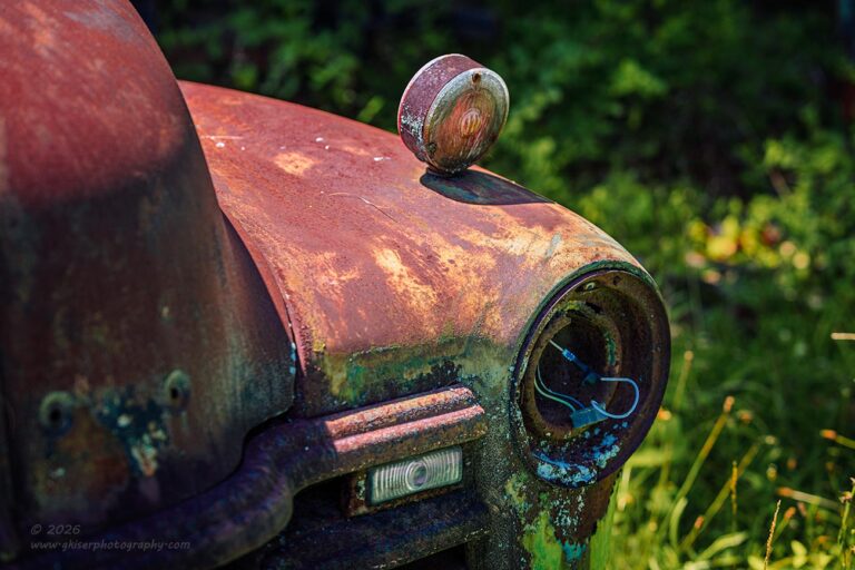
I wasn’t quite finished with the truck though. I still wanted to get something with the front of it. It was the way that the sun was raking across the top of the fender and leaving the front of the truck in shadow that drew me in for this next composition. Instead of doing my normal shot from the outside looking towards the center of the truck, I switched it up and moved to the center and shot out towards the grass. This allowed the fender and headlight bucket to provide the shape of the photo while the grass gave plenty of depth to the scene.
While I have always enjoyed working with the lights on these old vehicles, even when the light is missing, I have changed how I like to capture this part of the car over the years. Once upon a time, I wanted to keep the frame filled with nothing but the car which meant shooting into the vehicle to get the side of the fender, the lights, and a portion of the grill and hood. These days, I like to show the environment of the vehicle a little more. It helps to tell more of the story, and I think makes for a more complete photograph. In the case of this truck, it allowed me to really explore the shadows and highlights that the scene had to offer.
Those shadows and highlights offered up their own difficulties though. I was dealing with two very different color temperatures in the scene. The shadowed areas were very blue because of the light reflecting off of the sky. Where the sun was hitting was quite warm and that was causing me a problem with making the scene look balanced. This is where the human eye is a wonderful thing. While looking at a scene, our eyes and brain will constantly adjust the colors based on the lighting so that we don’t actually notice the change. The camera is dumb and can’t do that. It captures a single frame, and the colors are rendered based on the white balance setting in the camera, and it is a global thing.
In order to combat this, I will set the white balance to the existing light for the main subject. In this case, it was set to sunny because the main subject of the scene was what was in the sunlight. This brought cooler tones to the shadows and caused them to be very blue and magenta in contrast. I knew that I was going to have a time in post with this one, but it looked too good to pass up. There ended up being a lot of split toning with this photo to get the colors closer to what our eyes actually would be seeing in these conditions. I think that this one took the longest to process and I had to do more adjustments here than the others. The end result is pretty solid though and I’m happy that I stuck with it.
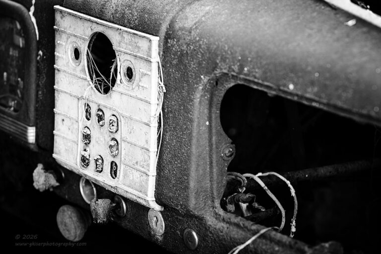
The simpler option would have been to make it black and white, but after trying that, I realized that a good part of the story was centered around the colors which meant that I didn’t want to lose that aspect. Every photo has its own considerations, and I look at each one individually based on what I want to achieve with the photograph. For instance, let’s take a look at this next composition that I shot. It was time to move on from the truck, and I chose to move my attention to the sedan that was parked in front. This is a car that I have photographed several times over the years, and it makes for a great source of isolations.
The lighting was such that I didn’t care for the look of the car overall and there were a lot of distractions around out which meant that I was looking for details once again. The outside was kind of bland with no trim on it and a pretty uniform rusty coverage. It was the inside that grabbed my attention this time. I was looking at what was left of the dash and unlike so many of these cars that I photograph, the dash was actually in pretty bad shape. There was one aspect that really caught my attention though, and that was the button panel in the center between the glove box and the instruments. The buttons were all corroded away and there wasn’t much identifiable about the piece, but it was lighter than the dash and stuck out to me. Of course, there was also the aspect that it wasn’t a large TV monitor that every rolling computer…I mean new car has on the dash. This was one of those tactile panels that had buttons and mechanical connections. That interested me greatly.
I started to look for a composition that would work. There wasn’t much to work with on the dash, so it was all a game of positioning and use of negative space to define the actual important areas. I ended up firing off two frames here with slightly different depths of field to make sure that I just had the part that I wanted in focus while the rest of the frame went soft. Between the two frames, I was sure that I had what I wanted.
When I got the images home, I chose the second of the two and started the processing. The colors weren’t working for me because everything was largely that rusty red tone and it was overbearing in the image. The red also set the wrong mood in my opinion so I chose to go with black and white for this one. That was when the entire photo came together. I was able to change the tonal relationships between the panel and the actual dash. While there hadn’t been much difference between them in the color version, I was now looking at a much higher contrast version of the scene which I really liked.
The black and white treatment added to the abstract feel of this one and I felt that the entire scene just got better without all the color. That was one visual clue that I just didn’t want in the frame because I wanted more engagement from the viewer who was looking at the image. I wanted there to be more questions than answers. You can tell that the dash is rusty because of the textures. Had I left the color, that was what would have identified the dash as rusty, and the textures would have been insignificant to the scene. For me, the textures define every surface here and were just so much more important to the overall scene.
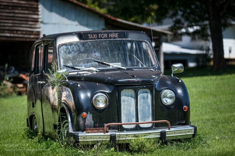
Now, the next subject that I chose to shoot was completely different in terms of what I felt made for important aspects. A couple of years ago, Dean had a client of his drop off a Winchester cab which was made by Ford in the European market. It needed a little freshening up, but it was largely in pretty good shape. When it got there, I wanted to photograph it because it was a unique piece and something that I will probably not get too many chances to photograph. However, it really didn’t fall into my decay style with very little rust thanks to a fiberglass body. It was also painted black which is one of my least favorite colors to photograph. Additionally, there were distractions in every direction which were very difficult to compose around.
I had worked with this car for a good deal of time during one of the last workshops that I taught here because the participants found it very interesting, as I did. We tried a number of different ways of capturing it and ended up working the details more than anything. It was a rainy day which helped with the black paint by adding some dimension to it with the water on the surface. I even got a few photos of it, but nothing that I was overly thrilled with. I still needed to get an overall capture of this little car if no other reason than I knew that Toni would think it was the cutest thing ever.
That became my mission at this point. I wanted to get an overall establishing photo of this English cab. I was still using the telephoto lens which might seem like an odd choice for some. It was the exact opposite of what I had recommended during the workshop because I was teaching to use the wide-angle lenses to minimize the background and potentially hide it all behind the car. Now, I was looking at things completely different. I wanted to include the background as a part of the story. I didn’t want to see the cab just sitting there all by itself. A cab was meant to haul people, and people exist in structures. There was one angle that included the barn and the house in the background which I felt was going to be the right choice.
How I handled these elements was going to determine if the photo worked or not. By getting a good distance away, I was able to compress the scene and include just sections of the barn and the house in the background. By limiting the depth of field, I was able to have the car jump out from that background. The blurred structures became just a hint of human activity while the cab was in full focus for all the attention. The grown-up grass around it told another part of the story and the really tall weed along the side of the passenger fender added just another layer to that story. I had the human aspect that was needed for the subject and I had the element of neglect and decay thanks to the immediate surroundings. The car itself had also started to show more signs of age which worked well in conjunction with the rest of the frame. When it was all done and said, I had a photo that I felt was pretty successful in capturing what I was after.
Unlike other photos in this blog, the colors were very instrumental in telling this story. The colors set a bright and cheery tone with the blues and the greens giving a calming look to it all. That mood would have been totally lost in black and white. The way that the black paint reflected the blue from the sky added that cool tone that I wanted. Sometimes that works to my advantage, other times, the cool tones become a distraction to the overall photo. That was a decision that I was going to have to make for the next set of images which were all going to be isolations within the body of the car.
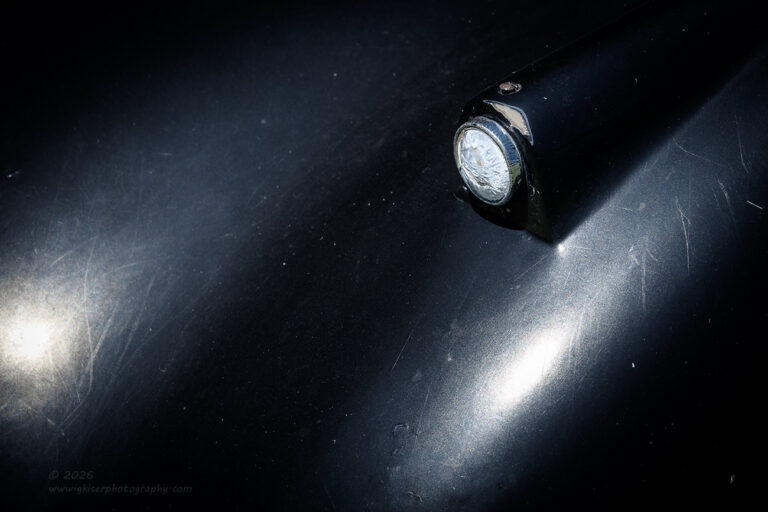
The first thing that I chose to focus on was the little marker light on the top of the fender. It was small and largely unobtrusive, but I noticed that there were to areas of glare from the bright sunlight. This was another one of those examples where the sunlight provided elements that just were not there otherwise. I started to look at the way that things were coming together and worked out a composition that was anchored with the marker light but included two areas of glare from the sunlight. The polarizer was twisted until I had the right level of contrast within the scene.
This image could have easily been done as a black and white photo because it was all about a white lens and white glare on black paint. However, that black paint was still reflecting that blue from the sky which essentially made this a blue canvas to work with. The blue was a calming color, and I thought that it set the right tone for the image that I was looking for. The decision was easy to leave this in color because of that mood that was set. That would have been lost in black and white, and even though the color was subtle, it was an important element to a very minimal scene.
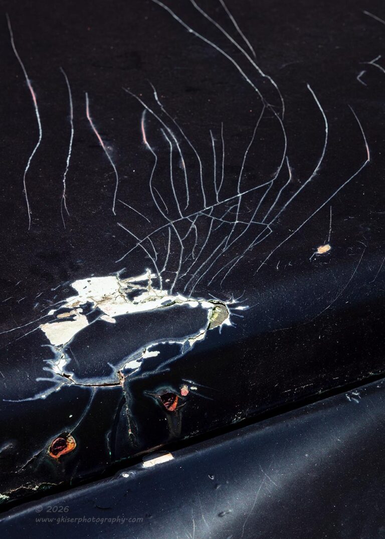
The next area that I chose to focus on was right on the side of the hood where there had been an emblem of some sort. There were two holes where screws or pins had been inserted into the hood. Just above that was an area where the fiberglass had cracked and then there were associated paint spiderwebs from that bit of damage that looked really interesting. It was the contrasts that drew me in for this scene. The white color beneath the black paint just really highlighted the damage and the cracks. My first thought was to make this a high contrast black and white, but there were a couple of things that shifted my thought process. first of all, there was the warm rusty tones of the holes that balanced out with the blue in the paint. That blue set a nice mood for the image as well. The colors, while not instrumental to the scene still added a quality that increased the level of interest that the photo possessed, so the colors were left in the photo.
The composition was one that took a bit of work to figure out. I really liked the way that the paint cracks were radiating from the point of damage, but I also liked the slight glare that showed the shape of the fender below the hood. With a bit of tweaking with the polarizer, I was able to get that glare to just the right level to add to the composition. For it all to come together, I had to go with a vertical orientation which was the most effective way to include all that I liked while keeping the photo concise.
I really liked the end result here and it has a certain cartoon character aspect to it with the cracks looking like dramatic hair on our hero. There is no real sense of scale unless you know what the holes are for. This really amps up the abstract qualities of this image which was exactly what I was going for. None of the elements would work alone in a photo, but together, they all combine to create interesting shapes, textures, as well as depth. It is just a fun photo to look at and explore even though you have no idea that you are looking at a cute little English taxi sitting next to a barn beside a large firetruck. Such is the beauty of these little isolations when done as abstracts.
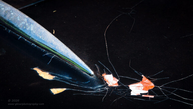
My next composition was very similar to the previous in that it was based on cracks in the paint on the hood. This time, I chose to work with an area next to one of the hinges. The hinges were chrome which reflected a good bit more of the surroundings than the black paint. These hinges were also long and pointy, so when I saw that one of them was pointing right at some heavy paint chipping, I knew that I had something to work with. There was more color in this area between the chrome hinge and the ruddy brown primer, so I was pretty sure that this was going to be a color image from the start.
It was the composition that I needed to figure out. I didn’t want it to look like a picture of a chrome hinge because what I was mostly interested in was the cracking on the hood. The hinge was just a supporting player to get the eyes to go to that area. With the hinge being chrome, I knew that it was going to be the brightest part of the frame which would make it a very dominant element. I wanted this only for the purpose of directing the eyes, so I positioned the hinge on the upper left portion of the frame to grab the eyes like an arrow pointing down to the cracks.
To further accentuate the cracks as the main subject, I went with a 16:9 aspect ratio that removed much of the negative space and concentrated the attention to the lower right quarter where the hinge was pointing. The end result was a much more effective roadmap for the eyes to follow through the frame. There was still negative space which made the hinge act more like an arrow pointing to the cracks and keeping the attention lower in the frame. The colors were again important with this one for the combination of warm and cooler tones. The primer drew more attention because of the warm tones and the fact that I bumped up the saturation which pulled the eyes from the brighter chrome, but with reduced saturation. All these little visual tricks are designed to keep the eyes going where I wanted them to go within the frame.
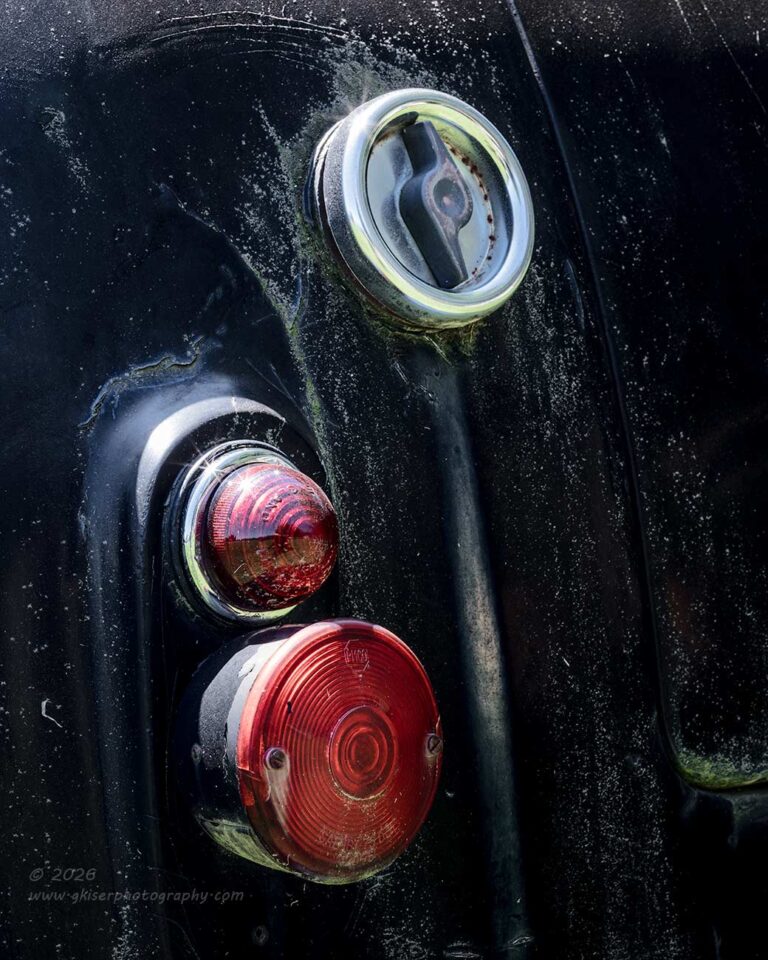
With my work on the hood finished, I started to work my way around the rest of the car. I ended up at the back of the car around the taillights. This is an area that I had tried to work before, and I am pretty sure that I worked through some ideas for compositions during a workshop here as well. I had not been able to find anything that I really liked before, but something seemed different today. I’m pretty sure that it was the addition of more dirt on the rear of the car as well as the staining below the fuel filler. Those extra elements gave a bit more interest to the scene, and I felt that it was worth trying for a composition here before moving on to something else.
Instead of looking at this from straight on, I moved off to the side and allowed the curve of the quarter panel to become an element as well. I made sure that the lights were not organized a straight line but had a diagonal element to add. The fuel cap was positioned off to the upper right as a visual anchor to the whole image while the lights framed the staining running down the flat surface. the seam for the trunk gave a bit of a framing element to the right side of the image to complete the composition.
It all worked together quite nicely and was another image that I preferred in color for the contrast in cooler tones in the paint to the warmer tones of the lenses to the taillights. Even the hint of green worked well in this composition for a little more color contrast. I only shot two of this composition with slightly different focal points for getting the depth of field where I wanted it. That became the last image that I shot of the cab, but I still wasn’t done with the day.
At this point, I had captured a total of 42 frames since starting, and with these nine additional keepers, my total was now up to 15 keepers which was quite impressive considering I was now working right around noon on a cloudless day when no photographers should be expected to work. I’m still not done either, so keep your eyes out for the next installment that will either be out tomorrow, or I might wait until after my next Behind the Camera which is scheduled to be published tomorrow morning.
Either way, I’ll be back here tomorrow with another blog entry, and you will see the conclusion to this one soon enough.
Until then…
 www.singh-ray.com
Remember to use the code KISER10 to get 10% off your purchase