Wednesday, April 15, 2026
Welcome back to the blog! I really shouldn’t be talking about a trek today. It was very sunny, with no real clouds in the sky. I didn’t really have any idea what I wanted to shoot. The biggest thing on my agenda for the day was getting the truck warmed up so that I could do the service on it which would only take a couple of hours. I guess I was motivated to get that done after watching Sierra do her own oil change and tire rotation without any help from me yesterday. I kind of felt like I had missed out on all the fun watching her wrench on her car. I just needed to drive around 150 miles to get to the mileage for my service. I tried to get Toni to let me take her to work which would have accounted for roughly 80 of those miles and would have kept her from having to drive since she wasn’t feeling all that great. She didn’t want to let me drive her because she is stubborn and independent. Don’t tell her I said that….K?
With the idea of heading out to Yadkinville before sunrise, I naturally thought about places that I could go with the camera just in case the light was good. Looking at the weather, there wasn’t going to be any clouds of consequence, so I wasn’t really thinking a colorful sunrise. Actually, I was thinking about things that I could shoot in the full sun, or that maybe could benefit from some long shadows stretching across the landscape. Nothing was really coming to mind as I was thinking about it. However, Sierra and I ended up going to get Toni from work yesterday afternoon because she didn’t feel comfortable driving herself home. While going there, we passed a location that I am kind of familiar with, having passed by it several times while taking Toni and during a few treks in the area. It is a metal building that has two firetrucks parked on the West side wall under the overhang. One of the trucks is from the late ’50’s it appears and the other is much more modern but still outdated for being a current piece of equipment. I’ve never seen anyone around the building and one of the sides of the parking lot is always coned off. There are no signs to say what it is, but I’ve taken notice of the older truck because of the patina on it. There is still some red on it, but a lot of the truck has seen the red paint chipped away and some of it faded to white. It is interesting to look at, but not really something that I actively thought about photographing.
That is until now. Knowing that I would be out there possibly in the morning, I could make use of the shadow of the building to keep the light even on the truck and instead of capturing the entire truck, I could work on some abstracts. This is something that certainly fits into my goals for the year and I could see some potential with details and abstract compositions. I just needed to know more about the location to see if it was something that I could access the property or if I would need to find an owner. Looking on the maps app on my phone, I found the location and found that the business was actually a museum that was used as event venue. This would explain the old trucks on the side and the fact that during the days there is nobody there. I imagine that they do more business in the evenings and on weekends. With that in mind, I figured that as long as the parking lot wasn’t completely coned off, I should have no problem accessing a public area.
I had a potential subject in mind and I knew when I would be able to go and capture it. The only problem was that Toni didn’t want me to take her to work. I asked when she got up, and when she declined, I went back to sleep. When she left, that was when I wasn’t able to go back to sleep and went ahead and got up. I took care of my morning routines which included checking to see if the government had taken their slice of the pie out of the bank account for taxes. Yaaaay taxes!!! After I got everything handled with the office stuff, I went back upstairs to look at the weather. It was clear outside and the light looked pretty good with the low sun. Since I had nothing else going on for the day, I decided to get that 150ish miles on the truck so that it was ready for the service and hopefully get a couple of photos that I could work on later in the day to round it all out.
I think that I left around 7:30 which put me arriving at the location shortly after 8am. When I got there, the one side was coned off as usual, and the other entrance was opened up. There were no signs indicating that I couldn’t be there, so I pulled in to get a closer look at the firetruck. It was pretty much as I had visualized it in my mind as well as from Google Map Street View. The light was coming down on the other side of the building which left the subject in full shadow which worked well for what I was wanting to do. I just needed to see if I could get any good photos of this truck. I parked my truck out of the way and got out to look around the firetruck to see what caught my eye.
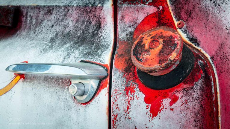
This was not one of those subjects that just got me excited to see, so it took me a while to warm up to it. I have an interesting relationship with emergency vehicles. After working as a police officer for 20 years, seeing this type of vehicle will often create a bit of anxiety for me and it will put me in a frame of mind that isn’t usually conducive to creativity. That part of my mind gave me a hard no for the newer truck while I felt that I could spend some time with the older one. I just took my time around it and tried to listen to what it said as far as how it wanted to be photographed. It was not a quick process, but it didn’t take a long time either. The first thing that I spotted that was interesting was the fuel filler near the driver’s door handle. This is an area that I’ve photographed many times on trucks of this generation and that was a good place to start.
With something in mind, I went back to the truck and pulled out the camera. I went with the telephoto lens because I really didn’t want to include any of the background which was pretty much just a red metal building that added nothing at all to the firetruck. The long lens would allow me to really pull out the details that I was wanting and hopefully allow me to get some abstract views of the truck as well. I went ahead and added the polarizer as well so that I could control the contrasts and any glare that might pop up. With that, I went back to the truck and started working through the first composition.
I liked the idea of a horizontal frame for the shot because it would be a great way to include both the handle as well as the fuel filler. I worked out the composition so that I didn’t get the mirror bracing to the left side while still keeping just a bit of the yellow stripe that was leading right to the door handle. In the original composition, I had a small portion of the window included in the upper left corner, but decided to go with a 16:9 aspect ratio instead which cropped that glass out leaving a much more simplified composition.

It wasn’t a fantastic composition by any stretch, but I did like the textures that it captured. I decided to work with another view of the scene and see if I could get something a little more direct. Since the handle gave more clues to the scene than the fuel filler, I decided to concentrate on the more abstract part of the scene. By flipping the camera into portrait orientation, that element was isolated along with the body lines. I really liked how this was going and changed my angle slightly so as to bring in the door seam to match up with the body line to the right of the fuel cap. This gave a teardrop shape to the scene that I really liked. The lines framed the gas cap, and the textures and colors became the main focal point of the photo.
I think that this is much more effective than the previous one, but I think that they both have merits which is why you are seeing them both as keepers. In the first one, I kind of like the idea of the frame being divided by that door seam with both sides very different from one another. That juxtaposition gives that composition a little more visual tension and a bit more dialog for the eyes to work through. In short, that photo will keep a viewer involved a bit longer than the more direct shot that followed. However, I do like the directness of the vertical image that allows the viewer to fully appreciate the textures and the way that the colors have aged on this truck. Which version is your favorite?
That first compositional concept got the ball rolling with this truck. I started to get into the mood to shoot these isolations and began seeing other points of interest that I could work with. The next thing that interested me was the side of the hood with the F-750 emblem fitted right underneath of the yellow stripes. There was also the turn signal that was on top of the fender that was rather interesting as well. Looking at all of those details, I started to formulate a plan for a composition. Usually when I am working with this area on a truck, the metal is all rusted and there is a lot of patina to work with. In this case, the majority of the scene was white and there was no real rust to speak of. There was just a tiny bit of red and that yellow stripe for color. The rest was pretty much a blank slate.
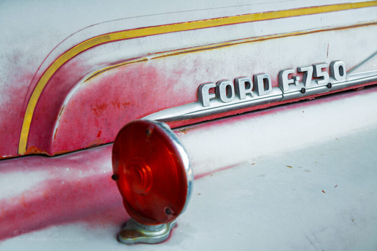
I knew that negative space was going to be a thing with this photo and I planned for it from the beginning. I needed a flow to the elements in order to have the negative space make sense and look purposeful. The body lines on the side of the hood provided a framework for the yellow stripe and there was a thinner stripe of rust that kind of looked like a smaller version of that upper stripe. The Ford emblem was placed between those two stripes and the lower edge of the hood matching up with the straight part of the striping. I knew that I wanted that to be done as a diagonal element but needed to find a creative use for the curve in the stripes to the left. That was where the turn signal came into play. Since it was roughly the same color as the red on the truck, it complimented the color palette nicely and the curve matched the curve of the stripe and body line. In order to simplify the scene, I wanted to keep the curve into a straight line theme going which meant that I was going to have the emblem intersect with the light. This gave the illusion that the line continued in the same fashion for both elements in the frame.
Yes, that was a lot of thinking for something that looks so simple, but the last thing that I wanted to do was create distractions and extra elements in the scene. Normally, I like to have my elements separated, but had I done that with the light and the emblem, the shape that they created would not have existed. If that were the case, there would be no visual link to the stripe, the body line, and the bit of rust on that body line. I needed that repeating pattern, and by letting two of the elements come in contact with each other, I succeeded in doing just that.
As I had expected, there was a lot of negative space in the image with the top of the fender being white. The lower right corner was pretty much devoid of visual interest, but that pushed the eyes to the shapes that defined the main elements and the visual flow of the image. The last bit of creative thought came into play with the depth of field. Had I done everything in focus, I was afraid that the emblem would have gotten lost in the mix since it wasn’t a vibrant color like the reds and yellows. Since I just needed the shape of the light, there was nothing that said that it had to be in focus, and by letting it blur just a little bit, I would be able to show depth in the scene which was something that I determined was needed here. With the focus firmly on the emblem, the attention still goes right to the lettering which was my main element in the frame. The shapes just frame that and provide the visual path through the frame.

I was really starting to get into the groove with this truck by this point. I hadn’t really been here long, but in the time that I had been shooting, I was starting to understand the firetruck and was beginning to see the beauty of it more than thinking about the calls that it had gone on in the past. I was now ready to get serious with the compositions and really dial in the abstract work that I was wanting to do with this subject. It was the front of the truck where I turned my attention next. I caught myself before I did anything with the headlights since that was something that I have done plenty of in the past and there wasn’t anything particularly interesting about these headlights. For me, the interest was below the grill down at the bumper. Now how many times have you known me to get interested in a bumper for a photo? That is usually something that I add in for framing purposes if at all. This time, I was being drawn to that bumper.
The questions started to pop into my head as to why I liked the bumper. The rust was looking nice on and there was a lot of texture. There were two large hooks on the bumper that caught my eye as well. I think that it was the hook more than anything that created the visual interest, so that is what I started to focus my attention on. There was no way I was going to have a photo of a hook though. There needed to be something else in the frame to add to the interest and the story. This was where the power of “And” came into play. Just above the bumper there were three holes in the lower portion of the fascia which showed nothing behind them. It was that round void in the holes that got me thinking about the hook and I saw a connection in the shapes. That was going to be the basis of the composition, it was just a matter of figuring out the organization of it all at this point.
Unlike the photo of the hood before, I needed to have separation between the hook and the circle openings. This was handled by the height of the camera as well as the angle I was from the bumper. The idea was to keep everything diagonal for some visual drama while the hook anchored the entire scene. The more I played with the composition and did my little dance to get the camera in the right spot, the more I liked the photo through the viewfinder. When I was finally happy with the layout of everything, I switched over to live view and looked at it in a larger format.
I really liked how it looked, but it was off balance. There were a lot of colors with the rust and patina of the bumper and the hook while the front of the truck was just white. That made everything just too heavy at the lower left corner for me. I knew that the composition was solid and I didn’t want to mess with that any. Instead, I decided to go with black and white so the photo was all about dark and light with the darkness providing a solid foundation for the brighter elements towards the top. Once I switched over to black and white everything started to look even better. The composition was stronger without the color and I was sold on this one.
Now that I have had time to properly process it and do the black and white conversion the way that I wanted to, not just looking at a preview based on the camera’s processing, I have to say that I really love this one. It accomplishes everything that I wanted it to while remaining very much abstract. There is nothing at all that I would want to change about this one and if I had stopped right now, I would be very happy with the effort that it took to get here and get started. Of course, I wasn’t done just yet and I was just getting warmed up.
Since I was at the front of the truck, I started to look at the wheels on the front and saw that they might make an interesting abstract in black and white. After looking at the front wheel for a bit, I decided that there wasn’t enough depth to that one and the one at the rear looked far more interesting. That was all that it took to move to the rear of the firetruck to start looking at that back wheel and how I could photograph it.
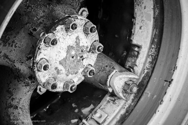
Photographing wheels is not something that is foreign to me. I’ve done it plenty of times on trucks, cars, tractors, and even an airplane. Had it not been for some uniqueness on these wheels I probably would have foregone them in the spirit of doing new and different things and finding different ways of seeing. I did like the rear wheels on this truck and started to work out a composition that I liked. Not wanting to go for the straight on shot of the wheel, I looked for an angle that created some nice shapes as well as some depth to the scene. Of course, the hub was going to be the central element and the visual anchor for the entire thing.
What I decided on was using the rim of the wheel as a frame work while the angle of the camera pushed the hub to the upper left of the frame. There was a lot of the rim to the right which balanced out the hub nicely while there was only a sliver of a rim to the upper left which just closed in the composition quite nicely. I left the angle in a way that there was just a single spoke that stretched out to the rim which filled the repeating rings with a different shape to break them up. The rest of the spokes just created mass in the frame that gave dimension to the overall composition.
This was one of those that I had seen in black and white before even thinking about the composition on any real level. I still had the camera set up to show me black and white which was the perfect starting point for this composition. It allowed me to really understand the luminosity range of the different tones that I was capturing which got me thinking about how I was going to process the image. What you see here is pretty much exactly what I saw when setting the image up and it came together just beautifully.
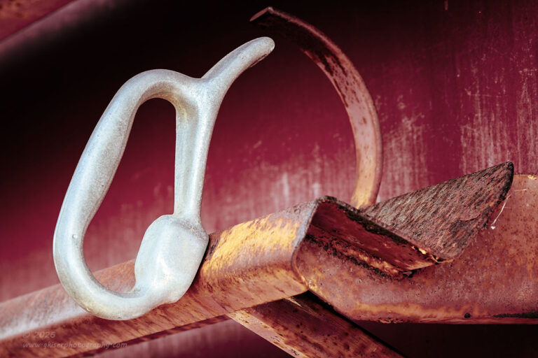
Confidence was starting to take over, and I was starting to really see the benefit in doing black and white photos with this truck since there was so much red with it. It gave me a chance to really focus on the shapes and textures which was what I was truly after with this subject. I pretty much left the camera set to a black and white picture style for the rest of time that I was out here. For the next composition that I worked on, I looked at the hose carrier on the driver’s side. One was filled with a large hose, but the other one was empty and that was the one that drew my attention. I liked the contrast of the handle and how it arched to the strap on the inside of the shelf. This was going to be the next composition that I worked with.
I got down low so that the lines would no longer be horizontal and I could bring some diagonal elements into the frame. It was looking so good in black and white with the shape of the handle dominating the scene. The shelf provided a foundation for the composition, and everything started to fall into place rather quickly. It wasn’t long before I was getting very excited about this composition and really started to fine tune the framing in the camera. There was so much preliminary work on the composition that I only needed to shoot two frames with slightly different depths of field to make sure that I had what I wanted when it came time to process the photo.
When I got home, it was the one with a shallower depth of field that I liked the most of the two. Now, since I shoot in RAW, the photos load into Lightroom in full color with the Adobe color profile assigned to them. I saw a lot of red as I had suspected and why I wanted to do this one in black and white, but it seemed to hit me different seeing it in color. There was a good bit of contrast to the scene thanks to the yellows and oranges on the shelf as compared to the reds on the side of the truck. The handle was still the raw aluminum looking color which contrasted nicely with the warmer tones. It worked as a color image, and maybe even better than it had as a black and white.
That was how I ended up processing this photo and tried to work it out so that all of the subtle contrasts were capitalized on. The yellows and oranges were really brought out to contrast with the reds, and it all seemed to come together quite nicely. Looking back, I don’t think that a black and white rendition of this composition would have been nearly as compelling. The idea for doing it in black and white was certainly not wasted though as we will see a little later on.
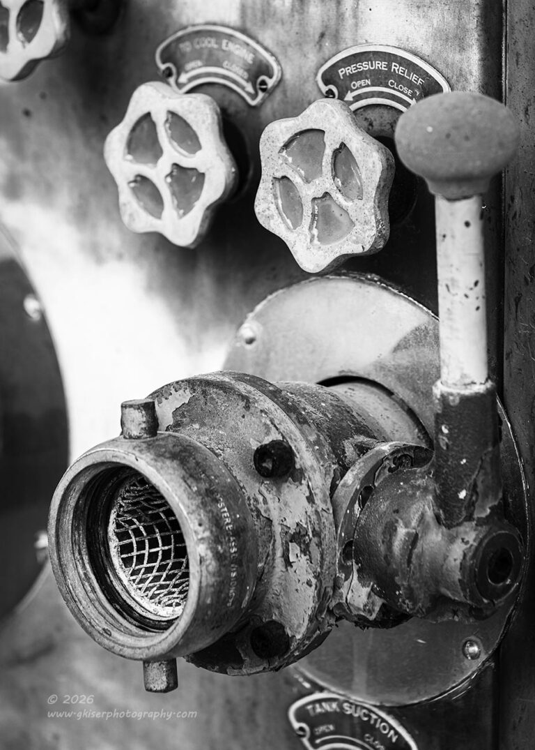
One area of the truck that I had spotted from the road that I wanted to work with was the pump gear on the side of the truck. I knew from experience with the White Firetruck that is at Outlawed Restorations, I enjoyed photographing those details. This truck was both easier to work with and harder at the same time. The easier part came from the fact that there were just more controls and attachments to choose from when it came to compositions and elements. What made it harder was pretty much the exact same thing. Having choices is nice, but with so many choices all jumbled together it became very difficult to gain separation between elements. With no separation, creating a visual pathway through the scene was much more difficult. Having labels on all of the controls also created some creative difficulties for me.
The right thing to do was to think simple and identify elements that I wanted to capture. From that starting point, I would start to build a composition and a story around that element. The first thing that I chose to work with was the input fitting for the water to fill the tank. I liked the filter that was at the opening and the whole unit protruded from the side of the truck for some added interest. From there, I started to build a composition that made sense. There was a control lever that I felt needed to be included in the composition which necessitated the inclusion of two knobs above the valve. In order to keep the main element from being crowded at the bottom of the frame, I had to include the label that indicated what the device was, though I had to creatively crop that element to keep from having to include yet another element.
In order to keep the attention on the fitting, I chose to reduce the depth of field to keep the focus on just that fitting and valve letting much of the rest of the scene go into blur. I was able to keep the labels readable which I’m actually happy about, but the majority of the background goes very soft which keeps that attention where it needs to be. There was actually a lot of thought that went into this composition and by the time I was done with the fine tuning, I made one exposure before looking at it in the image review with the zoom turned on. I wasn’t able to determine any way to make it better, so that one exposure was all that I captured.
As with the last photo, when it came into Lightroom, it was in full color, but unlike the last one, the colors way overpowered the composition, and I didn’t like it at all. I knew that I had really enjoyed it in black and white, so it made it through the rounds of culling to be edited. The first thing that I did with it was to convert it to a suitable black and white profile that started to bring in the contrast that I was after. Once that was done, I saw the potential in the scene once again and proceeded with the full processing with just the right amount of contrast being added to the frame to bring out the areas that I really wanted to focus on. It turned into another one of my favorites from the day and I think that I did a great job at managing the number of elements that I had to deal with in order to get the framing that I wanted.
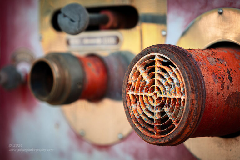
I was enjoying the challenge of working with the pump gear on this truck and moved to the next area that interested me. This time it was what appeared to be a breather of sorts with a very rusted grill on the end. I really enjoyed the textures and the fact that it looked like a RADAR scope in a lot of ways. This was a bit more difficult to come up with a composition though. There wasn’t much to this main element short of it being a tube coming out of a fitting on the side of the truck. There wasn’t much in the way of structure or visible interest associated with it. I didn’t want to just capture an image of the grill on this thing, I needed there to be a story with it, or at least some other supporting characters in the frame.
Moving from side to side and trying different angles, I decided that not only was the light better when photographing the scene from the right side, the background elements seemed to be simpler as well. There was another fitting just beyond my main subject with a lever above that. There was another fitting just beyond that point as well. Wanting to keep with the rule of odds, I wanted to focus on the nearest three elements. however, to do that, I had to bring in that fourth in the far background unless I relaxed the angle that I was shooting from. I tried that, but it started to look too boring. I needed the steep angle on the scene to really show off the shape of the breather, but that brought in a lot of background.
In order to simplify that, I reduced the depth of field dramatically so that only the grill and the associated tube was in focus. Everything else in the frame went soft, but you could still make out what the next layer of elements actually were. It was that furthest layer that blurred out so much that it was no longer significant in the frame. Success!!! I was back to my three elements in the frame and by elevating the camera slightly from where it had been, I was able to get the main subject and the next fitting off of the same plane to give a shallow diagonal aspect to the frame, while creating a triangle with the lever.
I did shoot this one as a black and white with the color profile on the camera set up to show just that presentation. However, after looking at it in both color and black and white, I found that the colors helped to define the individual elements a bit better than the black and white was capable of. In some situations, color added to the complexity of the scene and ruined a composition, but in others, like this one, color added a much-needed layer of contrast to isolate the elements from one another. These are just some of the thoughts that go through my head as I am working through the different photos that I shoot across all different genres.

If you would like to get a better understanding of what I am thinking while photographing different subjects, you might be interested in a mentorship program with me. I do have opening currently and can take on some new clients for mentorships. This isn’t just a follow me around and watch me work kind of thing either. I treat my mentorships as a very valuable learning opportunity for the client, not as a chance for me to show off. Most of my mentoring takes place without me evening having my camera out. I work with the client and their gear to help them through the different phases of their own creative process. I ask the questions that help them dial in what they are wanting to shoot and then help them arrive at the strongest composition possible. It is a constant dialog where I am listening to what they are wanting to accomplish and I do everything that I can to see the scene the way that they are seeing it. In a lot of respects, that is a big reason that I am working on teaching myself to see differently this year. I want to be able to speak fluently in several different visual languages so that I can help far more photographers learn their craft.
If a mentorship is something that interests you, all you need to do is give me a call or email me to get a free consultation scheduled. From there, we will determine if we are a good fit for your learning process and figure out what your ideal mentorship program looks like. It might be just an hour spent out in the field, it could be a critique of an image or two, or you might be best served with an advanced mentorship that spans 25 hours of structured time with ongoing support and unlimited unscheduled inquiries that don’t require an immediate response. I build the experience for your needs and expectations and have done mentorships completely online as well as in person. It is all up to what you are wanting and needing.
One of the things that always seems to come up in my mentorships is clarity of thought with compositions. I push you to dial in exactly what you are wanting to capture which will yield images like this last photograph of another intake port on the side of the firetruck. I liked the shape of this one and the fact that the valve which is visible looked like an eye to me. As I was studying this particular subject, I found that I liked the diamond plate floor that it was sitting on as well as the lever to actuate the valve. I chose to include that lever as I had in an earlier photo, but this time I didn’t have so much extraneous clutter around it. This was much easier to isolate and really dial in a composition around. I liked the instruction label to the side of the lever as it added a sense of movement to the scene and a little bit more of the story.
I shot this one in black and white and that was how it stayed through the processing. The colors got in the way here as the shapes were all determined by luminosity values and not hues. This is the power of black and white and why I love working with it as much as I do. There are just times that colors create confusion and overcomplicate a scene that otherwise is a very solid composition. There are other times when the colors mask what you are trying to showcase and understanding when those situations arise gives you many more opportunities to capture different scenes. This one just didn’t work in color to even look at on the side of the truck. However, thinking in black and white caused me to point the camera to it while it was showing black and white. It revealed a whole different look to the scene and one that worked very well without color.
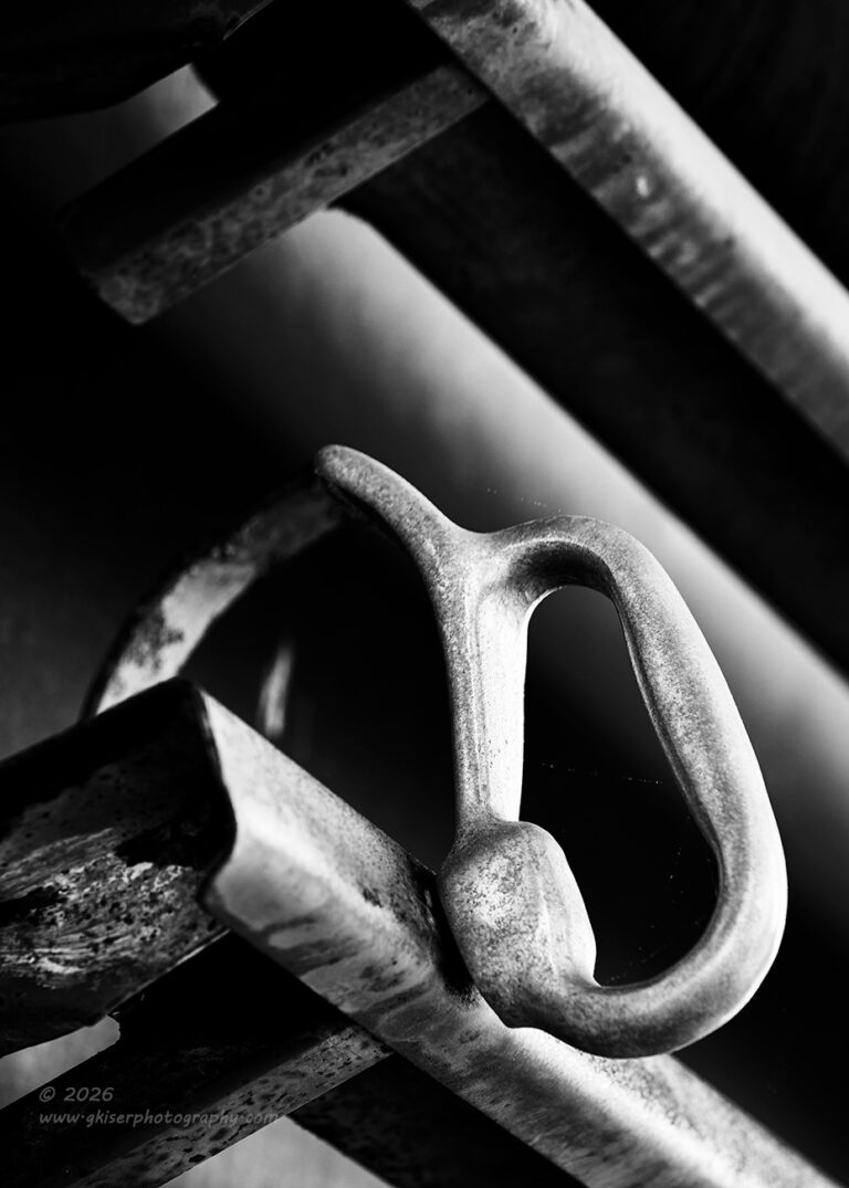
Another example of a photo that just didn’t work in color is the next frame. You might recognize the visual anchor with the bright handle. This is from the passenger side and is of the same hose shelf that I had photographed on the other side. Those of you who are paying attention will recognize that the first photo was done in color and this one is in black and white. My hat is off to you for remembering that, and I know that you did because if you are still reading, you are certainly paying attention.
So, how is it that this photo didn’t work at all in color when the same type of image was done earlier in color as chosen over black and white? It all comes down to the different colors in the scene. The other side was much more weathered and had more light on it. Those aspects brought out more rust tones with oranges and yellows in addition to the reds. On this side, I didn’t have that benefit and the truck was pretty much a dark and dull red with the light from the building bouncing back more red onto the scene. The handle was much brighter as it was a raw aluminum finish which shone nice and proud against the darker areas of the paint.
Since I didn’t have an analogous color scheme going on with the warm tones, the colors turned boring and overpowering of my main subject. In short, the reds were now competing for the attention of the handle and I couldn’t have that. By losing the color, I was able to work specifically with the tonalities within the frame, and I was able to control that all through contrast adjustments. The result was an image that was both high contrast and one that had wonderful gradations of gray through the image. I looked at this one in relation to the zone system started by Ansel Adams to make sure that I had tonalities from black to white in the image with smooth gradations while still keeping it largely high contrast and low key.
While shooting this one, I had applied a green filter to the profile on the camera which added to the contrast with the red paint. I could tell that this was going to be something much better than what I had shot previously and possibly one of the strongest images of the day. I committed to the concept and ended up shooting seven total frames with differences in the angle that I shot in, the amount of polarization that was used, differences in depth of field, and I even jogged the exposure a bit to deepen the dark tones even more in camera. The time spent working on this composition was not wasted in the least. It was the fifth frame that turned into the keeper. I liked the more extreme diagonals here along with the trio of strong lines on the right. I also liked how the handle and the strap came together at the top with no separation to complete that shape on two different planes. I loved everything about this one image and the processing went very quickly with it because I had taken so much care to get it right in the field.
This is probably my favorite image of the day from an abstract point of view. There was a lot that went into capturing it and I think that it turned out better than I had anticipated when I started out photographing it. The processing, while simple, took it to another level entirely and elevated it just that much. I’m hoping that I see this one again in the yearly collection of significant images that I’ll share later in the year.
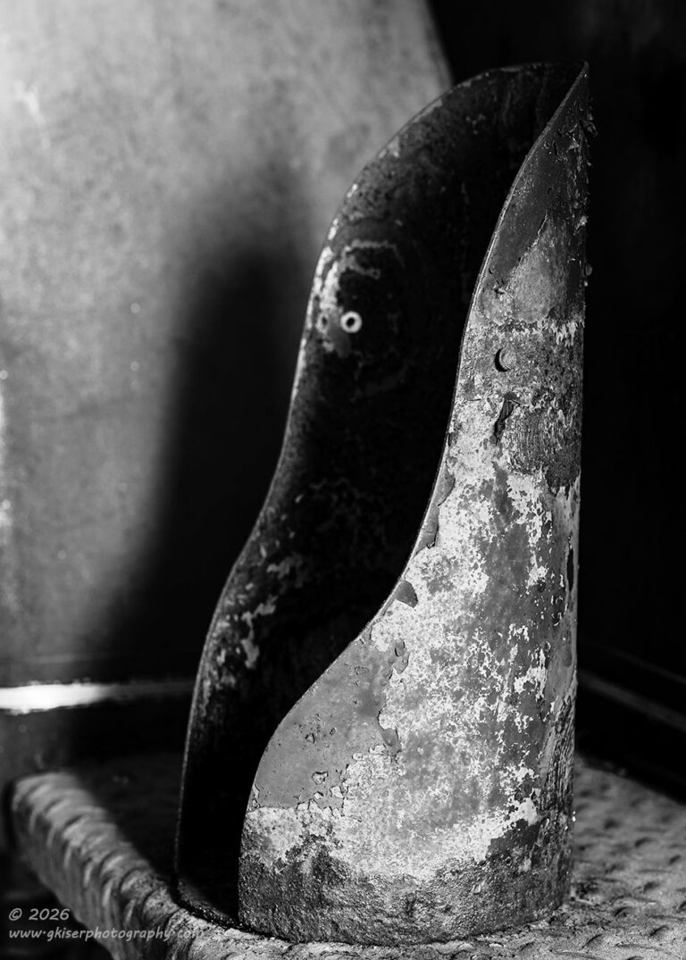
While I was working with the passenger side of the firetruck, I started to look at the extinguisher mount on the rear corner. There wasn’t anything inherently special about this element, but I did like the flow that it had. The curves were nice and soft and the texture added a bit of a harder element to it. The wat that the light was hitting the scene created some very nice shadows that I liked. This one went back to that two out of three rule that I have. I had great light here which created the chance for a solid composition that worked with that light. The subject wasn’t necessarily the strongest thing out there, but with the other two aspects in my favor, it would likely lead to a relatively strong photograph. The chances were high enough that I wanted to give it a try.
Most of the time and effort spent in deciding on a composition was spent figuring out how to best use the shadows and the highlights which defined the shapes. I knew that this was going to be in black and white because everything here was red with the exception of the yellow pinstripe that was going along the lower portion of the fender and the bare diamondplate floor. I could get more use out of those differences if I viewed them as luminance values rather than color. That choice would also bring more weight to the textures of the rust on the holder itself.
I left the camera in the black and white picture style with the green filter applied. This gave the whole scene a very high contrast look right out of the box. Of course, that green filter would just show in the camera’s image review while the image that was loaded into Lightroom would be rendered as a color image in Adobe’s color profile. As with so many photos that I shot during this second half of the session, I didn’t like the color version at all, and it just looked too plain. By stripping the color, I gained a very abstract feel to the image. The red made it too easily associated with a firetruck, and you saw what was missing in the photo rather than what was there. Without the color, you are looking at the shape of the holder as well as the texture. This is what becomes the most important part of the photo. If you think about it, in black and white, having the extinguisher present would actually ruin the photo while in the color version, you are looking for that element. I certainly think that the right choice was made with this one and while it isn’t among my favorites from the day, I really think that it is an effective photograph that fits the abstract feel that I was looking for.
That was the last composition that I shot of the firetruck. I did go to the newer one to give it one last look in case something jumped out at me. There was just nothing there that interested me photographically, so I went back to my truck and broke the camera apart and put it all back in the bag. It had been a very successful stop, and I felt that I had a good many keepers from the time here. I still had some driving to do to get the miles that I needed, so I picked a random direction and started that way.
Eventually, I got into an area that I had started scouting a couple of weeks before and found the road that I wanted to spend more time working with. It wasn’t quite as target rich as I had recalled, but that might be because of the sunlight which was pretty bright at this point. I honestly wasn’t planning on getting any more photos because of the quality of light, but I was happy to make this a scouting mission and look for things that I could come back to later on. There were some barns here and there, but nothing that was particularly special. It was a nice ride, and I found myself on roads that I had never been on which is always fun for me. I enjoy finding new things and locations that might work for photos. I wasn’t quite finding anything that captured my creative eye though.
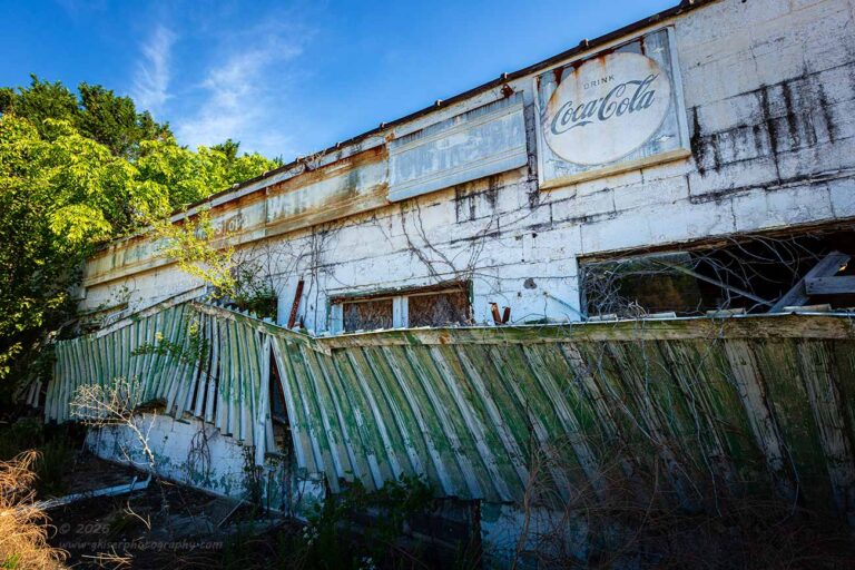
Turn after turn, I just kept driving on and looking around. At one point, I got to the end of the road and was about to turn onto a main road when I saw the remains of an old store of some sort. The awning that had been over the windows and doors had fallen down and was now covering those windows and doors. It looked very odd with the awning resembling a wooden fence now. I could see a Coke sign still on the face of the building and there was just a whisper of a cloud in the sky overhead. It was certainly decay that I was seeing and it was interesting. The light wasn’t great with the entire building in shadow with the sun coming from the right side, but behind the building. I had a good subject, but the light wasn’t great. If I could figure out a strong composition, I could make do with the light and create a solid image. It was worth a try, so I pulled into the parking lot and started to look at things critically.
The composition was not going to be easy to get because the building was basically flat on the front with a visual blockade over the points of interest along the wall like the doors and windows. I needed to figure out something interesting to make the composition work. The answer came in reminding myself of my goal for the year. I had worked the abstract end of that earlier in the day, and this seemed like a good chance for working the wide-angle lens for a bit. It was worth a try, so I built the camera with that lens. I didn’t add a polarizer because the sky was quite blue overhead which would show serious banding with the polarizer attached at the wide angles. It was also quicker to build this way, and I didn’t want to dedicate too much time to this until I knew that I had something that would work.
I found the angle that worked with the light and got in close to the building making the Coke sign the focal point for the composition. It wasn’t placed in the arbitrary rule of thirds location because that wouldn’t have worked at all. I found a place that provided balance and allowed the rest of the scene to fall into the frame in a way that made sense. I actually liked how it was looking through this lens and decided to commit to the concept of this shot. Once I had the composition figured out, I started to make exposures and realized that because I was shooting into the shadows, my shutter speed was a bit slower than I wanted. I was seeing movement in the bushes which I didn’t want to see.
Once that exposure issue was figured out, the better frames started to appear, and I was able to make some slight compositional adjustments to work with the way that the light was falling around the building. I felt that it was important to capture the tree that was in the full sunlight to the right, but to keep things balanced, I wanted to get the little patch of grass that was being hit by the sun in the lower left corner. In a way, this was a reverse vignette since so much of the scene was in shadows. I wanted the brighter areas to frame the image on that side. The right side was a different story. I let the lower right fall into deep shadow without hesitation. I didn’t want too much attention there, and that helped to force the attention upwards to the sign which was a brighter portion of the building. With some extra contrast added in. This kept the eyes where they needed to be and the fallen awning turned into a leading line through the image to pull the eyes to the right. It had worked out better than I thought that it would and that gave me reason to pursue other compositions with the building. These were very much experiments and ones that I am not all that thrilled with the results.
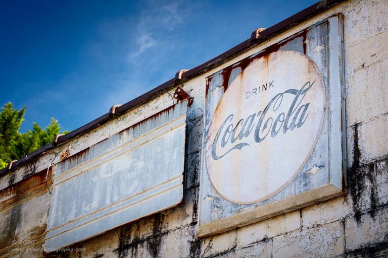
As I was getting done and starting to break the camera apart, I did swap out to the telephoto lens once more and went back to the building to isolate that sign that I had enjoyed so much in the first composition. Since I didn’t have to worry about banding in the sky, I added the polarizer to the lens this time and went back to see if I could get a composition that worked for the sign. That turned out to be much easier than I had anticipated. I had the composition worked out in a matter of moments and was making exposures shortly after that. It was the second one that I shot that worked the best with the depth of field.
I really liked how the Coke sign is the only one that is really readable. The other sign is actually a continuation from the other sign panels to the left, but it is much more difficult to make out the lettering, or the faded remnants of the lettering. This allowed me to be able to get this composition which would not have worked had the letters still been readable on the other sign as I would more than likely have had to include more of the panels to have it make sense. As it is, the one sign makes perfect sense all by itself.
Now the one thing that doesn’t really make sense is the fact that the coke sign is blue. That is part of the interest to this scene that I had. I’m used to seeing the signs in red which makes this unique. I also like how it matches the sky for an overall cool tone to the image. There are warm tones on the wall, and the rust staining on the signs adds another warm element to the color palette. To complete that balance, I warmed the green tones of the tree slightly so that I had a nice color palette going on through the scene.
There were lots of other compositions shot here for the quick time that I worked the scene, but these were the only two that I thought worked out. It is getting late at this point, so I am not going to go back through the images to see if there are any more that I might want to process. I doubt it very seriously but tomorrow will answer that question for us. As it sits, I had shot 54 frames, and you are seeing thirteen keepers from just two locations. I shot abstracts and did some work with the wide-angle lens which keeps me on track for learning different ways of seeing. I don’t know if you can see the change or not, but I am feeling it when I am looking at the scenes now. I am recognizing the tired compositions that I usually shoot and striving to look past those. In some cases, I am looking back on previous things that I have tried and just not gone back to, and in other situations, I am trying completely new ideas. I am seeing a change, and I hope that change is showing up to you in my work.
As always, thank you for joining me on this trek. It was a lot of fun and allowed me to get close enough to my mileage to get the service done on the truck. That is all done now, and I’m about ready to turn in. If you have firefighters in your family or friend group, send them a link to this blog as I’m sure they will enjoy seeing the different aspects of the old truck. I do have a soft spot for the squirts after working with so many over 20 years in Greensboro. Just like police, they have several loose screws to want to do that job, and the screws that are loose for them are very different screws than the ones that the police suffer from. It takes all kinds to be in public service and I’m proud of my time there, but very glad that it is over now.
Until next time…