Friday, September 4, 2026
Welcome back! I almost made this a two-chapter affair but decided to just make two independent entries instead. The two are not really related except that they happened on the same day. They were in two different areas of the county and two very different cars. If you missed how the day started out, I’ll give you a chance to catch up by clicking this link. Essentially, I had started out around the middle of the day hoping to get some clouds as the storms were going to be rolling through later in the afternoon. What I ended up with was a very hot and sunny time during the entirety of my trek. I saw 101° at one point on the truck’s thermometer which was enough to make me question my life choices up till now.
When I had finished up with my time with the Chrysler Imperial, I had continued on my path to get to a Chevy that I had been interested in photographing for a few weeks now. It wasn’t too far away, and I owed it to myself to go and check it out. When I got there, I found that there was a jacket spread out on the hood and there was dappled light all over the car. These two factors just ruined the idea of photos for me, and I didn’t even give it more than a second’s thought before I got turned around and back on the road. In fact, the car has impressed me less and less over the last two times that I have seen it. The location is not great at all, and honestly, the isolations that I would shoot on it are not all that different from other photos that I already have in my collection. There is a good chance that I will end up not doing anything at all with the car unless it moves into a different location which would make for a better overall and establishing shot.
The car suffered from some of the same problems that the Chrysler had with the paint being in decent conditions and it being black in color. Those two things usually will keep me from wanting to photograph a car. With the Chrysler, the bright chrome on it saved the day with it being in the full sun. The high contrast that was seen due to the chrome worked fantastic in black and white. The Chevy’s chrome wasn’t in nearly as good a shape, so that would be a lesser contrast in photos. The current dappled light just added confusion to the images and the Chrysler didn’t suffer from that at all. I take each scene and subject individually when it comes to deciding what I will be photographing or skipping. I was skipping the Chevy for now.
Honestly, I was happy with what I had captured with 23 frames on the memory card, and I was pretty sure that those were going to equate to a half dozen or so keepers based on memory. There was no real reason to push on to find something else, but I was enjoying the air conditioning and the music selection for the day, so I just kept on driving. I ended up getting into the Western side of Winston and going through some of the areas of town where I had grown up. I don’t get out that way often, and I felt like it was a good time to scout out there to see if there was anything that might work for photos.
As it turned out, I did spot a ’64ish Impala with some fantastic patina tucked into a driveway off of one of the main roads that I was on. The sunny conditions were lousy for getting any photographs of this car and I didn’t like how it was positioned for photos at the moment. It was something that I made a mental note of and will be returning to the location later on in the hopes of finding better lighting with it. I think that I can get some really good isolations captured with it under the right light.
My tour of Winston continued until I got word that a package had been delivered at home and I needed to get back to get it inside sooner rather than later. I got my course adjusted to the West and was starting back along the back road route that I normally take between Winston and Purlear. I’ve been on this road many times in the past few months and have found more and more to photograph each time I’ve taken the route. Even though I was essentially finished with the trek for the day, I kept my eyes open because there had been a few spots that had interested me in previous trips out this way.
One of those spots was in East Bend at a shop which I had visited once before for some photos of an old Corvair. They occasionally have something interesting out front and for the last few weeks there has been a red Galaxie 500 that looks to be a drag car sitting in front of the shop. The car appears to be in pretty good condition with very limited rust and the chrome being in good shape. That has kind of kept me from getting too interested in the car during the previous times of seeing it. However, I was kind of in the right frame of mind to tackle a car like this with the bright sun that was out. I mean, I had just had a very successful session with car in a similar condition.
I kept my eye out for the area where the car was parked and found it right where I had last seen it. It was sitting in front of the metal building that housed the shop and nothing was around it. The shop was closed and I saw no activity on the property. After pulling into the parking lot, I spent a few moments looking the car over to see if there were any compositional ideas that came to mind.
What I found was that the car had most of the right trim as well as emblems to work with. These are important when I am looking for isolations to shoot. The biggest difference between capturing overall and establishing photos of cars versus the isolations becomes the little details. Things like emblems, badges, and trim don’t really matter all that much when photographing an entire vehicle. The vehicle actually tells the story in those cases. When you don’t have the entire vehicle in the frame, the story comes from the little details that can be found on a car. Those details can be body lines with rust providing the textures and colors, or they can fall on the emblems and trim. Of course, the chrome emblems and trim always look good against rust, they can also make a minimally rusty vehicle interesting in their own right as well. What I was seeing was a car with decent paint over most of the body, but the emblems and trim were making it interesting when it came to working isolations.

That was enough to prompt me to get the truck parked and to pull out the camera. Once again, I chose the telephoto lens because of the chrome. The further away I would be from the car, the smaller my reflection would be. The long lens also made it easier to compress the images and reduce the amount of background that was visible. All of these things I’ve come to rely on when it comes to choosing this lens over the standard zoom that I once used exclusively for this kind of work. With the polarizer attached, I was ready to get started with this car.
It really felt like a polar opposite subject from the Chrysler. This car was a bright red while the Imperial had been a dull black. What had been a largely cool color palette which was reduced to black and white for the contrast had been traded in for one of the more exciting colors in the spectrum. Red is one of those colors that has to be used carefully in photographs because of the responses it will cause in an audience. Red is the color of emergency or danger. It causes some excitable reactions in the viewer which can ruin the mood of an image, or it can enhance the reaction. With this being a powerful car and obviously set up as a drag car, I figured a little visual excitement wouldn’t be a big deal. I’m also very aware of how red appears to those with versions of color blindness and I know that seeing this car as a yellow/green tone will have a very different emotional response. Red is just one of those colors that I do try to be very careful with in my photography, but at the same time, I recognize that reds are an integral part of what I capture since rust is usually based in the reds more than any other color.
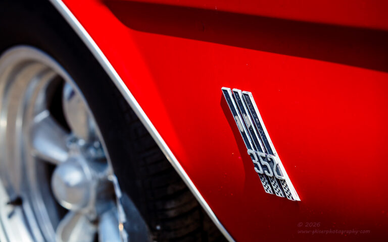
The first composition that I started working on was with the fender emblem. The reason for that is that I found this badge a little bit curious. I wasn’t really aware of a 352 cu in motor from Ford or at least hadn’t seen that badging before. As it turns out, I found out during some research that this engine was manufactured for the Edsel line of cars and was part of the FE line of V8’s. That made this car even cooler after doing the research on it and I’m glad that I spent time with this badge.
I worked two different compositions out with the 352 badge. The first one was a horizontal frame which included the Rally wheel that added a hint of blue thanks to the reflection from the sky. This seemed to balance out the color palette nicely and I liked the contrast in shape and complexity between portions of the photo. The body line along the top of the fender with the shadow falling under it provided a perfect frame for the top of the image to close it in with the 352 badge situated right where I wanted it within the frame.
The vertical version changed things up and removed the blue tinted chrome of the wheel leaving the dark tire as a framing element at the lower left and a smaller version of the shadow at the top for framing. This composition had the red showing up through the vast majority of the frame and under most situations I would find that too much and a bit overbearing. For this car, and the main subject of the photograph, the excessive red in the frame seemed to work well. I liked the mood of the image and felt that if I had done this in black and white, it would have reduced the visual energy far too much.
In fact, none of the photos that I captured of this car were done in black and white which surprised me considering that normally I don’t like to fill the frame with red as I was doing with this car. The Chrysler had been a much better subject for black and white, and I had taken every opportunity to do the monochrome images with that car. The Galaxie demanded a different kind of treatment and the red turned into a very important part of its story.
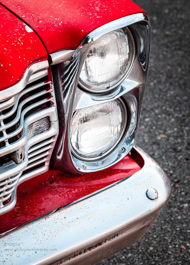
When I was finished with the fender emblems, I moved my attention to the front of the car and the headlights. I know that I have captured many headlight shots of Fairlanes and Galaxies over the years, but I liked the idea of the pavement as a background for this car. The cooler tones of the asphalt would work well with the warmer tones of the paint while supporting the blue tint to the chrome. The idea for the corner composition was more based on color harmony than the actual composition. However, I did put a lot of thought into the composition as I always have.
There is a little bit of an Easter Egg in this one. In one of the very few cases throughout the years, I have actually left my cameo in the chrome. I had done the funky chicken and tried to find myself when I was setting up the composition. There had been no movement in the chrome at all when I was doing it, so I was sure that I wasn’t going to get me. The problem that I didn’t really think of was the fact that the camera had been elevated well above eye level, so it was getting a different angle than I was seeing. From where I was looking, my reflection wasn’t present in the chrome, but where the camera was looking, there I was.
Fortunately, though, I was using the long lens which made my reflection very small in the composition and not overly visible. I really could have removed my reflection in post without too much trouble, but I kind of liked how I appeared. I wasn’t really skewed due to the perspective of the curved surface, and you can pretty much see all of me. I think that I add a bit of depth to the scene without being a distraction. It also shows how good the chrome is and tells the story about how this car had its pictures done. It is just a neat little detail for those that want to look into the image closely.
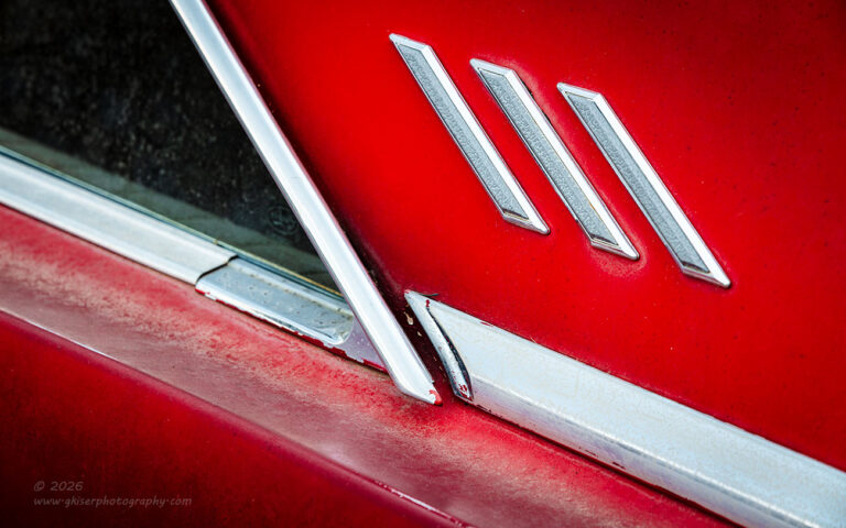
Feeling that I had done pretty much all that I would want to with the front of the car, I decided to move to the sides to check out the rear pillars. Most of the Fairlanes that I’ve photographed over the years have been four-door models, so I really liked the idea of the two-door body with this one. I knew that it would give me a slightly different collection of shapes to photograph. There were also the three bits of trim which were still on those pillars that I found to be quite interesting.
Photographing this section of a car is something that I will normally do and I had the basic compositions all worked out before I even put the camera in place. I knew that the compositions would work as shot from the front as well as from the rear. I liked this one from the driver’s side because the hash marks needed to be on the right side of the frame to aid in the eyes being able to track smoothly through the frame. Those hash marks were a destination for the eyes not an introduction. I really felt that they would stop the eyes had they been at the opening of the frame on the left. I did look at them on the passenger side and confirmed that fear. Fortunately, the paint was in slightly worse condition on the driver’s side which made for a more interesting photo as well.
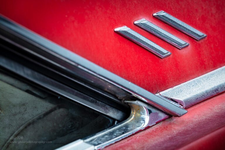
I worked the pillar shots from both the front and the back and found that they both worked out very well as far as compositions. I was also happy to see that there were some thin clouds coming into the area which diffused the sun a bit every once in a while. The diffused lighting really helped with the compositions here as there was a lot going on with the different shapes established by the chrome and the glass.
Once again, I felt that the red served the photos very well and I refused to do these in black and white. With this section of the car, I found that the worn paint below the belt molding really added to the image and helped to introduce that decay aspect that I am always after with my photos.
Decay can take so many forms and I’m really starting to get liberal with that definition. Once up on a time, I meant that there was rust and flaking paint. I still enjoy those scenes, but these days I’m also finding faded paint and dirt to be equally as compelling. The worn nature of some of this paint at the top of the quarter panel really works well for the decay aspect when paired with the dirt on the nicer paint. There is even a bit of overspray on some of the chrome trim that tells a bit of the story about how the car has been repainted at some point and is once again showing signs of neglect and decay. It is the little clues like this which I find very interesting in this type of photo. I’m assuming, since you are still reading that you like it too.
Don’t forget that any of these photos that you see in the blogs or in the galleries can be had as prints for your wall. There is no way to accurately describe the difference in holding an actual print of a significant size when compared to just looking at a digital image on your computer screen which has been resized and compressed to a fraction of its actual quality. If you love the image that you see here, you will be blown away with an actual print, so let’s start talking about what options you want for your print.
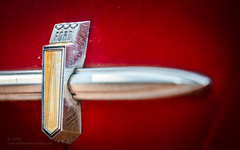
By this point, I had successfully photographed pretty much every part of the car that I had wanted to. There was just one more spot that I thought would make a strong photograph. This was the side molding where it came to an end on the fenders. I liked how there was a Ford crest crossing over the simple molding and how the molding terminated at a point. There was enough visual interest there for me to really want to put together a composition. There were a few things that I had to take into account though. The main one was that I needed this composition to read correctly from left to right. With the molding pointing obviously, I had a feeling that my only option was going to be on the passenger side so that the molding was pointing from left to right. This also had the other benefit of having the crest and the Ford name on the left side of the frame which also worked well in terms of reading the image. Fortunately, the lighting was slightly better on that side as well which made this composition that much easier.
The part where I really had to think about it was that I didn’t want the spear of the molding to be angled down in the frame. This would have been a normal way of photographing this element on this side of the car. With the red paint indicating excitement, I didn’t want to have the primary element on a downward diagonal with is a calming effect to the image. That would introduce visual confusion. Ideally, I thought that this image needed to be captured from well below so that it pointed up and added to that excitement. I figured out very quickly that it looked odd when the molding was pointed up because of how the crest was now angled. I had to anchor the scene with the vertical aspect of the molding which made things kind of static.
In order to address that, I changed up the angle a little bit so that I was shooting from much further forward. Now, I could introduce a limited depth of field to show motion within the frame. By keeping the crest sharp and the molding going softer the further away from the crest it went gave a sense of movement within the frame that supported the red color of the fender.
As a side note, this was the last image that I processed, and I almost didn’t do it because I didn’t like how it looked in RAW form. It seemed too static to me even with all of the things that I had done in the field to make it right. It was flat and I didn’t really care for it. I remembered seeing a lot of potential in the field with it, so I decided to see the processing through. It came down to finding more separation between the colors of the chrome and the fender as well as adding in some more shadowing to the scene. The more I worked with this, the stronger it became until it became one of my favorites from this car. It was also the last photograph that I shot for the day as I was getting uncomfortably hot and had pretty much worked the car as much as I had wanted to.
I had shot 13 images in 12 minutes which was moving right along. This brought my total image count to 36 frames. So essentially, I shot a roll of fill during the day over two different locations. Out of that roll of film, I ended up with a total 15 keepers which is knocking on the door of a 50% hit rate. I’ll go ahead and say that I am quite impressed with how the day turned out considering I had really no inkling of a plan when I started out. The two subjects that I photographed were totally new to me and I had never worked either one of them before even though I have passed by these locations many times over.
I do hope that you have enjoyed this adventure, and I’m glad that I was able to share it with you. I’m not sure if I’ll be able to get out again in the next week or so because I am having to start working on a branding session for a client that will have me doing a photo shoot inside of a recording studio. I’m really excited about that, but I’m going to have to really think through the lighting that I’ll be using during that session. That will take priority over any future treks in the near future, but hopefully, I can still get out another time or two over the next week or so.
Until next time…

Remember to use the code KISER10 to get 10% off your purchase