Wednesday, December 17, 2025
Welcome back for the next installment to this series. You might remember the first time that I visited this location and that it ended up in a three-part blog series with another part being a couple of different locations leading up to the main event. By the end of the day, I had 34 keepers to add into the collection with five of them being from the other two locations. If I’m mathing correctly, that means that this one location was good for 29 photos by the time I was all said and done. That is beyond what I would consider successful from a single location and a few hours. It was just the first time being out there and I was pretty much focusing on the low hanging fruit that time. I have meant to come back for a while but wanted to do it when the vegetation died back a little bit to allow better access to some of the cars on the property. The conditions happened to be looking pretty good on Wednesday, and I set out to give it another shot. You can get all caught up by starting at the beginning if you haven’t been following this adventure. When we last left off, I had just finished working on a Chrysler that was in a shelter and looking over a Polara drag car that I wasn’t able to get anything new or different from. That entry brought us to a total of 12 new images for the day up to that point and I had said that I was just getting rolling. Will this be the last entry, and the last photos from the day? Stick around and we will find out in short order.
One of the things that I had been working with during this visit to the location was really trying to capture the essence of the vehicles. I didn’t have the time, nor the familiarity with the spot back in the Summer to really take advantage of what was there. Now that I had a better understanding of the property, I was looking forward to delving a bit deeper into the possibilities and potentially correcting some of the missteps that I had taken the last time.
Yep, you heard me correctly, even though that trek was wildly successful, there were some photos that I shot that just didn’t work because I capture the scene as effectively as I would have wanted. One of the biggest goofs that I made was working with another Chrysler Imperial that was located at the rear of the property. While I did get a few decent images of the car, I had tried to photograph the emblem beside the marker light/badge on the rear quarter panel. I had tried to simplify the entire concept by shooting it straight on and making everything very blocky which worked with the design of the car. However, when I got the image into Lightroom, it failed to deliver. It was boring, and nothing I did seemed to work with it. I even went back to it a couple of days later as I was finishing up the blog entries to try it again. It was like trying to polish a turd, so after that second try, I just deleted the entire photo and moved on. It did stick with me and became something that I really wanted to try again if given the chance.
Now that I was back here, I had the chance to try this again. The car was still situated where it had been left in front of a newer model Mustang, and behind a box truck. There were two boats to the side of the car, and everything was close to the Chrysler. This meant that no matter how much I wanted to get a complete and encompassing photo of it, there was no way to make that happen without using a very judicious amount of AI which is something that I absolutely refuse to do. This left me with shooting isolations once again which was fine since that was kind of a theme behind the day as it was developing. It is easier to capture the essence of vehicles through the isolations and details than it is to capture the entire view of the vehicle which folks are used to seeing.
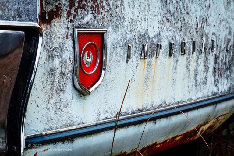
That emblem that identified this behemoth of a car on the quarter panel was something that I really wanted to capture, and capture well. I started to look at the way things all fit together and started to recall all the difficulties that I had run into with it before. On the one hand, I was faced with a very long emblem as it spelled out “IMPERIAL”, but the focus that I wanted was on the marker light which had its own emblem affixed to the lens. That light by itself would be boring in a photo, so I needed something else with it. Because of the proximity of the lettering, that was the best option, though that stretched out the scope of the composition quite a bit. If I were to just capture those two elements, the frame would be long and thin, and incredibly boring. I needed something for balance, and that is where the molding below came into play. That is what I had done the last time, but the photo was too blocky and with nothing below the molding, it looked like a false edge to the frame and what was beneath served no purpose. There was also a lot of dead space between the main subjects and the molding that felt odd. All of these things had caused me to ultimately trash the photo and vow to not try that same approach again.
I was looking but not really seeing much other way to capture the scene thanks to the incredibly long string of letters. I needed something that would introduce some drama into the scene, some kind of visual tension. I looked around once again and saw that there was a bumper in close proximity to the marker light which would help to frame that important element which needed to be the primary focus because of the red lens. This helped, but the photo was still very stagnant when shot from straight on. I tried angles from the left and the right, but I found that this offered a new batch of compositional issues. From the right side, I lost the importance of the marker light and the whole composition felt off in a bad way. From the left, I had the marker light, but it was hard to read the skinny string of letters, especially in the textured patina of the quarter panel. There was also no way to avoid capturing the ground beneath the quarter panel from either direction. At least there was a nice strip of rust at the bottom of the metal that would help to add interest as a reward for including more of the scene.
It was this angle from the left that worked out the best and offered at least a possibility of success. With that in mind, I started to frame up a composition still using my telephoto lens. I used the bumper as a foreground by just including a sliver of it to frame the rest of the photo and to provide a bit more context to the part of the car that we were looking at. I had the camera elevated to the point that the bottom molding strip came up at an angle providing a bit of excitement to the scene that went with the red light. The strip of rust down at the bottom of the frame balanced out the red in the light well and gave a nice frame to the bottom while the ground was allowed to go dark. The letters faded off into nothingness as they mixed in with the patina. I used a carful mixture of depth of field to keep the letters readable, but not so sharp that their perspective would become a distraction. If you look hard enough, you can make out the letters, but it isn’t something that I’m asking you to do in the photo.
That was probably the biggest compositional decision that I made with this whole photo. It is the photographer’s job to tell the viewer what to look at, and likely what order these things need to be looked at. By letting the letters go kind of soft, you can read them if you choose to, but they are not really important. The line of letters is, but the actual content isn’t as much. By keeping them just sharp enough, that is an option, but I’m also telling you that by having them trail off into a difficult surface to make the letters out that you really don’t have to read it. If they were blurred more, that would have been a decision that I made for you, but at the same time would have created a large portion of the photo that served no purpose because it was too blurred to read. These are the thoughts that were going through my mind as I was determining how to make this photo look.

In the end, I had a photograph where the marker light with the embedded emblem was the main character and the visual anchor for the entire scene. Everything else provided a sense of balance and or depth to the scene. Essentially, I had simplified a complex scene that was needed in order to show off a very simple element. That was the razor’s edge that I was walking with how this composition came together. It isn’t the best photo I’ve ever done, but I think it is a very workable variation on what I had tried and failed to do months before. I considered it a success and with that one under my hat, I started to look over the rest of the car to see if there was anything else that spoke to me and would be different than the last time I was out here.
As I started to look at the rear of the car, I happened to glance at that now very familiar emblem that was right above what used to be the bumper. I had spotted it the last time but decided that the scene around it was just too much of a hot mess to work with. This time I was coming into it with a slightly different mindset. I was looking for those scenes that were more interesting than expected. With the trees starting to grow out from the bumper and looking as if they were the reason that the bumper was pulled away from the car, I felt that this fit the bill of interesting. I began to really look at the scene to see what I had to work with. In the most pure form, I had an emblem that was isolated from other things that I could just fill the frame with. This wasn’t going to get the photo that I was after though. I needed to have more to the story, and I needed a bit more visual interest. The tree growing next to it was nice, but needed something else to tie it in. This is where the bumper came into place. The tree had portions on both sides of the bumper which provided a lot of context about the environment, even though it said nothing at all about the Mustang that was parked inches away. The bumper also had a nice relief cut into it for where it had originally fit under the emblem. This allowed for a nice framing element to the scene to further add value to that emblem as a main element. Above the emblem was a keyhole which fit right in because it was round like the emblem, and had a pronounced vertical aspect like the wings provided. It was a small element, but visually relevant in the scene. This also allowed me to include more height to the frame which gave me the opportunity to include a meaningful amount of the trees. The lock cylinder filled the negative space with another bright point of interest to balance out with the complexity of the saplings to the right.
The photograph has a lot of parts to it, and it might seem kind of complex upon the first look, but as you spend a bit of time here, you can understand more of what you are seeing. Each part plays a part, and an important part to the scene. I knew that this was a busy scene though, and that was why when it came time to process it, I chose to make it a black and white image, and a high contrast one at that. I didn’t need anyone really spending time looking at the details, I just needed the structure to shine through which doing it in this way made possible. It is a bit abstract, but there are clues as to what is going on for those that spend the time to look. It is that kind of thinking photograph that I really do enjoy creating.

After finishing up with the rear emblem on the Imperial, I started to look at the Super Bee that was parked next to the building. This is the car that I had spent probably the longest time with back in the Summer. It was out in the open, relatively speaking, and was quite interesting to look at. Nothing had really changed with it other than the vibrant greens that were no longer here. I think that there were a few less vehicles behind the car as well which created some more potential for photos. My goal for the day was not to get caught in the trap of shooting the same scenes that I had previously, so I had kind of shied away from working with this car. I mean, I had spent a lot of time with it and had gotten quite a many photos from it already. Were there really that many other possibilities left that would give me a reason to work with it again? Well, it was the car that proved to be the most photogenic of the day back then, and I really kind of felt like it was showing me the same potential this time. The difference was, I was familiar with this car now and my mind was open to the different possibilities that it now offered.
I went ahead and decided to see what I could do with it today. The first thing that I wanted to do was to get a full shot of the car because I knew that it could be done. I didn’t recall the exact compositions that I had shot before but remembered having a problem with the cars in the background which forced some compromises to where I placed the camera. It wasn’t seeming that difficult this time, and I saw a nice angle from the driver’s side front quarter. By getting down nice and low, I was able to block out the trailer that was parked at the side of the building and create a composition that isolated the car quite nicely. The lens that I was working with gave me a nice perspective but pushed me back into the trees. I got into the trees as far as I could without getting limbs in front of the lens, but it still wasn’t deep enough to get the scene at 70mm. I had to switch lenses for the first time during this trek.
I put on the standard zoom which would give me a bit wider of a field of view from closer in. I wanted to keep as close to the 70mm side of things as I could, so I got back at the tree line and framed this shot with everything still covered and out of frame. I remembered how difficult of a time I had with this kind of full view the last time but found it to be rather simple this time around. I’m pretty sure that there were cars missing from the background, and there was also a yard implement that had been totally grown over by grass that might have caused an issue the last time. That mound was much smaller now, and the background was clear, so I had a very good view of the car and from down low the car was looking great.
I was thinking that this was similar to what I had shot before, so I had already decided that it was going to be done in black and white. There wasn’t much color to be had back here anyway, so that wasn’t a big loss. I stuck to that plan and processed this as a black and white image only to find out that the one that I thought it was similar to had been shot from much further to the right. I liked this composition much more and as it turns out, the black and white was a great choice here for some added visual impact.
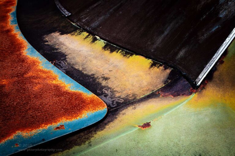
As I was realizing that I had forgotten exactly what I had shot of this car not reworking compositions became less of an issue for me. I just wanted to see what spoke to me this time with the lighting and the season. I also wanted to keep in mind my goal of doing more abstracts and details. I found the shape of the rear glass and the trunk area to be very interesting, and the colors of the decay really stood out to me with this car. I started to work out a composition that included these aspects in a compelling way. Something that I found to be rather odd was the dark black coating on the rear glass and partially on the body of the car. I wasn’t sure how this was going to work, but the more I started to look at the scene through the camera, the more I realized that it provided a great source of contrast for the scene as well as visual mystery that added to the abstract nature of the photos. I fully embraced the black substance and framed the shots with that in mind.
The first composition that I worked with was based on the curve of the body between the window and the trunk lid. I liked how it gave the winding road effect to the scene. The trunk lid had a really nice blue edge where the paint was still present, but that blue framed a vivid orange swath of rust that both contrasted and complimented the more earthy tones of the rest of the body. The black window provided even more definition for the shapes, much like when you weather a plastic model. It all looked excellent and was something that I had not seen before on this car.
When I got the image into Lightroom, I did a full processing of it and decided that it all came together beautifully, but there was something that didn’t set well with me. The more that I examined the photo the more I realized that I was having a hard time reading the image because of the chrome strip on the left side of the frame. I felt that the gentle triangle of the trunk would be a better introduction to the photo and I flipped the image horizontally. That fixed the issue and the image read much better than it had previously. Everything about this photo worked well at this point and I was actually surprised at how eye catching it was to just scroll past it in the filmstrip of images at the bottom of Lightroom. To think, I missed this completely the first time I was out here which really goes to show you how important being familiar with a location can be.
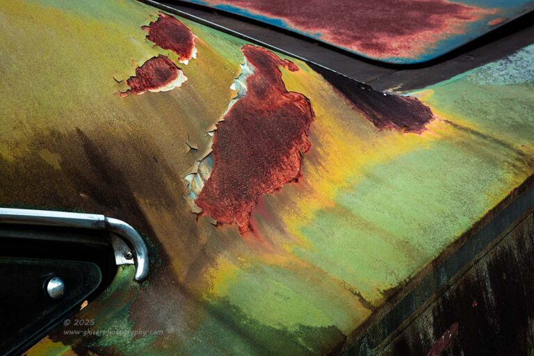
While I was dealing with the rear of this car looking for abstracts, I went to the other side to see what differences would be offered if any. That black substance was on more of the upper body which kind of defeated the original concept and forced me to look at things differently on this side. Here, there was a really nice area of rust on the pillar and the trunk still offered that same blue and rust combination. I just needed to figure out a composition that featured those elements in a cohesive way.
The answer came from further forward on the car looking back over the pillar to the trunk itself. I lost that beautiful curve at the rear window, but I gained another combination of elements that gave me a very interesting composition loaded with…you guessed it…triangles. I had one triangle with the quarter window that had a chrome button to force you to see it there to introduce the photo. There was another triangle created by the side of the quarter panel that was less illuminated than the top of the quarter. The final triangle was the trunk coming in the from the top right corner. It made for gobs of visual tension while retaining balance. Now, that isn’t the way that this one started. Before I started the actual processing of the photo, I had decided to flip the photo horizontally. I knew that it was reading wrong to start with but really liked the concept. The flip worked, and allowed me to finish the processing with everything in the place that it would be in.
As you can tell, I love to flip images horizontally, but it can only work if there is nothing there to identify the sides like letters, numbers, so something that is widely known. In both of these abstracts, there were no elements that would indicate direction and nothing that would give pause. Had I not mentioned the simple adjustment to the composition, I doubt you would have any idea. In fact, I had to really think about what I had done to these images to confirm that I had flipped them as I had remembered. It is an effective technique, but if done carelessly, can ruin a photo by belying the fact that it was done to any viewer to look at it.
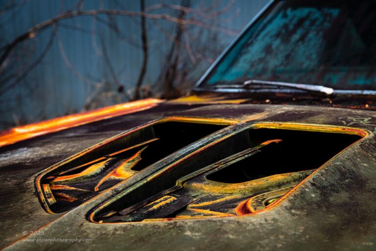
You could say that by this point, I was fully in my element once again with this car. I can see why I had so much fun with it last time. It is really easy to work with and offers what I imagine to be an endless number of compositional possibilities. One of those compositional possibilities had turned into one of those images that made the short list for consideration into one of the 12 most significant images for the year. I’ll let you wait a bit longer to see if it made that list or not. The image was an abstract of the hood with the gaping holes where the scoops would have gone. It was one of those experiments that I made because the opportunity presented itself. I had loved the image ever since creating it and wondered if I could do any better with it. As I was looking at this car, I started to think about another one of my images from the past year and how I pulled a portion of the hood and a portion of the windshield into a cohesive composition. That one might show up on the list as well, but thinking about both of those photos, I started to think about combining the techniques that I had used with both of them.
I knew what the hood looked like from an elevated position as well as from a more reasonable position while including the entire car. What I didn’t know was what would this hood look like isolated from a mid-level height seeing more of the dimension of the skeletal portion within. There was no better time than now to find out, so I started working on positions with the camera and trying to figure out what angle would suite this best. I liked the view from the quarter angle, but when looking from the passenger side, I could see the cars parked along the side of the property which I didn’t care for. From the driver’s side, I had the side of the metal building which wasn’t terrible, and there were also trees. This time, the trees had no leaves so the actual structure of them made more sense, and there was one that curved at just the right height to frame the composition where I wanted to cut it.
As I was working out the finer points of the composition, I was really liking what I was seeing. In fact, I was wondering if this was going to be a better photo than the one that I have loved for months now. It is too early to tell, but I hope that it is better as that is always the goal each time I go out with the camera. I know that I processed it in a very similar way because I really enjoyed the grunge of it all and thought that it was fitting for the subject. This was a bit more difficult to apply that look to as I had chosen to use a limited depth of field to keep the attention on the openings on the hood. There was no reason to put much detail into the windshield or the trees in front of the building. The story was the hood; the rest just gave context. The issue was that I wasn’t able to grunge up the soft focused areas without it looking very odd. This was handled with the use of some very selective masking and a great deal of care in doing the adjustments. In the end, this photo is everything that I hoped it would be, and I really do see it as a total success. Given some time, I really think that this one is one of those significant images, but it still has too much of the new photo smell on it to be sure. Let me know what you think about it.
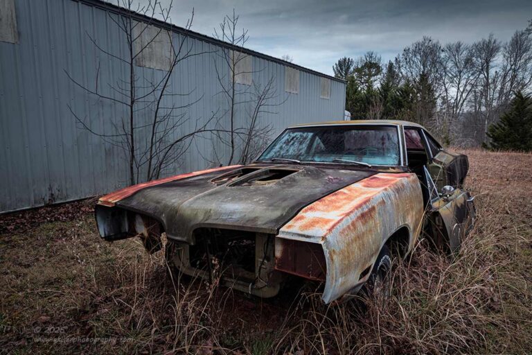
As I was looking at the car, I started to remember one of the compositions that I had shot of it that I had really liked. However, the green in the trees had kind of forced a color palette that I wasn’t completely sold on. Now that the trees were bare on the side of the building and the colors were less vibrant, I had the opportunity to change up the whole mood of the scene. I didn’t refer back to the previous photo at all but knew mostly what it looked like from memory. Still using the standard zoom, I moved around and got into a position that I felt suited the scene the best. Looking back, I changed the perspective a good bit by getting in closer to the car and using a narrower focal length. This gave the car more presence in the frame, but it still had the same balance because the trees were no longer full of leaves.
The colors of the grass and trees in the background fit better with the colors of the car allowing me to capture a more muted color palette that suited what I was after here. This is a big improvement from the first attempt at capturing the car and while I didn’t want to get into a habit of reshooting the same views this go ’round, I am happy that I did this one and feel that it serves the car much better in terms of feeling.
It is quite funny that the first time I saw this car I regretted that it was missing the bumper and most of the bits that go with it. Even the doors leaning up against the sides of the car was something that I saw as an unfortunate aspect. Now that I fully understand the property and the cars on it, these things make the photos work as well as they do. They offer just a bit more to the story and make this car more unique in comparison to others that I might photograph. I can tell that the last time I shot this car, I spent more time avoiding the missing front pieces with some compositions that were more focused on the sides, but after living with one of the compositions that proudly featured the empty front of the car, I found that I really liked the look. I’ve leaned into that aspect more and more this time around and really think that the photos tell a much stronger story because of it.

By this point I was starting to see that I might fall into the pit of trying to recreate previous compositions, so I decided to break that pattern really quick and go back over to the Imperial which I felt might still offer some interesting views. While I was walking around it though, I kept looking at the Super Bee in the distance. There was just something about that car that I couldn’t shake. I wanted to try and get a photo that used the Imperial as a foreground interest while the main subject was the Super Bee. This was a slightly different take on a previously shot image where I had used a portion of the Imperial as a background element beyond the Super Bee. This was more out of necessity than want though because of the angle that I had chosen to work with. Now, I was wanting to include the big car, but in a completely different way. The only way to make that happen was to include the trees that were growing up through the bumper. It did have the potential of making this a bit of a voyeuristic kind of photo which could be a good thing. It was worth trying at least.
I moved back to the area behind the car and the trees and started to frame up the shot. The standard zoom was just too wide for what I was envisioning, and the main subject was getting lost in the frame. I needed to make it bigger and for that to happen, I would need to step back a bit further and let the focal length reach out to capture the car. After swapping out the lens to my telephoto, I found the spot nearly on top of a boat where I could get the framing I was after. It was an odd composition for me and was a bit more complex than I like to shoot, but there was something about it that appealed to me.
I committed to the composition and started to play with the depth of field which was going to be a very important part of the creative process for this one. On one hand, I could really limit the depth of field and blur out the trees completely leaving only a shadow of them as well as rendering the big Imperial as blob down in the corner while the other car was nice and sharp. That would make everything up close a distraction because of the amount of blur. On the other hand, I could increase the depth of field and render the whole scene in apparent focus which would have the same end result. The foreground would be distracting and would take the attention away from the car in the midground. The best option was to pick a middle of the road aperture that would render the foreground elements soft, but still roughly in focus so that the viewer can tell what they are looking at but not feel inclined to spend much time looking. The sharper of the cars would become the main point of interest which was what I was wanting. Remember when I was talking about how the photographer tells the viewer what to look at and the order that they are looking? Well, that is what I was establishing with these choices.
The next choice that I had to make was the position of the camera so that the trees sprouting up through the frame were not blocking anything too important with the car. By important, I mean things like the decal on the rear quarter identifying it as a Super Bee. I also wanted to keep the taillights visible as well as the missing door and side windows. In fact, anything that defined the shape of the car, I didn’t want a branch to impact. I also needed to have enough separation between the two cars and the space between them to go with the flow of the image. There was a lot of moving in order to get this composition to work, but I finally landed on the right spot for the camera, and the resulting photo was just what I was after.
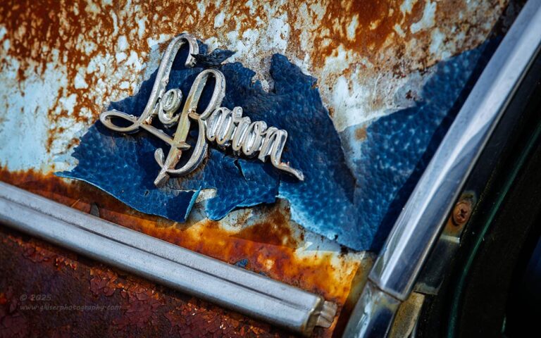
Now that I was back at the Imperial, I wanted to give it that once over that I had come over here to do originally. I guess I was finally satisfied with the other car because I was finally able to concentrate more on looking the details of this car over once again. What caught my attention was the emblems on the rear pillar which were present on both sides. They had a bit of the vinyl roof still tacked on underneath of the emblem which was a point of interest. I looked at both sides in an attempt to figure out if either side was better than the other. As it turned out, both sides were pretty much equal in appearance, but I tended to like the passenger side better. When I looked at it in terms of potential compositions, I determined that the passenger side would read better left to right than the driver’s side so that decision was made.
Now that I had the side figured out, I started to work out a composition. The emblem was kind of small, so if I included too much of the car, it would get lost. My main goal was to capture the emblem and the trapped bit of vinyl which dictated a rather small scope in terms of what all to include. I liked the chrome bits below and to the right as they did a great job framing the emblem. I just needed to make sure that I didn’t get a straight on composition which would have been very static and boring. By moving off to the front a bit, I was able to get the lower molding to come in at an angle that kind of matched up with the molding at the door opening. The natural tilt from the shooting location made the molding go in two different angles and create two different triangles along the bottom of the frame. This framed the emblem quite well and with a good bit of visual tension. The darker rust above the emblem finished off the framing and I had just what I was after in a composition.
That pretty much wrapped things up with the Imperial. I was actually starting to get a little tired at this point and was contemplating calling it a day. I wasn’t quite sure that I was all done though because I still hadn’t gone and worked with the Rambler which had been an afterthought the last time I was out here. I do try to work with Ramblers every chance I get because my grandfather owned several of them, and my mom learned to drive in one…well, learned what not to do when driving in one. There was an incident with a tree well within the front yard that may or may not have survived the driving lesson. That’s a story for another time though. Ramblers will always have a soft spot in my heart because of that history, and I still wanted to do some work with the one here.
You will have to wait a bit for that set of photos though. I’m going to take a break here after these additional nine images which brings the total up to 21 new images for the collection. How many more do we have? The short answer is enough to justify at least another blog entry. The longer answer is you will have to wait until to tomorrow to see what else I shot while I was out here.
I’ll be back shortly with another one soon enough….