Thursday, September 15, 2022
So, here we are experiencing cooler days with the promise of Autumn right around the corner. These are the days that I love to get out with the camera, but as it turns out, starting this past Tuesday and going as far as the forecast will show there is nothing but clear skies throughout this side of the state. If you have been reading my blogs for any length of time, you know how I hate clear skies for photography. It isn’t so much that I dislike a blue sky, I just really don’t care for a blank expanse of color over the top half of a scene. It is boring in my eyes, and I like the drama that a little bit of cloud cover will provide. During these clear sky days, I usually stick at home and take care of things around the house, or I go out and explore in the Miata. Since the beginning of the bright, blue-sky days, I’ve washed the 4Runner, Toni’s Accord, and mowed the yard. Yesterday I decided to start sharing images on social media once again and that took a large portion of the day. When Thursday morning rolled around, I was out of chores to do and was ready to go on a little road trip with the Miata. The catch was, I was still feeling rather creative and wanted to do something with the camera.
Ideally, I would have had a session scheduled this week for portraits of some sort, but there was nothing on my calendar. I got to thinking about things that I could potentially put in front of the camera and came up with a very short list because of that clear sky. I could have done for a sunrise and captured the twilight wedge, but I wasn’t really feeling like doing landscapes, and that wasn’t really what I was after creatively. I was starting to get back into the rhythm of doing my decay and rural scenes which has been a large part of my recent treks here of late. These subjects don’t usually photograph well in bright sun though. Maybe I’ll just go ride and enjoy the weather without thinking about photography.
It was a good idea, but one that didn’t last long at all. I knew that the Miata was still clean from when I washed it a couple of weeks ago, and looking back, it had been quite some time since I last photographed the convertible. I could always go out and find places to photograph the car at. I started to think about possibilities that would work. Most everything that I could think of would just not really work because the sky was going to be so empty. The other side of that is that the car photographs very well under bright sunlight because of the color it is painted. The light was going to be great, but I needed something that wasn’t dependent on the sky. I was stumped for a solution.
As I was getting ready for bed, I was thinking how Toni had told me to get a photograph of the Ambar Mart which was about 2.5 miles up the road from the house. It is just a little convenience store that was in business when we moved into the house a couple of years ago but has since closed. Not knowing what the future holds for the building and property, she thought it would be a good idea to capture how it appeared when it was freshly closed. I had been out there many times and looked at it to try and get an idea of how to best capture it. The results of those scouting trips were that I just wasn’t interested in capturing it in this state. It still looked too current for my tastes…but I did keep it as a location in my mind.
Now that I was looking for something to photograph the Miata with, the idea of the store came back into my thoughts. Looking at the mental picture that I had of the store showed that the dominant colors were pale blue and white with a sign that was a pinkish red. The sign was too dominant in the scene but had a nice contrast to the cooler tones that surrounded it. I started to mentally place the Miata in the scene and quickly realized that the intense red color of the car would more than balance the sign out. I could also place the Miata diagonally from the sign for a bit of visual interest. A clear blue sky would actually benefit this because it would just give a wash of color in the background which would allow the canopy to stand out as a third element. It wasn’t a perfect plan, but it was something that I thought might just work.
This wasn’t anything that I was going to need to get up early for because the car photographs very well in full daylight. The only thing that I needed to consider was that the sun should be low enough that it would illuminate completely under the canopy allowing the car to be placed logically by the pumps. With that idea, I had my morning plan in place.
When I got up, I took care of some business stuff as I do each morning and then I grabbed my camera bag and tripod before stuffing it into the trunk of the car. I never realize how big my gear is until I try to fit it in the trunk because the bag just barely fits into the opening. The tripod completely collapsed pretty much wedges in there. It does fit though, and it doesn’t make the car lift up too badly in the front either. It was about 10am when I headed out and I took a roundabout route to get to the store just to enjoy the car for a few minutes before turning it into an element for a photograph.
When I arrived, the lot was clear as I expected. I had previsualized the placement of the car and pulled up to the pumps. I got out and checked the center cap of the front wheel and found that the logo was upside down. I pulled the car up a bit to level the logo before turning everything off. I grabbed the tripod from the trunk and pulled out the camera with a 24-70mm lens attached. Because I was dealing with a highly reflective surface, I added a polarizer as well. I checked the framing with this lens and found it to be satisfactory, so I closed up the trunk and started to work out the composition.
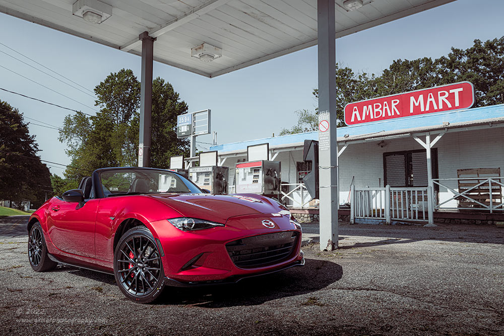
There was a total of eleven frames captured in a short amount of time. The one that you see here is number 7. I tried various distances from the car as well as different heights to get the relationships between elements to change slightly. I worked from 24mm up to about 55mm (and then found myself in the roadway) with the tripod dropped all the way to the ground and raised up to above eye level. In each image there were three main elements that didn’t change. The car was my foreground, the sign was placed on a diagonal from the car to balance out the composition, and I used the canopy to add the needed interest to the sky above and to close in the shot.
What I liked best about this composition was the presence of the Miata at 28mm. It becomes a main element in the scene that supports the color that it brings to the image. The canopy overhead is only partially included in the frame and allows me to get just two edges of it forming a “V” that follows the tree line loosely for a bit of cohesiveness. I used the polarizer to even out the tones on the car, but it also boosted the saturation in the sky more than I wanted. I knew that I was going to have to work with the sky in post to get it to look the way I wanted it to, but the car needed to have the filter applied in order to really make the paint look its best. The sign which was so important to the composition was placed just opposite of the support beam so that it was fully visible. I had also made sure that the price marquee sign was also fully visible and separated from any distractions. I would have liked to have had the door to the store freely visible, but there was a gate there that I had no control over at all. It did work with the metal grate that was over the doorway to increase security for the closed business. The two elements together give the accurate assumption that the business is closed for the duration.
While I was working on these compositions, I had the parking lights on, but they were so faint that I couldn’t see them through the camera at all. They kept turning off after 30 seconds and I missed more “lit” photos than I got. Unfortunately, this was one of the ones that I missed, but overall, it was much stronger of an image so this is the one that I kept. The lights didn’t make much difference because the marker lights were just thin LED strips, and the parking light in the headlight was right where a specular highlight was anyway. Another small aggravation that happened during the middle of the shoot was a garbage truck pulled into the lot just to sit there for a few minutes and apparently watch what I was doing. When the air brakes bled, they kicked up all kinds of debris that I ended up having to clone out from the surface of the hood. About the time that the truck left, a car pulled in and they watched me for a minute or two. Apparently, I am rather interesting when I am working.
Anyway, with all of the distractions over, I was able to get through a good many variations on my compositional idea. I packed it all up and wedged it back into the trunk before continuing on my ride for the day. A couple of hours later, I was back at home and working the bag out of the trunk. I imported the images into Lightroom and picked three that I liked the most to work on processing. The first one that I ended up working with turned out to be the winner of the group. The processing was a little different than I normally do, so I’ll talk about little about that now.
As I mentioned, the blue of the sky wasn’t really doing me any favors after being polarized. I knew that I was going to have to deal with that first and foremost. Secondly, I wanted to create an image that had a good color balance throughout which is always the goal. I just usually have more colors to work with than this. As I looked at the image, The overall tone was very cool with the blues, and then there were the two big pops of red with a bit of green as a neutral tone. I knew that I wanted to simplify the colors even more and make the blues all the same tone as well as matching the reds better than they were.
I started out by going through the different color profiles in Lightroom and found one of the vintage ones had the closest color tones to what I was looking for. The overall saturation was brought way down in the image, and the contrast was dropped as well. It was a good starting point. From there, I started to work with the blue tones and though local adjustments, I tweaked the hue and luminance for the blues until I had a pretty uniform look through the scene. I then worked on the pop of the car before matching the sign tones to the paint. Once I had all of that basically figured out, I dropped all the saturation levels to 0 and then built them up one at a time until I had the right tones in the right intensity for the image that I was after. It is a technique that I’ve done before, but I don’t do that often because most of my scenes involve a wide mix of colors. This was certainly one that I wanted to concentrate on only three of the colors and make all the tones fall to within one of those hues. The final touch came from a bit of color grading where I boosted the midtones and added a bit of blue to the highlights and shadows to mix with a slight tint of warmth in the mids.
The edit was actually a lot of fun because I usually don’t go for a vintage look in my images. It seemed to fit with the setting though, and the dichotomy of the car added so much to the scene. It isn’t a decay image by any stretch, but there is a story here and I think that it is only possible to tell this particular story with that little element of the convertible. I’m still a big proponent of shooting it as you find it, but without altering anything in the scene, I was able to add an element in a location where a vehicle would naturally be that completed the scene. I’ve now got an image of this store that is indicative of how it looked when it was closed. Should it fall into disrepair in the coming years, I will have a before and after shot of it. For now, I think it made for a pretty great location for my little red roller-skate.
I hope that you have enjoyed this quick trek and the resulting photograph. Because this is such a well-known store in the area, I’m going to put it in my Scenes from the Foothills Gallery. Those that know the area know this store, and I hope that it brings back lots of memories from when it was open. If you are one of those that has a connection to this place, I would love to help put a print in your hand. Just let me know if this has a place on your wall.
If you are wanting a portrait session, this is the week to get it booked because I am itching to create art and the lighting outside is just not working with me. Give me a call (336-681-0220) and let’s get the ideas flowing. I’m ready for another studio session, but I’m also fine doing a location shoot if that is what you are after.
Until next time….

Remember to use the code KISER10 to get 10% off your purchase