Monday, June 9, 2025
In case you are wondering, the yard is still pretty tall, and now that the sun is out in full force, I won’t be going out for more photos today as I had originally considered. This is just the weather pattern that we are in right now. Forecasts mean nothing and we can go from clear sky to a full-on storm in a matter of minutes. At least the pretty day makes it to where I can get this blog finished up a bit earlier than I had anticipated and might actually get out to deal with the yard here shortly.
In case you missed the first part of this blog, you should give it a quick read, so you know how this trek came to be. Don’t worry, I’ll wait while you catch up.
I’m waiting….it really wasn’t that long of an entry because I was trying to get it published before midnight.
Ok, now that you are all caught up, we can get back to it.
Well, that was a lie. I actually just took about a 30-minute break to go back and look at Lightroom one last time before I really got into typing on this entry. What I found were two photos that made it through the first round of culling but were eliminated in favor of others when I was getting ready to do the processing. Now that I was looking with a fresh set of eyes, I actually liked both of them and decided to see what they would look like all finished up. The end results were pretty good, and I have added both of them to the collection now. I’ll drop them in at the end of this entry so you can see what was added after you have seen all the other photos that made it through the initial culling phase.
Now, we are back to the regularly scheduled programming for the blog. When we last left the account of this trek, I was firmly into the isolations because of how the cars were positioned in the environment. This is usually the most effective way of capturing this type of subject when they are in a less than ideal location. You will recall that they were parked right next to each other for one thing, but they were just feet away from a small barn, and there were two other white vehicles on the other side in close proximity. There was a trailer loaded with the parts that would soon become the shelter for the cars and a large tree stump between the trailer and the cars. The angles that I could work with were very few and for the most variety in the photos, I decided to really spend the time working the isolations.
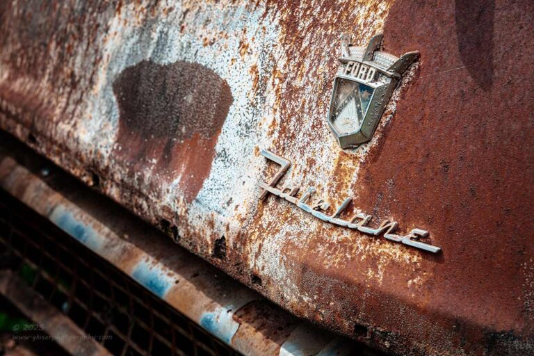
When it comes to isolations, I like to concentrate on things that look unique to the car, or to the condition of the car. Since both of these cars were essentially the same, it was a matter of finding the most interesting patina as well as any variations in what emblems were present. For instance, only the teal car had the Fairlane badge on the hood as the beige car had lost it at some point leaving just the crest and the ornament on top. This made the teal car more interesting for isolations dealing with the hood details. In fact, this was the first time that I can recall seeing the Fairlane badge on the hood, and the slightly different crest with the crown atop made for a very interesting set of elements to me. This was why I chose to focus my attention on those two elements for a composition.
In full disclosure, this composition was purely an accident. I had no intention of including the grill and was just looking for a more exciting angle than straight on for this composition. As I always do, I had my camera to my eye, which was still fitted with the telephoto lens, but it was still racked out to about 70mm as I was looked over the scene to see what angles would work. As I started to get into position with the camera from deep to the driver’s side, I saw a broader composition than intended with the grill filling the lower left corner. In a split second, I recognized that as a great balancing element for the emblems that I was wanting to capture. This became the driving force behind the composition, and I started to dial it in from that point. By the time I had captured this composition, I had no interest in revisiting my original concept because I knew it wasn’t going to be nearly as effective as this one.
This just goes to show that even a photographer such as myself that has done this type of photography for years can still find new and exciting ways of capturing similar scenes. I have no problem admitting that this was an accidental find either. In fact, a lot of my newer compositions come from just having the camera to my eye and looking around an area for the right angle to photograph. As happened here, the wider angle of the hunt will often include other elements that I had not considered before. It really paid off here, and I’m thrilled about that!
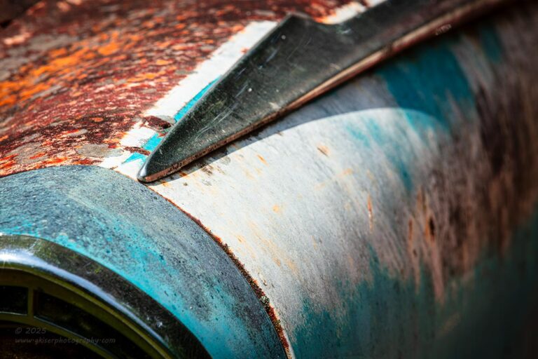
While I was working on the hood details of the teal car, I started to really pay attention to the fender trim at the top of the fenders. Now this trim was present on both cars, but only the teal car had the color contrasts provided by the teal and orange which really appealed to me. Based on the direction of the light, I decided to focus my attention on the driver’s side fender to start with as it gave a bit more variety in patina for some more visual interest. I went with the headlight for a focal point to start with, but that seemed too expected, and I was feeling that this side looked more like an abstract composition. I narrowed my scope to just the shapes and colors which added to the mystery and appeal of the composition. It was a very small section of the fender, but it included everything that I felt was needed to get the point across.
This was going back to the concept of synecdoche that I spoke about not that long ago. Essentially, I am letting a detail speak for the entire scene. Through these details, you often see other details that would have been missed had the larger scene been captured. With this close crop, you can tell more about the sun because the curve from the trim is casting a curved shadow which shows the shape of the chrome even better than the photo would indicate. The texture on the rust is much more pronounced and contrasts to the smoothness of the faded paint on the fender. The trim around the headlight is all of a sudden, a big element and one that demands attention. Had the headlight been included, that detail would have been largely lost in the scene. By focusing on these small snippets from the whole, I am able to tell a more interesting story that includes more than “I came, I saw, I took the photo.”
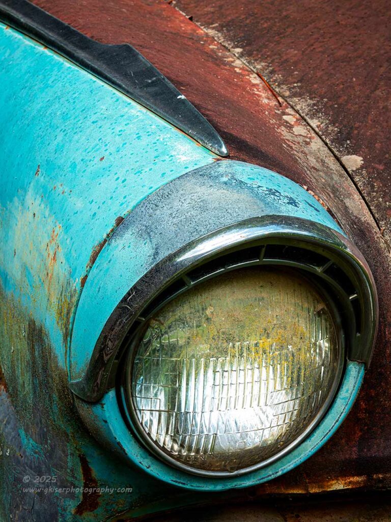
If you contrast the previous photo with this one, you can kind of see how the roles of the different elements change in significance. Of course, this is on the other side of the car, but I wanted to capture more of the teal color which was a bit richer on the passenger side of the car. The main focal point here is the headlight which I didn’t want for the other side, but here it made more sense to me. I especially liked the layer of organic material on the lens as it added a bit of character to the car that I don’t get to see all that often with the cars that I photograph. The trim above the headlight is no longer all that important, but you are looking at it because you were introduced to it in the earlier photo. In one, you wonder what is responsible for the shape at the lower corner of the image, but in this one, you can tell that it surrounds the headlight which is bright and pulls all the attention. There are no questions here, and you just don’t get as involved with that little detail knowing the answers.
The composition here is a much more simplistic one, but still one that has some visual twists and turns which I really enjoy. The bit of trim at the top of the fender is still very important to the overall look of the photo and the color contrast is just wonderful. There is no doubt why this is my favorite color combination on these old cars that I shoot. I’m just really thankful that teal was a very popular color back then because it really makes my job as a photographer much more fun now.
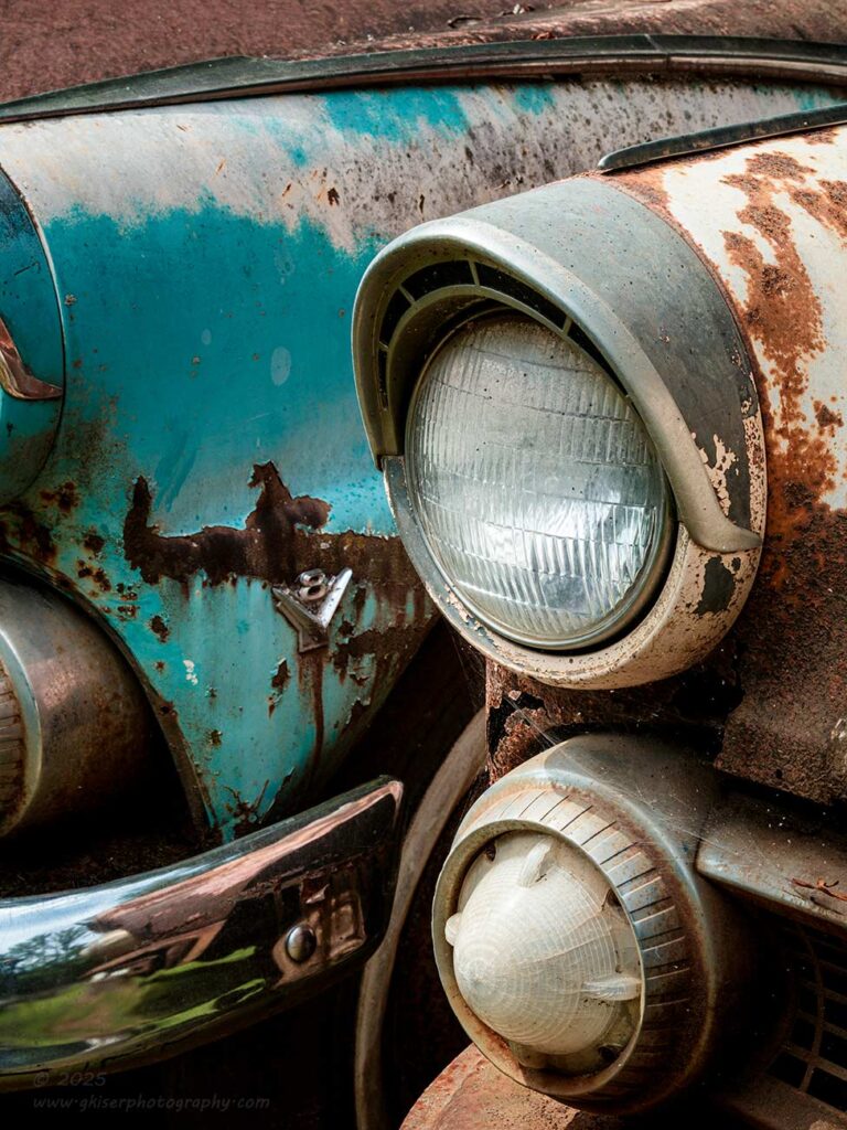
By this point in the day, I was starting to get a little more daring in my creativity and felt that I could try some more things. I had been doing well at moving around and capturing all kinds of detail shots that I was sure would turn out pretty good. I mean, everything was either a tried-and-true concept, or something that I felt really strongly would succeed. I had been out here long enough that I no longer felt that I needed to play it safe. I could experiment because I had two very similar cars close together which would offer up some unique possibilities. Of course, I was still thinking about isolations, but there was nothing that said that I couldn’t do isolations with two vehicles in the frame.
As I have mentioned, I loved the pairing of the teal and rust colors. It is one of those looks that just works which is why you see it in movies so often. You will also remember that I loved the V8 badge on the teal car which I photographed and talked about in the previous entry. Thinking about all of these things, I wanted to give that badge another try. It was the only one left on the two cars and it just happened to be located on the fender that was between them both. Because of that location, it was very difficult to get an isolation on it, and I ended up with a unique angle that turned into a bit of an abstract composition that looked like a cartoon weightlifter according to Toni.
Now that I wasn’t concerned with going for the safe composition, I started to look at the repeating patterns between the two cars with the matching lights. I began to frame up a shot that included both sets of lights with the V8 sandwiched between them. It was interesting, but the emblem was lost in the frame with all the bright lights being present and it looked kind of static with two headlights, two turn signals, and the emblem right in the middle of them. I needed to do something to add some visual interest to the scene. There was no way that adding more elements was going to work, so I had to remove elements. I needed the rust tones on the nearest car for the color, and the framing elements of the lights. The teal car was more about the color and the badge, so I didn’t really need the lights. I cropped in closer with the camera in a vertical orientation so that the lights were eliminated. This started feeling much better.
Something that I noticed now for the first time was how the fender trim that I had been focused on so much previously started to become more visible with this crop and both bits of trim formed a triangle as well as framing the teal color. It added a lot of visual interest to the top of the frame that made for a very strong framing element. I decided to leave just enough of the light housings to provide a frame for the left side of the image without having anything bright enough to pull the attention away from the middle of the frame. It was the bumper and the turn signal that gave the last bit of framing for the photo and now the V8 emblem was just visible enough to work the way I had hoped.
This was an interesting composition to come up with, and it is a bit busier than I would have preferred but I think that it is effective in communicating what I was after. There is a lot to look at here and I hope that it isn’t so much that it pushes the viewer away. Ideally, the viewer will spend a lot of time here looking at the basic composition and then diving into the different sub compositions that were used throughout the frame. It is a story with many chapters and one that you can pick up and start reading at any point during the course of the overall story.
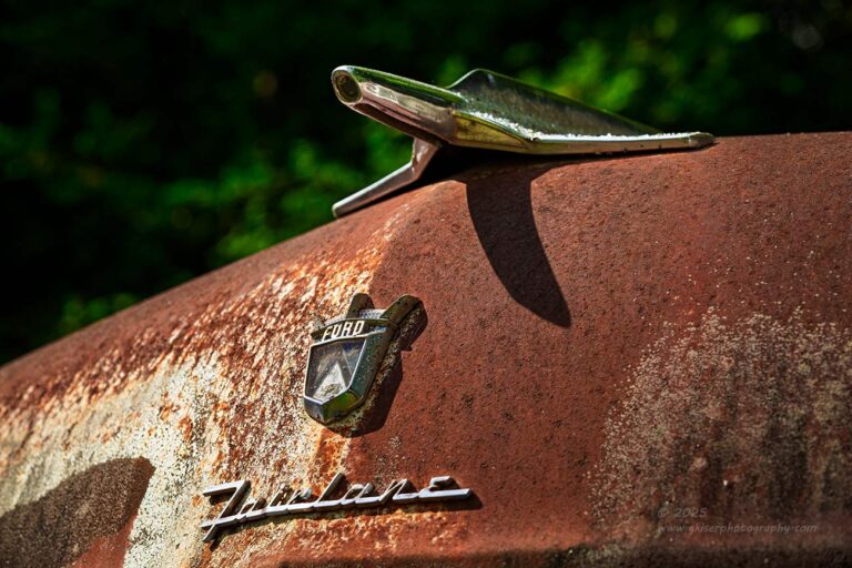
There was a composition that I had worked on earlier in the day which you haven’t seen yet. I had originally shot it with the standard zoom and included the bulge of the passenger side headlight on the teal car. I thought that would provide a bit of visual balance to the scene which I was trying to capture. I was again focused on the crest and the Fairlane badge, but this time I wanted the hood ornament which I had determined looked exactly like a Colonial Viper from Battlestar Galactica. If you are familiar with the different show generations, you are now in a position where you can’t unsee the connection.
I was again looking for a vantage point that was a little different and I had decided that I liked photographing this part of the hood from way down low. With the telephoto lens, I thought that I could get a little closer and more personal with the elements than I had before. I framed up this shot that did not include the fender on the left side and it felt much more simplistic. However, the angle was a bit more extreme which I liked better. Looking between the two images on the back of the camera I wasn’t sure which I would prefer when I got home to see it on the big screen. My thought was that I would like the first attempt better because there was a balancing element on the left which was a bit different than what I normally would have done.
When I got the images home, there was one of each version that made it through the initial culling. I liked them both, but in the end, the real details of the shot were too small in the original composition because it incorporated more of the scene. I preferred the more intimate capture thanks to the telephoto lens and that was the one that I ended up processing. The background blur was also a bit more pleasing thanks to the narrower focal length. Because I was needing three elements in focus, I wasn’t able to shoot wide open. I found that f/8 was the sweet spot for getting all three elements in focus, but at the wider focal length, the background had a bit more detail to it when compared with the telephoto version. Sometimes direct is best and that is what I ended up liking the most with this concept so I’m very happy that I went back for another try at it before I left for the day.
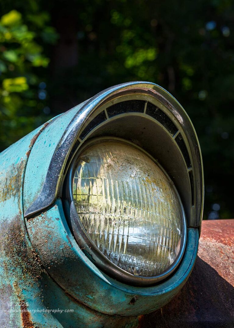
Since I was down on the ground already, I started to look at the headlight on the teal car one more time. I was still interested in that trim above the light which I had used in the abstract shot, but I knew that it would be much more pronounced when shot from below. From that vantage point, you could really see how far out it jutted from the actual lens of the light. This low angle was also an angle that is not routinely seen by folks walking around. That is unless you are 4′ 13″ like Toni is, in which case this is a normal view for you.
I went with a compositional idea very similar to how I had done the hood ornament shot with the camera off to an angle for a bit of drama and looking up causing the protruding elements to really become dominant features in the frame. If you compare the two photos of the single passenger side headlight on this teal car, you can see the vast difference in energy that is presented in the photo. In one, the light is looking down and has a much more calming feeling to it, while the one where the light is looking up into the unknown has quite a bit more excitement to it. Personally, I much prefer this second variation on the subject but also see compelling reasons to keep both of them in the collection because they say completely different things even though they are of the exact same subject.
This was the last of this section of 39 frames for a total frame count of 65 images shot during the course of a tad over an hour. I would have loved to stick around longer, but the light was not getting any better and I had exhausted the compositions that I could come up with. They were also starting to mow the yard, and I didn’t want to be in their way, so it was time to pack up. I stopped by a couple of other places on the way home in hopes of finding another quick subject to shoot because I really thought that I would have around five or so from the Fords. For some reason I wanted more from the day, and I wanted more variety since everything that I had shot had come from two cars that were essentially the same shape.
I’m glad I didn’t find anything else because out of those 65 frames, I ended up with a dozen keepers that you have seen. That is more than twice what I had expected, and when I started out, I was thinking only a few compositions would be possible. Thanks to the power of isolations, I was able to turn this location into something very productive, and I can really understand why I pursued these two cars for as long as I did.
Thank you for joining me on this trek and I hope that you enjoyed the photos.
Wait….what?
Oh yeah, I nearly forgot about the other two photos that I mentioned at the beginning of this entry. I did go back through the photos one last time before I really got started with the typing here to make sure that I hadn’t overlooked anything. Occasionally that happens, and it happened once again with this trek. As I mentioned, I had a lot more keepers than I considered possible from this location, so I was quick to dismiss some images in favor of others because there were just so many good ones to choose from. Now that I’m not nearly as sweaty and tired, I was able to go back through and see some merit to these other two that I had missed yesterday.
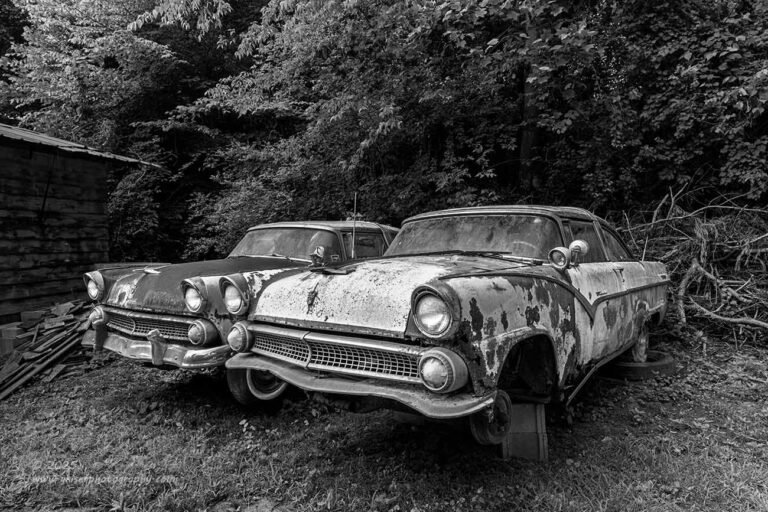
This one was the last one that I processed, but it was one of the first that I had shot from the day. I was still using the standard zoom at the time and after getting the overall shot that included the trunk in the foreground, I decided that I wanted to see what it looked like without the stump. It was a much simpler photo, and I decided that I liked the one framed by the stump better during the initial culling. That one was processed as a color image because the stump and the barn shared some color cues that I liked for a framing aspect which helped to make the cars more dominant. Without the stump, I felt that the building to the left was slightly out of place. However, when I looked at it once again, I liked the directness of the composition for focusing on the cars. I thought that if done in black and white, the focus would be pulled from the building and secured right there on the cars where I needed it to be.
I started doing a black and white presentation with it and began to see some great potential. I went through three different color profiles until I had the right black and white conversion to work with and finished it up. It looks so much more effective in black and white than it did in color. I suspect that is because I didn’t really care for the pink undertones of the foreground car which you can see in the color photo. This takes the emphasis away from the colors and puts it back on the cars and the repeating patterns thanks to them both being the same bodystyle. It is just a more effective photo than I had given it credit for initially. It is also one of the rare times that I didn’t really add much of a vignette to close in the image. I liked the way that the greenery got brighter all around the cars while the trees in the background were a bit darker. I chose to emphasize that aspect more by a series of radial filters that darkened the background while keeping the outer edges of the frame a bit brighter. It still shows depth but does it in a way that accentuates the cars in the middle of the composition.
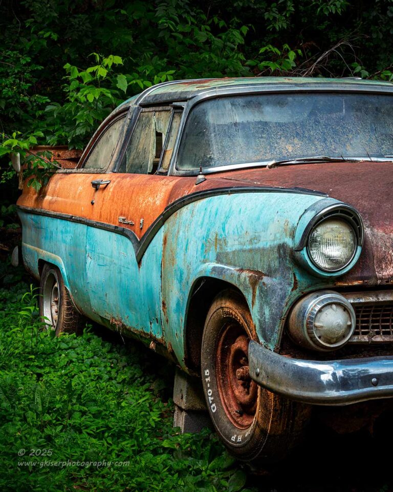
The next photo that I chose to pull into the postproduction phase was this vertical crop of my favorite of the two cars. I knew from the beginning that this one had the best colors and the most visual interest to work with. The problem was that I wasn’t able to get an overall shot of this car which included the colors of the side because of how close it was to the neighboring car. To get that angle, I was going to have to accept the background which was a white Camaro and Mitsubishi truck. That was too complicated which was why I did a much shallower angle on both cars that you saw in the previous entry. That angle didn’t show off the colors that I liked, and what you could see from them was a distraction which was why that ended up being a black and white photo.
In order to try and get a shot of the colors and shapes that I so adored with this car, I decided to go with the (mumbles under his breath) Instagram framing (coughs and clears throat) where I basically cut the car down the middle. This seemed very awkward to me, and I didn’t really like what I was having to do here because the composition felt like an overall shot that was folded over in the middle. I only took two frames here because I just didn’t really like it. When I got the images home, I let one of them through the initial culling, but it was dropped after that. It just looked too gimmicky for me, and I didn’t like what I was seeing.
However, through the time that I was typing out the first part of the blog and through the night, I was wishing that I had something that showed off the colors and the shapes of the side of the car. I also really liked the fact that these were two-door cars and felt that I hadn’t given that aspect enough attention. It wasn’t until I started writing this blog entry that my memory went back to that “fad crop” composition of the car and I wanted to give it another look. I broke away from typing and went back to Lightroom to give it another look. Other than the fact that it was one of those shots that I don’t like on Instagram, there was a lot to like about it. It had all the aspects that I wanted to showcase about the car and the composition was well balanced. Thanks to the rusty wheel, I had a beautiful diagonal component from the lower right to the upper left. The surrounding greens just set the whole color palette off. The lights were there, but used as a framing element and the focus of the image was squarely on the side of the car which was the intention. I had gone with a very deep depth of field to make sure that the attention was on the side of the car rather than the headlights and grill which was abruptly stopped in the composition.
I decided to see what it would look like as a fully processed image since what I was looking at was kind of flat and without much character. With just a few selections made, I was actually feeling pretty good about the photo and decided to see it through. It still feels like an odd composition coming from me, but it does convey what I wanted it to and that is more important than anything else in my book. It is the best image showcasing what I loved about this car, and that was enough for me to reconsider including it here. Now, it had better get 10,000 likes on Instagram since this crop is all the rage for automotive photographers these days.
Now, that brings us to the end of this trek and the photos. I now have 14 keepers out of 65 frames which is almost unheard of, especially with lighting that was changing so frequently. I’m glad that I was able to get so many usable photos from these two cars since they will not be nearly as accessible in a short while and that they were pretty dang unique in my finds. I do appreciate you joining me as I talk about my experience with these two cars. I’ll mention it again, that if any of these photos connects with you and you would like to have a print of one or more for your walls, I can certainly help you with that. Not only do I have some basic photo print options available through the gallery store, but I can also do special order prints on different kinds of media like metal or canvas, and they can be as large as you would like. I’m not going to lie; there are several here that I would love to see as large prints getting ready to be shipped out to a client. I would actually like to have a few of them on my walls, but until such time as I can sell some of my back stock, I have no room on the walls for new prints.
As of the time of me wrapping up this blog, the sky is crystal clear outside with some pretty harsh sun. It is not looking like I will be able to get out for more photos today. Maybe this will be the day that I finally do get the yard mowed. I’ll know here in about an hour and 45 minutes when everything should be dried out from the storms last night.
Until next time…