Saturday, July 11, 2026
I said that this might be the case when I wrapped up my last blog entry. For you, that was yesterday, for me, that was only a few hours ago that I finished it up. As I am typing this, it is still Saturday evening, but you will be reading this on Monday if you are getting notifications as a subscriber to the blog. If you aren’t subscribed, then you haven’t gotten a notification and there is no telling when you are reading this one. I’ve just come off of a pretty successful trek into Taylorsville which culminated in a grand time with an old Chevy sedan. Working with that car in the location that it was in kind of motivated me to spend some time with an old Dodge truck that has recently shown up at a local car lot close to home. The truck was left parked in front of a metal building next to the office for the business. The location was lousy and while the truck looked awesome and ready for a full-on photo shoot, the surroundings just didn’t support an overall establishing photo. However, the patina and the age of the truck were really nice and begging for some isolation shots.
This is where the motivation issues came into play. For much of June and into the beginning of July I have been contemplating whether or not photography even matters. That question has really taken the motivation out of the equation for much of what I normally want to shoot. While I still haven’t fully come to terms with the question at hand, the motivation has gradually returned here in the past week or so. It kind of all started with a trek out to Ronda where I ended up working a couple of cars that I have been watching for quite some time now. That really got the creative juices flowing and I ended up following that up with a trek into Siloam to check out a location that Toni had suggested. While that location didn’t work out, I still came back with some pretty good images from the day. In a very short amount of time I’ve added a ton of new images and with the last three-part blog series, I’ve added even more.
As I was wrapping things up earlier today (a couple of days ago for you), I started to think about this Dodge truck that I’ve watched for a few weeks now. It hasn’t been anything that I was jumping up and down about photographing, but it was a very cool truck and interesting for sure. It gave off vibes of another Dodge that I had photographed in North Wilkesboro a while back which turned out pretty good. The patina was very similar as was the overall look of the front end. That made me want to give it a try, but the location really killed it for me. It wasn’t that I was seeing it as too hard a subject to photograph, I just wasn’t seeing the opportunity to do much different with it. The success that I had with the Chevy sedan that I had just photographed had me thinking that I might be able to pull off some different things since I had shot the very same car twice before and the location that the car was in was actually a bit worse than what the Dodge was surrounded by. I felt that it might be worth a try to see what I could get.

As I was finishing up the blog it was still storming outside and not really looking like it was going to ease up. That killed any chance for going out to get any photos for me. I was going to have to wait and see what the afternoon held as far as weather. There was a chance for some clouds and an equal chance for sunny conditions. I was looking for clouds for this truck because of the surroundings that might cast shadows over the truck and make for uneven lighting. I could work better with the diffused light from the clouds and then add my own contrast into the images.
I think it was around 4:45 when the light was actually starting to look good after the sun had replaced the rain for the previous couple of hours. Since the light was good and it was a weekend when the business was closed, I figured that now was as good a time as any to go out and see what I could do with the truck. I grabbed my camera and left the bag open in the bed so that it would acclimate to the warm and humid conditions before I started to use it. The last thing I wanted was to have to wait for 20 minutes while the lens defogged. The short trip out there would at least get me a little headstart on the defogging end of things.
When I pulled into the business, I made sure that nobody was there that I would get in the way of and I took a minute to walk around the truck to see if there were any ideas that jumped out at me and would give me an idea of the best lens to use. The basic compositions sprang to mind, and I felt that the standard zoom would probably be the best bet to show the dimensions of the truck with a little bit of a wide-angle approach. I wouldn’t be able to take it too far though because of the surroundings creeping into the frame. I wanted to avoid that as much as possible and just focus my attention on the truck and the little details that it offered up.
With the camera built around the standard zoom I started off at the nose where I focused my attention on the lettering and the hood ornament. I didn’t want to do this as the boring straight on shot, so I looked at the angles from the left and the right to see what worked best. I liked the angle as seen from the Driver’s side since it captured the parking lot in the upper corner rather than the Subaru that was parked next to it. The composition was simple enough and the exposure was easy to figure out. With that, I was on my way.
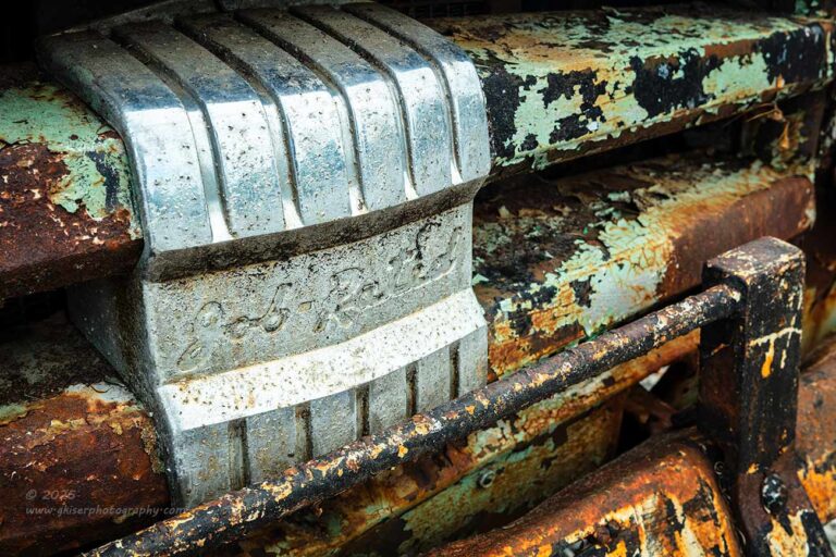
There was a lot of badging on the front of this truck, and one that caught my attention was the large block in the grill that said “Job Rated” which I’ve started seeing on several of the Dodge trucks that I’ve been photographing here lately. It was a fair distance away from the other emblems, so I felt that I needed to capture it all by itself. Again, I wanted to concentrate on the angles and not just go with the expected symmetrical composition. This time, I went from the passenger side so that the script would be more prominent in the composition as read from left to right. It helped that the block was the brightest thing on the grill because that formed the visual anchor for the image and allowed the script to be a little easier to find.
The key here was the diagonals that were present in the grill that brought your eyes into the scene and added a bit of excitement as they were angled up rather than down. There was a bit of added depth to the scene with the overrider bar on the bumper which I really liked for that extra element. There is an abstract feeling to this composition which keeps things very interesting, but for those who know about these Dodge trucks, there are a lot of clues here as to what is being seen.
I had just gotten started and had shot only four frames with two of them being keepers. It was a good sign of things to come. The question that I was asking was how many compositions could I realistically come up with on this one truck? Something that I noticed early on was that this was a large and blocky vehicle without the curves that some of my other subjects have had that allow me to really capture some dimension to the body. This was not nearly as three dimensional when viewed in isolations and I felt that was going to hod me back a little bit.
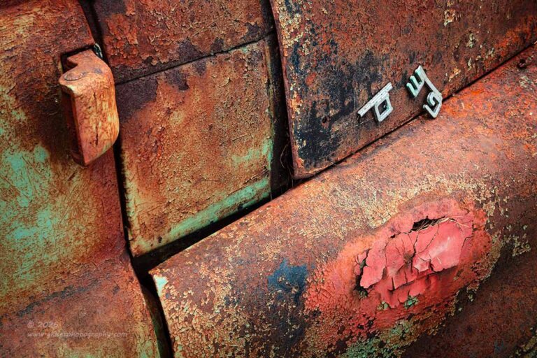
The way that I overcame that blocky appearance was to introduce angles to the compositions by raising the camera and shooting off axis as much as possible. It was the next composition where that came into play. I had noticed the emblem, or the remaining bits of the emblem on the passenger side hood. There were only three letters left barely holding onto the metal. It was interesting to me and offered a visual anchor for the image. Looking at the surroundings as an abstract design with textures, I started to organize the panel lines to create the basis for the overall design of the image. While doing that, I chose to bring in the door hinge and a place that had been touched up and was now peeling as two other main elements to create a triangle path through the image.
The overall design of this photo was a little complex, but it seemed to read well from left to right with the blocks of texture forming the background and the three elements creating the visual pathway for the eyes to follow. The letters were the brightest part, so I knew that the eyes would always gravitate to those within the photo. I liked the colors even though they were predominantly warm tones. The thought had crossed my mind about doing this in black and white because of the heavy use of reds and oranges, but I liked how the aqua color kind of popped against the warmer tones. It was just the color contrast needed for another layer of interest which I felt that this abstract needed.
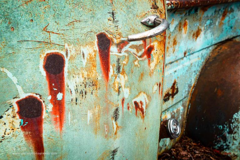
The next spot on the truck that I wanted to photograph showed the exact opposite color contrast from the passenger side. The driver’s side was mostly that aqua color with some very emphasized areas of rust that were bleeding through. There was a pattern of three of these large rust spots that were showing staining down the side. The very red tones reminded me of a string of bullet holes in the door. They led right to the door handle which kind of gave a nice reward for following the path. With that in mind, I started to work out a composition around that aspect.
I needed to go beyond the door because the handle was right at the edge of the door and I didn’t want to crowd it by cropping at that edge. The solution was to include part of the bedside in the rear of the truck. With the door slightly opened and the bed inset, I didn’t like how it looked as viewed from the side. When I moved to the front, the division between the two parts of the truck seemed to fade away with the emphasis placed on the door and those rust spots. I pushed the angle as much as I could so that the door handle extended into the side of the bed to link the two portions of the photo together and to give the sense of depth to the side of the truck.
The fender and the bed rail created a natural vignette on that side of the frame and the deeper tones balanced out well with the dark spots of rust on the door. This was an odd composition for me, and it is one that I’m not sure how I’ll feel about it in a few month’s time. For now, I really like it because it is so different from what I normally shoot. There is an abstract quality here that I really like while still looking at a large portion of the truck. The framing works well enough to highlight the rust spots as being the main focus here and the differences between the shapes of the metal add a bit of visual interest to keep the eyes involved in the photo as you try and figure out just what you are looking at.
Let me know what you think about this one as it is just another experiment in my quest to see things differently this year. I know that everything that I try will not be a success and much of what I do will take a lot of time to live with to really determine if it works or not. Your input could help me understand how others are seeing these types of images and help me to really fine tune my own creative ideas.
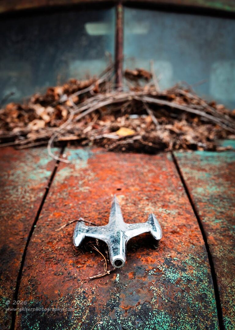
One aspect of this truck that I had enjoyed, even as I was driving by, was the debris at the base of the windshield. This little detail shared so much information about where this truck had been parked. No, not a location, but the fact that it was under a tree for quite some time. The current location had nothing at all to do with that, and I saw the chance to get a view of this truck that made it look like it was still sitting under that tree rather than on a car lot. The question was just how to get the composition worked out to make sense.
One technique that I have used before was to use the hood ornament as a focal point down in the lower third of the frame and use the dead leaves as the framework for the upper part of the image. That was my basic idea for this one, but I found that I really liked the curvature of the leaves at the top. This kind of forced my hand to include enough of them that I was going to have to bring in the windshield as well. My initial idea was to crop just below the roof and leave the glass as the top of the frame while I had more of the curve of the hood flowing through the bottom of the frame. I tried to visualize this crop while I was shooting the image, but at a ratio of 3:2 the frame was a good bit longer than I was going to end up using which would probably be at an aspect ratio of 5:7.
When I got this image home and started to crop to get the aspect ratio right, I found that the hoor ornament was squarely in the middle of the frame and I didn’t like that at all. The glass also made a terrible upper boundary for the image, and I didn’t like it at all. Before I gave up on it though, I decided to see what would happen if I included the roof of the truck which I had included just enough of thinking that was the area that I would be cropping out. By shifting the framing, I was able to lower the ornament to a much more appropriate position within the frame while giving the top of the image a much better framing element. This was a composition that I could work with and I continued the processing until it all came together even better than I had expected.
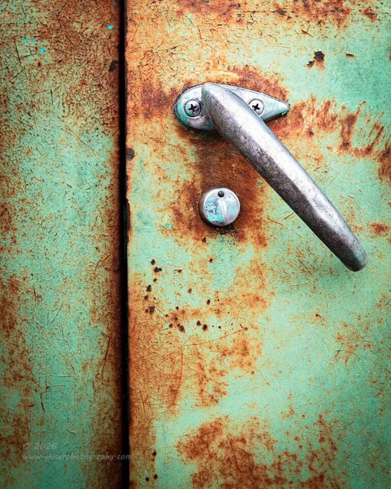
I was only a dozen frames into this trek by this point but was starting to understand this truck better and better. I was hearing how it wanted to be photographed and what it led me to next was the passenger side door right at the handle. I liked this handle because it was twisted from the horizontal position and was now creating a diagonal. This section of the cab had that great mint green color and the orange surface rust that complimented each other so well. There wasn’t anything overly complicated about the scene here and I wasn’t going to over complicate it if I could help it. My idea was simple, capture the handle and the keyhole along with the panel line that was heavily shaded with the door being slightly ajar.
The issue that I had to work through was how to organize things in the frame. Since I had a nice long line thanks to the door jam, I decided to go with a vertical composition to anchor that aspect and keep it from looking like poor framing. Where I placed that line was very important to the overall balance of the image as well because it really couldn’t be placed in the center because it would throw the balance way off with the only weight being on the side with the handle. If I pushed the line too far to the left, then the eyes would never bother going to the left side of the frame. There was another issue here as well that if I stayed true to the direction of the scene, the viewer’s eyes were going to have to jump over the strong line to get to the handle. I knew that I needed to give some room for the eyes to pick up speed on the left side which further gave reason to give that line some breathing room.
What I ended up deciding was that I would place the line exactly on the left third of the frame which I had an overlay on the LCD for reference. This allowed me to get the frame perfectly straight by placing the grid line over the panel line. I expanded the frame so that the handle was in the upper right of the frame roughly in the position of the golden spiral. This seemed to be a really good placement of elements within the frame and everything felt balanced. I could also change the aspect ratio to a square crop if I felt the need to do so in post. I knew that the 3:2 aspect ratio was way too tall and a 4:3 felt awkward to me. My hope was that a 4:5 would be the Goldilocks of the crops and fit the composition well, which it did.
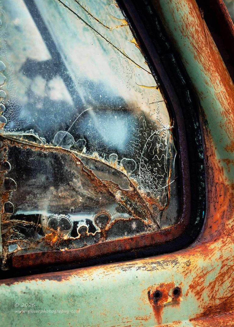
While working on the door handle, I started to really pay attention to the vent window which had some wonderful cracking going on as well as delamination. When I was all finished with the door handle, I turned my attention to that window and started to make a composition around it. It wasn’t coming together all that well and I was having a hard time getting the framing just right. I found myself wanting more reach out of the lens which was a good indication that it was time to change lenses for the telephoto which would probably do wonders for me in some of the details that I was wanting to capture.
After a quick switch of lenses, I was back in position to the side of the vent window trying to frame up a composition. The pillar made it kind of difficult because I really didn’t want to include areas that weren’t the truck in the composition. However, in order to get the colors and textures of the door at the lower right, I was going to have to capture portions that were beyond the truck once the pillar angle got to a certain point. I was just careful to keep trees in the background so that the green wasn’t too jarring for the image. It was important to me to include the mirror mounting holes as another point of texture and visual interest as well as a framing element for the lower right corner.
With all of this in mind, I found the composition that I liked and decided on the depth of field that would work for the image. There were only two exposures made here with slightly different framings to give me options during the culling process. It was the second one of the series that made it as a keeper. I almost gave up on this one, but I’m very glad that I stuck with it and saw it through. While it isn’t a favorite of mine, there is no question that this is some interesting glass that does tell a story.
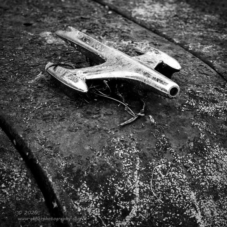
With the long lens working out well for me, I started to revisit some of the other areas that I had already shot. One of these was the hood ornament that had already had a good bit of attention. I had tried to get a very close in composition of it but wasn’t able to get the camera in close enough to fill the frame like I wanted. That is one of the benefits of the long lens, though it does have its limitations. While I can really fill the frame with a small detail, I can’t get too close to it because I won’t be able to focus within a certain distance. It is kind of an odd place to be. The long lens can take a small element and fill the frame, but I have to be a good distance away from it. The standard zoom has a nearly macro capability which allows me to get in very close to a subject and still be able to focus. Since I always use a tripod, there are times when I am unable to get the camera that close and in those situations, I go to the long lens. Now I was having to make sure that I was far enough away that my focusing would work.
I was able to get a composition that I liked with the long lens that framed the ornament between the two panel lines of the hood sides. It was kind of an expected composition but those panel lines were unique for the subjects that I’ve been able to photograph over the years which made it worth shooting. It was also a photo that I felt would be better in black and white because it was mainly about the contrast between the chrome and the hood. I didn’t need the viewer getting tied up in seeing the patina and the different color contrasts in addition to the luminance contrasts. Essentially, this simple image needed to stay simple to remain effective and the color overcomplicated it in my opinion.
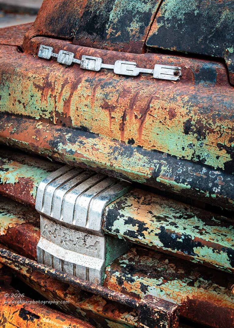
Where the color made more of a difference was on the front of the truck. There were so many different colors between the paint, the rust, the staining, and the stainless trim that I felt the colors became part of the story. That was essentially what I chose to focus on for the next composition which was anchored around the “Job Rated” block. I had started out with a composition that included the hood ornament and the lettering. I had moved to that big block, and then I had worked the hood ornament all by itself. I changed things up by including the lettering with the block on the grill for this one. It just goes to show that when you have three different defining elements on a vehicle, you can work with them each separately or put them in groups for some different effects to the composition.
It was with this composition that I really started to realize just how broad the front of this truck was. There was no aerodynamic quality about the front end and it was just an in-your-face design that just looked powerful. I chose to really focus on this design feature as I composed the image. Once again, I wanted to avoid the straight on composition and chose to go at an angle to introduce diagonal aspects with the grill. After checking both sides, it seemed that the best light was on the driver’s side and I also didn’t have to worry about including the Subaru parked next to the Dodge since I was pretty sure that I was going to get a bit of the parking lot in the corner of the image.
Ironically, including a bit of the background in the photo was instrumental in defining the shape of the front of the truck. Had I found a way to avoid that, the entire front of the truck would have just looked flat and devoid of any depth. By showing the curve of the hood, there was a very important design language that was conveyed through the image. Without it, I don’t think that this composition would have worked at all.
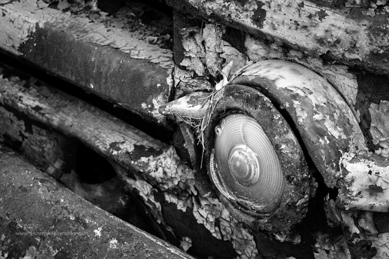
While working with the different views on the front of the truck, I started to pay attention to the turn signals, or more accurately…turn signal on the driver’s side. The passenger side was missing completely and would have made for a lousy subject. The one on the driver’s side was very interesting with lots of patina and textures to provide visual interest. I also liked the colors that were present here for the contrast and also for the life that they provided. I could see this area of the truck as both a black and white as well as a color composition. I just had to figure out how best to compose the frame.
This was actually the composition that I spent the most time on and shot the most frames of with a total count of seven different compositions taking into account different framings. There were two main ideas at work here with one being the simple one that you see here with the turn signal being the main subject and the grill just leading your eyes to it. The other concept opened things up slightly to include part of the bumperette as a framing element on the left and a bit more space above the light. This was the composition that I liked the best in the field and was firmly committed to getting that one right.
As happens from time to time, what I think works best in the field might not work when I get the images home and see them on a larger screen. This was one of those times. I still liked the composition, but the more I looked at it, the more I realized that it was overly complex with the additional elements in the frame. There was already a lot going on with the textures and the colors. By adding that bumperette and the bit more room above the light, it just became overly complicated for me to look at and I kept trying to figure out the visual pathway. The more basic composition seemed to be the better option for a larger frame.
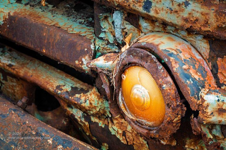
Now, what you are seeing here is not two versions of the same image. They are actually two different frames, numbers three and seven respectively. There is a subtle angle difference between them, but other than that, they are pretty much the same. Since I had two that I liked which were very similar and I remembered being able to see this part of the truck in both black and white as well as color, I decided to process both photos differently to see how I liked them in the end. It was pretty much as I expected with both being effective for different reasons.
The emphasis was different between the two photos with the texture being most important in one and the color contrasts being most important in the other. I liked them both equally as well and decided that they both could stay in the keeper stack.
This brought my total frame count to 26, just about a roll of 35mm film. Of those, I ended up with eleven keepers which was pretty dang good. I was thinking I was being optimistic thinking that I probably had five or six keepers from the trek. I mean, not that long ago, I was keeping 10% of what I shot which would have left me with two or three from a trek like this. Here recently, I have been doing much better with my hit rate which was why I was doubling that number. It never occurred to me that I could double that number again to get the actual number of solid images from the day.
For essentially 40 minutes of shooting, I have added another large group of images to my catalog which makes me very happy. This is normally a time of year that my successful photos start to drop off. Last year was an exception as I was still having very successful treks all through the Summer. While this Summer started off kind of slow, it has picked up quite a bit over the last week. I am about ready to take a break and recover from several back-to-back photography days. I know you are probably ready to stop hearing from me by this point and I get that. Daily emails might be a bit much and I’ll give your inbox a break for a while.
Just know that I do appreciate you joining me on these treks and for those of you who subscribe to the blog, I really appreciate you for looking forward to my next adventures. It is your support that fuels my want to go out and capture more of these photos. For that, I thank you.
Until the next time…