Wednesday, November 18, 2026
And just like that we are back with the third and final chapter to this blog series. Well, it has been about a day for you, but here in the studio, it has only been a matter of minutes since I wrapped up chapter 2. In fact, you probably haven’t even read that part just yet, so I’ll sit back and give you time to peruse it to get caught up.
Now that we are all on the same page, I would like to get right back into it starting from where we last left off. I was finally starting to work with the Humvee that was parked behind the business and had come up with a photo that I actually liked of the front marker light. It was also around this area that the shadows were the most interesting because of the shape of the hood. There was one area where body lines all came together which created an interesting radiating pattern going up and to the right. This was what I wanted to capture, but at the same time, I wanted to create some kind of abstract with it. As I had mentioned, the hood was green and apparently from a junk yard as there was spray paint on it used to identify the piece. I had to be creative to avoid too much of that paint as it would have been a distraction. I also needed to have some kind of visual anchor for the image. This is what I was starting to really look at during this stage.
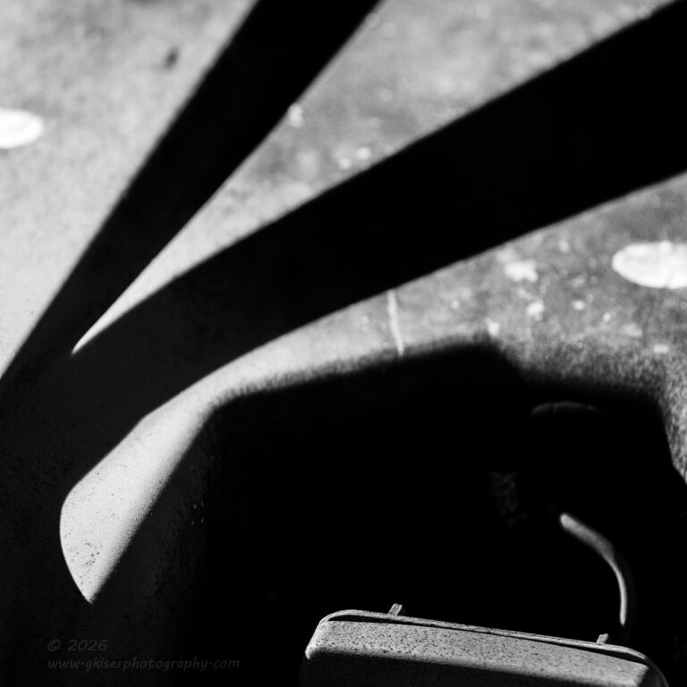
What I decided to do was use that odd sensor which was positioned inboard of the marking light for that visual anchor. I would frame the shot as a vertical image to have the radiating shadows going up and to the right. This felt logical to me, and I started to work out the composition based on that idea. When I was pretty sure that I had it, I dialed in the right depth of field so that the shadow would go soft and the bits of visible spray paint would not be a distraction. I wasn’t really sure if I liked it or not, and I didn’t really see a way to improve it at the time. Because of that, I didn’t linger with that composition and only shot a single exposure.
When I got home, this one made it through the culling process, and I started to play with it in post to see how it would turn out. I immediately liked the idea of doing the photo in black and white because it was all based on a green subject with splotches of white paint. This meant that the colors were just simply not that important to me or the photo. By making it black and white, things started to look better, but it still felt awkward to me. I wasn’t sold on the composition at all at this point but still worked through the process. Since it was a vertical image, I immediately set my mind to changing the aspect ratio. In the vast majority of my vertical images, the 3:2 aspect ratio just seems too tall, so I will typically cut that down to something like a 5:7, 4:5, or 3:4 which feels much better for a vertical frame in most situations. I kept batting around different aspect ratios as I got further into the processing, but nothing really seemed to work as well as I had hoped.
As I was getting into the final stages, I was starting to really increase the contrast in the image and that was forcing the shadows to go very dark which I liked. I started to see the image a little different and the more I looked at it, the more that sensor was just becoming a distraction because it had nothing at all to do with the shapes that I was seeing within the shadows. The fact that I had seen that as a focal point for the image to start with had prompted me to actually focus on that portion of the frame. That brought more attention to it and the distraction got bigger because of it.
I finally made the choice to mostly omit that sensor in favor of focusing on the shadow above. Now, the edges were soft because the focus was now right at the bottom of the frame where the top of the sensor was. However, the whole photo took on a different look and started to look like a hand signing “OK” which became an interesting story. It certainly started to look abstract and the soft focus on the shadows helped that process along.
This is one of those images that didn’t turn out anything like I had visualized it at the time. It took on its own life and what would normally be seen as an error in focusing helped to make the image a success. Now, this is certainly not a favorite image of mine, and it is one that I think I’ll have to live with for a while to see if I truly like it. It does have merit though and I’m glad that I spent the time to really find out how the image wanted to be presented. It was the only frame that I had shot of this concept which might have been part of the problem. I really should have fleshed the concept out a bit further in the field which might have created a stronger image in the end.
This was the last photo that I shot of the Hummer. I just wasn’t able to really dial in that much interest with it. I knew that there was still more to work with around the Cadillac out front and that was where I wanted to go next. Since I was now using the telephoto lens, I knew that I was going to have some different options available to me in terms of framing and compositions which was pretty exciting.
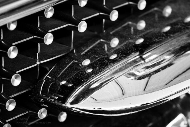
When I got back out to the car, I started working with the grill which I had already spent a good deal of time with earlier. I went back to the area where the little sliver of a bumper came into the grill on the passenger side. That stub bumper was reflecting many of the decorative points on the grill and I really liked the patterns that developed. The shelter that was over the car was also reflecting in the chrome and I liked the way that the lighting created lines that kind of went with the lines of the grill. It was random, yet organized which is just how I like my abstracts to be.
As I had done with the previous compositions of the grill like this, I did the photo in black and white since there really wasn’t much color in the scene at all. this worked out very well and I liked the contrast that was brought into the frame by doing it this way. Because it seemed to read a little bland from left to right, I did flip the image so that the diagonal would go up and to the right for a bit more visual drama. This was an easy fix since there was nothing in the frame that had to be rendered in a specific direction. This just felt much better overall to me.
This was actually the first of three images that I shot of the grill with the telephoto lens. I noticed right away that it was much easier to keep from appearing as a reflection with the distance that I was able to work from which was nice. This also allowed me the opportunity to change my height to the bumper for some variation to the diagonals. I knew that I was probably going to be flipping the image as I had done so having some steeper angles wasn’t going to be a problem for me. Had I been locked down to the native direction, this would have come across as rather awkward and overly calming for the patterns and elements in the scene.

As I was typing about that last photo, I was also looking at the other photos in the series which were done slightly different. The third image had way too much angle to it, but the second frame was one that I had also considered for processing. This time I had a different idea about it. I was fine with the black and white choices that I had been making for the grill photos but had started to wonder what a color image would look like. From this side, the overhang of the shelter was very visible in the chrome, and it had a slight warm tone to it. I knew that the sky would introduce some blues to the frame as well which would likely balance out well with the warmer tones. Since I had been typing steadily for hours at this point, I decided to pull that second exposure back into Lightroom to see what a color presentation would look like.
It was a little bland at first, but the more I worked with it the more I was liking the tones and colors. There were a couple of tricks that I had to use to get the colors where I wanted them, but that was just a little bit of tweaking of the hue and saturation levels of the blue, yellow, and orange channels with an additional overlay of some split toning to add some additional warm and cool tones. After a bit of global saturation and vibrancy adjustments, I was pretty well happy with the way that it had come out. I also checked the vectorscope to see how my eyes were doing with this one as far as color harmony and found the colors to be spot on perfect on the color wheel. You just don’t know how happy I am to see that my gut instincts on colors are actually calibrated just right. This is something that I have been working on for years and feel pretty confident about it. The addition of the vectorscope in Lightroom is a great chance to confirm those choices.
Something else that is worth mentioning here with this image is the concept of flipping the frame. Unlike what I have done with the previous black and white version, this version was not flipped and the diagonal is clearly aimed down. Take a moment to look at both of these images and compare them. I think that they both work very well but read completely differently from left to right. The only real difference other than a slight altitude adjustment with the camera is that one is in color and the other isn’t. It is that change that dictated just how I needed the image to read.
With the addition of the warmer tones, there was a level of excitement that was added to the image just based on the colors alone. I could have flipped this image and had the diagonal going up and to the right which would have amplified the visual excitement. In my opinion, however, that would have pushed the image too far in that direction. In order to balance the visual drama from the color, I chose to have it structurally calmer. They both have the same visual energy, but arrive at that by two different methods.
These things and more are possible topics that I am happy to work with my mentorship clients on. I offer a wide variety of options for mentorships, but I am also happy to custom create a program just for you. It all starts with a free, no-obligation consultation where we get to know each other, and I make sure that I can offer what you are needing in your own photography journey. There are a lot of ways that this can be done both in person and virtually. A couple of years ago I stopped doing workshops in favor of the mentorships because I found that I could cover much more ground in less time when I am creating a curriculum for a single client rather than trying to fill the needs of several different photographers during a workshop. This also means that a mentorship session can be a good deal less expensive than a workshop and have you back home in time for dinner. Let me know if there is something that I can help you with in your own photography journey.
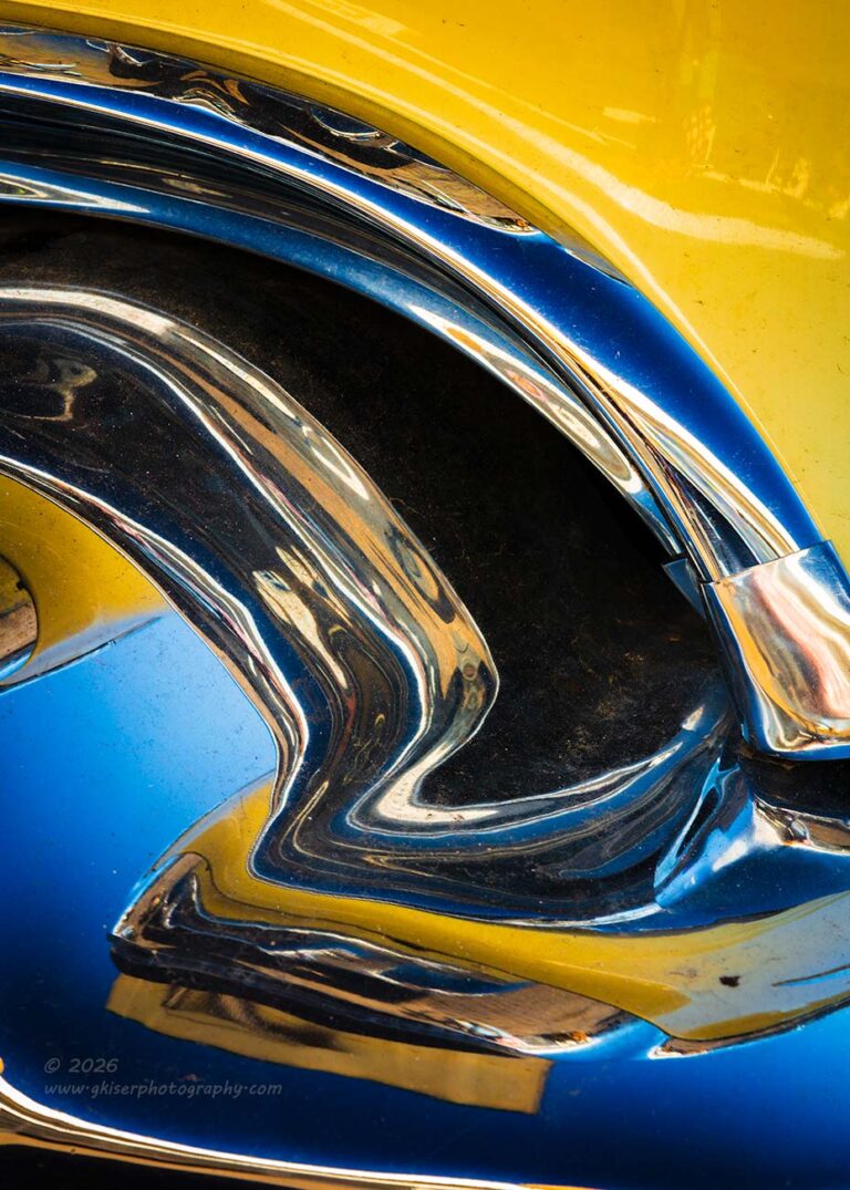
Of course, with me back at the front of the car I was being drawn to the lovely curves of the grill and bumper which I had worked with at the start of the day. With the longer lens, I was able to get a slightly different frame of the scene and decided to give it another try. The lighting was also different by this point giving me some different colors to work with. The overall recipe for the composition was largely the same as what I had done before which made it simple to recreate.
Not wanting to spend too much time with this, I only shot two frames with the focus point moved between the two. It was the first one that won out and became the keeper from this set. Something that I realized during the processing was that the colors were more intense now that some time had passed and the sun had moved. I had processed this one largely in the same way that I had done the earlier ones, but it popped much more. I liked that and wanted to have that effect with the other images as well. I ended up going back to those earlier frames and working the colors to be even more intense. That allowed them all to match up pretty well and I was happy with that.
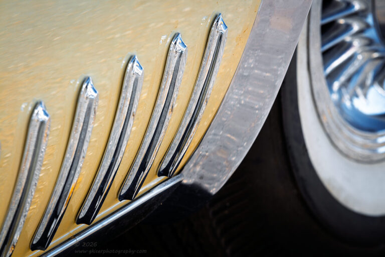
Another area of the car that had interested me from the beginning was the area around the rear wheel. There was a series of chrome gills that filled the lower part of the quarter panel that interested me. I started to look at how those would look in a photo but knew that I was going to need to do something creative with the angles to keep it from looking too static. Nothing that I did seemed to work well for the gills, but when I expanded the scope of the image to include the wheel, I found something that really finished off the composition. The spokes in the wheel cover looked similar to the gills and there was a deflector at the wheel arch that matched the whitewall tire. There were two elements that were in opposition with each other that added that element that I wanted. I just had to work out the height of the camera to get the angles right for a bit of added visual tension between the two portions. The point where I cropped the wheel was also going to be relatively important as well.
I ended up shooting four different variations with camera placement and point of focus. There was a lot of reflection of the pavement in the paint, so I wanted to minimize that part of the image so that the focus would be on the broader shapes. This was done with a limited depth of field, but one that was sufficient enough to render the wheel cover with enough detail to actually work in the image.
The next step was actually deciding on how to present the image. I had thought that I would do this in black and white, but as I was looking at it during the early stages of the processing, I felt that there was just enough blue in the wheel cover to balance out the pale yellow of the paint. I ended up leaving this one in color and you can actually see the color for what it was on the car much better in this photo. Since the blue was very pale in the reflection, I didn’t want to go overboard with the saturation levels, which meant that I left them pretty well where they appeared in reality. This was a more subtle image that was about the shapes rather than the color. The color was there more or less to provide a bit more contrast to the scene and to give a little color harmony at the same time.
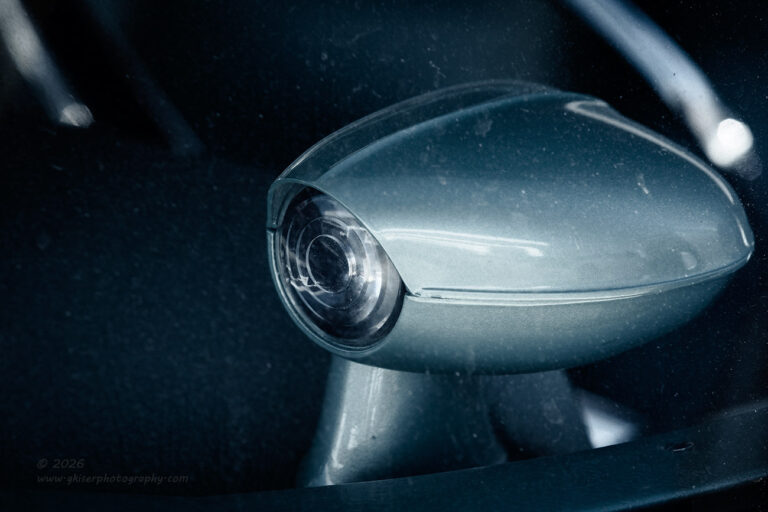
By this time, I was starting to wind down and I was getting tired. There was one area that I had spotted on the interior which had interested me. I had no idea what it was but liked the shape and the oddity of it was going to make for a pretty decent abstract. It wasn’t until I got home and was able to research it that I found out what it might be. It would seem that this is the sensor for the auto dimming headlights that Cadillac used in the late 50’s and early 60’s. I didn’t even know that was an available feature on cars back then, so working with this car actually taught me something.
What I liked about it was the fact that it kind of looked like a spaceship of sorts. This fits for the era of car design as they were all about capturing the essence of flight and space travel around then. It was on the other side of the windshield which presented some issues for me, but instead of trying to work around them, I decided to embrace the dirt and spots on the glass. This gave the scene a dated feel that added even more interest to the final composition. The other issue that was presented due to the glass was the decals that were found on the glass around this area. There was an inspection sticker as well as a barcode from the auction that it came from. I didn’t want to include any of that kind of identifying material in a photo and found that it really would have been a distraction to this composition. I just worked out a composition that avoided those stickers while keeping portions of the steering wheel to help frame the sensor.
I ended up shooting three different variations of the composition with slightly different framing. During the culling portion, I decided that I really liked the second one for the framing that I had used. That was the one that I started to work with but decided that I needed to adjust the tilt of the frame just a tad which then put the edge too close to the sensor on the right. I went back to the other variations and found one with a bit more room behind the sensor and started to work that one instead. It survived the slight rotation of the image well, and I was on my way with the actual processing.
The scene was just a greenish blue which wasn’t particularly pretty and there were no color contrasts to work with. This seemed like a perfect time to use black and white, so I didn’t have to worry about the colors. None of the black and white profiles seemed to work out for this scene though. It just didn’t feel right. None of the color profiles seemed to capture the tone that I wanted either which left me in kind of a conundrum. The solution came in one of my favorite specialty profiles that desaturates the colors, adds contrast, and shifts the tones to the blue end of the spectrum. When I selected that profile, I saw a color developing that really fit the era with that steel blue with just a slight greenish cast to it. The color was perfect and worked for the shape that I was seeing and the dirt on the glass to really put a time stamp on the image.
From there, it was just a matter of massaging the color tones and working out the contrasts within the scene. It didn’t take too long once I found that profile to get it all finished and ready to print. It is not a perfect image by any stretch, but it is those imperfections that cancel out the relatively good condition of the interior of this car. Show and shine photos are not really my thing, and I have found that any bit of decay in an image will help tell a much more interesting story. The only decay here was the dirt on the window that actually made the photo look old like it had survived from that time period. It fit the decay theme that I was after and the photo made me very happy.
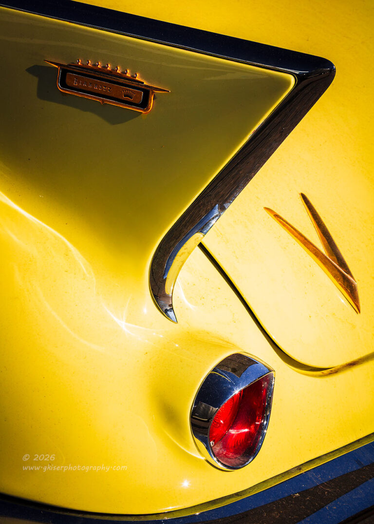
Before I decided to call it a day, I wanted to return to the rear of the car and do some more work with the fins now that I had a different lens fitted. If you will recall from the first chapter, that was where I had started the day out. The first three images had been an attempt to capture the fin with the badge on it framing the “V” and the Eldorado lettering on the trunk lid. I ended up not liking those so much after seeing what I was getting ready to capture so I am very happy that I revisited this section of the car.
The first attempt was done very similar to what I had done before with a horizontal orientation focusing on the nameplate and fin. I didn’t like how the bumper was intruding into the composition this way and felt that from where I was standing a stronger composition would actually be a vertical one that eliminated the nameplate in favor of just focusing on the “V” which matched the shape of the trim on the fin. The bumper and taillight would now become the bottom framing elements for the photo.
I had shot one frame horizontally and now I had done another one vertically. There was no doubt that the vertical one was the stronger one, but I wasn’t able to get past the fact that I had omitted an important element with the Eldorado badging. I did go back to the horizontal framing again, but from a different angle. During the culling phase, I found that the omission of the lettering didn’t really matter and actually made for a very strong and compelling composition with the “V” shape being there in the forefront of it all. I ended up processing this one and did it as a full color image with a similar treatment to the saturation levels that I had done earlier with the front of the car. The blue and the yellow really popped and made for a striking image. The reduction to shapes turned this into something closer to an abstract rather than automotive photography. I actually loved how it turned out and I was so happy that I had tried it this way even though it didn’t accomplish what I was after at the time. It is another one of my favorites from this trek and it is ironic that it comes from the same element of the car as my top favorite which was captured from the other side and much lower. It just goes to show how important camera height is to a photograph.
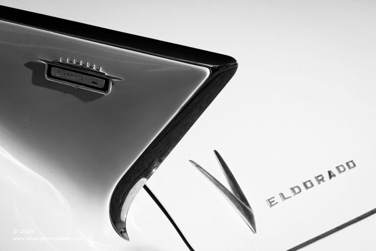
As I mentioned, I did go back to the concept of including the lettering on the trunk. This time, I moved the position of the camera a bit and changed the height a bit to support the new angle. While I had been trying to include the taillight previously, I decided to omit that and break up the panel gap on the trunk lid by cropping through the corner of it. I loved how the fin and the “V” mirrored the same kind of language and decided to keep those elements close together. To include the lettering, I found that I had to bring in a lot of negative space in the upper right which was unable to be mirrored on the opposite side. There was also a large amount of yellow in the frame and without the red of the taillight to compliment the yellow, it seemed overdone and unrealistic.
Since this was a study in the shapes and letters against the yellow, I decided to see what it would look like as a high contrast and high key image. Essentially, I was going to trade the yellow for white and keep the trim darker in contrast. Once I found the right profile to work with, I was able to see this as a very nice abstract that focused just on what I was wanting to showcase. I actually really liked this and liked it almost as much as the brilliantly colored variations on the fin that I had worked with already. The language was different with the black and white, but I felt that it spoke just as loudly as the ones in full color.
This was the last frame that I shot for the day. I hadn’t really kept track of how many frames had been shot during the hour and forty minutes that I was out here working. I thought it was probably around 35 or so frames since I had been moving around a lot and not getting bogged down with any particular composition. I was thinking that I might have a half dozen keepers out of the bunch which would be easy enough to process and get into the blog before time to go to bed. Well, we see how that worked out for me. The truth of the matter was that I had shot 54 frames during that time there. Of those, I ended up with 22 keepers which is nearly half of everything that I shot. It had been a slow start, but by the end of the day, it was a very successful trek and one more for the books that was done on a very sunny day.
Thank you for joining me on this one, and I hope that you have enjoyed the photos as well as the story behind them. I’ll be honest with you; this is probably one of my more favorite treks for how the colors came out. I love working with colors and have had to really watch how I saturate the colors in my decay images. There is nothing worse that photographing a scene that should have a somber look to it and then really cranking up the colors. The mood just doesn’t fit. This time, I had the chance to really push the colors on that yellow Cadillac because you just can’t see yellow and not feel happiness. The car was in a condition that supported that and I wanted to capitalize on the combination. I did take a bit of artistic license with the colors as far as how punchy I made them, but I really do think that it serves the grander purpose behind the photos. Let me know if you agree.
Hopefully, I’ll be able to get back out in the field some more sooner than later with another adventure. I’ve got a place in mind, but I’m going to need some very cloudy conditions and a good bit of time to work through the property. It is one that I have visited before, but the conditions were really quite difficult to work with under the blazing sun. Hopefully the vegetation will be less problematic and in a dormant state for this next visit. That is coming at some point in these colder months. I’ll also be out there exploring and trying to find some other locations which are new to photograph.
Until then…

Remember to use the code KISER10 to get 10% off your purchase