Monday, July 27, 2026
Not that long ago, I went out on a limb and tried out a concept that I had been mulling over for some time. From my perspective, the experiment went very well, and I ended up with photographs that were very much what I had in mind. I was also pretty much spot on in my estimation of the response from the audience. With just a couple of exceptions that have contacted me in reference to those photos, the blog entry and the photos have pretty much landed with a dull thud. I’m not discouraged though because I really do think that this is something that I want to explore a bit more to see what is there.
For those that might not remember the experiment, I had the crazy notion of going out and photographing road markings. The large white arrows specifically, but I had the intention of doing it with a fine art and abstract feel to the images. I’ve had some time to live with those photos now and consider what I did well with them and where I could improve. This was actually kind of harder to accomplish than you might think. Without a lot of feedback from that trek, I was left deciding based on only my point of view. I saw areas that I wanted to try to expand on and areas that I thought worked quite well overall. Since that trek, I have been keeping my eye out for another location that might work well for this kind of photography.
Now you might be thinking that finding road markings should be quite simple as they are literally all over the place. This is not wrong, but there are some things that I do look for which make certain scenes better than others for this type of photography. First of all, I need the location to be safe which means free of traffic. This is a big one since the markings that I am wanting to photograph are there just for traffic control. Second of all, I am looking for areas that have higher contrast. This means I am looking for fresher paint and newer asphalt. A faded blacktop and worn paint won’t really help me with this type of photography because it is all based on contrast. A new consideration that I have added to the list compared to the first time is the addition of color. What I had done the first time was restricted to white paint on a black surface which was excellent for black and white photos, but I felt that color might be an interesting addition to the concept.
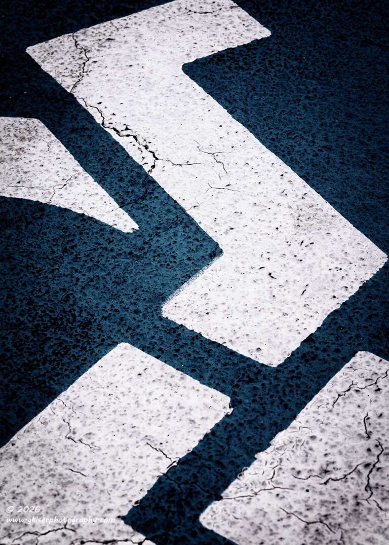
When it comes to road markings, there are two primary colors that are used. White, which I had already worked with, and yellow which is used as well for traffic control. I liked the idea of the yellow paint because the pavement would reflect a blue tone on a sunny day which would give me a nice color contrast that I didn’t have before. I’ve been looking for some yellow markings which had some shape and interest to them, but haven’t really found anything that I thought would work out well enough. While I was looking, I did spend a lot of time looking in parking lots and found another option that I hadn’t considered before. The markings for a handicapped space presented another option with the blue background and white design on it. I liked the idea that the shapes would be random and depending on how I framed and composed the image, the actual nature of what was being photographed would be lost. That was the main idea behind this kind of photography anyway, so I already had that goal in mind.
I still had to find the markings in good condition which is not so easy to do out here in the rural areas of Wilkes County. If I were in a big city, I’m sure this would be much easier to locate, but at the same time that would mean that I would have to be in the city which I just didn’t care to do at all. Maybe when I get better at this kind of photography, I will be able to deal with going into crowded areas with lots more noise and commotion. Until that point, I’ll stick with my quiet neck of the woods where I am very comfortable and know how things work.
After a good bit of rain, we ended up with a dry day today with a good bit of sunlight. It wasn’t a good day for waterfall photography which has also been on my list of things to work with. It was, however, a great day for a ride in the Miata which I embarked on right after finishing breakfast. It was a fun ride and not too hot at all. On the way back home, I passed by a church that I had been keeping an eye on because the parking lot checked a few of the boxes for this road marking abstract photography that I was starting to look into. The parking lot had usually been gated and not accessible, but this time, I saw that the gates were open and there was a car in the parking lot. As I did a quick look through the parking lot, I spotted several handicapped parking areas which had the blue and white markings that I had considered a possibility.
With the sun out, I thought that this might be a good chance to see if I could expand on the concept that I started a while back. I just needed to get home and switch out vehicles to get the camera back out there. This didn’t take too long and once I was finished up with some tasks at home, I was back out on the road headed to the church. There was always the chance that the gates would be closed up, but I was feeling lucky today for some reason.
When I got to the church, I found the gates all opened up as I had seen a short time before. The car that had been in the parking lot was no longer there. In fact, it was totally empty. This made me feel better about being out here photographing the pavement. I’m still quite sure that I look like I need some assistance in life hunched over a tripod and camera with my attention fixed on the pavement. Not too many people would understand what I was doing and with this kind of photography, I don’t think I could really explain it in a way that would make them feel more comfortable about what I was up to.
Anyway, I got parked and took a closer look at the parking spaces that I had to choose from. There was one that was in slightly better shape than the others and that was the one that I decided to work with. I had been considering the lens choices for this kind of work for a little while and had decided that the telephoto lens would be the better option because of how intricate the different elements of the design were. I didn’t need the help of perspective here because I wasn’t wanting to capture much of the scene at all. I just needed little areas that told a very different story from what the actual graphic was showing.
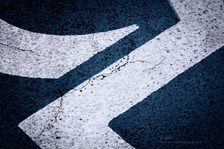
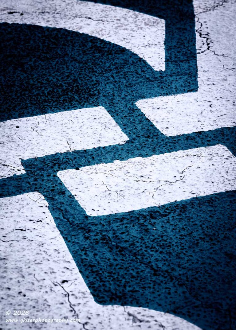
I think that the idea of doing this kind of photography appeals to me because it is all about how I see things, not necessarily how things appear. I’m trying everything that I can to remove the context from the scene and leave the viewer seeing just what interested me about the scene rather than the entire scene. I felt that was going to be very important with this particular subject because it is a universal graphic and when paired with the blue instantly recognizable. My task was to remove the context and focus my attention on the colors and shapes which were going to be the product of my framing.
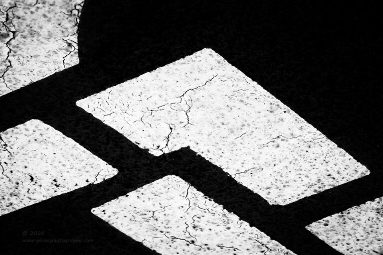
I took a little while to walk around the graphic to see what shapes and patterns jumped out at me. It because a much more difficult process than I had thought at first. Everything that I wanted to put in the frame was too much like the original shape of the graphic. Unfortunately, I was falling victim to wanting to create something recognizable on a subconscious level since all of the elements of this graphic went into something that I was comfortable with. I had to break that pattern, so I started to zoom in and find very simple angles which I then expanded on to get the compositions that you see here.
I was really liking the idea of adding the color into the scene, but I knew that in post I was going to be altering the shades and tones of the blue to keep that from being a direct clue. There was also a pretty good chance that I would be trying some of these in black and white to further separated the photos from the actual subject. I kept the camera in a color mode for simplicity though and just knew how the contrast would play out in black and white.
It took a little while to work my way around the entire graphic and pick out areas that I liked. The concept of negative and empty space stayed at the forefront of my mind as I worked the different compositions along the way. More than anything, I wanted to harness negative space and even used it to the point where the idea of negative space moved between the blue and the white surfaces to where either could be the negative space, or maybe even both could be at the same time. This was all part of the continued experiment to see what worked and what didn’t.
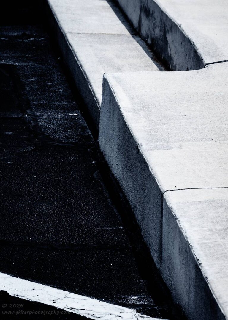
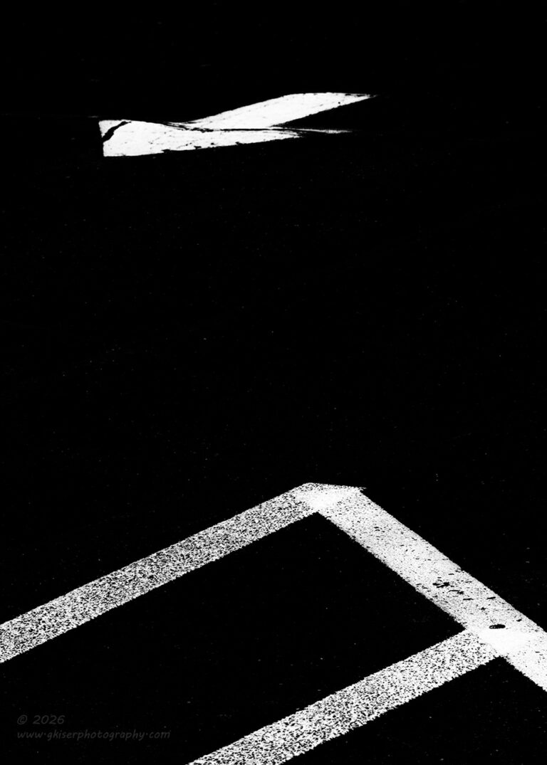
Of course, as I moved around the graphic, I also spent some time looking at the surrounding areas to see if there was anything else that I might want to spend some time with. I did like a view that included the safety zone with a directional arrow a short distance away from it. It was a similar setup from what I had worked the previous time with two different areas of arrows. This was going to be designed differently, but with the same void between that added to the visual tension. The extreme angle from the low camera also added to that tension and made the piece feel uncomfortable to look at.
Oddly enough, I was going for the element of uncomfortable with this one. I want to make photos that bring about an emotional reaction when I can. Photos like this don’t really scream emotion, but I’ve found that introducing an element of uncomfort can have a very similar effect on the viewer to keep them engaged. Art is not supposed to be comfortable and calming all of the time. Some of the great pieces of art are actually quite uncomfortable to look at and that is what makes them great. You just can’t look away from it as you explore what is making it feel “off.”
While looking for these odd views, I spotted the curb by the main chapel that had a single step from the parking lot to the entryway. The light was looking really good on that step and the angle that I was standing at added to the interest. It looked abstract all by itself, but I knew that by zeroing in on the step itself, I would be able to add to that abstract quality pretty easily. As I stuck with my original plan of including the road markings, I did the first composition with one of the parking space stripes included for another diagonal in the composition. It was the cumulative effect of the shapes that I felt made this image work, but I wanted to dial in even closer to concentrate on the transition with the one step.
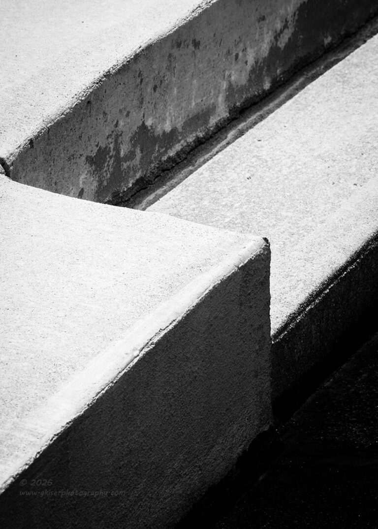
I spent way more time with this composition than I probably should have. I wanted to make sure that I had the right scaling of the elements as well as a frame that would work in a shorter aspect ratio than the 3:2 that I was looking at on the screen. I was thinking that this was going to be a 5:7 which made the optional 4:3 ratio in the camera useless for really getting the right framing. I had to guess at how things were going to look, but I am pretty confident in estimating the crop lines for the different aspect ratios.
Once I had it all figured out, I fired off a few frames to make sure that I had the exposure close to how I was going to want the final image. I knew that I wanted a good deal of contrast here with the different levels of shadows that I was working with. With the sun out, I had that contrast to the point that I had to make sure I didn’t blow out the brighter areas which I needed to have for the textures it offered. It only took two frames here to get the image that I wanted.
In fact, there were not that many photos shot during this session. By the end of my time there, just over 20 minutes, I had shot 17 frames which turned into these seven keepers. There is no question that I am happy with the outcome, but I’m that just like the last time I did photos like this, there won’t be much in the way of reaction from them. So, if you like these photos, or like the idea behind them, please take a moment to let me know. Let me know what you like about them and what you would like to see different. I’m still learning how to work this particular subject and if I can make the images in a way that appeal to others, I’ll consider that a true win.
If you are still reading this blog, I appreciate you for sticking with me during this odd trek. I really think that I want to continue doing more with these types of photos and look forward to having you along with me as I learn more ways to make the photos work.
Until next time…
 www.singh-ray.com
Remember to use the code KISER10 to get 10% off your purchase